harmony 鸿蒙折叠展开动效
折叠展开动效
场景介绍
由于目前移动端需要展示的内容越来越多,但是移动端的空间弥足珍贵,在有限的空间内不可能罗列展示全部种类内容,因此折叠/展开功能就可以解决当前问题,本文就介绍下如何使用ArkTS来实现折叠展开动效。
效果呈现
折叠展开动效定义:点击展开按钮,下拉动画展示内容,点击折叠按钮,折叠动画折叠内容。
本例最终效果如下:
运行环境
本例基于以下环境开发,开发者也可以基于其它适配的版本进行开发: - IDE: DevEco Studio 3.1 Release - SDK: Ohos_sdk_public 3.2.12.5(API Version 9 Release)
实现思路
创建折叠时的文本组件,根据List组件中的groupcollapse和groupexpand事件自定义一个CollapseAndExpand组件,父组件通过维护flag和onFlagChange来控制折叠/展开的动效,设置动效所需的参数,添加逻辑来展示展开后的文本。
开发步骤
创建自定义接口IRowItem。 具体代码如下:
interface IRowItem {
    id?: number;
    title?: string;
    name1?: string;
    name2?: string;
    name3?: string;
    flag?: boolean;
    type?: string;
    onFlagChange?: () => void;
}
创建自定义组件CollapseAndExpandDemo,根据自定义接口IRowItem添加内容,创建UI展示文本。 具体代码如下:
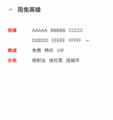
@Entry
@Component{
    ...
    build() {
        Column() {
            Row() {
                Image($r("app.media.ic_public_back"))
                .width(20)
                .height(20)
                Text('周免英雄')
                .fontSize(18)
                .fontWeight(FontWeight.Bold)
                .margin({ left: 10 })
            }
            .width('100%')
            .margin({ bottom: 30 })


            Column() {
                RowItem({ props: { title: 'AAAAA', name1: 'BBBBB', name2: 'CCCCC', name3: '武器大师' } })
                // 文本折叠时,type为DOWN
                RowItem({ props: { name1: 'DDDDD', name2: 'EEEEE', name3: 'FFFFF', type: 'DOWN', onFlagChange: this.onFlagChange } })


                //被折叠的文本内容
                ...


                RowItem({ props: { title: '商城', name1: '免费', name2: '特价', name3: 'VIP' } })
                RowItem({ props: { title: '分类', name1: '按职业', name2: '按位置', name3: '按城市' } })
            }
            .width('100%')
}
被折叠文本信息。 具体代码如下:
CollapseAndExpand({
    items: [
        { id: 0, name1: 'GGGGG', name2: 'HHHHH', name3: 'JJJJJ' },
        { id: 1, name1: 'KKKKK', name2: 'LLLLL', name3: 'MMMMM' },
        { id: 2, name1: 'NNNNN', name2: 'OOOOO', name3: 'PPPPP' },
        // 文本展开时,type为UP
        { id: 3, name1: 'QQQQQ', name2: 'RRRRR', name3: 'SSSSS', type: 'UP', onFlagChange: this.onFlagChange }
    ],
})
将步骤2创建的文本进行渲染。 具体如下:
build() {
    Flex() {
      Text(this.props.title)
        .fontSize(14)
        .fontWeight(FontWeight.Bold)
        .layoutWeight(1)
        .fontColor(Color.Red)
        .margin({ right: 10 })
      Flex({ alignItems: ItemAlign.Center }) {
        Text(this.props.name1).fontSize(14).margin({ right: 10 })
        Text(this.props.name2).fontSize(14).margin({ right: 10 })
        Text(this.props.name3).fontSize(14).margin({ right: 10 })
        ...
      }
    }
  }
创建自定义组件CollapseAndExpand。 根据自定义组件说明动效,@Provide负责数据更新,并且触发渲染;@Consume在感知数据更新后,重新渲染。 具体代码如下:
@Entry
@Component
struct CollapseAndExpandDemo {
  @Provide("flag") flag: boolean = false
  private onFlagChange = () => {
    animateTo({
        duration: 650,
        curve: Curve.Smooth
    }, () => {
        this.flag = !this.flag;
    })
  }


  ...


@Component
struct CollapseAndExpand {
    private items: IRowItem[] = [];
    @Consume("flag") flag: boolean;


    build() {
        Column() {
            ForEach(this.items, (item: IRowItem) => {
                RowItem({ props: item })
            }, (item: IRowItem) => item.id.toString())
        }
        .width('100%')
        .clip(true)
        .height(this.flag ? 130 : 0)
    }
}
根据步骤4最终的flag以及props的type值,判断折叠展开的效果实现。 具体代码如下:
build() {
    ...
    // 当文本折叠(flag为false且type为down)时,展示展开按钮
    // 当文本展开(flag为true且type为up)时,展示折叠按钮
    if (!this.flag && this.props.type === 'DOWN'||this.flag && this.props.type === 'UP') {
    Image($r("app.media.icon"))
        .width(16)
        .height(16)
        .objectFit(ImageFit.Contain)
        .rotate({ angle: !this.flag && this.props.type === 'DOWN' ? 0 : 180 })
        // 点击按钮后旋转180°,展示折叠按钮
        .onClick(() =>
        this.props.onFlagChange()
        )
        .transition({ type: TransitionType.All, opacity: 0 })
    }
}
完整代码
示例代码如下:
interface IRowItem {
    id?: number;
    title?: string;
    name1?: string;
    name2?: string;
    name3?: string;
    flag?: boolean;
    type?: string;
    onFlagChange?: () => void;
}

@Entry
@Component
struct CollapseAndExpandDemo {
    @Provide("flag") flag: boolean = false
    private onFlagChange = () => {
        animateTo({
            duration: 650,
            curve: Curve.Smooth
            }, () => {
                this.flag = !this.flag;
                })
    }

    build() {
        Column() {
            Row() {
                Image($r("app.media.ic_public_back")).width(20).height(20)
                Text('周免英雄')
                .fontSize(18)
                .fontWeight(FontWeight.Bold)
                .margin({ left: 10 })
            }
            .width('100%')
            .margin({ bottom: 30 })

            Column() {
                RowItem({
                    props: { title: '英雄', name1: 'AAAAA', name2: 'BBBBB', name3: 'CCCCC' } })
                RowItem({
                    props: {
                        name1: 'DDDDD',
                        name2: 'EEEEE',
                        name3: 'FFFFF',
                        // 文本折叠时,type为DOWN
                        type: 'DOWN',
                        onFlagChange: this.onFlagChange
                    }
                })
                // 直接调用折叠展开组件
                CollapseAndExpand({
                    items: [
                        { id: 0, name1: 'GGGGG', name2: 'HHHHH', name3: 'JJJJJ' },
                        { id: 1, name1: 'KKKKK', name2: 'LLLLL', name3: 'MMMMM' },
                        { id: 2, name1: 'NNNNN', name2: 'OOOOO', name3: 'PPPPP' },
                        { id: 3,
                        name1: 'QQQQQ',
                        name2: 'RRRRR',
                        name3: 'SSSSS',
                        // 文本折叠时,type为UP
                        type: 'UP',
                        onFlagChange: this.onFlagChange }
                    ],
                })

                RowItem({ props: { title: '商城', name1: '免费', name2: '特价', name3: 'VIP' } })
                RowItem({ props: { title: '分类', name1: '按职业', name2: '按位置', name3: '按城市' } })
            }
            .width('100%')

        }
        .height('100%')
        .padding({ top: 30, right: 30, left: 30 })
  }
}

@Component
struct RowItem {
    private props: IRowItem;
    @Consume("flag") flag: boolean

    build() {
        Flex() {
            Text(this.props.title)
            .fontSize(14)
            .fontWeight(FontWeight.Bold)
            .layoutWeight(1)
            .fontColor(Color.Red)
            .margin({ right: 10 })
            Flex({ alignItems: ItemAlign.Center }) {
                Text(this.props.name1).fontSize(14).margin({ right: 10 })
                Text(this.props.name2).fontSize(14).margin({ right: 10 })
                Text(this.props.name3).fontSize(14).margin({ right: 10 })

                // 当文本折叠(flag为false且type为down)时,展示展开按钮
                // 当文本展开(flag为true且type为up)时,展示折叠按钮
                if (!this.flag && this.props.type === 'DOWN'||this.flag && this.props.type === 'UP') {
                    Image($r("app.media.ic_public_arrow_down_0"))
                    .width(16)
                    .height(16)
                    .objectFit(ImageFit.Contain)
                    .rotate({ angle: !this.flag && this.props.type === 'DOWN' ? 0 : 180 })
                    // 点击展开按钮后旋转180°,展示折叠按钮
                    .onClick(() => this.props.onFlagChange())
                    .transition({ type: TransitionType.All, opacity: 0 })
                }
            }
            .layoutWeight(3)
        }
        .width('100%')
        .height(16)
        .margin({ top: 15 })
    }
}

@Component
struct CollapseAndExpand {
    private items: IRowItem[] = [];
    @Consume("flag") flag: boolean;

    build() {
        Column() {
            ForEach(this.items, (item: IRowItem) => {
                RowItem({ props: item })
            }, (item: IRowItem) => item.id.toString())
        }
        .width('100%')
        .clip(true)
        .height(this.flag ? 130 : 0)
    }
}
参考
你可能感兴趣的鸿蒙文章
harmony 鸿蒙使用Badge组件完成聊天未读消息数量显示功能
1
赞
- 所属分类: 后端技术
- 本文标签:
热门推荐
-
2、 优质文章
-
3、 gt
-
7、 openharmony
-
9、 golang
-
10、 Vue中input框自动聚焦