harmony 鸿蒙安全区域
安全区域
安全区域是指页面的显示区域,默认情况下开发者开发的界面都布局在安全区域内,不与系统设置的避让区比如状态栏、导航栏区域重叠。提供属性方法允许开发者设置组件绘制内容突破安全区域的限制,通过expandSafeArea属性支持组件不改变布局情况下扩展其绘制区域至安全区外,通过设置setKeyboardAvoidMode来配置虚拟键盘弹出时页面的避让模式。页面中有标题栏等文字不希望和避让区重叠时,建议对组件设置expandSafeArea属性实现沉浸式效果,也可以直接通过窗口接口setWindowLayoutFullScreen设置全屏沉浸式。
说明:
从API Version 10开始支持。后续版本如有新增内容,则采用上角标单独标记该内容的起始版本。
摄像头挖孔区域不属于避让区,页面默认不避让挖孔。
从API Version 12开始,可在module.json5中添加以下配置项, 摄像头挖孔区域会视为避让区,实现页面默认避让挖孔:
“metadata”: [
{
“name”: “avoid_cutout”,
“value”: “true”,
}
],
expandSafeArea
expandSafeArea(types?: Array<SafeAreaType>, edges?: Array<SafeAreaEdge>): T
控制组件扩展其安全区域。
原子化服务API: 从API version 11开始,该接口支持在原子化服务中使用。
系统能力: SystemCapability.ArkUI.ArkUI.Full
参数:
| 参数名 | 类型 | 必填 | 说明 |
|---|---|---|---|
| types | Array <SafeAreaType> | 否 | 配置扩展安全区域的类型。未添加Metadata配置项时,页面不避让挖孔, CUTOUT类型不生效。 默认值:[SafeAreaType.SYSTEM, SafeAreaType.CUTOUT, SafeAreaType.KEYBOARD] |
| edges | Array <SafeAreaEdge> | 否 | 配置扩展安全区域的方向。 默认值:[SafeAreaEdge.TOP, SafeAreaEdge.BOTTOM, SafeAreaEdge.START, SafeAreaEdge.END] 扩展至所有避让区域。 |
返回值:
| 类型 | 说明 |
|---|---|
| T | 返回当前组件。 |
说明:
设置expandSafeArea属性进行组件绘制扩展时,建议组件尺寸不要设置固定宽高(百分比除外),当设置固定宽高时,扩展安全区域的方向只支持[SafeAreaEdge.TOP, SafeAreaEdge.START],扩展后的组件尺寸保持不变。
安全区域不会限制内部组件的布局和大小,不会裁剪内部组件。
当父容器是滚动容器时,设置expandSafeArea属性不生效。
设置expandSafeArea()时,不传参,走默认值处理;设置expandSafeArea([],[])时,相当于入参是空数组,此时设置expandSafeArea属性不生效。
组件设置expandSafeArea生效的条件为:
1.type为SafeAreaType.KEYBOARD时默认生效,表现为组件不避让键盘。 2.设置其他type,组件的边界与安全区域重合时组件能够延伸到安全区域下。例如:设备顶部状态栏高度100,那么组件在屏幕中的绝对位置需要为0 <= y <= 100。组件延伸到避让区时,在避让区的事件如点击事件等可能会被系统拦截,优先给状态栏等系统组件响应。
滚动类容器内的组件不建议设置expandSafeArea属性,如果设置,需要按照组件嵌套关系,将当前节点到滚动类祖先容器间所有直接节点设置expandSafeArea属性,否则expandSafeArea属性在滚动后可能会失效,写法参考示例7。
expandSafeArea属性仅作用于当前组件,不会向父组件或子组件传递,因此使用过程中,所有相关组件均需配置。
同时设置expandSafeArea和position属性时,position属性会优先生效,expandSafeArea属性会后生效。对于未设置position、offset等绘制属性的组件,如果其边界未与避让区重叠,设置expandSafeArea属性将不生效,如弹窗和半模态组件。
对于expandSafeArea属性无法生效的场景,若要将组件部署在避让区,需要手动调整组件的坐标。
setKeyboardAvoidMode11+
setKeyboardAvoidMode(value: KeyboardAvoidMode): void
控制虚拟键盘抬起时页面的避让模式。
原子化服务API: 从API version 11开始,该接口支持在原子化服务中使用。
系统能力: SystemCapability.ArkUI.ArkUI.Full
参数:
| 参数名 | 类型 | 必填 | 说明 |
|---|---|---|---|
| value | KeyboardAvoidMode | 是 | 配置虚拟键盘抬起时页面的避让模式。 默认值:KeyboardAvoidMode.OFFSET,键盘抬起时默认避让模式为上抬。 |
说明:
KeyboardAvoidMode.RESIZE模式会压缩页面大小,页面中设置百分比宽高的组件会跟随页面压缩,而直接设置宽高的组件会按设置的固定大小布局。设置KeyboardAvoidMode的RESIZE模式时,expandSafeArea([SafeAreaType.KEYBOARD],[SafeAreaEdge.BOTTOM])不生效。
KeyboardAvoidMode.NONE模式配置页面不避让键盘,页面会被抬起的键盘遮盖。
getKeyboardAvoidMode
getKeyboardAvoidMode(): KeyboardAvoidMode
返回虚拟键盘抬起时页面的避让模式。
原子化服务API: 从API version 11开始,该接口支持在原子化服务中使用。
系统能力: SystemCapability.ArkUI.ArkUI.Full
返回值:
| 名称 | 说明 |
|---|---|
| KeyboardAvoidMode | 返回虚拟键盘抬起时的页面避让模式。 |
ignoreLayoutSafeArea20+
ignoreLayoutSafeArea(types?: Array<LayoutSafeAreaType>, edges?: Array<LayoutSafeAreaEdge>)
控制组件布局时延伸至安全区域。设置ignoreLayoutSafeArea属性可使组件的布局范围扩展至组件级安全区(safeAreaPadding)和页面级安全区(状态栏、导航栏、挖孔区、软键盘)。依据safeAreaPadding功能,组件能够感知并利用向外累积的邻接可用安全区范围(详见累计安全区延伸),通过ignoreLayoutSafeArea属性利用该范围进行布局。
原子化服务API: 从API version 20开始,该接口支持在原子化服务中使用。
系统能力: SystemCapability.ArkUI.ArkUI.Full
参数:
| 参数名 | 类型 | 必填 | 说明 |
|---|---|---|---|
| types | Array <LayoutSafeAreaType> | 否 | 配置扩展布局安全区域的种类。 默认值:[LayoutSafeAreaType.SYSTEM] 扩展至系统默认非安全区域。 非法值:按默认值处理。 |
| edges | Array <LayoutSafeAreaEdge> | 否 | 扩展布局安全区域的方向且支持镜像能力。 默认值:[LayoutSafeAreaEdge.ALL] 扩展至所有方向。 非法值:按默认值处理。 |
说明:
设置ignoreLayoutSafeArea([], [])时,相当于参数为空数组,此时设置ignoreLayoutSafeArea属性的效果等同于未生效。
对于自适应宽高(即设置了width属性或height属性为LayoutPolicy.matchParent)的组件,ignoreLayoutSafeArea将使组件尺寸自适应地撑满父容器安全区;对于非自适应宽高的组件,ignoreLayoutSafeArea将使组件保持原有尺寸,基于扩展后的安全区域计算位置布局。
与expandSafeArea的区别在于:expandSafeArea仅扩展组件的渲染区域,后代组件不受当前组件expandSafeArea设置的影响;ignoreLayoutSafeArea扩展组件的布局区域,后代组件能够感知当前组件ignoreLayoutSafeArea设置的效果,即后代节点将基于当前组件经过ignoreLayoutSafeArea布局后的实际结果进行布局。具体对比可参考示例10。
组件使用ignoreLayoutSafeArea能力需依赖容器支持,当前支持子组件ignoreLayoutSafeArea的容器组件包括:Flex、Row、Column、Stack、GridRow、GridCol、RowSplit、ColumnSplit。
示例
示例1(实现沉浸式效果)
该示例通过设置expandSafeArea属性向顶部和底部扩展安全区实现沉浸式效果。
// xxx.ets
@Entry
@Component
struct SafeAreaExample1 {
  @State text: string = ''
  controller: TextInputController = new TextInputController()

  build() {
    Row() {
        Column()
          .height('100%').width('100%')
          .backgroundImage($r('app.media.bg')).backgroundImageSize(ImageSize.Cover)
          .expandSafeArea([SafeAreaType.SYSTEM], [SafeAreaEdge.TOP, SafeAreaEdge.BOTTOM])
    }.height('100%')
  }
}

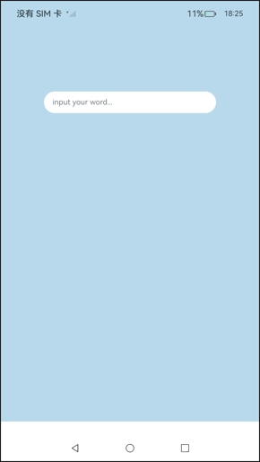
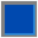
示例2(同时设置固定宽高和expandSafeArea属性)
该示例展示了同时设置固定宽高和expandSafeArea属性的效果。
// xxx.ets
@Entry
@Component
struct SafeAreaExample2 {
  @State text: string = ''
  controller: TextInputController = new TextInputController()

  build() {
    Column() {
      TextInput({ text: this.text, placeholder: 'input your word...', controller: this.controller })
        .placeholderFont({ size: 14, weight: 400 })
        .width(320).height(40).offset({y: 120})
        .fontSize(14).fontColor(Color.Black)
        .backgroundColor(Color.White)
    }
    .height('780')
    .width('100%')
    .backgroundColor('rgb(179,217,235)')
    .expandSafeArea([SafeAreaType.SYSTEM], [SafeAreaEdge.TOP, SafeAreaEdge.BOTTOM])
  }
}
如下图:Column组件扩展至了顶部状态栏[SafeAreaEdge.TOP],未扩展至底部导航条[SafeAreaEdge.BOTTOM],扩展后的组件高度与设置的高度一致。
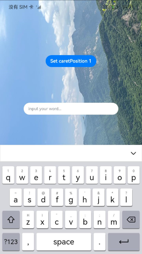
示例3(键盘避让时固定背景图位置)
该示例通过为背景图组件设置expandSafeArea属性,来实现拉起键盘进行避让时,背景图保持不动的效果。
// xxx.ets
@Entry
@Component
struct SafeAreaExample3 {
  @State text: string = ''
  controller: TextInputController = new TextInputController()

  build() {
    Row() {
      Stack() {
        Column()
          .height('100%').width('100%')
          .backgroundImage($r('app.media.bg')).backgroundImageSize(ImageSize.Cover)
          .expandSafeArea([SafeAreaType.KEYBOARD, SafeAreaType.SYSTEM])
        Column() {
          Button('Set caretPosition 1')
            .onClick(() => {
              this.controller.caretPosition(1)
            })
          TextInput({ text: this.text, placeholder: 'input your word...', controller: this.controller })
            .placeholderFont({ size: 14, weight: 400 })
            .width(320).height(40).offset({y: 120})
            .fontSize(14).fontColor(Color.Black)
            .backgroundColor(Color.White)
        }.width('100%').alignItems(HorizontalAlign.Center)
      }
    }.height('100%')
  }
}
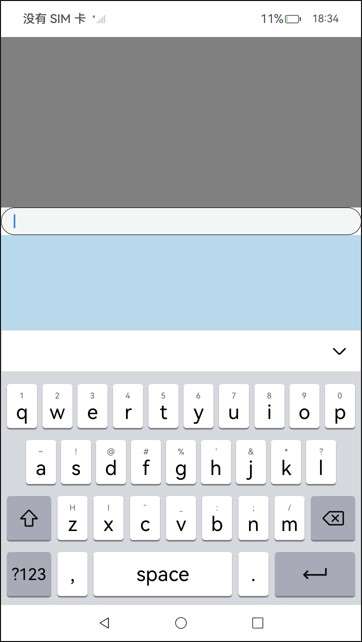
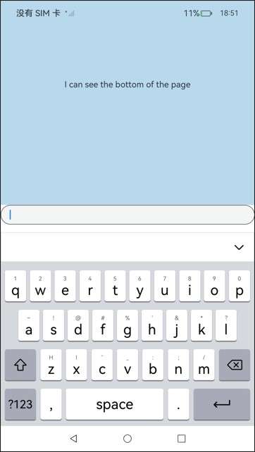
示例4(设置键盘避让模式为压缩)
该示例通过调用setKeyboardAvoidMode设置键盘避让模式为RESIZE模式,实现键盘抬起时page的压缩效果。
// EntryAbility.ets
import { KeyboardAvoidMode } from '@kit.ArkUI';

onWindowStageCreate(windowStage: window.WindowStage) {
  // Main window is created, set main page for this ability
  hilog.info(0x0000, 'testTag', '%{public}s', 'Ability onWindowStageCreate');

  windowStage.loadContent('pages/Index', (err, data) => {
    let keyboardAvoidMode = windowStage.getMainWindowSync().getUIContext().getKeyboardAvoidMode();
    // 设置虚拟键盘抬起时压缩页面大小为减去键盘的高度
  windowStage.getMainWindowSync().getUIContext().setKeyboardAvoidMode(KeyboardAvoidMode.RESIZE);
    if (err.code) {
      hilog.error(0x0000, 'testTag', 'Failed to load the content. Cause: %{public}s', JSON.stringify(err) ?? '');
      return;
    }
    hilog.info(0x0000, 'testTag', 'Succeeded in loading the content. Data: %{public}s', JSON.stringify(data) ?? '');
  });
}
// xxx.ets
@Entry
@Component
struct KeyboardAvoidExample1 {
  build() {
    Column() {
      Row().height("30%").width("100%").backgroundColor(Color.Gray)
      TextArea().width("100%").borderWidth(1)
      Text("I can see the bottom of the page").width("100%").textAlign(TextAlign.Center).backgroundColor('rgb(179,217,235)').layoutWeight(1)
    }.width('100%').height("100%")
  }
}
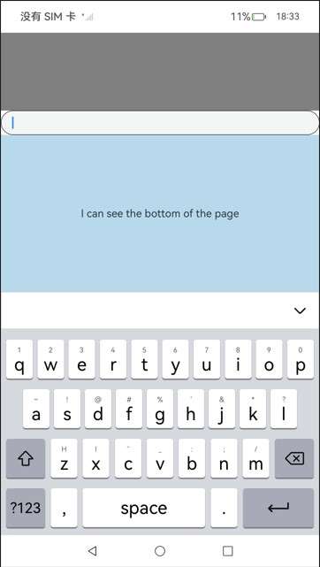
示例5(设置键盘避让模式为上抬)
该示例通过调用setKeyboardAvoidMode设置键盘避让模式为OFFSET模式,实现键盘抬起时page的上抬效果。但当输入光标距离屏幕底部的高度大于键盘高度时,page不会抬起,如本例中所示。
// EntryAbility.ets
import { KeyboardAvoidMode } from '@kit.ArkUI';

onWindowStageCreate(windowStage: window.WindowStage) {
  // Main window is created, set main page for this ability
  hilog.info(0x0000, 'testTag', '%{public}s', 'Ability onWindowStageCreate');

  windowStage.loadContent('pages/Index', (err, data) => {
    let keyboardAvoidMode = windowStage.getMainWindowSync().getUIContext().getKeyboardAvoidMode();
    // 设置虚拟键盘抬起时把页面上抬直到露出光标
  windowStage.getMainWindowSync().getUIContext().setKeyboardAvoidMode(KeyboardAvoidMode.OFFSET);
    if (err.code) {
      hilog.error(0x0000, 'testTag', 'Failed to load the content. Cause: %{public}s', JSON.stringify(err) ?? '');
      return;
    }
    hilog.info(0x0000, 'testTag', 'Succeeded in loading the content. Data: %{public}s', JSON.stringify(data) ?? '');
  });
}
// xxx.ets
@Entry
@Component
struct KeyboardAvoidExample2 {
  build() {
    Column() {
      Row().height("30%").width("100%").backgroundColor(Color.Gray)
      TextArea().width("100%").borderWidth(1)
      Text("I can see the bottom of the page").width("100%").textAlign(TextAlign.Center).backgroundColor('rgb(179,217,235)').layoutWeight(1)
    }.width('100%').height("100%")
  }
}
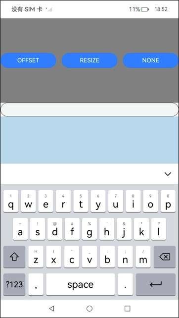
示例6(切换避让模式)
该示例通过调用setKeyboardAvoidMode来实现OFFSET、RESIZE和NONE模式之间的切换,实现三种不同的键盘避让效果。
import { hilog } from '@kit.PerformanceAnalysisKit';
import { KeyboardAvoidMode } from '@kit.ArkUI';
@Entry
@Component

struct KeyboardAvoidExample3 {
  build() {
    Column() {
      Row({space:15}) {
        Button('OFFSET')
          .onClick(() => {
            this.getUIContext().setKeyboardAvoidMode(KeyboardAvoidMode.OFFSET);
            hilog.info(0x0000, 'keyboardAvoidMode: %{public}s', JSON.stringify(this.getUIContext().getKeyboardAvoidMode()));
          })
          .layoutWeight(1)
        Button('RESIZE')
          .onClick(() => {
            this.getUIContext().setKeyboardAvoidMode(KeyboardAvoidMode.RESIZE);
            hilog.info(0x0000, 'keyboardAvoidMode: %{public}s', JSON.stringify(this.getUIContext().getKeyboardAvoidMode()));
          })
          .layoutWeight(1)
        Button('NONE')
          .onClick(() => {
            this.getUIContext().setKeyboardAvoidMode(KeyboardAvoidMode.NONE);
            hilog.info(0x0000, 'keyboardAvoidMode: %{public}s', JSON.stringify(this.getUIContext().getKeyboardAvoidMode()));
          })
          .layoutWeight(1)
      }
      .height("30%")
      .width("100%")
      .backgroundColor(Color.Gray)

      TextArea()
        .width("100%")
        .borderWidth(1)

      Text("I can see the bottom of the page")
        .width("100%")
        .textAlign(TextAlign.Center)
        .backgroundColor('rgb(179,217,235)')
        .layoutWeight(1)

      TextArea()
        .width("100%")
        .borderWidth(1)
    }
    .width('100%')
    .height("100%")
  }
}
OFFSET模式
RESIZE模式
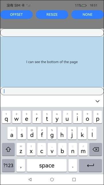
NONE模式
示例7(滚动类容器扩展安全区)
该示例通过在滚动类容器内调用expandSafeArea属性实现沉浸式效果。
class SwiperDataSource implements IDataSource {
  private list: Array<Color> = []
  constructor(list: Array<Color>) {
    this.list = list
  }
  totalCount(): number {
    return this.list.length
  }
  getData(index: number): Color {
    return this.list[index]
  }
  registerDataChangeListener(listener: DataChangeListener): void {
  }
  unregisterDataChangeListener(listener: DataChangeListener): void {
  }
}
@Entry
@Component
struct ExpandSafeAreaTest {
  private swiperController: SwiperController = new SwiperController()
  private swiperData: SwiperDataSource = new SwiperDataSource([])
  private list: Array<Color> = [
    Color.Pink,
    Color.Blue,
    Color.Green
  ]
  aboutToAppear(): void {
    this.swiperData = new SwiperDataSource(this.list)
  }
  build() {
    Scroll() {
      Column() {
        Swiper(this.swiperController) {
          LazyForEach(this.swiperData, (item: Color, index: number) => {
            Column() {
              Text('banner' + index).fontSize(50).fontColor(Color.White)
            }
            .expandSafeArea([SafeAreaType.SYSTEM], [SafeAreaEdge.TOP, SafeAreaEdge.BOTTOM])
            .width('100%')
            .height(400)
            .backgroundColor(item)
          })
        }
        .loop(true)
        .expandSafeArea([SafeAreaType.SYSTEM], [SafeAreaEdge.TOP, SafeAreaEdge.BOTTOM])
        .clip(false)
        Column(){
          Text("Tab页Content").fontSize(50)
        }.width("100%").height(1000)
        .backgroundColor(Color.Grey)
      }.expandSafeArea([SafeAreaType.SYSTEM], [SafeAreaEdge.TOP, SafeAreaEdge.BOTTOM])
    }
    .clip(false)
    .edgeEffect(EdgeEffect.None)
    .width("100%").height("100%")
  }
}

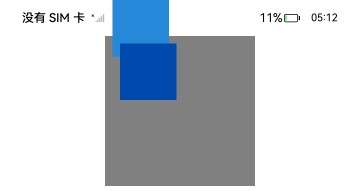
示例8(ignoreLayoutSafeArea延伸组件布局范围)
该示例利用ignoreLayoutSafeArea改变组件位置。相比未使用该属性,配置ignoreLayoutSafeArea后,Row组件基于Stack内容区、Stack组件级安全区、系统状态栏共同组成的范围,取其左上部分,作左上对齐。
import { LengthMetrics } from '@kit.ArkUI'

@Entry
@Component
struct IgnoreLayoutSafeAreaTest1 {
  build() {
    Column() {
      Stack() {
        Row()
          .backgroundColor('rgb(39, 135, 217)')
          .width(75)  // 固定宽度
          .height(75) // 固定高度
          .ignoreLayoutSafeArea([LayoutSafeAreaType.SYSTEM], [LayoutSafeAreaEdge.START, LayoutSafeAreaEdge.TOP])  // 设置布局区域延伸取左和上方向,至系统避让区SYSTEM

        Row()
          .backgroundColor('rgb(0, 74, 175)')
          .width(75)
          .height(75)

      }
      .width(200)
      .height(200)
      .backgroundColor(Color.Gray)
      .align(Alignment.TopStart)  // 子组件相对于Stack容器左上对齐
      .padding({
        left: 10  // 设置左侧10vp普通内边距
      })
      .safeAreaPadding(LengthMetrics.vp(10))  // 设置10vp安全区内边距(即组件级安全区)
    }
    .width("100%")
  }
}
示例9(ignoreLayoutSafeArea配合LayoutPolicy.matchParent延伸组件布局范围)
该示例利用ignoreLayoutSafeArea和LayoutPolicy.matchParent同时改变组件大小和位置。相比未使用该属性,配置ignoreLayoutSafeArea后,Row组件基于Stack内容区、Stack组件级安全区,取其右下部分并撑满可用空间。
import { LengthMetrics } from '@kit.ArkUI'

@Entry
@Component
struct IgnoreLayoutSafeAreaTest2 {
  build() {
    Column() {
      Stack() {
        Row()
          .backgroundColor('rgb(39, 135, 217)')
          .width(LayoutPolicy.matchParent)  // 自适应宽度
          .height(LayoutPolicy.matchParent) // 自适应高度
          .ignoreLayoutSafeArea([LayoutSafeAreaType.ALL], [LayoutSafeAreaEdge.END, LayoutSafeAreaEdge.BOTTOM])  // 设置布局区域延伸取右和下方向,至全部避让区ALL

        Row()
          .backgroundColor('rgb(0, 74, 175)')
          .width(LayoutPolicy.matchParent)
          .height(LayoutPolicy.matchParent)

      }
      .width(200)
      .height(200)
      .backgroundColor(Color.Gray)
      .align(Alignment.TopStart)  // 子组件相对于Stack容器左上对齐
      .padding(10) // 设置10vp普通内边距
      .safeAreaPadding(LengthMetrics.vp(10))  // 设置10vp安全区内边距(即组件级安全区)
    }
    .width("100%")
  }
}
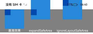
示例10(expandSafeArea与ignoreLayoutSafeArea的区别)
该示例展示了容器分别设置了expandSafeArea和ignoreLayoutSafeArea的布局效果和各自对子组件布局效果的影响。两种设置下,容器都可见地进行了延伸,但前者的子组件不受延伸影响,后者的子组件因父容器的延伸改变了位置。
import { LengthMetrics } from '@kit.ArkUI'

@Entry
@Component
struct IgnoreLayoutSafeAreaTest2 {
  build() {
    Row(){
      Column(){
        Stack(){
          Stack(){

          }
          .width(30)
          .height(30)
          .backgroundColor('rgb(0, 74, 175)')
        }
        .width(100)
        .height(100)
        .backgroundColor('rgb(39, 135, 217)')
        .align(Alignment.TopStart)

        Text("基准效果").fontColor(Color.White)
      }

      Column(){
        Stack(){
          Stack(){

          }
          .width(30)
          .height(30)
          .backgroundColor('rgb(0, 74, 175)')
        }
        .width(100)
        .height(100)
        .backgroundColor('rgb(39, 135, 217)')
        .align(Alignment.TopStart)
        .expandSafeArea()

        Text("expandSafeArea").fontColor(Color.White)
      }

      Column(){
        Stack(){
          Stack(){

          }
          .width(30)
          .height(30)
          .backgroundColor('rgb(0, 74, 175)')
        }
        .width(100)
        .height(100)
        .backgroundColor('rgb(39, 135, 217)')
        .align(Alignment.TopStart)
        .ignoreLayoutSafeArea()

        Text("ignoreLayoutSafeArea").fontColor(Color.White)
      }
    }
    .width("100%")
    .backgroundColor(Color.Gray)
    .justifyContent(FlexAlign.SpaceEvenly)
  }
}
你可能感兴趣的鸿蒙文章
- 所属分类: 后端技术
- 本文标签:
热门推荐
-
2、 优质文章
-
3、 gt
-
7、 openharmony
-
9、 golang
-
10、 Vue中input框自动聚焦