DataPanel
The <DataPanel> component displays proportions in a chart.
NOTE
This component is supported since API version 7. Updates will be marked with a superscript to indicate their earliest API version.
Child Components
Not supported
APIs
DataPanel(options:{values: number[], max?: number, type?: DataPanelType})
Since API version 9, this API is supported in ArkTS widgets.
Parameters
| Name | Type | Mandatory | Description |
|---|---|---|---|
| values | number[] | Yes | Data value list. A maximum of nine values are supported. If more than nine values are set, only the first nine ones are used. A value less than 0 evaluates to the value 0. |
| max | number | No | - When set to a value greater than 0, this parameter indicates the maximum value in the values list. - When set to a value equal to or smaller than 0, this parameter indicates the sum of values in the values list. The values are displayed in proportion. Default value: 100 |
| type8+ | DataPanelType | No | Type of the data panel (dynamic modification is not supported). Default value: DataPanelType.Circle |
DataPanelType
Since API version 9, this API is supported in ArkTS widgets.
| Name | Description |
|---|---|
| Line | Line data panel. |
| Circle | Circle data panel. |
Attributes
In addition to the universal attributes, the following attributes are supported.
| Name | Type | Description |
|---|---|---|
| closeEffect | boolean | Whether to disable the rotation and shadow effects for the component. Default value: false NOTE This attribute enables or disables the shadow effect only when trackShadow is not set. The shadow effect enabled through this attribute is in the default style. |
| valueColors10+ | Array<ResourceColor |LinearGradient> | Array of data segment colors. A value of the ResourceColor type indicates a solid color, and A value of the LinearGradient type indicates a color gradient. |
| trackBackgroundColor10+ | ResourceColor | Background color. The value is in hexadecimal ARGB notation. The first two digits indicate opacity. Default value: '#08182431' |
| strokeWidth10+ | Length | Stroke width of the border. Default value: 24 Unit: vp NOTE A value less than 0 evaluates to the default value. This attribute does not take effect when the data panel type is DataPanelType.Line. |
| trackShadow10+ | DataPanelShadowOptions | Shadow style. NOTE If this attribute is set to null, the shadow effect is disabled. |
DataPanelShadowOptions10+
| Name | Type | Mandatory | Description |
|---|---|---|---|
| radius | number |Resource | No | Shadow blur radius. Default value: 5 Unit: vp NOTE A value less than or equal to 0 evaluates to the default value. |
| colors | Array<ResourceColor |LinearGradient> | No | Array of shadow colors for data segments. Default value: same as the value of valueColors NOTE If the number of the set shadow colors is less than that of the data segments, the number of the displayed shadow colors is the same as the former. If the number of the set shadow colors is greater than that of the data segments, the number of the displayed shadow colors is the same as the latter. |
| offsetX | number |Resource | No | Offset on the x-axis. Default value: 5 Unit: vp |
| offsetY | number |Resource | No | Offset on the y-axis. Default value: 5 Unit: vp |
LinearGradient10+
Describes the linear gradient.
LinearGradient(colorStops: ColorStop[])
| Name | Type | Mandatory | Description |
|---|---|---|---|
| colorStops | ColorStop[] | Yes | Gradient colors and color stops. |
ColorStop10+
Describes the gradient color stop.
| Name | Type | Mandatory | Description |
|---|---|---|---|
| color | ResourceColor | Yes | Color value. |
| offset | Length | Yes | Gradient color stop (proportion value between 0 and 1). A value less than 0 evaluates to the value 0. A value greater than 1 evaluates to the value 1. |
Example
Example 1
// xxx.ets
@Entry
@Component
struct DataPanelExample {
  public valueArr: number[] = [10, 10, 10, 10, 10, 10, 10, 10, 10]

  build() {
    Column({ space: 5 }) {
      Row() {
        Stack() {
          DataPanel({ values: [25], max: 100, type: DataPanelType.Circle }).width(168).height(168)
          Column() {
            Text('30').fontSize(35).fontColor('#182431')
            Text('1.0.0').fontSize(9.33).lineHeight(12.83).fontWeight(500).opacity(0.6)
          }

          Text('%')
            .fontSize(9.33)
            .lineHeight(12.83)
            .fontWeight(500)
            .opacity(0.6)
            .position({ x: 104.42, y: 78.17 })
        }.margin({ right: 44 })

        Stack() {
          DataPanel({ values: [50, 12, 8, 5], max: 100, type: DataPanelType.Circle }).width(168).height(168)
          Column() {
            Text('75').fontSize(35).fontColor('#182431')
            Text('Used: 98 GB/128 GB') .fontSize(8.17).lineHeight(11.08).fontWeight(500).opacity(0.6)
          }

          Text('%')
            .fontSize(9.33)
            .lineHeight(12.83)
            .fontWeight(500)
            .opacity(0.6)
            .position({ x: 104.42, y: 78.17 })
        }
      }.margin({ bottom: 59 })

      DataPanel({ values: this.valueArr, max: 100, type: DataPanelType.Line }).width(300).height(10)
    }.width('100%').margin({ top: 5 })
  }
}

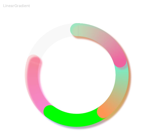
Example 2
// xxx.ets
@Entry
@Component
struct LinearGradientDataPanelExample {
  public values1: number[] = [20, 20, 20, 20]
  public color1: LinearGradient = new LinearGradient([{ color: "#65EEC9A3", offset: 0 }, { color: "#FFEF629F", offset: 1 }])
  public color2: LinearGradient = new LinearGradient([{ color: "#FF67F9D4", offset: 0 }, { color: "#FFFF9554", offset: 1 }])
  public colorShadow1: LinearGradient = new LinearGradient([{ color: "#65EEC9A3", offset: 0 }, { color: "#65EF629F", offset: 1 }])
  public colorShadow2: LinearGradient = new LinearGradient([{ color: "#65e26709", offset: 0 }, { color: "#65efbd08", offset: 1 }])
  public colorShadow3: LinearGradient = new LinearGradient([{ color: "#6572B513", offset: 0 }, { color: "#6508efa6", offset: 1 }])
  public colorShadow4: LinearGradient = new LinearGradient([{ color: "#65ed08f5", offset: 0 }, { color: "#65ef0849", offset: 1 }])
  @State color3: string = '#00FF00'
  @State color4: string = '#20FF0000'
  @State bgColor: string = '#08182431'
  @State offsetX: number = 15
  @State offsetY: number = 15
  @State radius: number = 5
  @State colorArray: Array<LinearGradient|ResourceColor> = [this.color1, this.color2, this.color3, this.color4]
  @State shadowColorArray: Array<LinearGradient|ResourceColor> = [this.colorShadow1, this.colorShadow2, this.colorShadow3, this.colorShadow4]

  build() {
    Column({ space: 5 }) {
      Text('LinearGradient').fontSize(9).fontColor(0xCCCCCC).textAlign(TextAlign.Start).width('100%').margin({ top: 20, left: 20})
      DataPanel({ values: this.values1, max: 100, type: DataPanelType.Circle })
        .width(300)
        .height(300)
        .valueColors(this.colorArray)
        .trackShadow({
          radius: this.radius,
          colors: this.shadowColorArray,
          offsetX: this.offsetX,
          offsetY: this.offsetY
        })
        .strokeWidth(30)
        .trackBackgroundColor(this.bgColor)
    }.width('100%').margin({ top: 5 })
  }
}
你可能感兴趣的鸿蒙文章
harmony 鸿蒙ArkTS-based Declarative Development Paradigm