harmony 鸿蒙Checkbox
Checkbox
提供多选框组件,通常用于某选项的打开或关闭。
说明:
API version 11开始,Checkbox默认样式由圆角方形变为圆形。
该组件从API version 8开始支持。后续版本如有新增内容,则采用上角标单独标记该内容的起始版本。
子组件
无
接口
Checkbox(options?: CheckboxOptions)
多选框组件。
卡片能力: 从API version 9开始,该接口支持在ArkTS卡片中使用。
原子化服务API: 从API version 11开始,该接口支持在原子化服务中使用。
系统能力: SystemCapability.ArkUI.ArkUI.Full
参数:
| 参数名 | 类型 | 必填 | 说明 |
|---|---|---|---|
| options | CheckboxOptions | 否 | 配置多选框的参数。 |
CheckboxOptions对象说明
多选框的信息。
系统能力: SystemCapability.ArkUI.ArkUI.Full
| 名称 | 类型 | 必填 | 说明 |
|---|---|---|---|
| name | string | 否 | 指定多选框名称。 卡片能力: 从API version 9开始,该接口支持在ArkTS卡片中使用。 原子化服务API: 从API version 11开始,该接口支持在原子化服务中使用。 |
| group | string | 否 | 用于指定多选框所属群组的名称(即所属CheckboxGroup的名称)。 说明: 未配合使用CheckboxGroup组件时,此值无用。 卡片能力: 从API version 9开始,该接口支持在ArkTS卡片中使用。 原子化服务API: 从API version 11开始,该接口支持在原子化服务中使用。 |
| indicatorBuilder12+ | CustomBuilder | 否 | 配置多选框的选中样式为自定义组件。自定义组件与Checkbox组件为中心点对齐显示。indicatorBuilder设置为undefined/null时,默认为indicatorBuilder未设置状态。 原子化服务API: 从API version 12开始,该接口支持在原子化服务中使用。 |
属性
除支持通用属性外,还支持以下属性:
select
select(value: boolean)
设置多选框选中状态。
从API version 10开始,该属性支持$$双向绑定变量。
从API version 18开始,该属性支持!!双向绑定变量。
卡片能力: 从API version 9开始,该接口支持在ArkTS卡片中使用。
原子化服务API: 从API version 11开始,该接口支持在原子化服务中使用。
系统能力: SystemCapability.ArkUI.ArkUI.Full
参数:
| 参数名 | 类型 | 必填 | 说明 |
|---|---|---|---|
| value | boolean | 是 | 多选框是否选中。 默认值:false 值为true时,多选框被选中。值为false时,多选框未选中。 |
select18+
select(isSelected: Optional<boolean>)
设置多选框选中状态。与select相比,isSelected参数新增了对undefined类型的支持。
卡片能力: 从API version 18开始,该接口支持在ArkTS卡片中使用。
原子化服务API: 从API version 18开始,该接口支持在原子化服务中使用。
系统能力: SystemCapability.ArkUI.ArkUI.Full
参数:
| 参数名 | 类型 | 必填 | 说明 |
|---|---|---|---|
| isSelected | Optional<boolean> | 是 | 多选框是否选中。 当isSelected的值为undefined时取默认值false。 值为true时,多选框被选中。值为false时,多选框未选中。 |
selectedColor
selectedColor(value: ResourceColor)
设置多选框选中状态颜色。
卡片能力: 从API version 9开始,该接口支持在ArkTS卡片中使用。
原子化服务API: 从API version 11开始,该接口支持在原子化服务中使用。
系统能力: SystemCapability.ArkUI.ArkUI.Full
参数:
| 参数名 | 类型 | 必填 | 说明 |
|---|---|---|---|
| value | ResourceColor | 是 | 多选框选中状态颜色。 默认值:$r(‘sys.color.ohos_id_color_text_primary_activated’)。 异常值按照默认值处理。 |
selectedColor18+
selectedColor(resColor: Optional<ResourceColor>)
设置多选框选中状态颜色。与selectedColor相比,resColor参数新增了对undefined类型的支持。
卡片能力: 从API version 18开始,该接口支持在ArkTS卡片中使用。
原子化服务API: 从API version 18开始,该接口支持在原子化服务中使用。
系统能力: SystemCapability.ArkUI.ArkUI.Full
参数:
| 参数名 | 类型 | 必填 | 说明 |
|---|---|---|---|
| resColor | Optional<ResourceColor> | 是 | 多选框选中状态颜色。 当resColor的值为undefined时,默认值:$r(‘sys.color.ohos_id_color_text_primary_activated’)。 异常值按照默认值处理。 |
unselectedColor10+
unselectedColor(value: ResourceColor)
设置多选框非选中状态的边框颜色。
原子化服务API: 从API version 11开始,该接口支持在原子化服务中使用。
系统能力: SystemCapability.ArkUI.ArkUI.Full
参数:
| 参数名 | 类型 | 必填 | 说明 |
|---|---|---|---|
| value | ResourceColor | 是 | 多选框非选中状态边框颜色。 默认值:$r(‘sys.color.ohos_id_color_switch_outline_off’) |
unselectedColor18+
unselectedColor(resColor: Optional<ResourceColor>)
设置多选框非选中状态的边框颜色。与unselectedColor10+相比,resColor参数新增了对undefined类型的支持。
原子化服务API: 从API version 18开始,该接口支持在原子化服务中使用。
系统能力: SystemCapability.ArkUI.ArkUI.Full
参数:
| 参数名 | 类型 | 必填 | 说明 |
|---|---|---|---|
| resColor | Optional<ResourceColor> | 是 | 多选框非选中状态边框颜色。 当resColor的值为undefined时,默认值:$r(‘sys.color.ohos_id_color_switch_outline_off’) |
mark10+
mark(value: MarkStyle)
设置多选框内部图标的样式。
原子化服务API: 从API version 11开始,该接口支持在原子化服务中使用。
系统能力: SystemCapability.ArkUI.ArkUI.Full
参数:
| 参数名 | 类型 | 必填 | 说明 |
|---|---|---|---|
| value | MarkStyle | 是 | 多选框内部图标样式。 从API version 12开始,设置了indicatorBuilder时,按照indicatorBuilder中的内容显示。 默认值:{ strokeColor : $r('sys.color.ohos_id_color_foreground_contrary'),strokeWidth: $r('sys.float.ohos_id_checkbox_stroke_width'),size: ‘20vp’ } |
mark18+
mark(style: Optional<MarkStyle>)
设置多选框内部图标的样式。与mark10+相比,style参数新增了对undefined类型的支持。
原子化服务API: 从API version 18开始,该接口支持在原子化服务中使用。
系统能力: SystemCapability.ArkUI.ArkUI.Full
参数:
| 参数名 | 类型 | 必填 | 说明 |
|---|---|---|---|
| style | Optional<MarkStyle> | 是 | 多选框内部图标样式。 设置了indicatorBuilder时,按照indicatorBuilder中的内容显示。 当style的值为undefined时,默认值:{ strokeColor : $r('sys.color.ohos_id_color_foreground_contrary'),strokeWidth: $r('sys.float.ohos_id_checkbox_stroke_width'),size: ‘20vp’ } |
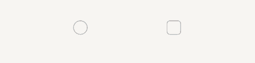
shape11+
shape(value: CheckBoxShape)
设置CheckBox组件形状,包括圆形和圆角方形。如果想要调整当前CheckBox的样式,需使用contentModifier属性自定义CheckBox样式。
卡片能力: 从API version 11开始,该接口支持在ArkTS卡片中使用。
原子化服务API: 从API version 12开始,该接口支持在原子化服务中使用。
系统能力: SystemCapability.ArkUI.ArkUI.Full
参数:
| 参数名 | 类型 | 必填 | 说明 |
|---|---|---|---|
| value | CheckBoxShape | 是 | CheckBox组件形状,包括圆形和圆角方形。 默认值:CheckBoxShape.CIRCLE |
shape18+
shape(shape: Optional<CheckBoxShape>)
设置CheckBox组件形状,包括圆形和圆角方形。与shape11+相比,shape参数新增了对undefined类型的支持。如果想要调整当前CheckBox的样式,需使用contentModifier属性自定义CheckBox样式。
卡片能力: 从API version 18开始,该接口支持在ArkTS卡片中使用。
原子化服务API: 从API version 18开始,该接口支持在原子化服务中使用。
系统能力: SystemCapability.ArkUI.ArkUI.Full
参数:
| 参数名 | 类型 | 必填 | 说明 |
|---|---|---|---|
| shape | Optional<CheckBoxShape> | 是 | CheckBox组件形状,包括圆形和圆角方形。 当shape的值为undefined时,默认值为CheckBoxShape.CIRCLE。 |
contentModifier12+
contentModifier(modifier: ContentModifier<CheckBoxConfiguration>)
定制CheckBox内容区的方法。设置该属性时,会导致其他属性设置失效。
原子化服务API: 从API version 12开始,该接口支持在原子化服务中使用。
系统能力: SystemCapability.ArkUI.ArkUI.Full
参数:
| 参数名 | 类型 | 必填 | 说明 |
|---|---|---|---|
| modifier | ContentModifier<CheckBoxConfiguration> | 是 | 在CheckBox组件上,定制内容区的方法。 modifier:内容修改器,开发者需要自定义class实现ContentModifier接口。 |
contentModifier18+
contentModifier(modifier: Optional
定制CheckBox内容区的方法。与contentModifier12+相比,modifier参数新增了对undefined类型的支持。设置该属性时,会导致其他属性设置失效。
原子化服务API: 从API version 18开始,该接口支持在原子化服务中使用。
系统能力: SystemCapability.ArkUI.ArkUI.Full
参数:
| 参数名 | 类型 | 必填 | 说明 |
|---|---|---|---|
| modifier | Optional<ContentModifier<CheckBoxConfiguration>> | 是 | 在CheckBox组件上,定制内容区的方法。 modifier:内容修改器,开发者需要自定义class实现ContentModifier接口。 当modifier的值为undefined时,不使用内容修改器。 |
事件
支持通用事件外,还支持以下事件:
onChange
onChange(callback: OnCheckboxChangeCallback)
当选中状态发生变化时,触发该回调。
卡片能力: 从API version 9开始,该接口支持在ArkTS卡片中使用。
原子化服务API: 从API version 11开始,该接口支持在原子化服务中使用。
系统能力: SystemCapability.ArkUI.ArkUI.Full
参数:
| 参数名 | 类型 | 必填 | 说明 |
|---|---|---|---|
| callback | OnCheckboxChangeCallback | 是 | 返回选中的状态。 |
onChange18+
onChange(callback: Optional<OnCheckboxChangeCallback>)
当选中状态发生变化时,触发该回调。与onChange相比,callback参数新增了对undefined类型的支持。
卡片能力: 从API version 18开始,该接口支持在ArkTS卡片中使用。
原子化服务API: 从API version 18开始,该接口支持在原子化服务中使用。
系统能力: SystemCapability.ArkUI.ArkUI.Full
参数:
| 参数名 | 类型 | 必填 | 说明 |
|---|---|---|---|
| callback | Optional<OnCheckboxChangeCallback> | 是 | 返回选中的状态。 当callback的值为undefined时,不使用回调函数。 |
OnCheckboxChangeCallback18+
type OnCheckboxChangeCallback = (value: boolean) => void
选中的状态。
卡片能力: 从API version 18开始,该接口支持在ArkTS卡片中使用。
原子化服务API: 从API version 18开始,该接口支持在原子化服务中使用。
系统能力: SystemCapability.ArkUI.ArkUI.Full
参数:
| 参数名 | 类型 | 必填 | 说明 |
|---|---|---|---|
| value | boolean | 是 | 返回true表示已选中。返回false表示未选中。 |
CheckBoxConfiguration12+对象说明
开发者需要自定义class实现ContentModifier接口。
原子化服务API: 从API version 12开始,该接口支持在原子化服务中使用。
系统能力: SystemCapability.ArkUI.ArkUI.Full
| 名称 | 类型 | 只读 | 可选 | 说明 |
|---|---|---|---|---|
| name | string | 否 | 否 | 当前多选框名称。 |
| selected | boolean | 否 | 否 | 指示多选框是否被选中,值为true时,多选框被选中。值为false时,多选框未选中。如果select属性没有设置默认值是false。如果设置select属性,此值与设置select属性的值相同。 |
| triggerChange | Callback<boolean> | 否 | 否 | 触发多选框选中状态变化。true表示从未选中变为选中,false表示从选中变为未选中。 |
示例
示例1(设置多选框形状)
该示例通过配置CheckBoxShape实现圆形和圆角方形多选框样式。
// xxx.ets
@Entry
@Component
struct CheckboxExample {
  build() {
    Flex({ justifyContent: FlexAlign.SpaceEvenly }) {
      Checkbox({ name: 'checkbox1', group: 'checkboxGroup' })
        .select(true)
        .selectedColor(0xed6f21)
        .shape(CheckBoxShape.CIRCLE)
        .onChange((value: boolean) => {
          console.info('Checkbox1 change is' + value);
        })
      Checkbox({ name: 'checkbox2', group: 'checkboxGroup' })
        .select(false)
        .selectedColor(0x39a2db)
        .shape(CheckBoxShape.ROUNDED_SQUARE)
        .onChange((value: boolean) => {
          console.info('Checkbox2 change is' + value);
        })
    }
  }
}
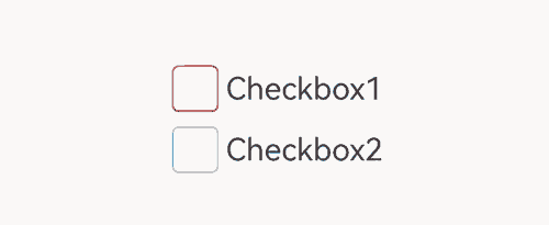
示例2(设置多选框颜色)
该示例通过配置mark实现自定义多选框的颜色。
// xxx.ets
@Entry
@Component
struct Index {

  build() {
    Row() {
      Column() {
        Flex({ justifyContent: FlexAlign.Center, alignItems: ItemAlign.Center }) {
          Checkbox({ name: 'checkbox1', group: 'checkboxGroup' })
            .selectedColor(0x39a2db)
            .shape(CheckBoxShape.ROUNDED_SQUARE)
            .onChange((value: boolean) => {
              console.info('Checkbox1 change is'+ value);
            })
            .mark({
              strokeColor:Color.Black,
              size: 50,
              strokeWidth: 5
            })
            .unselectedColor(Color.Red)
            .width(30)
            .height(30)
          Text('Checkbox1').fontSize(20)
        }
        Flex({ justifyContent: FlexAlign.Center, alignItems: ItemAlign.Center }) {
          Checkbox({ name: 'checkbox2', group: 'checkboxGroup' })
            .selectedColor(0x39a2db)
            .shape(CheckBoxShape.ROUNDED_SQUARE)
            .onChange((value: boolean) => {
              console.info('Checkbox2 change is' + value);
            })
            .width(30)
            .height(30)
          Text('Checkbox2').fontSize(20)
        }
      }
      .width('100%')
    }
    .height('100%')
  }
}
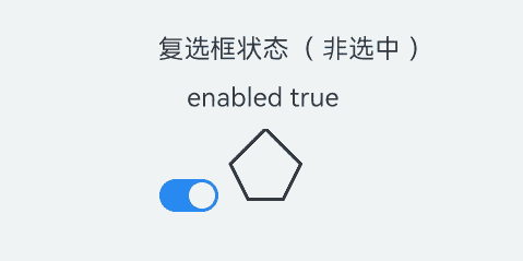
示例3(自定义多选框样式)
该示例通过contentModifier属性实现了自定义复选框样式的功能,自定义样式实现了一个五边形复选框,如果选中,内部会出现红色三角图案,标题会显示选中字样,如果取消选中,红色三角图案消失,标题会显示非选中字样。
// xxx.ets
class MyCheckboxStyle implements ContentModifier<CheckBoxConfiguration> {
  selectedColor: Color = Color.White;

  constructor(selectedColor: Color) {
    this.selectedColor = selectedColor;
  }

  applyContent(): WrappedBuilder<[CheckBoxConfiguration]> {
    return wrapBuilder(buildCheckbox);
  }
}

@Builder
function buildCheckbox(config: CheckBoxConfiguration) {
  Column({ space: 10 }) {
    Text(config.name + (config.selected ? "( 选中 )" : "( 非选中 )")).margin({ right: 70, top: 50 })
    Text(config.enabled ? "enabled true" : "enabled false").margin({ right: 110 })
    Shape() {
      Path()
        .width(100)
        .height(100)
        .commands('M100 0 L0 100 L50 200 L150 200 L200 100 Z')
        .fillOpacity(0)
        .strokeWidth(3)
        .onClick(() => {
          if (config.selected) {
            config.triggerChange(false);
          } else {
            config.triggerChange(true);
          }
        })
        .opacity(config.enabled ? 1 : 0.1)
      Path()
        .width(10)
        .height(10)
        .commands('M50 0 L100 100 L0 100 Z')
        .visibility(config.selected ? Visibility.Visible : Visibility.Hidden)
        .fill(config.selected ? (config.contentModifier as MyCheckboxStyle).selectedColor : Color.Black)
        .stroke((config.contentModifier as MyCheckboxStyle).selectedColor)
        .margin({ left: 10, top: 10 })
        .opacity(config.enabled ? 1 : 0.1)
    }
    .width(300)
    .height(200)
    .viewPort({
      x: 0,
      y: 0,
      width: 310,
      height: 310
    })
    .strokeLineJoin(LineJoinStyle.Miter)
    .strokeMiterLimit(5)
    .margin({ left: 50 })
  }
}

@Entry
@Component
struct Index {
  @State checkboxEnabled: boolean = true;

  build() {
    Column({ space: 100 }) {
      Checkbox({ name: '复选框状态', group: 'checkboxGroup' })
        .contentModifier(new MyCheckboxStyle(Color.Red))
        .onChange((value: boolean) => {
          console.info('Checkbox change is' + value);
        }).enabled(this.checkboxEnabled)

      Row() {
        Toggle({ type: ToggleType.Switch, isOn: true }).onChange((value: boolean) => {
          if (value) {
            this.checkboxEnabled = true;
          } else {
            this.checkboxEnabled = false;
          }
        })
      }.position({ x: 50, y: 130 })
    }.margin({ top: 30 })
  }
}
示例4(设置文本多选框样式)
该示例通过配置indicatorBuilder实现选中样式为Text。
// xxx.ets
@Entry
@Component
struct CheckboxExample {
  @Builder
  indicatorBuilder(value: number) {
    Column(){
      Text(value > 99 ? '99+': value.toString())
        .textAlign(TextAlign.Center)
        .fontSize(value > 99 ?  '16vp': '20vp')
        .fontWeight(FontWeight.Medium)
        .fontColor('#ffffffff')
    }
  }
  build() {
    Row() {
      Column() {
        Flex({ justifyContent: FlexAlign.Center, alignItems: ItemAlign.Center}) {
          Checkbox({ name: 'checkbox1', group: 'checkboxGroup', indicatorBuilder:()=>{this.indicatorBuilder(9)}})
            .shape(CheckBoxShape.CIRCLE)
            .onChange((value: boolean) => {
              console.info('Checkbox1 change is'+ value);
            })
            .mark({
              strokeColor:Color.Black,
              size: 50,
              strokeWidth: 5
            })
            .width(30)
            .height(30)
          Text('Checkbox1').fontSize(20)
        }.padding(15)
        Flex({ justifyContent: FlexAlign.Center, alignItems: ItemAlign.Center }) {
          Checkbox({ name: 'checkbox2', group: 'checkboxGroup', indicatorBuilder:()=>{this.indicatorBuilder(100)}})
            .shape(CheckBoxShape.ROUNDED_SQUARE)
            .onChange((value: boolean) => {
              console.info('Checkbox2 change is' + value);
            })
            .width(30)
            .height(30)
          Text('Checkbox2').fontSize(20)
        }
      }
      .width('100%')
    }
    .height('100%')
  }
}
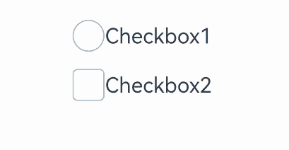
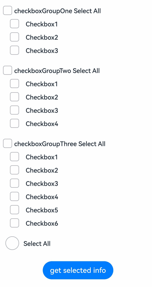
示例5(获取多选框选中信息)
该示例通过选中checkbox以及checkboxGroup多选框来获取选中的信息。
// xxx.ets
@Entry
@Component
struct CheckboxExample {
  @State arrOne: Array<string> = ['1', '2', '3'];
  @State arrTwo: Array<string> = ['1', '2', '3', '4'];
  @State arrThree: Array<string> = ['1', '2', '3', '4', '5', '6'];
  @State selected: boolean = false;
  @State infoOne: string = '';
  @State infoTwo: string = '';
  @State infoThree: string = '';

  build() {
    Column() {
      // 单元项全选按钮
      Flex({ justifyContent: FlexAlign.Start, alignItems: ItemAlign.Center }) {
        CheckboxGroup({ group: 'checkboxGroupOne' })
          .selectAll(this.selected)
          .checkboxShape(CheckBoxShape.ROUNDED_SQUARE)
          .selectedColor('#007DFF')
          .onChange((itemName: CheckboxGroupResult) => {
            this.infoOne = "checkboxGroupOne" + JSON.stringify(itemName);
            console.info("checkboxGroupOne" + JSON.stringify(itemName));
          })
        Text('checkboxGroupOne Select All').fontSize(14).lineHeight(20).fontColor('#182431').fontWeight(500)
      }

      // 选项1
      Flex({ justifyContent: FlexAlign.Start, alignItems: ItemAlign.Center }) {
        Column() {
          ForEach(this.arrOne, (item: string) => {
            Row() {
              Checkbox({ name: 'checkbox' + item, group: 'checkboxGroupOne' })
                .selectedColor('#007DFF')
                .shape(CheckBoxShape.ROUNDED_SQUARE)
                .onChange((value: boolean) => {
                  console.info('Checkbox' + item + 'change is' + value);
                })
                .margin({ left: 20 })
              Text('Checkbox' + item)
                .fontSize(14)
                .lineHeight(20)
                .fontColor('#182431')
                .fontWeight(500)
                .margin({ left: 10 })
            }
          }, (item: string) => item)
        }
      }.margin({ bottom: 15 })

      Flex({ justifyContent: FlexAlign.Start, alignItems: ItemAlign.Center }) {
        CheckboxGroup({ group: 'checkboxGroupTwo' })
          .selectAll(this.selected)
          .checkboxShape(CheckBoxShape.ROUNDED_SQUARE)
          .selectedColor('#007DFF')
          .onChange((itemName: CheckboxGroupResult) => {
            this.infoTwo = "checkboxGroupTwo" + JSON.stringify(itemName);
            console.info("checkboxGroupTwo" + JSON.stringify(itemName));
          })
        Text('checkboxGroupTwo Select All').fontSize(14).lineHeight(20).fontColor('#182431').fontWeight(500)
      }

      // 选项2
      Flex({ justifyContent: FlexAlign.Start, alignItems: ItemAlign.Center }) {
        Column() {
          ForEach(this.arrTwo, (item: string) => {
            Row() {
              Checkbox({ name: 'checkbox' + item, group: 'checkboxGroupTwo' })
                .selectedColor('#007DFF')
                .shape(CheckBoxShape.ROUNDED_SQUARE)
                .onChange((value: boolean) => {
                  console.info('Checkbox' + item + 'change is' + value);
                })
                .margin({ left: 20 })
              Text('Checkbox' + item)
                .fontSize(14)
                .lineHeight(20)
                .fontColor('#182431')
                .fontWeight(500)
                .margin({ left: 10 })
            }
          }, (item: string) => item)
        }
      }.margin({ bottom: 15 })

      Flex({ justifyContent: FlexAlign.Start, alignItems: ItemAlign.Center }) {
        CheckboxGroup({ group: 'checkboxGroupThree' })
          .selectAll(this.selected)
          .checkboxShape(CheckBoxShape.ROUNDED_SQUARE)
          .selectedColor('#007DFF')
          .onChange((itemName: CheckboxGroupResult) => {
            this.infoThree = "checkboxGroupThree" + JSON.stringify(itemName);
            console.info("checkboxGroupThree" + JSON.stringify(itemName));
          })
        Text('checkboxGroupThree Select All').fontSize(14).lineHeight(20).fontColor('#182431').fontWeight(500)
      }

      // 选项3
      Flex({ justifyContent: FlexAlign.Start, alignItems: ItemAlign.Center }) {
        Column() {
          ForEach(this.arrThree, (item: string) => {
            Row() {
              Checkbox({ name: 'checkbox' + item, group: 'checkboxGroupThree' })
                .selectedColor('#007DFF')
                .shape(CheckBoxShape.ROUNDED_SQUARE)
                .onChange((value: boolean) => {
                  console.info('Checkbox' + item + 'change is' + value);
                })
                .margin({ left: 20 })
              Text('Checkbox' + item)
                .fontSize(14)
                .lineHeight(20)
                .fontColor('#182431')
                .fontWeight(500)
                .margin({ left: 10 })
            }
          }, (item: string) => item)
        }
      }.margin({ bottom: 15 })

      //全选按钮
      Flex({ justifyContent: FlexAlign.Start, alignItems: ItemAlign.Center }) {
        Row() {
          CheckboxGroup({ group: 'checkboxGroup' })
            .checkboxShape(CheckBoxShape.CIRCLE)
            .selectedColor('#007DFF')
            .width(30)
            .margin({ left: 10 })
            .onChange(() => {
              this.selected = !this.selected
            })
          Text('Select All')
            .fontSize(14)
            .lineHeight(20)
            .fontColor('#182431')
            .fontWeight(500)
            .margin({ left: 10 })
        }
      }.margin({ bottom: 15 })

      //获取选中信息
      Button('get selected info')
        .margin({ top: 10 })
        .onClick(() => {
          this.getUIContext().getPromptAction().showToast({
            message: 'selected info: ' + this.infoOne + '\n' + this.infoTwo + '\n' + this.infoThree
          })
        })
    }.padding(10)
  }
}
你可能感兴趣的鸿蒙文章
- 所属分类: 后端技术
- 本文标签:
热门推荐
-
2、 优质文章
-
3、 gt
-
7、 openharmony
-
9、 golang
-
10、 Vue中input框自动聚焦