harmony 鸿蒙Radio
Radio
单选框,提供相应的用户交互选择项。
说明:
API version 12开始,Radio选中默认样式由RadioIndicatorType.DOT变为RadioIndicatorType.TICK。
该组件从API version 8开始支持。后续版本如有新增内容,则采用上角标单独标记该内容的起始版本。
子组件
无
接口
Radio(options: RadioOptions)
创建单选框组件。
卡片能力: 从API version 9开始,该接口支持在ArkTS卡片中使用。
原子化服务API: 从API version 11开始,该接口支持在原子化服务中使用。
系统能力: SystemCapability.ArkUI.ArkUI.Full
参数:
| 参数名 | 类型 | 必填 | 说明 |
|---|---|---|---|
| options | RadioOptions | 是 | 配置单选框的参数。 |
RadioOptions对象说明
系统能力: SystemCapability.ArkUI.ArkUI.Full
| 名称 | 类型 | 必填 | 说明 |
|---|---|---|---|
| value | string | 是 | 当前单选框的值。 卡片能力: 从API version 9开始,该接口支持在ArkTS卡片中使用。 原子化服务API: 从API version 11开始,该接口支持在原子化服务中使用。 |
| group | string | 是 | 当前单选框的所属群组名称,相同group的Radio只能有一个被选中。 卡片能力: 从API version 9开始,该接口支持在ArkTS卡片中使用。 原子化服务API: 从API version 11开始,该接口支持在原子化服务中使用。 |
| indicatorType12+ | RadioIndicatorType | 否 | 配置单选框的选中样式。未设置时按照RadioIndicatorType.TICK进行显示。 卡片能力: 从API version 12开始,该接口支持在ArkTS卡片中使用。 原子化服务API: 从API version 12开始,该接口支持在原子化服务中使用。 |
| indicatorBuilder12+ | CustomBuilder | 否 | 配置单选框的选中样式为自定义组件。自定义组件与Radio组件为中心点对齐显示。indicatorBuilder设置为undefined时,按照RadioIndicatorType.TICK进行显示。 卡片能力: 从API version 12开始,该接口支持在ArkTS卡片中使用。 原子化服务API: 从API version 12开始,该接口支持在原子化服务中使用。 |
RadioIndicatorType12+枚举说明
卡片能力: 从API version 12开始,该接口支持在ArkTS卡片中使用。
原子化服务API: 从API version 12开始,该接口支持在原子化服务中使用。
系统能力: SystemCapability.ArkUI.ArkUI.Full
| 名称 | 值 | 说明 |
|---|---|---|
| TICK | 0 | 选中样式为系统默认TICK图标。 |
| DOT | 1 | 选中样式为系统默认DOT图标。 |
| CUSTOM | 2 | 选中样式为indicatorBuilder中的内容。 |
属性
除支持通用属性外,还支持以下属性:
checked
checked(value: boolean)
设置单选框的选中状态。
从API version 10开始,该属性支持$$双向绑定变量。 从API version 18开始,该属性支持!!双向绑定变量。
卡片能力: 从API version 9开始,该接口支持在ArkTS卡片中使用。
原子化服务API: 从API version 11开始,该接口支持在原子化服务中使用。
系统能力: SystemCapability.ArkUI.ArkUI.Full
参数:
| 参数名 | 类型 | 必填 | 说明 |
|---|---|---|---|
| value | boolean | 是 | 单选框的选中状态。 默认值:false 值为true时,单选框被选中。值为false时,单选框不被选中。 |
checked18+
checked(isChecked: Optional<boolean>)
设置单选框的选中状态。与checked相比,isChecked参数新增了对undefined类型的支持。
卡片能力: 从API version 18开始,该接口支持在ArkTS卡片中使用。
原子化服务API: 从API version 18开始,该接口支持在原子化服务中使用。
系统能力: SystemCapability.ArkUI.ArkUI.Full
参数:
| 参数名 | 类型 | 必填 | 说明 |
|---|---|---|---|
| isChecked | Optional<boolean> | 是 | 单选框的选中状态。 当isChecked的值为undefined时取默认值false。 值为true时,单选框被选中。值为false时,单选框不被选中。 |
radioStyle10+
radioStyle(value?: RadioStyle)
设置单选框选中状态和非选中状态的样式。
从API version 10开始,该接口支持在ArkTS组件中使用。
原子化服务API: 从API version 11开始,该接口支持在原子化服务中使用。
系统能力: SystemCapability.ArkUI.ArkUI.Full
参数:
| 参数名 | 类型 | 必填 | 说明 |
|---|---|---|---|
| value | RadioStyle | 否 | 单选框选中状态和非选中状态的样式。 |
contentModifier12+
contentModifier(modifier: ContentModifier<RadioConfiguration>)
定制Radio内容区的方法。
原子化服务API: 从API version 12开始,该接口支持在原子化服务中使用。
系统能力: SystemCapability.ArkUI.ArkUI.Full
参数:
| 参数名 | 类型 | 必填 | 说明 |
|---|---|---|---|
| modifier | ContentModifier<RadioConfiguration> | 是 | 在Radio组件上,定制内容区的方法。 modifier:内容修改器,开发者需要自定义class实现ContentModifier接口。 |
contentModifier18+
contentModifier(modifier: Optional
定制Radio内容区的方法。与contentModifier12+相比,modifier参数新增了对undefined类型的支持。
原子化服务API: 从API version 18开始,该接口支持在原子化服务中使用。
系统能力: SystemCapability.ArkUI.ArkUI.Full
参数:
| 参数名 | 类型 | 必填 | 说明 |
|---|---|---|---|
| modifier | Optional<ContentModifier<RadioConfiguration>> | 是 | 在Radio组件上,定制内容区的方法。 modifier:内容修改器,开发者需要自定义class实现ContentModifier接口。 当modifier的值为undefined时,不使用内容修改器。 |
事件
除支持通用事件外,还支持以下事件:
onChange
onChange(callback: (isChecked: boolean) => void)
单选框选中状态改变时触发回调。
卡片能力: 从API version 9开始,该接口支持在ArkTS卡片中使用。
原子化服务API: 从API version 11开始,该接口支持在原子化服务中使用。
系统能力: SystemCapability.ArkUI.ArkUI.Full
参数:
| 参数名 | 类型 | 必填 | 说明 |
|---|---|---|---|
| isChecked | boolean | 是 | 单选框选中状态改变时触发该回调。 值为true时,表示从未选中变为选中。值为false时,表示从选中变为未选中。 |
onChange18+
onChange(callback: Optional<OnRadioChangeCallback>)
单选框选中状态改变时触发回调。与onChange相比,callback参数新增了对undefined类型的支持。
卡片能力: 从API version 18开始,该接口支持在ArkTS卡片中使用。
原子化服务API: 从API version 18开始,该接口支持在原子化服务中使用。
系统能力: SystemCapability.ArkUI.ArkUI.Full
参数:
| 参数名 | 类型 | 必填 | 说明 |
|---|---|---|---|
| callback | Optional<OnRadioChangeCallback> | 是 | 单选框选中状态改变时触发该回调。 当callback的值为undefined时,不使用回调函数。 |
OnRadioChangeCallback18+
type OnRadioChangeCallback = (isChecked: boolean) => void
单选框选中状态改变时触发回调。
原子化服务API: 从API version 18开始,该接口支持在原子化服务中使用。
系统能力: SystemCapability.ArkUI.ArkUI.Full
参数:
| 参数名 | 类型 | 必填 | 说明 |
|---|---|---|---|
| isChecked | boolean | 是 | 单选框的状态。 值为true时,表示从未选中变为选中。值为false时,表示从选中变为未选中。 |
RadioStyle10+对象说明
原子化服务API: 从API version 11开始,该接口支持在原子化服务中使用。
系统能力: SystemCapability.ArkUI.ArkUI.Full
| 名称 | 类型 | 必填 | 说明 |
|---|---|---|---|
| checkedBackgroundColor | ResourceColor | 否 | 开启状态底板颜色。 默认值: $r('sys.color.ohos_id_color_text_primary_activated') |
| uncheckedBorderColor | ResourceColor | 否 | 关闭状态描边颜色。 默认值: $r('sys.color.ohos_id_color_switch_outline_off') |
| indicatorColor | ResourceColor | 否 | 开启状态内部圆饼颜色。从API version 12开始,indicatorType设置为RadioIndicatorType.TICK和RadioIndicatorType.DOT时,支持修改内部颜色。indicatorType设置为RadioIndicatorType.CUSTOM时,不支持修改内部颜色。 默认值: $r('sys.color.ohos_id_color_foreground_contrary') |
RadioConfiguration12+对象说明
开发者需要自定义class实现ContentModifier接口。
原子化服务API: 从API version 12开始,该接口支持在原子化服务中使用。
系统能力: SystemCapability.ArkUI.ArkUI.Full
| 名称 | 类型 | 只读 | 可选 | 说明 |
|---|---|---|---|---|
| value | string | 否 | 否 | 当前单选框的值。 |
| checked | boolean | 否 | 否 | 设置单选框的选中状态。 默认值:false 值为true时,单选框被选中。值为false时,单选框不被选中。 |
| triggerChange | Callback<boolean> | 否 | 否 | 触发单选框选中状态变化。 值为true时,表示从未选中变为选中。值为false时,表示从选中变为未选中。 |
示例
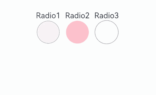
示例1 (设置底板颜色)
该示例通过配置checkedBackgroundColor实现自定义单选框的底板颜色。
// xxx.ets
@Entry
@Component
struct RadioExample {
  build() {
    Flex({ direction: FlexDirection.Row, justifyContent: FlexAlign.Center, alignItems: ItemAlign.Center }) {
      Column() {
        Text('Radio1')
        Radio({ value: 'Radio1', group: 'radioGroup' }).checked(true)
          .radioStyle({
            checkedBackgroundColor: Color.Pink
          })
          .height(50)
          .width(50)
          .onChange((isChecked: boolean) => {
            console.log('Radio1 status is ' + isChecked);
          })
      }
      Column() {
        Text('Radio2')
        Radio({ value: 'Radio2', group: 'radioGroup' }).checked(false)
          .radioStyle({
            checkedBackgroundColor: Color.Pink
          })
          .height(50)
          .width(50)
          .onChange((isChecked: boolean) => {
            console.log('Radio2 status is ' + isChecked);
          })
      }
      Column() {
        Text('Radio3')
        Radio({ value: 'Radio3', group: 'radioGroup' }).checked(false)
          .radioStyle({
            checkedBackgroundColor: Color.Pink
          })
          .height(50)
          .width(50)
          .onChange((isChecked: boolean) => {
            console.log('Radio3 status is ' + isChecked);
          })
      }
    }.padding({ top: 30 })
  }
}
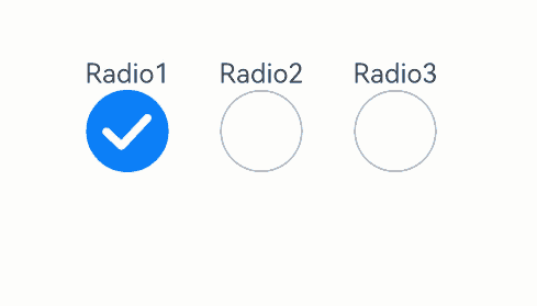
示例2 (设置选中样式)
该示例通过配置indicatorType、indicatorBuilder实现自定义选中样式。
// xxx.ets
@Entry
@Component
struct RadioExample {
  @Builder
  indicatorBuilder() {
    Image($r("app.media.star"))
  }
  build() {
    Flex({ direction: FlexDirection.Row, justifyContent: FlexAlign.Center, alignItems: ItemAlign.Center }) {
      Column() {
        Text('Radio1')
        Radio({ value: 'Radio1', group: 'radioGroup',
          indicatorType:RadioIndicatorType.TICK
        }).checked(true)
          .height(50)
          .width(80)
          .onChange((isChecked: boolean) => {
            console.log('Radio1 status is ' + isChecked);
          })
      }
      Column() {
        Text('Radio2')
        Radio({ value: 'Radio2', group: 'radioGroup',
          indicatorType:RadioIndicatorType.DOT
        }).checked(false)
          .height(50)
          .width(80)
          .onChange((isChecked: boolean) => {
            console.log('Radio2 status is ' + isChecked);
          })
      }
      Column() {
        Text('Radio3')
        Radio({ value: 'Radio3', group: 'radioGroup',
          indicatorType:RadioIndicatorType.CUSTOM,
          indicatorBuilder:()=>{this.indicatorBuilder()}
        }).checked(false)
          .height(50)
          .width(80)
          .onChange((isChecked: boolean) => {
            console.log('Radio3 status is ' + isChecked);
          })
      }
    }.padding({ top: 30 })
  }
}
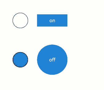
示例3(设置自定义样式)
该示例通过contentModifier实现自定义单选框样式。
class MyRadioStyle implements ContentModifier<RadioConfiguration> {
  type: number = 0;
  selectedColor: ResourceColor = Color.Black;

  constructor(numberType: number, colorType: ResourceColor) {
    this.type = numberType;
    this.selectedColor = colorType;
  }

  applyContent(): WrappedBuilder<[RadioConfiguration]> {
    return wrapBuilder(buildRadio);
  }
}

@Builder
function buildRadio(config: RadioConfiguration) {
  Row({ space: 30 }) {
    Circle({ width: 50, height: 50 })
      .stroke(Color.Black)
      .fill(config.checked ? (config.contentModifier as MyRadioStyle).selectedColor : Color.White)
    Button(config.checked ? "off" : "on")
      .width(100)
      .type(config.checked ? (config.contentModifier as MyRadioStyle).type : ButtonType.Normal)
      .backgroundColor('#2787D9')
      .onClick(() => {
        if (config.checked) {
          config.triggerChange(false);
        } else {
          config.triggerChange(true);
        }
      })
  }
}

@Entry
@Component
struct refreshExample {
  build() {
    Column({ space: 50 }) {
      Row() {
        Radio({ value: 'Radio1', group: 'radioGroup' })
          .contentModifier(new MyRadioStyle(1, '#004AAF'))
          .checked(false)
          .width(300)
          .height(100)
      }

      Row() {
        Radio({ value: 'Radio2', group: 'radioGroup' })
          .checked(true)
          .width(300)
          .height(60)
          .contentModifier(new MyRadioStyle(2, '#004AAF'))
      }
    }
  }
}
你可能感兴趣的鸿蒙文章
- 所属分类: 后端技术
- 本文标签:
热门推荐
-
2、 优质文章
-
3、 gt
-
7、 openharmony
-
9、 golang
-
10、 Vue中input框自动聚焦