harmony 鸿蒙Dialog
Dialog
A dialog is a modal window. Before it disappears, users cannot perform any operation.
How to Use
Use a dialog to display information or operations that users need or must pay attention to. In other cases, use a non-modal window such as a notification window.
Include a combination of different components, for example, text (in different formats, such as indentation, link, or bold), list, text box, grid, icon, and image, in a dialog. It is generally used to select or confirm information.
Category
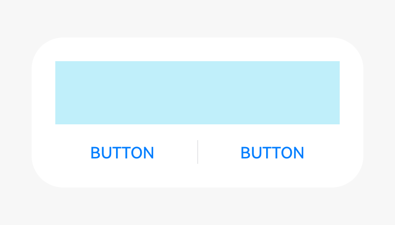
Dialog without a title
Dialog with a title
Dialog with text only
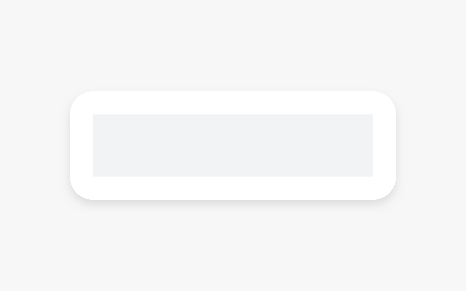
Dialog Without a Title
A dialog does not have a title.
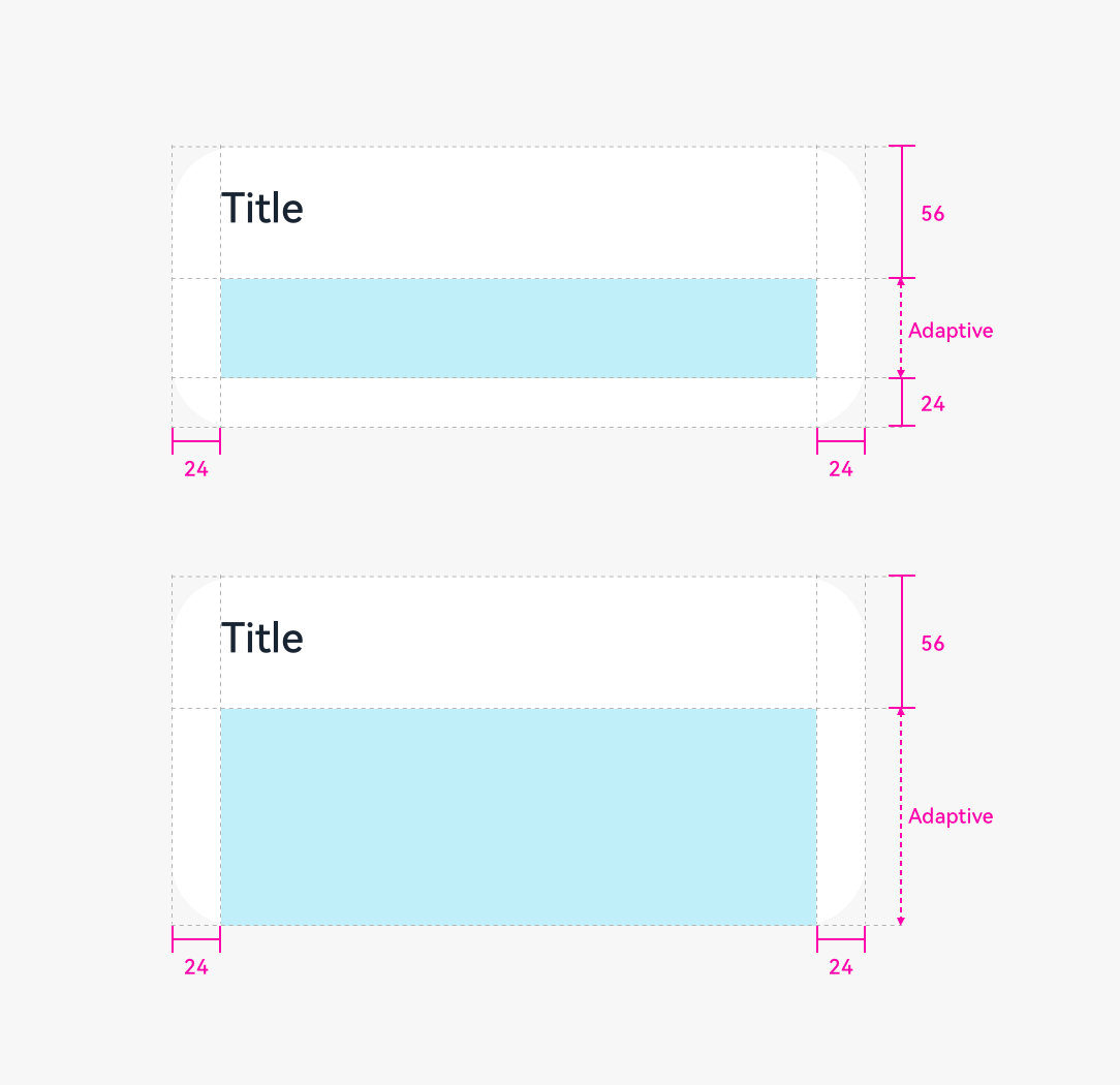
If the content is not displayed in a list, leave a margin of 24 vp both above and below the content.
 |
 |
|---|---|
| Content only | Content and button |
Dialog with a Title
In the title area, there can be a pure title in one or two lines. Alternatively, there can be a title followed by an operation icon.
 |
|---|
| Title and content |
If the content is not displayed in a list, leave a margin of 24 vp both above and below the content.
Dialog with Text Only
If there is only a title, the title is centered.
Height and Position
The height and location of a dialog differs in portrait and landscape orientations.
Portrait
Maximum height of a dialog = 0.8 x (Screen height – Status bar height – Navigation bar height)
Position: Always above the navigation bar (even if the navigation bar is hidden)
Landscape
Maximum height of a dialog = 0.9 x (Screen height – Status bar)
Position: Center aligned the screen height excluding the status bar
Writing Instructions
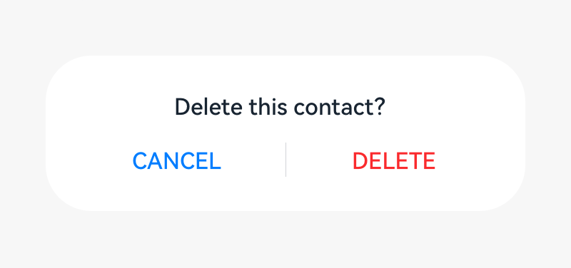
Dialog for Operation Confirmation
Title
Short and complete. No period is required if a statement is used.
Exclamation marks and question marks are required for exclamatory and interrogative sentences, respectively.
Concise and clear. Titles can be a phrase (verb + noun).
Content text
- Describe the content that needs to be confirmed by users. The content can be questions or statements. Try not to provide additional information. If necessary, avoid repeating the title.
Button
Buttons allow the user to choose whether to proceed with the next action. Use operation content for buttons.
Button contents are usually the same as the verbs in the title. Do not use “Yes” or “No”.
Dialog for Information Confirmation
Content text
- Use statements to describe the specific items that need to be notified to users. For example, no updates available.
Button
- Use OK.
Rules for Handling Ultra-Long UI Strings
Title in a Dialog
- Decrease the font size to 15 fp level by level.
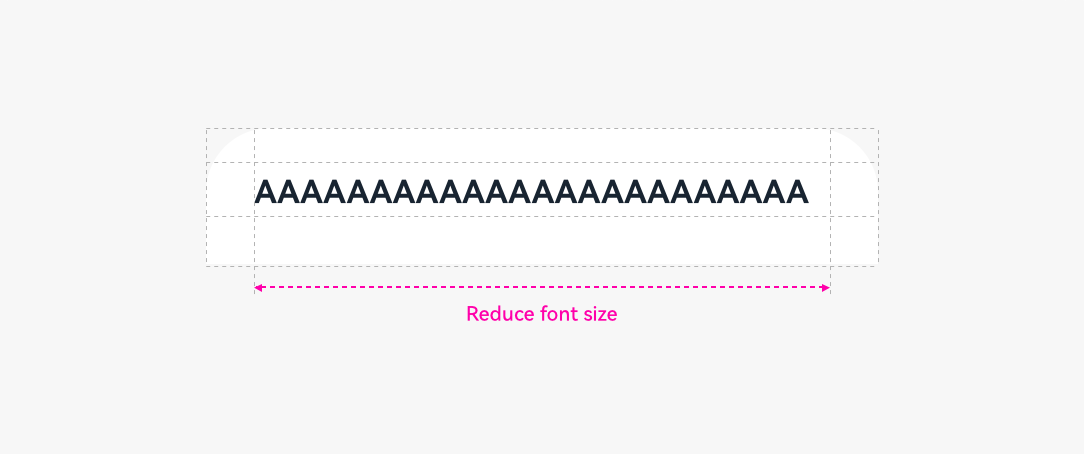
Wrap lines if the length exceeds the upper limit.
If the text still cannot fit in, use “…” for truncation.
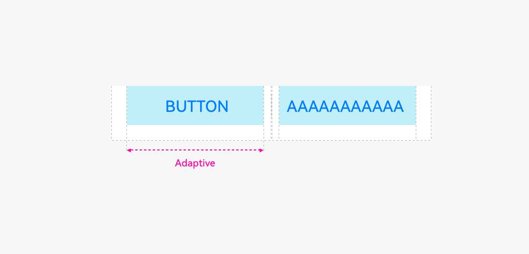
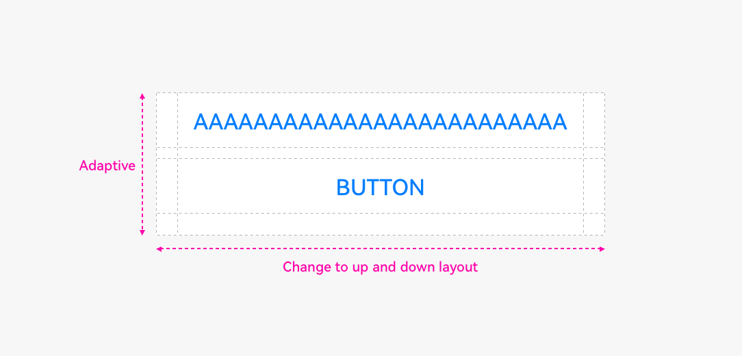
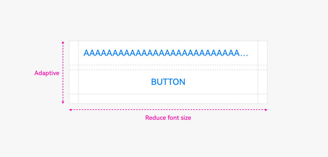
Button in a Dialog
- Do not wrap lines for button texts.
- Change the buttons from horizontal alignment to vertical alignment.
Reduce the font size level by level until the minimum font size 9 fp is reached.
If the text still cannot fit in, use “…” for truncation.
Resources
For details about the dialog box, see the API Reference.
你可能感兴趣的鸿蒙文章
harmony 鸿蒙OpenHarmony Application UX Design Specifications
harmony 鸿蒙Animation Attributes
harmony 鸿蒙Animation Design Principles
harmony 鸿蒙Application Navigation Structure Design
harmony 鸿蒙Application Page Structure Design
- 所属分类: 后端技术
- 本文标签:
热门推荐
-
2、 优质文章
-
3、 gt
-
7、 openharmony
-
9、 golang
-
10、 Vue中input框自动聚焦