绘制图形
绘制能力主要是通过框架提供的绘制组件来支撑,支持svg标准绘制命令。
本节主要学习如何使用绘制组件,绘制详情页食物成分标签(基本几何图形)和应用Logo(自定义图形)。
绘制基本几何图形
绘制组件封装了一些常见的基本几何图形,比如矩形Rect、圆形Circle、椭圆形Ellipse等,为开发者省去了路线计算的过程。
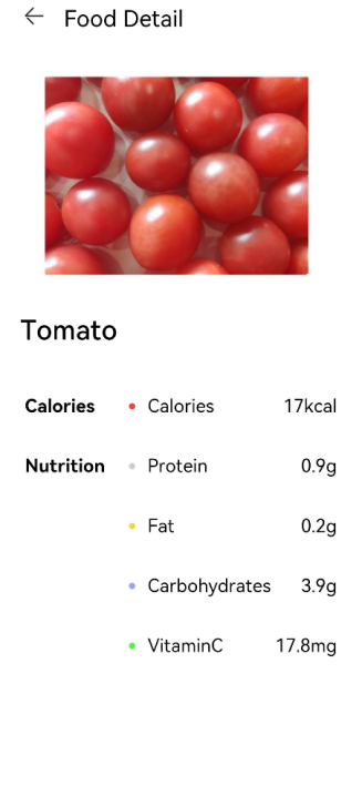
FoodDetail页面的食物成分表里,给每一项成分名称前都加上一个圆形的图标作为成分标签。
-
创建Circle组件,在每一项含量成分前增加一个圆形图标作为标签。设置Circle的直径为 6vp。修改FoodDetail页面的ContentTable组件里的IngredientItem方法,在成分名称前添加Circle。
// FoodDetail.ets @Component struct ContentTable { private foodItem: FoodData @Builder IngredientItem(title:string, colorValue: string, name: string, value: string) { Flex() { Text(title) .fontSize(17.4) .fontWeight(FontWeight.Bold) .layoutWeight(1) Flex({ alignItems: ItemAlign.Center }) { Circle({width: 6, height: 6}) .margin({right: 12}) .fill(colorValue) Text(name) .fontSize(17.4) .flexGrow(1) Text(value) .fontSize(17.4) } .layoutWeight(2) } } build() { ...... } } -
每个成分的标签颜色不一样,所以我们在build方法中,调用IngredientItem,给每个Circle填充不一样的颜色。
// FoodDetail.ets
@Component
struct ContentTable {
  private foodItem: FoodData

  @Builder IngredientItem(title:string, colorValue: string, name: string, value: string) {
    Flex() {
      Text(title)
        .fontSize(17.4)
        .fontWeight(FontWeight.Bold)
        .layoutWeight(1)
      Flex({ alignItems: ItemAlign.Center }) {
        Circle({width: 6, height: 6})
          .margin({right: 12})
          .fill(colorValue)
        Text(name)
          .fontSize(17.4)
          .flexGrow(1)
        Text(value)
          .fontSize(17.4)
      }
      .layoutWeight(2)
    }
  }

  build() {
    Flex({ direction: FlexDirection.Column, justifyContent: FlexAlign.SpaceBetween, alignItems: ItemAlign.Start }) {
      this.IngredientItem('Calories', '#FFf54040', 'Calories', this.foodItem.calories + 'kcal')
      this.IngredientItem('Nutrition', '#FFcccccc', 'Protein', this.foodItem.protein + 'g')
      this.IngredientItem(' ', '#FFf5d640', 'Fat', this.foodItem.fat + 'g')
      this.IngredientItem(' ', '#FF9e9eff', 'Carbohydrates', this.foodItem.carbohydrates + 'g')
      this.IngredientItem(' ', '#FF53f540', 'VitaminC', this.foodItem.vitaminC + 'mg')
    }
    .height(280)
    .padding({ top: 30, right: 30, left: 30 })
  }
}
绘制自定义几何图形
除绘制基础几何图形,开发者还可以使用Path组件来绘制自定义的路线,下面进行绘制应用的Logo图案。
-
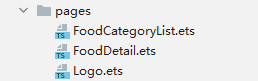
在pages文件夹下创建新的页面Logo.ets。
-
Logo.ets中删掉模板代码,创建Logo Component。
@Entry @Component struct Logo { build() { } } -
创建Flex组件为根节点,宽高设置为100%,设置其在主轴方向和交叉轴方向的对齐方式都为Center,创建Shape组件为Flex子组件。
Shape组件是所有绘制组件的父组件。如果需要组合多个绘制组件成为一个整体,需要创建Shape作为其父组件。
我们要绘制的Logo的大小630px * 630px。声明式UI范式支持多种长度单位的设置,在前面的章节中,我们直接使用number作为参数,即采用了默认长度单位vp,虚拟像素单位。vp和设备分辨率以及屏幕密度有关。比如设备分辨率为1176 * 2400,屏幕基准密度(resolution)为3,vp = px / resolution,则该设备屏幕宽度是392vp。
但是绘制组件采用svg标准,默认采取px为单位的,为方便统一,在这绘制Logo这一部分,统一采取px为单位。声明式UI框架同样也支持px单位,入参类型为string,设置宽度为630px,即210vp,设置方式为width('630px')或者width(210)。
@Entry @Component struct Logo { build() { Flex({ alignItems: ItemAlign.Center, justifyContent: FlexAlign.Center }) { Shape() { } .height('630px') .width('630px') } .width('100%') .height('100%') } } -
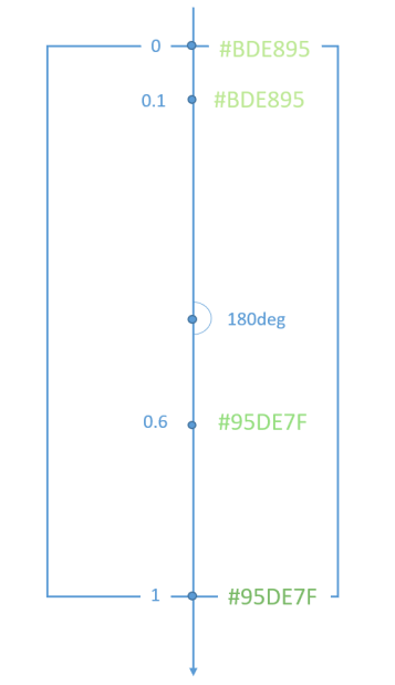
给页面填充渐变色。设置为线性渐变,偏移角度为180deg,三段渐变 #BDE895 -->95DE7F --> #7AB967,其区间分别为[0, 0.1], (0.1, 0.6], (0.6, 1]。
.linearGradient(
  {
    angle: 180,
    colors: [['#BDE895', 0.1], ["#95DE7F", 0.6],  ["#7AB967", 1]]
})
@Entry
@Component
struct Logo {
  build() {
    Flex({ alignItems: ItemAlign.Center, justifyContent: FlexAlign.Center }) {
      Shape() {

      }
      .height('630px')
      .width('630px')
    }
    .width('100%')
    .height('100%')
    .linearGradient(
    {
      angle: 180,
      colors: [['#BDE895', 0.1], ["#95DE7F", 0.6],  ["#7AB967", 1]]
    })
  }
}
-
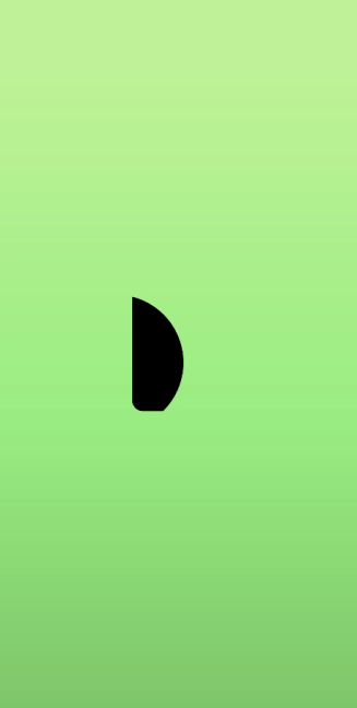
绘制第一条路线Path,设置其绘制命令。
Path()
  .commands('M162 128.7 a222 222 0 0 1 100.8 374.4 H198 a36 36 0 0 3 -36 -36')
Path的绘制命令采用svg标准,上述命令可分解为:
M162 128.7将笔触移动到(Moveto)坐标点(162, 128.7)。
a222 222 0 0 1 100.8 374.4画圆弧线(elliptical arc)半径rx,ry为222,x轴旋转角度x-axis-rotation为0,角度大小large-arc-flag为0,即小弧度角,弧线方向(sweep-flag)为1,即逆时针画弧线,小写a为相对位置,即终点坐标为(162 + 100.8 = 262.8, 128.7 + 374.4 = 503.1)。
H198画水平线(horizontal lineto)到198,即画(262.8, 503.1)到(198, 503.1)的水平线。
a36 36 0 0 3 -36 -36画圆弧线(elliptical arc),含义同上,结束点为(198 - 36 = 162, 503.1 - 36 = 467.1)。
V128.7画垂直线(vertical lineto)到128.7,即画(162, 467.1)到(162, 128.7)的垂直线。
z关闭路径(closepath)。
填充颜色为白色,线条颜色为透明。
.fill(Color.White)
.stroke(Color.Transparent)
@Entry @Component struct Logo { build() { Flex({ alignItems: ItemAlign.Center, justifyContent: FlexAlign.Center }) { Shape() { Path() .commands('M162 128.7 a222 222 0 0 1 100.8 374.4 H198 a36 36 0 0 3 -36 -36') .fill(Color.White) .stroke(Color.Transparent) } .height('630px') .width('630px') } .width('100%') .height('100%') .linearGradient( { angle: 180, colors: [['#BDE895', 0.1], ["#95DE7F", 0.6], ["#7AB967", 1]] }) } }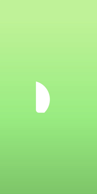
-
在Shape组件内绘制第二个Path。第二条Path的背景色为渐变色,但是渐变色的填充是其整体的box,所以需要clip将其裁剪,入参为Shape,即按照Shape的形状进行裁剪。
Path()
  .commands('M319.5 128.1 c103.5 0 187.5 84 187.5 187.5 v15 a172.5 172.5 0 0 3 -172.5 172.5 H198 a36 36 0 0 3 -13.8 -1 207 207 0 0 0 87 -372 h48.3 z')
  .fill('none')
  .stroke(Corlor.Transparent)
  .linearGradient(
  {
    angle: 30,
    colors: [["#C4FFA0", 0],  ["#ffffff", 1]]
  })
  .clip(new Path().commands('M319.5 128.1 c103.5 0 187.5 84 187.5 187.5 v15 a172.5 172.5 0 0 3 -172.5 172.5 H198 a36 36 0 0 3 -13.8 -1 207 207 0 0 0 87 -372 h48.3 z'))
Path的绘制命令比较长,可以将其作为组件的成员变量,通过this调用。
@Entry
@Component
struct Logo {
  private pathCommands1:string = 'M319.5 128.1 c103.5 0 187.5 84 187.5 187.5 v15 a172.5 172.5 0 0 3 -172.5 172.5 H198 a36 36 0 0 3 -13.8 -1 207 207 0 0 0 87 -372 h48.3 z'
  build() {
    ......
        Path()
          .commands(this.pathCommands1)
          .fill('none')
          .stroke(Color.Transparent)
          .linearGradient(
          {
            angle: 30,
            colors: [["#C4FFA0", 0],  ["#ffffff", 1]]
          })
          .clip(new Path().commands(this.pathCommands1))
     ......
  }
}
-
在Shape组件内绘制第二个Path。
@Entry
@Component
struct Logo {
  private pathCommands1:string = 'M319.5 128.1 c103.5 0 187.5 84 187.5 187.5 v15 a172.5 172.5 0 0 3 -172.5 172.5 H198 a36 36 0 0 3 -13.8 -1 207 207 0 0 0 87 -372 h48.3 z'
  private pathCommands2:string = 'M270.6 128.1 h48.6 c51.6 0 98.4 21 132.3 54.6 a411 411 0 0 3 -45.6 123 c-25.2 45.6 -56.4 84 -87.6 110.4 a206.1 206.1 0 0 0 -47.7 -288 z'
  build() {
    Flex({ alignItems: ItemAlign.Center, justifyContent: FlexAlign.Center }) {
      Shape() {
        Path()
          .commands('M162 128.7 a222 222 0 0 1 100.8 374.4 H198 a36 36 0 0 3 -36 -36')
          .fill(Color.White)
          .stroke(Color.Transparent)

        Path()
          .commands(this.pathCommands1)
          .fill('none')
          .stroke(Color.Transparent)
          .linearGradient(
          {
            angle: 30,
            colors: [["#C4FFA0", 0],  ["#ffffff", 1]]
          })
          .clip(new Path().commands(this.pathCommands1))

        Path()
          .commands(this.pathCommands2)
          .fill('none')
          .stroke(Color.Transparent)
          .linearGradient(
          {
            angle: 50,
            colors: [['#8CC36A', 0.1], ["#B3EB90", 0.4],  ["#ffffff", 0.7]]
          })
          .clip(new Path().commands(this.pathCommands2))
      }
      .height('630px')
      .width('630px')
    }
    .width('100%')
    .height('100%')
    .linearGradient(
      {
        angle: 180,
        colors: [['#BDE895', 0.1], ["#95DE7F", 0.6],  ["#7AB967", 1]]
      })
  }
}
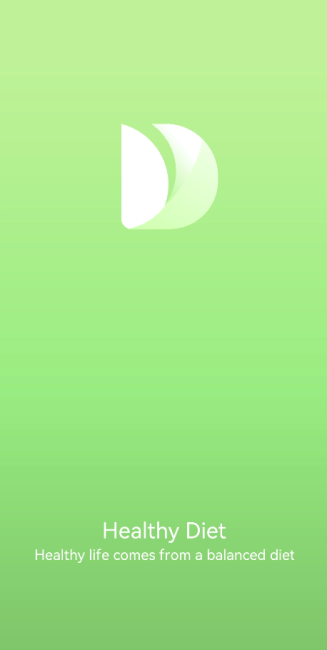
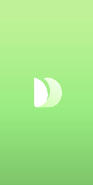
完成应用Logo的绘制。Shape组合了三个Path组件,通过svg命令绘制出一个艺术的叶子,寓意绿色健康饮食方式。
-
添加应用的标题和slogan。
@Entry
@Component
struct Logo {
  private pathCommands1: string = 'M319.5 128.1 c103.5 0 187.5 84 187.5 187.5 v15 a172.5 172.5 0 0 3 -172.5 172.5 H198 a36 36 0 0 3 -13.8 -1 207 207 0 0 0 87 -372 h48.3 z'
  private pathCommands2: string = 'M270.6 128.1 h48.6 c51.6 0 98.4 21 132.3 54.6 a411 411 0 0 3 -45.6 123 c-25.2 45.6 -56.4 84 -87.6 110.4 a206.1 206.1 0 0 0 -47.7 -288 z'

  build() {
    Flex({ direction: FlexDirection.Column, alignItems: ItemAlign.Center, justifyContent: FlexAlign.Center }) {
      Shape() {
        Path()
          .commands('M162 128.7 a222 222 0 0 1 100.8 374.4 H198 a36 36 0 0 3 -36 -36')
          .fill(Color.White)
          .stroke(Color.Transparent)

        Path()
          .commands(this.pathCommands1)
          .fill('none')
          .stroke(Color.Transparent)
          .linearGradient(
            {
              angle: 30,
              colors: [["#C4FFA0", 0], ["#ffffff", 1]]
            })
          .clip(new Path().commands(this.pathCommands1))

        Path()
          .commands(this.pathCommands2)
          .fill('none')
          .stroke(Color.Transparent)
          .linearGradient(
            {
              angle: 50,
              colors: [['#8CC36A', 0.1], ["#B3EB90", 0.4], ["#ffffff", 0.7]]
            })
          .clip(new Path().commands(this.pathCommands2))
      }
      .height('630px')
      .width('630px')

      Text('Healthy Diet')
        .fontSize(26)
        .fontColor(Color.White)
        .margin({ top: 300 })

      Text('Healthy life comes from a balanced diet')
        .fontSize(17)
        .fontColor(Color.White)
        .margin({ top: 4 })
    }
    .width('100%')
    .height('100%')
    .linearGradient(
      {
        angle: 180,
        colors: [['#BDE895', 0.1], ["#95DE7F", 0.6], ["#7AB967", 1]]
     })
  }
}