harmony 鸿蒙Common Component Development
Common Component Development
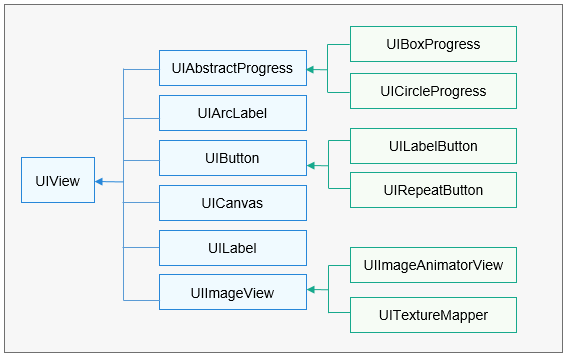
Common components inherit from the base class UIView. Child components cannot be added to common components, such as buttons, images, and labels.
Figure 1 Tree structure of common components

UIView is a base class of the following components: UIAbstractProgress, UIArcLabel, UIButton, UICanvas, UILabel, and UIImageView. UIBoxProgress and UICircleProgress inherit from UIAbstractProgress. UILabelButton and UIRepeatButton inherit from UIButton. UIImageAnimatorView and UITextureMapper inherit from UIImageView.
UIButton
When to Use
UIButton supports the click event and allows you to set styles in different states.
Available APIs
Table 1 Available functions in UIButton
void SetImageSrc (const char *defaultImgSrc, const char triggeredImgSrc) |
|
voidSetStyleForState (const Style &style, ButtonState state) |
|
How to Develop
Implement the click event.
class TestBtnOnClickListener : public OHOS::UIView::OnClickListener {
    bool OnClick(UIView& view, const ClickEvent& event) override
    {
        int16_t width = view.GetWidth() + 10;
        int16_t height = view.GetHeight() + 10;
        view.Resize(width, height);
        view.Invalidate();
        return true;
    }
};
Create a UIButton instance.
UIButton* button = new UIButton();
button->SetPosition(50, 50);
button->SetWidth(100);
button->SetHeight(50);
Register the click event callback for UIButton.
button->SetOnClickListener(new TestBtnOnClickListener());Verify that the button is clicked and its size increases gradually, as shown in the following figure.
UIImageView
When to Use
UIImageView supports the functions to display images, set opacity, rotate images, and zoom in or out images. The following image formats are supported: RGB565, RGB888, RGBA8888, PNG, and JPG.
Available APIs
Table 2 Available functions in UIImageView
How to Develop (Adaptive Mode)
Create a UIImageView instance.
UIImageView* imageView = new UIImageView();
imageView->SetPosition(0, 30);
Set the image path with binary data.
imageView->SetSrc("..\\config\\images\\A021_001.bin");Verify that the UIImageView component is adaptive to the image.
How to Develop (Tile Mode)
Create a UIImageView instance.
UIImageView* imageView = new UIImageView();
imageView->SetPosition(0, 30);
Set the image path.
imageView->SetSrc("..\\config\\images\\A021_001.bin");Disable the image auto-adaptation effect and resize the image to display the image in tile mode.
imageView->SetAutoEnable(false);
imageView->Resize(454, 150);
Verify that the tile mode has been enabled for the UIImageView.
UILabel
When to Use
UILabel displays text in an area. You can set the background color, text display style, and long text display effect for a label.
Available APIs
Table 3 Available functions in UILabel
Sets the label mode, such as truncation and automatic extension. |
|
void SetAlign(UITextLanguageAlignment horizontalAlign, UITextLanguageAlignment verticalAlign = TEXT_ALIGNMENT_TOP); |
|
How to Develop (Default Mode)
Create a lUILabel instance and set its size and position.
UILabel* label = new UILabel();
label->SetPosition(x, y);
label->Resize(width, height);
Set the font.
label->SetFont("SourceHanSansSC-Regular.otf", 30);Set the text.
label->SetText("label");Verify the label size and display effect, as shown in the following figure.

How to Develop (Background Color and Opacity)
Create a lUILabel instance and set its size and position.
UILabel* label = new UILabel();
label->SetPosition(x, y);
label->Resize(width, height);
Set the font.
label->SetFont("SourceHanSansSC-Regular.otf", 30);Set the background color and opacity.
label->SetStyle(STYLE_BACKGROUND_COLOR, Color::Gray().full);
label->SetStyle(STYLE_BACKGROUND_OPA, 127);
label->SetText("Label");
Verify that the background color of the label is Gray, as shown in the following figure.

How to Develop (Letter Spacing)
Create a lUILabel instance and set its size and position.
UILabel* label = new UILabel();
label->SetPosition(x, y);
label->Resize(width, height);
Set the font.
label->SetFont("SourceHanSansSC-Regular.otf", 30);Set the font color and letter spacing.
label->SetStyle(STYLE_BACKGROUND_COLOR, Color::Gray().full);
label->SetStyle(STYLE_LETTER_SPACE, 5);
label->SetText("Label");
Verify that the letter spacing is 5 pixels on the label, as shown in the following figure.

How to Develop (Size-Adaptive Mode)
Regarding too long text, the size of a label can be automatically adjusted based on the text, or the text can be truncated or displayed with the scrolling effect.
Create a lUILabel instance and set its size and position.
UILabel* label = new UILabel();
label->SetPosition(x, y);
label->Resize(width, height);
Set the font.
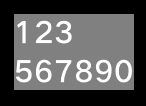
label->SetFont("SourceHanSansSC-Regular.otf", 30);Set the font color to Gray and enable the label size to adapt to the text.
label->SetStyle(STYLE_BACKGROUND_COLOR, Color::Gray().full);
label->SetLineBreakMode(UILabel::LINE_BREAK_ADAPT);
label->SetText("123\n567890");
Verify that the label size adapts to the text, as shown in the following figure.

How to Develop (Ellipsis Mode)
In ellipsis mode, an ellipsis (…) is displayed at the end of the label if the text cannot be completely displayed.
Create a lUILabel instance and set its size and position.
UILabel* label = new UILabel();
label->SetPosition(x, y);
label->Resize(width, height);
Set the font.
label->SetFont("SourceHanSansSC-Regular.otf", 30);Set the text display mode to LINE_BREAK_ELLIPSIS.
label->SetStyle(STYLE_BACKGROUND_COLOR, Color::Gray().full);
label->SetLineBreakMode(UILabel::LINE_BREAK_ELLIPSIS);
label->SetText("123567890");
Verify that the ellipsis mode has taken effect on the label, as shown in the following figure.

How to Develop (Scrolling Mode)
In scrolling mode, long text is kept scrolling on a screen to bring the entire text into view.
Create a lUILabel instance and set its size and position.
UILabel* label = new UILabel();
label->SetPosition(x, y);
label->Resize(width, height);
Set the font.
label->SetFont("SourceHanSansSC-Regular.otf", 30);Set the text display mode to UI_LABEL_LONG_ROLL.
label->SetStyle(STYLE_BACKGROUND_COLOR, Color::Gray().full);
label->SetStyle(STYLE_BACKGROUND_OPA, 127);
label->SetLineBreakMode(UILabel::LINE_BREAK_MARQUEE);
label->SetText("123567890");
Verify that the text is scrolling on the label, as shown in the following figure.
 .gif)
.gif)
你可能感兴趣的鸿蒙文章
harmony 鸿蒙AI Framework Development Guide
harmony 鸿蒙Neural Network Runtime Device Access
harmony 鸿蒙Application Privilege Configuration
harmony 鸿蒙Setting Up a Development Environment
harmony 鸿蒙Development Guidelines
harmony 鸿蒙Application Framework Overview
harmony 鸿蒙ArkCompiler Development
harmony 鸿蒙Window Title Bar Customization Development (ArkTS)
- 所属分类: 后端技术
- 本文标签:


