harmony 鸿蒙ArkUI Subsystem Changelog
ArkUI Subsystem Changelog
cl.arkui.1 Display Effect Change of the alignment Parameter in the <DatePickerDialog>, <TimePickerDialog>, and <TextPickerDialog> Components
Access Level
Public
Reason for Change
Specification optimization.
Change Impact
This change is a compatible change.
In <DatePickerDialog>, <TimePickerDialog>, and <TextPickerDialog> components, the alignment parameter to adjust the position of the picker dialog box relative to the window. The affected scenarios are as follows:
(a) alignment is set to Top, TopStart, or TopEnd
Before change: There is a default spacing of 40 vp between the picker dialog box and the top of the window.
After change: The spacing between the picker dialog box and the top of the window is 0.
(b) alignment is set to Bottom
Before change: There is a default spacing of 16 vp between the picker dialog box and the bottom of the window.
After change: The spacing between the picker dialog box and the bottom of the window is 0.
© alignment is set to Center
Before change: There is an upward offset of 16 vp relative to the center of the window.
After change: The picker dialog box is in the center of the window
API Level
11
Change Since
OpenHarmony SDK 4.1.5.3
Key API/Component Changes
DatePickerDialog, TimePickerDialog, TextPickerDialog
Adaptation Guide
If you want to set the spacing between the picker dialog box and window edges, use offset together with alignment.
cl.arkui.2 Renaming of the buttonMargin and textMargin APIs for the <SegmentButton> Component
Access Level
Public
Reason for Change
The original API names do not convey the actual functionality of the APIs.
Change Impact
This change is a non-compatible change. The APIs for setting the button and text paddings in the <SegmentButton> component are renamed as follows:
(a) API for setting the button padding
Before change: buttonMargin
After change: buttonPadding
(b) API for setting the text padding
Before change: textMargin
After change: textPadding
Change Since
OpenHarmony SDK 4.1.5.3
Key API/Component Changes
SegmentButton
Adaptation Guide
Before change:
The APIs for setting the button and text paddings in the <SegmentButton> component are buttonMargin and textMargin, respectively.
After change:
The APIs for setting the button and text paddings in the <SegmentButton> component are buttonPadding and textPadding, respectively.
cl.arkui.3 Default Value Change for IconOptions.size of cancelButton in the <TextInput> Component
Access Level
Public
Reason for Change
If the IconOptions.size parameter is not set in the cancelButton API, the image size obtained is different from the actual one.
Change Impact
This change is a non-compatible change. If the IconOptions.size parameter is not set in the cancelButton API, the image size obtained is as follows:
Before change: 0.00 px
After change: 24.00 vp
Change Since
OpenHarmony SDK 4.1.5.3
Key API/Component Changes
TextInput
Adaptation Guide
N/A
cl.arkui.4 Change in the @Prop and @BuilderParam Initialization Validation Specification
Access Level
Public
Reason for Change
The initialization validation spefication for @Prop and @BuilderParam is changed to cover the case where they are used with @Require.
Change Impact
This change is a non-compatible change. Specifically, when the @Require decorator is used together with the @Prop or @BuilderParam decorator, the @Prop or @BuilderParam decorated variable must have its initial value passed from the parent component. If the parent component does not pass in any value, a compilation error occurs. This check for initialization from the parent component is not conducted if the @Prop or @BuilderParam decorator is not used with @Require.
API Level
11
Change Since
OpenHarmony SDK 4.1.5.3
Example
@Entry
@Component
struct Index {
  build() {
    Row() {
      Child()
    }
  }
}

@Component
struct Child {
  // ERROR: Property buildText must be initialized through the component constructor.
  @Require @BuilderParam buildText: () => void;
  // ERROR: Property initBuildText must be initialized through the component constructor.
  @Require @BuilderParam initBuildText: () => void = buildFuction;
  // ERROR: Property message must be initialized through the component constructor.
  @Require @Prop message: string = 'Hello';
  // ERROR: Property initMessage must be initialized through the component constructor.
  @Require @Prop initMessage: string;
  // Remove the error message: ERROR: Property 'chindProp' in the custom component 'Child' is missing assignment or initialization.
  @Prop chindProp: string;
  // Remove the error message: ERROR: Property 'chindBuildParam' in the custom component 'Child' is missing assignment or initialization.
  @BuilderParam chindBuildParam: () => void;

  build() {
  }
}

@Builder
function buildFuction() {
}
Key API/Component Changes
N/A
Adaptation Guide
When the \@Require decorator is used together with the \@Prop or \@BuilderParam decorator, the \@Prop and \@BuilderParam decorated variable must have a value passed from the parent component during construction of the owning component.
cl.arkui.5 Change in the Popup Style and Avoidance Logic Specifications
Access Level
Public
Reason for Change
The UX capability is enhanced.
Change Impact
This change is a compatible change.
- If the popup background color is not set, the default background color is used with a blur effect applied. To remove the blur effect, call backgroundBlurStyle and set BlurStyle.NONE (backgroundBlurStyle: BlurStyle.NONE).
   // xxx.ets
   @Entry
   @Component
   struct PopupExample {
     @State handlePopup: boolean = false

     build() {
       Column() {
         // PopupOptions for setting the popup
         Button('PopupOptions')
           .onClick(() => {
             this.handlePopup = !this.handlePopup;
           })
           .bindPopup(this.handlePopup, {
             message: 'This is a popup with PopupOptions',
             backgroundBlurStyle: BlurStyle.NONE,
           })
           .position({ x: 100, y: 150 })
       }
     }
   }
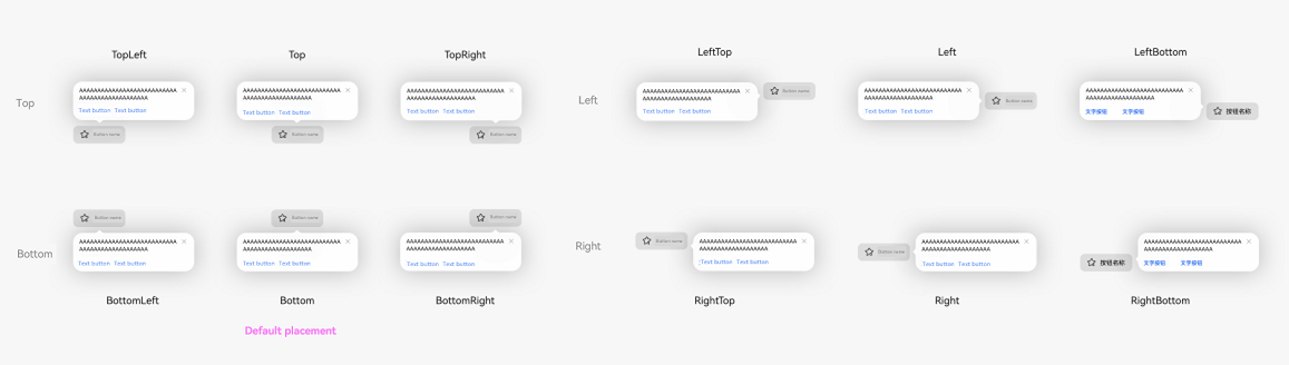
The following 12 alignment modes are added:
- Top: TopLeft/Top/TopRight
- Bottom: BottomLeft/Bottom/BottomRight
- Left: LeftTop/Left/LeftBottom
- Right: RightTop/Right/RightBottom
   // xxx.ets
   @Entry
   @Component
   struct PopupExample {
     @State handlePopup: boolean = false;

     build() {
       Column() {
         // PopupOptions for setting the popup
         Button ('Button Name')
           .onClick(() => {
             this.handlePopup = !this.handlePopup;
           })
           .bindPopup(this.handlePopup, {
             message: 'Test',
             placement: Placement.Bottom
           })
           .position({ x: 100, y: 150 })
       }
     }
   }
When a popup of the PopupOptions type has a button, the popup does not disappear when anywhere outside of the popup area is clicked.
Before change: When a popup of the PopupOptions type has a button, the popup disappears when anywhere outside of the popup area is clicked.
After change: When a popup of the PopupOptions type has a button, the popup does not disappear when anywhere outside of the popup area is clicked.
NOTE
A popup of the PopupOptions type has a button when either primaryButton or secondaryButton or both are set in PopupOptions through bindPopup.
A popup of the PopupOptions type allows scrolling when text overflow occurs.
Before change: In a popup of the PopupOptions type, extra-long text is clipped.
After change: In a popup of the PopupOptions type, a scroll API can be added to allow for scrolling when text overflow occurs.
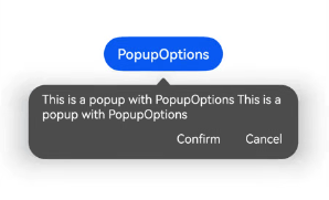
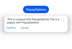
The font color of the popup of the PopupOptions type is the value of ohos_id_color_text_primary in the layered parameters.
Before change: The font color of the popup of the PopupOptions type is the value of ohos_id_color_text_primary_contrary in the layered parameters.
After change: The font color of the popup of the PopupOptions type is the value of ohos_id_color_text_primary in the layered parameters.
The button color of the popup of the PopupOptions type is the value of ohos_id_color_text_primary_activated in the layered parameters.
Before change: The button color of the popup of the PopupOptions type is the value of ohos_id_color_text_primary_contrary in the layered parameters.
After change: The button color of the popup of the PopupOptions type is the value of ohos_id_color_text_primary_activated in the layered parameters.
In the popup of the PopupOptions type, buttons can be displayed in the flex layout so that a line break is inserted in cases of text overflowing.
Before change: If the button in a popup of the PopupOptions type contains ultra-long text, the text is clipped.
After change: If the button in a popup of the PopupOptions type contains ultra-long text, the extra text is wrapped onto a new line in flex layout.
A popup of the CustomPopupOptions type can be configured to be focusable, by setting the focusable parameter in CustomPopupOptions to true.
   // xxx.ets
   @Entry
   @Component
   struct PopupExample {
     @State customPopup: boolean = false

     // Define the popup content in the popup builder.
     @Builder
     popupBuilder() {
       Row({ space: 2 }) {
         Button("button1")
         Button("button2")
       }
     }

     build() {
       Column() {
         // CustomPopupOptions for setting the popup
         Button('CustomPopupOptions')
           .position({ x: 80, y: 300 })
           .onClick(() => {
             this.customPopup = !this.customPopup
           })
           .bindPopup(this.customPopup, {
             builder: this.popupBuilder,
             focusable: true
           })
       }
     }
   }
If showInSubWindow is set to true, the maximum height of the popup is the device screen height. If showInSubWindow is set to false, the maximum height of the popup is the application window height.
Before change: There is no maximum height limit. If the text is too long, it will be clipped.
After change: The maximum height is specified, and if the text is too long, a scroll bar is added to display the text.
If showInSubWindow is set to true, the maximum height is the device screen height. Allowable height = Maximum height – Status bar height (0 if there is no status bar) – Dock height (0 if there is no dock) – 40 vp – 40 vp.
If showInSubWindow is set to false, the maximum height is the height of the application window. Allowable height = Maximum height – Status bar height (0 if there is no status bar) – Dock height (0 if there is no dock) – 40 vp – 40 vp.
The following figures show the styles of items 1, 5, and 6 before and after the change.
- Before change
- After change
NOTE
The popup of the PopupOptions type is a popup where the PopupOptions data structure is passed in by bindPopup.
The popup of the CustomPopupOptions type is a popup where the CustomPopupOptions data structure is passed in by bindPopup.
API Level
11
Change Since
OpenHarmony SDK 4.1.5.2
Key API/Component Changes
bindPopup
Adaptation Guide
Customize the popup background color based on user requirements. For details, see item 1.
Set whether the popup obtains focus when displayed. For details, see item 8.
cl.Arkui.6 Added Support for Displaying a Dialog Box in a Subwindow
Access Level
Public
Reason for Change
The UX capability is enhanced.
Change Impact
This change is a compatible change. The showInSubWindow attribute, which is already supported in the <CustomDialog> component, is added to the <AlertDialog> and <ActionSheet> components and the showDialog and showActionMenu APIs in the promptAction module. If this attribute is manually set to true, the dialog box is created in a subwindow and can be displayed outside of the application window.
API Level
11
Change Since
OpenHarmony SDK 4.1.5.5
Key API/Component Changes
Before change: The showInSubWindow attribute is available for the CustomDialogControllerOptions API of the <CustomDialog> component.
After change: The showInSubWindow attribute is available for the <AlertDialog>, <CustomDialog>, and <ActionSheet> components and the showDialog and showActionMenu APIs in the promptAction module.
Adaptation Guide
N/A
cl.Arkui.7 Change in the Mask Scope of the <CustomDialog> Component
Access Level
Public
Reason for Change
The change is made to maintain consistency with UX specifications.
Change Impact
This change is a non-compatible change.
Before change: When showInSubWindow is set to true, the mask of the <CustomDialog> component covers the subwindow; when showInSubWindow is set to false, the mask covers the entire application window.
After change: The mask of the <CustomDialog> component covers the entire application window regardless of whether showInSubWindow is true or false.

API Level
11
Change Since
OpenHarmony SDK 4.1.5.5
Key API/Component Changes
CustomDialog
Adaptation Guide
You can customize the mask scope when showInSubWindow is set to true by controlling the application window scope.
cl.Arkui.8 Adding of the isModal Attribute for Dialog Boxes
Access Level
Public
Reason for Change
The UX capability is enhanced.
Change Impact
This change is a compatible change. The isModal attribute is added to the <AlterDialog>, <CustomDialog>, and <ActionSheet> components and the showDialog and showActionMenu APIs in the promptAction module. The value true (default) means that the dialog box has a mask, and false means the opposite.
API Level
11
Change Since
OpenHarmony SDK 4.1.5.5
Key API/Component Changes
isModal
Adaptation Guide
N/A
cl.Arkui.9 API Change of the Advanced Popup Component
Access Level
Public
Reason for Change
The UX capability is enhanced.
Change Impact
In the PopupIconOptions data structure of @ohos.arkui.advanced.Popup (popup component), the image variable does not accept the PixelMap or DrawableDescriptor data type.
API Level
11
Change Since
OpenHarmony SDK 4.1.5.2
Key API/Component Changes
@ohos.arkui.advanced.Popup
Adaptation Guide
Regarding the image variable in the PopupIconOptions data structure of @ohos.arkui.advanced.Popup (popup component), only values of the ResourceStr type are allowed.
你可能感兴趣的鸿蒙文章
harmony 鸿蒙Access Token Changelog
harmony 鸿蒙Security Subsystem - Key Management Service Changelog
- 所属分类: 后端技术
- 本文标签:
热门推荐
-
2、 优质文章
-
3、 gt
-
7、 openharmony
-
9、 golang
-
10、 Vue中input框自动聚焦