harmony 鸿蒙Indicator
Indicator
导航点组件,提供圆点导航点以及数字导航点两种导航点样式。
将原Swiper组件中的Indicator已有的能力作为一个单独组件提供给开发者使用。开发者可以不依赖Swiper组件单独显示导航点,也可以通过IndicatorComponentController与Swiper组件绑定使用。
当多个导航点组件和同一个Swiper绑定时,只有最后一个导航点组件能成功和Swiper绑定。
当一个导航点组件和多个Swiper绑定时,只有最后一个Swiper能成功和导航点组件绑定。
说明:
该组件从API version 15开始支持。后续版本如有新增内容,则采用上角标单独标记该内容的起始版本。
子组件
不包含子组件。
接口
IndicatorComponent(controller?: IndicatorComponentController)
单独导航点组件的构造函数,可配置该组件的控制器。
卡片能力: 从API version 15开始,该接口支持在ArkTS卡片中使用。
原子化服务API: 从API version 15开始,该接口支持在原子化服务中使用。
系统能力: SystemCapability.ArkUI.ArkUI.Full
参数:
|参数名|类型|必填|说明| |—–|—–|–| —| |controller| IndicatorComponentController|否|设置控制器,可通过该参数控制单独导航点进行导航点之间的跳转。|
属性
除支持通用属性外,还支持以下属性。
style
style(indicatorStyle: DotIndicator|DigitIndicator)
设置可选导航点指示器样式。
卡片能力: 从API version 15开始,该接口支持在ArkTS卡片中使用。
原子化服务API: 从API version 15开始,该接口支持在原子化服务中使用。
系统能力: SystemCapability.ArkUI.ArkUI.Full
参数:
| 参数名 | 类型 | 必填 | 说明 |
|---|---|---|---|
| indicatorStyle | DotIndicator | DigitIndicator | 是 | 可选导航点指示器样式。 - DotIndicator:圆点指示器样式。 - DigitIndicator:数字指示器样式。 默认类型:DotIndicator。 |
说明:
当indicatorStyle的类型为DotIndicator时,maxDisplayCount不生效。
count
count(totalCount: number)
设置导航点总数量。
单独导航点组件和Swiper绑定的时候,以Swiper的页面数量为准。
卡片能力: 从API version 15开始,该接口支持在ArkTS卡片中使用。
原子化服务API: 从API version 15开始,该接口支持在原子化服务中使用。
系统能力: SystemCapability.ArkUI.ArkUI.Full
参数:
| 参数名 | 类型 | 必填 | 说明 |
|---|---|---|---|
| totalCount | number | 是 | 导航点总数量。 默认值:2。 |
initialIndex
initialIndex(index: number)
设置首次显示时当前导航点的索引值。设置小于0或大于等于导航点数量时,按照默认值0处理。
单独导航点组件和Swiper绑定的时候,该属性不生效。
卡片能力: 从API version 15开始,该接口支持在ArkTS卡片中使用。
原子化服务API: 从API version 15开始,该接口支持在原子化服务中使用。
系统能力: SystemCapability.ArkUI.ArkUI.Full
参数:
| 参数名 | 类型 | 必填 | 说明 |
|---|---|---|---|
| index | number | 是 | 首次显示时当前导航点的索引值。 默认值:0。 |
loop
loop(isLoop: boolean)
设置是否开启循环。
单独导航点组件和Swiper绑定的时候,该属性不生效。
卡片能力: 从API version 15开始,该接口支持在ArkTS卡片中使用。
原子化服务API: 从API version 15开始,该接口支持在原子化服务中使用。
系统能力: SystemCapability.ArkUI.ArkUI.Full
参数:
| 参数名 | 类型 | 必填 | 说明 |
|---|---|---|---|
| isLoop | boolean | 是 | 是否开启循环。true为开启循环,false为不开启循环。 默认值:true。 |
vertical
vertical(isVertical: boolean)
设置是否为纵向滑动。
单独导航点组件和Swiper绑定的时候,该属性不生效。
卡片能力: 从API version 15开始,该接口支持在ArkTS卡片中使用。
原子化服务API: 从API version 15开始,该接口支持在原子化服务中使用。
系统能力: SystemCapability.ArkUI.ArkUI.Full
参数:
| 参数名 | 类型 | 必填 | 说明 |
|---|---|---|---|
| isVertical | boolean | 是 | 是否为纵向滑动。true为纵向滑动,false为横向滑动。 默认值:false |
事件
除支持通用事件外,还支持以下事件:
onChange
onChange(event: Callback<number>)
当前显示的选中导航点索引变化时触发该事件,可通过回调函数获取当前选中导航点的索引值。
卡片能力: 从API version 15开始,该接口支持在ArkTS卡片中使用。
原子化服务API: 从API version 15开始,该接口支持在原子化服务中使用。
系统能力: SystemCapability.ArkUI.ArkUI.Full
参数:
| 参数名 | 类型 | 必填 | 说明 |
|---|---|---|---|
| event | Callback<number> | 是 | 当前显示元素的索引变化时触发的回调。 |
IndicatorComponentController
Indicator组件的控制器,可以将此对象绑定至Indicator组件来控制翻页。
constructor
constructor()
IndicatorComponentController的构造函数。
卡片能力: 从API version 15开始,该接口支持在ArkTS卡片中使用。
原子化服务API: 从API version 15开始,该接口支持在原子化服务中使用。
系统能力: SystemCapability.ArkUI.ArkUI.Full
showNext
showNext(): void
跳转到下一导航点。
卡片能力: 从API version 15开始,该接口支持在ArkTS卡片中使用。
原子化服务API: 从API version 15开始,该接口支持在原子化服务中使用。
系统能力: SystemCapability.ArkUI.ArkUI.Full
showPrevious
showPrevious(): void
跳转到上一导航点。
卡片能力: 从API version 15开始,该接口支持在ArkTS卡片中使用。
原子化服务API: 从API version 15开始,该接口支持在原子化服务中使用。
系统能力: SystemCapability.ArkUI.ArkUI.Full
changeIndex
changeIndex(index: number, useAnimation?: boolean): void
翻至指定页面。
卡片能力: 从API version 15开始,该接口支持在ArkTS卡片中使用。
原子化服务API: 从API version 15开始,该接口支持在原子化服务中使用。
系统能力: SystemCapability.ArkUI.ArkUI.Full
参数:
| 参数名 | 类型 | 必填 | 说明 |
|---|---|---|---|
| index | number | 是 | 指定页面在Swiper中的索引值。 |
| useAnimation | boolean | 否 | 设置翻至指定页面时是否有动效,true表示有动效,false表示没有动效。 默认值:false。 |
示例
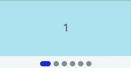
示例1(圆点单独导航点与Swiper绑定使用)
该示例通过Swiper组件的indicator接口与IndicatorComponent的构造函数绑定同一IndicatorComponentController对象,实现了圆点单独导航点与Swiper的交互。
@Entry
@Component
struct DotIndicatorDemo {
  private indicatorController: IndicatorComponentController = new IndicatorComponentController();
  private swiperController: SwiperController = new SwiperController();
  @State list: number[] = [];
  aboutToAppear(): void {
    for (let i = 1; i <= 6; i++) {
      this.list.push(i);
    }
  }

  build() {
    Column() {
      Swiper(this.swiperController) {
        ForEach(this.list, (item: string) => {
          Text(item.toString())
            .width('100%')
            .height(160)
            .backgroundColor(0xAFEEEE)
            .textAlign(TextAlign.Center)
            .fontSize(30)
        }, (item: string) => item)
      }
      .cachedCount(2)
      .index(0)
      .autoPlay(true)
      .interval(2000)
      .indicator(this.indicatorController)
      .loop(true)
      .duration(1000)
      .itemSpace(0)
      .curve(Curve.Linear)
      .onChange((index: number) => {
        console.info(index.toString());
      })

      IndicatorComponent(this.indicatorController)
        .initialIndex(0)
        .style(
          new DotIndicator()
            .itemWidth(15)
            .itemHeight(15)
            .selectedItemWidth(15)
            .selectedItemHeight(15)
            .color(Color.Gray)
            .selectedColor(Color.Blue))
        .loop(true)
        .count(6)
        .vertical(true)
        .onChange((index: number) => {
          console.log("current index: " + index );
        })
    }
  }
}
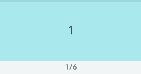
示例2(数字单独导航点与Swiper绑定使用)
该示例通过Swiper组件的indicator接口与IndicatorComponent的构造函数绑定同一IndicatorComponentController对象,实现了数字单独导航点与Swiper的交互。
@Entry
@Component
struct DigitIndicatorDemo {
  private indicatorController: IndicatorComponentController = new IndicatorComponentController();
  private swiperController: SwiperController = new SwiperController();
  @State list: number[] = [];
  aboutToAppear(): void {
    for (let i = 1; i <= 6; i++) {
      this.list.push(i);
    }
  }

  build() {
    Column() {
      Swiper(this.swiperController) {
        ForEach(this.list, (item: string) => {
          Text(item.toString())
            .width('100%')
            .height(160)
            .backgroundColor(0xAFEEEE)
            .textAlign(TextAlign.Center)
            .fontSize(30)
        }, (item: string) => item)
      }
      .cachedCount(2)
      .index(0)
      .autoPlay(true)
      .interval(2000)
      .indicator(this.indicatorController)
      .loop(true)
      .duration(1000)
      .itemSpace(0)
      .curve(Curve.Linear)
      .onChange((index: number) => {
        console.info(index.toString());
      })

      IndicatorComponent(this.indicatorController)
        .initialIndex(0)
        .style(Indicator.digit()
          .fontColor(Color.Gray)
          .selectedFontColor(Color.Gray)
          .digitFont({ size: 20, weight: FontWeight.Bold })
          .selectedDigitFont({ size: 20, weight: FontWeight.Normal }))
        .loop(true)
        .count(6)
        .vertical(true)
        .onChange((index: number) => {
          console.log("current index: " + index );
        })
    }
  }
}
你可能感兴趣的鸿蒙文章
- 所属分类: 后端技术
- 本文标签:
热门推荐
-
2、 优质文章
-
3、 gt
-
7、 openharmony
-
9、 golang
-
10、 Vue中input框自动聚焦