harmony 鸿蒙TextPicker
TextPicker
滑动选择文本内容的组件。
说明:
该组件从API version 8开始支持。后续版本如有新增内容,则采用上角标单独标记该内容的起始版本。
该组件不建议开发者在动效过程中修改属性数据。
子组件
无
接口
TextPicker(options?: TextPickerOptions)
根据range指定的选择范围创建文本选择器。
原子化服务API: 从API version 11开始,该接口支持在原子化服务中使用。
系统能力: SystemCapability.ArkUI.ArkUI.Full
参数:
| 参数名 | 类型 | 必填 | 说明 |
|---|---|---|---|
| options | TextPickerOptions | 否 | 配置文本选择器的参数。 |
TextPickerOptions对象说明
原子化服务API: 从API version 11开始,该接口支持在原子化服务中使用。
系统能力: SystemCapability.ArkUI.ArkUI.Full
| 名称 | 类型 | 必填 | 说明 |
|---|---|---|---|
| range | string[] | string[] []10+ |Resource | TextPickerRangeContent[]10+ | TextCascadePickerRangeContent[]10+ |
是 | 选择器的数据选择列表。不可设置为空数组,若设置为空数组,则不显示;若动态变化为空数组,则保持当前正常值显示。 说明:单列数据选择器使用string[],Resource,TextPickerRangeContent[]类型。 多列数据选择器使用string[][]类型。 多列联动数据选择器使用TextCascadePickerRangeContent[]类型。 Resource类型只支持strarray.json。 range的类型及列数不可以动态修改。 |
| selected | number | number[]10+ | 否 | 设置默认选中项在数组中的索引值,索引从0开始。 默认值:0 说明:单列数据选择器使用number类型。 多列、多列联动数据选择器使用number[]类型。 从API version 10开始,该参数支持$$双向绑定变量。 |
| value | ResourceStr | ResourceStr[] | 否 | 设置默认选中项的值,优先级低于selected。 默认值:第一个元素值 从API version 20开始,支持Resource类型。 说明:只有显示文本列表时该值有效。显示图片或图片加文本的列表时,该值无效。 单列数据选择器使用ResourceStr类型。 多列、多列联动数据选择器使用ResourceStr[]类型。 从API version 10开始,该参数支持$$双向绑定变量。 |
| columnWidths18+ | LengthMetrics[] | 否 | 设置每一个选择项列宽。 默认值:每一个选择项列宽相等。 说明:如果文本长度大于列宽时,文本被截断。 支持Undefined和Null,不支持Undefined[]和Null[]。 |
TextPickerRangeContent10+对象说明
原子化服务API: 从API version 11开始,该接口支持在原子化服务中使用。
系统能力: SystemCapability.ArkUI.ArkUI.Full
| 名称 | 类型 | 必填 | 说明 |
|---|---|---|---|
| icon | string | Resource | 是 | 图片资源。 icon是string类型时,表示图片存放的路径,例如”/common/hello.png”。 |
| text | string | Resource | 否 | 文本信息。 默认值:空字符串 说明:如果文本长度大于列宽时,文本被截断。 |
TextCascadePickerRangeContent10+对象说明
原子化服务API: 从API version 11开始,该接口支持在原子化服务中使用。
系统能力: SystemCapability.ArkUI.ArkUI.Full
| 名称 | 类型 | 必填 | 说明 |
|---|---|---|---|
| text | string | Resource | 是 | 文本信息。 说明:如果文本长度大于列宽时,文本被截断。 |
| children | TextCascadePickerRangeContent[] | 否 | 联动数据。 |
DividerOptions12+对象说明
原子化服务API: 从API version 12开始,该接口支持在原子化服务中使用。
系统能力: SystemCapability.ArkUI.ArkUI.Full
| 名称 | 类型 | 必填 | 说明 |
|---|---|---|---|
| strokeWidth | Dimension | 否 | 分割线的线宽(默认单位vp),也可指定单位为px,不支持”百分比”类型。 取值范围:strokeWidth小于0取默认值,最大不得超过列高的一半。 默认值:2.0px |
| startMargin | Dimension | 否 | 分割线与TextPicker侧边起始端的距离(默认单位vp),也可指定单位为px,不支持“百分比”类型。 取值范围:startMargin小于0时无效,最大值不得超过TextPicker列宽。 默认值:0 |
| endMargin | Dimension | 否 | 分割线与TextPicker侧边结束端的距离(默认单位vp),也可指定单位为px,不支持“百分比”类型。 取值范围:endMargin小于0时无效,最大值不得超过TextPicker列宽。 默认值:0 |
| color | ResourceColor | 否 | 分割线的颜色。 默认值:’#33000000’ |
属性
除支持通用属性外,还支持以下属性:
defaultPickerItemHeight
defaultPickerItemHeight(value: number|string)
设置Picker各选择项的高度。
原子化服务API: 从API version 11开始,该接口支持在原子化服务中使用。
系统能力: SystemCapability.ArkUI.ArkUI.Full
参数:
| 参数名 | 类型 | 必填 | 说明 |
|---|---|---|---|
| value | number | string | 是 | Picker各选择项的高度。number类型取值范围:[0, +∞),string类型仅支持number类型取值的字符串形式,例如”56”。 默认值:选中项56vp,非选中项36vp。 说明: 设置该参数后,选中项与非选中项的高度均为所设置的值。 |
defaultPickerItemHeight18+
defaultPickerItemHeight(height: Optional<number|string>)
设置Picker各选择项的高度。与defaultPickerItemHeight相比,height参数新增了对undefined类型的支持。
原子化服务API: 从API version 18开始,该接口支持在原子化服务中使用。
系统能力: SystemCapability.ArkUI.ArkUI.Full
参数:
| 参数名 | 类型 | 必填 | 说明 |
|---|---|---|---|
| height | Optional<number | string> | 是 | Picker各选择项的高度。number类型取值范围:[0, +∞),string类型仅支持number类型取值的字符串形式,例如”56”。 默认值:选中项56vp,非选中项36vp。 说明: 设置该参数后,选中项与非选中项的高度均为所设置的值。 当height的值为undefined时,维持上次取值。 |
disappearTextStyle10+
disappearTextStyle(value: PickerTextStyle)
设置所有选项中最上和最下两个选项的文本颜色、字号和字体粗细。
原子化服务API: 从API version 11开始,该接口支持在原子化服务中使用。
系统能力: SystemCapability.ArkUI.ArkUI.Full
参数:
| 参数名 | 类型 | 必填 | 说明 |
|---|---|---|---|
| value | PickerTextStyle | 是 | 所有选项中最上和最下两个选项的文本颜色、字号、字体粗细。 默认值: { color: ‘#ff182431’, font: { size: ‘14fp’, weight: FontWeight.Regular } } |
disappearTextStyle18+
disappearTextStyle(style: Optional<PickerTextStyle>)
设置所有选项中最上和最下两个选项的文本颜色、字号、字体粗细。与disappearTextStyle10+相比,style参数新增了对undefined类型的支持。
原子化服务API: 从API version 18开始,该接口支持在原子化服务中使用。
系统能力: SystemCapability.ArkUI.ArkUI.Full
参数:
| 参数名 | 类型 | 必填 | 说明 |
|---|---|---|---|
| style | Optional<PickerTextStyle> | 是 | 所有选项中最上和最下两个选项的文本颜色、字号、字体粗细。 当style的值为undefined时,默认值: { color: ‘#ff182431’, font: { size: ‘14fp’, weight: FontWeight.Regular } } |
textStyle10+
textStyle(value: PickerTextStyle)
设置所有选项中除了最上、最下及选中项以外的文本颜色、字号、字体粗细。
原子化服务API: 从API version 11开始,该接口支持在原子化服务中使用。
系统能力: SystemCapability.ArkUI.ArkUI.Full
参数:
| 参数名 | 类型 | 必填 | 说明 |
|---|---|---|---|
| value | PickerTextStyle | 是 | 所有选项中除了最上、最下及选中项以外的文本颜色、字号、字体粗细。 默认值: { color: ‘#ff182431’, font: { size: ‘16fp’, weight: FontWeight.Regular } } |
textStyle18+
textStyle(style: Optional<PickerTextStyle>)
设置所有选项中除了最上、最下及选中项以外的文本颜色、字号、字体粗细。与textStyle10+相比,style参数新增了对undefined类型的支持。
原子化服务API: 从API version 18开始,该接口支持在原子化服务中使用。
系统能力: SystemCapability.ArkUI.ArkUI.Full
参数:
| 参数名 | 类型 | 必填 | 说明 |
|---|---|---|---|
| style | Optional<PickerTextStyle> | 是 | 所有选项中除了最上、最下及选中项以外的文本颜色、字号、字体粗细。 当style的值为undefined时,默认值: { color: ‘#ff182431’, font: { size: ‘16fp’, weight: FontWeight.Regular } } |
selectedTextStyle10+
selectedTextStyle(value: PickerTextStyle)
设置选中项的文本颜色、字号、字体粗细。Wearable设备不支持设置该属性。
原子化服务API: 从API version 11开始,该接口支持在原子化服务中使用。
系统能力: SystemCapability.ArkUI.ArkUI.Full
参数:
| 参数名 | 类型 | 必填 | 说明 |
|---|---|---|---|
| value | PickerTextStyle | 是 | 选中项的文本颜色、字号、字体粗细。 默认值: { color: ‘#ff007dff’, font: { size: ‘20fp’, weight: FontWeight.Medium } } |
selectedTextStyle18+
selectedTextStyle(style: Optional<PickerTextStyle>)
设置选中项的文本颜色、字号、字体粗细。与selectedTextStyle10+相比,style参数新增了对undefined类型的支持。
原子化服务API: 从API version 18开始,该接口支持在原子化服务中使用。
系统能力: SystemCapability.ArkUI.ArkUI.Full
参数:
| 参数名 | 类型 | 必填 | 说明 |
|---|---|---|---|
| style | Optional<PickerTextStyle> | 是 | 选中项的文本颜色、字号、字体粗细。 当style的值为undefined时,默认值: { color: ‘#ff007dff’, font: { size: ‘20fp’, weight: FontWeight.Medium } } |
selectedIndex10+
selectedIndex(value: number|number[])
设置默认选中项在数组中的索引值,优先级高于options中的选中值。单列数据选择器使用number类型。多列、多列联动数据选择器使用number[]类型。
原子化服务API: 从API version 11开始,该接口支持在原子化服务中使用。
系统能力: SystemCapability.ArkUI.ArkUI.Full
参数:
| 参数名 | 类型 | 必填 | 说明 |
|---|---|---|---|
| value | number | number[] | 是 | 默认选中项在数组中的索引值,索引从0开始。 默认值:0 当value的值为undefined时,默认值与options中的selected值保持一致。如果options中的selected值为undefined,则默认值为0。 |
selectedIndex18+
selectedIndex(index: Optional<number|number[]>)
设置默认选中项在数组中的索引值,优先级高于options中的选中值。单列数据选择器使用number类型。多列、多列联动数据选择器使用number[]类型。与selectedIndex相比,index参数新增了对undefined类型的支持。
原子化服务API: 从API version 18开始,该接口支持在原子化服务中使用。
系统能力: SystemCapability.ArkUI.ArkUI.Full
参数:
| 参数名 | 类型 | 必填 | 说明 |
|---|---|---|---|
| index | Optional<number | number[]> | 是 | 默认选中项在数组中的索引值,索引从0开始。 默认值:0 当index的值为undefined时,默认值与options中的selected值保持一致,如果options中的selected值为undefined,则默认值为0。 |
canLoop10+
canLoop(value: boolean)
设置是否可循环滚动。
原子化服务API: 从API version 11开始,该接口支持在原子化服务中使用。
系统能力: SystemCapability.ArkUI.ArkUI.Full
参数:
| 参数名 | 类型 | 必填 | 说明 |
|---|---|---|---|
| value | boolean | 是 | 是否可循环滚动。 true:可循环,false:不可循环。 默认值:true |
canLoop18+
canLoop(isLoop: Optional<boolean>)
设置是否可循环滚动。与canLoop10+相比,isLoop参数新增了对undefined类型的支持。
原子化服务API: 从API version 18开始,该接口支持在原子化服务中使用。
系统能力: SystemCapability.ArkUI.ArkUI.Full
参数:
| 参数名 | 类型 | 必填 | 说明 |
|---|---|---|---|
| isLoop | Optional<boolean> | 是 | 是否可循环滚动。 true:可循环,false:不可循环。 当isLoop的值为undefined时,默认值:true |
divider12+
divider(value: DividerOptions|null)
设置分割线样式,不设置该属性则按“默认值”展示分割线。
startMargin + endMargin 超过组件宽度后startMargin和endMargin会被置0。
原子化服务API: 从API version 12开始,该接口支持在原子化服务中使用。
系统能力: SystemCapability.ArkUI.ArkUI.Full
参数:
|参数名|类型 |必填|说明 |
|——|——-|—-|———————————————————————|
|value|DividerOptions |null|是 |1.设置DividerOptions,则按设置的样式显示分割线。
默认值:
{
strokeWidth: ‘2px’,
startMargin: 0,
endMargin: 0,
color: ‘#33000000’
}
2.设置为null不显示分割线。|
divider18+
divider(textDivider: Optional<DividerOptions|null>)
设置分割线样式,不设置该属性则按“默认值”展示分割线。与divider12+相比,textDivider参数新增了对undefined类型的支持。
startMargin + endMargin 超过组件宽度后startMargin和endMargin会被置0。
原子化服务API: 从API version 18开始,该接口支持在原子化服务中使用。
系统能力: SystemCapability.ArkUI.ArkUI.Full
参数:
| 参数名 | 类型 | 必填 | 说明 |
|---|---|---|---|
| textDivider | Optional<DividerOptions |null> | 是 | 1.设置DividerOptions,则按设置的样式显示分割线。 当textDivider的值为undefined时,默认值: { strokeWidth: ‘2px’, startMargin: 0, endMargin: 0, color: ‘#33000000’ } 2.设置为null不显示分割线。 |
gradientHeight12+
gradientHeight(value: Dimension)
设置渐隐效果的高度。若未设置该属性,则显示默认渐隐效果。
原子化服务API: 从API version 12开始,该接口支持在原子化服务中使用。
系统能力: SystemCapability.ArkUI.ArkUI.Full
参数:
| 参数名 | 类型 | 必填 | 说明 |
|---|---|---|---|
| value | Dimension | 是 | 内容区上下边缘的渐隐高度(支持百分比,100%为TextPicker高度的一半即最大值),设置为0时不显示渐隐效果,负数等非法值显示默认渐隐效果。默认值为36vp。 |
gradientHeight18+
gradientHeight(height: Optional<Dimension>)
设置渐隐效果高度,不设置该属性则显示默认渐隐效果。与gradientHeight12+相比,height参数新增了对undefined类型的支持。
原子化服务API: 从API version 18开始,该接口支持在原子化服务中使用。
系统能力: SystemCapability.ArkUI.ArkUI.Full
参数:
| 参数名 | 类型 | 必填 | 说明 |
|---|---|---|---|
| height | Optional<Dimension> | 是 | 内容区上下边缘的渐隐高度(支持百分比,100%为TextPicker高度的一半即最大值),设置为0时不显示渐隐效果,负数等非法值显示默认渐隐效果。默认值为36vp。 当height的值为undefined时,默认值为36vp。 |
disableTextStyleAnimation15+
disableTextStyleAnimation(disabled: boolean)
设置滑动过程中是否有文本样式变化动效。设置为true时,滑动过程中无字号、字重、字体颜色等变化动效,且文本均显示为defaultTextStyle属性设置样式。如未设置defaultTextStyle,则显示为Text组件默认样式。
原子化服务API: 从API version 15开始,该接口支持在原子化服务中使用。
系统能力: SystemCapability.ArkUI.ArkUI.Full
参数:
| 参数名 | 类型 | 必填 | 说明 |
|---|---|---|---|
| disabled | boolean | 是 | 设置滑动过程中是否有文本样式变化动效。 true:无文本样式变化动效,false:有文本样式变化动效。 默认值:false |
defaultTextStyle15+
defaultTextStyle(style: TextPickerTextStyle)
设置关闭滑动过程中文本样式变化动效时,各个选项文本的样式。仅当disableTextStyleAnimation为true时生效。
原子化服务API: 从API version 15开始,该接口支持在原子化服务中使用。
系统能力: SystemCapability.ArkUI.ArkUI.Full
参数:
| 参数名 | 类型 | 必填 | 说明 |
|---|---|---|---|
| style | TextPickerTextStyle | 是 | 设置关闭滑动过程中文本样式变化动效时的各个选项文本的样式。 默认值:与Text组件默认值相同。 |
enableHapticFeedback18+
enableHapticFeedback(enable: Optional<boolean>)
设置是否开启触控反馈。
原子化服务API: 从API version 18开始,该接口支持在原子化服务中使用。
系统能力: SystemCapability.ArkUI.ArkUI.Full
| 参数名 | 类型 | 必填 | 说明 |
|---|---|---|---|
| enable | Optional<boolean> | 是 | 设置是否开启触控反馈。 默认值:true,true表示开启触控反馈,false表示不开启触控反馈。 |
说明:
开启触控反馈时,需要在工程的module.json5中配置requestPermissions字段开启振动权限,配置如下:
> "requestPermissions": [ > { > "name": "ohos.permission.VIBRATE", > } > ] > ``` ### digitalCrownSensitivity<sup>18+</sup> digitalCrownSensitivity(sensitivity: Optional\<CrownSensitivity>) 设置表冠灵敏度。 **原子化服务API:** 从API version 18开始,该接口支持在原子化服务中使用。 **系统能力:** SystemCapability.ArkUI.ArkUI.Full |参数名 |参数类型 |必填 |参数描述 | |-----|----------------------------------------|----|-------------------------| |sensitivity|[Optional](https://m.seaxiang.com/blog/wS3lqp)\<[CrownSensitivity](ts-appendix-enums.md#crownsensitivity18)>|是 |表冠响应灵敏度。<br/>默认值:CrownSensitivity.MEDIUM,响应速度适中。 | > **说明:** > > 用于圆形屏幕的穿戴设备。组件响应[表冠事件](ts-universal-events-crown.md),需要先获取焦点。 ### selectedBackgroundStyle<sup>20+</sup> selectedBackgroundStyle(style: Optional\<PickerBackgroundStyle>) 设置选中项的背景样式。 **原子化服务API:** 从API version 20开始,该接口支持在原子化服务中使用。 **系统能力:** SystemCapability.ArkUI.ArkUI.Full |参数名 |类型 |必填 |说明 | |-----|----------------------------------------|----|-------------------------| |style|[Optional](https://m.seaxiang.com/blog/wS3lqp)\<[PickerBackgroundStyle](#pickerbackgroundstyle20)>|是 |选中项背景的颜色和边框圆角半径,多列模式时会同时设置所有列的选中项背景的颜色和圆角半径。<br/>默认值:<br/>{ <br/>color: '#0C182431'<br/>borderRadius: { value:24 unit:1 }<br/>}| ## 事件 除支持[通用事件](ts-component-general-events.md)外,还支持以下事件: ### onChange onChange(callback: (value: string \| string[], index: number \| number[]) => void) 滑动TextPicker文本内容后,选项归位至选中项位置时,触发该回调。当显示文本或图片加文本列表时,value值为选中项中的文本值,当显示图片列表时,value值为空。 **原子化服务API:** 从API version 11开始,该接口支持在原子化服务中使用。 **系统能力:** SystemCapability.ArkUI.ArkUI.Full **参数:** |参数名|类型 |必填|说明 | |------|------------------------------------------|----|-------------------------------------------------| |value|string \| string[]<sup>10+</sup>|是 |当前选中项的文本。多列的情况,value为数组类型。 | |index|number \| number[]<sup>10+</sup>|是 |当前选中项的索引值,索引从0开始。多列的情况,index为数组类型。| ### onChange<sup>18+</sup> onChange(callback: Optional\<OnTextPickerChangeCallback>) 滑动TextPicker文本内容后,选项归位至选中项位置时,触发该回调。与[onChange](#onchange)相比,callback参数新增了对undefined类型的支持。 回调会在滑动动画结束后触发,如果需要快速获取索引值变化,建议使用[onEnterSelectedArea](#onenterselectedarea18)接口。 **原子化服务API:** 从API version 18开始,该接口支持在原子化服务中使用。 **系统能力:** SystemCapability.ArkUI.ArkUI.Full **参数:** |参数名 |类型 |必填|说明 | |--------|------------------------------------------------------------|----|------------------------------------------------------------| |callback|[Optional](https://m.seaxiang.com/blog/wS3lqp)\<[OnTextPickerChangeCallback](#ontextpickerchangecallback18)>|是 |滑动选中TextPicker文本内容后,触发的回调。<br/>当callback的值为undefined时,不使用回调函数。| ### onScrollStop<sup>14+</sup> onScrollStop(callback: TextPickerScrollStopCallback) 文本选择器的选项列滑动停止时触发该事件。 手指拖动选项列触发的滑动,手指离开屏幕且滑动停止时会触发该事件。 **原子化服务API:** 从API version 14开始,该接口支持在原子化服务中使用。 **系统能力:** SystemCapability.ArkUI.ArkUI.Full **参数:** |参数名|类型 |必填|说明 | |------|------------------------------------------|----|-------------------------------------------------| |callback|[TextPickerScrollStopCallback](#textpickerscrollstopcallback14)|是 |文本选择器的选项列滑动停止时触发该事件。| ### onScrollStop<sup>18+</sup> onScrollStop(callback: Optional\<TextPickerScrollStopCallback>) 文本选择器的选项列滑动停止时触发该事件。与[onScrollStop](#onscrollstop14)<sup>14+</sup>相比,callback参数新增了对undefined类型的支持。 手指拖动选项列触发的滑动,手指离开屏幕且滑动停止时会触发该事件。 **原子化服务API:** 从API version 18开始,该接口支持在原子化服务中使用。 **系统能力:** SystemCapability.ArkUI.ArkUI.Full **参数:** |参数名|类型 |必填|说明 | |------|------------------------------------------|----|-------------------------------------------------| |callback|[TextPickerScrollStopCallback](#textpickerscrollstopcallback14)|是 |文本选择器的选项列滑动停止时触发该事件。<br/>当callback的值为undefined时,不使用回调函数。| ### onEnterSelectedArea<sup>18+</sup> onEnterSelectedArea(callback: TextPickerEnterSelectedAreaCallback) 滑动[TextPicker](#textpicker)过程中,选项进入分割线区域内,触发该回调。 与onChange事件的差别在于,该事件的触发时机早于onChange事件,当当前滑动列滑动距离超过选中项高度的一半时,选项此时已经进入分割线区域内,会触发该事件。 当显示文本或图片加文本列表时,value值为选中项中的文本值,当显示图片列表时,value值为空。 **原子化服务API:** 从API version 18开始,该接口支持在原子化服务中使用。 **系统能力:** SystemCapability.ArkUI.ArkUI.Full **参数:** |参数名 |类型 |必填|说明 | |--------|--------------------------|----|------------------------------------------| |callback|[TextPickerEnterSelectedAreaCallback](#textpickerenterselectedareacallback18)|是 |滑动TextPicker过程中,选项进入分割线区域时触发的回调。| ### onAccept<sup>(deprecated) </sup> onAccept(callback: (value: string, index: number) => void) 点击弹窗中的“确定”按钮时触发该回调。该事件仅在[文本滑动选择器弹窗](ts-methods-textpicker-dialog.md)中生效。 从API version 10开始废弃。 **系统能力:** SystemCapability.ArkUI.ArkUI.Full **参数:** |参数名|类型 |必填|说明 | |------|------|----|--------------------| |value|string|是 |当前选中项的文本。 | |index|number|是 |当前选中项的索引值,索引从0开始。| ### onCancel<sup>(deprecated) </sup> onCancel(callback: () => void) 点击弹窗中的“取消”按钮时触发该回调。该事件仅在[文本滑动选择器弹窗](ts-methods-textpicker-dialog.md)中生效。 从API version 10开始废弃。 **系统能力:** SystemCapability.ArkUI.ArkUI.Full ## TextPickerTextStyle<sup>15+</sup>类型说明 文本样式选项,继承自[PickerTextStyle](https://m.seaxiang.com/blog/lDorQT)。 **原子化服务API:** 从API version 15开始,该接口支持在原子化服务中使用。 |参数名 |类型 |必填 |说明 | |-----|----------------------------------------|----|-------------------------| |color|[ResourceColor](https://m.seaxiang.com/blog/3hxcXkcolor)|否 |文本颜色。 | |font|[Font](ts-types.md#font) |否 |文本样式。| |minFontSize|number \| string \| [Resource](https://m.seaxiang.com/blog/3hxcXk)|否 |文本最小显示字号,与maxFontSize配合使用。设置minFontSize与maxFontSize时,font中的size不生效。默认最大行数为1,自适应高度方式为MIN_FONT_SIZE_FIRST。 | |maxFontSize|number \| string \| [Resource](https://m.seaxiang.com/blog/3hxcXk)|否 |文本最大显示字号。 | | overflow | [TextOverflow](ts-appendix-enums.md#textoverflow)|否 |文本截断方式,设置为MARQUEE时不生效。 | ## OnTextPickerChangeCallback<sup>18+</sup> type OnTextPickerChangeCallback = (value: string|string[], index: number|number[]) => void 滑动选中[TextPicker](#textpicker)文本内容后,触发该回调。当显示文本或图片加文本列表时,value值为选中项中的文本值,当显示图片列表时,value值为空。 **卡片能力:** 从API version 18开始,该接口支持在ArkTS卡片中使用。 **原子化服务API:** 从API version 18开始,该接口支持在原子化服务中使用。 **系统能力:** SystemCapability.ArkUI.ArkUI.Full **参数:** |参数名|类型 |必填|说明 | |------|------------------------------------------|----|-------------------------------------------------| |value|string \| string[]<sup>10+</sup>|是 |当前选中项的文本。多列的情况,value为数组类型。 | |index|number \| number[]<sup>10+</sup>|是 |当前选中项的索引值,索引从0开始。多列的情况,index为数组类型。| ## TextPickerScrollStopCallback<sup>14+</sup> type TextPickerScrollStopCallback = (value: string|string[], index: number|number[]) => void 文本选择器的选项列滑动停止时触发该事件。 当显示文本或图片加文本列表时,value值为选中项中的文本值,当显示图片列表时,value值为空。 **卡片能力:** 从API version 14开始,该接口支持在ArkTS卡片中使用。 **原子化服务API:** 从API version 14开始,该接口支持在原子化服务中使用。 **系统能力:** SystemCapability.ArkUI.ArkUI.Full **参数:** |参数名|类型 |必填|说明 | |------|------------------------------------------|----|-------------------------------------------------| |value|string \| string[]|是 |当前选中项的文本。多列的情况,value为数组类型。 | |index|number \| number[]|是 |当前选中项的索引值,索引从0开始。多列的情况,index为数组类型。| ## TextPickerEnterSelectedAreaCallback<sup>18+</sup> type TextPickerEnterSelectedAreaCallback = (value: string|string[], index: number|number[]) => void 滑动[TextPicker](#textpicker)过程中,选项进入分割线区域内,触发该回调。 在多列联动场景中,不建议使用该回调,由于该回调标识的是滑动过程中选项进入分割线区域内的节点,而跟随变化的选项并不涉及滑动,因此,回调的返回值中,仅当前滑动列的值会正常变化,其余未滑动列的值保持不变。 **卡片能力:** 从API version 18开始,该接口支持在ArkTS卡片中使用。 **原子化服务API:** 从API version 18开始,该接口支持在原子化服务中使用。 **系统能力:** SystemCapability.ArkUI.ArkUI.Full **参数:** |参数名|类型 |必填|说明 | |------|------------------------------------------|----|-------------------------------------------------| |value|string \| string[]|是 |当前选中项的文本。多列的情况,value为数组类型。 | |index|number \| number[]|是 |当前选中项的索引值,索引从0开始。多列的情况,index为数组类型。| ## PickerBackgroundStyle<sup>20+</sup> 选择器选项背景样式,包括选项背景颜色和选项边框圆角半径。 **原子化服务API:** 从API version 20开始,该接口支持在原子化服务中使用。 **系统能力:** SystemCapability.ArkUI.ArkUI.Full **参数:** |参数名|类型 |必填|说明 | |------|-------------------------------------|----|-------------------------------------------------| |color|[ResourceColor](https://m.seaxiang.com/blog/3hxcXkcolor)|否 |选项背景颜色,默认值为'#0C182431'。 | |borderRadius|[LengthMetrics](https://m.seaxiang.com/blog/Sao8oW) \| [BorderRadiuses](ts-types.md#borderradiuses9) \| [LocalizedBorderRadiuses](ts-types.md#localizedborderradiuses12)|否 |选项边框圆角半径。LengthMetrics类型的value参数同时作用于四个圆角半径大小,unit参数用于设置单位;BorderRadiuses类型可以设置四个不同值的圆角半径,所有单位固定为VP。LocalizedBorderRadiuses类型可以设置四个不同值的圆角半径,并且可以单独设置每个圆角的单位。默认值为{ value:24 unit:1 },即四个圆角半径均为24VP。| ## 示例 ### 示例1(设置选择器列数) 该示例通过配置range实现单列或多列文本选择器,通过配置columnWidths设置每一列宽度。 ```ts // xxx.ets import { LengthMetrics } from '@kit.ArkUI'; class bottom { bottom:number = 50; } let bott:bottom = new bottom(); @Entry @Component struct TextPickerExample { private select: number = 1; private apfruits: string[] = ['apple1', 'apple2', 'apple3', 'apple4']; private orfruits: string[] = ['orange1', 'orange2', 'orange3', 'orange4']; private pefruits: string[] = ['peach1', 'peach2', 'peach3', 'peach4']; private multi: string[][] = [this.apfruits, this.orfruits, this.pefruits]; private cascade: TextCascadePickerRangeContent[] = [ { text: '辽宁省', children: [{ text: '沈阳市', children: [{ text: '沈河区' }, { text: '和平区' }, { text: '浑南区' }] }, { text: '大连市', children: [{ text: '中山区' }, { text: '金州区' }, { text: '长海县' }] }] }, { text: '吉林省', children: [{ text: '长春市', children: [{ text: '南关区' }, { text: '宽城区' }, { text: '朝阳区' }] }, { text: '四平市', children: [{ text: '铁西区' }, { text: '铁东区' }, { text: '梨树县' }] }] }, { text: '黑龙江省', children: [{ text: '哈尔滨市', children: [{ text: '道里区' }, { text: '道外区' }, { text: '南岗区' }] }, { text: '牡丹江市', children: [{ text: '东安区' }, { text: '西安区' }, { text: '爱民区' }] }] } ]; private singleColumnWidths: LengthMetrics[] = [ LengthMetrics.percent(50) ]; private multipleColumnWidths: LengthMetrics[] = [ LengthMetrics.vp(100), LengthMetrics.vp(200), LengthMetrics.vp(100) ]; private cascadeColumnWidths: LengthMetrics[] = [ LengthMetrics.percent(20), LengthMetrics.percent(30), LengthMetrics.percent(50) ]; build() { Column() { TextPicker({ range: this.apfruits, selected: this.select, columnWidths: this.singleColumnWidths }) .onChange((value: string|string[], index: number|number[]) => { console.info('Picker item changed, value: ' + value + ', index: ' + index); }) .onScrollStop((value: string|string[], index: number|number[]) => { console.info('Picker scroll stopped, value: ' + value + ', index: ' + index); }).margin(bott) .onEnterSelectedArea((value: string|string[], index: number|number[]) => { console.info('Picker item enter selected area, value: ' + value + ', index: ' + index); }) TextPicker({ range: this.multi, columnWidths: this.multipleColumnWidths }) .onChange((value: string|string[], index: number|number[]) => { console.info('TextPicker 多列:onChange ' + JSON.stringify(value) + ', ' + 'index: ' + JSON.stringify(index)); }) .onScrollStop((value: string|string[], index: number|number[]) => { console.info('TextPicker 多列:onScrollStop ' + JSON.stringify(value) + ', ' + 'index: ' + JSON.stringify(index)); }).margin(bott) .onEnterSelectedArea((value: string|string[], index: number|number[]) => { console.info('TextPicker 多列:onEnterSelectedArea ' + JSON.stringify(value) + ', ' + 'index: ' + JSON.stringify(index)); }) TextPicker({ range: this.cascade, columnWidths: this.cascadeColumnWidths }) .onChange((value: string|string[], index: number|number[]) => { console.info('TextPicker 多列联动:onChange ' + JSON.stringify(value) + ', ' + 'index: ' + JSON.stringify(index)); }) .onScrollStop((value: string|string[], index: number|number[]) => { console.info('TextPicker 多列联动:onScrollStop ' + JSON.stringify(value) + ', ' + 'index: ' + JSON.stringify(index)); }) .onEnterSelectedArea((value: string|string[], index: number|number[]) => { console.info('TextPicker 多列联动:onEnterSelectedArea ' + JSON.stringify(value) + ', ' + 'index: ' + JSON.stringify(index)); }) } } }
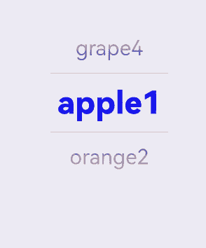
示例2(设置文本样式)
该示例通过配置disappearTextStyle、textStyle、selectedTextStyle实现文本选择器中的文本样式。
// xxx.ets
@Entry
@Component
struct TextPickerExample {
  private select: number = 1;
  private fruits: string[] = ['apple1', 'orange2', 'peach3', 'grape4'];

  build() {
    Column() {
      TextPicker({
        range: this.fruits,
        selected: this.select,
        value: this.fruits[this.select]
      })
        .onChange((value: string|string[], index: number|number[]) => {
          console.info('Picker item changed, value: ' + value + ', index: ' + index);
        })
        .onScrollStop((value: string|string[], index: number|number[]) => {
          console.info('Picker scroll stopped, value: ' + value + ', index: ' + index);
        })
        .disappearTextStyle({ color: Color.Red, font: { size: 15, weight: FontWeight.Lighter } })
        .textStyle({ color: Color.Black, font: { size: 20, weight: FontWeight.Normal } })
        .selectedTextStyle({ color: Color.Blue, font: { size: 30, weight: FontWeight.Bolder } })
        .defaultPickerItemHeight(50)
        .canLoop(false)
        .selectedIndex(2)
    }.width('100%').height('100%')
  }
}
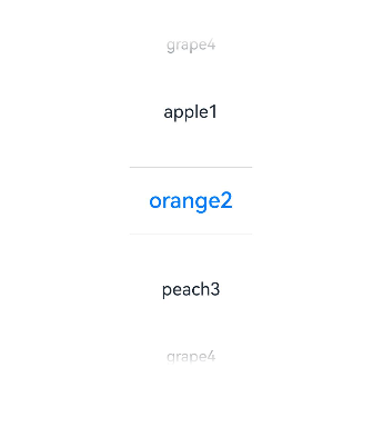
示例3(设置无分割线样式)
该示例通过配置divider为null实现无分割线样式的文本选择器。
// xxx.ets
@Entry
@Component
struct TextPickerExample {
  private select: number = 1;
  private fruits: string[] = ['apple1', 'orange2', 'peach3', 'grape4'];

  build() {
    Column() {
      TextPicker({ range: this.fruits, selected: this.select })
        .onChange((value: string|string[], index: number|number[]) => {
          console.info('Picker item changed, value: ' + value + ', index: ' + index);
        })
        .onScrollStop((value: string|string[], index: number|number[]) => {
          console.info('Picker scroll stopped, value: ' + value + ', index: ' + index);
        })
        .disappearTextStyle({color: Color.Red, font: {size: 15, weight: FontWeight.Lighter}})
        .textStyle({color: Color.Black, font: {size: 20, weight: FontWeight.Normal}})
        .selectedTextStyle({color: Color.Blue, font: {size: 30, weight: FontWeight.Bolder}})
        .divider(null)
    }.width('100%').height('100%')
  }
}
示例4(设置分割线样式)
该示例通过配置divider的DividerOptions类型实现分割线样式的文本选择器。
// xxx.ets
@Entry
@Component
struct TextPickerExample {
  private select: number = 1;
  private fruits: string[] = ['apple1', 'orange2', 'peach3', 'grape4'];

  build() {
    Column() {
      TextPicker({ range: this.fruits, selected: this.select })
        .onChange((value: string|string[], index: number|number[]) => {
          console.info('Picker item changed, value: ' + value + ', index: ' + index);
        })
        .onScrollStop((value: string|string[], index: number|number[]) => {
          console.info('Picker scroll stopped, value: ' + value + ', index: ' + index);
        })
        .disappearTextStyle({color: Color.Red, font: {size: 15, weight: FontWeight.Lighter}})
        .textStyle({color: Color.Black, font: {size: 20, weight: FontWeight.Normal}})
        .selectedTextStyle({color: Color.Blue, font: {size: 30, weight: FontWeight.Bolder}})
        .divider({
          strokeWidth: 10,
          color: Color.Red,
          startMargin: 10,
          endMargin: 20
        } as DividerOptions)
    }.width('100%').height('100%')
  }
}
示例5(设置渐隐效果)
该示例通过gradientHeight自定义TextPicker的渐隐效果高度。
// xxx.ets
@Entry
@Component
struct TextPickerExample {
  private select: number = 1;
  private fruits: string[] = ['apple1', 'orange2', 'peach3', 'grape4'];

  build() {
    Column() {
      TextPicker({ range: this.fruits, selected: this.select })
        .onChange((value: string|string[], index: number|number[]) => {
          console.info('Picker item changed, value: ' + value + ', index: ' + index);
        })
        .onScrollStop((value: string|string[], index: number|number[]) => {
          console.info('Picker scroll stopped, value: ' + value + ', index: ' + index);
        })
        .disappearTextStyle({color: Color.Red, font: {size: 15, weight: FontWeight.Lighter}})
        .textStyle({color: Color.Black, font: {size: 20, weight: FontWeight.Normal}})
        .selectedTextStyle({color: Color.Blue, font: {size: 30, weight: FontWeight.Bolder}})
        .gradientHeight(100)
    }.width('100%').height('100%')
  }
}
示例6(设置选择项高度)
该示例通过配置defaultPickerItemHeight设置选择项的高度。
// xxx.ets
@Entry
@Component
struct TextPickerExample {
  private select: number = 1;
  private fruits: string[] = ['apple1', 'orange2', 'peach3', 'grape4'];

  build() {
    Column() {
      TextPicker({ range: this.fruits, selected: this.select })
        .defaultPickerItemHeight(60)
        .onChange((value: string|string[], index: number|number[]) => {
          console.info('Picker item changed, value: ' + value + ', index: ' + index);
        })
        .onScrollStop((value: string|string[], index: number|number[]) => {
          console.info('Picker scroll stopped, value: ' + value + ', index: ' + index);
        })
    }.width('100%').height('100%')
  }
}
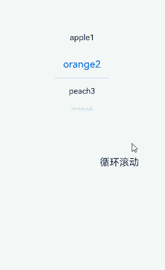
示例7(设置循环滚动)
该示例通过配置canLoop设置TextPicker是否循环滚动。
// xxx.ets
@Entry
@Component
struct TextPickerExample {
  @State isLoop: boolean = false;
  private select: number = 1;
  private fruits: string[] = ['apple1', 'orange2', 'peach3', 'grape4'];

  build() {
    Column() {
      TextPicker({ range: this.fruits, selected: this.select })
        .onChange((value: string|string[], index: number|number[]) => {
          console.info('Picker item changed, value: ' + value + ', index: ' + index);
        })
        .onScrollStop((value: string|string[], index: number|number[]) => {
          console.info('Picker scroll stopped, value: ' + value + ', index: ' + index);
        })
        .canLoop(this.isLoop)

      Row() {
        Text('循环滚动').fontSize(20)

        Toggle({ type: ToggleType.Switch, isOn: false })
          .onChange((isOn: boolean) => {
            this.isLoop = isOn;
          })
      }.position({ x: '60%', y: '40%' })

    }.width('100%')
  }
}
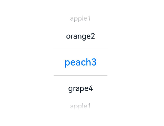
示例8(设置选中项索引值)
该示例通过配置selectedIndex设置默认选中项的索引值。
// xxx.ets
@Entry
@Component
struct TextPickerExample {
  private fruits: string[] = ['apple1', 'orange2', 'peach3', 'grape4'];

  build() {
    Column() {
      TextPicker({ range: this.fruits, selected: 1 })
        .selectedIndex(2)
        .onChange((value: string|string[], index: number|number[]) => {
          console.info('Picker item changed, value: ' + value + ', index: ' + index);
        })
        .onScrollStop((value: string|string[], index: number|number[]) => {
          console.info('Picker scroll stopped, value: ' + value + ', index: ' + index);
        })
    }.width('100%').height('100%')
  }
}
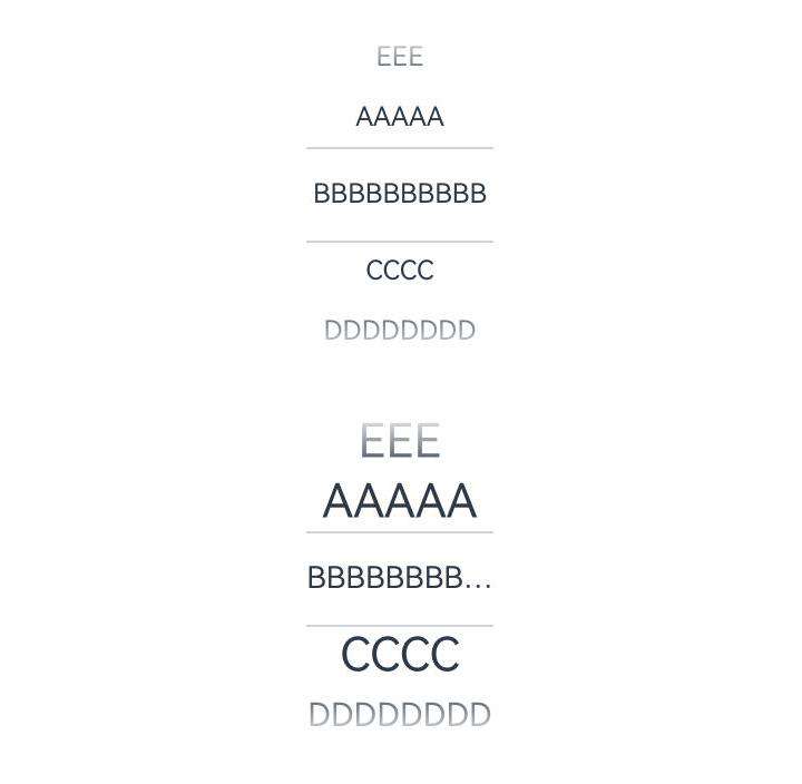
示例9(设置禁用文本样式变化动效与对应文本样式)
该示例通过配置disableTextStyleAnimation、defaultTextStyle实现文本选择器禁用文本样式变化动效与此时的文本样式设置。
// xxx.ets
@Entry
@Component
struct TextPickerExample {
  private select: number = 1;
  private fruits: string[] = ['AAAAA', 'BBBBBBBBBBBBB', 'CCCC', 'DDDDDDDD', 'EEE'];

  build() {
    Column() {
      TextPicker({
        range: this.fruits,
        selected: this.select,
        value: this.fruits[this.select]
      })
        .disableTextStyleAnimation(true)
        .margin({ bottom: 30 })
      TextPicker({
        range: this.fruits,
        selected: this.select,
        value: this.fruits[this.select]
      })
        .disableTextStyleAnimation(true)
        .defaultTextStyle({ minFontSize: 18, maxFontSize: 28, overflow: TextOverflow.Ellipsis })
    }.width('100%').height('100%')
  }
}
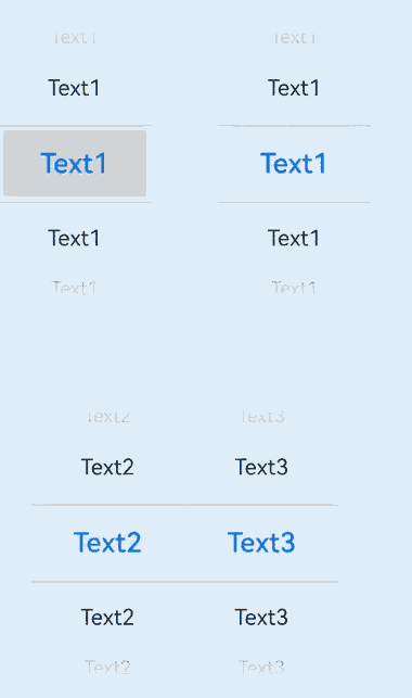
示例10(设置选中项背景样式)
该示例通过配置selectedBackgroundStyle实现文本选择器选中项的背景样式。
// xxx.ets
import { TextPickerModifier } from '@kit.ArkUI';

@Entry
@Component
struct TextPickerExample {
  private showText1: string [] =
    ['Text1', 'Text1', 'Text1', 'Text1']
  private showText2: string[] [] =
    [
      ['Text2', 'Text2', 'Text2', 'Text2'],
      ['Text3', 'Text3', 'Text3', 'Text3']
    ]
  private textPickerModifier: TextPickerModifier = new TextPickerModifier()
    .selectedBackgroundStyle({
      borderRadius: {
        topLeft:8,
        topRight:8,
        bottomLeft:8,
        bottomRight:8
      },
      color: "#FFFFEEF6"
    })
  build() {
    Column() {
      Row() {
        TextPicker({ range: this.showText1 })
          .selectedBackgroundStyle({
            color:"#FFD5D5D5",
            borderRadius: { value:0, unit :1 }
          })
        Column()
          .width("10%")
        TextPicker({ range: this.showText1 })
          .selectedBackgroundStyle({
            color:"#FFE3F8F9",
            borderRadius: {
              topStart: { value:5, unit:1 },
              topEnd: { value:10, unit:1 },
              bottomStart: { value:15, unit:1 },
              bottomEnd: { value:20, unit:1 },
            }
          })
      }
      Row()
        .height("10%")
      Row() {
        TextPicker({ range: this.showText2 })
          .attributeModifier(this.textPickerModifier)
      }
    }.height('100%')
  }
}
你可能感兴趣的鸿蒙文章
- 所属分类: 后端技术
- 本文标签:
热门推荐
-
2、 优质文章
-
3、 gt
-
7、 openharmony
-
9、 golang
-
10、 Vue中input框自动聚焦