harmony 鸿蒙State Button
State Button
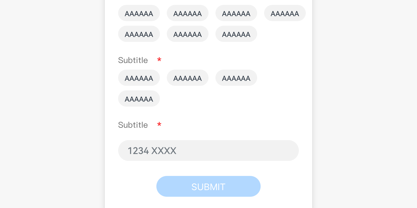
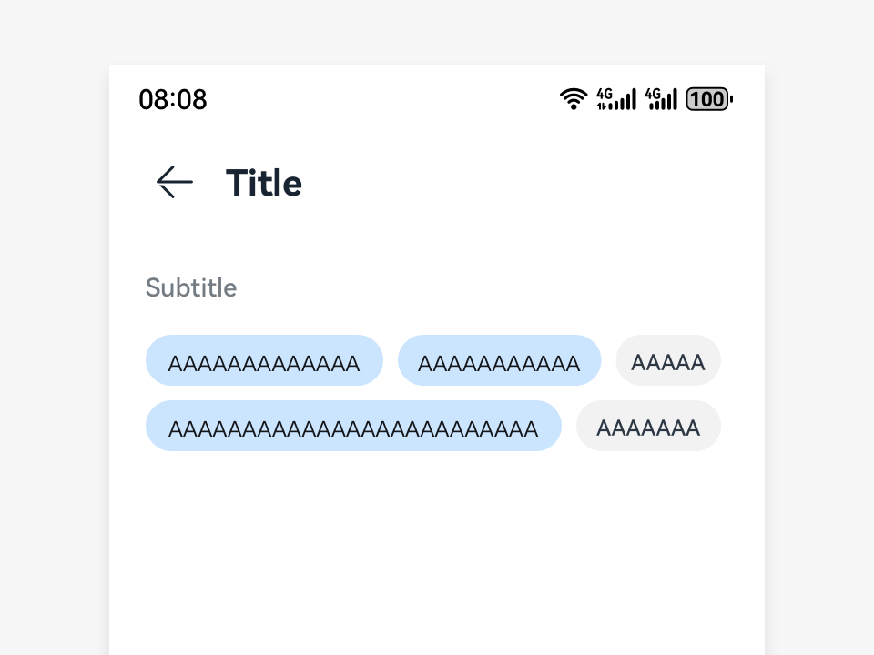
State buttons allow users to select from a group of options and may display the selection result in real time. Generally, the option group consists of many state buttons.
How to Use
Use state buttons when your users need to select one or more options from a group of options. The selected options are displayed in real time on the screen or submitted as the selection result.
State buttons can be either checked or unchecked.
Multiple state buttons are used together to specify a group of options.
State buttons can be used for single selection. In this case, only one option can be selected. The selected option can be changed, but only one will be in the checked state.
State buttons can be used for multiple selections. In this case, every state button can be simultaneously in the checked state.
Writing Instructions
Use noun phrases for the text of each state button, with no punctuation included.
Resources
For details about the development guide related to the state button, see Toggle.
你可能感兴趣的鸿蒙文章
harmony 鸿蒙OpenHarmony Application UX Design Specifications
harmony 鸿蒙Animation Attributes
harmony 鸿蒙Animation Design Principles
harmony 鸿蒙Application Navigation Structure Design
harmony 鸿蒙Application Page Structure Design
- 所属分类: 后端技术
- 本文标签:
热门推荐
-
2、 优质文章
-
3、 gt
-
7、 openharmony
-
9、 golang
-
10、 Vue中input框自动聚焦