harmony 鸿蒙Playing Moving Photos with MovingPhotoView
Playing Moving Photos with MovingPhotoView
The system provides the MovingPhotoView component, which can be used to play moving photos in social networking and gallery applications.
Constraints
The restrictions on using the MovingPhotoView component are as follows:
- Currently, live properties cannot be set.
- Currently, the ArkUI expandSafeArea cannot be set.
- When this component is long pressed to trigger playback, the component area is zoomed in to 1.1 times.
- This component uses AVPlayer to play moving photos. A maximum of three AVPlayers can be used at the same time. Otherwise, frame freezing may occur.
How to Develop
- Import modules.
import { MovingPhotoView, MovingPhotoViewController, MovingPhotoViewAttribute } from '@kit.MediaLibraryKit';
- Obtain a MovingPhoto object.
Use the photoAccessHelper APIs to create or obtain a moving photo object. The MovingPhotoView receives only the constructed moving photo object.
For details about how to create and obtain a moving photo object, see Accessing and Managing Moving Photo Assets.
src: photoAccessHelper.MovingPhoto|undefined = undefined;
- Create a MovingPhotoViewController to control the playback status (such as playing or stopping) of the moving photo.
controller: MovingPhotoViewController = new MovingPhotoViewController();
- Create a MovingPhotoView instance.
The values in the following sample code are only examples. For details about the value range of each parameter, see @ohos.multimedia.movingphotoview.
    import { photoAccessHelper, MovingPhotoView, MovingPhotoViewController, MovingPhotoViewAttribute } from '@kit.MediaLibraryKit';

    @Entry
    @Component
    struct Index {
      @State src: photoAccessHelper.MovingPhoto|undefined = undefined
      @State isMuted: boolean = false
      controller: MovingPhotoViewController = new MovingPhotoViewController();
      build() {
        Column() {
          MovingPhotoView({
            movingPhoto: this.src,
            controller: this.controller
            // imageAIOptions: this.options
          })
            // Whether to mute the playback. The default value is false. In this example, it is controlled by the button.
            .muted(this.isMuted)
            // Video display mode. The default value is Cover.
            .objectFit(ImageFit.Cover)
            // Triggered when the playback starts.
            .onStart(() => {
              console.log('onStart');
            })
            // Triggered when the playback ends.
            .onFinish(() => {
              console.log('onFinish');
            })
            // Triggered when the playback stops.
            .onStop(() => {
              console.log('onStop')
            })
            // Triggered when an error occurs.
            .onError(() => {
              console.log('onError');
            })

          Row() {
            // Button for starting playback.
            Button('start')
              .onClick(() => {
                this.controller.startPlayback()
              })
              .margin(5)
            // Button for stopping playback.
            Button('stop')
              .onClick(() => {
                this.controller.stopPlayback()
              })
              .margin(5)
            // Button controlling whether to mute the playback.
            Button('mute')
              .onClick(() => {
                this.isMuted = !this.isMuted
              })
              .margin(5)
          }
          .alignItems(VerticalAlign.Center)
          .justifyContent(FlexAlign.Center)
          .height('15%')
        }
      }
    }
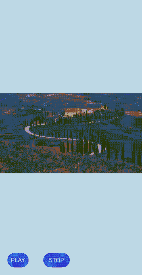
Effect
你可能感兴趣的鸿蒙文章
harmony 鸿蒙Media Library Kit (Media File Management Service)
harmony 鸿蒙Accessing and Managing Moving Photos
harmony 鸿蒙Observing Media Assets
harmony 鸿蒙Introduction to Media Library Kit
harmony 鸿蒙Selecting Media Assets Using Picker
harmony 鸿蒙Managing Media Assets
- 所属分类: 后端技术
- 本文标签:
热门推荐
-
2、 优质文章
-
3、 gt
-
7、 openharmony
-
9、 golang
-
10、 Vue中input框自动聚焦