harmony 鸿蒙文本显示 (Text/Span)
文本显示 (Text/Span)
Text是文本组件,用于展示用户视图,如显示文章的文字内容。该组件支持绑定自定义文本选择菜单,用户可根据需要选择不同功能。此外,还可以扩展自定义菜单,丰富可用选项,进一步提升用户体验。Span则用于展示行内文本。
创建文本
Text可通过以下两种方式来创建:
- string字符串。
Text('我是一段文本')
- 引用Resource资源。
资源引用类型可以通过$r创建Resource类型对象,文件位置为/resources/base/element/string.json,具体内容如下:
  {
    "string": [
      {
        "name": "module_desc",
        "value": "模块描述"
      }
    ]
  }
  Text($r('app.string.module_desc'))
    .baselineOffset(0)
    .fontSize(30)
    .border({ width: 1 })
    .padding(10)
    .width(300)
添加子组件
Span只能作为Text和RichEditor组件的子组件显示文本内容。可以在一个Text内添加多个Span来显示一段信息,例如产品说明书、承诺书等。
- 创建Span。
Span组件需嵌入在Text组件中才能显示,单独使用时不会显示任何内容。Text与Span同时配置文本内容时,Span内容将覆盖Text内容。
  Text('我是Text') {
    Span('我是Span')
  }
  .padding(10)
  .borderWidth(1)
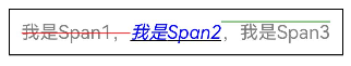
- 设置文本装饰线及颜色。
通过decoration设置文本装饰线及颜色。
  Text() {
    Span('我是Span1,').fontSize(16).fontColor(Color.Grey)
      .decoration({ type: TextDecorationType.LineThrough, color: Color.Red })
    Span('我是Span2').fontColor(Color.Blue).fontSize(16)
      .fontStyle(FontStyle.Italic)
      .decoration({ type: TextDecorationType.Underline, color: Color.Black })
    Span(',我是Span3').fontSize(16).fontColor(Color.Grey)
      .decoration({ type: TextDecorationType.Overline, color: Color.Green })
  }
  .borderWidth(1)
  .padding(10)
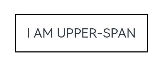
- 通过textCase设置文字一直保持大写或者小写状态。
  Text() {
    Span('I am Upper-span').fontSize(12)
      .textCase(TextCase.UpperCase)
  }
  .borderWidth(1)
  .padding(10)
- 添加事件。
由于Span组件无尺寸信息,仅支持添加点击事件onClick。
  Text() {
    Span('I am Upper-span').fontSize(12)
      .textCase(TextCase.UpperCase)
      .onClick(() => {
        console.info('我是Span——onClick');
      })
  }
创建自定义文本样式
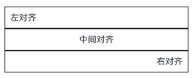
- 通过textAlign属性设置文本对齐样式。
  Text('左对齐')
    .width(300)
    .textAlign(TextAlign.Start)
    .border({ width: 1 })
    .padding(10)
  Text('中间对齐')
    .width(300)
    .textAlign(TextAlign.Center)
    .border({ width: 1 })
    .padding(10)
  Text('右对齐')
    .width(300)
    .textAlign(TextAlign.End)
    .border({ width: 1 })
    .padding(10)
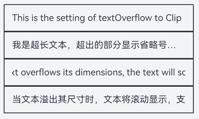
- 通过textOverflow属性控制文本超长处理,textOverflow需配合maxLines一起使用(默认情况下文本自动折行)。从API version 18开始,文本超长时设置跑马灯的方式展示时,支持设置跑马灯的配置项,比如开关、步长、循环次数、方向等。
  Text('This is the setting of textOverflow to Clip text content This is the setting of textOverflow to None text content. This is the setting of textOverflow to Clip text content This is the setting of textOverflow to None text content.')
    .width(250)
    .textOverflow({ overflow: TextOverflow.None })
    .maxLines(1)
    .fontSize(12)
    .border({ width: 1 })
    .padding(10)
  Text('我是超长文本,超出的部分显示省略号。I am an extra long text, with ellipses displayed for any excess.')
    .width(250)
    .textOverflow({ overflow: TextOverflow.Ellipsis })
    .maxLines(1)
    .fontSize(12)
    .border({ width: 1 })
    .padding(10)
  Text('当文本溢出其尺寸时,文本将滚动显示。When the text overflows its dimensions, the text will scroll for displaying.')
    .width(250)
    .textOverflow({ overflow: TextOverflow.MARQUEE })
    .maxLines(1)
    .fontSize(12)
    .border({ width: 1 })
    .padding(10)
  Text('当文本溢出其尺寸时,文本将滚动显示,支持设置跑马灯配置项。When the text overflows its dimensions, the text will scroll for displaying.')
    .width(250)
    .textOverflow({ overflow: TextOverflow.MARQUEE })
    .maxLines(1)
    .fontSize(12)
    .border({ width: 1 })
    .padding(10)
    .marqueeOptions({
      start: true,
      fromStart: true,
      step: 6,
      loop: -1,
      delay: 0,
      fadeout: false,
      marqueeStartPolicy: MarqueeStartPolicy.DEFAULT
    })
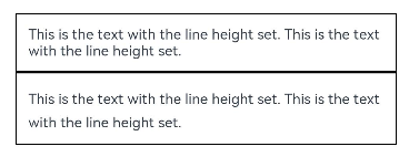
- 通过lineHeight属性设置文本行高。
  Text('This is the text with the line height set. This is the text with the line height set.')
    .width(300).fontSize(12).border({ width: 1 }).padding(10)
  Text('This is the text with the line height set. This is the text with the line height set.')
    .width(300).fontSize(12).border({ width: 1 }).padding(10)
    .lineHeight(20)
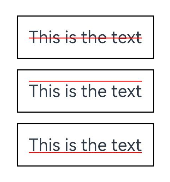
- 通过decoration属性设置文本装饰线样式及其颜色。
  Text('This is the text')
    .decoration({
      type: TextDecorationType.LineThrough,
      color: Color.Red
    })
    .borderWidth(1).padding(10).margin(5)
  Text('This is the text')
    .decoration({
      type: TextDecorationType.Overline,
      color: Color.Red
    })
    .borderWidth(1).padding(10).margin(5)
  Text('This is the text')
    .decoration({
      type: TextDecorationType.Underline,
      color: Color.Red
    })
    .borderWidth(1).padding(10).margin(5)
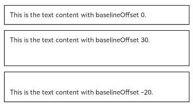
- 通过baselineOffset属性设置文本基线的偏移量。
  Text('This is the text content with baselineOffset 0.')
    .baselineOffset(0)
    .fontSize(12)
    .border({ width: 1 })
    .padding(10)
    .width('100%')
    .margin(5)
  Text('This is the text content with baselineOffset 30.')
    .baselineOffset(30)
    .fontSize(12)
    .border({ width: 1 })
    .padding(10)
    .width('100%')
    .margin(5)
  Text('This is the text content with baselineOffset -20.')
    .baselineOffset(-20)
    .fontSize(12)
    .border({ width: 1 })
    .padding(10)
    .width('100%')
    .margin(5)
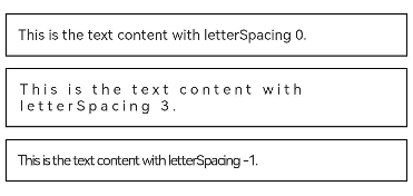
- 通过letterSpacing属性设置文本字符间距。
  Text('This is the text content with letterSpacing 0.')
    .letterSpacing(0)
    .fontSize(12)
    .border({ width: 1 })
    .padding(10)
    .width('100%')
    .margin(5)
  Text('This is the text content with letterSpacing 3.')
    .letterSpacing(3)
    .fontSize(12)
    .border({ width: 1 })
    .padding(10)
    .width('100%')
    .margin(5)
  Text('This is the text content with letterSpacing -1.')
    .letterSpacing(-1)
    .fontSize(12)
    .border({ width: 1 })
    .padding(10)
    .width('100%')
    .margin(5)
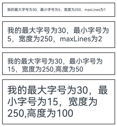
- 通过minFontSize与maxFontSize自适应字体大小。
minFontSize用于设置文本的最小显示字号,maxFontSize用于设置文本的最大显示字号。这两个属性必须同时设置才能生效,并且需要与maxLines属性或布局大小限制配合使用,单独设置任一属性将不会产生效果。
  Text('我的最大字号为30,最小字号为5,宽度为250,maxLines为1')
    .width(250)
    .maxLines(1)
    .maxFontSize(30)
    .minFontSize(5)
    .border({ width: 1 })
    .padding(10)
    .margin(5)
  Text('我的最大字号为30,最小字号为5,宽度为250,maxLines为2')
    .width(250)
    .maxLines(2)
    .maxFontSize(30)
    .minFontSize(5)
    .border({ width: 1 })
    .padding(10)
    .margin(5)
  Text('我的最大字号为30,最小字号为15,宽度为250,高度为50')
    .width(250)
    .height(50)
    .maxFontSize(30)
    .minFontSize(15)
    .border({ width: 1 })
    .padding(10)
    .margin(5)
  Text('我的最大字号为30,最小字号为15,宽度为250,高度为100')
    .width(250)
    .height(100)
    .maxFontSize(30)
    .minFontSize(15)
    .border({ width: 1 })
    .padding(10)
    .margin(5)
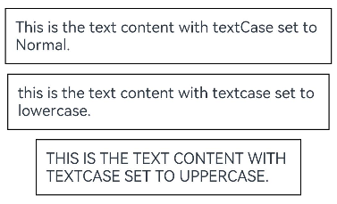
- 通过textCase属性设置文本大小写。
  Text('This is the text content with textCase set to Normal.')
    .textCase(TextCase.Normal)
    .padding(10)
    .border({ width: 1 })
    .padding(10)
    .margin(5)
  // 文本全小写展示
  Text('This is the text content with textCase set to LowerCase.')
    .textCase(TextCase.LowerCase)
    .border({ width: 1 })
    .padding(10)
    .margin(5)
  // 文本全大写展示
  Text('This is the text content with textCase set to UpperCase.')
    .textCase(TextCase.UpperCase)
    .border({ width: 1 })
    .padding(10)
    .margin(5)
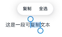
- 通过copyOption属性设置文本是否可复制粘贴。
  Text("这是一段可复制文本")
    .fontSize(30)
    .copyOption(CopyOptions.InApp)
添加事件
Text组件可以添加通用事件,可以绑定onClick、onTouch等事件来响应操作。
Text('点我')
  .onClick(() => {
      console.info('我是Text的点击响应事件');
   })
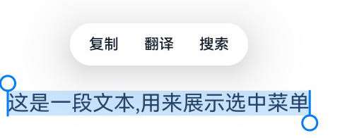
设置选中菜单
- 设置Text被选中时,会弹出包含复制、翻译、搜索的菜单。
Text组件需要设置copyOption属性才可以被选中。
  Text("这是一段文本,用来展示选中菜单")
    .fontSize(30)
    .copyOption(CopyOptions.InApp)
- Text组件通过设置bindSelectionMenu属性绑定自定义选择菜单。
  Text("这是一段文本,用来展示选中菜单", this.options)
    .fontSize(30)
    .copyOption(CopyOptions.InApp)
    .bindSelectionMenu(TextSpanType.TEXT, this.RightClickTextCustomMenu, TextResponseType.RIGHT_CLICK, {
      onAppear: () => {
        console.info('自定义选择菜单弹出时触发该回调');
      },
      onDisappear: () => {
        console.info('自定义选择菜单关闭时触发该回调');
      }
    })
  // 定义菜单项
  @Builder
  RightClickTextCustomMenu() {
    Column() {
      Menu() {
        MenuItemGroup() {
          MenuItem({ startIcon: $r('app.media.app_icon'), content: "CustomMenu One", labelInfo: "" })
            .onClick(() => {
              // 使用closeSelectionMenu接口关闭菜单
              this.controller.closeSelectionMenu();
            })
          MenuItem({ startIcon: $r('app.media.app_icon'), content: "CustomMenu Two", labelInfo: "" })
          MenuItem({ startIcon: $r('app.media.app_icon'), content: "CustomMenu Three", labelInfo: "" })
        }
      }.backgroundColor('#F0F0F0')
    }
  }

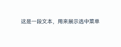
- Text组件通过设置editMenuOptions属性扩展自定义选择菜单,可以设置扩展项的文本内容、图标以及回调方法。
  Text('这是一段文本,用来展示选中菜单')
    .fontSize(20)
    .copyOption(CopyOptions.LocalDevice)
    .editMenuOptions({
      onCreateMenu: this.onCreateMenu, onMenuItemClick: this.onMenuItemClick
    })
  // 定义onCreateMenu,onMenuItemClick
  onCreateMenu = (menuItems: Array<TextMenuItem>) => {
    let item1: TextMenuItem = {
      content: 'customMenu1',
      icon: $r('app.media.app_icon'),
      id: TextMenuItemId.of('customMenu1'),
    };
    let item2: TextMenuItem = {
      content: 'customMenu2',
      id: TextMenuItemId.of('customMenu2'),
      icon: $r('app.media.app_icon'),
    };
    menuItems.push(item1);
    menuItems.unshift(item2);
    return menuItems;
  }

  onMenuItemClick = (menuItem: TextMenuItem, textRange: TextRange) => {
    if (menuItem.id.equals(TextMenuItemId.of("customMenu2"))) {
      console.log("拦截 id: customMenu2 start:" + textRange.start + "; end:" + textRange.end);
      return true;
    }
    if (menuItem.id.equals(TextMenuItemId.COPY)) {
      console.log("拦截 COPY start:" + textRange.start + "; end:" + textRange.end);
      return true;
    }
    if (menuItem.id.equals(TextMenuItemId.SELECT_ALL)) {
      console.log("不拦截 SELECT_ALL start:" + textRange.start + "; end:" + textRange.end);
      return false;
    }
    return false;
  };
场景示例
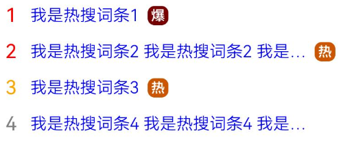
该示例通过maxLines、textOverflow、textAlign、constraintSize属性展示了热搜榜的效果。
// xxx.ets
@Entry
@Component
struct TextExample {
  build() {
    Column() {
      Row() {
        Text("1").fontSize(14).fontColor(Color.Red).margin({ left: 10, right: 10 })
        Text("我是热搜词条1")
          .fontSize(12)
          .fontColor(Color.Blue)
          .maxLines(1)
          .textOverflow({ overflow: TextOverflow.Ellipsis })
          .fontWeight(300)
        Text("爆")
          .margin({ left: 6 })
          .textAlign(TextAlign.Center)
          .fontSize(10)
          .fontColor(Color.White)
          .fontWeight(600)
          .backgroundColor(0x770100)
          .borderRadius(5)
          .width(15)
          .height(14)
      }.width('100%').margin(5)

      Row() {
        Text("2").fontSize(14).fontColor(Color.Red).margin({ left: 10, right: 10 })
        Text("我是热搜词条2 我是热搜词条2 我是热搜词条2 我是热搜词条2 我是热搜词条2")
          .fontSize(12)
          .fontColor(Color.Blue)
          .fontWeight(300)
          .constraintSize({ maxWidth: 200 })
          .maxLines(1)
          .textOverflow({ overflow: TextOverflow.Ellipsis })
        Text("热")
          .margin({ left: 6 })
          .textAlign(TextAlign.Center)
          .fontSize(10)
          .fontColor(Color.White)
          .fontWeight(600)
          .backgroundColor(0xCC5500)
          .borderRadius(5)
          .width(15)
          .height(14)
      }.width('100%').margin(5)

      Row() {
        Text("3").fontSize(14).fontColor(Color.Orange).margin({ left: 10, right: 10 })
        Text("我是热搜词条3")
          .fontSize(12)
          .fontColor(Color.Blue)
          .fontWeight(300)
          .maxLines(1)
          .constraintSize({ maxWidth: 200 })
          .textOverflow({ overflow: TextOverflow.Ellipsis })
        Text("热")
          .margin({ left: 6 })
          .textAlign(TextAlign.Center)
          .fontSize(10)
          .fontColor(Color.White)
          .fontWeight(600)
          .backgroundColor(0xCC5500)
          .borderRadius(5)
          .width(15)
          .height(14)
      }.width('100%').margin(5)

      Row() {
        Text("4").fontSize(14).fontColor(Color.Grey).margin({ left: 10, right: 10 })
        Text("我是热搜词条4 我是热搜词条4 我是热搜词条4 我是热搜词条4 我是热搜词条4")
          .fontSize(12)
          .fontColor(Color.Blue)
          .fontWeight(300)
          .constraintSize({ maxWidth: 200 })
          .maxLines(1)
          .textOverflow({ overflow: TextOverflow.Ellipsis })
      }.width('100%').margin(5)
    }.width('100%')
  }
}
你可能感兴趣的鸿蒙文章
0
赞
- 所属分类: 后端技术
- 本文标签:
热门推荐
-
2、 优质文章
-
3、 gt
-
7、 openharmony
-
9、 golang
-
10、 Vue中input框自动聚焦