harmony 鸿蒙切换按钮 (Toggle)
切换按钮 (Toggle)
Toggle组件提供状态按钮样式、勾选框样式和开关样式,一般用于两种状态之间的切换。具体用法请参考Toggle。
创建切换按钮
Toggle通过调用ToggleOptions来创建,具体调用形式如下:
Toggle(options: { type: ToggleType, isOn?: boolean })
其中,ToggleType为开关类型,包括Button、Checkbox和Switch,isOn为切换按钮的状态。
API version 11开始,Checkbox默认样式由圆角方形变为圆形。
接口调用有以下两种形式:
创建不包含子组件的Toggle。 当ToggleType为Checkbox或者Switch时,用于创建不包含子组件的Toggle:
Toggle({ type: ToggleType.Checkbox, isOn: false })
Toggle({ type: ToggleType.Checkbox, isOn: true })
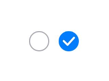
  Toggle({ type: ToggleType.Switch, isOn: false })
  Toggle({ type: ToggleType.Switch, isOn: true })

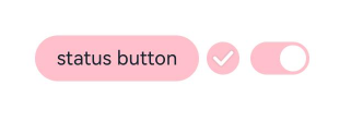
- 创建包含子组件的Toggle。
当ToggleType为Button时,只能包含一个子组件,如果子组件有文本设置,则相应的文本内容会显示在按钮上。
  Toggle({ type: ToggleType.Button, isOn: false }) {
    Text('status button')
      .fontColor('#182431')
      .fontSize(12)
  }.width(100)
  Toggle({ type: ToggleType.Button, isOn: true }) {
    Text('status button')
      .fontColor('#182431')
      .fontSize(12)
  }.width(100)

自定义样式
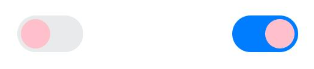
- 通过selectedColor属性设置Toggle打开选中后的背景颜色。
  Toggle({ type: ToggleType.Button, isOn: true }) {
    Text('status button')
    .fontColor('#182431')
    .fontSize(12)
  }.width(100).selectedColor(Color.Pink)
  Toggle({ type: ToggleType.Checkbox, isOn: true })
    .selectedColor(Color.Pink)
  Toggle({ type: ToggleType.Switch, isOn: true })
    .selectedColor(Color.Pink)
- 通过switchPointColor属性设置Switch类型的圆形滑块颜色,仅对type为ToggleType.Switch生效。
  Toggle({ type: ToggleType.Switch, isOn: false })
    .switchPointColor(Color.Pink)
  Toggle({ type: ToggleType.Switch, isOn: true })
    .switchPointColor(Color.Pink)
添加事件
除支持通用事件外,Toggle还用于选中和取消选中后触发某些操作,可以绑定onChange事件来响应操作后的自定义行为。
Toggle({ type: ToggleType.Switch, isOn: false })
  .onChange((isOn: boolean) => {
      if(isOn) {
        // 需要执行的操作
      }
  })
场景示例
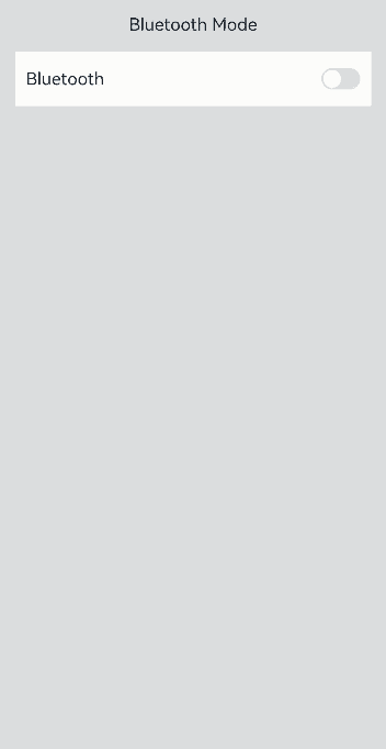
Toggle用于切换蓝牙开关状态。
// xxx.ets
import { promptAction } from '@kit.ArkUI';

@Entry
@Component
struct ToggleExample {
  @State BOnSt: promptAction.ShowToastOptions = { 'message': 'Bluetooth is on.' };
  @State BOffSt: promptAction.ShowToastOptions = { 'message': 'Bluetooth is off.' };

  build() {
    Column() {
      Row() {
        Text("Bluetooth Mode")
          .height(50)
          .fontSize(16)
      }

      Row() {
        Text("Bluetooth")
          .height(50)
          .padding({ left: 10 })
          .fontSize(16)
          .textAlign(TextAlign.Start)
          .backgroundColor(0xFFFFFF)
        Toggle({ type: ToggleType.Switch })
          .margin({ left: 200, right: 10 })
          .onChange((isOn: boolean) => {
            if (isOn) {
              this.getUIContext().getPromptAction().showToast(this.BOnSt);
            } else {
              this.getUIContext().getPromptAction().showToast(this.BOffSt);
            }
          })
      }
      .backgroundColor(0xFFFFFF)
    }
    .padding(10)
    .backgroundColor(0xDCDCDC)
    .width('100%')
    .height('100%')
  }
}
你可能感兴趣的鸿蒙文章
0
赞
- 所属分类: 后端技术
- 本文标签:
热门推荐
-
2、 优质文章
-
3、 gt
-
7、 openharmony
-
9、 golang
-
10、 Vue中input框自动聚焦