harmony 鸿蒙Touch Target
Touch Target
You can set the touch target for components that support universal click events, touch events, and gestures.
NOTE
The APIs of this module are supported since API version 8. Updates will be marked with a superscript to indicate their earliest API version.
Attributes
| Name | Type | Description |
|---|---|---|
| responseRegion | Array<Rectangle> |Rectangle | One or more touch targets, including their location and size. The default touch target is the entire component. Default value: { x: 0, y: 0, width: ‘100%’, height: ‘100%’ } Since API version 9, this API is supported in ArkTS widgets. |
Rectangle
Since API version 9, this API is supported in ArkTS widgets.
| Name | Type | Mandatory | Description |
|---|---|---|---|
| x | Length | No | X coordinate of the touch point relative to the upper left corner of the component. Default value: 0vp |
| y | Length | No | Y coordinate of the touch point relative to the upper left corner of the component. Default value: 0vp |
| width | Length | No | Width of the touch target. Default value: ‘100%’ |
| height | Length | No | Height of the touch target. Default value: ‘100%’ |
NOTE
x and y can be set to a positive or negative percentage value. For example, when x is set to ‘100%’, the touch target is the offset from the right edge of the component by the component’s width. When x is set to ’-100%’, the touch target is the offset from the left edge of the component by the component’s width. When y is set to ‘100%’, the touch target is the offset from the bottom edge of the component by the component’s height. When y is set to ’-100%’, the touch target is the offset from the top edge of the component by the component’s height.
width and height can only be set to positive percentage values. When width is set to ‘100%’, the width of the touch target is equal to that of the component. For example, if the width of a component is 100 vp, ‘100%’ indicates that the width of the touch target is also 100 vp. when height is set to ‘100%’, the height of the touch target is equal to that of the component.
The percentage is measured relative to the component itself.
Example
// xxx.ets
@Entry
@Component
struct TouchTargetExample {
  @State text: string = ""

  build() {
    Column({ space: 20 }) {
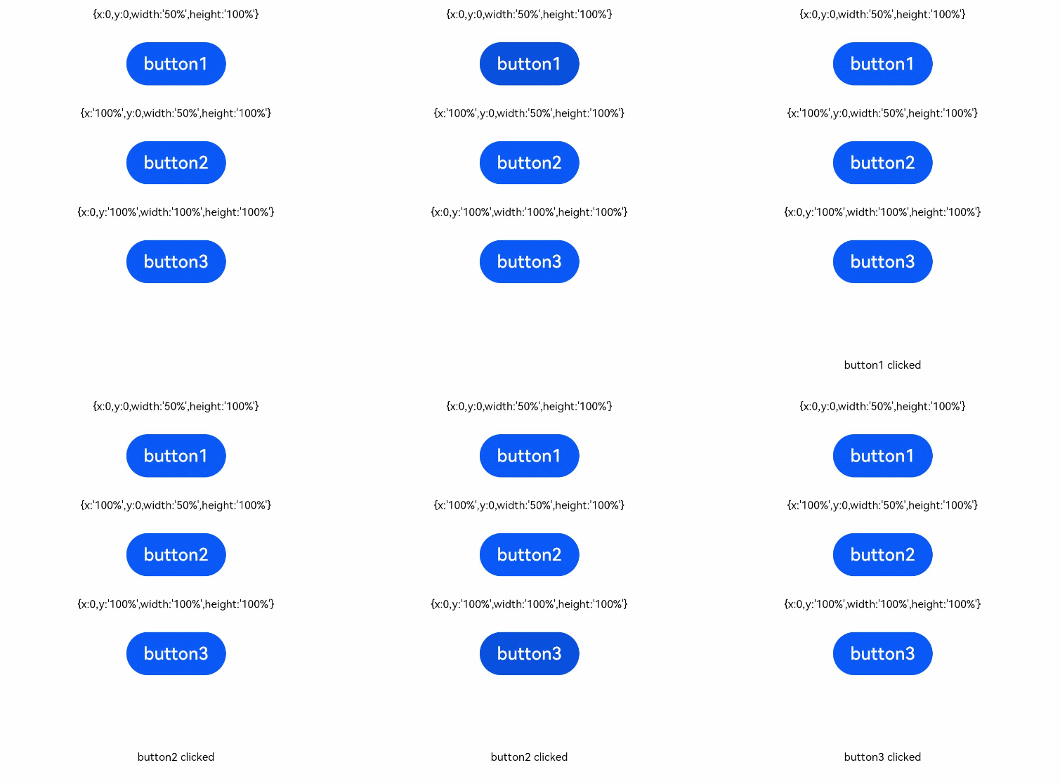
      Text("{x:0,y:0,width:'50%',height:'100%'}")
      // The width of the touch target is half of that of the button. The user will get no response if they touch the right of the button.
      Button("button1")
        .responseRegion({ x: 0, y: 0, width: '50%', height: '100%' })
        .onClick(() => {
          this.text = 'button1 clicked'
        })

      // The touch target is located rightward by one button width, with its width half of the button width. The touch event is triggered if the left of the right part of button2 is touched.
      Text("{x:'100%',y:0,width:'50%',height:'100%'}")
      Button("button2")
        .responseRegion({ x: '100%', y: 0, width: '50%', height: '100%' })
        .onClick(() => {
          this.text = 'button2 clicked'
        })
      // The touch target is located downward by one button height, with its size equal to the button size. The touch event is triggered if the lower part of button3 is touched.
      Text("{x:0,y:'100%',width:'100%',height:'100%'}")
      Button("button3")
        .responseRegion({ x: 0, y: '100%', width: '100%', height: '100%' })
        .onClick(() => {
          this.text = 'button3 clicked'
        })

      Text(this.text).margin({ top: 50 })
    }.width('100%').margin({ top: 10 })
  }
}

你可能感兴趣的鸿蒙文章
harmony 鸿蒙ArkTS-based Declarative Development Paradigm
- 所属分类: 后端技术
- 本文标签: