harmony 鸿蒙ArkUI Subsystem Changelog
ArkUI Subsystem Changelog
cl.arkui.1 Changes in the Default QR Code Color, Background Color, and Size
Access Level
Public
Reason for Change
The default color and size of the <QRCode> component do not comply with the UX specifications.
Change Impact
This change is a compatible change. It delivers a more visually appealing component.
API Level
7
Key API/Component Changes
In versions earlier than API version 11, the <QRCode> component uses the following default settings: color: Color.Black; background color: Color.White; width and height: same as the parent component.

Since API version 11, the <QRCode> component uses the following default settings: color: ohos_id_color_foreground; background color: ohos_id_color_background; width and height: 240 vp.

Adaptation Guide
For details, see QRCode.
Sample code:
// xxx.ets
@Entry
@Component
struct QRCodeExample {
  private value: string = 'hello world'
  build() {
    Column() {
      QRCode(this.value)
    }.width('100%').height('100%')
  }
}
cl.arkui.2 Changes to the <Refresh> Component
Access Level
Public
Reason for Change
The UI specifications are changed to bring about UX enhancement.
Change Impact
- Default refresh settings
In versions earlier than API version 11, child components of the <Refresh> component do not move down with the pull-down gesture, and the edge bounce effect of the component is independent of the loading.

Since API version 11, child components of the <Refresh> component move down with the pull-down gesture.
- Custom refresh settings with the builder API
In versions earlier than API version 11, the <Refresh> component is embedded with child components, with a height not greater than 64 vp. The edge bounce effect of the scrolling component and the custom refresh style for the pull-down gesture take effect at the same time.
Since API version 11, child components of the <Refresh> component move down with the pull-down gesture. There are no constraints on the height of the custom refresh component with the builder API.
- friction API
In versions earlier than API version 11, the <Refresh> component’s sensitivity to the pull-down gesture is set through the friction API. Since API version 11, the <Refresh> component’s sensitivity to the pull-down gesture decreases with the pull-down gesture. The friction API has no effect.
- offset API
In versions earlier than API version 11, the pull-down distance required for the <loadingProgress> component to start to display is set through the offset API of the <Refresh> component. Since API version 11, the pull-down distance required for the <loadingProgress> component to start to display is fixed at 16 vp. The friction API has no effect.
API Level
8
Change Since
OpenHarmony SDK 4.1.2.2
Key API/Component Changes
Refresh
Adaptation Guide
- Default refresh settings
For details, see Refresh.
Sample code:
@Entry
@Component
struct RefreshExample {
@State isRefreshing: boolean = false
@State arr: String[] = ['0', '1', '2', '3', '4','5','6','7','8','9','10']
build() {
Column() {
Refresh({ refreshing: $$this.isRefreshing}) {
List() {
ForEach(this.arr, (item: string) => {
ListItem() {
Text('' + item)
.width('100%').height(100).fontSize(16)
.textAlign(TextAlign.Center).borderRadius(10).backgroundColor(0xFFFFFF)
}
}, (item: string) => item)
}
.onScrollIndex((first: number) => {
console.info(first.toString())
})
.width('100%')
.height('100%')
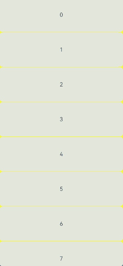
.divider({strokeWidth:1,color:Color.Yellow,startMargin:10,endMargin:10})
.scrollBar(BarState.Off)
.backgroundColor(Color.Yellow)
}
.onStateChange((refreshStatus: RefreshStatus) => {
console.info('Refresh onStatueChange state is ' + refreshStatus)
})
.onRefreshing(() => {
setTimeout(() => {
this.isRefreshing = false
}, 2000)
console.log('onRefreshing test')
})
.backgroundColor(0x89CFF0)
}
}
}
- Custom refresh settings with the builder API
For details, see Refresh.
Sample code:
// xxx.ets
@Entry
@Component
struct RefreshExample {
  @State isRefreshing: boolean = false
  @State arr: String[] = ['0', '1', '2', '3', '4','5','6','7','8','9','10']
  @Builder
  customRefreshComponent()
  {
    Stack()
    {
      Row()
      {
        LoadingProgress().height(32)
        Text("Refreshing...").fontSize(16).margin({left:20})
      }
      .alignItems(VerticalAlign.Center)
    }.width("100%").align(Alignment.Center)
  }

  build() {
    Column() {
      Refresh({ refreshing: $$this.isRefreshing,builder:this.customRefreshComponent()}) {
        List() {
          ForEach(this.arr, (item: string) => {
            ListItem() {
              Text('' + item)
                .width('100%').height(100).fontSize(16)
                .textAlign(TextAlign.Center).borderRadius(10).backgroundColor(0xFFFFFF)
            }
          }, (item: string) => item)
        }
        .onScrollIndex((first: number) => {
          console.info(first.toString())
        })
        .width('100%')
        .height('100%')
        .divider({strokeWidth:1,color:Color.Yellow,startMargin:10,endMargin:10})
        .scrollBar(BarState.Off)
        .backgroundColor(Color.Yellow)
      }
      .onStateChange((refreshStatus: RefreshStatus) => {
        console.info('Refresh onStatueChange state is ' + refreshStatus)
      })
      .onRefreshing(() => {
        setTimeout(() => {
          this.isRefreshing = false
        }, 2000)
        console.log('onRefreshing test')
      })
      .backgroundColor(0x89CFF0)
    }
  }
}
- friction and offset APIs
No adaptation is required.
你可能感兴趣的鸿蒙文章
- 所属分类: 后端技术
- 本文标签:
热门推荐
-
2、 优质文章
-
3、 gt
-
7、 openharmony
-
9、 golang
-
10、 Vue中input框自动聚焦