harmony 鸿蒙Refresh
Refresh
The Refresh component is a container that provides the pull-to-refresh feature.
NOTE
This component is supported since API version 8. Updates will be marked with a superscript to indicate their earliest API version.
This component provides linkage with a vertical scrolling Swiper and Web component since API version 12. The linkage does not work if the loop attribute of Swiper is set to true.
Child Components
This component supports only one child component.
Since API version 11, this component’s child component moves down with the pull-down gesture.
APIs
Refresh(value: RefreshOptions)
Creates a Refresh container.
Atomic service API: This API can be used in atomic services since API version 11.
System capability: SystemCapability.ArkUI.ArkUI.Full
Parameters
| Name | Type | Mandatory | Description |
|---|---|---|---|
| value | RefreshOptions | Yes | Parameters of the Refresh component. |
RefreshOptions
Defines the options of the Refresh component.
System capability: SystemCapability.ArkUI.ArkUI.Full
| Name | Type | Mandatory | Description |
|---|---|---|---|
| refreshing | boolean | Yes | Whether the component is being refreshed. The value true means that the component is being refreshed, and false means the opposite. Default value: false This parameter supports two-way binding through $$. Atomic service API: This API can be used in atomic services since API version 11. |
| offset(deprecated) | number |string | No | Distance from the pull-down starting point to the top of the component. Default value: 16. Unit: vp. If the type is string, the pixel unit must be explicitly specified, for example, ‘10px’; if the unit is not specified, for example, ‘10’, the default unit vp is used. This API is deprecated since API version 11. No substitute API is provided. NOTE The value range of offset is [0vp, 64vp]. If the value is greater than 64 vp, the value 64 vp will be used. The value cannot be a percentage or a negative number. |
| friction(deprecated) | number |string | No | Coefficient of friction, which indicates the Default value: 62 - 0 indicates that the Refresh component is not responsive to the pull-down gesture. - 100 indicates that the Refresh component is highly responsive to the pull-down gesture. - A larger value indicates higher responsiveness of the Refresh component to the pull-down gesture. This API is deprecated since API version 11. You can use pullDownRatio instead since API version 12. |
| builder10+ | CustomBuilder | No | Custom content in the refreshing area. NOTE In API version 10 and earlier versions, there is a height limit of 64 vp on custom components. This restriction is removed since API version 11. When a custom component is set with a fixed height, it will be displayed below the refreshing area at that fixed height; when the custom component does not have a height set, its height will adapt to the height of the refreshing area, which may result in the height of the custom component changing to 0 along with the refreshing area. To maintain the intended layout, configure a minimum height constraint for a custom component, which ensures that the component’s height does not fall below a certain threshold. For details about how to apply this constraint, see Example 3. Since API version 12, use refreshingContent instead of builder for customizing the content of the refreshing area, to avoid animation interruptions caused by the destruction and re-creation of the custom component during the refreshing process. Atomic service API: This API can be used in atomic services since API version 11. |
| promptText12+ | ResourceStr | No | Custom text displayed at the bottom of the refreshing area. NOTE When setting the text, follow the constraints on the Text components. If you are using builder or refreshingContent to customize the content displayed in the refreshing area, the text set with promptText will not be displayed. When promptText is set and effective, the refreshOffset attribute defaults to 96 vp. The maximum font scale factor for the custom text, as specified by maxFontScale, is 2. Atomic service API: This API can be used in atomic services since API version 12. |
| refreshingContent12+ | ComponentContent | No | Custom content in the refreshing area. NOTE If this parameter and the builder parameter are set at the same time, the builder parameter does not take effect. When a custom component is set with a fixed height, it will be displayed below the refreshing area at that fixed height; when the custom component does not have a height set, its height will adapt to the height of the refreshing area, which may result in the height of the custom component changing to 0 along with the refreshing area. To maintain the intended layout, configure a minimum height constraint for a custom component, which ensures that the component’s height does not fall below a certain threshold. For details about how to apply this constraint, see Example 4. Atomic service API: This API can be used in atomic services since API version 12. |
Supplementary Notes - If neither builder nor refreshingContent is set, the pull-down displacement effect is implemented by adjusting the translate attribute of the child component. During the pull-down process, the onAreaChange event of the child component is not triggered, and any changes made to the translate attribute of the child component do not take effect. - When builder or refreshingContent is set, the pull-down displacement effect is implemented by adjusting the position of the child component relative to the Refresh component. During the pull-down process, the onAreaChange event of the child component can be triggered. However, if the position attribute is set for the child component, the position of the child component relative to the Refresh component is fixed, preventing the child component from moving down with the pull gesture.
Attributes
In addition to the universal attributes, the following attributes are supported.
refreshOffset12+
refreshOffset(value: number)
Sets the minimum pull-down offset required to trigger a refresh. If the distance pulled down is less than the value specified by this attribute, releasing the gesture does not trigger a refresh.
Atomic service API: This API can be used in atomic services since API version 12.
System capability: SystemCapability.ArkUI.ArkUI.Full
Parameters
| Name | Type | Mandatory | Description |
|---|---|---|---|
| value | number | Yes | Pull-down offset, in vp. Default value: 96 vp when promptText is set and 64 vp when promptText is not set. If the value specified is 0 or less than 0, the default value is used. |
pullToRefresh12+
pullToRefresh(value: boolean)
Sets whether to initiate a refresh when the pull-down distance exceeds the value of refreshOffset.
Atomic service API: This API can be used in atomic services since API version 12.
System capability: SystemCapability.ArkUI.ArkUI.Full
Parameters
| Name | Type | Mandatory | Description |
|---|---|---|---|
| value | boolean | Yes | Whether to initiate a refresh when the pull-down distance exceeds the value of refreshOffset. The value true means to initiate a refresh, and false means the opposite. Default value: true |
pullDownRatio12+
pullDownRatio(ratio: Optional<number>)
Sets the pull-down ratio.
Atomic service API: This API can be used in atomic services since API version 12.
System capability: SystemCapability.ArkUI.ArkUI.Full
Parameters
| Name | Type | Mandatory | Description |
|---|---|---|---|
| ratio | Optional<number> | Yes | Pull-down ratio. A larger value indicates higher responsiveness to the pull-down gesture. The value 0 indicates that the pull-down does not follow the gesture, and 1 indicates that the pull-down follows the gesture proportionally. If this parameter is not set or is set to undefined, a dynamic pull-down ratio is used. That is, the larger the pull-down distance, the smaller the ratio. The value ranges from 0 to 1. A value less than 0 is handled as 0, and a value greater than 1 is handled as 1. |
maxPullDownDistance20+
maxPullDownDistance(distance: Optional<number>)
Sets the maximum pull-down distance.
Atomic service API: This API can be used in atomic services since API version 20.
System capability: SystemCapability.ArkUI.ArkUI.Full
Parameters
| Name | Type | Mandatory | Description |
|---|---|---|---|
| distance | Optional<number> | Yes | Maximum pull-down distance. The minimum value for the maximum pull-down distance is 0. Values less than 0 are treated as 0. If this value is less than the refresh offset (refreshOffset), the refresh action will not be triggered when the pull-down gesture is released. If set to undefined or null, this parameter is considered not set. Default value: undefined. |
Events
In addition to the universal events, the following events are supported.
onStateChange
onStateChange(callback: (state: RefreshStatus) => void)
Called when the refresh status changes.
Atomic service API: This API can be used in atomic services since API version 11.
System capability: SystemCapability.ArkUI.ArkUI.Full
Parameters
| Name | Type | Mandatory | Description |
|---|---|---|---|
| state | RefreshStatus | Yes | Refresh status. |
onRefreshing
onRefreshing(callback: () => void)
Called when the component starts refreshing.
Atomic service API: This API can be used in atomic services since API version 11.
System capability: SystemCapability.ArkUI.ArkUI.Full
onOffsetChange12+
onOffsetChange(callback: Callback<number>)
Called when the pull-down distance changes.
Atomic service API: This API can be used in atomic services since API version 12.
System capability: SystemCapability.ArkUI.ArkUI.Full
Parameters
| Name | Type | Mandatory | Description |
|---|---|---|---|
| callback | Callback<number> | Yes | Pull-down distance. Unit: vp |
RefreshStatus
Enumerates the states of a refresh operation.
Atomic service API: This API can be used in atomic services since API version 11.
System capability: SystemCapability.ArkUI.ArkUI.Full
| Name | Value | Description |
|---|---|---|
| Inactive | 0 | The component is not pulled down. This is the default value. |
| Drag | 1 | The component is being pulled down, but the pull-down distance is shorter than the minimum length required to trigger the refresh. |
| OverDrag | 2 | The component is being pulled down, and the pull-down distance exceeds the minimum length required to trigger the refresh. |
| Refresh | 3 | The pull-down ends, and the component rebounds to the minimum length required to trigger the refresh and enters the refreshing state. |
| Done | 4 | The refresh is complete, and the component returns to the initial state (at the top). |
Example
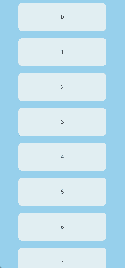
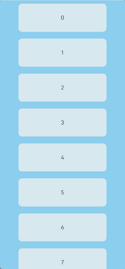
Example 1: Using the Default Refreshing Style
This example implements a Refresh component with its refreshing area in the default style.
// xxx.ets
@Entry
@Component
struct RefreshExample {
  @State isRefreshing: boolean = false;
  @State arr: String[] = ['0', '1', '2', '3', '4', '5', '6', '7', '8', '9', '10'];

  build() {
    Column() {
      Refresh({ refreshing: $$this.isRefreshing }) {
        List() {
          ForEach(this.arr, (item: string) => {
            ListItem() {
              Text('' + item)
                .width('70%')
                .height(80)
                .fontSize(16)
                .margin(10)
                .textAlign(TextAlign.Center)
                .borderRadius(10)
                .backgroundColor(0xFFFFFF)
            }
          }, (item: string) => item)
        }
        .onScrollIndex((first: number) => {
          console.info(first.toString());
        })
        .width('100%')
        .height('100%')
        .alignListItem(ListItemAlign.Center)
        .scrollBar(BarState.Off)
      }
      .onStateChange((refreshStatus: RefreshStatus) => {
        console.info('Refresh onStatueChange state is ' + refreshStatus);
      })
      .onOffsetChange((value: number) => {
        console.info('Refresh onOffsetChange offset:' + value);
      })
      .onRefreshing(() => {
        setTimeout(() => {
          this.isRefreshing = false;
        }, 2000)
        console.log('onRefreshing test');
      })
      .backgroundColor(0x89CFF0)
      .refreshOffset(64)
      .pullToRefresh(true)
    }
  }
}
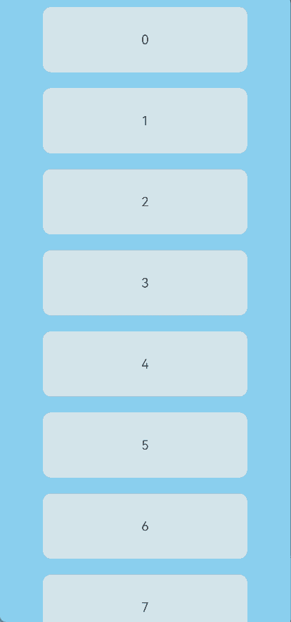
Example 2: Setting the Text Displayed in the Refreshing Area
This example shows how to set the text displayed in the refreshing area using the promptText parameter.
// xxx.ets
@Entry
@Component
struct RefreshExample {
  @State isRefreshing: boolean = false;
  @State promptText: string = "Refreshing...";
  @State arr: String[] = ['0', '1', '2', '3', '4', '5', '6', '7', '8', '9', '10'];

  build() {
    Column() {
      Refresh({ refreshing: $$this.isRefreshing, promptText: this.promptText }) {
        List() {
          ForEach(this.arr, (item: string) => {
            ListItem() {
              Text('' + item)
                .width('70%')
                .height(80)
                .fontSize(16)
                .margin(10)
                .textAlign(TextAlign.Center)
                .borderRadius(10)
                .backgroundColor(0xFFFFFF)
            }
          }, (item: string) => item)
        }
        .onScrollIndex((first: number) => {
          console.info(first.toString());
        })
        .width('100%')
        .height('100%')
        .alignListItem(ListItemAlign.Center)
        .scrollBar(BarState.Off)
      }
      .backgroundColor(0x89CFF0)
      .pullToRefresh(true)
      .refreshOffset(96)
      .onStateChange((refreshStatus: RefreshStatus) => {
        console.info('Refresh onStatueChange state is ' + refreshStatus);
      })
      .onOffsetChange((value: number) => {
        console.info('Refresh onOffsetChange offset:' + value);
      })
      .onRefreshing(() => {
        setTimeout(() => {
          this.isRefreshing = false;
        }, 2000)
        console.log('onRefreshing test');
      })
    }
  }
}
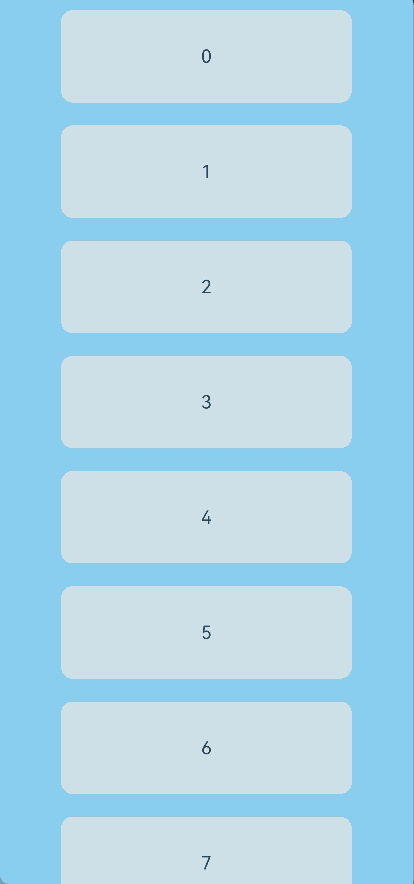
Example 3: Customizing the Refreshing Area Content with builder
This example shows how to customize the content displayed in the refreshing area using the builder parameter.
// xxx.ets
@Entry
@Component
struct RefreshExample {
  @State isRefreshing: boolean = false;
  @State arr: String[] = ['0', '1', '2', '3', '4', '5', '6', '7', '8', '9', '10'];

  @Builder
  customRefreshComponent() {
    Stack() {
      Row() {
        LoadingProgress().height(32)
        Text("Refreshing...").fontSize(16).margin({ left: 20 })
      }
      .alignItems(VerticalAlign.Center)
    }
    .align(Alignment.Center)
    .clip(true)
    // Set a minimum height constraint to ensure that the height of the custom component does not fall below the specified minHeight when the height of the refreshing area changes.
    .constraintSize({ minHeight: 32 })
    .width("100%")
  }

  build() {
    Column() {
      Refresh({ refreshing: $$this.isRefreshing, builder: this.customRefreshComponent() }) {
        List() {
          ForEach(this.arr, (item: string) => {
            ListItem() {
              Text('' + item)
                .width('70%')
                .height(80)
                .fontSize(16)
                .margin(10)
                .textAlign(TextAlign.Center)
                .borderRadius(10)
                .backgroundColor(0xFFFFFF)
            }
          }, (item: string) => item)
        }
        .onScrollIndex((first: number) => {
          console.info(first.toString());
        })
        .width('100%')
        .height('100%')
        .alignListItem(ListItemAlign.Center)
        .scrollBar(BarState.Off)
      }
      .backgroundColor(0x89CFF0)
      .pullToRefresh(true)
      .refreshOffset(64)
      .onStateChange((refreshStatus: RefreshStatus) => {
        console.info('Refresh onStatueChange state is ' + refreshStatus);
      })
      .onRefreshing(() => {
        setTimeout(() => {
          this.isRefreshing = false;
        }, 2000)
        console.log('onRefreshing test');
      })
    }
  }
}
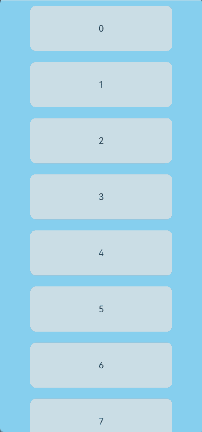
Example 4: Customizing the Refreshing Area Content with refreshingContent
This example shows how to customize the content displayed in the refreshing area using the refreshingContent parameter.
// xxx.ets
import { ComponentContent } from '@ohos.arkui.node';

class Params {
  refreshStatus: RefreshStatus = RefreshStatus.Inactive;

  constructor(refreshStatus: RefreshStatus) {
    this.refreshStatus = refreshStatus;
  }
}

@Builder
function customRefreshingContent(params: Params) {
  Stack() {
    Row() {
      LoadingProgress().height(32)
      Text("refreshStatus: " + params.refreshStatus).fontSize(16).margin({ left: 20 })
    }
    .alignItems(VerticalAlign.Center)
  }
  .align(Alignment.Center)
  .clip(true)
  // Set a minimum height constraint to ensure that the height of the custom component does not fall below the specified minHeight when the height of the refreshing area changes.
  .constraintSize({ minHeight: 32 })
  .width("100%")
}

@Entry
@Component
struct RefreshExample {
  @State isRefreshing: boolean = false;
  @State arr: String[] = ['0', '1', '2', '3', '4', '5', '6', '7', '8', '9', '10'];
  @State refreshStatus: RefreshStatus = RefreshStatus.Inactive;
  private contentNode?: ComponentContent<Object> = undefined;
  private params: Params = new Params(RefreshStatus.Inactive);

  aboutToAppear(): void {
    let uiContext = this.getUIContext();
    this.contentNode = new ComponentContent(uiContext, wrapBuilder(customRefreshingContent), this.params);
  }

  build() {
    Column() {
      Refresh({ refreshing: $$this.isRefreshing, refreshingContent: this.contentNode }) {
        List() {
          ForEach(this.arr, (item: string) => {
            ListItem() {
              Text('' + item)
                .width('70%')
                .height(80)
                .fontSize(16)
                .margin(10)
                .textAlign(TextAlign.Center)
                .borderRadius(10)
                .backgroundColor(0xFFFFFF)
            }
          }, (item: string) => item)
        }
        .onScrollIndex((first: number) => {
          console.info(first.toString());
        })
        .width('100%')
        .height('100%')
        .alignListItem(ListItemAlign.Center)
        .scrollBar(BarState.Off)
      }
      .backgroundColor(0x89CFF0)
      .pullToRefresh(true)
      .refreshOffset(96)
      .onStateChange((refreshStatus: RefreshStatus) => {
        this.refreshStatus = refreshStatus;
        this.params.refreshStatus = refreshStatus;
        // Update the content of the custom component.
        this.contentNode?.update(this.params);
        console.info('Refresh onStatueChange state is ' + refreshStatus);
      })
      .onRefreshing(() => {
        setTimeout(() => {
          this.isRefreshing = false;
        }, 2000)
        console.log('onRefreshing test');
      })
    }
  }
}
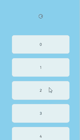
Example 5: Implementing the Maximum Pull-down Distance
This example shows how to use the pullDownRatio attribute and the onOffsetChange event to implement the maximum pull-down distance.
// xxx.ets
import { ComponentContent } from '@ohos.arkui.node';

@Builder
function customRefreshingContent() {
  Stack() {
    Row() {
      LoadingProgress().height(32)
    }
    .alignItems(VerticalAlign.Center)
  }
  .align(Alignment.Center)
  .clip(true)
  // Set a minimum height constraint to ensure that the height of the custom component does not fall below the specified minHeight when the height of the refreshing area changes.
  .constraintSize({ minHeight: 32 })
  .width("100%")
}

@Entry
@Component
struct RefreshExample {
  @State isRefreshing: boolean = false;
  @State arr: String[] = ['0', '1', '2', '3', '4', '5', '6', '7', '8', '9', '10'];
  @State maxRefreshingHeight: number = 100.0;
  @State ratio: number = 1;
  private contentNode?: ComponentContent<Object> = undefined;

  aboutToAppear(): void {
    let uiContext = this.getUIContext();
    this.contentNode = new ComponentContent(uiContext, wrapBuilder(customRefreshingContent));
  }

  build() {
    Column() {
      Refresh({ refreshing: $$this.isRefreshing, refreshingContent: this.contentNode }) {
        List() {
          ForEach(this.arr, (item: string) => {
            ListItem() {
              Text('' + item)
                .width('70%')
                .height(80)
                .fontSize(16)
                .margin(10)
                .textAlign(TextAlign.Center)
                .borderRadius(10)
                .backgroundColor(0xFFFFFF)
            }
          }, (item: string) => item)
        }
        .onScrollIndex((first: number) => {
          console.info(first.toString());
        })
        .width('100%')
        .height('100%')
        .alignListItem(ListItemAlign.Center)
        .scrollBar(BarState.Off)
      }
      .backgroundColor(0x89CFF0)
      .pullDownRatio(this.ratio)
      .pullToRefresh(true)
      .refreshOffset(64)
      .onOffsetChange((offset: number) => {
        // The closer to the maximum distance, the smaller the pull-down ratio.
        this.ratio = 1 - Math.pow((offset / this.maxRefreshingHeight), 3);
      })
      .onStateChange((refreshStatus: RefreshStatus) => {
        console.info('Refresh onStatueChange state is ' + refreshStatus);
      })
      .onRefreshing(() => {
        setTimeout(() => {
          this.isRefreshing = false;
        }, 2000)
        console.log('onRefreshing test');
      })
    }
  }
}
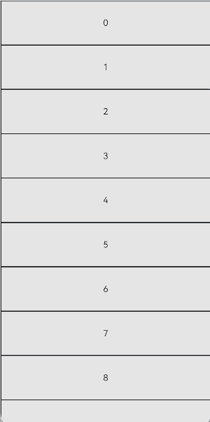
Example 6: Implementing Pull-Down-to-Refresh and Pull-Up-to-Load-More
This example demonstrates how to combine the Refresh component with the List component to implement pull-down-to-refresh and pull-up-to-load-more features.
// xxx.ets
@Entry
@Component
struct ListRefreshLoad {
  @State arr: Array<number> = [0, 1, 2, 3, 4, 5, 6, 7, 8, 9, 10];
  @State refreshing: boolean = false;
  @State refreshOffset: number = 0;
  @State refreshState: RefreshStatus = RefreshStatus.Inactive;
  @State isLoading: boolean = false;

  @Builder
  refreshBuilder() {
    Stack({ alignContent: Alignment.Bottom }) {
      // The Progress component is displayed based on the refresh state.
      // It is only shown when the refresh state is Drag or Refresh.
      if (this.refreshState != RefreshStatus.Inactive && this.refreshState != RefreshStatus.Done) {
        Progress({ value: this.refreshOffset, total: 64, type: ProgressType.Ring })
          .width(32).height(32)
          .style({ status: this.refreshing ? ProgressStatus.LOADING : ProgressStatus.PROGRESSING })
          .margin(10)
      }
    }
    .clip(true)
    .height("100%")
    .width("100%")
  }

  @Builder
  footer() {
    Row() {
      LoadingProgress().height(32).width(48)
      Text("Loading")
    }.width("100%")
    .height(64)
    .justifyContent(FlexAlign.Center)
    // The component is hidden when not in the loading state.
    .visibility(this.isLoading ? Visibility.Visible : Visibility.Hidden)
  }

  build() {
    Refresh({ refreshing: $$this.refreshing, builder: this.refreshBuilder() }) {
      List() {
        ForEach(this.arr, (item: number) => {
          ListItem() {
            Text('' + item)
              .width('100%')
              .height(80)
              .fontSize(16)
              .textAlign(TextAlign.Center)
              .backgroundColor(0xFFFFFF)
          }.borderWidth(1)
        }, (item: string) => item)

        ListItem() {
          this.footer();
        }
      }
      .onScrollIndex((start: number, end: number) => {
        // Trigger new data loading when the end of the list is reached.
        if (end >= this.arr.length - 1) {
          this.isLoading = true;
          // Simulate new data loading.
          setTimeout(() => {
            for (let i = 0; i < 10; i++) {
              this.arr.push(this.arr.length);
              this.isLoading = false;
            }
          }, 700)
        }
      })
      .scrollBar(BarState.Off)
      // Enable the effect used when the scroll boundary is reached.
      .edgeEffect(EdgeEffect.Spring, { alwaysEnabled: true })
    }
    .width('100%')
    .height('100%')
    .backgroundColor(0xDCDCDC)
    .onOffsetChange((offset: number) => {
      this.refreshOffset = offset;
    })
    .onStateChange((state: RefreshStatus) => {
      this.refreshState = state;
    })
    .onRefreshing(() => {
      // Simulate data refreshing.
      setTimeout(() => {
        this.refreshing = false;
      }, 2000)
    })
  }
}
Example 7: Setting the Maximum Pull-Down Distance
This example demonstrates how to set the maximum pull-down distance using the maxPullDownDistance attribute.
// xxx.ets
@Entry
@Component
struct RefreshExample {
  @State isRefreshing: boolean = false
  @State arr: String[] = ['0', '1', '2', '3', '4', '5', '6', '7', '8', '9', '10']

  build() {
    Column() {
      Refresh({ refreshing: $$this.isRefreshing }) {
        List() {
          ForEach(this.arr, (item: string) => {
            ListItem() {
              Text('' + item)
                .width('70%')
                .height(80)
                .fontSize(16)
                .margin(10)
                .textAlign(TextAlign.Center)
                .borderRadius(10)
                .backgroundColor(0xFFFFFF)
            }
          }, (item: string) => item)
        }
        .onScrollIndex((first: number) => {
          console.info(first.toString())
        })
        .width('100%')
        .height('100%')
        .alignListItem(ListItemAlign.Center)
        .scrollBar(BarState.Off)
      }
      .maxPullDownDistance(150)
      .onStateChange((refreshStatus: RefreshStatus) => {
        console.info('Refresh onStatueChange state is ' + refreshStatus)
      })
      .onOffsetChange((value: number) => {
        console.info('Refresh onOffsetChange offset:' + value)
      })
      .onRefreshing(() => {
        setTimeout(() => {
          this.isRefreshing = false
        }, 2000)
        console.log('onRefreshing test')
      })
      .backgroundColor(0x89CFF0)
      .refreshOffset(64)
      .pullToRefresh(true)
    }
  }
}
你可能感兴趣的鸿蒙文章
- 所属分类: 后端技术
- 本文标签:
热门推荐
-
2、 优质文章
-
3、 gt
-
7、 openharmony
-
9、 golang
-
10、 Vue中input框自动聚焦