harmony 鸿蒙List
List
The List component provides a list container that presents a series of list items arranged in a column with the same width. It supports presentations of the same type of data in a multiple and coherent row style, for example, images or text.
NOTE
This component is supported since API version 7. Updates will be marked with a superscript to indicate their earliest API version.
Child Components
Only the ListItem and ListItemGroup child components are allowed, with support for if/else, ForEach, LazyForEach, and Repeat rendering control.
NOTE
Below are the rules for calculating the indexes of the child components of List:
The index increases in ascending order of child components.
In the if/else statement, only the child components for which the condition evaluates to true participate in the index calculation.
In the ForEach, LazyForEach, or Repeat statement, the indexes of all expanded subnodes are calculated.
After changes occur in if/else, ForEach, LazyForEach, or Repeat, the indexes of the child nodes are updated.
Each ListItemGroup component is taken as a whole and assigned an index, and the indexes of the list items within are not included in the index calculation.
Child components of List whose visibility attribute is set to Hidden or None are included in the index calculation.
APIs
List(value?: ListOptions)
Widget capability: This API can be used in ArkTS widgets since API version 9.
Atomic service API: This API can be used in atomic services since API version 11.
System capability: SystemCapability.ArkUI.ArkUI.Full
Parameters
| Name | Type | Mandatory | Description |
|---|---|---|---|
| value | ListOptions | No | Options of the List component. |
ListOptions18+
Defines the options of the List component.
Widget capability: This API can be used in ArkTS widgets since API version 18.
Atomic service API: This API can be used in atomic services since API version 18.
System capability: SystemCapability.ArkUI.ArkUI.Full
| Name | Type | Mandatory | Description |
|---|---|---|---|
| initialIndex | number | No | Index of the item to be displayed at the start when the list is initially loaded. Default value: 0 NOTE If the set value is a negative number or is greater than the index of the last item in the list, the value is invalid. In this case, the default value will be used. |
| space | number |string | No | Spacing between list items along the main axis. Default value: 0 If the parameter type is number, the unit is vp. NOTE If this parameter is set to a negative number or a value greater than or equal to the length of the list content area, the default value is used. If this parameter is set to a value less than the width of the list divider, the width of the list divider is used as the spacing. Child components of List whose visibility attribute is set to None are not displayed, but the spacing above and below them still takes effect. |
| scroller | Scroller | No | Scroller, which can be bound to scrollable components. NOTE The scroller cannot be bound to other scrollable components. |
Attributes
In addition to universal attributes and scrollable component common attributes, the following attributes are also supported.
NOTE
The default value of the universal attribute clip is true for the List component.
listDirection
listDirection(value: Axis)
Sets the direction in which the list items are arranged.
Widget capability: This API can be used in ArkTS widgets since API version 9.
Atomic service API: This API can be used in atomic services since API version 11.
System capability: SystemCapability.ArkUI.ArkUI.Full
Parameters
| Name | Type | Mandatory | Description |
|---|---|---|---|
| value | Axis | Yes | Direction in which the list items are arranged. Default value: Axis.Vertical |
divider
divider(value: ListDividerOptions|null)
Sets the style of the divider for the list items. By default, there is no divider.
If endMargin and startMargin add up to a value that exceeds the column width, they will be set to 0.
strokeWidth, startMargin, and endMargin cannot be set in percentage.
The divider is drawn between list items along the main axis, and not above the first list item and below the last list item.
In multi-column mode, the value of startMargin is calculated from the start edge of the cross axis of each column. In other cases, it is calculated from the start edge of the cross axis of the list.
When a list item has polymorphic styles applied, the dividers above and below the pressed child component are not rendered.
Widget capability: This API can be used in ArkTS widgets since API version 9.
Atomic service API: This API can be used in atomic services since API version 11.
System capability: SystemCapability.ArkUI.ArkUI.Full
Parameters
| Name | Type | Mandatory | Description |
|---|---|---|---|
| value | ListDividerOptions |null | Yes | Style of the divider for the list items. Default value: null |
scrollBar
scrollBar(value: BarState)
Sets the scrollbar state.
Widget capability: This API can be used in ArkTS widgets since API version 9.
Atomic service API: This API can be used in atomic services since API version 11.
System capability: SystemCapability.ArkUI.ArkUI.Full
Parameters
| Name | Type | Mandatory | Description |
|---|---|---|---|
| value | BarState | Yes | Scrollbar state. Default value: BarState.Auto NOTE In API version 9 and earlier versions, the default value is BarState.Off. Since API version 10, the default value is BarState.Auto. |
cachedCount
cachedCount(value: number)
Sets the number of list items or list item groups to be preloaded (cached). In a lazy loading scenario, only the content equivalent to cachedCount outside the visible area of the list is preloaded. In a non-lazy loading scenario, all items are loaded at once. For both lazy and non-lazy loading, only the content within the list display area plus the content equivalent to cachedCount outside the display area is laid out. For details, see Minimizing White Blocks During Swiping.
When cachedCount is set for a list, the system preloads and lays out the cachedCount-specified number of rows of list items both above and below the currently visible area of the list. When calculating the number of rows for list items, the system takes into account the number of rows from the list items within a list item group. If a list item group does not contain any list items, then the entire list item group is counted as one row.
When a list is nested with LazyForEach, and within LazyForEach there is a list item group, LazyForEach will create cachedCount-specified number of list item groups both above and below the currently visible area of the list.
Widget capability: This API can be used in ArkTS widgets since API version 9.
Atomic service API: This API can be used in atomic services since API version 11.
System capability: SystemCapability.ArkUI.ArkUI.Full
Parameters
| Name | Type | Mandatory | Description |
|---|---|---|---|
| value | number | Yes | Number of list items or list item groups to be preloaded (cached). Default value: number of nodes visible on the screen, with the maximum value of 16 Value range: [0, +∞) |
cachedCount14+
cachedCount(count: number, show: boolean)
Sets the number of list items or list item groups to be cached (preloaded) and specifies whether to display the preloaded nodes.
When cachedCount is set for the list, the system preloads and lays out the cachedCount-specified number of rows of list items both above and below the currently visible area of the list. When calculating the number of rows for list items, the system takes into account the number of rows from the list items within a list item group. If a list item group does not contain any list items, then the entire list item group is counted as one row. This attribute can be combined with the clip or content clipping attributes to display the preloaded nodes.
Widget capability: This API can be used in ArkTS widgets since API version 14.
Atomic service API: This API can be used in atomic services since API version 14.
System capability: SystemCapability.ArkUI.ArkUI.Full
Parameters
| Name | Type | Mandatory | Description |
|---|---|---|---|
| count | number | Yes | Number of list items to be preloaded. Default value: number of nodes visible on the screen, with the maximum value of 16 Value range: [0, +∞) |
| show | boolean | Yes | Whether to display the preloaded list items. Default value: false |
editMode(deprecated)
editMode(value: boolean)
Sets whether to enable edit mode. For details about how to delete selected list items, see Example 3.
This API is deprecated since API version 9. There is no substitute API.
System capability: SystemCapability.ArkUI.ArkUI.Full
Parameters
| Name | Type | Mandatory | Description |
|---|---|---|---|
| value | boolean | Yes | Whether to enable edit mode. Default value: false |
edgeEffect
edgeEffect(value: EdgeEffect, options?: EdgeEffectOptions)
Sets the effect used when the scroll boundary is reached.
NOTE
By default, this component can produce a bounce effect only when there is more than one screen of content. To produce a bounce effect when there is less than one screen of content, use the options parameter of the edgeEffect attribute.
Widget capability: This API can be used in ArkTS widgets since API version 9.
Atomic service API: This API can be used in atomic services since API version 11.
System capability: SystemCapability.ArkUI.ArkUI.Full
Parameters
| Name | Type | Mandatory | Description |
|---|---|---|---|
| value | EdgeEffect | Yes | Effect used when the scroll boundary is reached. The spring and shadow effects are supported. Default value: EdgeEffect.Spring |
| options11+ | EdgeEffectOptions | No | Whether to enable the scroll effect when the component content is smaller than the component itself. The value { alwaysEnabled: true } means to enable the scroll effect, and { alwaysEnabled: false } means the opposite. Default value: { alwaysEnabled: false } |
chainAnimation
chainAnimation(value: boolean)
Sets whether to enable chained animations, which provide a visually connected, or “chained,” effect when the list is scrolled or its top or bottom edge is dragged.
With chained animations enabled, list items are spaced apart by a certain distance, which is 20 vp by default and can be adjusted as needed using the space parameter of the List component. During scrolling, the list item being actively dragged by the user’s finger is considered the active object, while adjacent items are driven objects. The active object triggers a physics-based spring animation that affects the driven objects.
When chained animations are active, the list divider is not displayed.
For chained animations to work properly, the following conditions must be met:
The list is configured to use a spring effect when its scroll boundary is reached.
The list is not in multi-column mode.
Widget capability: This API can be used in ArkTS widgets since API version 9.
Atomic service API: This API can be used in atomic services since API version 11.
System capability: SystemCapability.ArkUI.ArkUI.Full
Parameters
| Name | Type | Mandatory | Description |
|---|---|---|---|
| value | boolean | Yes | Whether to enable chained animations. false (default): Chained animations are disabled. true: Chained animations are enabled. |
multiSelectable8+
multiSelectable(value: boolean)
Sets whether to enable multiselect.
Widget capability: This API can be used in ArkTS widgets since API version 9.
Atomic service API: This API can be used in atomic services since API version 11.
System capability: SystemCapability.ArkUI.ArkUI.Full
Parameters
| Name | Type | Mandatory | Description |
|---|---|---|---|
| value | boolean | Yes | Whether to enable multiselect. false (default): Multiselect is disabled. true: Multiselect is enabled. |
lanes9+
lanes(value: number|LengthConstrain, gutter?: Dimension)
Sets the number of columns or rows in the list. If the value is set to the gutter type, it indicates the gap between columns. It takes effect when the number of columns is greater than 1.
The rules are as follows:
- If the value is set to a number, the column width is calculated by dividing the cross-axis width of the List component by the specified number.
- If the value is set to {minLength, maxLength}, the number of columns is adjusted adaptively based on the width of the List component, ensuring that the width respects the {minLength, maxLength} constraints during adaptation. The minLength constraint is prioritized.
- If the value is set to {minLength, maxLength}, and the cross-axis width constraint of the parent component is infinite, the parent component is arranged by column, and the column width is calculated based on the largest list item in the display area.
- Each list item group occupies one row in multi-column mode. Its child list items are arranged based on the lanes attribute of the list.
- If the value is set to {minLength, maxLength}, the number of columns is calculated based on the cross-axis width of the list item group. If the cross-axis width of the list item group is different from that of the list, the number of columns in the list item group may be different from that in the list.
Widget capability: This API can be used in ArkTS widgets since API version 9.
Atomic service API: This API can be used in atomic services since API version 11.
System capability: SystemCapability.ArkUI.ArkUI.Full
Parameters
| Name | Type | Mandatory | Description |
|---|---|---|---|
| value | number |LengthConstrain | Yes | Number of columns or rows in the list. Default value: 1 |
| gutter10+ | Dimension | No | Gap between columns. Default value: 0 |
alignListItem9+
alignListItem(value: ListItemAlign)
Alignment mode of list items along the cross axis when the cross-axis width of the list is greater than the cross-axis width of list items multiplied by the value of lanes.
Widget capability: This API can be used in ArkTS widgets since API version 9.
Atomic service API: This API can be used in atomic services since API version 11.
System capability: SystemCapability.ArkUI.ArkUI.Full
Parameters
| Name | Type | Mandatory | Description |
|---|---|---|---|
| value | ListItemAlign | Yes | Alignment mode of list items along the cross axis. Default value: ListItemAlign.Start |
sticky9+
sticky(value: StickyStyle)
Sets whether to pin the header to the top or the footer to the bottom in the list item group, if set. To support both the pin-to-top and pin-to-bottom features, set sticky to StickyStyle.Header |StickyStyle.Footer.
NOTE
Occasionally, after sticky is set, floating-point calculation precision may result in small gaps appearing during scrolling. To address this issue, you can apply the pixelRound attribute to the current component, which rounds down the pixel values and help eliminate the gaps.
Widget capability: This API can be used in ArkTS widgets since API version 9.
Atomic service API: This API can be used in atomic services since API version 11.
System capability: SystemCapability.ArkUI.ArkUI.Full
Parameters
| Name | Type | Mandatory | Description |
|---|---|---|---|
| value | StickyStyle | Yes | Whether to pin the header to the top or the footer to the bottom in the list item group. Default value: StickyStyle.None |
scrollSnapAlign10+
scrollSnapAlign(value: ScrollSnapAlign)
Sets the scroll snap alignment effect for list items. This effect aligns list items to the nearest snap point when scrolling ends.
This attribute is effective only when all list items have the same height.
It does not take effect when scrolling ends using a touchpad or mouse device.
During the alignment animation, the scroll operation source type reported by the onWillScroll event is ScrollSource.FLING.
Atomic service API: This API can be used in atomic services since API version 11.
System capability: SystemCapability.ArkUI.ArkUI.Full
Parameters
| Name | Type | Mandatory | Description |
|---|---|---|---|
| value | ScrollSnapAlign | Yes | Alignment mode of the scroll snap position. Default value: ScrollSnapAlign.NONE |
enableScrollInteraction10+
enableScrollInteraction(value: boolean)
Sets whether to support scroll gestures. When this attribute is set to false, scrolling by finger or mouse is not supported, but the scroll controller API is not affected.
Atomic service API: This API can be used in atomic services since API version 11.
System capability: SystemCapability.ArkUI.ArkUI.Full
Parameters
| Name | Type | Mandatory | Description |
|---|---|---|---|
| value | boolean | Yes | Whether to support scroll gestures. Default value: true |
nestedScroll10+
nestedScroll(value: NestedScrollOptions)
Sets the nested scrolling options. You can set the nested scrolling mode in the forward and backward directions to implement scrolling linkage with the parent component.
Atomic service API: This API can be used in atomic services since API version 11.
System capability: SystemCapability.ArkUI.ArkUI.Full
Parameters
| Name | Type | Mandatory | Description |
|---|---|---|---|
| value | NestedScrollOptions | Yes | Nested scrolling options. |
friction10+
friction(value: number|Resource)
Sets the friction coefficient. It applies only to gestures in the scrolling area, and it affects only indirectly the scroll chaining during the inertial scrolling process. A value less than or equal to 0 evaluates to the default value.
Atomic service API: This API can be used in atomic services since API version 11.
System capability: SystemCapability.ArkUI.ArkUI.Full
Parameters
| Name | Type | Mandatory | Description |
|---|---|---|---|
| value | number |Resource | Yes | Friction coefficient. Default value: 0.9 for wearable devices and 0.6 for non-wearable devices. Since API version 11, the default value for non-wearable devices is 0.7. Since API version 12, the default value for non-wearable devices is 0.75. |
contentStartOffset11+
contentStartOffset(value: number)
Sets the offset from the start of the list content to the boundary of the list display area.
Atomic service API: This API can be used in atomic services since API version 12.
System capability: SystemCapability.ArkUI.ArkUI.Full
Parameters
| Name | Type | Mandatory | Description |
|---|---|---|---|
| value | number | Yes | Offset from the start of the list content to the boundary of the list display area. Default value: 0 Unit: vp |
contentEndOffset11+
contentEndOffset(value: number)
Sets the offset from the end of the list content to the boundary of the list display area.
Atomic service API: This API can be used in atomic services since API version 12.
System capability: SystemCapability.ArkUI.ArkUI.Full
Parameters
| Name | Type | Mandatory | Description |
|---|---|---|---|
| value | number | Yes | Offset from the end of the list content to the boundary of the list display area. Default value: 0 Unit: vp |
childrenMainSize12+
childrenMainSize(value: ChildrenMainSize)
Sets the size information of the child components of a List component along the main axis.
Atomic service API: This API can be used in atomic services since API version 12.
System capability: SystemCapability.ArkUI.ArkUI.Full
Parameters
| Name | Type | Mandatory | Description |
|---|---|---|---|
| value | ChildrenMainSize | Yes | 1. Purpose: By providing a ChildrenMainSize object to the List component, it accurately conveys the size information of all child components along the main axis. This enables the List component to maintain an accurate scroll position even when child components have varying sizes on the main axis, when child components are added or removed, or when scrollToIndex is used. This ensures that scrollTo can jump to an exact specified location, currentOffset can obtain the current exact scroll position, and the built-in scrollbar can move smoothly without any discontinuities. 2. Constraints: (1) The provided size along the main axis must be consistent with the actual size of the child components on the main axis. Any changes in size or additions/removals of child components must be communicated to the List component through the ChildrenMainSize object method. (2) When the child component is a list item group, the overall size of the list item group along the main axis must be accurately calculated based on the number of columns in the list item group, the spacing between list items along the main axis, and the size of the header, footer, and list items within the list item group. The calculated size must then be provided to the List component. (3) If child components include list item groups, the childrenMainSize attribute must be set for each individual list item group. Each list item group, as well as the List component itself, must be bound one-to-one with a ChildrenMainSize object through the childrenMainSize attribute. (4) For a multi-column list where child components are generated using LazyForEach, ensure that LazyForEach generates either all ListItemGroup components or all** ListItem** components. |
maintainVisibleContentPosition12+
maintainVisibleContentPosition(enabled: boolean)
Sets whether the visible content position should remain unchanged when data is inserted or deleted above the visible area.
Atomic service API: This API can be used in atomic services since API version 12.
System capability: SystemCapability.ArkUI.ArkUI.Full
Parameters
| Name | Type | Mandatory | Description |
|---|---|---|---|
| enabled | boolean | Yes | Whether the visible content position should remain unchanged when data is inserted or deleted above the visible area. Default value: false false: The visible content position will change when data is inserted or deleted. true: The visible content position remains unchanged when data is inserted or deleted. |
NOTE - The visible content position will only remain unchanged when LazyForEach is used to insert or delete data outside the visible area. If ForEach is used to insert or delete data, or if LazyForEach is used for data reloading, the visible content position will change even if maintainVisibleContentPosition is set to true. - When maintainVisibleContentPosition is set to true, inserting or deleting data above the visible area will trigger onDidScroll and onScrollIndex events. - In a multi-column scenario, setting maintainVisibleContentPosition to true allows you to insert or delete entire rows of data while keeping the visible content position unchanged. If the insertion or deletion does not involve entire rows, however, the visible content position will still change.
stackFromEnd18+
stackFromEnd(enabled: boolean)
Sets whether the list’s layout starts from the bottom (end) rather than the top (beginning).
Atomic service API: This API can be used in atomic services since API version 18.
System capability: SystemCapability.ArkUI.ArkUI.Full
Parameters
| Name | Type | Mandatory | Description |
|---|---|---|---|
| enabled | boolean | Yes | Whether the list’s layout starts from the bottom (end) rather than the top (beginning). false (default): The layout starts from the top. true: The layout starts from the bottom. |
NOTE - When stackFromEnd is set to true, the following rules apply:
If the content of the List component is shorter than the component height, the content will be aligned to the bottom of the component. - If the height of a list item in the visible area changes, or if a new list item is inserted, the list items above the changed or inserted item will move upwards to accommodate the new layout. - The default value of initialIndex becomes the total number of list items minus one.
ListItemAlign9+
Widget capability: This API can be used in ArkTS widgets since API version 9.
Atomic service API: This API can be used in atomic services since API version 11.
System capability: SystemCapability.ArkUI.ArkUI.Full
| Name | Value | Description |
|---|---|---|
| Start | 0 | The list items are packed toward the start edge of the List component along the cross axis. |
| Center | 1 | The list items are centered in the List component along the cross axis. |
| End | 2 | The list items are packed toward the end edge of the List component along the cross axis. |
StickyStyle9+
Widget capability: This API can be used in ArkTS widgets since API version 9.
Atomic service API: This API can be used in atomic services since API version 11.
System capability: SystemCapability.ArkUI.ArkUI.Full
| Name | Value | Description |
|---|---|---|
| None | 0 | In the ListItemGroup component, the header is not pinned to the top, and the footer is not pinned to the bottom. |
| Header | 1 | In the ListItemGroup component, the header is pinned to the top, and the footer is not pinned to the bottom. |
| Footer | 2 | In the ListItemGroup component, the footer is pinned to the bottom, and the header is not pinned to the top. |
ScrollSnapAlign10+
Enumerates the alignment modes of list items when scrolling ends.
When list items are left-, right-, top-, or bottom-aligned, the items at the end must be completely displayed, without exposure of any blank area of the boundary; the items at the other end can be out of alignment.
This API is available only when the heights of list items are the same.
Atomic service API: This API can be used in atomic services since API version 11.
System capability: SystemCapability.ArkUI.ArkUI.Full
| Name | Value | Description |
|---|---|---|
| NONE | 0 | No alignment. This is the default value. |
| START | 1 | The first item in the view is aligned at the start of the list. NOTE When the list hits the end, the items at the end must be completely displayed. In this case, the items at the start may not be aligned. |
| CENTER | 2 | The middle items in the view are aligned in the center of the list. NOTE The top and end items can be aligned in the center of the list. In this case, a blank area may result, and the first or last item is aligned to the center of the list. |
| END | 3 | The last item in the view is aligned at the end of the list. NOTE When the list hits the start, the items at the start must be completely displayed. In this case, the items at the end may not be aligned. |
CloseSwipeActionOptions11+
Implements the callbacks and events for the ListItem in the expanded state.
Atomic service API: This API can be used in atomic services since API version 12.
System capability: SystemCapability.ArkUI.ArkUI.Full
| Name | Type | Mandatory | Description |
|---|---|---|---|
| onFinish | ()=>void | No | Triggered after the collapse animation is complete. |
ListDividerOptions18+
Defines the divider style of the list or list item group.
Widget capability: This API can be used in ArkTS widgets since API version 18.
Atomic service API: This API can be used in atomic services since API version 18.
System capability: SystemCapability.ArkUI.ArkUI.Full
| Name | Type | Mandatory | Description |
|---|---|---|---|
| strokeWidth | Length | Yes | Width of the divider. |
| color | ResourceColor | No | Color of the divider. Default value: 0x08000000 |
| startMargin | Length | No | Distance between the divider and the start edge of the list. Default value: 0, in vp |
| endMargin | Length | No | Distance between the divider and the end edge of the list. Default value: 0, in vp |
Events
In addition to universal events and scrollable component common events, the following events are also supported.
onItemDelete(deprecated)
onItemDelete(event: (index: number) => boolean)
Triggered when a list item is deleted.
This API is deprecated since API version 9. There is no substitute API.
System capability: SystemCapability.ArkUI.ArkUI.Full
Parameters
| Name | Type | Mandatory | Description |
|---|---|---|---|
| index | number | Yes | Index of the deleted list item. |
Return value
| Type | Description |
|---|---|
| boolean | Whether the list item is deleted. |
onScrollIndex
onScrollIndex(event: (start: number, end: number, center: number) => void)
Triggered when a child component enters or leaves the list display area. During index calculation, each ListItemGroup component is taken as a whole and assigned an index, and the indexes of the list items within are not included in the calculation.
When the list edge scrolling effect is the spring effect, the onScrollIndex event is not triggered when the user scrolls the list to the edge or releases the list to rebound.
This event is triggered once when the list is initialized and when the index of the first list item or the next list item in the list display area changes.
Since API version 10, this event is also triggered when the child component in the center of the list display area changes.
Widget capability: This API can be used in ArkTS widgets since API version 9.
Atomic service API: This API can be used in atomic services since API version 11.
System capability: SystemCapability.ArkUI.ArkUI.Full
Parameters
| Name | Type | Mandatory | Description |
|---|---|---|---|
| start | number | Yes | Index of the first child component in the list display area. |
| end | number | Yes | Index of the last child component in the list display area. |
| center10+ | number | Yes | Index of the center child component in the list display area. |
onReachStart
onReachStart(event: () => void)
Triggered when the list reaches the start position.
This event is triggered once when initialIndex is 0 during list initialization and once when the list scrolls to the start position. When the list edge scrolling effect is the spring effect, this event is triggered once when the list passes the start position and is triggered again when the list returns to the start position.
Widget capability: This API can be used in ArkTS widgets since API version 9.
Atomic service API: This API can be used in atomic services since API version 11.
System capability: SystemCapability.ArkUI.ArkUI.Full
onReachEnd
onReachEnd(event: () => void)
Triggered when the list reaches the end position.
When the list edge scrolling effect is the spring effect, this event is triggered once when the list passes the end position and is triggered again when the list returns to the end position.
Widget capability: This API can be used in ArkTS widgets since API version 9.
Atomic service API: This API can be used in atomic services since API version 11.
System capability: SystemCapability.ArkUI.ArkUI.Full
onScrollFrameBegin9+
onScrollFrameBegin(event: (offset: number, state: ScrollState) => { offsetRemain: number })
Triggered when the list starts to scroll. The input parameters indicate the amount by which the list will scroll. The event handler then works out the amount by which the list needs to scroll based on the real-world situation and returns the result.
If listDirection is set to Axis.Vertical, the return value is the amount by which the list needs to scroll in the vertical direction. If listDirection is set to Axis.Horizontal, the return value is the amount by which the list needs to scroll in the horizontal direction.
This event is triggered when the user starts dragging the list or the list starts inertial scrolling. It is not triggered when the component rebounds, the scrolling controller is used, or the scrollbar is dragged.
Widget capability: This API can be used in ArkTS widgets since API version 9.
Atomic service API: This API can be used in atomic services since API version 11.
System capability: SystemCapability.ArkUI.ArkUI.Full
Parameters
| Name | Type | Mandatory | Description |
|---|---|---|---|
| offset | number | Yes | Amount to scroll by, in vp. |
| state | ScrollState | Yes | Current scroll state. |
Return value
| Type | Description |
|---|---|
| { offsetRemain: number } | Actual amount by which the grid scrolls, in vp. |
onScrollStart9+
onScrollStart(event: () => void)
Triggered when the list starts scrolling initiated by the user’s finger dragging the list or its scrollbar. This event is also triggered when the animation contained in the scrolling triggered by Scroller starts.
Widget capability: This API can be used in ArkTS widgets since API version 9.
Atomic service API: This API can be used in atomic services since API version 11.
System capability: SystemCapability.ArkUI.ArkUI.Full
onScrollStop
onScrollStop(event: () => void)
Triggered when the list stops scrolling after the user’s finger leaves the screen. This event is also triggered when the animation contained in the scrolling triggered by Scroller stops.
Widget capability: This API can be used in ArkTS widgets since API version 9.
Atomic service API: This API can be used in atomic services since API version 11.
System capability: SystemCapability.ArkUI.ArkUI.Full
onItemMove
onItemMove(event: (from: number, to: number) => boolean)
Triggered when a list item moves.
Atomic service API: This API can be used in atomic services since API version 11.
System capability: SystemCapability.ArkUI.ArkUI.Full
Parameters
| Name | Type | Mandatory | Description |
|---|---|---|---|
| from | number | Yes | Index of the item before moving. |
| to | number | Yes | Index of the item after moving. |
Return value
| Type | Description |
|---|---|
| boolean | Whether the item is moved. |
onItemDragStart8+
onItemDragStart(event: (event: ItemDragInfo, itemIndex: number) => ((() => any) |void))
Triggered when a list item starts to be dragged.
Atomic service API: This API can be used in atomic services since API version 11.
System capability: SystemCapability.ArkUI.ArkUI.Full
Parameters
| Name | Type | Mandatory | Description |
|---|---|---|---|
| event | ItemDragInfo | Yes | Information about the drag point. |
| itemIndex | number | Yes | Index of the dragged item. |
onItemDragEnter8+
onItemDragEnter(event: (event: ItemDragInfo) => void)
Triggered when the dragged item enters the drop target of the list.
Atomic service API: This API can be used in atomic services since API version 11.
System capability: SystemCapability.ArkUI.ArkUI.Full
Parameters
| Name | Type | Mandatory | Description |
|---|---|---|---|
| event | ItemDragInfo | Yes | Information about the drag point. |
onItemDragMove8+
onItemDragMove(event: (event: ItemDragInfo, itemIndex: number, insertIndex: number) => void)
Triggered when the dragged item moves over the drop target of the list.
Atomic service API: This API can be used in atomic services since API version 11.
System capability: SystemCapability.ArkUI.ArkUI.Full
Parameters
| Name | Type | Mandatory | Description |
|---|---|---|---|
| event | ItemDragInfo | Yes | Information about the drag point. |
| itemIndex | number | Yes | Initial position of the dragged item. |
| insertIndex | number | Yes | Index of the position to which the dragged item is dropped. |
onItemDragLeave8+
onItemDragLeave(event: (event: ItemDragInfo, itemIndex: number) => void)
Triggered when the dragged item leaves the drop target of the list.
Atomic service API: This API can be used in atomic services since API version 11.
System capability: SystemCapability.ArkUI.ArkUI.Full
Parameters
| Name | Type | Mandatory | Description |
|---|---|---|---|
| event | ItemDragInfo | Yes | Information about the drag point. |
| itemIndex | number | Yes | Index of the dragged item. |
onItemDrop8+
onItemDrop(event: (event: ItemDragInfo, itemIndex: number, insertIndex: number, isSuccess: boolean) => void)
Triggered when the dragged item is dropped on the drop target of the list.
During dragging across lists, true is returned if the drop target is bound to onItemDrop. Otherwise, false is returned. During dragging within a list, isSuccess is the return value of the onItemMove event.
Atomic service API: This API can be used in atomic services since API version 11.
System capability: SystemCapability.ArkUI.ArkUI.Full
Parameters
| Name | Type | Mandatory | Description |
|---|---|---|---|
| event | ItemDragInfo | Yes | Information about the drag point. |
| itemIndex | number | Yes | Initial position of the dragged item. |
| insertIndex | number | Yes | Index of the position to which the dragged item is dropped. |
| isSuccess | boolean | Yes | Whether the dragged item is successfully dropped. |
onScroll(deprecated)
onScroll(event: (scrollOffset: number, scrollState: ScrollState) => void)
Triggered when the list scrolls.
This API is deprecated since API version 12. You are advised to use onDidScroll instead.
Widget capability: This API can be used in ArkTS widgets since API version 9.
Atomic service API: This API can be used in atomic services since API version 11.
System capability: SystemCapability.ArkUI.ArkUI.Full
Parameters
|Name|Type|Mandatory|Description|
|——|——|——|——|
|scrollOffset|number|Yes|Scroll offset of each frame. The offset is positive when the list is scrolled up and negative when the list is scrolled down.
Unit: vp|
|scrollState|ScrollState|Yes|Current scroll state.|
onScrollVisibleContentChange12+
onScrollVisibleContentChange(handler: OnScrollVisibleContentChangeCallback)
Triggered when a child component enters or leaves the list display area. During index calculation, the list item, header of the list item group, and footer of the list item group each are counted as a child component.
When the list edge scrolling effect is the spring effect, the onScrollVisibleContentChange event is not triggered when the user scrolls the list to the edge or releases the list to rebound.
This event is triggered once when the list is initialized and when the index of the first child component or the next child component in the list display area changes.
Atomic service API: This API can be used in atomic services since API version 12.
System capability: SystemCapability.ArkUI.ArkUI.Full
Parameters
| Name | Type | Mandatory | Description |
|---|---|---|---|
| handler | OnScrollVisibleContentChangeCallback | Yes | Callback invoked when the displayed content changes. |
ScrollState
Widget capability: This API can be used in ArkTS widgets since API version 9.
Atomic service API: This API can be used in atomic services since API version 11.
System capability: SystemCapability.ArkUI.ArkUI.Full
| Name | Value | Description |
|---|---|---|
| Idle | 0 | Idle state. Triggered when the scroll state returns to idle, and when the controller’s non-animated methods are used to control the scroll. |
| Scroll | 1 | Scrolling state. Triggered when the list is dragged with the finger, when the scrollbar is dragged, or when the mouse scroll wheel is used. |
| Fling | 2 | Inertial scrolling state. Triggered by all animated scroll actions. This includes: - Inertial scrolling that occurs after a fling - Bounce-back scrolling when the swipe reaches the edge - Inertial scrolling after quickly dragging the built-in scrollbar and releasing - Scrolling controlled by the animated methods provided by the scroller |
ListScroller11+
Implements the scroll controller of the List component. A List component is bound to a ListScroller on a one-to-one basis.
NOTE
ListScroller inherits from Scroller and has all methods of Scroller.
Objects to Import
listScroller: ListScroller = new ListScroller()
getItemRectInGroup11+
getItemRectInGroup(index: number, indexInGroup: number): RectResult
Obtains the size of a list item in a list item group and its position relative to the list.
Atomic service API: This API can be used in atomic services since API version 12.
System capability: SystemCapability.ArkUI.ArkUI.Full
Parameters
| Name | Type | Mandatory | Description |
|---|---|---|---|
| index | number | Yes | Index of the list item group in the list. |
| indexInGroup | number | Yes | Index of the list item in the list item group. |
NOTE
- The value of index must be the index of a child component visible in the display area. Otherwise, the value is considered invalid.
- The child component for which index is set must be a list item group. Otherwise, the **index **value is considered invalid.
- The value of indexInGroup must be the index of a list item in the list item group visible in the display area. Otherwise, the value is considered invalid.
- When index or indexInGroup is set to an invalid value, the returned size and position are both 0.
Return value
| Type | Description |
|---|---|
| RectResult | Size of the list item in the list item group and its position relative to the list. Unit: vp |
Error codes
For details about the error codes, see Universal Error Codes.
| ID | Error Message |
|---|---|
| 401 | Parameter error. Possible causes: 1. Mandatory parameters are left unspecified; 2.Incorrect parameters types; 3. Parameter verification failed. |
| 100004 | Controller not bound to component. |
getVisibleListContentInfo14+
getVisibleListContentInfo(x:number, y: number): VisibleListContentInfo
Obtains the index information of the child component at the specified coordinates.
Atomic service API: This API can be used in atomic services since API version 14.
System capability: SystemCapability.ArkUI.ArkUI.Full
Parameters
| Name | Type | Mandatory | Description |
|---|---|---|---|
| x | number | Yes | X-coordinate, in vp. |
| y | number | Yes | Y-coordinate, in vp. |
NOTE
If the provided value of x or y is invalid, the returned VisibleListContentInfo object has the index property set to -1, and both itemGroupArea and itemIndexInGroup are undefined.
Return value
| Type | Description |
|---|---|
| VisibleListContentInfo | Index information of the child component at the specified coordinates. |
Error codes
For details about the error codes, see Universal Error Codes.
| ID | Error Message |
|---|---|
| 401 | Parameter error. Possible causes: 1. Mandatory parameters are left unspecified; 2.Incorrect parameters types; 3. Parameter verification failed. |
| 100004 | The controller not bound to component. |
scrollToItemInGroup11+
scrollToItemInGroup(index: number, indexInGroup: number, smooth?: boolean, align?: ScrollAlign): void
Scrolls to the specified list item in the specified list item group.
When smooth is set to true, all passed items are loaded and counted in layout calculation. This may result in performance issues if a large number of items are involved.
Atomic service API: This API can be used in atomic services since API version 12.
System capability: SystemCapability.ArkUI.ArkUI.Full
Parameters
| Name | Type | Mandatory | Description |
|---|---|---|---|
| index | number | Yes | Index of the target list item group in the current container. NOTE If the value set is a negative value or greater than the maximum index of the items in the container, the value is deemed abnormal, and no scrolling will be performed. |
| indexInGroup | number | Yes | Index of the target list item in the list item group specified by index. NOTE If the value set is a negative value or greater than the maximum index of the items in the list item group, the value is deemed abnormal, and no scrolling will be performed. |
| smooth | boolean | No | Whether to enable the smooth animation for scrolling to the item with the specified index. The value true means to enable that the smooth animation, and false means the opposite. Default value: false |
| align | ScrollAlign | No | How the list item to scroll to is aligned with the container. Default value: ScrollAlign.START |
Error codes
For details about the error codes, see Universal Error Codes.
| ID | Error Message |
|---|---|
| 401 | Parameter error. Possible causes: 1. Mandatory parameters are left unspecified; 2.Incorrect parameters types; 3. Parameter verification failed. |
| 100004 | Controller not bound to component. |
closeAllSwipeActions11+
closeAllSwipeActions(options?: CloseSwipeActionOptions): void
Collapses the list items in the EXPANDED state and sets callback events.
Atomic service API: This API can be used in atomic services since API version 12.
System capability: SystemCapability.ArkUI.ArkUI.Full
Parameters
| Name | Type | Mandatory | Description |
|---|---|---|---|
| options | CloseSwipeActionOptions | No | Callback events for collapsing list items in the EXPANDED state. |
Error codes
For details about the error codes, see Universal Error Codes.
| ID | Error Message |
|---|---|
| 401 | Parameter error. Possible causes: 1. Mandatory parameters are left unspecified; 2.Incorrect parameters types; 3. Parameter verification failed. |
| 100004 | Controller not bound to component. |
NOTE
- A ListScroller must be bound to the List component.
OnScrollVisibleContentChangeCallback12+
type OnScrollVisibleContentChangeCallback = (start: VisibleListContentInfo, end: VisibleListContentInfo) => void
Called when a child component enters or leaves the list display area.
Atomic service API: This API can be used in atomic services since API version 12.
System capability: SystemCapability.ArkUI.ArkUI.Full
| Name | Type | Mandatory | Description |
|---|---|---|---|
| start | VisibleListContentInfo | Yes | Information about the currently displayed first list item or list item group. |
| end | VisibleListContentInfo | Yes | Information about the currently displayed last list item or list item group. |
VisibleListContentInfo12+
Atomic service API: This API can be used in atomic services since API version 12.
System capability: SystemCapability.ArkUI.ArkUI.Full
| Name | Type | Mandatory | Description |
|---|---|---|---|
| index | number | Yes | Index of the list item or list item group in the list display area. |
| itemGroupArea | ListItemGroupArea | No | Position of the top or bottom edge of the viewport in the list item group to which the edge is located, if applicable. |
| itemIndexInGroup | number | No | Index of the starting or ending list item in the list item group to which the top or bottom edge of the viewport is located. |
ListItemGroupArea12+
Atomic service API: This API can be used in atomic services since API version 12.
System capability: SystemCapability.ArkUI.ArkUI.Full
| Name | Value | Description |
|---|---|---|
| NONE | 0 | The edge of the viewport is in the position of none. Applicable when the list item group does not contain any header, footer, or list item. |
| IN_LIST_ITEM_AREA | 1 | The edge of the viewport is in the position of a list item. |
| IN_HEADER_AREA | 2 | The edge of the viewport is in the position of a header. |
| IN_FOOTER_AREA | 3 | The edge of the viewport is in the position of a footer. |
Example
Example 1: Adding a Scroll Event
In this example, a vertical list is implemented, and a callback is invoked when the first or last item displayed in the list changes.
// xxx.ets
@Entry
@Component
struct ListExample {
  private arr: number[] = [0, 1, 2, 3, 4, 5, 6, 7, 8, 9]

  build() {
    Column() {
      List({ space: 20, initialIndex: 0 }) {
        ForEach(this.arr, (item: number) => {
          ListItem() {
            Text('' + item)
              .width('100%').height(100).fontSize(16)
              .textAlign(TextAlign.Center).borderRadius(10).backgroundColor(0xFFFFFF)
          }
        }, (item: string) => item)
      }
      .listDirection(Axis.Vertical) // Arrangement direction
      .scrollBar(BarState.Off)
      .friction(0.6)
      .divider({ strokeWidth: 2, color: 0xFFFFFF, startMargin: 20, endMargin: 20 }) // Divider
      .edgeEffect(EdgeEffect.Spring) // Set the edge scrolling effect to Spring.
      .onScrollIndex((firstIndex: number, lastIndex: number, centerIndex: number) => {
        console.info('first' + firstIndex)
        console.info('last' + lastIndex)
        console.info('center' + centerIndex)
      })
      .onScrollVisibleContentChange((start: VisibleListContentInfo, end: VisibleListContentInfo) => {
        console.log(' start index: ' + start.index +
                    ' start item group area: ' + start.itemGroupArea +
                    ' start index in group: ' + start.itemIndexInGroup)
        console.log(' end index: ' + end.index +
                    ' end item group area: ' + end.itemGroupArea +
                    ' end index in group: ' + end.itemIndexInGroup)
      })
      .onDidScroll((scrollOffset: number, scrollState: ScrollState) => {
        console.info(`onScroll scrollState = ScrollState` + scrollState + `, scrollOffset = ` + scrollOffset)
      })
      .width('90%')
    }
    .width('100%')
    .height('100%')
    .backgroundColor(0xDCDCDC)
    .padding({ top: 5 })
  }
}

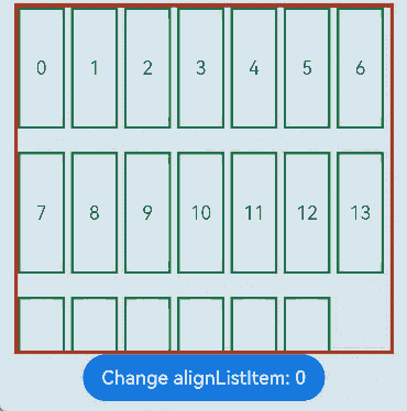
Example 2: Setting Child Element Alignment
This example showcases the alignment effects of child elements in the cross-axis direction of the List component using different ListItemAlign enumeration values.
// xxx.ets
@Entry
@Component
struct ListLanesExample {
  @State arr: string[] = ["0", "1", "2", "3", "4", "5", "6", "7", "8", "9", "10", "11", "12", "13", "14", "15", "16", "17", "18", "19"]
  @State alignListItem: ListItemAlign = ListItemAlign.Start

  build() {
    Column() {
      List({ space: 20, initialIndex: 0 }) {
        ForEach(this.arr, (item: string) => {
          ListItem() {
            Text('' + item)
              .width('100%')
              .height(100)
              .fontSize(16)
              .textAlign(TextAlign.Center)
              .borderRadius(10)
              .backgroundColor(0xFFFFFF)
          }
          .border({ width: 2, color: Color.Green })
        }, (item: string) => item)
      }
      .height(300)
      .width("90%")
      .friction(0.6)
      .border({ width: 3, color: Color.Red })
      .lanes({ minLength: 40, maxLength: 40 })
      .alignListItem(this.alignListItem)
      .scrollBar(BarState.Off)

      Button("Change alignListItem: "+ this.alignListItem).onClick(() => {
        if (this.alignListItem == ListItemAlign.Start) {
          this.alignListItem = ListItemAlign.Center
        } else if (this.alignListItem == ListItemAlign.Center) {
          this.alignListItem = ListItemAlign.End
        } else {
          this.alignListItem = ListItemAlign.Start
        }
      })
    }.width('100%').height('100%').backgroundColor(0xDCDCDC).padding({ top: 5 })
  }
}
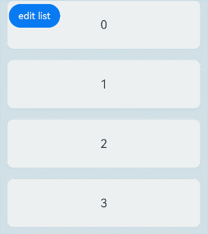
Example 3: Setting the Editable Mode
This example illustrates how to set whether the current List component is in editable mode.
// xxx.ets
@Entry
@Component
struct ListExample {
  @State arr: number[] = [0, 1, 2, 3, 4, 5, 6, 7, 8, 9]
  @State editFlag: boolean = false

  build() {
    Stack({ alignContent: Alignment.TopStart }) {
      Column() {
        List({ space: 20, initialIndex: 0 }) {
          ForEach(this.arr, (item: number, index?: number) => {
            ListItem() {
              Flex({ direction: FlexDirection.Row, alignItems: ItemAlign.Center }) {
                Text('' + item)
                  .width('100%')
                  .height(80)
                  .fontSize(20)
                  .textAlign(TextAlign.Center)
                  .borderRadius(10)
                  .backgroundColor(0xFFFFFF)
                  .flexShrink(1)
                if (this.editFlag) {
                  Button() {
                    Text("delete").fontSize(16)
                  }.width('30%').height(40)
                  .onClick(() => {
                    if (index != undefined) {
                      console.info(this.arr[index] + 'Delete')
                      this.arr.splice(index, 1)
                      console.info(JSON.stringify(this.arr))
                      this.editFlag = false
                    }
                  }).stateEffect(true)
                }
              }
            }
          }, (item: string) => item)
        }.width('90%')
        .scrollBar(BarState.Off)
        .friction(0.6)
      }.width('100%')

      Button('edit list')
        .onClick(() => {
          this.editFlag = !this.editFlag
        }).margin({ top: 5, left: 20 })
    }.width('100%').height('100%').backgroundColor(0xDCDCDC).padding({ top: 5 })
  }
}
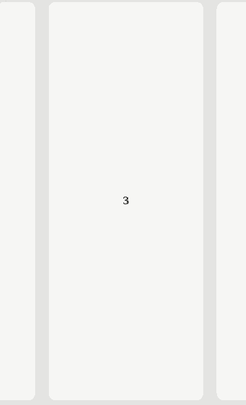
Example 4: Setting the Alignment Mode for the Scroll Snap Position
This example shows how to configure the List component to align the scroll snap position to the center.
// xxx.ets
@Entry
@Component
struct ListExample {
  private arr: number[] = []
  private scrollerForList: Scroller = new Scroller()

  aboutToAppear() {
    for (let i = 0; i < 20; i++) {
      this.arr.push(i)
    }
  }
  build() {
    Column() {
      Row() {
        List({ space: 20, initialIndex: 3, scroller: this.scrollerForList }) {
          ForEach(this.arr, (item: number) => {
            ListItem() {
              Text('' + item)
                .width('100%').height(100).fontSize(16)
                .textAlign(TextAlign.Center)
            }
            .borderRadius(10).backgroundColor(0xFFFFFF)
            .width('60%')
            .height('80%')
          }, (item: number) => JSON.stringify(item))
        }
        .chainAnimation(true)
        .edgeEffect(EdgeEffect.Spring)
        .listDirection(Axis.Horizontal)
        .height('100%')
        .width('100%')
        .scrollSnapAlign(ScrollSnapAlign.CENTER)
        .borderRadius(10)
        .backgroundColor(0xDCDCDC)
      }
      .width('100%')
      .height('100%')
      .backgroundColor(0xDCDCDC)
      .padding({ top: 10 })
    }
  }
}
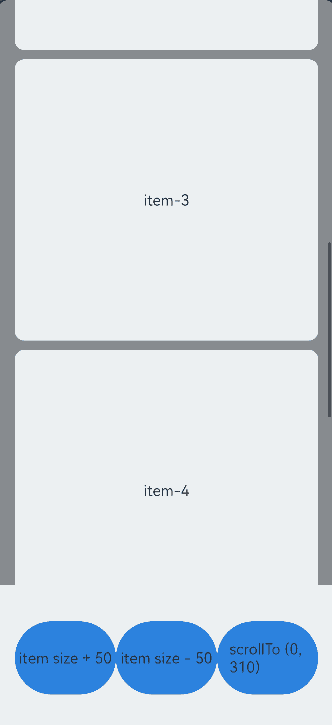
Example 5: Implementing Accurate Scrolling
This example shows that, by setting the childrenMainSize attribute, the list can jump to an exact specific location when the scrollTo API is called, even when the heights of the child components are inconsistent.
For details about how to use these features in conjunction with state management V2, see List.
// xxx.ets
@Entry
@Component
struct ListExample {
  private arr: number[] = []
  private scroller: ListScroller = new ListScroller()
  @State listSpace: number = 10
  @State listChildrenSize: ChildrenMainSize = new ChildrenMainSize(100)
  aboutToAppear(){
    // Initialize the data source.
    for (let i = 0; i < 10; i++) {
      this.arr.push(i)
    }
    // The first five items do not have a default main axis size of 100; therefore, it is necessary to inform the list through the ChildrenMainSize.
    this.listChildrenSize.splice(0, 5, [300, 300, 300, 300, 300])
  }
  build() {
    Column() {
      List({ space: this.listSpace, initialIndex: 4, scroller: this.scroller }) {
        ForEach(this.arr, (item: number) => {
          ListItem() {
            Text('item-' + item)
              .height( item < 5 ? 300 : this.listChildrenSize.childDefaultSize)
              .width('90%')
              .fontSize(16)
              .textAlign(TextAlign.Center)
              .borderRadius(10)
              .backgroundColor(0xFFFFFF)
          }
        }, (item: string) => item)
      }
      .backgroundColor(Color.Gray)
      .layoutWeight(1)
      .scrollBar(BarState.On)
      .childrenMainSize(this.listChildrenSize)
      .alignListItem(ListItemAlign.Center)
      Row(){
        Button() { Text('item size + 50') }.onClick(()=>{
          this.listChildrenSize.childDefaultSize += 50
        }).height('50%').width('30%')
        Button() { Text('item size - 50') }.onClick(()=>{
          if (this.listChildrenSize.childDefaultSize === 0) {
            return
          }
          this.listChildrenSize.childDefaultSize -= 50
        }).height('50%').width('30%')
        Button() { Text('scrollTo (0, 310)') }.onClick(()=>{
          // 310: Jump to the position where the top of item 1 is aligned with the top of the list.
          // If childrenMainSize is not set, the scrollTo API may not work correctly when the heights of the list items are inconsistent.
          this.scroller.scrollTo({xOffset: 0, yOffset: 310})
        }).height('50%').width('30%')
      }.height('20%')
    }
  }
}
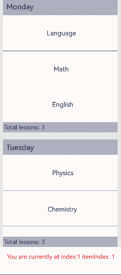
Example 6: Obtaining Child Component Index Information
This example demonstrates how to obtain index information of list items in a List component when groups are involved.
// xxx.ets
@Entry
@Component
struct ListItemGroupExample {
  private timeTable: TimeTable[] = [
    {
      title: 'Monday',
      projects: ['Language', 'Math', 'English']
    },
    {
      title: 'Tuesday',
      projects: ['Physics', 'Chemistry', 'Biology']
    },
    {
      title: 'Wednesday',
      projects: ['History', 'Geography', 'Politics']
    },
    {
      title: 'Thursday',
      projects: ['Art', 'Music', 'Sports']
    }
  ]
  private scroller: ListScroller = new ListScroller()
  @State listIndexInfo: VisibleListContentInfo = {index: -1}
  @State mess:string = "null"
  @State itemBackgroundColorArr: boolean[] = [false]
  @Builder
  itemHead(text: string) {
    Text(text)
      .fontSize(20)
      .backgroundColor(0xAABBCC)
      .width("100%")
      .padding(10)
  }

  @Builder
  itemFoot(num: number) {
    Text('Total lessons: ' + num)
      .fontSize(16)
      .backgroundColor(0xAABBCC)
      .width("100%")
      .padding(5)
  }

  build() {
    Column() {
      List({ space: 20, scroller: this.scroller}) {
        ForEach(this.timeTable, (item: TimeTable, index: number) => {
          ListItemGroup({ header: this.itemHead(item.title), footer: this.itemFoot(item.projects.length) }) {
            ForEach(item.projects, (project: string, subIndex: number) => {
              ListItem() {
                Text(project)
                  .width("100%")
                  .height(100)
                  .fontSize(20)
                  .textAlign(TextAlign.Center)
                  .backgroundColor(this.itemBackgroundColorArr[index *3 +subIndex] ? 0x68B4FF: 0xFFFFFF)
              }
            }, (item: string) => item)
          }
          .divider({ strokeWidth: 1, color: Color.Blue }) // Divider between lines
        },(item: string) => item)
      }
      .width('90%')
      .sticky(StickyStyle.Header|StickyStyle.Footer)
      .scrollBar(BarState.Off)
      .gesture(
        PanGesture()
          .onActionUpdate((event: GestureEvent) => {
            if (event.fingerList[0] != undefined && event.fingerList[0].localX != undefined && event.fingerList[0].localY != undefined) {
              this.listIndexInfo  = this.scroller.getVisibleListContentInfo(event.fingerList[0].localX, event.fingerList[0].localY)
              let itemIndex:string = 'undefined';
              if (this.listIndexInfo.itemIndexInGroup != undefined ) {
                itemIndex = this.listIndexInfo.itemIndexInGroup.toString()
                if (this.listIndexInfo.index != undefined && this.listIndexInfo.index >= 0 &&
                  this.listIndexInfo.itemIndexInGroup >= 0 ) {
                  this.itemBackgroundColorArr[this.listIndexInfo.index * 3 + this.listIndexInfo.itemIndexInGroup] = true;
                }
              }
              this.mess = 'index:' + this.listIndexInfo.index.toString() + ' itemIndex:' + itemIndex
            }
          }))
      .gesture(
        TapGesture({ count: 1 })
          .onAction((event: GestureEvent) => {
            if (event) {
              this.itemBackgroundColorArr.splice(0,this.itemBackgroundColorArr.length);
            }
          })
      )
      Text('You are currently at index '+ this.mess)
        .fontColor(Color.Red)
        .height(50)
    }.width('100%').height('90%').backgroundColor(0xDCDCDC).padding({ top: 5 })
  }
}

interface TimeTable {
  title: string;
  projects: string[];
}
Example 7: Setting Edge Fading
This example demonstrates how to implement a List component with an edge fading effect and set the length of the fading edge.
import { LengthMetrics } from '@kit.ArkUI'
@Entry
@Component
struct ListExample {
  private arr: number[] = [0, 1, 2, 3, 4, 5, 6, 7, 8, 9, 10, 11]
  scrollerForList: Scroller = new Scroller()
  build() {
    Column() {

      List({ space: 20, initialIndex: 0, scroller: this.scrollerForList }) {
        ForEach(this.arr, (item: number) => {
          ListItem() {
            Text('' + item)
              .width('100%').height(100).fontSize(16)
              .textAlign(TextAlign.Center).borderRadius(10).backgroundColor(0xFFFFFF)
          }
        }, (item: string) => item)
      }
      .fadingEdge(true,{fadingEdgeLength:LengthMetrics.vp(80)})
    }
    .width('100%')
    .height('100%')
    .backgroundColor(0xDCDCDC)
    .padding({ top: 5 })
  }
}
Example 8: Setting the Single-Side Edge Effect
This example demonstrates how to set a single-side edge effect for the List component using the edgeEffect API.
// xxx.ets
@Entry
@Component
struct ListExample {
  private arr: number[] = [0, 1, 2, 3, 4, 5, 6, 7, 8, 9, 10, 11]
  scrollerForList: Scroller = new Scroller()
  build() {
    Column() {
      List({ space: 20, initialIndex: 0, scroller: this.scrollerForList }) {
        ForEach(this.arr, (item: number) => {
          ListItem() {
            Text('' + item)
              .width('100%').height(100).fontSize(16)
              .textAlign(TextAlign.Center).borderRadius(10).backgroundColor(0xFFFFFF)
          }
        }, (item: string) => item)
      }
      .edgeEffect(EdgeEffect.Spring,{alwaysEnabled:true,effectEdge:EffectEdge.START})
      .width('90%').height('90%')
    }
    .width('100%')
    .height('100%')
    .backgroundColor(0xDCDCDC)
    .padding({ top: 5 })
  }
}
你可能感兴趣的鸿蒙文章
- 所属分类: 后端技术
- 本文标签:
热门推荐
-
2、 优质文章
-
3、 gt
-
7、 openharmony
-
9、 golang
-
10、 Vue中input框自动聚焦