harmony 鸿蒙ListItemGroup
ListItemGroup
The ListItemGroup component is used to display list item groups. It must be used with the List component. Unless specified otherwise, it spans the entire width of the List component.
NOTE
- This component is supported since API version 9. Updates will be marked with a superscript to indicate their earliest API version.
- This component can be used only as a child of List.
- The ListItemGroup component does not support the universal attribute aspectRatio.
- If the parent List component of ListItemGroup has its listDirection attribute set to Axis.Vertical, setting the universal attribute height has no effect. In this case, the height of the ListItemGroup component is fixed at the sum of the component’s header height, footer height, and total height of the list items.
- If the parent List component of ListItemGroup has its listDirection attribute set to Axis.Horizontal, setting the universal attribute width has no effect. In this case, the width of the ListItemGroup component is fixed at the sum of the component’s header width, footer width, and total width of the list items.
- The list items in the ListItemGroup component cannot be edited or dragged. This means that their editable attribute does not take effect.
- The ListItemGroup ignores the direction attribute for setting the layout direction; instead, it adopts the layout direction of its parent List component.
Child Components
This component supports the ListItem child component.
APIs
ListItemGroup(options?: ListItemGroupOptions)
Atomic service API: This API can be used in atomic services since API version 11.
System capability: SystemCapability.ArkUI.ArkUI.Full
Parameters
| Name | Type | Mandatory | Description |
|---|---|---|---|
| options | ListItemGroupOptions | No | Parameters of the list item group. |
ListItemGroupOptions
System capability: SystemCapability.ArkUI.ArkUI.Full
| Name | Type | Mandatory | Description |
|---|---|---|---|
| header | CustomBuilder | No | Header of the list item group. NOTE One child component, or no child component at all, can be placed inside. Atomic service API: This API can be used in atomic services since API version 11. |
| headerComponent13+ | ComponentContent | No | Header of the list item group, in the type of ComponentContent. NOTE One child component, or no child component at all, can be placed inside. This parameter takes precedence over the header parameter. This means that, if both header and headerComponent are set, the value of headerComponent is used. To avoid display issues, do not assign the same headerComponent to different ListItemGroup components. Atomic service API: This API can be used in atomic services since API version 13. |
| footer | CustomBuilder | No | Footer of the list item group. NOTE One child component, or no child component at all, can be placed inside. Atomic service API: This API can be used in atomic services since API version 11. |
| footerComponent13+ | ComponentContent | No | Footer of the list item group, in the type of ComponentContent. NOTE One child component, or no child component at all, can be placed inside. This parameter takes precedence over the footer parameter. This means that, if both footer and footerComponent are set, the value of footerComponent is used. To avoid display issues, do not assign the same footerComponent to different ListItemGroup components. Atomic service API: This API can be used in atomic services since API version 13. |
| space | number |string | No | Spacing between list items. This parameter only affects the spacing between list items, but not spacing between the header and list items or between the footer and list items. Default value: 0 Unit: vp Atomic service API: This API can be used in atomic services since API version 11. |
| style10+ | ListItemGroupStyle | No | Style of the list item group. Default value: ListItemGroupStyle.NONE If this parameter is set to ListItemGroupStyle.NONE, no style is applied. When ListItemGroupStyle.CARD is used, you are advised to pair it with ListItemStyle.CARD from ListItem to apply the default card style. In the card style, the default specifications for the ListItemGroup are as follows: horizontal margin of 12 vp on both left and right sides, and vertical as well as horizontal padding of 4 vp. In the default card style, list items can be in focus, hover, press, selected, or disable style depending on their state. NOTE In the card style, by default, the list runs along the vertical axis, that is, listDirection is at Axis.Vertical. If listDirection is set to Axis.Horizontal, a disordered display may result. The alignListItem attribute of the list is set to ListItemAlign.Center by default, which aligns the list items in the center. Atomic service API: This API can be used in atomic services since API version 11. |
Attributes
divider
divider(value: ListDividerOptions|null)
Sets the style of the divider for the list items. By default, there is no divider.
strokeWidth, startMargin, and endMargin cannot be set in percentage.
When a list item has polymorphic styles applied, the dividers above and below the pressed child component are not rendered.
Atomic service API: This API can be used in atomic services since API version 11.
System capability: SystemCapability.ArkUI.ArkUI.Full
Parameters
| Name | Type | Mandatory | Description |
|---|---|---|---|
| value | ListDividerOptions |null | Yes | Style of the divider for the list items. Default value: null |
childrenMainSize12+
childrenMainSize(value: ChildrenMainSize)
Sets the size information of the child components of a ListItemGroup component along the main axis.
Atomic service API: This API can be used in atomic services since API version 12.
System capability: SystemCapability.ArkUI.ArkUI.Full
Parameters
| Name | Type | Mandatory | Description |
|---|---|---|---|
| value | ChildrenMainSize | Yes | Size information of all list items along the main axis, provided through a ChildrenMainSize object to the ListItemGroup component. The provided size along the main axis must be consistent with the actual size of the child components on the main axis. For the setting to take effect, this attribute must be used together with the childrenMainSize attribute of the List component. Any changes in size or additions/removals of child components must be communicated to the ListItemGroup component through the ChildrenMainSize object method. |
ListItemGroupStyle10+
Atomic service API: This API can be used in atomic services since API version 11.
System capability: SystemCapability.ArkUI.ArkUI.Full
| Name | Value | Description |
|---|---|---|
| NONE | 0 | No style. |
| CARD | 1 | Default card style. |
Example
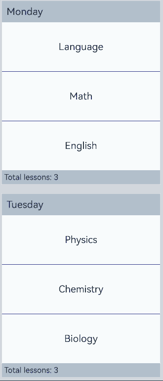
Example 1: Setting a Sticky Header and Footer
This example demonstrates how to set a sticky header and footer using the stick attribute.
// xxx.ets
@Entry
@Component
struct ListItemGroupExample {
  private timeTable: TimeTable[] = [
    {
      title: 'Monday',
      projects: ['Language', 'Math', 'English']
    },
    {
      title: 'Tuesday',
      projects: ['Physics', 'Chemistry', 'Biology']
    },
    {
      title: 'Wednesday',
      projects: ['History', 'Geography', 'Politics']
    },
    {
      title: 'Thursday',
      projects: ['Art', 'Music', 'Sports']
    }
  ]

  @Builder
  itemHead(text: string) {
    Text(text)
      .fontSize(20)
      .backgroundColor(0xAABBCC)
      .width("100%")
      .padding(10)
  }

  @Builder
  itemFoot(num: number) {
    Text('Total lessons: ' + num)
      .fontSize(16)
      .backgroundColor(0xAABBCC)
      .width("100%")
      .padding(5)
  }

  build() {
    Column() {
      List({ space: 20 }) {
        ForEach(this.timeTable, (item: TimeTable) => {
          ListItemGroup({ header: this.itemHead(item.title), footer: this.itemFoot(item.projects.length) }) {
            ForEach(item.projects, (project: string) => {
              ListItem() {
                Text(project)
                  .width("100%")
                  .height(100)
                  .fontSize(20)
                  .textAlign(TextAlign.Center)
                  .backgroundColor(0xFFFFFF)
              }
            }, (item: string) => item)
          }
          .divider({ strokeWidth: 1, color: Color.Blue }) // Divider between lines
        })
      }
      .width('90%')
      .sticky(StickyStyle.Header|StickyStyle.Footer)
      .scrollBar(BarState.Off)
    }.width('100%').height('100%').backgroundColor(0xDCDCDC).padding({ top: 5 })
  }
}

interface TimeTable {
  title: string;
  projects: string[];
}
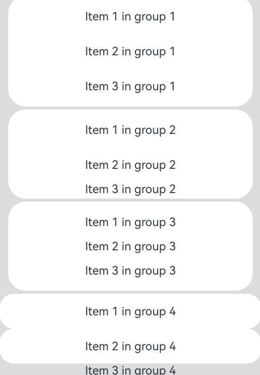
Example 2: Setting the Card Style
This example illustrates the card-style effect of the ListItemGroup component.
// xxx.ets
@Entry
@Component
struct ListItemGroupExample2 {
  private arr: ArrObject[] = [
    {
      style: ListItemGroupStyle.CARD,
      itemStyles: [ListItemStyle.CARD, ListItemStyle.CARD, ListItemStyle.CARD]
    },
    {
      style: ListItemGroupStyle.CARD,
      itemStyles: [ListItemStyle.CARD, ListItemStyle.CARD, ListItemStyle.NONE]
    },
    {
      style: ListItemGroupStyle.CARD,
      itemStyles: [ListItemStyle.CARD, ListItemStyle.NONE, ListItemStyle.CARD]
    },
    {
      style: ListItemGroupStyle.NONE,
      itemStyles: [ListItemStyle.CARD, ListItemStyle.CARD, ListItemStyle.NONE]
    }
  ]

  build() {
    Column() {
      List({ space: "4vp", initialIndex: 0 }) {
        ForEach(this.arr, (item: ArrObject, index?: number) => {
          ListItemGroup({ style: item.style }) {
            ForEach(item.itemStyles, (itemStyle: number, itemIndex?: number) => {
              ListItem({ style: itemStyle }) {
                if (index != undefined && itemIndex != undefined) {
                  Text("Item " + (itemIndex + 1) +" in group " + (index + 1))
                    .width("100%")
                    .textAlign(TextAlign.Center)
                }
              }
            }, (item: string) => item)
          }
        })
      }
      .width('100%')
      .multiSelectable(true)
      .backgroundColor(0xDCDCDC)
    }
    .width('100%')
    .padding({ top: 5 })
  }
}

interface ArrObject {
  style: number;
  itemStyles: number[];
}
Example 3: Setting Header and Footer
This example demonstrates how to set the header and footer using ComponentContent.
// xxx.ets
import { ComponentContent } from '@kit.ArkUI';

interface TimeTable {
  title: string;
  projects: string[];
}

class HeadBuilderParams {
  text: string|Resource;
  constructor(text: string|Resource) {
    this.text = text;
  }
}

class FootBuilderParams {
  num: number|Resource;
  constructor(num: number|Resource) {
    this.num = num;
  }
}

@Builder
function itemHead(params: HeadBuilderParams) {
  Text(params.text)
    .fontSize(20)
    .height('48vp')
    .width("100%")
    .padding(10)
    .backgroundColor($r('sys.color.background_tertiary'))
}

@Builder
function itemFoot(params: FootBuilderParams) {
  Text('Total lessons: ' + params.num)
    .fontSize(20)
    .height('48vp')
    .width("100%")
    .padding(10)
    .backgroundColor($r('sys.color.background_tertiary'))
}

@Component
struct MyItemGroup {
  item: TimeTable = { title: "", projects: [] }
  header?: ComponentContent<HeadBuilderParams> = undefined
  footer?: ComponentContent<FootBuilderParams> = undefined
  headerParam = new HeadBuilderParams(this.item.title)
  footerParam = new FootBuilderParams(this.item.projects.length)

  aboutToAppear(): void {
    this.header = new ComponentContent(this.getUIContext(), wrapBuilder(itemHead), this.headerParam)
    this.footer = new ComponentContent(this.getUIContext(), wrapBuilder(itemFoot), this.footerParam)
  }
  GetHeader() {
    this.header?.update(new HeadBuilderParams(this.item.title));
    return this.header;
  }

  GetFooter() {
    this.footer?.update(new FootBuilderParams(this.item.projects.length));
    return this.footer;
  }

  build() {
    ListItemGroup({
      headerComponent: this.GetHeader(),
      footerComponent: this.GetFooter()
    }) {
      ForEach(this.item.projects, (project: string) => {
        ListItem() {
          Text(project)
            .width("100%")
            .height(100)
            .fontSize(20)
            .textAlign(TextAlign.Center)
        }
      }, (item: string) => item)
    }
    .divider({ strokeWidth: 1, color: Color.Blue }) // Divider between lines
  }
}

@Entry
@Component
struct ListItemGroupExample {
  @State timeTable: TimeTable[] = [
    {
      title: 'Monday',
      projects: ['Language', 'Math', 'English']
    },
    {
      title: 'Tuesday',
      projects: ['Physics', 'Chemistry', 'Biology']
    },
    {
      title: 'Wednesday',
      projects: ['History', 'Geography', 'Politics', 'Sports']
    },
    {
      title: 'Thursday',
      projects: ['Art', 'Music']
    }
  ]

  build() {
    Column() {
      Button("Update").width(100).height(50).onClick(() => {
        this.timeTable[0] = {
          title: 'Monday after update',
          projects: ['Language', 'Physics', 'History', 'Art']
        }
      })
      List({ space: 20 }) {
        ForEach(this.timeTable, (item: TimeTable) => {
          MyItemGroup({ item: item })
        })
      }
      .layoutWeight(1)
      .sticky(StickyStyle.Header|StickyStyle.Footer)
      .scrollBar(BarState.Off)
    }
    .backgroundColor($r('sys.color.background_primary'))
  }
}

你可能感兴趣的鸿蒙文章
- 所属分类: 后端技术
- 本文标签:
热门推荐
-
2、 优质文章
-
3、 gt
-
7、 openharmony
-
9、 golang
-
10、 Vue中input框自动聚焦