harmony 鸿蒙Size
Size
The size attributes set the width, height, and margin of a component.
NOTE
The APIs of this module are supported since API version 7. Updates will be marked with a superscript to indicate their earliest API version.
width
width(value: Length)
Sets the width of the component. By default, the width required to fully hold the component content is used. If the width of the component is greater than that of the parent container, the component will be drawn beyond the parent container scope.
Since API version 10, this API supports the calc calculation feature.
Widget capability: Since API version 9, this feature is supported in ArkTS widgets.
Atomic service API: This API can be used in atomic services since API version 11.
System capability: SystemCapability.ArkUI.ArkUI.Full
Parameters
| Name | Type | Mandatory | Description |
|---|---|---|---|
| value | Length | Yes | Width of the component to set. Unit: vp |
NOTE
In the TextInput component, setting width to auto means that the width adapts to the width of the text content.
In the AlphabetIndexer component, setting width to auto means that the width adapts to the maximum width of index entries.
height
height(value: Length)
Sets the height of the component. By default, the height required to fully hold the component content is used. If the height of the component is greater than that of the parent container, the component will be drawn beyond the parent container scope.
Since API version 10, this API supports the calc calculation feature.
Widget capability: Since API version 9, this feature is supported in ArkTS widgets.
Atomic service API: This API can be used in atomic services since API version 11.
System capability: SystemCapability.ArkUI.ArkUI.Full
Parameters
| Name | Type | Mandatory | Description |
|---|---|---|---|
| value | Length | Yes | Height of the component to set. Unit: vp |
NOTE
In the Row, Column, and RelativeContainer components, setting width and height to auto means that the size adapts to the size of their child components.
width15+
width(widthValue: Length|LayoutPolicy)
Sets the width of the component or its horizontal layout policy. By default, the component uses the width required for its content. If the width of the component is greater than that of the parent container, the component will be drawn beyond the parent container scope.
Widget capability: This API can be used in ArkTS widgets since API version 15.
Atomic service API: This API can be used in atomic services since API version 15.
System capability: SystemCapability.ArkUI.ArkUI.Full
Parameters
| Name | Type | Mandatory | Description |
|---|---|---|---|
| widthValue | Length | LayoutPolicy | Yes | Width of the component to set. Unit: vp |
height15+
height(heightValue: Length|LayoutPolicy)
Sets the height of the component or its vertical layout policy. By default, the component uses the height required for its content. If the height of the component is greater than that of the parent container, the component will be drawn beyond the parent container scope.
Widget capability: This API can be used in ArkTS widgets since API version 15.
Atomic service API: This API can be used in atomic services since API version 15.
System capability: SystemCapability.ArkUI.ArkUI.Full
Parameters
| Name | Type | Mandatory | Description |
|---|---|---|---|
| heightValue | Length | LayoutPolicy | Yes | Height of the component to set. Unit: vp |
NOTE
In the Row and Column components, width and height can be set to parameters of the LayoutPolicy type.
size
size(value: SizeOptions)
Sets the size of the component.
Since API version 10, this API supports the calc calculation feature.
Widget capability: Since API version 9, this feature is supported in ArkTS widgets.
Atomic service API: This API can be used in atomic services since API version 11.
System capability: SystemCapability.ArkUI.ArkUI.Full
Parameters
| Name | Type | Mandatory | Description |
|---|---|---|---|
| value | SizeOptions | Yes | Size of the component to set. Unit: vp |
padding
padding(value: Padding|Length|LocalizedPadding)
Sets the padding of the component.
Since API version 10, this API supports the calc calculation feature.
Widget capability: Since API version 9, this feature is supported in ArkTS widgets.
Atomic service API: This API can be used in atomic services since API version 11.
System capability: SystemCapability.ArkUI.ArkUI.Full
Parameters
| Name | Type | Mandatory | Description |
|---|---|---|---|
| value | Padding | Length | LocalizedPadding12+ | Yes | Padding of the component to set. When the parameter is of the Length type, the four paddings take effect. Default value: 0 Unit: vp When padding is set to a percentage, the width of the parent container is used as the basic value. |
margin
margin(value: Margin|Length|LocalizedMargin)
Sets the margin of the component.
Since API version 10, this API supports the calc calculation feature.
Widget capability: Since API version 9, this feature is supported in ArkTS widgets.
Atomic service API: This API can be used in atomic services since API version 11.
System capability: SystemCapability.ArkUI.ArkUI.Full
Parameters
| Name | Type | Mandatory | Description |
|---|---|---|---|
| value | Margin |Length |LocalizedMargin12+ | Yes | Margin of the component to set. When the parameter is of the Length type, the four margins take effect. Default value: 0 Unit: vp When margin is set to a percentage, the width of the parent container is used as the basic value. When child components are laid out along the cross axis of the Row, Column, or Flex container, the cross axis size of the child components and the margins add up to the total size of the container. For example, if the width of the Column container is 100, the width of the child component is 50, the left margin is 10, and the right margin is 20, then the actual horizontal offset of the child component is 10. |
safeAreaPadding14+
safeAreaPadding(value: Padding|LengthMetrics|LocalizedPadding)
Sets the safe area padding. It enables a container to add a component-level safe area for child components to expand into.
Widget capability: This API can be used in ArkTS widgets since API version 14.
Atomic service API: This API can be used in atomic services since API version 14.
System capability: SystemCapability.ArkUI.ArkUI.Full
Parameters
| Name | Type | Mandatory | Description |
|---|---|---|---|
| paddingValue | Padding | LengthMetrics | LocalizedPadding | Yes | Safe area padding. Default value: 0 Unit: vp |
layoutWeight
layoutWeight(value: number|string)
Sets the weight of the component during layout. A component with this attribute is allocated space along the main axis of its parent container (Row, Column, or Flex) based on its specified weight.
Widget capability: Since API version 9, this feature is supported in ArkTS widgets.
Atomic service API: This API can be used in atomic services since API version 11.
System capability: SystemCapability.ArkUI.ArkUI.Full
Parameters
| Name | Type | Mandatory | Description |
|---|---|---|---|
| value | number |string | Yes | Weight of the component during layout. When the size of the parent container is determined, the container space is allocated along the main axis among the component and its sibling components based on their respective weights, ignoring their own size settings. Default value: 0 NOTE This parameter is only effective in Row, Column, and Flex container components. The value can be a number greater than or equal to 0 or a string that can be converted to a number. If any child component in a container has the layoutWeight attribute set to a value greater than 0, then child components will no longer be laid out based on flexShrink and flexGrow. |
constraintSize
constraintSize(value: ConstraintSizeOptions)
Sets the constraint size of the component, which is used to limit the size range during component layout.
Since API version 10, this API supports the calc calculation feature.
Widget capability: Since API version 9, this feature is supported in ArkTS widgets.
Atomic service API: This API can be used in atomic services since API version 11.
System capability: SystemCapability.ArkUI.ArkUI.Full
Parameters
| Name | Type | Mandatory | Description |
|---|---|---|---|
| value | ConstraintSizeOptions | Yes | Constraint size of the component to set. constraintSize takes precedence over width and height. See Impact of constraintSize on width/height. Default value: { minWidth: 0, maxWidth: Infinity, minHeight: 0, maxHeight: Infinity } Unit: vp |
Impact of constraintSize(minWidth/maxWidth/minHeight/maxHeight) on width/height
| Default Value | Result |
|---|---|
| |width=MAX(minWidth,MIN(maxWidth,width)) height=MAX(minHeight,MIN(maxHeight,height)) |
|
| maxWidth, maxHeight | width=MAX(minWidth,width) height=MAX(minHeight,height) |
| minWidth, minHeight | width=MIN(maxWidth,width) height=MIN(maxHeight,height) |
| width, height | If minWidth < maxWidth, the layout logic of the component takes effect, and the value range of width is [minWidth, maxWidth]. Otherwise, width = MAX(minWidth, maxWidth). If minHeight < maxHeight, the layout logic of the component takes effect, and the value range of height is [minHeight, maxHeight]. Otherwise, height = MAX (minHeight, maxHeight). |
| width and maxWidth; height and maxHeight | width = minWidth height = minHeight |
| width and minWidth; and height and minHeight | The layout logic of the component takes effect, and the value of width cannot be greater than that of maxWidth. The layout logic of the component takes effect, and the value of height cannot be greater than that of maxHeight. |
| minWidth and maxWidth; minHeight and maxHeight | The width of the component is initially determined by the value of width, and it may be adjusted based on other layout attributes. The height of the component is initially determined by the value of height, and it may be adjusted based on other layout attributes. |
| width, minWidth, and maxWidth | The layout restrictions passed by the parent container are used for layout. |
| height, minHeight, and maxHeight | The layout restrictions passed by the parent container are used for layout. |
SizeOptions
Widget capability: Since API version 9, this feature is supported in ArkTS widgets.
Atomic service API: This API can be used in atomic services since API version 11.
| Name | Type | Mandatory | Description |
|---|---|---|---|
| width | Length | No | Component width. |
| height | Length | No | Component height. |
ConstraintSizeOptions
Widget capability: Since API version 9, this feature is supported in ArkTS widgets.
Atomic service API: This API can be used in atomic services since API version 11.
| Name | Type | Mandatory | Description |
|---|---|---|---|
| minWidth | Length | No | Minimum width of the component. |
| maxWidth | Length | No | Maximum width of the component. |
| minHeight | Length | No | Minimum height of the component. |
| maxHeight | Length | No | Maximum height of the component. |
NOTE
In the Row, Column, and RelativeContainer components, setting width and height to auto means that the size adapts to the size of their child components. In the TextInput component, setting width to auto means that the width adapts to the width of the text content.
Example
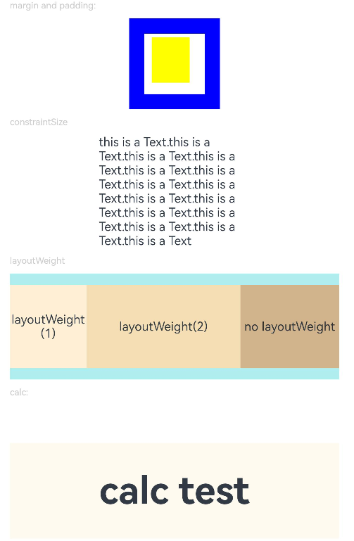
Example 1: Setting the Component Width, Height, Margin, and Padding
This example demonstrates how to set the width, height, margin, and padding of a component.
// xxx.ets
@Entry
@Component
struct SizeExample {
  build() {
    Column({ space: 10 }) {
      Text('margin and padding:').fontSize(12).fontColor(0xCCCCCC).width('90%')
      Row() {
        // Width: 80; height: 80; margin: 20 (blue area); top, bottom, left, and right paddings: 5, 15, 10, and 20 (white area)
        Row() {
          Row().size({ width: '100%', height: '100%' }).backgroundColor(Color.Yellow)
        }
        .width(80)
        .height(80)
        .padding({ top: 5, left: 10, bottom: 15, right: 20 })
        .margin(20)
        .backgroundColor(Color.White)
      }.backgroundColor(Color.Blue)

      Text('constraintSize').fontSize(12).fontColor(0xCCCCCC).width('90%')
      Text('this is a Text.this is a Text.this is a Text.this is a Text.this is a Text.this is a Text.this is a Text.this is a Text.this is a Text.this is a Text.this is a Text.this is a Text.this is a Text.this is a Text.this is a Text')
        .width('90%')
        .constraintSize({ maxWidth: 200 })

      Text('layoutWeight').fontSize(12).fontColor(0xCCCCCC).width('90%')
      // When the container size is determined, the component occupies the space along the main axis based on the layout weight, and the component size setting is ignored.
      Row() {
        // Weight 1: The component occupies 1/3 of the remaining space along the main axis.
        Text('layoutWeight(1)')
          .size({ width: '30%', height: 110 }).backgroundColor(0xFFEFD5).textAlign(TextAlign.Center)
          .layoutWeight(1)
        // Weight 2: The component occupies 2/3 of the remaining space along the main axis.
        Text('layoutWeight(2)')
          .size({ width: '30%', height: 110 }).backgroundColor(0xF5DEB3).textAlign(TextAlign.Center)
          .layoutWeight(2)
        // If layoutWeight is not set, the component is rendered based on its own size setting.
        Text('no layoutWeight')
          .size({ width: '30%', height: 110 }).backgroundColor(0xD2B48C).textAlign(TextAlign.Center)
      }.size({ width: '90%', height: 140 }).backgroundColor(0xAFEEEE)
      // calc calculation feature
      Text('calc:').fontSize(12).fontColor(0xCCCCCC).width('90%')
      Text('calc test')
        .fontSize(50)
        .fontWeight(FontWeight.Bold)
        .backgroundColor(0xFFFAF0)
        .textAlign(TextAlign.Center)
        .margin('calc(25vp*2)')
        // If width or height is set to a percentage, the width or height of the parent container are used as the basic value.
        .size({ width: 'calc(90%)', height: 'calc(50vp + 10%)' })
    }.width('100%').margin({ top: 5 })
  }
}
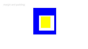
Example 2: Using LocalizedPadding and LocalizedMargin Types
This example demonstrates how to use LocalizedPadding and LocalizedMargin types to set the padding and margin.
// xxx.ets
import { LengthMetrics } from '@kit.ArkUI'

@Entry
@Component
struct SizeExample {
  build() {
    Column({ space: 10 }) {
      Text('margin and padding:').fontSize(12).fontColor(0xCCCCCC).width('90%')
      Row() {
        // Set the width to 80, height to 80, top, bottom, start, and end paddings to 40, 20, 30, and 10, respectively (blue area), and top, bottom, start, and end margins to 5, 15, 10, and 20, respectively (white area).
        Row() {
          Row().size({ width: '100%', height: '100%' }).backgroundColor(Color.Yellow)
        }
        .width(80)
        .height(80)
        .padding({
          top: LengthMetrics.vp(5),
          bottom: LengthMetrics.vp(15),
          start: LengthMetrics.vp(10),
          end: LengthMetrics.vp(20)
        })
        .margin({
          top: LengthMetrics.vp(40),
          bottom: LengthMetrics.vp(20),
          start: LengthMetrics.vp(30),
          end: LengthMetrics.vp(10)
        })
        .backgroundColor(Color.White)
      }.backgroundColor(Color.Blue)
    }.width('100%').margin({ top: 5 })
  }
}
The following shows how the example is represented with left-to-right scripts.
The following shows how the example is represented with right-to-left scripts.
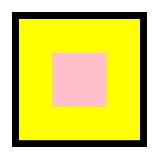
Example 3: Setting Safe Area
This example demonstrates how to set a component-level safe area for a container.
// xxx.ets
import { LengthMetrics } from '@kit.ArkUI';

@Entry
@Component
struct SafeAreaPaddingExample {
  build() {
    Column() {
      Column() {
        Column()
          .width("100%")
          .height("100%")
          .backgroundColor(Color.Pink)
      }
      .width(200)
      .height(200)
      .backgroundColor(Color.Yellow)
      .borderWidth(10)
      .padding(10)
      .safeAreaPadding(LengthMetrics.vp(40))
    }
    .height('100%')
    .width('100%')
  }
}
你可能感兴趣的鸿蒙文章
- 所属分类: 后端技术
- 本文标签:
热门推荐
-
2、 优质文章
-
3、 gt
-
7、 openharmony
-
9、 golang
-
10、 Vue中input框自动聚焦