harmony 鸿蒙Sheet Transition
Sheet Transition
You can bind a sheet to a component through the bindSheet attribute. You can also set the sheet to the preset or custom height for when the component is inserted.
NOTE
This feature is supported since API version 10. Updates will be marked with a superscript to indicate their earliest API version.
Route hopping is not supported.
bindSheet
bindSheet(isShow: Optional<boolean>, builder: CustomBuilder, options?: SheetOptions)
Binds a sheet to the component, which is displayed when the component is touched.
Atomic service API: This API can be used in atomic services since API version 11.
System capability: SystemCapability.ArkUI.ArkUI.Full
Parameters
| Name | Type | Mandatory | Description |
|---|---|---|---|
| isShow | Optional<boolean> | Yes | Whether to display the sheet. Since API version 10, this parameter supports two-way binding through $$. Since API version 18, this parameter supports two-way binding through !!. |
| builder | CustomBuilder | Yes | Content of the sheet. |
| options | SheetOptions | No | Optional attributes of the sheet. |
NOTE
When no two-way binding is set up for the isShow parameter, closing the sheet by dragging does not change the parameter value.
To synchronize the value of the isShow parameter with the sheet UI state, set up a two-way binding for isShow through $$. Since API version 18, this parameter supports two-way binding through !!.
In scenarios where a sheet with a single detent is dragged upwards or a sheet with multiple detents is shifted to another detent by swiping up, the display area is updated after the drag ends or the shift is completed.
A sheet is a popup that is strictly bound to its host node. To achieve an effect where the sheet appears the moment the page is displayed, ensure that the host node is mounted in the view hierarchy. If the host node is not yet mounted when isShow is set to true, the sheet will not be displayed. You are advised to use the onAppear to ensure that the sheet is shown after the host node is mounted. When SheetMode is set to EMBEDDED, in addition to the host node, also ensure that the corresponding page node is successfully mounted.
The exit animation of the sheet does not support interruption, and the sheet cannot respond to other gestures during the execution. The current exit animation uses a spring curve, which has a subtle trailing effect that is not visually prominent. Therefore, when the sheet exits, although it may appear to have disappeared, the animation might not have fully finished, and attempting to initiate the sheet again by a touch will not work. You must wait for the animation to fully complete before you can initiate the sheet again.
SheetOptions
Inherits from BindOptions.
| Name | Type | Mandatory | Description |
|---|---|---|---|
| height | SheetSize |Length | No | Height of the sheet. Default value: LARGE NOTE In versions earlier than API version 12, this attribute is ineffective for a bottom sheet in landscape mode; the height is fixed at 8 vp from the top of the screen. Since API version 12, this attribute takes effect for a bottom sheet in landscape mode; the maximum height is 8 vp from the top of the screen. Since API version 14, for a bottom sheet in landscape mode, the maximum height is 8 vp from the top of the screen if there is no status bar, and 8 vp from the status bar if there is one. When a bottom sheet has detents set, this attribute is ineffective. For a bottom sheet in portrait mode, the maximum height is 8 vp from the status bar. For center and popup sheets set to SheetSize.LARGE or SheetSize.MEDIUM, this attribute is ineffective, with the default height being 560 vp. For center and popup sheets, the minimum height is 320 vp, and the maximum height is 90% of the shorter edge of the window. If the height specified by Length and the height adaptively set with SheetSize.FIT_CONTENT exceed the maximum height, the maximum height is used instead. If they are less than the minimum height, the minimum height is used instead. Atomic service API: This API can be used in atomic services since API version 11. |
| detents11+ | [(SheetSize |Length), ( SheetSize |Length)?, (SheetSize |Length)?] | No | Array of heights where the sheet can rest. NOTE Since API version 12, this attribute takes effect for a bottom sheet in landscape mode. In earlier versions, this attribute takes effect only for the bottom sheet in portrait mode. The first height in the tuple is the initial height. The sheet can switch between heights by dragging. After the sheet is dragged and released, it switches to the target height or remains at the current height, depending on the velocity and distance. If the velocity exceeds the threshold, the sheet switches to the target height in the same direction as the velocity. If the velocity is less than the threshold, the displacement distance is used for judgement. If the displacement distance is greater than 1⁄2 of the distance between the current and target positions, the sheet switches to the target height in the same direction as the velocity; otherwise, the sheet remains at the current height. Velocity threshold: 1000; Distance threshold: 50%. Atomic service API: This API can be used in atomic services since API version 12. |
| preferType11+ | SheetType | No | Type of the sheet. NOTE The types supported by the sheet vary by window. 1. Width < 600 vp: bottom 2. 600 vp <= Width < 840 vp: bottom, center, and popup (default) 3. Width >= 840 vp: bottom, center, and popup (default) Atomic service API: This API can be used in atomic services since API version 12. |
| showClose11+ | boolean |Resource | No | Whether to display the close icon. By default, the icon is displayed. On 2-in-1 devices, the icon does not have a background by default. NOTE The value of Resource must be of the Boolean type. Atomic service API: This API can be used in atomic services since API version 12. |
| dragBar | boolean | No | Whether to display the drag bar. NOTE By default, the drag bar is displayed only when the sheet’s detents attribute is set to multiple heights and the settings take effect. Atomic service API: This API can be used in atomic services since API version 11. |
| blurStyle11+ | BlurStyle | No | Background blur of the sheet. By default, there is no background blur. Atomic service API: This API can be used in atomic services since API version 12. |
| maskColor | ResourceColor | No | Mask color of the sheet. Atomic service API: This API can be used in atomic services since API version 11. |
| title11+ | SheetTitleOptions |CustomBuilder | No | Title of the sheet. Atomic service API: This API can be used in atomic services since API version 12. |
| enableOutsideInteractive11+ | boolean | No | Whether to allow users to interact with the page pertaining to the sheet. NOTE The value true means that interactions are allowed, in which case no mask is not displayed. The value false means that interactions are not allowed, in which case a mask is displayed. If this parameter is not set, interactions are allowed for the popup sheet, but not for bottom and center sheets. If this parameter is set to true, the setting of maskColor does not take effect. Atomic service API: This API can be used in atomic services since API version 12. |
| shouldDismiss11+ | (sheetDismiss: SheetDismiss) => void | No | Callback invoked when the user performs an interactive dismiss operation: pulling down or clicking the back button, the mask, or the close icon. NOTE If this callback is registered, the sheet is not dismissed immediately when the user performs the above operations. To dismiss the sheet, you must call shouldDismiss.dismiss() in the callback. If this callback is not registered, the sheet is dismissed immediately when the user performs the above operations, without any additional behavior. It is recommended that this API be used in scenarios where a secondary confirmation is required Atomic service API: This API can be used in atomic services since API version 12. |
| onWillDismiss12+ | DismissSheetAction | No | Callback invoked when the user performs an interactive dismiss operation: pulling down or clicking the back button, the mask, or the close icon, to obtain the type of dismiss operation and decide whether to dismiss the sheet. NOTE If this callback is registered, the sheet is not dismissed immediately when the user performs the above operations. Instead, you can use the reason parameter in the callback to determine the type of dismiss operation and decide whether to dismiss the sheet. If this callback is not registered, the sheet is dismissed immediately when the user performs the above operations, without any additional behavior. No further interception with onWillDismiss is allowed in an onWillDismiss callback. It is recommended that this API be used in scenarios where a secondary confirmation is required Atomic service API: This API can be used in atomic services since API version 12. |
| onWillSpringBackWhenDismiss12+ | SpringBackAction | No | Callback invoked when the user performs a pull-down-to-dismiss gesture, to control the bounce effect. NOTE If this callback is registered along with shouldDismiss or onWillDismiss, you can control whether the sheet bounces back during the pull-down-to-dismiss operation by calling springBack in the callback. If this callback is not registered but shouldDismiss or onWillDismiss is registered, the sheet will bounce back before remaining open or being dismissed based on the callback behavior. If neither this callback nor shouldDismiss or onWillDismiss is registered, the sheet is dismissed by default during the pull-down-to-dismiss operation. Atomic service API: This API can be used in atomic services since API version 12. |
| onHeightDidChange12+ | Callback<number> | No | Callback for changes in the height of the sheet. NOTE For a bottom sheet, the height of each frame is only returned when there are changes in detents or during drag actions. When the sheet is pulled up or making space for the soft keyboard, only the final height is returned. For other types of sheets, the final height is only returned when the sheet is pulled up. The return value is in px. Atomic service API: This API can be used in atomic services since API version 12. |
| onDetentsDidChange12+ | Callback<number> | No | Callback for changes in the detents of the sheet. NOTE For a bottom sheet, the final height is returned when there are changes in detents. The return value is in px. Atomic service API: This API can be used in atomic services since API version 12. |
| onWidthDidChange12+ | Callback<number> | No | Callback for changes in the width of the sheet. NOTE The final height is returned when there are changes in the width. The return value is in px. Atomic service API: This API can be used in atomic services since API version 12. |
| onTypeDidChange12+ | Callback<SheetType> | No | Callback for changes in the type of the sheet. NOTE The final type is returned when there are changes in the type. Atomic service API: This API can be used in atomic services since API version 12. |
| borderWidth12+ | Dimension |EdgeWidths |LocalizedEdgeWidths12+ | No | Border width of the sheet. You can set the width for all four sides or set separate widths for individual sides. Default value: 0 Percentage parameter method: Set the border width of the sheet as a percentage of the width of the parent element. If the left and right border widths of the sheet are greater than the width of the sheet, and the top and bottom border widths are greater than the height of the sheet, the display may not appear as expected. NOTE For bottom sheets, the bottom border width setting is ineffective. Atomic service API: This API can be used in atomic services since API version 12. |
| borderColor12+ | ResourceColor |EdgeColors |LocalizedEdgeColors12+ | No | Border color of the sheet. Default value: Color.Black borderColor must be used with borderWidth in pairs. NOTE For bottom sheets, the bottom border color setting is ineffective. Atomic service API: This API can be used in atomic services since API version 12. |
| borderStyle12+ | BorderStyle |EdgeStyles | No | Border style of the sheet. Default value: BorderStyle.Solid borderStyle must be used with borderWidth in pairs. NOTE For bottom sheets, the bottom border style setting is ineffective. Atomic service API: This API can be used in atomic services since API version 12. |
| width12+ | Dimension | No | Width of the sheet. Percentage parameter method: Set the width of the sheet as a percentage of the width of the parent element. Atomic service API: This API can be used in atomic services since API version 12. |
| shadow12+ | ShadowOptions |ShadowStyle | No | Shadow of the sheet. Default value for 2-in-1 devices: ShadowStyle.OUTER_FLOATING_SM Atomic service API: This API can be used in atomic services since API version 12. |
| uiContext12+ | UIContext | No | UIContext instance corresponding to the window where the sheet is displayed. NOTE The sheet launched with openBindSheet does not support setting or updating this attribute. Atomic service API: This API can be used in atomic services since API version 12. |
| mode12+ | SheetMode | No | Display mode of the sheet. Default value: SheetMode.OVERLAY NOTE 1. During the display of the sheet, the mode attribute does not support dynamic changes. The display hierarchy of the two modes is entirely different, making it impossible to switch a sheet from one mode to another while it is being displayed. You are advised to clearly define and fix the mode value to ensure consistency in the display hierarchy. 2. The UIContext attribute cannot be set when SheetMode.EMBEDDED is set, as their corresponding sheet display hierarchy effects are mutually conflicting. 3. For a sheet launched with openBindSheet, if a valid target ID is not provided, SheetMode.EMBEDDED cannot be set, and the default value SheetMode.OVERLAY is used. Atomic service API: This API can be used in atomic services since API version 12. |
| scrollSizeMode12+ | ScrollSizeMode | No | Content update mode of the sheet when it is scrolled. Default value: ScrollSizeMode.FOLLOW_DETENT |
| keyboardAvoidMode13+ | SheetKeyboardAvoidMode | No | How the sheet avoids the soft keyboard when it is brought up. Default value: TRANSLATE_AND_SCROLL Atomic service API: This API can be used in atomic services since API version 13. |
| enableHoverMode14+ | boolean | No | Whether to enable the hover mode. Default value: false, meaning not to enable the hover mode. NOTE The bottom and popup sheets do not respond in the hover mode. |
| hoverModeArea14+ | HoverModeAreaType | No | Display area of the dialog box in hover mode. Default value: HoverModeAreaType.BOTTOM_SCREEN |
| radius15+ | LengthMetrics |BorderRadiuses |LocalizedBorderRadiuses | No | Corner radius of the sheet. To deliver the optimal experience, use the same radius for the four corners. Default value: 32vp NOTE 1. The corner radius is displayed based on the set value. If it is not set, the default value is used. The bottom sheet does not display the bottom two corners, even if they are set. 2. If different corner radii are set for the four corners and one of the values is invalid, the corner pertaining to the invalid value is reset to the default value, while the other corners retain their set values. If a uniform corner radius is set for all four corners and the value is invalid, all four corners are reset to the default value. 3. When the corner radius is set as a percentage, the width of the sheet is used as the reference. 4. If the corner radius is greater than half the width of the sheet, it is set to half the width of the sheet. 5. If the height of the sheet is too small and the corner radius is set too large, it may cause display issues. Atomic service API: This API can be used in atomic services since API version 15. |
| detentSelection15+ |
SheetSize |Length | No | Initial detent (position) for non-gesture switching. Default value: detents[0] NOTE 1. The value must be within the range of the detents array. If the value is outside this range, this API has no effect. 2. When SheetSize.FIT_CONTENT is used, this API has no effect. 3. Avoid calling this API when gesture-based detent switching is used. Atomic service API: This API can be used in atomic services since API version 15. |
| placement18+ | Placement | No | Display position of the sheet popup relative to the target. Default value: Placement.Bottom NOTE 1. The system attempts to display the popup at the specified position if the popup fits within the window. If this is not feasible, it tries vertical flipping first, followed by a 90° horizontal rotation. 2. If the alignment causes the popup to exceed the window bounds, it will be adjusted horizontally or vertically until fully visible. 3. If none of the four directions can accommodate the popup, the behavior depends on the value of the placementOnTarget property: (1) If the property value is true, the popup moves in the mirror direction of the specified placement until fully visible. (2) If the property value is false, the system selects the direction that can fully display the popup width and has the most remaining height. It then adjusts the sheet height to fit this direction, ensuring that the popup is displayed while maintaining the alignment specified by the placement setting. Atomic service API: This API can be used in atomic services since API version 18. |
| placementOnTarget18+ | Boolean | No | Whether the sheet popup can overlap the target if none of the four directions can accommodate the popup. Default value: true Atomic service API: This API can be used in atomic services since API version 18. |
| effectEdge18+ | number | No | Edge effect used when the boundary of the scrolling area in reached in the sheet. Single-edge activation is supported. Default value: EffectEdge.START |EffectEdge.END (that is, value 3) NOTE 1. Only start edge: EffectEdge.START 2. Only end edge: EffectEdge.END 3. Both edges: EffectEdge.START |EffectEdge.END (that is, value 3) 4. Neither edge: EffectEdge.START & EffectEdge.END (that is, value 0) Atomic service API: This API can be used in atomic services since API version 18. |
| showInSubWindow18+ | boolean | No | Whether to show the sheet in a subwindow. Default value: false, meaning the sheet is displayed within the application, not in a separate subwindow NOTE 1. A dialog box whose showInSubWindow attribute is true cannot trigger the display of another dialog box whose showInSubWindow attribute is also true. 2. Avoid using picker components (such as CalendarPicker, CalendarPickerDialog, DatePickerDialog, TextPickerDialog, and TimePickerDialog) in the dialog box where showInSubWindow is set to true, as the dialog box may affect the behavior of these components. 3. This property cannot be dynamically changed when the sheet is displayed. Atomic service API: This API can be used in atomic services since API version 18. |
SheetSize
Enumerates the sheet heights.
| Name | Value | Description |
|---|---|---|
| MEDIUM | 0 | The sheet height is half of the screen height. Atomic service API: This API can be used in atomic services since API version 11. |
| LARGE | 1 | The sheet height is almost the screen height. Atomic service API: This API can be used in atomic services since API version 11. |
| FIT_CONTENT11+ | 2 | The sheet height automatically adapts to the content. Atomic service API: This API can be used in atomic services since API version 12. |
BindOptions
Defines the common configuration for sheets and modals.
| Name | Type | Mandatory | Description |
|---|---|---|---|
| backgroundColor | ResourceColor | No | Background color of the sheet. Default value: Color.White Atomic service API: This API can be used in atomic services since API version 11. |
| onWillAppear12+ | () => void | No | Callback for when the sheet is about to be displayed (before the animation starts). Atomic service API: This API can be used in atomic services since API version 12. |
| onAppear | () => void | No | Callback for when the sheet is displayed (after the animation ends). Atomic service API: This API can be used in atomic services since API version 11. |
| onWillDisappear12+ | () => void | No | Callback for when the sheet is about to disappear (before the animation starts). NOTE Modifying state variables within the onWillDisappear function is not allowed, as it may lead to unstable component behavior. Atomic service API: This API can be used in atomic services since API version 12. |
| onDisappear | () => void | No | Callback for when the sheet disappears (after the animation ends). Atomic service API: This API can be used in atomic services since API version 11. |
SheetType11+
Enumerates the sheet styles.
Atomic service API: This API can be used in atomic services since API version 12.
| Name | Value | Description |
|---|---|---|
| BOTTOM | 0 | Bottom sheet. |
| CENTER | 1 | Center sheet. |
| POPUP | 2 | Popup sheet. The popup sheet cannot be dismissed with a pull-down gesture. |
SheetDismiss11+
Controls the dismissal of a sheet.
Atomic service API: This API can be used in atomic services since API version 12.
| Name | Type | Mandatory | Description |
|---|---|---|---|
| dismiss | () => void | Yes | Callback for dismissing the sheet. Call this API only when you need the sheet to exit. |
SheetTitleOptions11+
Provides the options for configuring the title of a sheet.
Atomic service API: This API can be used in atomic services since API version 12.
| Name | Type | Mandatory | Description |
|---|---|---|---|
| title | ResourceStr | Yes | Main title of the sheet. |
| subtitle | ResourceStr | No | Subtitle of the sheet. |
SheetMode12+
Enumerates the display layer modes of a sheet.
Atomic service API: This API can be used in atomic services since API version 12.
| Name | Value | Description |
|---|---|---|
| OVERLAY | 0 | The sheet is displayed at the top of the window corresponding to the current UIContext instance, above all pages. It is displayed at the same level as dialog boxes. |
| EMBEDDED | 1 | The sheet is displayed at the top of the current page. NOTE Currently, the sheet can only be mounted on a Page or NavDestination node, with priority given to the NavDestination node if it is present. This means that, the sheet can only be displayed at the top of these two types of pages. In this mode, new pages can overlay the sheet, and when the user returns to the previous page, the sheet remains present without losing its content. In this mode, you must ensure that the target page node, such as the Page node, has been attached to the tree before bringing up the sheet; otherwise, the sheet will not be able to be attached to the corresponding page node. |
ScrollSizeMode12+
Enumerates the content update modes of a sheet when it is scrolled vertically.
| Name | Value | Description |
|---|---|---|
| FOLLOW_DETENT | 0 | The sheet updates the content display area after a swipe ends. |
| CONTINUOUS | 1 | The sheet continuously updates the content display area during the scroll process. |
DismissSheetAction12+
Defines the callback triggered when a sheet is about to be dismissed.
Atomic service API: This API can be used in atomic services since API version 12.
| Name | Type | Mandatory | Description |
|---|---|---|---|
| dismiss | function | Yes | Callback for dismissing the sheet. Call this API when you need to exit the page. |
| reason | DismissReason | Yes | Type of operation that causes the sheet to be dismissed. |
SpringBackAction12+
Controls the interactive spring back of a sheet before it is dismissed.
| Name | Type | Mandatory | Description |
|---|---|---|---|
| springBack | function | Yes | Callback to control the interactive spring back before the sheet is dismissed. |
SheetKeyboardAvoidMode13+
| Name | Value | Description |
|---|---|---|
| NONE | 0 | Disables keyboard avoidance for the sheet. |
| TRANSLATE_AND_RESIZE | 1 | Lifts the sheet to avoid the keyboard; if not enough, resizes the content. |
| RESIZE_ONLY | 2 | Resizes the content to avoid the keyboard. |
| TRANSLATE_AND_SCROLL | 3 | Lifts the sheet to avoid the keyboard; if not enough, scrolls the content. |
Example
Example 1: Setting Sheets with Different Heights
This example demonstrates how to set different heights for sheets using the height property.
// xxx.ets
@Entry
@Component
struct SheetTransitionExample {
@State isShow: boolean = false
@State sheetHeight: number = 300;
@Builder
myBuilder() {
Column() {
Button("change height")
.margin(10)
.fontSize(20)
.onClick(() => {
this.sheetHeight = 500;
})
Button("Set Illegal height")
.margin(10)
.fontSize(20)
.onClick(() => {
this.sheetHeight = -1;
})
Button("close modal 1")
.margin(10)
.fontSize(20)
.onClick(() => {
this.isShow = false;
})
}
.width('100%')
.height('100%')
}
build() {
Column() {
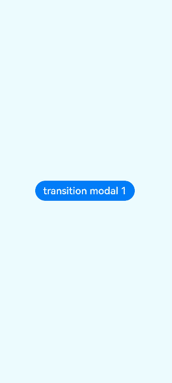
Button("transition modal 1")
.onClick(() => {
this.isShow = true
})
.fontSize(20)
.margin(10)
.bindSheet($$this.isShow, this.myBuilder(), {
height: this.sheetHeight,
backgroundColor: Color.Green,
onWillAppear: () => {
console.log("BindSheet onWillAppear.")
},
onAppear: () => {
console.log("BindSheet onAppear.")
},
onWillDisappear: () => {
console.log("BindSheet onWillDisappear.")
},
onDisappear: () => {
console.log("BindSheet onDisappear.")
}
})
}
.justifyContent(FlexAlign.Center)
.width('100%')
.height('100%')
}
}
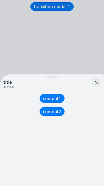
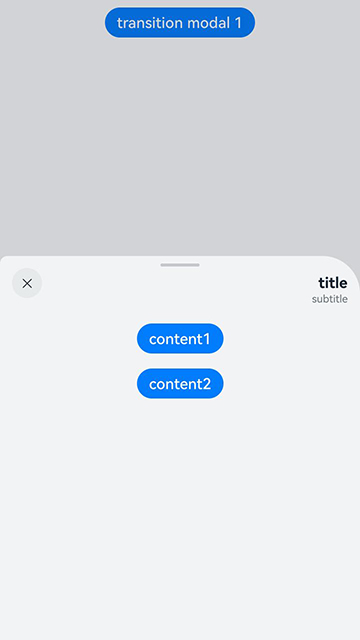
Example 2: Setting Three Different Height Detents
This example demonstrates how to use the detents property of bindSheet to set three different height detents for a sheet. 1. The drag bar is only effective when there are multiple height detents. 2. Unlike the height property, which can set different heights at different times, the detents property provides a gesture to switch between detent heights and is more suitable for fixed height intervals. 3. If the height range is uncertain or there may be more than three different heights, avoid using the detents property.
// xxx.ets
@Entry
@Component
struct SheetTransitionExample {
  @State isShow: boolean = false

  @Builder
  myBuilder() {
    Column() {
      Button("content1")
        .margin(10)
        .fontSize(20)

      Button("content2")
        .margin(10)
        .fontSize(20)
    }
    .width('100%')
  }

  build() {
    Column() {
      Button("transition modal 1")
        .onClick(() => {
          this.isShow = true
        })
        .fontSize(20)
        .margin(10)
        .bindSheet($$this.isShow, this.myBuilder(), {
          detents: [SheetSize.MEDIUM, SheetSize.LARGE, 200],
          backgroundColor: Color.Gray,
          blurStyle: BlurStyle.Thick,
          showClose: true,
          title: { title: "title", subtitle: "subtitle" },
        })
    }
    .justifyContent(FlexAlign.Start)
    .width('100%')
    .height('100%')
  }
}
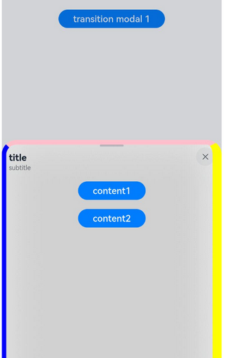
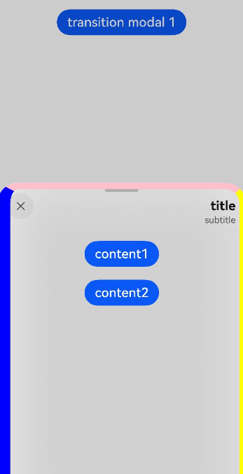
Example 3: Setting the Border Width and Color
This example demonstrates how to use the borderWidth and borderColor properties with LocalizedEdgeWidths and LocalizedEdgeColors types in bindSheet.
// xxx.ets
import { LengthMetrics } from '@kit.ArkUI'

@Entry
@Component
struct SheetTransitionExample {
  @State isShow: boolean = false

  @Builder
  myBuilder() {
    Column() {
      Button("content1")
        .margin(10)
        .fontSize(20)

      Button("content2")
        .margin(10)
        .fontSize(20)
    }
    .width('100%')
  }

  build() {
    Column() {
      Button("transition modal 1")
        .onClick(() => {
          this.isShow = true
        })
        .fontSize(20)
        .margin(10)
        .bindSheet($$this.isShow, this.myBuilder(), {
          detents: [SheetSize.MEDIUM, SheetSize.LARGE, 200],
          backgroundColor: Color.Gray,
          blurStyle: BlurStyle.Thick,
          showClose: true,
          title: { title: "title", subtitle: "subtitle" },
          borderWidth: { top: LengthMetrics.vp(10), start: LengthMetrics.vp(10), end: LengthMetrics.vp(20) },
          borderColor: { top: Color.Pink, start: Color.Blue, end: Color.Yellow },
        })
    }
    .justifyContent(FlexAlign.Start)
    .width('100%')
    .height('100%')
  }
}
The following shows how the example is represented with left-to-right scripts.
The following shows how the example is represented with right-to-left scripts.
Example 4: Using Dismiss Callbacks
This example shows how to register onWillDismiss and onWillSpringBackWhenDismiss with bindSheet.
// xxx.ets
@Entry
@Component
struct bindSheetExample {
  @State isShow: Boolean = false;

  @Builder
  myBuilder() {
    Column() {
      Button() {
        Text("CONTEXT")
      }.height(50)
    }
  }

  build() {
    Column() {
      Button("NoRegisterSpringback")
        .onClick(() => {
          this.isShow = true
        })
        .fontSize(20)
        .margin(10)
        .bindSheet($$this.isShow, this.myBuilder(), {
          height: SheetSize.MEDIUM,
          blurStyle: BlurStyle.Thick,
          showClose: true,
          title: { title: "title", subtitle: "subtitle" },
          preferType: SheetType.CENTER,


          onWillDismiss: ((DismissSheetAction: DismissSheetAction) => {
            if (DismissSheetAction.reason == DismissReason.SLIDE_DOWN) {
              DismissSheetAction.dismiss() // Register the dismiss behavior.
            }
          }),

          onWillSpringBackWhenDismiss: ((SpringBackAction: SpringBackAction) => {
            // If springBack is not registered, the sheet will not exhibit a spring back effect when pulled down.
            //SpringBackAction.springBack()
          }),
        })
    }
  }
}

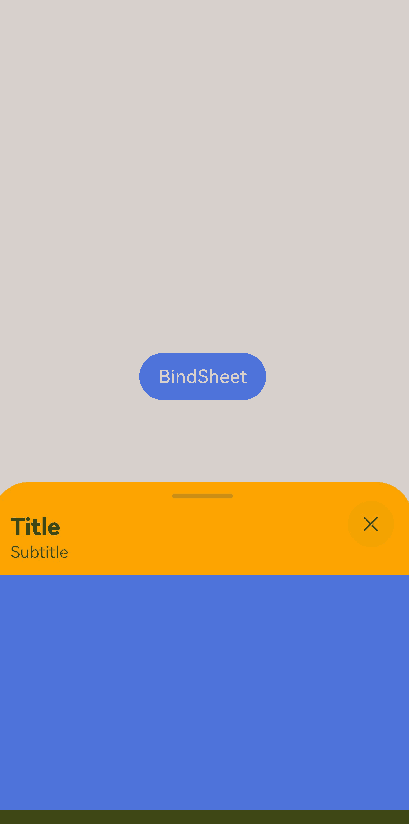
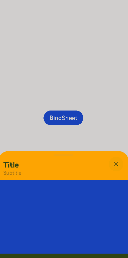
Example 5: Setting the Content Update Mode
This example shows how to use ScrollSizeMode.CONTINUOUS, which continuously updates the content and is suitable for detents with multiple height settings. Whenever possible, minimize UI loading time within the builder, as real-time content refreshing during scrolling has higher performance requirements.
// xxx.ets
@Entry
@Component
struct Index {
  @State isShow: boolean = false;

  @Builder
  myBuilder() {
    Column() {
      Column()
        .backgroundColor(Color.Blue)
        .height(200)
        .width('100%')
      Column()
        .backgroundColor(Color.Green)
        .height(200)
        .width('100%')
    }
  }

  build() {
    Column() {
      Button('BindSheet')
        .onClick(() => {
          this.isShow = true;
        })
        .bindSheet($$this.isShow, this.myBuilder(), {
          detents: [300, 600, 900],
          uiContext: this.getUIContext(),
          mode: SheetMode.OVERLAY,
          scrollSizeMode: ScrollSizeMode.CONTINUOUS,
          backgroundColor: Color.Orange,
          title: { title: 'Title', subtitle: 'Subtitle' }
        })
    }
    .justifyContent(FlexAlign.Center)
    .width('100%')
    .height('100%')
  }
}
The sheet’s content height is not updated until the user stops dragging and releases the sheet.
The sheet’s content height is updated in real time as the user drags the sheet.
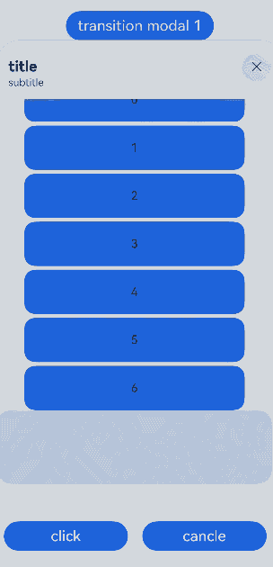
Example 6: Configuring the Sheet to Resize to Avoid the Keyboard
This example demonstrates how to adjust the scrollable content within a sheet when the keyboard height changes by setting SheetKeyboardAvoidMode to RESIZE_ONLY.
//xxx.ets
import window from '@ohos.window';
import { BusinessError } from '@ohos.base';

@Entry
@Component
struct ListenKeyboardHeightChange {
  @State isShow: boolean = false;
  @State avoidMode: SheetKeyboardAvoidMode = SheetKeyboardAvoidMode.RESIZE_ONLY;
  scroller = new Scroller();
  private arr: number[] = [0, 1, 2, 3, 4, 5, 6];
  windowClass: window.Window|undefined = undefined;

  aboutToAppear(): void {
    try {
      window.getLastWindow(this.getUIContext().getHostContext(), (err: BusinessError, data) => {
        const errCode: number = err.code;
        if (errCode) {
          console.error(`Failed to obtain the top window, Cause code: ${err.code}, message: ${err.message}`);
          return;
        }
        this.windowClass = data;
        try {
          if (this.windowClass !== undefined) {
            console.log('success in listen height change');
            this.windowClass.on('keyboardHeightChange', this.callback);
          }
        } catch (exception) {
          console.error(`Failed to enable the listener for keyboard height changes, Cause code: ${exception.code}, message: ${exception.message}`);
        }
        console.info('Succeeded in obtaining the top window. Data: ' + JSON.stringify(data));
      });
    } catch (exception) {
      console.error(`Failed to obtain the top window, Cause code: ${exception.code}, message: ${exception.message}`);
    }
  }

  callback = (height: number) => {
    console.log('height change: ' + height);
    if (height !== 0) {
      this.scroller.scrollTo({
        xOffset: 0, yOffset: height + this.scroller.currentOffset().yOffset,
        animation: { duration: 1000, curve: Curve.Ease, canOverScroll: false }
      });
    }
  }

  @Builder
  myBuilder() {
    Scroll(this.scroller) {
      Column() {
        ForEach(this.arr, (item: number) => {
          Row() {
            Text(item.toString())
              .width('80%')
              .height(60)
              .backgroundColor('#3366CC')
              .borderRadius(15)
              .fontSize(16)
              .textAlign(TextAlign.Center)
              .margin({ top: 5 })
          }
        }, (item: number) => item.toString())

        TextInput().height('100')

        Flex({ alignItems: ItemAlign.End }) {
          Row() {
            Button("click")
              .margin(10)
              .fontSize(20)
              .width('45%')

            Button("cancel")
              .margin(10)
              .fontSize(20)
              .width('45%')
          }.width('100%')
        }.height(100)
      }.margin({ right: 15, bottom: 50 })
    }
    .height('100%')
    .scrollBar(BarState.On)
    .scrollable(ScrollDirection.Vertical)
  }

  build() {
    Column() {
      Button("transition modal 1")
        .onClick(() => {
          this.isShow = true
        })
        .fontSize(20)
        .margin(10)
        .bindSheet($$this.isShow, this.myBuilder(), {
          height: 750,
          backgroundColor: Color.Gray,
          blurStyle: BlurStyle.Thick,
          showClose: true,
          title: { title: "title", subtitle: "subtitle" },
          keyboardAvoidMode: SheetKeyboardAvoidMode.RESIZE_ONLY,
        })
    }
    .justifyContent(FlexAlign.Start)
    .width('100%')
    .height('100%')
  }
}
Example 7: Setting the Corner Radius in a Mirrored Layout
This example demonstrates how to set different corner radii for a sheet in a mirrored layout. Typically, to avoid a poor visual experience, do not set different values.
In this example, the radius property of the sheet uses the LocalizedBorderRadiuses type.
import { LengthMetrics } from '@kit.ArkUI';

@Entry
@Component
struct SheetTransitionExample {
  @State isShow: boolean = false

  @Builder
  myBuilder() {
    Column() {
      Button("content1")
        .margin(10)
        .fontSize(20)

      Button("content2")
        .margin(10)
        .fontSize(20)
    }
    .width('100%')
  }

  build() {
    Column() {
      Button("transition modal 1")
        .onClick(() => {
          this.isShow = true
        })
        .fontSize(20)
        .margin(10)
        .bindSheet($$this.isShow, this.myBuilder(), {
          detents: [SheetSize.MEDIUM, SheetSize.LARGE, 200],
          title: { title: "title", subtitle: "subtitle" },
          radius: { topStart: LengthMetrics.vp(50), topEnd: LengthMetrics.vp(10) },
        })
    }
    .justifyContent(FlexAlign.Start)
    .width('100%')
    .height('100%')
  }
}
The following shows how the example is represented with left-to-right scripts.
The following shows how the example is represented with right-to-left scripts.
你可能感兴趣的鸿蒙文章
- 所属分类: 后端技术
- 本文标签:
热门推荐
-
2、 优质文章
-
3、 gt
-
7、 openharmony
-
9、 golang
-
10、 Vue中input框自动聚焦