harmony 鸿蒙@ohos.promptAction (Prompt)
@ohos.promptAction (Prompt)
The PromptAction module provides APIs for creating and showing toasts, dialog boxes, and action menus.
NOTE
The initial APIs of this module are supported since API version 9. Newly added APIs will be marked with a superscript to indicate their earliest API version.
This module cannot be used in the file declaration of the UIAbility. In other words, the APIs of this module can be used only after a component instance is created; they cannot be called in the lifecycle of the UIAbility.
The functionality of this module depends on UI context. This means that the APIs of this module cannot be used where the UI context is unclear. For details, see UIContext. Except for UI-less scenarios such as ServiceExtension, it is recommended that you use the dialog APIs provided by UIContext.
Modules to Import
import { promptAction } from '@kit.ArkUI';
promptAction.openToast18+
openToast(options: ShowToastOptions): Promise<number>
Opens a toast. This API returns the toast ID.
Atomic service API: This API can be used in atomic services since API version 18.
System capability: SystemCapability.ArkUI.ArkUI.Full
Parameters
| Name | Type | Mandatory | Description |
|---|---|---|---|
| options | ShowToastOptions | Yes | Toast options. |
Return value
| Type | Description |
|---|---|
| Promise<number> | ID of the toast, which is required in closeToast. |
Error codes
For details about the error codes, see Universal Error Codes and promptAction Error Codes.
| ID | Error Message |
|---|---|
| 401 | Parameter error. Possible causes: 1. Mandatory parameters are left unspecified; 2.Incorrect parameters types; 3. Parameter verification failed. |
| 100001 | Internal error. |
Example
import { promptAction } from '@kit.ArkUI';
import { BusinessError } from '@kit.BasicServicesKit';
@Entry
@Component
struct toastExample {
@State toastId: number = 0;
build() {
Column() {
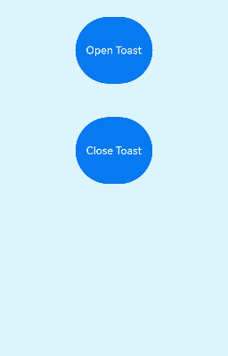
Button('Open Toast')
.height(100)
.type(ButtonType.Capsule)
.onClick(() => {
promptAction.openToast({
message: 'Toast Message',
duration: 10000,
}).then((toastId: number) => {
this.toastId = toastId;
})
.catch((error: BusinessError) => {
console.error(`openToast error code is ${error.code}, message is ${error.message}`)
})
})
Blank().height(50);
Button('Close Toast')
.height(100)
.type(ButtonType.Capsule)
.onClick(() => {
try {
promptAction.closeToast(this.toastId);
} catch (error) {
let message = (error as BusinessError).message;
let code = (error as BusinessError).code;
console.error(`CloseToast error code is ${code}, message is ${message}`);
};
})
}.height('100%').width('100%').justifyContent(FlexAlign.Center)
}
}
promptAction.closeToast18+
closeToast(toastId: number): void
Closes a toast.
Atomic service API: This API can be used in atomic services since API version 18.
System capability: SystemCapability.ArkUI.ArkUI.Full
Parameters
| Name | Type | Mandatory | Description |
|---|---|---|---|
| toastId | number | Yes | ID of the toast to close, which is returned by openToast. |
Error codes
For details about the error codes, see Universal Error Codes and promptAction Error Codes.
| ID | Error Message |
|---|---|
| 401 | Parameter error. Possible causes: 1. Mandatory parameters are left unspecified; 2.Incorrect parameters types; 3. Parameter verification failed. |
| 100001 | Internal error. |
Example
See the example for promptAction.openToaset18.
ShowToastOptions
Describes the options for showing the toast.
System capability: SystemCapability.ArkUI.ArkUI.Full
| Name | Type | Mandatory | Description |
|---|---|---|---|
| message | string |Resource | Yes | Text to display. NOTE The default font is ‘Harmony Sans’. Other fonts are not supported. Atomic service API: This API can be used in atomic services since API version 11. |
| duration | number | No | Duration that the toast will remain on the screen. The default value is 1500 ms. The value range is 1500 ms to 10000 ms. If a value less than 1500 ms is set, the default value is used. If the value greater than 10000 ms is set, the upper limit 10000 ms is used. Atomic service API: This API can be used in atomic services since API version 11. |
| bottom | string |number | No | Distance from the bottom of the toast to the navigation bar. In ToastShowMode.TOP_MOST mode, if the soft keyboard is raised and the bottom value is too small, the toast will automatically avoid being blocked by the soft keyboard by moving up 80 vp above it. In ToastShowMode.DEFAULT mode, the toast will move up by the height of the soft keyboard. Default value: 80vp NOTE When there is no navigation bar at the bottom, bottom sets the distance from the bottom of the toast to the bottom of the window. If the alignment property is set, bottom will not take effect. Atomic service API: This API can be used in atomic services since API version 11. |
| showMode11+ | ToastShowMode | No | Whether to show the toast above the application. Default value: ToastShowMode.DEFAULT, which means to show the toast in the application. Atomic service API: This API can be used in atomic services since API version 12. |
| alignment12+ | Alignment | No | Alignment mode. Default value: undefined, indicating bottom start Atomic service API: This API can be used in atomic services since API version 12. |
| offset12+ | Offset | No | Offset in the specified alignment mode. Default value: { dx: 0, dy: 0 }, indicating no offset NOTE Only values in the px unit are accepted. To use the vp unit, convert them to px first. Atomic service API: This API can be used in atomic services since API version 12. |
| backgroundColor12+ | ResourceColor | No | Background color of the toast. Default value: Color.Transparent NOTE When backgroundColor is set to a non-transparent color, backgroundBlurStyle must be set to BlurStyle.NONE; otherwise, the color display may not meet the expected effect. Atomic service API: This API can be used in atomic services since API version 12. |
| textColor12+ | ResourceColor | No | Font color of the toast. Default value: Color.Black Atomic service API: This API can be used in atomic services since API version 12. |
| backgroundBlurStyle12+ | BlurStyle | No | Background blur style of the toast. Default value: BlurStyle.COMPONENT_ULTRA_THICK NOTE Setting this parameter to BlurStyle.NONE disables the background blur. When backgroundBlurStyle is set to a value other than NONE, do not set backgroundColor. If you do, the color display may not produce the expected visual effect. Atomic service API: This API can be used in atomic services since API version 12. |
| shadow12+ | ShadowOptions |ShadowStyle | No | Background shadow of the toast. Default value: ShadowStyle.OUTER_DEFAULT_MD Atomic service API: This API can be used in atomic services since API version 12. |
| enableHoverMode14+ | boolean | No | Whether to enable the hover state. Default value: false, meaning not to enable the hover state. Atomic service API: This API can be used in atomic services since API version 14. |
| hoverModeArea14+ | HoverModeAreaType | No | Display area of the toast in the hover state. Default value: HoverModeAreaType.BOTTOM_SCREEN, indicating that the toast is displayed in the lower half screen Atomic service API: This API can be used in atomic services since API version 14. |
ToastShowMode11+
Describes the mode in which the toast is shown.
Atomic service API: This API can be used in atomic services since API version 12.
System capability: SystemCapability.ArkUI.ArkUI.Full
| Name | Value | Description |
|---|---|---|
| DEFAULT | 0 | The toast is shown within the application. |
| TOP_MOST | 1 | The toast is shown above the application. |
ShowDialogOptions
Describes the options for showing the dialog box.
System capability: SystemCapability.ArkUI.ArkUI.Full
| Name | Type | Mandatory | Description |
|---|---|---|---|
| title | string |Resource | No | Title of the dialog box. Atomic service API: This API can be used in atomic services since API version 11. |
| message | string |Resource | No | Text body. Atomic service API: This API can be used in atomic services since API version 11. |
| buttons | Array<Button> | No | Array of buttons in the dialog box. The array structure is {text:‘button’, color: ‘#666666’}. More than one button is supported. Atomic service API: This API can be used in atomic services since API version 11. |
| alignment10+ | DialogAlignment | No | Alignment mode of the dialog box in the vertical direction. Default value: DialogAlignment.Default NOTE If showInSubWindow is set to true in UIExtension, the dialog box is aligned with the host window based on UIExtension. Atomic service API: This API can be used in atomic services since API version 11. |
| offset10+ | Offset | No | Offset of the dialog box based on the alignment settings. Default value: { dx: 0 , dy: 0 } Atomic service API: This API can be used in atomic services since API version 11. |
| maskRect10+ | Rectangle | No | Mask area of the dialog box. Events outside the mask area are transparently transmitted, and events within the mask area are not. Default value: { x: 0, y: 0, width: ‘100%’, height: ‘100%’ } NOTE maskRect does not take effect when showInSubWindow is set to true. If only partial properties are set, the unspecified properties default to 0. Atomic service API: This API can be used in atomic services since API version 11. |
| showInSubWindow11+ | boolean | No | Whether to show the dialog box in a subwindow when it is not in the main window. Default value: false, meaning the dialog box is displayed within the application, not in a separate subwindow NOTE A dialog box whose showInSubWindow attribute is true cannot trigger the display of another dialog box whose showInSubWindow attribute is also true. Atomic service API: This API can be used in atomic services since API version 12. |
| isModal11+ | boolean | No | Whether the dialog box is a modal. A modal dialog box has a mask applied, while a non-modal dialog box does not. Default value: true Atomic service API: This API can be used in atomic services since API version 12. |
| backgroundColor12+ | ResourceColor | No | Background color of the dialog box. Default value: Color.Transparent NOTE When backgroundColor is set to a non-transparent color, backgroundBlurStyle must be set to BlurStyle.NONE; otherwise, the color display may not meet the expected effect. Atomic service API: This API can be used in atomic services since API version 12. |
| backgroundBlurStyle12+ | BlurStyle | No | Background blur style of the dialog box. Default value: BlurStyle.COMPONENT_ULTRA_THICK NOTE Setting this parameter to BlurStyle.NONE disables the background blur. When backgroundBlurStyle is set to a value other than NONE, do not set backgroundColor. If you do, the color display may not produce the expected visual effect. Atomic service API: This API can be used in atomic services since API version 12. |
| backgroundBlurStyleOptions18+ | BackgroundBlurStyleOptions | No | Options for customizing the background blur style. Atomic service API: This API can be used in atomic services since API version 18. |
| backgroundEffect18+ | BackgroundEffectOptions | No | Options for customizing the background effect. Atomic service API: This API can be used in atomic services since API version 18. |
| shadow12+ | ShadowOptions |ShadowStyle | No | Shadow of the dialog box. Default value on 2-in-1 devices: ShadowStyle.OUTER_FLOATING_MD when the dialog box is focused and ShadowStyle.OUTER_FLOATING_SM otherwise Atomic service API: This API can be used in atomic services since API version 12. |
| enableHoverMode14+ | boolean | No | Whether to enable the hover state. Default value: false, meaning not to enable the hover state. Atomic service API: This API can be used in atomic services since API version 14. |
| hoverModeArea14+ | HoverModeAreaType | No | Display area of the dialog box in the hover state. Default value: HoverModeAreaType.BOTTOM_SCREEN Atomic service API: This API can be used in atomic services since API version 14. |
| onWillAppear18+ | Callback<void> | No | Event callback when the dialog box is about to appear. NOTE 1. The normal timing sequence is as follows: onWillAppear > onDidAppear > onWillDisappear > onDidDisappear. 2. You can set the callback event for changing the dialog box display effect in onWillAppear. The settings take effect next time the dialog box appears. Atomic service API: This API can be used in atomic services since API version 18. |
| onDidAppear18+ | Callback<void> | No | Event callback when the dialog box appears. NOTE 1. The normal timing sequence is as follows: onWillAppear > onDidAppear > onWillDisappear > onDidDisappear. 2. You can set the callback event for changing the dialog box display effect in onDidAppear. The settings take effect next time the dialog box appears. 3. When a dialog box is dismissed immediately after being shown, onWillDisappear may be triggered before onDidAppear. 4. If the dialog box is dismissed before its entrance animation is finished, the animation will be interrupted, and onDidAppear will not be triggered. Atomic service API: This API can be used in atomic services since API version 18. |
| onWillDisappear18+ | Callback<void> | No | Event callback when the dialog box is about to disappear. NOTE 1. The normal timing sequence is as follows: onWillAppear > onDidAppear > onWillDisappear > onDidDisappear. Atomic service API: This API can be used in atomic services since API version 18. |
| onDidDisappear18+ | Callback<void> | No | Event callback when the dialog box disappears. NOTE 1. The normal timing sequence is as follows: onWillAppear > onDidAppear > onWillDisappear > onDidDisappear. Atomic service API: This API can be used in atomic services since API version 18. |
| levelMode15+ | LevelMode | No | Display level of the dialog box. NOTE - Default value: LevelMode.OVERLAY - This parameter takes effect only when showInSubWindow is set to false. Atomic service API: This API can be used in atomic services since API version 15. |
| levelUniqueId15+ | number | No | Unique ID of the node under the display level for the page-level dialog box. NOTE - This parameter takes effect only when levelMode is set to LevelMode.EMBEDDED. Atomic service API: This API can be used in atomic services since API version 15. |
| immersiveMode15+ | ImmersiveMode | No | Overlay effect for the page-level dialog box. NOTE - Default value: ImmersiveMode.DEFAULT - This parameter takes effect only when levelMode is set to LevelMode.EMBEDDED. Atomic service API: This API can be used in atomic services since API version 15. |
| levelOrder18+ | LevelOrder | No | Display order of the dialog box. NOTE - Default value: LevelOrder.clamp(0) - Dynamic updating is not supported. Atomic service API: This API can be used in atomic services since API version 18. |
ShowDialogSuccessResponse
Describes the dialog box response result.
Atomic service API: This API can be used in atomic services since API version 11.
System capability: SystemCapability.ArkUI.ArkUI.Full
| Name | Type | Mandatory | Description |
|---|---|---|---|
| index | number | Yes | Index of the selected button in the buttons array. |
ActionMenuOptions
Describes the options for showing the action menu.
System capability: SystemCapability.ArkUI.ArkUI.Full
| Name | Type | Mandatory | Description |
|---|---|---|---|
| title | string |Resource | No | Title of the dialog box. Atomic service API: This API can be used in atomic services since API version 11. |
| buttons | [Button,Button?,Button?,Button?,Button?,Button?] | Yes | Array of menu item buttons. The array structure is {text:‘button’, color: ‘#666666’}. Up to six buttons are supported. If there are more than six buttons, only the first six buttons will be displayed. Atomic service API: This API can be used in atomic services since API version 11. |
| showInSubWindow11+ | boolean | No | Whether to show the dialog box in a subwindow when it is not in the main window. Default value: false, indicating that the dialog box is not displayed in the subwindow NOTE - A dialog box whose showInSubWindow attribute is true cannot trigger the display of another dialog box whose showInSubWindow attribute is also true. - If showInSubWindow is set to true in UIExtension, the dialog box is aligned with the host window based on UIExtension. Atomic service API: This API can be used in atomic services since API version 12. |
| isModal11+ | boolean | No | Whether the dialog box is a modal. A modal dialog box has a mask applied, while a non-modal dialog box does not. Default value: true Atomic service API: This API can be used in atomic services since API version 12. |
| levelMode15+ | LevelMode | No | Display level of the dialog box. NOTE - Default value: LevelMode.OVERLAY - This parameter takes effect only when showInSubWindow is set to false. Atomic service API: This API can be used in atomic services since API version 15. |
| levelUniqueId15+ | number | No | Unique ID of the node under the display level for the page-level dialog box. NOTE - This parameter takes effect only when levelMode is set to LevelMode.EMBEDDED. Atomic service API: This API can be used in atomic services since API version 15. |
| immersiveMode15+ | ImmersiveMode | No | Overlay effect for the page-level dialog box. NOTE - Default value: ImmersiveMode.DEFAULT - This parameter takes effect only when levelMode is set to LevelMode.EMBEDDED. Atomic service API: This API can be used in atomic services since API version 15. |
ActionMenuSuccessResponse
Describes the action menu response result.
Atomic service API: This API can be used in atomic services since API version 11.
System capability: SystemCapability.ArkUI.ArkUI.Full
| Name | Type | Mandatory | Description |
|---|---|---|---|
| index | number | Yes | Index of the selected button in the buttons array, starting from 0. |
DialogController18+
Implements a custom dialog box controller that inherits from CommonController.
It can be used as a member variable of UIContext to display custom dialog boxes. For specific usage, see the examples for openCustomDialogWithController and presentCustomDialog.
Atomic service API: This API can be used in atomic services since API version 18.
System capability: SystemCapability.ArkUI.ArkUI.Full
CommonController18+
Implements a common controller for managing components related to promptAction.
Atomic service API: This API can be used in atomic services since API version 18.
System capability: SystemCapability.ArkUI.ArkUI.Full
constructor
constructor()
Atomic service API: This API can be used in atomic services since API version 18.
System capability: SystemCapability.ArkUI.ArkUI.Full
close
close(): void
Closes the custom dialog box. If the dialog box is already closed, this API has no effect.
Atomic service API: This API can be used in atomic services since API version 18.
System capability: SystemCapability.ArkUI.ArkUI.Full
LevelOrder18+
Defines the display order of a dialog box.
Atomic service API: This API can be used in atomic services since API version 18.
System capability: SystemCapability.ArkUI.ArkUI.Full
clamp18+
static clamp(order: number): LevelOrder
Creates a dialog box level with the specified order.
Atomic service API: This API can be used in atomic services since API version 18.
System capability: SystemCapability.ArkUI.ArkUI.Full
Parameters
| Name | Type | Mandatory | Description |
|---|---|---|---|
| order | number | Yes | Display order of the dialog box. The value range is [-100000.0, +100000.0]. Values outside this range are clamped to the nearest limit. |
Return value
| Type | Description |
|---|---|
| LevelOrder | Current instance. |
getOrder18+
getOrder(): number
Obtains the display order of this dialog box.
Atomic service API: This API can be used in atomic services since API version 18.
System capability: SystemCapability.ArkUI.ArkUI.Full
Return value
| Type | Description |
|---|---|
| number | Display order of the dialog box. |
DialogOptions18+
Defines the options of the custom dialog box. This API extends BaseDialogOptions.
Atomic service API: This API can be used in atomic services since API version 18.
System capability: SystemCapability.ArkUI.ArkUI.Full
| Name | Type | Mandatory | Description |
|---|---|---|---|
| backgroundColor | ResourceColor | No | Background color of the dialog box. Default value: Color.Transparent NOTE When backgroundColor is set to a non-transparent color, backgroundBlurStyle must be set to BlurStyle.NONE; otherwise, the color display may not meet the expected effect. |
| cornerRadius | DialogOptionsCornerRadius | No | Background corner radius of the dialog box. You can set separate radiuses for the four rounded corners. Default value: { topLeft: ‘32vp’, topRight: ‘32vp’, bottomLeft: ‘32vp’, bottomRight: ‘32vp’ } The radius of the rounded corners is subject to the component size. Its maximum value is half of the component width or height. If the value is negative, the default value is used. When set to a percentage, the value defines the radius as a percentage of the parent component’s width or height. |
| borderWidth | DialogOptionsBorderWidth | No | Border width of the dialog box. You can set the width for all four sides or set separate widths for individual sides. Default value: 0 When set to a percentage, the value defines the border width as a percentage of the parent dialog box’s width. If the left and right borders are greater than its width, or the top and bottom borders are greater than its height, the dialog box may not display as expected. |
| borderColor | DialogOptionsBorderColor | No | Border color of the dialog box. Default value: Color.Black borderColor must be used with borderWidth in pairs. |
| borderStyle | DialogOptionsBorderStyle | No | Border style of the dialog box. Default value: BorderStyle.Solid borderStyle must be used with borderWidth in pairs. |
| width | Dimension | No | Width of the dialog box. NOTE - Default maximum width of the dialog box: 400 vp - When this parameter is set to a percentage, the reference width of the dialog box is the width of the window where the dialog box is located. You can decrease or increase the width as needed. |
| height | Dimension | No | Height of the dialog box. NOTE - Default maximum height of the dialog box: 0.9 x (Window height – Safe area) - When this parameter is set to a percentage, the reference height of the dialog box is the height of the window where the dialog box is located minus the safe area. You can decrease or increase the height as needed. |
| shadow | DialogOptionsShadow | No | Shadow of the dialog box. Default value on 2-in-1 devices: ShadowStyle.OUTER_FLOATING_MD when the dialog box is focused and ShadowStyle.OUTER_FLOATING_SM otherwise |
| backgroundBlurStyle | BlurStyle | No | Background blur style of the dialog box. Default value: BlurStyle.COMPONENT_ULTRA_THICK NOTE Setting this parameter to BlurStyle.NONE disables the background blur. When backgroundBlurStyle is set to a value other than NONE, do not set backgroundColor. If you do, the color display may not produce the expected visual effect. |
DialogOptionsCornerRadius18+
type DialogOptionsCornerRadius = Dimension |BorderRadiuses
Defines the allowed data types for specifying the background corner radius of a dialog box.
Atomic service API: This API can be used in atomic services since API version 18.
System capability: SystemCapability.ArkUI.ArkUI.Full
| Type | Description |
|---|---|
| Dimension | Length type used to represent a size unit. |
| BorderRadiuses | Type used to describe the corner radius of a component’s border. |
DialogOptionsBorderWidth18+
type DialogOptionsBorderWidth = Dimension |EdgeWidths
Defines the allowed data types for specifying the background border width of a dialog box.
Atomic service API: This API can be used in atomic services since API version 18.
System capability: SystemCapability.ArkUI.ArkUI.Full
| Type | Description |
|---|---|
| Dimension | Length type used to represent a size unit. |
| EdgeWidths | Type used to describe the edge width of a component in different directions. |
DialogOptionsBorderColor18+
type DialogOptionsBorderColor = ResourceColor |EdgeColors
Defines the allowed data types for specifying the background border color of a dialog box.
Atomic service API: This API can be used in atomic services since API version 18.
System capability: SystemCapability.ArkUI.ArkUI.Full
| Type | Description |
|---|---|
| ResourceColor | Color type used to describe resource colors. |
| EdgeColors | Type used to describe the border color for each edge of a component. |
DialogOptionsBorderStyle18+
type DialogOptionsBorderStyle = BorderStyle |EdgeStyles
Defines the allowed data types for specifying the background border style of a dialog box.
Atomic service API: This API can be used in atomic services since API version 18.
System capability: SystemCapability.ArkUI.ArkUI.Full
| Type | Description |
|---|---|
| BorderStyle | Type used to describe the border style of a component. |
| EdgeStyles | Type used to describe the border style for each edge of a component. |
DialogOptionsShadow18+
type DialogOptionsShadow = ShadowOptions |ShadowStyle
Defines the allowed data types for specifying the background shadow of a dialog box.
Atomic service API: This API can be used in atomic services since API version 18.
System capability: SystemCapability.ArkUI.ArkUI.Full
| Type | Description |
|---|---|
| ShadowOptions | Type used to describe shadow attributes, including the blur radius, color, and offset along the x-axis and y-axis. |
| ShadowStyle | Type used to describe the shadow style. |
CustomDialogOptions11+
Defines the options of a custom dialog box, which inherit from BaseDialogOptions.
Atomic service API: This API can be used in atomic services since API version 12.
System capability: SystemCapability.ArkUI.ArkUI.Full
| Name | Type | Mandatory | Description |
|---|---|---|---|
| builder | CustomBuilder | Yes | Content of the custom dialog box. NOTE The builder needs to be assigned an arrow function in the following format: () => { this.XXX() }, where XXX indicates the internal builder name. If you are working with a global builder, call it within a local builder within a component. The aspect ratio of the root node of a builder is relative to the size of the dialog box container. The aspect ratio of a non-root node is relative to the size of its parent node. Atomic service API: This API can be used in atomic services since API version 12. |
| backgroundColor 12+ | ResourceColor | No | Background color of the dialog box. Default value: Color.Transparent NOTE When backgroundColor is set to a non-transparent color, backgroundBlurStyle must be set to BlurStyle.NONE; otherwise, the color display may not meet the expected effect. |
| cornerRadius12+ | Dimension |BorderRadiuses | No | Radius of the rounded corners of the background. You can set separate radiuses for the four rounded corners. Default value: { topLeft: ‘32vp’, topRight: ‘32vp’, bottomLeft: ‘32vp’, bottomRight: ‘32vp’ } The radius of the rounded corners is subject to the component size. Its maximum value is half of the component width or height. If the value is negative, the default value is used. When set to a percentage, the value defines the radius as a percentage of the parent component’s width or height. |
| borderWidth12+ | Dimension |EdgeWidths | No | Border width of the dialog box. You can set the width for all four sides or set separate widths for individual sides. Default value: 0 When set to a percentage, the value defines the border width as a percentage of the parent dialog box’s width. If the left and right borders are greater than its width, or the top and bottom borders are greater than its height, the dialog box may not display as expected. |
| borderColor12+ | ResourceColor |EdgeColors | No | Border color of the dialog box. Default value: Color.Black borderColor must be used with borderWidth in pairs. |
| borderStyle12+ | BorderStyle |EdgeStyles | No | Border style of the dialog box. Default value: BorderStyle.Solid borderStyle must be used with borderWidth in pairs. |
| width12+ | Dimension | No | Width of the dialog box. NOTE - Default maximum width of the dialog box: 400 vp - When this parameter is set to a percentage, the reference width of the dialog box is the width of the window where the dialog box is located. You can decrease or increase the width as needed. |
| height12+ | Dimension | No | Height of the dialog box. NOTE - Default maximum height of the dialog box: 0.9 x (Window height – Safe area) - When this parameter is set to a percentage, the reference height of the dialog box is the height of the window where the dialog box is located minus the safe area. You can decrease or increase the height as needed. |
| shadow12+ | ShadowOptions |ShadowStyle | No | Shadow of the dialog box. Default value on 2-in-1 devices: ShadowStyle.OUTER_FLOATING_MD when the dialog box is focused and ShadowStyle.OUTER_FLOATING_SM otherwise |
| backgroundBlurStyle12+ | BlurStyle | No | Background blur style of the dialog box. Default value: BlurStyle.COMPONENT_ULTRA_THICK NOTE Setting this parameter to BlurStyle.NONE disables the background blur. When backgroundBlurStyle is set to a value other than NONE, do not set backgroundColor. If you do, the color display may not produce the expected visual effect. |
BaseDialogOptions11+
Defines the options of the dialog box.
System capability: SystemCapability.ArkUI.ArkUI.Full
| Name | Type | Mandatory | Description |
|---|---|---|---|
| maskRect | Rectangle | No | Mask area. Default value: { x: 0, y: 0, width: ‘100%’, height: ‘100%’ } NOTE maskRect does not take effect when showInSubWindow is set to true. If only partial properties are set, the unspecified properties default to 0. Atomic service API: This API can be used in atomic services since API version 12. |
| alignment | DialogAlignment | No | Alignment mode of the dialog box in the vertical direction. Default value: DialogAlignment.Default NOTE If showInSubWindow is set to true in UIExtension, the dialog box is aligned with the host window based on UIExtension. Atomic service API: This API can be used in atomic services since API version 12. |
| offset | Offset | No | Offset of the dialog box based on the alignment settings. Default value: { dx: 0 , dy: 0 } Atomic service API: This API can be used in atomic services since API version 12. |
| isModal | boolean | No | Whether the dialog box is a modal. A modal dialog box has a mask applied, while a non-modal dialog box does not. Default value: true Atomic service API: This API can be used in atomic services since API version 12. |
| showInSubWindow | boolean | No | Whether to show the dialog box in a subwindow when it is not in the main window. Default value: false, meaning the dialog box is displayed within the application, not in a separate subwindow Atomic service API: This API can be used in atomic services since API version 12. |
| onWillDismiss12+ | Callback<DismissDialogAction> | No | Callback for interactive dismissal of the dialog box. NOTE 1. If this callback is registered, the dialog box will not be dismissed immediately after the user touches the mask or the Back button, presses the Esc key, or swipes left or right on the screen. The reason parameter in the callback is used to determine whether the dialog box can be dismissed. The reason returned by the component does not support the value CLOSE_BUTTON. 2. In the onWillDismiss callback, another onWillDismiss callback is not allowed. Atomic service API: This API can be used in atomic services since API version 12. |
| autoCancel12+ | boolean | No | Whether to dismiss the dialog box when the mask is touched. The value true means to dismiss the dialog box when the mask is touched, and false means the opposite. Default value: true Atomic service API: This API can be used in atomic services since API version 12. |
| maskColor12+ | ResourceColor | No | Mask color. Default value: 0x33000000 Atomic service API: This API can be used in atomic services since API version 12. |
| transition12+ | TransitionEffect | No | Transition effect for the entrance and exit of the dialog box. NOTE 1. If this parameter is not set, the default effect is used. 2. Touching the Back button during the entrance animation pauses the entrance animation and starts the exit animation. The final effect is one obtained after the curves of the entrance and exit animations are combined. 3. Touching the Back button during the exit animation does not affect the animation playback. Touching the Back button again closes the application. Atomic service API: This API can be used in atomic services since API version 12. |
| dialogTransition18+ | TransitionEffect | No | Transition effect for the dialog box content. By default, there is no transition effect. Atomic service API: This API can be used in atomic services since API version 18. |
| maskTransition18+ | TransitionEffect | No | Transition effect for the mask. If not set, the transition effect matches the mask’s display animation. Atomic service API: This API can be used in atomic services since API version 18. |
| onDidAppear12+ | () => void | No | Event callback when the dialog box appears. NOTE 1. The normal timing sequence is as follows: onWillAppear > onDidAppear > (onDateAccept/onCancel/onDateChange) > onWillDisappear > onDidDisappear. 2. You can set the callback event for changing the dialog box display effect in onDidAppear. The settings take effect next time the dialog box appears. 3. If the user dismisses the dialog box immediately after it appears, onWillDisappear is invoked before onDidAppear. 4. If the dialog box is dismissed before its entrance animation is finished, this callback is not invoked. Atomic service API: This API can be used in atomic services since API version 12. |
| onDidDisappear12+ | () => void | No | Event callback when the dialog box disappears. NOTE The normal timing sequence is as follows: onWillAppear > onDidAppear > (onDateAccept/onCancel/onDateChange) > onWillDisappear > onDidDisappear. Atomic service API: This API can be used in atomic services since API version 12. |
| onWillAppear12+ | () => void | No | Event callback when the dialog box is about to appear. NOTE 1. The normal timing sequence is as follows: onWillAppear > onDidAppear > (onDateAccept/onCancel/onDateChange) > onWillDisappear > onDidDisappear. 2. You can set the callback event for changing the dialog box display effect in onWillAppear. The settings take effect next time the dialog box appears. Atomic service API: This API can be used in atomic services since API version 12. |
| onWillDisappear12+ | () => void | No | Event callback when the dialog box is about to disappear. NOTE 1. The normal timing sequence is as follows: onWillAppear > onDidAppear > (onDateAccept/onCancel/onDateChange) > onWillDisappear > onDidDisappear. 2. If the user dismisses the dialog box immediately after it appears, onWillDisappear is invoked before onDidAppear. Atomic service API: This API can be used in atomic services since API version 12. |
| keyboardAvoidMode12+ | KeyboardAvoidMode | No | How the dialog box avoids the soft keyboard when it is brought up. Default value: KeyboardAvoidMode.DEFAULT Atomic service API: This API can be used in atomic services since API version 12. |
| enableHoverMode14+ | boolean | No | Whether to enable the hover state. Default value: false, meaning not to enable the hover state. Atomic service API: This API can be used in atomic services since API version 14. |
| hoverModeArea14+ | HoverModeAreaType | No | Display area of the dialog box in the hover state. Default value: HoverModeAreaType.BOTTOM_SCREEN Atomic service API: This API can be used in atomic services since API version 14. |
| backgroundBlurStyleOptions18+ | BackgroundBlurStyleOptions | No | Options for customizing the background blur style. Atomic service API: This API can be used in atomic services since API version 18. |
| backgroundEffect18+ | BackgroundEffectOptions | No | Options for customizing the background effect. Atomic service API: This API can be used in atomic services since API version 18. |
| keyboardAvoidDistance15+ | LengthMetrics | No | Distance between the dialog box and the keyboard after keyboard avoidance is applied. NOTE - Default value: 16vp - Default unit: vp - This parameter takes effect only when keyboardAvoidMode is set to DEFAULT. Atomic service API: This API can be used in atomic services since API version 15. |
| levelMode15+ | LevelMode | No | Display level of the dialog box. NOTE - Default value: LevelMode.OVERLAY - This parameter takes effect only when showInSubWindow is set to false. Atomic service API: This API can be used in atomic services since API version 15. |
| levelUniqueId15+ | number | No | Unique ID of the node under the display level for the page-level dialog box. NOTE - This parameter takes effect only when levelMode is set to LevelMode.EMBEDDED. Atomic service API: This API can be used in atomic services since API version 15. |
| immersiveMode15+ | ImmersiveMode | No | Overlay effect for the page-level dialog box. NOTE - Default value: ImmersiveMode.DEFAULT - This parameter takes effect only when levelMode is set to LevelMode.EMBEDDED. Atomic service API: This API can be used in atomic services since API version 15. |
| levelOrder18+ | LevelOrder | No | Display order of the dialog box. NOTE - Default value: LevelOrder.clamp(0) - Dynamic updating is not supported. Atomic service API: This API can be used in atomic services since API version 18. |
| focusable18+ | boolean | No | Whether the dialog box can gain focus. Default value: true NOTE Only dialog boxes that are displayed on top of the current window can gain focus. Atomic service API: This API can be used in atomic services since API version 18. |
DismissDialogAction12+
Provides information about the action to dismiss the dialog box.
Atomic service API: This API can be used in atomic services since API version 12.
System capability: SystemCapability.ArkUI.ArkUI.Full
Attributes
| Name | Type | Readable | Writable | Description |
|---|---|---|---|---|
| dismiss | Callback<void> | No | No | Callback for dismissing the dialog box. This API is called only when the dialog box needs to be exited. |
| reason | DismissReason | No | No | Reason why the dialog box cannot be dismissed. You must specify whether to dismiss the dialog box for each of the listed actions. |
DismissReason12+
Atomic service API: This API can be used in atomic services since API version 12.
System capability: SystemCapability.ArkUI.ArkUI.Full
| Name | Value | Description |
|---|---|---|
| PRESS_BACK | 0 | Touching the Back button, swiping left or right on the screen, or pressing the Esc key. |
| TOUCH_OUTSIDE | 1 | Touching the mask. |
| CLOSE_BUTTON | 2 | Touching the Close button. |
| SLIDE_DOWN | 3 | Sliding down. NOTE This API is effective only in sheet transition. |
LevelMode15+
Enumerates the display level modes of the dialog box.
Atomic service API: This API can be used in atomic services since API version 15.
System capability: SystemCapability.ArkUI.ArkUI.Full
| Name | Value | Description |
|---|---|---|
| OVERLAY | 0 | The dialog box is displayed at the root node level of the application window and remain visible during navigation. |
| EMBEDDED | 1 | The dialog box is a child of the page’s route/navigation and is hidden when the page is hidden. |
ImmersiveMode15+
Enumerates the display area modes of the dialog box overlay within a page.
Atomic service API: This API can be used in atomic services since API version 15.
System capability: SystemCapability.ArkUI.ArkUI.Full
| Name | Value | Description |
|---|---|---|
| DEFAULT | 0 | The dialog box overlay follows the layout constraints of its parent node. |
| EXTEND | 1 | The dialog box overlay can extend to cover the status bar and navigation bar for a more immersive look. |
Button
Describes the menu item button in the action menu.
System capability: SystemCapability.ArkUI.ArkUI.Full
| Name | Type | Mandatory | Description |
|---|---|---|---|
| text | string |Resource | Yes | Button text. Atomic service API: This API can be used in atomic services since API version 11. |
| color | string | Resource | Yes | Text color of the button. Atomic service API: This API can be used in atomic services since API version 11. |
| primary12+ | boolean | No | Whether the button responds to the Enter key by default when the dialog box has focus and the Tab key is not pressed for sequential focus navigation. If there are multiple buttons, set this parameter to true for only one button. Otherwise, no button will respond. Multiple dialog boxes can automatically gain focus and respond to user interactions in a sequential manner. Atomic service API: This API can be used in atomic services since API version 12. |
promptAction.showToast(deprecated)
showToast(options: ShowToastOptions): void
Shows a toast.
NOTE
This API is deprecated since API version 18. You are advised to use showToast on the obtained PromptAction object.
Since API version 10, you can use the getPromptAction API in UIContext to obtain the PromptAction object associated with the current UI context.
Atomic service API: This API can be used in atomic services since API version 11.
System capability: SystemCapability.ArkUI.ArkUI.Full
Parameters
| Name | Type | Mandatory | Description |
|---|---|---|---|
| options | ShowToastOptions | Yes | Toast options. |
Error codes
For details about the error codes, see Universal Error Codes and promptAction Error Codes.
| ID | Error Message |
|---|---|
| 401 | Parameter error. Possible causes: 1. Mandatory parameters are left unspecified; 2.Incorrect parameters types; 3. Parameter verification failed. |
| 100001 | Internal error. |
Example
import { promptAction } from '@kit.ArkUI';
import { BusinessError } from '@kit.BasicServicesKit';
@Entry
@Component
struct toastExample {
build() {
Column() {
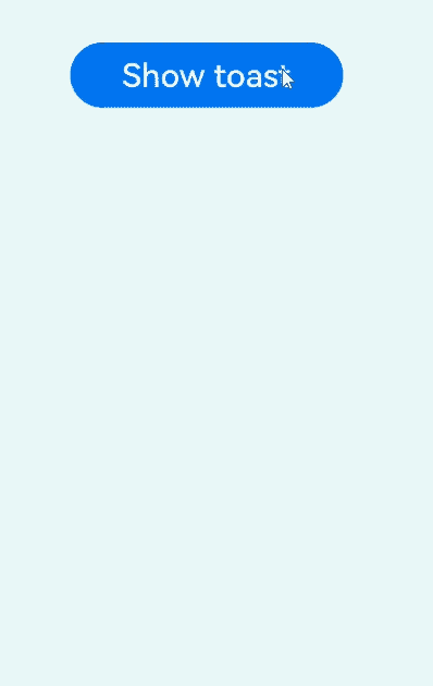
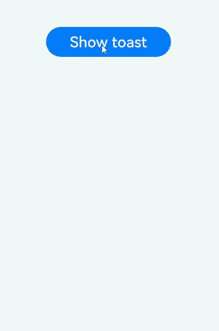
Button('Show toast').fontSize(20)
.onClick(() => {
try {
promptAction.showToast({
message: 'Hello World',
duration: 2000
});
} catch (error) {
let message = (error as BusinessError).message;
let code = (error as BusinessError).code;
console.error(`showToast args error code is ${code}, message is ${message}`);
};
})
}.height('100%').width('100%').justifyContent(FlexAlign.Center)
}
}
Below is a toast in API version 11 and earlier versions.
Below is a toast in API version 12 and later versions.
promptAction.showDialog(deprecated)
showDialog(options: ShowDialogOptions): Promise<ShowDialogSuccessResponse>
Shows a dialog box. This API uses a promise to return the result asynchronously.
NOTE
This API is deprecated since API version 18. You are advised to use showDialog instead on the obtained PromptAction object.
Since API version 10, you can use the getPromptAction API in UIContext to obtain the PromptAction object associated with the current UI context.
Atomic service API: This API can be used in atomic services since API version 11.
System capability: SystemCapability.ArkUI.ArkUI.Full
Parameters
| Name | Type | Mandatory | Description |
|---|---|---|---|
| options | ShowDialogOptions | Yes | Dialog box options. |
Return value
| Type | Description |
|---|---|
| Promise<ShowDialogSuccessResponse> | Promise used to return the dialog box response result. |
Error codes
For details about the error codes, see Universal Error Codes and promptAction Error Codes.
| ID | Error Message |
|---|---|
| 401 | Parameter error. Possible causes: 1. Mandatory parameters are left unspecified; 2.Incorrect parameters types; 3. Parameter verification failed. |
| 100001 | Internal error. |
Example
import { promptAction } from '@kit.ArkUI';
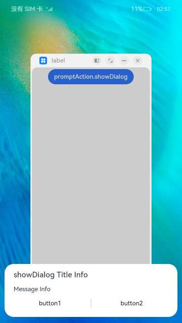
promptAction.showDialog({
title: 'Title Info',
message: 'Message Info',
buttons: [
{
text: 'button1',
color: '#000000'
},
{
text: 'button2',
color: '#000000'
}
],
})
.then(data => {
console.info('showDialog success, click button: ' + data.index);
})
.catch((err: Error) => {
console.info('showDialog error: ' + err);
})
promptAction.showDialog(deprecated)
showDialog(options: ShowDialogOptions, callback: AsyncCallback<ShowDialogSuccessResponse>):void
Shows a dialog box. This API uses an asynchronous callback to return the result.
NOTE
This API is deprecated since API version 18. You are advised to use showDialog instead on the obtained PromptAction object.
Since API version 10, you can use the getPromptAction API in UIContext to obtain the PromptAction object associated with the current UI context.
Atomic service API: This API can be used in atomic services since API version 11.
System capability: SystemCapability.ArkUI.ArkUI.Full
Parameters
| Name | Type | Mandatory | Description |
|---|---|---|---|
| options | ShowDialogOptions | Yes | Dialog box options. |
| callback | AsyncCallback<ShowDialogSuccessResponse> | Yes | Callback used to return the dialog box response result. |
Error codes
For details about the error codes, see Universal Error Codes and promptAction Error Codes.
| ID | Error Message |
|---|---|
| 401 | Parameter error. Possible causes: 1. Mandatory parameters are left unspecified; 2.Incorrect parameters types; 3. Parameter verification failed. |
| 100001 | Internal error. |
Example
import { promptAction } from '@kit.ArkUI';
import { BusinessError } from '@kit.BasicServicesKit';

try {
  promptAction.showDialog({
    title: 'showDialog Title Info',
    message: 'Message Info',
    buttons: [
      {
        text: 'button1',
        color: '#000000'
      },
      {
        text: 'button2',
        color: '#000000'
      }
    ]
  }, (err, data) => {
    if (err) {
      console.info('showDialog err: ' + err);
      return;
    }
    console.info('showDialog success callback, click button: ' + data.index);
  });
} catch (error) {
  let message = (error as BusinessError).message;
  let code = (error as BusinessError).code;
  console.error(`showDialog args error code is ${code}, message is ${message}`);
};
When the showInSubWindow attribute is set to true, the toast can be displayed outside the window.
import { promptAction } from '@kit.ArkUI';
import { BusinessError } from '@kit.BasicServicesKit';

try {
  promptAction.showDialog({
    title: 'showDialog Title Info',
    message: 'Message Info',
    isModal: true,
    showInSubWindow: true,
    buttons: [
      {
        text: 'button1',
        color: '#000000'
      },
      {
        text: 'button2',
        color: '#000000'
      }
    ]
  }, (err, data) => {
    if (err) {
      console.info('showDialog err: ' + err);
      return;
    }
    console.info('showDialog success callback, click button: ' + data.index);
  });
} catch (error) {
  let message = (error as BusinessError).message;
  let code = (error as BusinessError).code;
  console.error(`showDialog args error code is ${code}, message is ${message}`);
};
promptAction.showActionMenu(deprecated)
showActionMenu(options: ActionMenuOptions, callback: AsyncCallback<ActionMenuSuccessResponse>):void
Shows an action menu. This API uses a callback to return the result asynchronously.
NOTE
This API is deprecated since API version 18. You are advised to use showActionMenu instead on the obtained PromptAction object.
Since API version 11, you can use the getPromptAction API in UIContext to obtain the PromptAction object associated with the current UI context.
Atomic service API: This API can be used in atomic services since API version 11.
System capability: SystemCapability.ArkUI.ArkUI.Full
Parameters
| Name | Type | Mandatory | Description |
|---|---|---|---|
| options | ActionMenuOptions | Yes | Action menu options. |
| callback | AsyncCallback<ActionMenuSuccessResponse> | Yes | Callback used to return the action menu response result. |
Error codes
For details about the error codes, see Universal Error Codes and promptAction Error Codes.
| ID | Error Message |
|---|---|
| 401 | Parameter error. Possible causes: 1. Mandatory parameters are left unspecified; 2.Incorrect parameters types; 3. Parameter verification failed. |
| 100001 | Internal error. |
Example
import { promptAction } from '@kit.ArkUI';
import { BusinessError } from '@kit.BasicServicesKit';

try {
  promptAction.showActionMenu({
    title: 'Title Info',
    buttons: [
      {
        text: 'item1',
        color: '#666666'
      },
      {
        text: 'item2',
        color: '#000000'
      },
    ]
  }, (err, data) => {
    if (err) {
      console.info('showActionMenu err: ' + err);
      return;
    }
    console.info('showActionMenu success callback, click button: ' + data.index);
  })
} catch (error) {
  let message = (error as BusinessError).message
  let code = (error as BusinessError).code
  console.error(`showActionMenu args error code is ${code}, message is ${message}`);
};
promptAction.showActionMenu(deprecated)
showActionMenu(options: ActionMenuOptions): Promise<ActionMenuSuccessResponse>
Shows an action menu. This API uses a promise to return the result asynchronously.
NOTE
This API is deprecated since API version 18. You are advised to use showActionMenu instead on the obtained PromptAction object.instead
Since API version 10, you can use the getPromptAction API in UIContext to obtain the PromptAction object associated with the current UI context.
Atomic service API: This API can be used in atomic services since API version 11.
System capability: SystemCapability.ArkUI.ArkUI.Full
Parameters
| Name | Type | Mandatory | Description |
|---|---|---|---|
| options | ActionMenuOptions | Yes | Action menu options. |
Return value
| Type | Description |
|---|---|
| Promise<ActionMenuSuccessResponse> | Promise used to return the action menu response result. |
Error codes
For details about the error codes, see Universal Error Codes and promptAction Error Codes.
| ID | Error Message |
|---|---|
| 401 | Parameter error. Possible causes: 1. Mandatory parameters are left unspecified; 2.Incorrect parameters types; 3. Parameter verification failed. |
| 100001 | Internal error. |
Example
import { promptAction } from '@kit.ArkUI';

promptAction.showActionMenu({
  title: 'showActionMenu Title Info',
  buttons: [
    {
      text: 'item1',
      color: '#666666'
    },
    {
      text: 'item2',
      color: '#000000'
    },
  ]
})
  .then(data => {
    console.info('showActionMenu success, click button: ' + data.index);
  })
  .catch((err: Error) => {
    console.info('showActionMenu error: ' + err);
  })
promptAction.openCustomDialog(deprecated)
openCustomDialog(options: CustomDialogOptions): Promise<number>
Opens a custom dialog box.
This API cannot be used in ServiceExtension.
isModal = true and showInSubWindow = true cannot be used at the same time.
By default, the width of the dialog box in portrait mode is the width of the window where it is located minus the left and right margins (40 vp for 2-in-1 devices and 16 vp for other devices), and the maximum width is 400 vp.
NOTE
This API is supported since API version 11 and deprecated since API version 18. You are advised to use openCustomDialog instead on the obtained PromptAction object.
Since API version 12, you can use the getPromptAction API in UIContext to obtain the PromptAction object associated with the current UI context.
Atomic service API: This API can be used in atomic services since API version 12.
System capability: SystemCapability.ArkUI.ArkUI.Full
Parameters
| Name | Type | Mandatory | Description |
|---|---|---|---|
| options | CustomDialogOptions | Yes | Content of the custom dialog box. |
Return value
| Type | Description |
|---|---|
| Promise<number> | ID of the custom dialog box, which can be used in closeCustomDialog. |
Error codes
For details about the error codes, see Universal Error Codes and promptAction Error Codes.
| ID | Error Message |
|---|---|
| 401 | Parameter error. Possible causes: 1. Mandatory parameters are left unspecified; 2.Incorrect parameters types; 3. Parameter verification failed. |
| 100001 | Internal error. |
Example
import { promptAction } from '@kit.ArkUI';
import { BusinessError } from '@kit.BasicServicesKit';
@Entry
@Component
struct Index {
private customDialogComponentId: number = 0;
@Builder
customDialogComponent() {
Column() {
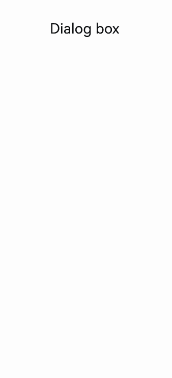
Text('Dialog box').fontSize(30)
Row({ space: 50 }) {
Button("OK").onClick(() => {
try {
promptAction.closeCustomDialog(this.customDialogComponentId)
} catch (error) {
let message = (error as BusinessError).message;
let code = (error as BusinessError).code;
console.error(`closeCustomDialog error code is ${code}, message is ${message}`);
}
})
Button("Cancel").onClick(() => {
try {
promptAction.closeCustomDialog(this.customDialogComponentId)
} catch (error) {
let message = (error as BusinessError).message;
let code = (error as BusinessError).code;
console.error(`closeCustomDialog error code is ${code}, message is ${message}`);
}
})
}
}.height(200).padding(5).justifyContent(FlexAlign.SpaceBetween)
}
build() {
Row() {
Column({ space: 20 }) {
Text('In-component dialog box')
.fontSize(30)
.onClick(() => {
promptAction.openCustomDialog({
builder: () => {
this.customDialogComponent()
},
onWillDismiss: (dismissDialogAction: DismissDialogAction) => {
console.info("reason" + JSON.stringify(dismissDialogAction.reason));
console.log("dialog onWillDismiss");
if (dismissDialogAction.reason == DismissReason.PRESS_BACK) {
dismissDialogAction.dismiss();
}
if (dismissDialogAction.reason == DismissReason.TOUCH_OUTSIDE) {
dismissDialogAction.dismiss();
}
}
}).then((dialogId: number) => {
this.customDialogComponentId = dialogId;
})
.catch((error: BusinessError) => {
console.error(`openCustomDialog error code is ${error.code}, message is ${error.message}`);
})
})
}
.width('100%')
}
.height('100%')
}
}
This example demonstrates how to set styles of a dialog box, including the width, height, background color, and shadow.
NOTE
Directly using openCustomDialog can lead to ambiguous instance issues. To avoid this, obtain a PromptAction instance using the getPromptAction API in UIContext, and then call openCustomDialog on the obtained instance.
import { LevelMode, ImmersiveMode } from '@kit.ArkUI';

let customDialogId: number = 0;

@Builder
function customDialogBuilder(uiContext: UIContext) {
  Column() {
    Text('Custom dialog Message').fontSize(10)
    Row() {
      Button("OK").onClick(() => {
        uiContext.getPromptAction().closeCustomDialog(customDialogId);
      })
      Blank().width(50)
      Button("Cancel").onClick(() => {
        uiContext.getPromptAction().closeCustomDialog(customDialogId);
      })
    }
  }
}

@Entry
@Component
struct Index {
  @State message: string = 'Hello World';
  private uiContext: UIContext = this.getUIContext();

  @Builder
  customDialogComponent() {
    customDialogBuilder(this.uiContext)
  }

  build() {
    Row() {
      Column() {
        Text(this.message).id("test_text")
          .fontSize(50)
          .fontWeight(FontWeight.Bold)
          .onClick(() => {
            const node: FrameNode|null = this.uiContext.getFrameNodeById("test_text")||null;
            this.uiContext.getPromptAction().openCustomDialog({
              builder: () => {
                this.customDialogComponent()
              },
              keyboardAvoidMode: KeyboardAvoidMode.NONE,
              showInSubWindow: false,
              offset: { dx: 5, dy: 5 },
              backgroundColor: 0xd9ffffff,
              cornerRadius: 20,
              width: '80%',
              height: 200,
              borderWidth: 1,
              borderStyle: BorderStyle.Dashed, // borderStyle must be used with borderWidth in pairs.
              borderColor: Color.Blue, // borderColor must be used with borderWidth in pairs.
              shadow: ({
                radius: 20,
                color: Color.Grey,
                offsetX: 50,
                offsetY: 0
              }),
              levelMode: LevelMode.EMBEDDED,
              levelUniqueId: node?.getUniqueId(),
              immersiveMode: ImmersiveMode.DEFAULT,
            }).then((dialogId: number) => {
              customDialogId = dialogId;
            })
          })
      }
      .width('100%')
    }
    .height('100%')
  }
}

This example shows how to implement a dialog box on a page.
NOTE
Directly using openCustomDialog can lead to ambiguous instance issues. To avoid this, it is recommended that you obtain a PromptAction instance using the getPromptAction API in UIContext, and then call openCustomDialog on the obtained instance.
// Index.ets
import { LevelMode, ImmersiveMode } from '@kit.ArkUI';

let customDialogId: number = 0;

@Builder
function customDialogBuilder(uiContext: UIContext) {
  Column() {
    Text('Custom dialog Message').fontSize(10).height(100)
    Row() {
      Button("Next").onClick(() => {
        uiContext.getRouter().pushUrl({ url: 'pages/Next' });
      })
      Blank().width(50)
      Button("Close").onClick(() => {
        uiContext.getPromptAction().closeCustomDialog(customDialogId);
      })
    }
  }.padding(20)
}

@Entry
@Component
struct Index {
  @State message: string = 'Hello World';
  private uiContext: UIContext = this.getUIContext();

  @Builder
  customDialogComponent() {
    customDialogBuilder(this.uiContext)
  }

  build() {
    Row() {
      Column() {
        Text(this.message).id("test_text")
          .fontSize(50)
          .fontWeight(FontWeight.Bold)
          .onClick(() => {
            const node: FrameNode|null = this.uiContext.getFrameNodeById("test_text")||null;
            this.uiContext.getPromptAction().openCustomDialog({
              builder: () => {
                this.customDialogComponent()
              },
              levelMode: LevelMode.EMBEDDED,
              levelUniqueId: node?.getUniqueId(),
              immersiveMode: ImmersiveMode.DEFAULT,
            }).then((dialogId: number) => {
              customDialogId = dialogId;
            })
          })
      }
      .width('100%')
    }
    .height('100%')
  }
}
// Next.ets
@Entry
@Component
struct Next {
  @State message: string = 'Back';

  build() {
    Row() {
      Column() {
        Button(this.message)
          .onClick(() => {
            this.getUIContext().getRouter().back();
          })
      }
      .width('100%')
    }
    .height('100%')
  }
}

promptAction.closeCustomDialog(deprecated)
closeCustomDialog(dialogId: number): void
Closes the specified custom dialog box.
NOTE
This API is supported since API version 11 and deprecated since API version 18. You are advised to use closeCustomDialog instead on the obtained PromptAction object.
Since API version 12, you can use the getPromptAction API in UIContext to obtain the PromptAction object associated with the current UI context.
Atomic service API: This API can be used in atomic services since API version 12.
System capability: SystemCapability.ArkUI.ArkUI.Full
Parameters
| Name | Type | Mandatory | Description |
|---|---|---|---|
| dialogId | number | Yes | ID of the custom dialog box to close. It is returned from openCustomDialog. |
Error codes
For details about the error codes, see Universal Error Codes and promptAction Error Codes.
| ID | Error Message |
|---|---|
| 401 | Parameter error. Possible causes: 1. Mandatory parameters are left unspecified; 2.Incorrect parameters types; 3. Parameter verification failed. |
| 100001 | Internal error. |
Example
See the example of promptAction.openCustomDialog.
你可能感兴趣的鸿蒙文章
harmony 鸿蒙ARKUI_TextPickerCascadeRangeContent
harmony 鸿蒙ARKUI_TextPickerRangeContent
harmony 鸿蒙ArkUI_AnimateCompleteCallback
harmony 鸿蒙ArkUI_ContextCallback
- 所属分类: 后端技术
- 本文标签:
热门推荐
-
2、 优质文章
-
3、 gt
-
7、 openharmony
-
9、 golang
-
10、 Vue中input框自动聚焦