harmony 鸿蒙advanced.Counter
advanced.Counter
A counter is a component used to accurately adjust values.
NOTE
This component is supported since API version 11. Updates will be marked with a superscript to indicate their earliest API version.
Modules to Import
import { CounterType, CounterComponent, CounterOptions, DateData } from '@kit.ArkUI';
Child Components
Not supported
CounterComponent
CounterComponent({ options: CounterOptions })
Defines a counter.
Decorator: @Component
Atomic service API: This API can be used in atomic services since API version 12.
System capability: SystemCapability.ArkUI.ArkUI.Full
Parameters
| Name | Type | Mandatory | Decorator | Description |
|---|---|---|---|---|
| options | CounterOptions | Yes | @Prop | Parameters of the counter. |
CounterOptions
Defines the type and style parameters of the counter.
Atomic service API: This API can be used in atomic services since API version 12.
System capability: SystemCapability.ArkUI.ArkUI.Full
| Name | Type | Mandatory | Description |
|---|---|---|---|
| type | CounterType | Yes | Type of the current counter. |
| direction12+ | Direction | No | Layout direction. Default value: Direction.Auto |
| numberOptions | NumberStyleOptions | No | Parameters of the number style counter. |
| inlineOptions | InlineStyleOptions | No | Parameters of the inline number style counter. |
| dateOptions | DateStyleOptions | No | Parameters of the inline date style counter. |
A counter type must go with parameters of the matching counter style. Below is a mapping between the counter types and counter styles.
| Counter Type | Counter Style |
|---|---|
| CounterType.LIST | NumberStyleOptions |
| CounterType.COMPACT | NumberStyleOptions |
| CounterType.INLINE | InlineStyleOptions |
| CounterType.INLINE_DATE | DateStyleOptions |
CounterType
Enumerates the counter types.
Atomic service API: This API can be used in atomic services since API version 12.
System capability: SystemCapability.ArkUI.ArkUI.Full
| Name | Value | Description |
|---|---|---|
| LIST | 0 | List counter. |
| COMPACT | 1 | Compact counter. |
| INLINE | 2 | Inline number counter. |
| INLINE_DATE | 3 | Inline date counter. |
CommonOptions
Defines common attributes and events of counters.
Atomic service API: This API can be used in atomic services since API version 12.
System capability: SystemCapability.ArkUI.ArkUI.Full
| Name | Type | Mandatory | Description |
|---|---|---|---|
| focusable | boolean | No | Whether the counter is focusable. NOTE This attribute takes effect for the number style counter. Default value: true true: The counter is focusable. false: The counter is not focusable. |
| step | number | No | Step of the counter. Value range: an integer greater than or equal to 1. Default value: 1 |
| onHoverIncrease | (isHover: boolean) =>void | No | Callback invoked when the mouse pointer is moved over or away from the increase button of the counter. isHover: whether the mouse pointer hovers over the component. The value true means that the mouse pointer enters the component, and the value false means that the mouse pointer leaves the component. |
| onHoverDecrease | (isHover: boolean) =>void | No | Callback invoked when the mouse pointer is moved over or away from the decrease button of the counter. isHover: whether the mouse pointer hovers over the component. The value true means that the mouse pointer enters the component, and the value false means that the mouse pointer leaves the component. |
InlineStyleOptions
Defines the attributes and events of the inline number style counter.
Inherits from CommonOptions.
Atomic service API: This API can be used in atomic services since API version 12.
System capability: SystemCapability.ArkUI.ArkUI.Full
| Name | Type | Mandatory | Description |
|---|---|---|---|
| value | number | No | Initial value of the counter. Default value: 0 |
| min | number | No | Minimum value of the counter. Default value: 0 |
| max | number | No | Maximum value of the counter. Default value: 999 |
| textWidth | number | No | Text width of the counter. Default value: 0 |
| onChange | (value: number) =>void | No | Callback invoked when the value changes. The current value is returned. value: current value. |
NumberStyleOptions
Defines the attributes and events of the number style counter.
Inherits from InlineStyleOptions.
Atomic service API: This API can be used in atomic services since API version 12.
System capability: SystemCapability.ArkUI.ArkUI.Full
| Name | Type | Mandatory | Description |
|---|---|---|---|
| label | ResourceStr | No | Label of the counter. |
| onFocusIncrease | () =>void | No | Callback invoked when the increase button of the counter gains focus. |
| onFocusDecrease | () =>void | No | Callback invoked when the decrease button of the counter gains focus. |
| onBlurIncrease | () =>void | No | Callback invoked when the increase button of the counter loses focus. |
| onBlurDecrease | () =>void | No | Callback invoked when the decrease button of the counter loses focus. |
DateStyleOptions
Defines the attributes and events of the inline date style counter.
Inherits from CommonOptions.
Atomic service API: This API can be used in atomic services since API version 12.
System capability: SystemCapability.ArkUI.ArkUI.Full
| Name | Type | Mandatory | Description |
|---|---|---|---|
| year | number | No | Initial year of the counter. Default value: 1 |
| month | number | No | Initial month of the counter. Default value: 1 |
| day | number | No | Initial day of the counter. Default value: 1 |
| onDateChange | (date: DateData)=>void | No | Callback invoked when the date changes. The current date is returned. date: current date. |
DateData
Defines common date attributes and methods.
Atomic service API: This API can be used in atomic services since API version 12.
System capability: SystemCapability.ArkUI.ArkUI.Full
| Name | Type | Read-Only | Optional | Description |
|---|---|---|---|---|
| year | number | No | No | Initial year of the counter. |
| month | number | No | No | Initial month of the counter. |
| day | number | No | No | Initial day of the counter. |
constructor
constructor(year: number, month: number, day: number)
A constructor used to create a DateData object.
Atomic service API: This API can be used in atomic services since API version 12.
System capability: SystemCapability.ArkUI.ArkUI.Full
| Name | Type | Description |
|---|---|---|
| year | number | Initial year of the counter. |
| month | number | Initial month of the counter. |
| day | number | Initial day of the counter. |
toString
toString(): string
Current date.
Atomic service API: This API can be used in atomic services since API version 12.
System capability: SystemCapability.ArkUI.ArkUI.Full
Return value
| Type | Description |
|---|---|
| string | Current date. |
Example
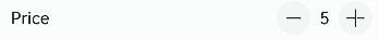
Example 1: Implementing a List Counter
This example implements a list counter by setting type to CounterType.LIST and configuring numberOptions.
import { CounterType, CounterComponent } from '@kit.ArkUI';

@Entry
@Component
struct ListCounterExample {
  build() {
    Column() {
      // List counter
      CounterComponent({
        options: {
          type: CounterType.LIST,
          numberOptions: {
            label: "Price",
            min: 0,
            value: 5,
            max: 10
          }
        }
      })
    }
  }
}
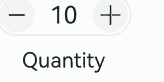
Example 2: Implementing a Compact Counter
This example implements a compact counter by setting type to CounterType.COMPACT and configuring numberOptions.
import { CounterType, CounterComponent } from '@kit.ArkUI';

@Entry
@Component
struct CompactCounterExample {
  build() {
    Column() {
      // Compact counter
      CounterComponent({
        options: {
          type: CounterType.COMPACT,
          numberOptions: {
            label: "Quantity",
            value: 10,
            min: 0,
            max: 100,
            step: 10
          }
        }
      })
    }
  }
}
Example 3: Implementing an Inline Number Counter
This example implements an inline number counter by setting type to CounterType.INLINE and configuring inlineOptions.
import { CounterType, CounterComponent } from '@kit.ArkUI';

@Entry
@Component
struct NumberStyleExample {
  build() {
    Column() {
      // Inline number counter
      CounterComponent({
        options: {
          type: CounterType.INLINE,
          inlineOptions: {
            value: 100,
            min: 10,
            step: 2,
            max: 1000,
            textWidth: 100,
            onChange: (value: number) => {
              console.log("onDateChange Date: " + value.toString());
            }
          }
        }
      })
    }
  }
}

Example 4: Implementing an Inline Date Counter
This example implements an inline date counter by setting type to CounterType.INLINE_DATE and configuring dateOptions, allowing for manual date input.
import { CounterType, CounterComponent, DateData } from '@kit.ArkUI';

@Entry
@Component
struct DataStyleExample {
  build() {
    Column() {
      // Inline date counter
      CounterComponent({
        options: {
          type: CounterType.INLINE_DATE,
          dateOptions: {
            year: 2016,
            onDateChange: (date: DateData) => {
              console.log("onDateChange Date: " + date.toString());
            }
          }
        }
      })
    }
  }
}

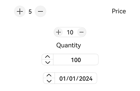
Example 5: Implementing a Mirrored Layout
This example implements a mirrored layout for list, compact, inline number, and inline date counters by setting direction.
// xxx.ets
import { CounterType, CounterComponent, DateData } from '@kit.ArkUI';

@Entry
@Component
struct CounterPage {
  @State currentDirection: Direction = Direction.Rtl

  build() {
    Column({}) {

      // List counter
      CounterComponent({
        options: {
          direction: this.currentDirection,
          type: CounterType.LIST,
          numberOptions: {
            label: "Price",
            min: 0,
            value: 5,
            max: 10,
          }
        }
      })
        .width('80%')

      // Compact counter
      CounterComponent({
        options: {
          direction: this.currentDirection,
          type: CounterType.COMPACT,
          numberOptions: {
            label: "Quantity",
            value: 10,
            min: 0,
            max: 100,
            step: 10
          }
        }
      }).margin({ top: 20 })

      // Inline number counter
      CounterComponent({
        options: {
          type: CounterType.INLINE,
          direction: this.currentDirection,
          inlineOptions: {
            value: 100,
            min: 10,
            step: 2,
            max: 1000,
            textWidth: 100,
            onChange: (value: number) => {
              console.log("onDateChange Date: " + value.toString());
            }
          }
        }
      }).margin({ top: 20 })
      // Inline date counter
      CounterComponent({
        options: {
          direction: this.currentDirection,
          type: CounterType.INLINE_DATE,
          dateOptions: {
            year: 2024,
            onDateChange: (date: DateData) => {
              console.log("onDateChange Date: " + date.toString());
            }
          }
        }
      }).margin({ top: 20 })
    }
    .width('100%')
    .height('100%')
    .justifyContent(FlexAlign.Center)
    .alignItems(HorizontalAlign.Center)
  }
}
你可能感兴趣的鸿蒙文章
- 所属分类: 后端技术
- 本文标签:
热门推荐
-
2、 优质文章
-
3、 gt
-
7、 openharmony
-
9、 golang
-
10、 Vue中input框自动聚焦