harmony 鸿蒙AlphabetIndexer
AlphabetIndexer
The AlphabetIndexer component can create a logically indexed array of items in a container for instant location.
NOTE
This component is supported since API version 7. Updates will be marked with a superscript to indicate their earliest API version.
Child Components
Not supported
APIs
AlphabetIndexer(options: AlphabetIndexerOptions)
Atomic service API: This API can be used in atomic services since API version 11.
System capability: SystemCapability.ArkUI.ArkUI.Full
Parameters
| Name | Type | Mandatory | Description |
|---|---|---|---|
| options | AlphabetIndexerOptions | Yes | Options of the AlphabetIndexer component. |
AlphabetIndexerOptions18+
Defines the options of the AlphabetIndexer component.
Atomic service API: This API can be used in atomic services since API version 18.
System capability: SystemCapability.ArkUI.ArkUI.Full
| Name | Type | Mandatory | Description |
|---|---|---|---|
| arrayValue7+ | Array<string> | Yes | Array of index items. Atomic service API: This API can be used in atomic services since API version 11. |
| selected7+ | number | Yes | Index of the initially selected item. If the value exceeds the value range, the default value 0 is used. This parameter supports two-way binding through $$. Atomic service API: This API can be used in atomic services since API version 11. |
Attributes
When the width attribute is set to “auto”, the width is adaptive. This means that the width will adjust according to the maximum width of the index items.
The default value of the padding attribute is 4 vp.
The maxFontScale and minFontScale attributes are both set to a constant value of 1, which means that they do not change with the system font size.
In addition to the universal attributes, the following attributes are supported.
color
color(value: ResourceColor)
Sets the text color for unselected items.
Atomic service API: This API can be used in atomic services since API version 11.
System capability: SystemCapability.ArkUI.ArkUI.Full
Parameters
| Name | Type | Mandatory | Description |
|---|---|---|---|
| value | ResourceColor | Yes | Text color of unselected items. Default value: 0x99182431 |
selectedColor
selectedColor(value: ResourceColor)
Sets the text color for the selected item.
Atomic service API: This API can be used in atomic services since API version 11.
System capability: SystemCapability.ArkUI.ArkUI.Full
Parameters
| Name | Type | Mandatory | Description |
|---|---|---|---|
| value | ResourceColor | Yes | Text color of the selected item. Default value: 0xFF007DFF |
popupColor
popupColor(value: ResourceColor)
Sets the text color for the primary index item in the pop-up window.
Atomic service API: This API can be used in atomic services since API version 11.
System capability: SystemCapability.ArkUI.ArkUI.Full
Parameters
| Name | Type | Mandatory | Description |
|---|---|---|---|
| value | ResourceColor | Yes | Text color of the primary index item in the pop-up window. Default value: 0xFF007DFF |
selectedBackgroundColor
selectedBackgroundColor(value: ResourceColor)
Sets the background color of the selected item.
Atomic service API: This API can be used in atomic services since API version 11.
System capability: SystemCapability.ArkUI.ArkUI.Full
Parameters
| Name | Type | Mandatory | Description |
|---|---|---|---|
| value | ResourceColor | Yes | Background color of the selected item. Default value: 0x1A007DFF |
popupBackground
popupBackground(value: ResourceColor)
Sets the background color for the pop-up window.
Atomic service API: This API can be used in atomic services since API version 11.
System capability: SystemCapability.ArkUI.ArkUI.Full
Parameters
| Name | Type | Mandatory | Description |
|---|---|---|---|
| value | ResourceColor | Yes | Background color of the pop-up window. The background blur effect of the pop-up text can affect the background color. You can disable the effect by setting popupBackgroundBlurStyle to NONE. Default value: API version 11 and earlier: 0xFFFFFFFF API version 12 and later: #66808080 |
usingPopup
usingPopup(value: boolean)
Sets whether to display the pop-up window.
Atomic service API: This API can be used in atomic services since API version 11.
System capability: SystemCapability.ArkUI.ArkUI.Full
Parameters
| Name | Type | Mandatory | Description |
|---|---|---|---|
| value | boolean | Yes | Whether to display the pop-up window. Default value: false (no the pop-up window is displayed). |
selectedFont
selectedFont(value: Font)
Sets the text style for the selected item.
Atomic service API: This API can be used in atomic services since API version 11.
System capability: SystemCapability.ArkUI.ArkUI.Full
Parameters
| Name | Type | Mandatory | Description |
|---|---|---|---|
| value | Font | Yes | Text style of the selected item. Default value: API version 11 and earlier: { size:‘12.0fp’, style:FontStyle.Normal, weight:FontWeight.Regular, family:‘HarmonyOS Sans’ } API version 12 and later: { size:‘10.0vp’, style:FontStyle.Normal, weight:FontWeight.Medium, family:‘HarmonyOS Sans’ } |
popupFont
popupFont(value: Font)
Sets the text style for the primary index item in the pop-up window.
Atomic service API: This API can be used in atomic services since API version 11.
System capability: SystemCapability.ArkUI.ArkUI.Full
Parameters
| Name | Type | Mandatory | Description |
|---|---|---|---|
| value | Font | Yes | Text style of the primary index item in the pop-up window. Default value: { size:‘24.0vp’, style:FontStyle.Normal, weight:FontWeight.Medium, family:‘HarmonyOS Sans’ } |
font
font(value: Font)
Sets the text style for unselected items.
Atomic service API: This API can be used in atomic services since API version 11.
System capability: SystemCapability.ArkUI.ArkUI.Full
Parameters
| Name | Type | Mandatory | Description |
|---|---|---|---|
| value | Font | Yes | Text style of unselected items. Default value: API version 11 and earlier: { size:‘12.0fp’, style:FontStyle.Normal, weight:FontWeight.Regular, family:‘HarmonyOS Sans’ } API version 12 and later: { size:‘10.0vp’, style:FontStyle.Normal, weight:FontWeight.Medium, family:‘HarmonyOS Sans’ } |
itemSize
itemSize(value: string|number)
Sets the size of the index item area.
Atomic service API: This API can be used in atomic services since API version 11.
System capability: SystemCapability.ArkUI.ArkUI.Full
Parameters
| Name | Type | Mandatory | Description |
|---|---|---|---|
| value | string |number | Yes | Size of the index item area, which is a square, meaning the side length of the square. This attribute cannot be set in percentage. Default value: 16.0 Unit: vp |
alignStyle
alignStyle(value: IndexerAlign, offset?: Length)
Sets the alignment style of the indexer pop-up window.
Atomic service API: This API can be used in atomic services since API version 11.
System capability: SystemCapability.ArkUI.ArkUI.Full
Parameters
| Name | Type | Mandatory | Description |
|---|---|---|---|
| value | IndexerAlign | Yes | Alignment style of the indexer pop-up window. The pop-up window can be displayed on the right or left of the indexer. Default value: IndexerAlign.END |
| offset10+ | Length | No | Spacing between the pop-up window and the alphabetic index bar. A value greater than or equal to 0 is valid. If this parameter is set to a value less than 0 or is not set, the spacing is the same as popupPosition. If this parameter and popupPosition are set at the same time, offset takes effect in the horizontal direction and popupPosition.y takes effect in the vertical direction. |
selected8+
selected(index: number)
Sets the index of the selected item.
Since API version 10, this attribute supports two-way binding through $$.
Atomic service API: This API can be used in atomic services since API version 11.
System capability: SystemCapability.ArkUI.ArkUI.Full
Parameters
| Name | Type | Mandatory | Description |
|---|---|---|---|
| index | number | Yes | Index of the selected item. Default value: 0 |
popupPosition8+
popupPosition(value: Position)
Sets the position of the pop-up window relative to the center of the indexer’s top border.
Atomic service API: This API can be used in atomic services since API version 11.
System capability: SystemCapability.ArkUI.ArkUI.Full
Parameters
| Name | Type | Mandatory | Description |
|---|---|---|---|
| value | Position | Yes | Position of the pop-up window relative to the center of the indexer’s top border. Default value: {x:60.0, y:48.0} |
popupSelectedColor10+
popupSelectedColor(value: ResourceColor)
Sets the text color for the selected secondary index item in the pop-up window.
Atomic service API: This API can be used in atomic services since API version 11.
System capability: SystemCapability.ArkUI.ArkUI.Full
Parameters
| Name | Type | Mandatory | Description |
|---|---|---|---|
| value | ResourceColor | Yes | Text color of the selected secondary index item in the pop-up window. Default value: #FF182431 |
popupUnselectedColor10+
popupUnselectedColor(value: ResourceColor)
Sets the text color for the unselected secondary index items in the pop-up window.
Atomic service API: This API can be used in atomic services since API version 11.
System capability: SystemCapability.ArkUI.ArkUI.Full
Parameters
| Name | Type | Mandatory | Description |
|---|---|---|---|
| value | ResourceColor | Yes | Text color of the selected secondary index item in the pop-up window. Default value: #FF182431 |
popupItemFont10+
popupItemFont(value: Font)
Sets the text style for the secondary index item in the pop-up window.
Atomic service API: This API can be used in atomic services since API version 11.
System capability: SystemCapability.ArkUI.ArkUI.Full
Parameters
| Name | Type | Mandatory | Description |
|---|---|---|---|
| value | Font | Yes | Text style of the secondary index item in the pop-up window. Default value: { size:24, weight:FontWeight.Medium } |
popupItemBackgroundColor10+
popupItemBackgroundColor(value: ResourceColor)
Sets the background color for the secondary index item in the pop-up window.
Atomic service API: This API can be used in atomic services since API version 11.
System capability: SystemCapability.ArkUI.ArkUI.Full
Parameters
| Name | Type | Mandatory | Description |
|---|---|---|---|
| value | ResourceColor | Yes | Background color of the secondary index item in the pop-up window. Default value: API version 11 and earlier: #FFFFFFFF API version 12 and later: #00000000 |
autoCollapse11+
autoCollapse(value: boolean)
Sets whether to auto-collapse or expand the indexer bar.
When the first index item is #:
- If the number of remaining index items after excluding the first item is less than or equal to 9, the full display mode is used.
- If the number of remaining index items is between 9 and 13 (inclusive), the mode will adaptively switch between full display and short collapse modes based on the indexer height.
- If the number of remaining index items is greater than 13, the mode will adaptively switch between short and long collapse modes based on the indexer height.
When the first index item is not #:
- If the total number of index items is less than or equal to 9, the full display mode is used.
- If the number of remaining index items is between 9 and 13 (inclusive), the mode will adaptively switch between full display and short collapse modes based on the indexer height.
- If the total number of index items is greater than 13, the mode will adaptively switch between short and long collapse modes based on the indexer height.
Atomic service API: This API can be used in atomic services since API version 12.
System capability: SystemCapability.ArkUI.ArkUI.Full
Parameters
| Name | Type | Mandatory | Description |
|---|---|---|---|
| value | boolean | Yes | Whether to auto-collapse or expand the indexer bar. Default value: In versions earlier than API version 12: false API version 12 and later: true |
popupItemBorderRadius12+
popupItemBorderRadius(value: number)
Sets the radius of the index border corners in the pop-up window.
Atomic service API: This API can be used in atomic services since API version 12.
System capability: SystemCapability.ArkUI.ArkUI.Full
Parameters
| Name | Type | Mandatory | Description |
|---|---|---|---|
| value | number | Yes | Radius of the index background border corners in the pop-up window. Default value: 24vp This parameter cannot be set in percentage. If the value specified is less than 0, 0 is used. The radius of the index background border corners in the pop-up window is automatically adaptive (radius of the index rounded corners + 4 vp). |
itemBorderRadius12+
itemBorderRadius(value: number)
Sets the radius of the index background border corners in the alphabetic index bar.
Atomic service API: This API can be used in atomic services since API version 12.
System capability: SystemCapability.ArkUI.ArkUI.Full
Parameters
| Name | Type | Mandatory | Description |
|---|---|---|---|
| value | number | Yes | Radius of the index background border corners in the alphabetic index bar. Default value: 8vp This parameter cannot be set in percentage. If the value specified is less than 0, 0 is used. The radius of the index background border corners in the alphabetic index bar is automatically adaptive (radius of the index rounded corners + 4 vp). |
popupBackgroundBlurStyle12+
popupBackgroundBlurStyle(value: BlurStyle)
Sets the background blur style of the pop-up window.
Atomic service API: This API can be used in atomic services since API version 12.
System capability: SystemCapability.ArkUI.ArkUI.Full
Parameters
| Name | Type | Mandatory | Description |
|---|---|---|---|
| value | BlurStyle | Yes | Background blur style of the pop-up window. The background blur effect can affect popupBackground. You can disable the effect by setting it to NONE. Default value: COMPONENT_REGULAR |
popupTitleBackground12+
popupTitleBackground(value: ResourceColor)
Sets the background color for the primary index item in the pop-up window.
Atomic service API: This API can be used in atomic services since API version 12.
System capability: SystemCapability.ArkUI.ArkUI.Full
Parameters
| Name | Type | Mandatory | Description |
|---|---|---|---|
| value | ResourceColor | Yes | Background color for the primary index item in the pop-up window. Default value: If the pop-up window has only one index: #00FFFFFF. If the pop-up window has multiple indexes: #0c182431. |
enableHapticFeedback12+
enableHapticFeedback(value: boolean)
Atomic service API: This API can be used in atomic services since API version 12.
System capability: SystemCapability.ArkUI.ArkUI.Full
| Name | Type | Mandatory | Description |
|---|---|---|---|
| value | boolean | Yes | Whether to enable haptic feedback. Default value: true (haptic feedback is enabled). |
IndexerAlign
System capability: SystemCapability.ArkUI.ArkUI.Full
| Name | Description |
|---|---|
| Left | The pop-up window is displayed on the right of the indexer. Atomic service API: This API can be used in atomic services since API version 11. |
| Right | The pop-up window is displayed on the left of the indexer. Atomic service API: This API can be used in atomic services since API version 11. |
| START12+ | The pop-up window is displayed on the right of the indexer for left-to-right scripts, and on the left of the indexer for right-to-left scripts. Atomic service API: This API can be used in atomic services since API version 12. |
| END12+ | The pop-up window is displayed on the left of the indexer for left-to-right scripts, and on the right of the indexer for right-to-left scripts. Atomic service API: This API can be used in atomic services since API version 12. |
Events
In addition to the universal events, the following events are supported.
onSelected(deprecated)
onSelected(callback: (index: number) => void)
Triggered when an index item is selected, with the callback parameter being the index of the currently selected item.
This API is deprecated since API version 8. You are advised to use onSelect instead.
System capability: SystemCapability.ArkUI.ArkUI.Full
Parameters
| Name | Type | Mandatory | Description |
|---|---|---|---|
| index | number | Yes | Index of the selected item. |
onSelect8+
onSelect(callback: OnAlphabetIndexerSelectCallback)
Triggered when an index item is selected, with the callback parameter being the index of the currently selected item.
Atomic service API: This API can be used in atomic services since API version 11.
System capability: SystemCapability.ArkUI.ArkUI.Full
Parameters
| Name | Type | Mandatory | Description |
|---|---|---|---|
| callback | OnAlphabetIndexerSelectCallback | Yes | Event triggered when an index item is selected. |
onRequestPopupData8+
onRequestPopupData(callback: OnAlphabetIndexerRequestPopupDataCallback)
Triggered to set the content of the secondary index items in the pop-up window. The callback parameter is the index of the currently selected item, and the return value is the content to be displayed in the pop-up window.
Atomic service API: This API can be used in atomic services since API version 11.
System capability: SystemCapability.ArkUI.ArkUI.Full
Parameters
| Name | Type | Mandatory | Description |
|---|---|---|---|
| callback | OnAlphabetIndexerRequestPopupDataCallback | Yes | Event triggered to set the content of the secondary index items in the pop-up window. |
onPopupSelect8+
onPopupSelect(callback: OnAlphabetIndexerPopupSelectCallback)
Triggered when a secondary index item in the pop-up window is selected. The callback parameter is the index of the selected secondary index item.
Atomic service API: This API can be used in atomic services since API version 11.
System capability: SystemCapability.ArkUI.ArkUI.Full
Parameters
| Name | Type | Mandatory | Description |
|---|---|---|---|
| callback | OnAlphabetIndexerPopupSelectCallback | Yes | Event triggered when a secondary index item in the pop-up window is selected. |
OnAlphabetIndexerSelectCallback18+
type OnAlphabetIndexerSelectCallback = (index: number) => void
Represents the callback invoked when an index item is selected.
Atomic service API: This API can be used in atomic services since API version 18.
System capability: SystemCapability.ArkUI.ArkUI.Full
Parameters |Name|Type|Mandatory|Description | |——-|—–|—-|——| |index |number|Yes|Index of the currently selected index item.|
OnAlphabetIndexerPopupSelectCallback18+
type OnAlphabetIndexerPopupSelectCallback = (index: number) => void
Represents the callback invoked when a secondary index item in the pop-up window is selected.
Atomic service API: This API can be used in atomic services since API version 18.
System capability: SystemCapability.ArkUI.ArkUI.Full
Parameters |Name|Type|Mandatory|Description | |——-|—–|—-|——| |index |number|Yes|Index of the currently selected secondary index item in the pop-up window.|
OnAlphabetIndexerRequestPopupDataCallback18+
type OnAlphabetIndexerRequestPopupDataCallback = (index: number) => Array<string>
Represents the callback invoked when an index item is selected and usingPopup is set to true.
Atomic service API: This API can be used in atomic services since API version 18.
System capability: SystemCapability.ArkUI.ArkUI.Full
Parameters |Name|Type|Mandatory|Description | |——-|—–|—-|——| |index |number|Yes|Index of the currently selected index item.|
Return value |Type |Description | |————-|——————–| |Array<string>|Array of secondary index items to be displayed in the pop-up window. Up to 5 items can be displayed vertically, with scrollable support for more items.|
Example
Example 1: Setting the Display Text for the Index Pop-up Window
This example demonstrates how to customize the display text for the index pop-up window using the onRequestPopupData event.
// xxx.ets
@Entry
@Component
struct AlphabetIndexerSample {
  private arrayA: string[] = ['Ann']
  private arrayB: string[] = ['Ben', 'Bob']
  private arrayC: string[] = ['Calvin', 'Cameron', 'Charlie', 'Charlotte']
  private arrayL: string[] = ['Daisy', 'Daniel', 'Darla', 'David', 'Derek', 'Dorothy', 'Duke']
  private value: string[] = ['#', 'A', 'B', 'C', 'D', 'E', 'F', 'G',
    'H', 'I', 'J', 'K', 'L', 'M', 'N',
    'O', 'P', 'Q', 'R', 'S', 'T', 'U',
    'V', 'W', 'X', 'Y', 'Z']

  build() {
    Stack({ alignContent: Alignment.Start }) {
      Row() {
        List({ space: 20, initialIndex: 0 }) {
          ForEach(this.arrayA, (item: string) => {
            ListItem() {
              Text(item)
                .width('80%')
                .height('5%')
                .fontSize(30)
                .textAlign(TextAlign.Center)
            }
          }, (item: string) => item)

          ForEach(this.arrayB, (item: string) => {
            ListItem() {
              Text(item)
                .width('80%')
                .height('5%')
                .fontSize(30)
                .textAlign(TextAlign.Center)
            }
          }, (item: string) => item)

          ForEach(this.arrayC, (item: string) => {
            ListItem() {
              Text(item)
                .width('80%')
                .height('5%')
                .fontSize(30)
                .textAlign(TextAlign.Center)
            }
          }, (item: string) => item)

          ForEach(this.arrayL, (item: string) => {
            ListItem() {
              Text(item)
                .width('80%')
                .height('5%')
                .fontSize(30)
                .textAlign(TextAlign.Center)
            }
          }, (item: string) => item)
        }
        .width('50%')
        .height('100%')

        AlphabetIndexer({ arrayValue: this.value, selected: 0 })
          .autoCollapse (false) // Disable the auto-collapse mode.
          .enableHapticFeedback(false) // Disable haptic feedback.
          .selectedColor(0xFFFFFF) // Text color of the selected item.
          .popupColor(0xFFFAF0) // Text color of the primary index item in the pop-up window.
          .selectedBackgroundColor(0xCCCCCC) // Background color of the selected item.
          .popupBackground (0xD2B48C) // Background color of the pop-up window.
          .usingPopup(true) // Display a pop-up window when an index item is selected.
          .selectedFont({ size: 16, weight: FontWeight.Bolder }) // Text style of the selected item.
          .popupFont({ size: 30, weight: FontWeight.Bolder }) // Text style of the primary index item in the pop-up window.
          .itemSize(28) // Size of each index item.
          .alignStyle (IndexerAlign.Left) // The pop-up window is displayed on the right of the indexer.
          .popupItemBorderRadius(24) // Set the radius of the index background rounded corners in the pop-up window.
          .itemBorderRadius(14) // Set the radius of the index background rounded corners in the alphabetic indexer bar.
          .popupBackgroundBlurStyle(BlurStyle.NONE) // Set the background blur style of the pop-up window.
          .popupTitleBackground(0xCCCCCC) // Background color of the primary index item in the pop-up window.
          .popupSelectedColor(0x00FF00) // Text color of the unselected secondary index items in the pop-up window.
          .popupUnselectedColor(0x0000FF) // Text color of the selected secondary index item in the pop-up window.
          .popupItemFont({ size: 30, style: FontStyle.Normal }) // Text style of the secondary index item in the pop-up window.
          .popupItemBackgroundColor(0xCCCCCC) // Background color of the secondary index item in the pop-up window.
          .onSelect((index: number) => {
            console.info(this.value[index] + ' Selected!')
          })
          .onRequestPopupData((index: number) => {
            // When A is selected, the secondary index item list in the pop-up window displays arrayA. Similarly, selecting B, C, or L will display their respective arrays.
            // For other index items, the pop-up window will only show the primary index item.
            if (this.value[index] == 'A') {
              return this.arrayA
            } else if (this.value[index] == 'B') {
              return this.arrayB
            } else if (this.value[index] == 'C') {
              return this.arrayC
            } else if (this.value[index] == 'L') {
              return this.arrayL
            } else {
              return []
            }
          })
          .onPopupSelect((index: number) => {
            console.info('onPopupSelected:' + index)
          })
      }
      .width('100%')
      .height('100%')
    }
  }
}

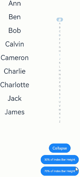
Example 2: Enabling Adaptive Collapse Mode
This example demonstrates how to enable adaptive collapse mode using the autoCollapse attribute.
// xxx.ets
@Entry
@Component
struct AlphabetIndexerSample {
  private arrayA: string[] = ['Ann']
  private arrayB: string[] = ['Ben', 'Bob']
  private arrayC: string[] = ['Calvin', 'Cameron', 'Charlie', 'Charlotte']
  private arrayJ: string[] = ['Jack', 'James']
  private value: string[] = ['#', 'A', 'B', 'C', 'D', 'E', 'F', 'G',
    'H', 'I', 'J', 'K', 'L', 'M', 'N',
    'O', 'P', 'Q', 'R', 'S', 'T', 'U',
    'V', 'W', 'X', 'Y', 'Z']
  @State isNeedAutoCollapse: boolean = false;
  @State indexerHeight: string = '75%';

  build() {
    Stack({ alignContent: Alignment.Start }) {
      Row() {
        List({ space: 20, initialIndex: 0 }) {
          ForEach(this.arrayA, (item: string) => {
            ListItem() {
              Text(item)
                .width('80%')
                .height('5%')
                .fontSize(30)
                .textAlign(TextAlign.Center)
            }
          }, (item: string) => item)

          ForEach(this.arrayB, (item: string) => {
            ListItem() {
              Text(item)
                .width('80%')
                .height('5%')
                .fontSize(30)
                .textAlign(TextAlign.Center)
            }
          }, (item: string) => item)

          ForEach(this.arrayC, (item: string) => {
            ListItem() {
              Text(item)
                .width('80%')
                .height('5%')
                .fontSize(30)
                .textAlign(TextAlign.Center)
            }
          }, (item: string) => item)

          ForEach(this.arrayJ, (item: string) => {
            ListItem() {
              Text(item)
                .width('80%')
                .height('5%')
                .fontSize(30)
                .textAlign(TextAlign.Center)
            }
          }, (item: string) => item)
        }
        .width('50%')
        .height('100%')

        Column() {
          Column() {
            AlphabetIndexer({ arrayValue: this.value, selected: 0 })
              .autoCollapse (this.isNeedAutoCollapse) // Enable or disable adaptive collapse mode.
              .height (this.indexerHeight) // Indexer height.
              .enableHapticFeedback(false) // Disable haptic feedback.
              .selectedColor(0xFFFFFF) // Text color of the selected item.
              .popupColor(0xFFFAF0) // Text color of the primary index item in the pop-up window.
              .selectedBackgroundColor(0xCCCCCC) // Background color of the selected item.
              .popupBackground (0xD2B48C) // Background color of the pop-up window.
              .usingPopup(true) // Display a pop-up window when an index item is selected.
              .selectedFont({ size: 16, weight: FontWeight.Bolder }) // Text style of the selected item.
              .popupFont({ size: 30, weight: FontWeight.Bolder }) // Text style of the pop-up window.
              .itemSize(28) // Size of an item in the alphabetic index bar.
              .alignStyle(IndexerAlign.Right) // The pop-up window is displayed on the left of the indexer.
              .popupTitleBackground("#D2B48C") // Background color of the primary index item in the pop-up window.
              .popupSelectedColor(0x00FF00) // Text color of the unselected secondary index items in the pop-up window.
              .popupUnselectedColor(0x0000FF) // Text color of the selected secondary index item in the pop-up window.
              .popupItemFont({ size: 30, style: FontStyle.Normal }) // Text style of the secondary index item in the pop-up window.
              .popupItemBackgroundColor(0xCCCCCC) // Background color of the secondary index item in the pop-up window.
              .onSelect((index: number) => {
                console.info(this.value[index] + ' Selected!');
              })
              .onRequestPopupData((index: number) => {
                // When A is selected, the secondary index item list in the pop-up window displays arrayA. Similarly, selecting B, C, or L will display their respective arrays.
                // For other index items, the pop-up window will only show the primary index item.
                if (this.value[index] == 'A') {
                  return this.arrayA;
                } else if (this.value[index] == 'B') {
                  return this.arrayB;
                } else if (this.value[index] == 'C') {
                  return this.arrayC;
                } else if (this.value[index] == 'J') {
                  return this.arrayJ;
                } else {
                  return [];
                }
              })
              .onPopupSelect((index: number) => {
                console.info('onPopupSelected:' + index);
              })
          }
          .height('80%')
          .justifyContent(FlexAlign.Center)

          Column() {
            Button('Collapse')
              .margin('5vp')
              .onClick(() => {
                this.isNeedAutoCollapse = true;
              })
            Button('30% of Index Bar Height')
              .margin('5vp')
              .onClick(() => {
                this.indexerHeight = '30%';
              })
            Button('70% of Index Bar Height')
              .margin('5vp')
              .onClick(() => {
                this.indexerHeight = '70%';
              })
          }.height('20%')
        }
        .width('50%')
        .justifyContent(FlexAlign.Center)
      }
      .width('100%')
      .height(720)
    }
  }
}
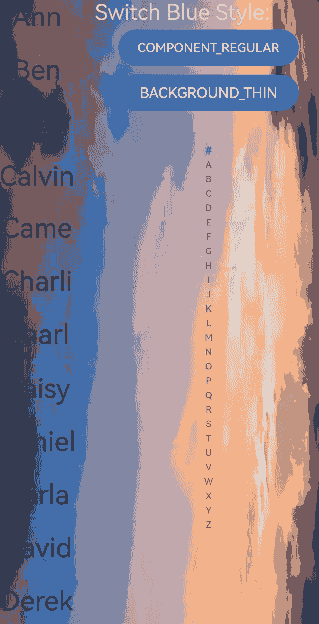
Example 3: Setting the Background Blur Style of the Pop-up Window
This example demonstrates how to apply a background blur effect to the pop-up window using the popupBackgroundBlurStyle attribute.
// xxx.ets
@Entry
@Component
struct AlphabetIndexerSample {
  private arrayA: string[] = ['Ann']
  private arrayB: string[] = ['Ben', 'Bob']
  private arrayC: string[] = ['Calvin', 'Cameron', 'Charlie', 'Charlotte']
  private arrayL: string[] = ['Daisy', 'Daniel', 'Darla', 'David', 'Derek', 'Dorothy', 'Duke']
  private value: string[] = ['#', 'A', 'B', 'C', 'D', 'E', 'F', 'G',
    'H', 'I', 'J', 'K', 'L', 'M', 'N',
    'O', 'P', 'Q', 'R', 'S', 'T', 'U',
    'V', 'W', 'X', 'Y', 'Z']
  @State customBlurStyle: BlurStyle = BlurStyle.NONE;

  build() {
    Stack({ alignContent: Alignment.Start }) {
      Row() {
        List({ space: 20, initialIndex: 0 }) {
          ForEach(this.arrayA, (item: string) => {
            ListItem() {
              Text(item)
                .width('80%')
                .height('5%')
                .fontSize(30)
                .textAlign(TextAlign.Center)
            }
          }, (item: string) => item)

          ForEach(this.arrayB, (item: string) => {
            ListItem() {
              Text(item)
                .width('80%')
                .height('5%')
                .fontSize(30)
                .textAlign(TextAlign.Center)
            }
          }, (item: string) => item)

          ForEach(this.arrayC, (item: string) => {
            ListItem() {
              Text(item)
                .width('80%')
                .height('5%')
                .fontSize(30)
                .textAlign(TextAlign.Center)
            }
          }, (item: string) => item)

          ForEach(this.arrayL, (item: string) => {
            ListItem() {
              Text(item)
                .width('80%')
                .height('5%')
                .fontSize(30)
                .textAlign(TextAlign.Center)
            }
          }, (item: string) => item)
        }
        .width('30%')
        .height('100%')

        Column() {
          Column() {
            Text('Switch Blue Style:')
              .fontSize(24)
              .fontColor(0xcccccc)
              .width('100%')
            Button('COMPONENT_REGULAR')
              .margin('5vp')
              .width(200)
              .onClick(() => {
                this.customBlurStyle = BlurStyle.COMPONENT_REGULAR;
              })
            Button('BACKGROUND_THIN')
              .margin('5vp')
              .width(200)
              .onClick(() => {
                this.customBlurStyle = BlurStyle.BACKGROUND_THIN;
              })
          }.height('20%')

          Column() {
            AlphabetIndexer({ arrayValue: this.value, selected: 0 })
              .usingPopup(true) // Display a pop-up window when an index item is selected.
              .alignStyle (IndexerAlign.Left) // The pop-up window is displayed on the right of the indexer.
              .popupItemBorderRadius(24) // Set the radius of the index background rounded corners in the pop-up window.
              .itemBorderRadius(14) // Set the radius of the index background rounded corners in the alphabetic indexer bar.
              .popupBackgroundBlurStyle(this.customBlurStyle) // Set the background blur style of the pop-up window.
              .popupTitleBackground(0xCCCCCC) // Background color of the primary index item in the pop-up window.
              .onSelect((index: number) => {
                console.info(this.value[index] + ' Selected!')
              })
              .onRequestPopupData((index: number) => {
                // When A is selected, the secondary index item list in the pop-up window displays arrayA. Similarly, selecting B, C, or L will display their respective arrays.
                // For other index items, the pop-up window will only show the primary index item.
                if (this.value[index] == 'A') {
                  return this.arrayA
                } else if (this.value[index] == 'B') {
                  return this.arrayB
                } else if (this.value[index] == 'C') {
                  return this.arrayC
                } else if (this.value[index] == 'L') {
                  return this.arrayL
                } else {
                  return []
                }
              })
              .onPopupSelect((index: number) => {
                console.info('onPopupSelected:' + index)
              })
          }
          .height('80%')
        }
        .width('70%')
      }
      .width('100%')
      .height('100%')
      .backgroundImage($r("app.media.image"))
    }
  }
}
你可能感兴趣的鸿蒙文章
- 所属分类: 后端技术
- 本文标签:
热门推荐
-
2、 优质文章
-
3、 gt
-
7、 openharmony
-
9、 golang
-
10、 Vue中input框自动聚焦