harmony 鸿蒙ArcAlphabetIndexer
ArcAlphabetIndexer
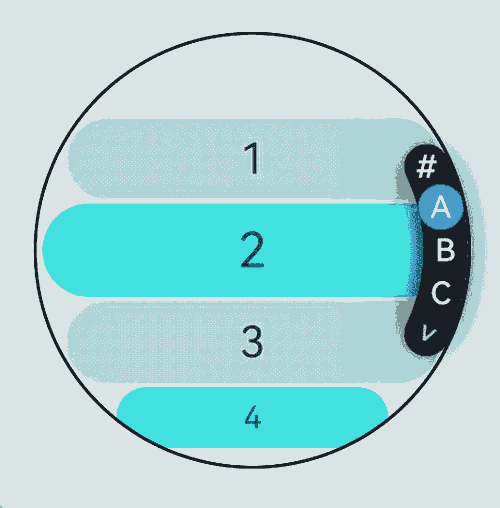
The ArcAlphabetIndexer component is a circular component designed for quick navigation through alphabetically sorted items. It can be integrated with container components to quickly locate items within the visible area.
NOTE
This component is supported since API version 16. Updates will be marked with a superscript to indicate their earliest API version.
Modules to Import
import { ArcAlphabetIndexer, ArcAlphabetIndexerAttribute } from '@kit.ArkUI'
Child Components
Not supported
APIs
ArcAlphabetIndexer(info: ArcAlphabetIndexerInitInfo)
Creates an instance of the ArcAlphabetIndexer component with initialization parameters.
Atomic service API: This API can be used in atomic services since API version 16.
System capability: SystemCapability.ArkUI.ArkUI.Circle
Parameters
| Name | Type | Mandatory | Description |
|---|---|---|---|
| info | ArcAlphabetIndexerInitInfo | Yes | Initialization parameters for the ArcAlphabetIndexer component. |
Attributes
In addition to the universal attributes, the following attributes are supported.
color
color(color: Optional<ColorMetrics>)
Sets the text color of the index items in the normal state.
Atomic service API: This API can be used in atomic services since API version 16.
System capability: SystemCapability.ArkUI.ArkUI.Circle
Parameters
| Name | Type | Mandatory | Description |
|---|---|---|---|
| color | Optional<ColorMetrics> | Yes | Text color of the index items in the normal state. Default value: 0xFFFFFF |
selectedColor
selectedColor(color: Optional<ColorMetrics>)
Sets the text color of the selected item.
Atomic service API: This API can be used in atomic services since API version 16.
System capability: SystemCapability.ArkUI.ArkUI.Circle
Parameters
| Name | Type | Mandatory | Description |
|---|---|---|---|
| color | Optional<ColorMetrics> | Yes | Text color of the selected item. Default value: 0xFFFFFF |
popupColor
popupColor(color: Optional<ColorMetrics>)
Sets the text color for the pop-up window.
Atomic service API: This API can be used in atomic services since API version 16.
System capability: SystemCapability.ArkUI.ArkUI.Circle
Parameters
| Name | Type | Mandatory | Description |
|---|---|---|---|
| color | Optional<ColorMetrics> | Yes | Text color of the pop-up window. Default value: 0xFFFFFF |
selectedBackgroundColor
selectedBackgroundColor(color: Optional<ColorMetrics>)
Sets the background color of the selected item.
Atomic service API: This API can be used in atomic services since API version 16.
System capability: SystemCapability.ArkUI.ArkUI.Circle
Parameters
| Name | Type | Mandatory | Description |
|---|---|---|---|
| color | Optional<ColorMetrics> | Yes | Background color of the selected item. Default value: 0x1F71FF |
popupBackground
popupBackground(color: Optional<ColorMetrics>)
Sets the background color of the pop-up window.
Atomic service API: This API can be used in atomic services since API version 16.
System capability: SystemCapability.ArkUI.ArkUI.Circle
Parameters
| Name | Type | Mandatory | Description |
|---|---|---|---|
| color | Optional<ColorMetrics> | Yes | Background color of the pop-up window. Default value: 0xD8404040 |
usePopup
usePopup(enabled: Optional<boolean>)
Sets whether to display the pop-up window.
Atomic service API: This API can be used in atomic services since API version 16.
System capability: SystemCapability.ArkUI.ArkUI.Circle
Parameters
| Name | Type | Mandatory | Description |
|---|---|---|---|
| enabled | Optional<boolean> | Yes | Whether to display the pop-up window. Default value: false |
selectedFont
selectedFont(font: Optional<Font>)
Sets the font style of the selected item, including size, weight, style, and font family.
Atomic service API: This API can be used in atomic services since API version 16.
System capability: SystemCapability.ArkUI.ArkUI.Circle
Parameters
| Name | Type | Mandatory | Description |
|---|---|---|---|
| font | Optional<Font> | Yes | Font style of the selected item. Default value: { size:‘13.0fp’, style:FontStyle.Normal, weight:500, family:‘HarmonyOS Sans’ } |
popupFont
popupFont(value: Optional<Font>)
Sets the font style of the pop-up window.
Atomic service API: This API can be used in atomic services since API version 16.
System capability: SystemCapability.ArkUI.ArkUI.Circle
Parameters
| Name | Type | Mandatory | Description |
|---|---|---|---|
| value | Optional<Font> | Yes | Font style of the pop-up window. Default value: { size:‘19.0fp’, style:FontStyle.Normal, weight:500, family:‘HarmonyOS Sans’ } |
font
font(font: Optional<Font>)
Sets the default font style of the index items.
Atomic service API: This API can be used in atomic services since API version 16.
System capability: SystemCapability.ArkUI.ArkUI.Circle
Parameters
| Name | Type | Mandatory | Description |
|---|---|---|---|
| font | Optional<Font> | Yes | Default font style of the index items. Default value: { size:‘13.0fp’, style:FontStyle.Normal, weight:500, family:‘HarmonyOS Sans’ } |
itemSize
itemSize(size: Optional<LengthMetrics>)
Sets the size of the index item area.
Atomic service API: This API can be used in atomic services since API version 16.
System capability: SystemCapability.ArkUI.ArkUI.Circle
Parameters
| Name | Type | Mandatory | Description |
|---|---|---|---|
| size | Optional<LengthMetrics> | Yes | Size of the index item area. For the circular item area, this represents the diameter of the circle. Percentage values are not supported. Default value: 24.0 Unit: vp |
selected
selected(index: Optional<number>)
Sets the index of the selected item.
Atomic service API: This API can be used in atomic services since API version 16.
System capability: SystemCapability.ArkUI.ArkUI.Circle
Parameters
| Name | Type | Mandatory | Description |
|---|---|---|---|
| index | Optional<number> | Yes | Index of the selected item. Default value: 0 This parameter supports two-way binding through $$. |
autoCollapse
autoCollapse(enable: Optional<boolean>)
Sets whether to auto-collapse or expand the indexer.
Atomic service API: This API can be used in atomic services since API version 16.
System capability: SystemCapability.ArkUI.ArkUI.Circle
Parameters
| Name | Type | Mandatory | Description |
|---|---|---|---|
| enable | Optional<boolean> | Yes | Whether to auto-collapse or expand the indexer. Default value: false |
popupBackgroundBlurStyle
popupBackgroundBlurStyle(style: Optional<BlurStyle>)
Sets the background blur style of the pop-up window.
Atomic service API: This API can be used in atomic services since API version 16.
System capability: SystemCapability.ArkUI.ArkUI.Circle
Parameters
| Name | Type | Mandatory | Description |
|---|---|---|---|
| style | Optional<BlurStyle> | Yes | Background blur style of the pop-up window. Default value: COMPONENT_REGULAR |
Events
In addition to the universal events, the following events are supported.
onSelect
onSelect(handler: Optional<OnSelectCallback>)
Triggered when an index item is selected. The return value is the index of the selected item.
Atomic service API: This API can be used in atomic services since API version 16.
System capability: SystemCapability.ArkUI.ArkUI.Circle
Parameters
| Name | Type | Mandatory | Description |
|---|---|---|---|
| handler | Optional<OnSelectCallback> | Yes | Callback used to return the result. |
ArcAlphabetIndexerInitInfo
Defines the initialization parameters for the ArcAlphabetIndexer component.
Atomic service API: This API can be used in atomic services since API version 16.
System capability: SystemCapability.ArkUI.ArkUI.Circle
Parameters
| Name | Type | Mandatory | Description |
|---|---|---|---|
| arrayValue | string[] | Yes | Array of alphabet index strings. It cannot be set to empty. |
| selected | number | Yes | Index of the initial selected item. If the value is out of range, the default value 0 is used. This parameter supports two-way binding through $$. |
OnSelectCallback
type OnSelectCallback = (index: number) => void
Defines the callback used in onSelect.
Atomic service API: This API can be used in atomic services since API version 16.
System capability: SystemCapability.ArkUI.ArkUI.Circle
Parameters
| Name | Type | Mandatory | Description |
|---|---|---|---|
| index | number | Yes | Index of the selected item. |
Example
This example demonstrates how to link an ArcAlphabetIndexer component with an ArcList component for synchronized control and navigation.
// xxx.ets
import {
  LengthMetrics,
  ColorMetrics,
  ArcList,
  ArcListItem,
  ArcListAttribute,
  ArcListItemAttribute,
  ArcAlphabetIndexer,
  ArcAlphabetIndexerAttribute
} from '@kit.ArkUI';

@Builder
function buildText() {
  Stack() {
    Text("head")
      .fontSize(30)
      .padding(10)
      .backgroundColor(0xF9CF93)
      .border({ width: '1px', color: Color.Black })

    Divider().width('100%').height('1px')
  }
  .alignContent(Alignment.Bottom)
}

@Entry
@Component
struct ArcListAndIndexer {
  private fullValue: string[] = [
    '#', 'A', 'B', 'C', 'D', 'E', 'F', 'G', 'H', 'I', 'J', 'K', 'L', 'M', 'N',
    'O', 'P', 'Q', 'R', 'S', 'T', 'U', 'V', 'W', 'X', 'Y', 'Z'
  ]
  private arrName : string[] = [
    '1','2','3','4','5','6','7','8','9','10','11','12','13','14','15','16','17','18','19','20',
    '21','22','23','24','25','26','27','28','29','30','31','32','33','34','35','36','37','38',
    '39','40', '41','42',
  ];

  private scrollerForList: Scroller = new Scroller()
  @State indexerIndex: number = 0;

  private watchSize: string = '466px' // Default watch size: 233*233
  private itemSize: number = 16  // Default size of the index item area: 24

  build() {
    Column() {
      Row() {
        Stack() {
          ArcList({ scroller : this.scrollerForList, initialIndex: 0 }) {
            ForEach(this.arrName, (itemName: string, index: number) => {
              ArcListItem() {
                Text(itemName)
                  .width('90%')
                  .height('92px')
                  .fontSize(16)
                  .textAlign(TextAlign.Center)
                  .backgroundColor(index % 2 == 0 ? 0xAFEEEE : 0x00FFFF)
                  .borderRadius(23)
              }
            })
          }
          .scrollBar(BarState.Off)
          .onScrollIndex((firstIndex: number, lastIndex: number, centerIndex: number) => {
            this.indexerIndex = centerIndex;
          })
          .borderWidth(1)
          .width(this.watchSize)
          .height(this.watchSize)
          .borderRadius(this.watchSize)
          .space(LengthMetrics.px(4))

          ArcAlphabetIndexer({ arrayValue: this.fullValue, selected: 0 })
            .autoCollapse(true)
            .width(this.watchSize)
            .height(this.watchSize)
            .usePopup(false)
            .selected(this.indexerIndex)
            .onSelect((index: number) => {
              this.indexerIndex = index
              this.scrollerForList.scrollToIndex(this.indexerIndex)
            })
            .borderWidth(1)
            .hitTestBehavior(HitTestMode.Transparent)
            .selectedColor(ColorMetrics.resourceColor(0xFFFFFF))
            .selectedBackgroundColor(ColorMetrics.resourceColor(0x1F71FF))
            .color(ColorMetrics.resourceColor(0xFFFFFF))
            .popupColor(ColorMetrics.resourceColor(0xFFFFFF))
            .popupBackground(ColorMetrics.resourceColor(0xD8404040))
            .itemSize(LengthMetrics.px(this.itemSize))
            .selectedFont({
              size:'11.0fp',
              style:FontStyle.Normal,
              weight:500,
              family:'HarmonyOS Sans'
            })
            .font({
              size:'11.0fp',
              style:FontStyle.Normal,
              weight:500,
              family:'HarmonyOS Sans'
            })

        }.width('100%').height('100%')
      }.width('100%').height('100%')
    }
  }
}
你可能感兴趣的鸿蒙文章
- 所属分类: 后端技术
- 本文标签:
热门推荐
-
2、 优质文章
-
3、 gt
-
7、 openharmony
-
9、 golang
-
10、 Vue中input框自动聚焦