harmony 鸿蒙ArcList
ArcList
The ArcList component is a circular layout container that displays a series of list items in an arc shape. It is suitable for presenting homogeneous data, such as images and text, in a continuous, multi-row format.
NOTE
This component is supported since API version 18. Updates will be marked with a superscript to indicate their earliest API version.
Modules to Import
import { ArcList, ArcListAttribute } from '@kit.ArkUI';
Child Components
Only the ArcListItem component is supported.
NOTE
Below are the rules for calculating the indexes of the child components of ArcList:
The index increases in ascending order of child components.
In the if/else statement, only the child components for which the condition evaluates to true participate in the index calculation.
In the ForEach or LazyForEach statement, the indexes of all expanded subnodes are calculated.
If the values of if/else, ForEach, and LazyForEach change, the indexes of subnodes are updated.
Child components of ArcList whose visibility attribute is set to Hidden or None are still included in the index calculation.
APIs
ArcList(options?: ArkListOptions)
Creates an instance of the ArcList component with optional configuration parameters.
Atomic service API: This API can be used in atomic services since API version 18.
System capability: SystemCapability.ArkUI.ArkUI.Circle
Parameters
| Name | Type | Mandatory | Description |
|---|---|---|---|
| options | ArkListOptions | No | Parameters for configuring the ArcList. |
Attributes
In addition to the universal attributes, the following attributes are supported.
digitalCrownSensitivity
digitalCrownSensitivity(sensitivity: Optional<CrownSensitivity>)
Sets the sensitivity of the digital crown’s response to events.
Atomic service API: This API can be used in atomic services since API version 18.
System capability: SystemCapability.ArkUI.ArkUI.Circle
Parameters
| Name | Type | Mandatory | Description |
|---|---|---|---|
| sensitivity | Optional<CrownSensitivity> | Yes | Sensitivity of the digital crown’s response. Default value: CrownSensitivity.MEDIUM, indicating moderate response speed |
space
space(space: Optional<LengthMetrics>)
Sets the spacing between list items.
Atomic service API: This API can be used in atomic services since API version 18.
System capability: SystemCapability.ArkUI.ArkUI.Circle
Parameters
| Name | Type | Mandatory | Description |
|---|---|---|---|
| space | Optional<LengthMetrics> | Yes | Spacing between list items. Default value: 0 Child components of ArcList whose visibility attribute is set to None are not displayed, but the spacing above and below them still takes effect. |
scrollBar
scrollBar(status: Optional<BarState>)
Sets the state of the scrollbar.
Atomic service API: This API can be used in atomic services since API version 18.
System capability: SystemCapability.ArkUI.ArkUI.Circle
Parameters
| Name | Type | Mandatory | Description |
|---|---|---|---|
| status | Optional<BarState> | Yes | State of the scrollbar. Default value: BarState.Auto |
cachedCount
cachedCount(count: Optional<number>)
Sets the number of arc list items to be preloaded (cached). In a lazy loading scenario, only the content equivalent to cachedCount outside the visible area of the arc list is preloaded. In a non-lazy loading scenario, all items are loaded at once. For both lazy and non-lazy loading, only the content within the visible area of the arc list plus the content equivalent to cachedCount outside the visible area is laid out.
When cachedCount is set for the arc list, the system preloads and lays out the cachedCount-specified number of rows of arc list items both above and below the currently visible area of the arc list.
Atomic service API: This API can be used in atomic services since API version 18.
System capability: SystemCapability.ArkUI.ArkUI.Circle
Parameters
| Name | Type | Mandatory | Description |
|---|---|---|---|
| count | Optional<number> | Yes | Number of list items to preload. Default value: number of nodes visible on the screen, with the maximum value of 16. Value range: [0, +∞). |
chainAnimation
chainAnimation(enable: Optional<boolean>)
Sets whether to enable chained animations, which provide a visually connected, or “chained,” effect when the ArcList component is scrolled or its top or bottom edge is dragged.
The list items are separated with even space, and one item animation starts after the previous animation during basic sliding interactions. The chained animation effect is similar with spring physics.
For chained animations to work properly, the edge scrolling effect of the ArcList component must be set to EdgeEffect.Spring.
Atomic service API: This API can be used in atomic services since API version 18.
System capability: SystemCapability.ArkUI.ArkUI.Circle
Parameters
| Name | Type | Mandatory | Description |
|---|---|---|---|
| enable | Optional<boolean> | Yes | Whether to enable chained animations. false (default): Chained animations are disabled. true: Chained animations are enabled. |
enableScrollInteraction
enableScrollInteraction(enable: Optional<boolean>)
Sets whether to support scroll gestures. When this attribute is set to false, scrolling by finger or mouse is not supported, but the Scroller controller API is not affected.
Atomic service API: This API can be used in atomic services since API version 18.
System capability: SystemCapability.ArkUI.ArkUI.Circle
Parameters
| Name | Type | Mandatory | Description |
|---|---|---|---|
| enable | Optional<boolean> | Yes | Whether to support scroll gestures. Default value: true |
fadingEdge
fadingEdge(enable: Optional<boolean>)
Sets whether to enable the edge fading effect.
Atomic service API: This API can be used in atomic services since API version 18.
System capability: SystemCapability.ArkUI.ArkUI.Circle
Parameters
| Name | Type | Mandatory | Description |
|---|---|---|---|
| enable | Optional<boolean> | Yes | Whether to enable the edge fading effect. When fadingEdge is set to true, it overrides the .overlay() attribute of the component. With fadingEdge set to true, avoid setting background-related attributes on the component, as this may affect the display of the fading effect. With fadingEdge set to true, the component is clipped to the boundary, and setting the component’s clip attribute to false will not take effect. Default value: false, which means not to enable the edge fading effect. |
friction
friction(friction: Optional<number>)
Sets the friction coefficient. It applies only to gestures in the scrolling area, and it affects only indirectly the scroll chaining during the inertial scrolling process. If this attribute is set to a value less than or equal to 0, the default value is used.
Atomic service API: This API can be used in atomic services since API version 18.
System capability: SystemCapability.ArkUI.ArkUI.Circle
Parameters
| Name | Type | Mandatory | Description |
|---|---|---|---|
| friction | Optional<number> | Yes | Friction coefficient. Default value: 0.8 Value range: (0, +∞). |
scrollBarWidth
scrollBarWidth(width: Optional<LengthMetrics>)
Sets the width of the scrollbar. Once the width is set, the scrollbar will use this width in its pressed state.
Atomic service API: This API can be used in atomic services since API version 18.
System capability: SystemCapability.ArkUI.ArkUI.Circle
Parameters
| Name | Type | Mandatory | Description |
|---|---|---|---|
| width | Optional<LengthMetrics> | Yes | Width of the scrollbar. Default value: 24 Minimum value: 4 Unit: vp |
scrollBarColor
scrollBarColor(color: Optional<ColorMetrics>)
Sets the color of the scrollbar.
Atomic service API: This API can be used in atomic services since API version 18.
System capability: SystemCapability.ArkUI.ArkUI.Circle
Parameters
| Name | Type | Mandatory | Description |
|---|---|---|---|
| color | Optional<ColorMetrics> | Yes | Color of the scrollbar. Default value: 0xA9FFFFFF |
flingSpeedLimit
flingSpeedLimit(speed: Optional<number>)
Sets the maximum initial speed for inertial scrolling after a fling gesture. If this attribute is set to a value less than or equal to 0, the default value is used.
Atomic service API: This API can be used in atomic services since API version 18.
System capability: SystemCapability.ArkUI.ArkUI.Circle
Parameters
| Name | Type | Mandatory | Description |
|---|---|---|---|
| speed | Optional<number> | Yes | Maximum initial speed for inertial scrolling. Default value: 9000. Unit: vp/s. Value range: (0, +∞). |
childrenMainSize
childrenMainSize(size: Optional<ChildrenMainSize>)
Sets the size information of the child components of the ArcList component along the main axis.
Atomic service API: This API can be used in atomic services since API version 18.
System capability: SystemCapability.ArkUI.ArkUI.Circle
Parameters
| Name | Type | Mandatory | Description |
|---|---|---|---|
| size | Optional<ChildrenMainSize> | Yes | Precise size information for all child components along the main axis. This ensures accurate scrolling positions in scenarios where child components have varying sizes, are added or removed, or when APIs like scrollToIndex are used. It guarantees that scrollTo can accurately navigate to the specified position, currentOffset accurately reflects the current scrolling position, and the built-in scrollbar moves smoothly without any jumps abrupt changes. NOTE The provided sizes must match the actual sizes of the child components. Any changes to the sizes, or any additions or removals of child components, must be notified to the ArcList component through the ChildrenMainSize object. |
Events
onScrollIndex
onScrollIndex(handler: Optional<ArcScrollIndexHandler>)
Triggered when a child component enters or leaves the visible area of the ArcList component. This event is triggered during initialization of the ArcList component and when the index of the first or last child component in the visible area changes, or when the center child component changes.
If the edge scrolling effect of the ArcList component is set to spring, this event is not triggered during continued scrolling at the edge or during the bounce-back process
Atomic service API: This API can be used in atomic services since API version 18.
System capability: SystemCapability.ArkUI.ArkUI.Circle
Parameters
| Name | Type | Mandatory | Description |
|---|---|---|---|
| handler | Optional<ArcScrollIndexHandler> | Yes | Callback triggered when a child component enters or leaves the visible area of the ArcList component. |
onReachStart
onReachStart(handler: Optional<VoidCallback>)
Triggered when the list reaches the start position.
This event is triggered during initialization of the ArcList component if initialIndex is set to 0, and whenever the list scrolls to the start position. If the edge scrolling effect is set to spring, this event is triggered when scrolling past the start position and again when bouncing back to it.
Atomic service API: This API can be used in atomic services since API version 18.
System capability: SystemCapability.ArkUI.ArkUI.Circle
| Name | Type | Mandatory | Description |
|---|---|---|---|
| handler | Optional<VoidCallback> | Yes | Callback triggered when the list reaches the start position. |
onReachEnd
onReachEnd(handler: Optional<VoidCallback>)
Triggered when the list reaches the end position.
If the edge scrolling effect is set to spring, this event is triggered when scrolling past the end position and again when bouncing back to it.
Atomic service API: This API can be used in atomic services since API version 18.
System capability: SystemCapability.ArkUI.ArkUI.Circle
| Name | Type | Mandatory | Description |
|---|---|---|---|
| handler | Optional<VoidCallback> | Yes | Callback triggered when the list reaches the end position. |
onScrollStart
onScrollStart(handler: Optional<VoidCallback>)
Triggered when the list starts scrolling initiated by the user’s finger dragging the list or its scrollbar. This event is also triggered when the animation contained in the scrolling triggered by Scroller starts.
Atomic service API: This API can be used in atomic services since API version 18.
System capability: SystemCapability.ArkUI.ArkUI.Circle
| Name | Type | Mandatory | Description |
|---|---|---|---|
| handler | Optional<VoidCallback> | Yes | Callback triggered when the list starts scrolling. |
onScrollStop
onScrollStop(handler: Optional<VoidCallback>)
Triggered when the list stops scrolling after the user’s finger leaves the screen. This event is also triggered when the animation contained in the scrolling triggered by Scroller stops.
Atomic service API: This API can be used in atomic services since API version 18.
System capability: SystemCapability.ArkUI.ArkUI.Circle
| Name | Type | Mandatory | Description |
|---|---|---|---|
| handler | Optional<VoidCallback> | Yes | Callback triggered when the list stops scrolling. |
onWillScroll
onWillScroll(handler: Optional<OnWillScrollCallback>)
Triggered before each frame when the list is being scrolled. The return value is the offset amount by which the list will scroll and the current scroll state. The returned offset is obtained by calculation, not the actual offset.
Atomic service API: This API can be used in atomic services since API version 18.
System capability: SystemCapability.ArkUI.ArkUI.Circle
Parameters
| Name | Type | Mandatory | Description |
|---|---|---|---|
| handler | Optional<OnWillScrollCallback> | Yes | Callback triggered before each frame when the list is being scrolled. |
NOTE
When ScrollEdge or ScrollToIndex that does not involve animation is called, onWillScroll is not triggered.
onDidScroll
onDidScroll(handler: Optional<OnScrollCallback>)
Triggered when the list scrolls. The return value is the offset amount by which the list has scrolled and the current scroll state.
Atomic service API: This API can be used in atomic services since API version 18.
System capability: SystemCapability.ArkUI.ArkUI.Circle
Parameters
| Name | Type | Mandatory | Description |
|---|---|---|---|
| handler | Optional<OnScrollCallback> | Yes | Callback triggered when the list scrolls. |
ArkListOptions
Provides basic parameters for creating an ArcList component.
Atomic service API: This API can be used in atomic services since API version 18.
System capability: SystemCapability.ArkUI.ArkUI.Circle
| Name | Type | Mandatory | Description |
|---|---|---|---|
| initialIndex | number | No | Item displayed at the beginning of the viewport when the ArcList component is loaded for the first time, that is, the first item to be displayed. Default value: 0 NOTE If the set value is a negative number or is greater than the index of the last item, the value is invalid. In this case, the default value will be used. |
| scroller | Scroller | No | Scroller, which can be bound to scrollable components for scrolling control. NOTE The same scroller cannot be bound to multiple scrollable components. |
| header | ComponentContent | No | Header component. |
ArcScrollIndexHandler
type ArcScrollIndexHandler = (start: number, end: number, center: number) => void
Represents the callback triggered when a child component enters or leaves the visible area of the ArcList component.
Atomic service API: This API can be used in atomic services since API version 18.
System capability: SystemCapability.ArkUI.ArkUI.Circle
| Name | Type | Mandatory | Description |
|---|---|---|---|
| start | number | Yes | Index of the first child component in the visible area of the ArcList component. |
| end | number | Yes | Index of the last child component in the visible area of the ArcList component. |
| center | number | Yes | Index of the center child component in the visible area of the ArcList component. |
Example
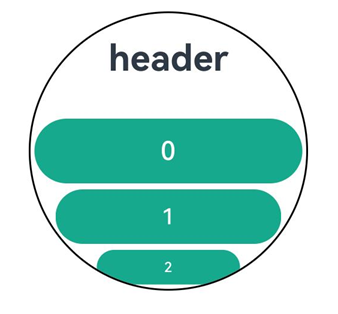
This example demonstrates an ArcList component with a header component and auto-scaling child items.
// xxx.ets
import { ComponentContent, LengthMetrics } from "@kit.ArkUI";
import { UIContext } from '@kit.ArkUI';
import { ArcList, ArcListItem, ArcListAttribute, ArcListItemAttribute } from '@kit.ArkUI';

@Builder
function buildText() {
  Column() {
    Text("header")
      .fontSize('60px')
      .fontWeight(FontWeight.Bold)
  }.margin(0)
}

@Entry
@Component
struct Index {
  @State  private numItems: number[] = [0, 1, 2, 3, 4, 5, 6, 7, 8, 9];

  private watchSize: string = '466px' // Default watch size: 466*466
  private listSize: string = '414px' // Item width

  context: UIContext = this.getUIContext()
  tabBar1: ComponentContent<Object> = new ComponentContent(this.context, wrapBuilder(buildText));

  @Builder
  buildList2() {
    Stack() {
      Column() {
      }
      .justifyContent(FlexAlign.Center)
      .width(this.watchSize)
      .height(this.watchSize)
      .clip(new Circle({ width: '100%', height: '100%' }))
      .backgroundColor(Color.White)

      ArcList({ initialIndex: 0, header: this.tabBar1 }) {
        ForEach(this.numItems, (item: number, index: number) => {
          ArcListItem() {
            Button('' + item, { type: ButtonType.Capsule })
              .width(this.listSize)
              .height('100px')
              .fontSize('40px')
              .focusable(true)
              .focusOnTouch(true)
              .backgroundColor(0x17A98D)
          }.align(Alignment.Center)
        }, (item: string, index: number) => item + index)
      }
      .space(LengthMetrics.px(10))
      .borderRadius(this.watchSize)
      .focusable(true)
      .focusOnTouch(true)
      .defaultFocus(true)
    }
    .align(Alignment.Center)
    .width(this.watchSize)
    .height(this.watchSize)
    .border({color: Color.Black, width: 1})
    .borderRadius(this.watchSize)
  }

  build() {
    Column() {
      this.buildList2()
    }
    .width('100%')
    .height('100%')
    .alignItems(HorizontalAlign.Center)
    .justifyContent(FlexAlign.Center)
  }
}
你可能感兴趣的鸿蒙文章
- 所属分类: 后端技术
- 本文标签:
热门推荐
-
2、 优质文章
-
3、 gt
-
7、 openharmony
-
9、 golang
-
10、 Vue中input框自动聚焦