harmony 鸿蒙Visibility
Visibility
The visibility attribute controls whether a component is visible.
NOTE
This event is supported since API version 7. Updates will be marked with a superscript to indicate their earliest API version.
visibility
visibility(value: Visibility)
Sets the visibility of this component.
Widget capability: Since API version 9, this feature is supported in ArkTS widgets.
Atomic service API: This API can be used in atomic services since API version 11.
System capability: SystemCapability.ArkUI.ArkUI.Full
Parameters
| Name | Type | Mandatory | Description |
|---|---|---|---|
| value | Visibility | Yes | Whether the component is visible. When appropriate, consider using conditional rendering as a substitute. Default value: Visibility.Visible |
Example
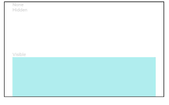
This example demonstrates how to use the visibility configuration to achieve different visibility control effects.
// xxx.ets
@Entry
@Component
struct VisibilityExample {
  build() {
    Column() {
      Column() {
        // The component is hidden and does not take up space in the layout.
        Text('None').fontSize(9).width('90%').fontColor(0xCCCCCC)
        Row().visibility(Visibility.None).width('90%').height(80).backgroundColor(0xAFEEEE)

        // The component is hidden but takes up space in the layout.
        Text('Hidden').fontSize(9).width('90%').fontColor(0xCCCCCC)
        Row().visibility(Visibility.Hidden).width('90%').height(80).backgroundColor(0xAFEEEE)

        // The component is visible, which is the default display mode.
        Text('Visible').fontSize(9).width('90%').fontColor(0xCCCCCC)
        Row().visibility(Visibility.Visible).width('90%').height(80).backgroundColor(0xAFEEEE)
      }.width('90%').border({ width: 1 })
    }.width('100%').margin({ top: 5 })
  }
}
你可能感兴趣的鸿蒙文章
0
赞
- 所属分类: 后端技术
- 本文标签:
热门推荐
-
2、 优质文章
-
3、 gt
-
7、 openharmony
-
9、 golang
-
10、 Vue中input框自动聚焦