harmony 鸿蒙Z-order Control
Z-order Control
The zIndex attribute sets the z-order of a component in the stacking context.
NOTE
The APIs of this module are supported since API version 7. Updates will be marked with a superscript to indicate their earliest API version.
zIndex
zIndex(value: number)
Sets the stack level of the component.
Widget capability: Since API version 9, this feature is supported in ArkTS widgets.
Atomic service API: This API can be used in atomic services since API version 11.
System capability: SystemCapability.ArkUI.ArkUI.Full
Parameters
| Name | Type | Mandatory | Description |
|---|---|---|---|
| value | number | Yes | Stacking order of the component relative to its sibling components in a container. The components with a larger z-index value cover those with a smaller one. When dynamically changing zIndex does not involve adding or removing sibling nodes, the components are sorted stably based on their previous stack level. |
Example
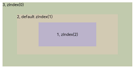
Example 1: Setting the Component Stacking Order
This example demonstrates how to set the stacking order of components using zIndex.
// xxx.ets
@Entry
@Component
struct ZIndexExample {
  build() {
    Column() {
      Stack() {
        // Components are stacked. By default, the component defined later is on the top. A component with a larger zIndex value is displayed before one with a smaller zIndex value.
        Text('1, zIndex(2)')
          .size({ width: '40%', height: '30%' }).backgroundColor(0xbbb2cb)
          .zIndex(2)
        Text('2, default zIndex(1)')
          .size({ width: '70%', height: '50%' }).backgroundColor(0xd2cab3).align(Alignment.TopStart)
          .zIndex(1)
        Text('3, zIndex(0)')
          .size({ width: '90%', height: '80%' }).backgroundColor(0xc1cbac).align(Alignment.TopStart)
      }.width('100%').height(200)
    }.width('100%').height(200)
  }
}
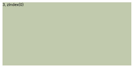
Display of child components in the Stack component when zIndex is not set
Display of child components in the Stack component when zIndex is set
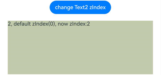
Example 2: Dynamically Modifying the zIndex Attribute
This example demonstrates dynamically modifying the zIndex attribute on a Button component.
// xxx.ets
@Entry
@Component
struct ZIndexExample {
  @State zIndex_ : number = 0
  build() {
    Column() {
      // Clicking the Button component changes the zIndex value. Components are sorted stably based on their previous stacking order.
      Button("change Text2 zIndex")
        .onClick(()=>{
          this.zIndex_ = (this.zIndex_ + 1) % 3;
        })
      Stack() {
        Text('1, zIndex(1)')
          .size({ width: '70%', height: '50%' }).backgroundColor(0xd2cab3).align(Alignment.TopStart)
          .zIndex(1)
        Text('2, default zIndex(0), now zIndex:' + this.zIndex_)
          .size({ width: '90%', height: '80%' }).backgroundColor(0xc1cbac).align(Alignment.TopStart)
          .zIndex(this.zIndex_)
      }.width('100%').height(200)
    }.width('100%').height(200)
  }
}
Effect without clicking the Button component to change zIndex
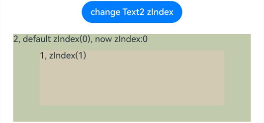
Effect after clicking the Button component to dynamically change zIndex so that Text1 and Text2 have the same zIndex value

Effect after clicking the Button component to dynamically change zIndex so that Text1 has a higher zIndex value than Text2
你可能感兴趣的鸿蒙文章
- 所属分类: 后端技术
- 本文标签:
热门推荐
-
2、 优质文章
-
3、 gt
-
7、 openharmony
-
9、 golang
-
10、 Vue中input框自动聚焦