harmony 鸿蒙Special Effect Drawing Combination
Special Effect Drawing Combination
The useEffect attribute is used to combine the drawing of special effects, such as background blur.
NOTE
This attribute is supported since API version 12. Updates will be marked with a superscript to indicate their earliest API version.
useEffect
useEffect(value: boolean)
Specifies whether to combine the drawing of special effects, such as background blur.
Atomic service API: This API can be used in atomic services since API version 12.
System capability: SystemCapability.ArkUI.ArkUI.Full
Parameters
| Name | Type | Mandatory | Description |
|---|---|---|---|
| value | boolean | Yes | Whether the component inherits the special effect settings of the EffectComponent component. The value true means the component inherits the special effect settings of the EffectComponent component, and false means the opposite. Default value: false |
useEffect14+
useEffect(useEffect: boolean, effectType: EffectType)
Specifies whether to apply the effect defined by the parent EffectComponent or the window.
Atomic service API: This API can be used in atomic services since API version 14.
System capability: SystemCapability.ArkUI.ArkUI.Full
Parameters
| Name | Type | Mandatory | Description |
|---|---|---|---|
| useEffect | boolean | Yes | Whether to apply the effect defined by the parent EffectComponent or the window. The value true means to apply the effect defined by the parent EffectComponent or the window. Default value: false |
| effectType | EffectType | Yes | Type of effect to apply to the component, which is defined by the parent EffectComponent or the window. Default value: EffectType.DEFAULT |
useEffect18+
useEffect(useEffect: Optional<boolean>, effectType?: EffectType)
Specifies whether to apply the effect defined by the parent EffectComponent or the window. Compared to useEffect14+, this API supports the undefined type for the useEffect parameter.
Atomic service API: This API can be used in atomic services since API version 18.
System capability: SystemCapability.ArkUI.ArkUI.Full
Parameters
| Name | Type | Mandatory | Description |
|---|---|---|---|
| useEffect | Optional<boolean> | Yes | Whether to apply the effect defined by the parent EffectComponent or the window. The value true means to apply the effect defined by the parent EffectComponent or the window. Default value: false If useEffect is set to undefined, the previous value is retained. |
| effectType | EffectType | No | Type of effect to apply to the component, which is defined by the parent EffectComponent or the window. Default value: EffectType.DEFAULT |
EffectType14+
Enumerates the types of effect templates.
Atomic service API: This API can be used in atomic services since API version 14.
System capability: SystemCapability.ArkUI.ArkUI.Full
| Name | Value | Description |
|---|---|---|
| DEFAULT | 0 | Uses the effect template defined by the parent EffectComponent or . |
| WINDOW_EFFECT | 1 | Uses the effect template defined by the window. |
Effect Template
| Device Type | Fuzzy Radius (Unit: px) | Saturation | Brightness | Color |
|---|---|---|---|---|
| Mobile device | 0 | 0 | 0 | ’#ffffffff’ |
| 2-in-1 device: dark mode | 80 | 1.5 | 1.0 | ’#e52e3033’ |
| 2-in-1 device: light mode | 80 | 1.9 | 1.0 | ’#e5ffffff’ |
| Tablet | 0 | 0 | 0 | ’#ffffffff’ |
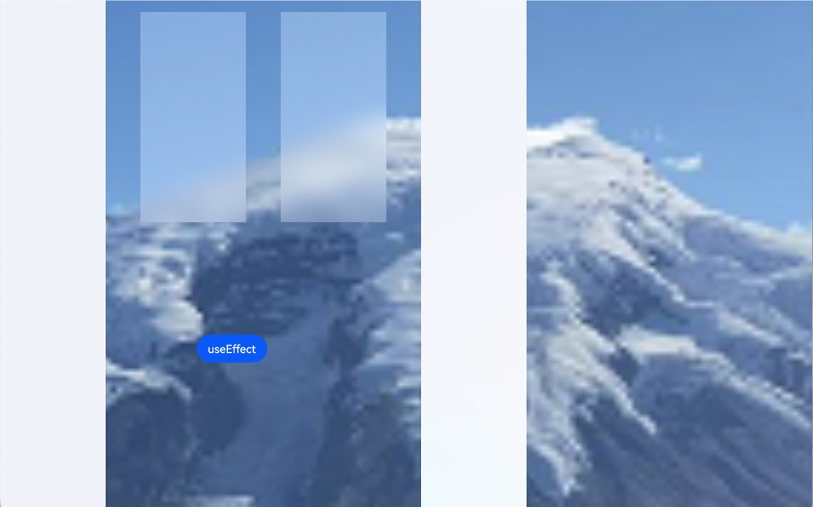
Example
This example shows how to combine the drawing of special effects, including background blur.
//Index.ets
@Entry
@Component
struct Index {
  @State isUse: boolean = true;

  build() {
    Stack() {
      Image($r("app.media.mountain"))
        .autoResize(true)
      EffectComponent() {
        Column({ space: 20 }) {
           Column() {
           }
           .position({ x: 0, y: 0 })
           .width(150)
           .height(800)
           .useEffect(this.isUse, EffectType.WINDOW_EFFECT)

           Column() {
           }
           .position({ x: 200, y: 20 })
           .width(150)
           .height(300)
           .useEffect(this.isUse, EffectType.DEFAULT)

           Column() {
           }
           .position({ x: 400, y: 20 })
           .width(150)
           .height(300)
           .useEffect(this.isUse)
        }
        .width('100%')
        .height('100%')
      }
      .backgroundBlurStyle(BlurStyle.Thin)

       Column() {
       }
        .position({ x: 600, y: 0 })
        .width(150)
        .height(800)
        .useEffect(this.isUse, EffectType.WINDOW_EFFECT)

      Row() {
        Button('useEffect')
        .margin(30)
        .onClick(() => {
          this.isUse = !this.isUse;
        })
      }
      .position({ x: 300, y: 450 })
    }
    .backgroundColor(Color.Black)
    .width('100%')
  }
}
你可能感兴趣的鸿蒙文章
- 所属分类: 后端技术
- 本文标签:
热门推荐
-
2、 优质文章
-
3、 gt
-
7、 openharmony
-
9、 golang
-
10、 Vue中input框自动聚焦