harmony 鸿蒙Transformation
Transformation
Transformation attributes allow you to rotate, translate, scale, or transform a component.
NOTE
The APIs of this module are supported since API version 7. Updates will be marked with a superscript to indicate their earliest API version.
rotate
rotate(value: RotateOptions)
Rotates the component.
Widget capability: This API can be used in ArkTS widgets since API version 9.
Atomic service API: This API can be used in atomic services since API version 11.
System capability: SystemCapability.ArkUI.ArkUI.Full
Parameters
| Name | Type | Mandatory | Description |
|---|---|---|---|
| value | RotateOptions | Yes | How the component rotates in the coordinate system (as shown below) with the upper left corner of the component as the coordinate origin. (x, y, z) specifies a vector as the axis of rotation. The axis and center of rotation are set based on the coordinate system, which remains where it is when the component is moved. Default value: When x, y, and z are not specified, their default values are 0, 0, and 1, respectively. If any of x, y, and z is specified, the default value for the unspecified one is 0. { centerX: ‘50%’, centerY: ‘50%’ centerZ: 0, perspective: 0 } Unit: vp 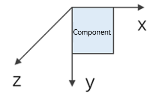 Since API version 10, CenterZ and perspective are supported in ArkTS widgets. |
rotate18+
rotate(options: Optional<RotateOptions>)
Rotates the component. Compared to rotate, this API supports the undefined type for the options parameter.
Widget capability: This API can be used in ArkTS widgets since API version 18.
Atomic service API: This API can be used in atomic services since API version 18.
System capability: SystemCapability.ArkUI.ArkUI.Full
Parameters
| Name | Type | Mandatory | Description |
|---|---|---|---|
| options | Optional<RotateOptions> | Yes | How the component rotates in the coordinate system (as shown below) with the upper left corner of the component as the coordinate origin. (x, y, z) specifies a vector as the axis of rotation. The axis and center of rotation are set based on the coordinate system, which remains where it is when the component is moved. Default value: When x, y, and z are not specified, their default values are 0, 0, and 1, respectively. If any of x, y, and z is specified, the default value for the unspecified one is 0. { centerX: ‘50%’, centerY: ‘50%’ centerZ: 0, perspective: 0 } Unit: vp Since API version 10, CenterZ and perspective are supported in ArkTS widgets. If options is undefined, the component reverts to its original state with no rotation. |
translate
translate(value: TranslateOptions)
Translates the component.
Widget capability: This API can be used in ArkTS widgets since API version 9.
Atomic service API: This API can be used in atomic services since API version 11.
System capability: SystemCapability.ArkUI.ArkUI.Full
Parameters
| Name | Type | Mandatory | Description |
|---|---|---|---|
| value | TranslateOptions | Yes | How the component is translated in the coordinate system (as shown below) with the upper left corner of the component as the coordinate origin. Values of x, y, and z indicate the translation distance along the respective axis. A positive value indicates a forward movement towards the respective axis, and a negative value indicates a backward movement towards the respective axis. The translation distance can be a number or a string (for example, ‘10px’ or ‘10%’). Default value: { x: 0, y: 0, z: 0 } Unit: vp NOTE When the component is translated along the z-axis, the position of the observation point remains unchanged. As such, the component appears larger when the value of z places it closer to the observation point and smaller when the value of z places it further away from the observation point. 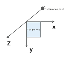 |
translate18+
translate(translate: Optional<TranslateOptions>)
Translates the component. Compared to translate, this API supports the undefined type for the translate parameter.
Widget capability: This API can be used in ArkTS widgets since API version 18.
Atomic service API: This API can be used in atomic services since API version 18.
System capability: SystemCapability.ArkUI.ArkUI.Full
Parameters
| Name | Type | Mandatory | Description |
|---|---|---|---|
| translate | Optional<TranslateOptions> | Yes | How the component is translated in the coordinate system (as shown below) with the upper left corner of the component as the coordinate origin. Values of x, y, and z indicate the translation distance along the respective axis. A positive value indicates a forward movement towards the respective axis, and a negative value indicates a backward movement towards the respective axis. The translation distance can be a number or a string (for example, ‘10px’ or ‘10%’). Default value: { x: 0, y: 0, z: 0 } Unit: vp NOTE When the component is translated along the z-axis, the position of the observation point remains unchanged. As such, the component appears larger when the value of z places it closer to the observation point and smaller when the value of z places it further away from the observation point. If options is undefined, the component reverts to its original state with no translation. |
scale
scale(value: ScaleOptions)
Scales the component.
Widget capability: This API can be used in ArkTS widgets since API version 9.
Atomic service API: This API can be used in atomic services since API version 11.
System capability: SystemCapability.ArkUI.ArkUI.Full
Parameters
| Name | Type | Mandatory | Description |
|---|---|---|---|
| value | ScaleOptions | Yes | Scale ratio along the x-, y-, and z-axis. The default value is 1. centerX and centerY are used to set the scale center point. Default value: { x: 1, y: 1, z: 1, centerX:‘50%’, centerY:‘50%’ } |
scale18+
scale(options: Optional<ScaleOptions>)
Scales the component. Compared to scale, this API supports the undefined type for the options parameter.
Widget capability: This API can be used in ArkTS widgets since API version 18.
Atomic service API: This API can be used in atomic services since API version 18.
System capability: SystemCapability.ArkUI.ArkUI.Full
Parameters
| Name | Type | Mandatory | Description |
|---|---|---|---|
| options | Optional<ScaleOptions> | Yes | Scale ratio along the x-, y-, and z-axis. The default value is 1. centerX and centerY are used to set the scale center point. Default value: { x: 1, y: 1, z: 1, centerX:‘50%’, centerY:‘50%’ } If options is undefined, the component reverts to its original state with no scaling. |
transform
transform(value: object)
Sets the transformation matrix of the component.
Atomic service API: This API can be used in atomic services since API version 11.
System capability: SystemCapability.ArkUI.ArkUI.Full
Parameters
| Name | Type | Mandatory | Description |
|---|---|---|---|
| value | object | Yes | Transformation matrix of the component. Only the Matrix4Transit object type is supported. |
transform18+
transform(transform: Optional<object>)
Sets the transformation matrix of the component. Compared to transform, this API supports the undefined type for the transform parameter.
Atomic service API: This API can be used in atomic services since API version 18.
System capability: SystemCapability.ArkUI.ArkUI.Full
Parameters
| Name | Type | Mandatory | Description |
|---|---|---|---|
| transform | Optional<object> | Transformation matrix of the component. Only the Matrix4Transit object type is supported. If transform is undefined, the component reverts to the identity matrix (no transformation). |
RotateOptions
Atomic service API: This API can be used in atomic services since API version 11.
System capability: SystemCapability.ArkUI.ArkUI.Full
| Name | Type | Mandatory | Description |
|---|---|---|---|
| x | number | No | X coordinate of the rotation axis vector. Widget capability: This API can be used in ArkTS widgets since API version 9. |
| y | number | No | Y coordinate of the rotation axis vector. Widget capability: This API can be used in ArkTS widgets since API version 9. |
| z | number | No | Z coordinate of the rotation axis vector. Widget capability: This API can be used in ArkTS widgets since API version 9. |
| angle | number |string | Yes | Angle to rotate. A positive angle indicates a clockwise rotation, and a negative angle indicates a counterclockwise rotation. The value can be of the string type, for example, ‘90deg’. Widget capability: This API can be used in ArkTS widgets since API version 9. |
| centerX | number |string | No | X coordinate of the transformation center point (anchor). Unit: vp Widget capability: This API can be used in ArkTS widgets since API version 9. |
| centerY | number |string | No | Y coordinate of the transformation center point (anchor). Unit: vp Widget capability: This API can be used in ArkTS widgets since API version 9. |
| centerZ10+ | number | No | Z-axis anchor, that is, the z-component of the 3D rotation center point. Widget capability: This API can be used in ArkTS widgets since API version 10. |
| perspective10+ | number | No | Distance from the user to the z=0 plane. The axis and center of rotation are set based on the coordinate system, which remains where it is when the component is moved. Widget capability: This API can be used in ArkTS widgets since API version 10. |
TranslateOptions
Widget capability: This API can be used in ArkTS widgets since API version 9.
Atomic service API: This API can be used in atomic services since API version 11.
System capability: SystemCapability.ArkUI.ArkUI.Full
| Name | Type | Mandatory | Description |
|---|---|---|---|
| x | number |string | No | Translation distance along the x-axis. For the number type, the unit is vp, and the value range is (-∞, +∞). For the string type, the value follows the format of Length string type. |
| y | number |string | No | Translation distance along the y-axis. For the number type, the unit is vp, and the value range is (-∞, +∞). For the string type, the value follows the format of Length string type. |
| z | number |string | No | Translation distance along the z-axis. For the number type, the unit is vp, and the value range is (-∞, +∞). For the string type, the value follows the format of Length string type. |
ScaleOptions
Widget capability: This API can be used in ArkTS widgets since API version 9.
Atomic service API: This API can be used in atomic services since API version 11.
System capability: SystemCapability.ArkUI.ArkUI.Full
| Name | Type | Mandatory | Description |
|---|---|---|---|
| x | number | No | Scale ratio along the x-axis. x > 1: The component is scaled up along the x-axis. 0 < x < 1: The component is scaled down along the x-axis. x < 0: The component is scaled in the reverse direction of the x-axis. |
| y | number | No | Scale ratio along the y-axis. y > 1: The component is scaled up along the y-axis. 0 < y < 1: The component is scaled down along the y-axis. y < 0: The component is scaled in the reverse direction of the y-axis. |
| z | number | No | Scale ratio along the z-axis. z > 1: The component is scaled up along the z-axis. 0 < z < 1: The component is scaled down along the z-axis. z < 0: The component is scaled in the reverse direction of the z-axis. |
| centerX | number |string | No | X coordinate of the transformation center point (anchor). Unit: vp |
| centerY | number |string | No | Y coordinate of the transformation center point (anchor). Unit: vp |
NOTE
If the rotate and scale attributes are both set for a component, the values of centerX and centerY conflict. In this case, the one that is set later in time is used.
Example
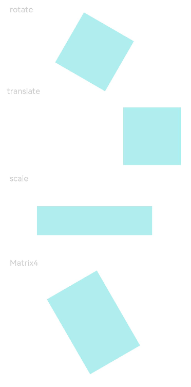
Example 1: Adding Graphical Transformation Effects
This example demonstrates how to apply various graphical transformations using the rotate, translate, scale, and transform APIs.
// xxx.ets
import { matrix4 } from '@kit.ArkUI';

@Entry
@Component
struct TransformExample {
  build() {
    Column() {
      Text('rotate').width('90%').fontColor(0xCCCCCC).padding(15).fontSize(14)
      Row()
        .rotate({
          x: 0,
          y: 0,
          z: 1,
          centerX: '50%',
          centerY: '50%',
          angle: 300
        })// The component rotates around the center point of the rotation axis (0, 0, 1) clockwise by 300 degrees.
        .width(100).height(100).backgroundColor(0xAFEEEE)

      Text('translate').width('90%').fontColor(0xCCCCCC).padding(10).fontSize(14)
      Row()
        .translate({ x: 100, y: 10 })// The component translates by 100 along the x-axis and by 10 along the y-axis.
        .width(100)
        .height(100)
        .backgroundColor(0xAFEEEE)
        .margin({ bottom: 10 })

      Text('scale').width('90%').fontColor(0xCCCCCC).padding(15).fontSize(14)
      Row()
        .scale({ x: 2, y: 0.5 })// The height and width are doubled. The z-axis has no effect in 2D mode.
        .width(100).height(100).backgroundColor(0xAFEEEE)

      Text('Matrix4').width('90%').fontColor(0xCCCCCC).padding(15).fontSize(14)
      Row()
        .width(100).height(100).backgroundColor(0xAFEEEE)
        .transform(matrix4.identity().translate({ x: 50, y: 50 }).scale({ x: 1.5, y: 1 }).rotate({
          x: 0,
          y: 0,
          z: 1,
          angle: 60
        }))
    }.width('100%').margin({ top: 5 })
  }
}
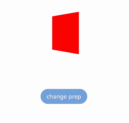
Example 2: Setting the Rotation Perspective
This example demonstrates how to use the perspective API to add a perspective effect to a component.
// xxx.ets
@Entry
@Component
struct Index {
  @State prep: number = 10;

  build() {
    Row() {
      Column() {
        Stack()
          .width(100)
          .height(100)
          .backgroundColor(Color.Red)
          .rotate({ y: 1, angle: 45, perspective: this.prep })
        Button('change prep')
          .margin({ top: 100 })
          .onClick(() => {
            this.getUIContext()?.animateTo({
              duration: 2000,
              curve: Curve.EaseIn,
              iterations: 1,
              playMode: PlayMode.Normal,
              onFinish: () => {
                console.info('play end')
              }
            }, () => {
              this.prep = 500 // Change the component's perspective from 10 to 500.
            })
          })
      }
      .width('100%')
    }
    .height('100%')
  }
}
Example 3: Implementing Rotation Around a Center Point
This example shows how to achieve the same rotation effect by setting different parameters for** rotate** and transform.
import { matrix4 } from '@kit.ArkUI'

@Entry
@Component
struct MatrixExample {
  build() {
    Column({ space: 100 }) {
      Text('Hello1')
        .textAlign(TextAlign.Center)
        .width(100)
        .height(60)
        .borderWidth(1)

      Text('Hello2')
        .textAlign(TextAlign.Center)
        .width(100)
        .height(60)
        .borderWidth(1)
        .rotate({
          // Rotate 90 degrees around the anchor (100 vp, 60 vp), where the value of centerX and centerY in rotate or scale are the component's anchors.
          z: 1,
          angle: 90,
          centerX: 100,
          centerY: 60
        })

      Text('Hello3')
        .textAlign(TextAlign.Center)
        .width(100)
        .height(60)
        .borderWidth(1)
        .transform(matrix4.identity()
          .rotate({
            // The component's anchor (centerX, centerY) is (50%, 50%) by default, which is (50 vp, 30 vp).
            // Set (centerX, centerY) of rotate in transform to (50 vp, 30 vp), which is an additional offset from the component's own anchor.
            // This transformation is equivalent to rotating around (100 vp, 60 vp), achieving the same rotation effect as "Hello2."
            z: 1,
            angle: 90,
            centerX: this.getUIContext().vp2px(50),
            centerY: this.getUIContext().vp2px(30)
          }))

      Text('Hello4')
        .textAlign(TextAlign.Center)
        .width(100)
        .height(60)
        .borderWidth(1)
        .scale({
          // centerX and centerY take effect only when x or y is set.
          // Set the component anchor to (100 vp, 60 vp).
          x: 1,
          y: 1,
          centerX: 100,
          centerY: 60
        })// If centerX and centerY are not specified, the rotation uses the component's own anchor as the center.
          // Here, the component rotates around (100 vp, 60 vp) through the anchor set by scale, achieving the same rotation effect as "Hello2."
        .transform(matrix4.identity().rotate({ z: 1, angle: 90 }))
    }.width('100%')
    .height('100%')
  }
}

你可能感兴趣的鸿蒙文章
- 所属分类: 后端技术
- 本文标签:
热门推荐
-
2、 优质文章
-
3、 gt
-
7、 openharmony
-
9、 golang
-
10、 Vue中input框自动聚焦