harmony 鸿蒙ArcListItem
ArcListItem
The ArcListItem component is used to display individual child components in an ArcList component and must be used in conjunction with ArcList.
NOTE
- This component is supported since API version 18. Updates will be marked with a superscript to indicate their earliest API version.
- This component can be used only as a child of ArcList.
- When this component is used with LazyForEach, its child components are created when it is created. When this component is used with if/else or ForEach, or when the parent component is ArcList, its child components are created when it is laid out.
Modules to Import
import { ArcListItem, ArcListItemAttribute } from '@kit.ArkUI';
Child Components
This component can contain a single child component.
APIs
ArcListItem
ArcListItem()
Creates an item for the ArcList component.
Atomic service API: This API can be used in atomic services since API version 18.
System capability: SystemCapability.ArkUI.ArkUI.Circle
Attributes
In addition to the universal attributes, the following attributes are supported.
autoScale
autoScale(enable: Optional<boolean>)
Sets whether to enable auto-scaling for the ArcListItem component.
Atomic service API: This API can be used in atomic services since API version 18.
System capability: SystemCapability.ArkUI.ArkUI.Circle
Parameters
| Name | Type | Mandatory | Description |
|---|---|---|---|
| enable | Optional<boolean> | Yes | Whether to enable auto-scaling. true: Enable auto-scaling. false: Disable auto-scaling. Default value: true. |
swipeAction
swipeAction(options: Optional<SwipeActionOptions>)
Sets the swipe action item displayed when the ArcListItem component is swiped out from the screen edge.
Atomic service API: This API can be used in atomic services since API version 18.
System capability: SystemCapability.ArkUI.ArkUI.Circle
Parameters
| Name | Type | Mandatory | Description |
|---|---|---|---|
| options | Optional<SwipeActionOptions> | No | Swipe action item displayed when the ArcListItem component is swiped out from the screen edge. |
Example
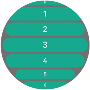
This example demonstrates the visual differences when auto-scaling is enabled or disabled for child items in an ArcList component.
// xxx.ets
import { LengthMetrics } from "@kit.ArkUI";
import { ArcList, ArcListItem, ArcListAttribute, ArcListItemAttribute } from '@kit.ArkUI';

@Entry
@Component
struct ArcListItemExample {
  private arr: number[] = [0, 1, 2, 3, 4, 5, 6, 7, 8, 9]
  private watchSize: string = '466px' // Default watch size: 466*466
  private itemSize: string = '414px' // Item width

  @Builder
  buildList() {
    Stack() {
      Column() {
      }
      .width(this.watchSize)
      .height(this.watchSize)
      .clip(new Circle({ width: '100%', height: '100%' }))
      .backgroundColor(0x707070)

      ArcList({ initialIndex: 3}) {
        ForEach(this.arr, (item: number) => {
          ArcListItem() {
            Button('' + item, { type: ButtonType.Capsule })
              .width(this.itemSize)
              .height('70px')
              .fontSize('40px')
              .backgroundColor(0x17A98D)
          }
          .autoScale(item % 3 == 0||item % 5 == 0)
        }, (item: string) => item)
      }
      .space(LengthMetrics.px(10))
      .borderRadius(this.watchSize)
    }
    .width(this.watchSize)
    .height(this.watchSize)
  }

  build() {
    Column() {
      this.buildList()
    }
    .width('100%')
    .height('100%')
    .alignItems(HorizontalAlign.Center)
    .justifyContent(FlexAlign.Center)
  }
}
你可能感兴趣的鸿蒙文章
- 所属分类: 后端技术
- 本文标签:
热门推荐
-
2、 优质文章
-
3、 gt
-
7、 openharmony
-
9、 golang
-
10、 Vue中input框自动聚焦