harmony 鸿蒙ArcSwiper
ArcSwiper
The ArcSwiper component is designed for circular screens to display child components in a carousel-like manner.
NOTE
This component is supported since API version 18. Updates will be marked with a superscript to indicate their earliest API version.
Modules to Import
import {
  ArcSwiper,
  ArcSwiperAttribute,
  ArcDotIndicator,
  ArcDirection,
  ArcSwiperController
} from '@kit.ArkUI';
Child Components
This component can contain child components.
NOTE
- Built-in components and custom components are allowed, with support for (if/else, ForEach, and LazyForEach) rendering control.
- Do not add or delete child components during a page turning animation. Doing so may result in child components not yet animated entering the viewport in advance and causing display exceptions.
APIs
ArcSwiper(controller?: ArcSwiperController)
Creates an ArcSwiper component.
Atomic service API: This API can be used in atomic services since API version 18.
System capability: SystemCapability.ArkUI.ArkUI.Circle
Parameters
| Name | Type | Mandatory | Description |
|---|---|---|---|
| controller | ArcSwiperController | No | Controller bound to the component to control the page turning. |
Attributes
In addition to the universal attributes, the following attributes are supported. Menu control is not supported.
index
index(index: Optional<number>)
Sets the index of the child component currently displayed in the container. If the value is less than 0 or greater than or equal to the number of child components, the default value 0 is used.
Atomic service API: This API can be used in atomic services since API version 18.
System capability: SystemCapability.ArkUI.ArkUI.Circle
Parameters
| Name | Type | Mandatory | Description |
|---|---|---|---|
| index | Optional<number> | Yes | Index of the child component currently displayed in the container. Default value: 0 |
indicator
indicator(style: Optional<ArcDotIndicator|boolean>)
Sets the style of the arc-shaped dot-style navigation indicator.
Atomic service API: This API can be used in atomic services since API version 18.
System capability: SystemCapability.ArkUI.ArkUI.Circle
Parameters
| Name | Type | Mandatory | Description |
|---|---|---|---|
| style | Optional<ArcDotIndicator |boolean> | Yes | Style of the arc-shaped dot-style navigation indicator. - ArcDotIndicator: properties and functionality of the arc-shaped dot-style navigation indicator. - boolean: whether to enable the arc-shaped dot-style navigation indicator. The value true means to enable the arc-shaped dot-style navigation indicator, and false means the opposite. Default value: true Default type: ArcDotIndicator |
duration
duration(duration: Optional<number>)
Sets the duration of the animation for child component switching.
Atomic service API: This API can be used in atomic services since API version 18.
System capability: SystemCapability.ArkUI.ArkUI.Circle
Parameters
| Name | Type | Mandatory | Description |
|---|---|---|---|
| duration | Optional<number> | Yes | Duration of the autoplay for child component switching. Default value: 400 Unit: ms |
vertical
vertical(isVertical: Optional<boolean>)
Sets whether vertical swiping is used.
Atomic service API: This API can be used in atomic services since API version 18.
System capability: SystemCapability.ArkUI.ArkUI.Circle
Parameters
| Name | Type | Mandatory | Description |
|---|---|---|---|
| isVertical | Optional<boolean> | Yes | Whether vertical swiping is used. The value true means vertical swiping, and false means horizontal swiping. Default value: false |
disableSwipe
disableSwipe(disabled: Optional<boolean>)
Sets whether to disable the swipe feature.
Atomic service API: This API can be used in atomic services since API version 18.
System capability: SystemCapability.ArkUI.ArkUI.Circle
Parameters
| Name | Type | Mandatory | Description |
|---|---|---|---|
| disabled | Optional<boolean> | Yes | Whether to disable the swipe feature. The value true means to disable the feature, and false means the opposite. Default value: false |
digitalCrownSensitivity
digitalCrownSensitivity(sensitivity: Optional<CrownSensitivity>)
Sets the sensitivity to the digital crown rotation.
Atomic service API: This API can be used in atomic services since API version 18.
System capability: SystemCapability.ArkUI.ArkUI.Circle
Parameters
| Name | Type | Mandatory | Description |
|---|---|---|---|
| sensitivity | Optional<CrownSensitivity> | Yes | Sensitivity to the digital crown rotation. Default value: CrownSensitivity.LOW |
effectMode
effectMode(edgeEffect: Optional<EdgeEffect>)
Sets the effect used when the scroll boundary is reached. For details about the supported effects, see EdgeEffect. The edge effect does not take effect when set using the controller API.
Atomic service API: This API can be used in atomic services since API version 18.
System capability: SystemCapability.ArkUI.ArkUI.Circle
Parameters
| Name | Type | Mandatory | Description |
|---|---|---|---|
| edgeEffect | Optional<EdgeEffect> | Yes | Effect used when the component is at one of the edges. Default value: EdgeEffect.Spring |
disableTransitionAnimation
disableTransitionAnimation(disabled: Optional<boolean>)
Sets whether to disable the transition animation.
Atomic service API: This API can be used in atomic services since API version 18.
System capability: SystemCapability.ArkUI.ArkUI.Circle
Parameters
| Name | Type | Mandatory | Description |
|---|---|---|---|
| disabled | Optional<boolean> | Yes | Whether to disable the transition animation. Default value: false, which means not to disable the transition animation. |
ArcSwiperController
Implements the controller of the ArcSwiper component. You can bind this object to the ArcSwiper component and use it to control page switching.
Atomic service API: This API can be used in atomic services since API version 18.
System capability: SystemCapability.ArkUI.ArkUI.Circle
constructor
constructor()
A constructor used to create an ArcSwiperController instance.
Atomic service API: This API can be used in atomic services since API version 18.
System capability: SystemCapability.ArkUI.ArkUI.Circle
showNext
showNext()
Turns to the next page. Page turning occurs with the animation, whose duration is specified by duration.
Atomic service API: This API can be used in atomic services since API version 18.
System capability: SystemCapability.ArkUI.ArkUI.Circle
showPrevious
showPrevious()
Turns to the previous page. Page turning occurs with the animation, whose duration is specified by duration.
Atomic service API: This API can be used in atomic services since API version 18.
System capability: SystemCapability.ArkUI.ArkUI.Circle
finishAnimation
finishAnimation(handler?: FinishAnimationHandler)
Stops an animation.
Atomic service API: This API can be used in atomic services since API version 18.
System capability: SystemCapability.ArkUI.ArkUI.Circle
Parameters
| Name | Type | Mandatory | Description |
|---|---|---|---|
| handler | FinishAnimationHandler | No | Callback invoked when the animation stops. If no value is provided, no callback is performed. |
ArcDotIndicator
Provides the properties and functionality of the arc-shaped dot-style navigation indicator.
Atomic service API: This API can be used in atomic services since API version 18.
System capability: SystemCapability.ArkUI.ArkUI.Circle
constructor
constructor()
A constructor used to create an ArcDotIndicator instance.
Atomic service API: This API can be used in atomic services since API version 18.
System capability: SystemCapability.ArkUI.ArkUI.Circle
arcDirection
arcDirection(direction: Optional<ArcDirection>): ArcDotIndicator
Sets the direction of the arc navigation indicator.
Atomic service API: This API can be used in atomic services since API version 18.
System capability: SystemCapability.ArkUI.ArkUI.Circle
Parameters
| Name | Type | Mandatory | Description |
|---|---|---|---|
| direction | Optional<ArcDirection> | Yes | Direction of the arc navigation indicator. Default value: ArcDirection.SIX_CLOCK_DIRECTION (6 o’clock direction) |
Return value
| Type | Description |
|---|---|
| ArcDotIndicator | Properties and functionality of the arc navigation indicator. |
itemColor
itemColor(color: Optional<ResourceColor>): ArcDotIndicator
Sets the color of the unselected navigation points in the arc navigation indicator.
Atomic service API: This API can be used in atomic services since API version 18.
System capability: SystemCapability.ArkUI.ArkUI.Circle
Parameters
| Name | Type | Mandatory | Description |
|---|---|---|---|
| color | Optional<ResourceColor> | Yes | Color of the unselected navigation points in the arc navigation indicator. Default value: ’#A9FFFFFF’ |
Return value
| Type | Description |
|---|---|
| ArcDotIndicator | Properties and functionality of the arc navigation indicator. |
selectedItemColor
selectedItemColor(color: Optional<ResourceColor>): ArcDotIndicator
Sets the color of the selected navigation point in the arc navigation indicator.
Atomic service API: This API can be used in atomic services since API version 18.
System capability: SystemCapability.ArkUI.ArkUI.Circle
Parameters
| Name | Type | Mandatory | Description |
|---|---|---|---|
| color | Optional<ResourceColor> | Yes | Color of the selected navigation point in the arc navigation indicator. Default value: #FF5EA1FF |
Return value
| Type | Description |
|---|---|
| ArcDotIndicator | Properties and functionality of the arc navigation indicator. |
backgroundColor
backgroundColor(color: Optional<ResourceColor>): ArcDotIndicator
Sets the color of the arc navigation indicator when it is long-pressed.
Atomic service API: This API can be used in atomic services since API version 18.
System capability: SystemCapability.ArkUI.ArkUI.Circle
Parameters
| Name | Type | Mandatory | Description |
|---|---|---|---|
| color | Optional<ResourceColor> | Yes | Color of the arc navigation indicator when it is long-pressed. Default value: ’#FF404040’ |
Return value
| Type | Description |
|---|---|
| ArcDotIndicator | Properties and functionality of the arc navigation indicator. |
maskColor
maskColor(color: Optional<LinearGradient>): ArcDotIndicator
Sets the mask gradient color of the arc navigation indicator.
Atomic service API: This API can be used in atomic services since API version 18.
System capability: SystemCapability.ArkUI.ArkUI.Circle
Parameters
| Name | Type | Mandatory | Description |
|---|---|---|---|
| color | Optional<LinearGradient> | Yes | Mask gradient color of the arc indicator. Default start color: ’#00000000’ Default end color: ’#FF000000’ |
Return value
| Type | Description |
|---|---|
| ArcDotIndicator | Properties and functionality of the arc navigation indicator. |
ArcDirection
Enumerates the direction of the arc navigation indicator.
Atomic service API: This API can be used in atomic services since API version 18.
System capability: SystemCapability.ArkUI.ArkUI.Circle
| Name | Value | Description |
|---|---|---|
| THREE_CLOCK_DIRECTION | 0 | 3 o’clock direction. |
| SIX_CLOCK_DIRECTION | 1 | 6 o’clock direction. |
| NINE_CLOCK_DIRECTION | 2 | 9 o’clock direction. |
FinishAnimationHandler
type FinishAnimationHandler = () => void
Defines the callback to notify the application when the animation stops playing.
Atomic service API: This API can be used in atomic services since API version 18.
System capability: SystemCapability.ArkUI.ArkUI.Circle
IndexChangedHandler
type IndexChangedHandler = (index: number) => void
Defines the callback to notify the application when the index of the currently displayed element changes.
Atomic service API: This API can be used in atomic services since API version 18.
System capability: SystemCapability.ArkUI.ArkUI.Circle
Parameters
| Name | Type | Mandatory | Description |
|---|---|---|---|
| index | number | Yes | Index of the currently displayed element. The index is zero-based. |
AnimationStartHandler
type AnimationStartHandler = (index: number, targetIndex: number, event: SwiperAnimationEvent) => void
Defines the callback triggered when the switching animation starts.
Atomic service API: This API can be used in atomic services since API version 18.
System capability: SystemCapability.ArkUI.ArkUI.Circle
Parameters
| Name | Type | Mandatory | Description |
|---|---|---|---|
| index | number | Yes | Index of the currently displayed element before the animation starts (not the final index after the animation ends). |
| targetIndex | number | Yes | Index of the target element to switch to. |
| event | SwiperAnimationEvent | Yes | Extra information of the animation, including the offset of the currently displayed element and target element relative to the start position of the ArcSwiper along the main axis, and the hands-off velocity. |
AnimationEndHandler
type AnimationEndHandler = (index: number, event: SwiperAnimationEvent) => void
Defines the callback triggered when the switching animation ends.
Atomic service API: This API can be used in atomic services since API version 18.
System capability: SystemCapability.ArkUI.ArkUI.Circle
Parameters
| Name | Type | Mandatory | Description |
|---|---|---|---|
| index | number | Yes | Index of the currently displayed element. |
| event | SwiperAnimationEvent | Yes | Extra information of the animation, which is the offset of the currently displayed element relative to the start position of the ArcSwiper along the main axis. |
GestureSwipeHandler
type GestureSwipeHandler = (index: number, event: SwiperAnimationEvent) => void
Callback triggered on a frame-by-frame basis when the page is turned by a swipe.
Atomic service API: This API can be used in atomic services since API version 18.
System capability: SystemCapability.ArkUI.ArkUI.Circle
Parameters
| Name | Type | Mandatory | Description |
|---|---|---|---|
| index | number | Yes | Index of the currently displayed element. |
| event | SwiperAnimationEvent | Yes | Extra information of the animation, which is the offset of the currently displayed element relative to the start position of the ArcSwiper along the main axis. |
Events
In addition to the universal events, the following events are supported.
onChange
onChange(handler: Optional<IndexChangedHandler>)
Triggered when the index of the currently displayed child component changes. The return value is the index of the currently displayed child component.
When the ArcSwiper component is used together with LazyForEach, the subpage UI update cannot be triggered in the onChange event.
Atomic service API: This API can be used in atomic services since API version 18.
System capability: SystemCapability.ArkUI.ArkUI.Circle
Parameters
| Name | Type | Mandatory | Description |
|---|---|---|---|
| handler | Optional<IndexChangedHandler> | Yes | Callback for the index of the currently displayed element. |
onAnimationStart
onAnimationStart(handler: Optional<AnimationStartHandler>)
Triggered when the switching animation starts.
Atomic service API: This API can be used in atomic services since API version 18.
System capability: SystemCapability.ArkUI.ArkUI.Circle
Parameters
| Name | Type | Mandatory | Description |
|---|---|---|---|
| handler | Optional<AnimationStartHandler> | Yes | Triggered when the switching animation starts. |
onAnimationEnd
onAnimationEnd(handler: Optional<AnimationEndHandler>)
Triggered when the switching animation ends.
This event is triggered when the switching animation of the ArcSwiper component ends, whether it is caused by gesture interruption or by calling finishAnimation through SwiperController. The index parameter indicates the index after the animation ends. When the ArcSwiper component contains multiple columns, the index is of the leftmost element.
Atomic service API: This API can be used in atomic services since API version 18.
System capability: SystemCapability.ArkUI.ArkUI.Circle
Parameters
| Name | Type | Mandatory | Description |
|---|---|---|---|
| handler | Optional<AnimationEndHandler> | Yes | Triggered when the switching animation ends. |
onGestureSwipe
onGestureSwipe(handler: Optional<GestureSwipeHandler>)
Triggered on a frame-by-frame basis when the page is turned by a swipe.
Atomic service API: This API can be used in atomic services since API version 18.
System capability: SystemCapability.ArkUI.ArkUI.Circle
Parameters
| Name | Type | Mandatory | Description |
|---|---|---|---|
| handler | Optional<GestureSwipeHandler> | Yes | Triggered on a frame-by-frame basis when the page is turned by a swipe. |
customContentTransition
customContentTransition(transition: Optional<SwiperContentAnimatedTransition>)
Defines a custom switching animation. You can define custom animation attributes, such as opacity, scale, and translate, in the callback invoked on a frame-by-frame basis during the swiping-initiated page switching animation.
During the swiping-initiated page switching animation, the SwiperContentTransitionProxy callback is invoked for all pages in the viewport on a frame-by-frame basis. For example, when there are two pages whose subscripts are 0 and 1 in the viewport, two callbacks whose indexes are 0 and 1 are invoked in each frame.
Atomic service API: This API can be used in atomic services since API version 18.
System capability: SystemCapability.ArkUI.ArkUI.Circle
Parameters
| Name | Type | Mandatory | Description |
|---|---|---|---|
| transition | Optional<SwiperContentAnimatedTransition> | Yes | Information about the custom switching animation. |
SwiperContentAnimatedTransition
Provides the information about the custom switching animation.
Atomic service API: This API can be used in atomic services since API version 18.
System capability: SystemCapability.ArkUI.ArkUI.Circle
| Name | Type | Read Only | Optional | Description |
|---|---|---|---|---|
| timeout | number | No | Yes | Timeout for the custom switching animation. The timeout timer starts when the default animation (page scrolling) reaches the point where the first frame is moved out of the viewport. If you do not call the finishTransition API of SwiperContentTransitionProxy before the timer expires, the component considers that the custom animation of the page ends and immediately removes the page node from the render tree. The unit is ms. The default value is 0. |
| transition | Callback<SwiperContentTransitionProxy> | No | No | Content of the custom switching animation. |
SwiperContentTransitionProxy
Implements the proxy object returned during the execution of the custom switching animation of the ArcSwiper component. You can use this object to obtain the page information in the custom animation viewport. You can also call the finishTransition API of this object to notify the ArcSwiper component that the custom animation has finished playing.
Atomic service API: This API can be used in atomic services since API version 18.
System capability: SystemCapability.ArkUI.ArkUI.Circle
Properties
| Name | Type | Read Only | Optional | Description |
|---|---|---|---|---|
| selectedIndex | number | No | No | Index of the currently selected page. |
| index | number | No | No | Index of a page in the viewport. |
| position | number | No | No | Position of the page specified by index relative to the start position of the ArcSwiper main axis (start position of the page corresponding to selectedIndex). |
| mainAxisLength | number | No | No | Length of the page specified by index along the main axis. |
NOTE
For example, when the currently selected child component’s index is 0, in the animation process of switching from page 0 to page 1, a callback will be triggered for all pages within the viewport on each frame. When there are two pages, page 0 and page 1, in the viewport, two callbacks will be triggered per frame. The first callback will have selectedIndex as 0, index as 0, position representing the movement ratio of page 0 relative to its position before the animation started at the current frame, and mainAxisLength representing the length of page 0 along the main axis. The second callback will still have selectedIndex as 0, index as 1, position representing the movement ratio of page 1 relative to page 0 before the animation started at the current frame, and mainAxisLength representing the length of page 1 along the main axis.
If the animation curve is a spring interpolation curve, during the transition animation from page 0 to page 1, due to the position and velocity when the user lifts their finger off the screen, animation may overshoot and slide past to page 2, then bounce back to page 1. Throughout this process, a callback is triggered for pages 1 and 2 within the viewport on every frame.
finishTransition
finishTransition(): void
Notifies the ArcSwiper component that the custom animation has finished playing.
Atomic service API: This API can be used in atomic services since API version 18.
System capability: SystemCapability.ArkUI.ArkUI.Circle
Example
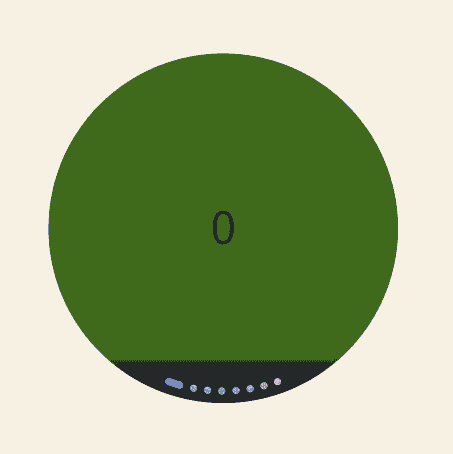
This example demonstrates the basic functionality of the ArcSwiper component.
// xxx.ets
import {
  ArcSwiper,
  ArcSwiperAttribute,
  ArcDotIndicator,
  ArcDirection,
  ArcSwiperController
} from '@kit.ArkUI'

class MyDataSource implements IDataSource {
  private list: Color[] = []

  constructor(list: Color[]) {
    this.list = list
  }

  totalCount(): number {
    return this.list.length
  }

  getData(index: number): Color {
    return this.list[index]
  }

  registerDataChangeListener(listener: DataChangeListener): void {
  }

  unregisterDataChangeListener() {
  }
}

@Entry
@Component
struct TestNewInterface {
  @State itemSimpleColor: Color|number|string = ''
  @State selectedItemSimpleColor: Color|number|string = ''
  private wearableSwiperController: ArcSwiperController = new ArcSwiperController()
  private arcDotIndicator: ArcDotIndicator = new ArcDotIndicator()
  private data: MyDataSource = new MyDataSource([])
  @State backgroundColors: Color[] = [Color.Green, Color.Blue, Color.Yellow, Color.Pink, Color.White, Color.Gray, Color.Orange, Color.Transparent]

  aboutToAppear(): void {
    let list: Color[] = []
    for (let i = 1; i <= 6; i++) {
      list.push(i);
    }
    this.data = new MyDataSource(this.backgroundColors)
  }

  build() {
    Column() {
      Row() {
        ArcSwiper(this.wearableSwiperController) {
          LazyForEach(this.data, (backgroundColor: Color, index: number) => {
            Text(index.toString())
              .width(233)
              .height(233)
              .backgroundColor(backgroundColor)
              .textAlign(TextAlign.Center)
              .fontSize(30)
          })
        }
        .clip(new Circle({ width: 233, height: 233 }))
        .effectMode(EdgeEffect.None)
        .backgroundColor(Color.Transparent)
        .index(0)
        .duration(400)
        .vertical(false)
        .indicator(this.arcDotIndicator
          .arcDirection(ArcDirection.SIX_CLOCK_DIRECTION)
          .itemColor(this.itemSimpleColor)
          .selectedItemColor(this.selectedItemSimpleColor)
        )
        .disableSwipe(false)
        .digitalCrownSensitivity(CrownSensitivity.MEDIUM)
        .onChange((index: number) => {
          console.info("onChange:" + index.toString())
        })
        .onAnimationStart((index: number, targetIndex: number, extraInfo: SwiperAnimationEvent) => {
          console.info("index: " + index)
          console.info("targetIndex: " + targetIndex)
          console.info("current offset: " + extraInfo.currentOffset)
          console.info("target offset: " + extraInfo.targetOffset)
          console.info("velocity: " + extraInfo.velocity)
        })
        .onAnimationEnd((index: number, extraInfo: SwiperAnimationEvent) => {
          console.info("index: " + index)
          console.info("current offset: " + extraInfo.currentOffset)
        })
        .disableTransitionAnimation(false)
      }.height('100%')
    }.width('100%')
  }
}
你可能感兴趣的鸿蒙文章
- 所属分类: 后端技术
- 本文标签:
热门推荐
-
2、 优质文章
-
3、 gt
-
7、 openharmony
-
9、 golang
-
10、 Vue中input框自动聚焦