harmony 鸿蒙Menu Control
Menu Control
A context menu – a vertical list of items – can be bound to a component and displayed by long-pressing, clicking, or right-clicking the component.
NOTE
The APIs of this module are supported since API version 7. Updates will be marked with a superscript to indicate their earliest API version.
CustomBuilder does not support the use of bindMenu and bindContextMenu methods. To display a multi-level menu, use the Menu component instead.
The text in the context menu cannot be selected by long-pressing.
When the window size changes, the menu is automatically hidden.
If a component is a draggable node and bindContextMenu is used without a preview specified, the menu will display a floating drag preview, and the menu options will not avoid the preview. To address this issue, you can set a preview or configure the target node to be non-draggable, based on the use case.
Since API version 12, menus allow users to display a submenu with a 500 ms long press, with the pressed state following the movement of the finger.
This feature is only available in scenarios where the Menu component is used and the child components include MenuItem or MenuItemGroup.
This feature is only available for menus with MenuPreviewMode set to NONE.
bindMenu
bindMenu(content: Array Binds a menu to this component, which is displayed when the user clicks the component. A menu item can be a combination of text and icons or a custom component. Atomic service API: This API can be used in atomic services since API version 11. System capability: SystemCapability.ArkUI.ArkUI.Full Parameters bindMenu(isShow: boolean, content: Array Binds a menu to this component, which is displayed when the user clicks the component. A menu item can be a combination of text and icons or a custom component. Atomic service API: This API can be used in atomic services since API version 12. System capability: SystemCapability.ArkUI.ArkUI.Full Parameters bindContextMenu(content: CustomBuilder, responseType: ResponseType, options?: ContextMenuOptions) Binds a context menu to this component, which is displayed when the user long-presses or right-clicks the component. Only custom menu items are supported. Atomic service API: This API can be used in atomic services since API version 11. System capability: SystemCapability.ArkUI.ArkUI.Full Parameters bindContextMenu(isShown: boolean, content: CustomBuilder, options?: ContextMenuOptions) Binds a context menu to the component, whose visibility is subject to the isShown settings. If isShown is true, the menu is displayed. If isShown is set to false, the menu is hidden. The menu items need to be customized. The position of the context menu is subject to the placement settings, rather than where the component is clicked. System capability: SystemCapability.ArkUI.ArkUI.Full Atomic service API: This API can be used in atomic services since API version 11. Parameters Inherits from ContextMenuOptions. System capability: SystemCapability.ArkUI.ArkUI.Full Atomic service API: This API can be used in atomic services since API version 12. System capability: SystemCapability.ArkUI.ArkUI.Full |Name|Value|Description |
|—–|-|————————————–|
|NONE|0|No preview is displayed. |
|IMAGE|1|The preview is a screenshot of the component on which a long-press triggers the context menu.| Atomic service API: This API can be used in atomic services since API version 12. System capability: SystemCapability.ArkUI.ArkUI.Full type AnimationRange<T>=[from: T, to: T] Describes the scale ratio relative to the preview image at the beginning and end of the scale animation. System capability: SystemCapability.ArkUI.ArkUI.Full Atomic service API: This API can be used in atomic services since API version 12. Enumerates the haptic feedback modes used when the menu is displayed. Atomic service API: This API can be used in atomic services since API version 18. System capability: SystemCapability.ArkUI.ArkUI.Full |Name|Value|Description |
|—–|-|————————————–|
|DISABLED|0|Haptic feedback is disabled when the menu is displayed. |
|ENABLED|1|Haptic feedback is enabled when the menu is displayed.|
|AUTO|2|Whether haptic feedback is enabled is subject to system settings. It is enabled when the menu has an overlay.| type BorderRadiusType = Length|BorderRadiuses|LocalizedBorderRadiuses Enumerates the border corner radius types. Atomic service API: This API can be used in atomic services since API version 18. System capability: SystemCapability.ArkUI.ArkUI.Full This example demonstrates how to use bindMenu to display a basic menu using MenuElement. This example shows how to use bindMenu with a custom builder to create a custom menu. This example demonstrates how to use bindContextMenu with ResponseType.LongPress to display a menu on long press. This example shows how to use bindContextMenu with ResponseType.RightClick and enableArrow to display a menu with an arrow on right-clicking. This example demonstrates how to use bindContextMenu with ResponseType.LongPress and MenuPreviewMode.IMAGE to display a menu with a screenshot preview on long pressure. This example shows how to use bindContextMenu with ResponseType.LongPress and a custom preview builder to display a menu with a custom preview on long pressure. This example demonstrates how to use bindContextMenu with a state variable to control the visibility of the menu. This example demonstrates how to use bindContextMenu with custom animations for the menu and preview. This example shows how to use bindMenu with symbolIcon to display a menu with symbol icons. This example demonstrates how to use bindContextMenu with hoverScale to create a shared element transition effect from the component screenshot to the custom preview. This example demonstrates how to customize the background blur effect for a menu by configuring backgroundBlurStyleOptions in bindMenu. This example demonstrates how to customize the background effect for a menu by configuring backgroundEffect in bindMenu.
Name
Type
Mandatory
Description
content
Array<MenuElement> |CustomBuilder
Yes
Array of menu item icons and text, or custom component.
options
MenuOptions
No
Parameters of the context menu.
bindMenu11+
Name
Type
Mandatory
Description
isShow11+
boolean
Yes
Whether to show the menu. The default value is false. The menu can be displayed only after the entire page is fully constructed. Therefore, to avoid incorrect display positions and shapes, do not set this parameter to true while the page is still being constructed. Since API version 13, this parameter supports two-way binding through !!.
content
Array<MenuElement> |CustomBuilder
Yes
Array of menu item icons and text, or custom component.
options
MenuOptions
No
Parameters of the context menu.
bindContextMenu8+
Name
Type
Mandatory
Description
content
CustomBuilder
Yes
Builder of the custom menu content.
responseType
ResponseType
Yes
How the context menu is triggered, which can be long-press or right-click. Long pressing with a mouse device is not supported.
options
ContextMenuOptions
No
Parameters of the context menu.
bindContextMenu12+
Name
Type
Mandatory
Description
isShown
boolean
Yes
Whether to show the context menu. The value true means to show the context menu, and false (default) means the opposite. The menu can be displayed properly only when the related page has been constructed. If this parameter is set to true before the construction is complete, display issues, such as misplacement, distortion, or failure to pop up, may occur. To trigger dragging by long presses is not supported. Since API version 13, this parameter supports two-way binding through the !! syntax.
content
CustomBuilder
Yes
Builder of the custom menu content.
options
ContextMenuOptions
No
Parameters of the context menu.
MenuElement
Name
Type
Mandatory
Description
value
ResourceStr
Yes
Menu item text.
Atomic service API: This API can be used in atomic services since API version 11.
icon10+
ResourceStr
No
Menu item icon.
Atomic service API: This API can be used in atomic services since API version 11.
enabled11+
boolean
No
Whether to enable interactions with the menu item.
Default value: true
true: Enable interactions with the menu item.
false: Disable interactions with the menu item.
Atomic service API: This API can be used in atomic services since API version 12.
action
() => void
Yes
Action triggered when a menu item is clicked.
Atomic service API: This API can be used in atomic services since API version 11.
symbolIcon12+
SymbolGlyphModifier
No
Icon of a menu item. When this parameter is set, the original icon is not displayed.
Atomic service API: This API can be used in atomic services since API version 12.MenuOptions10+
Name
Type
Mandatory
Description
title
ResourceStr
No
Menu title.
NOTE
This parameter is effective only when content is set to Array<MenuElement>.
Atomic service API: This API can be used in atomic services since API version 11.
showInSubWindow11+
boolean
No
Whether to show the menu in a subwindow.
Default value: true
NOTE
In bindMenu, this API is effective only for 2-in-1 devices.
Atomic service API: This API can be used in atomic services since API version 12.ContextMenuOptions10+
Name
Type
Mandatory
Description
offset
Position
No
Offset for showing the context menu, which should not cause the menu to extend beyond the screen.
Default value: { x: 0, y: 0 }. Percentage values are not supported.
NOTE
When the menu is displayed relative to the parent component area, the width or height of the area is automatically counted into the offset based on the placement attribute of the menu.
When the menu is displayed above the parent component (that is, placement is set to Placement.TopLeft, Placement.Top, or Placement.TopRight), a positive value of x indicates rightward movement relative to the parent component, and a positive value of y indicates upward movement.
When the menu is displayed below the parent component (that is, placement is set to Placement.BottomLeft, Placement.Bottom, or Placement.BottomRight), a positive value of x indicates rightward movement relative to the parent component, and a positive value of y indicates downward movement.
When the menu is displayed on the left of the parent component (that is, placement is set to Placement.LeftTop, Placement.Left, or Placement.LeftBottom), a positive value of x indicates leftward movement relative to the parent component, and a positive value of y indicates downward movement.
When the menu is displayed on the right of the parent component (that is, placement is set to Placement.RightTop, Placement.Right, or Placement.RightBottom), a positive value of x indicates rightward movement relative to the parent component, and a positive value of y indicates downward movement.
If the display position of the menu is adjusted (different from the main direction of the initial placement value), the offset value is invalid.
Atomic service API: This API can be used in atomic services since API version 11.
placement
Placement
No
Preferred position of the context menu. If the set position is insufficient for holding the component, it will be automatically adjusted.
NOTE
Setting placement to undefined or null is equivalent to not setting it at all. In this case, if bindMenu is used, the default value of placement is Placement.BottomLeft; if bindContextMenu8+ is used, the menu is displayed at the touched position; if bindContextMenu12+ is used, the default value is Placement.BottomLeft.
Atomic service API: This API can be used in atomic services since API version 11.
enableArrow
boolean
No
Whether to display an arrow. If the size and position of the context menu are insufficient for holding an arrow, no arrow is displayed.
Default value: false, indicating that no arrow is displayed.
NOTE
When enableArrow is true, an arrow is displayed in the position specified by placement. If placement is not set or its value is invalid, the arrow is displayed above the target. If the position is insufficient for holding the arrow, it is automatically adjusted. When enableArrow is undefined, no arrow is displayed. This API is supported in bindContextMenu since API version 10 and bindMenu since API version 12.
Atomic service API: This API can be used in atomic services since API version 11.
enableHoverMode18+
boolean
No
Whether the menu responds in hover mode. When its touched position is within the crease region of the foldable device, the menu does not respond in hover mode.
Default value: false, indicating that the menu does not respond in hover mode.
NOTE
The menu responds in hover mode when enableHoverMode is set to true and does not when enableHoverMode is set to false or an invalid value or is not set at all.
Atomic service API: This API can be used in atomic services since API version 18.
arrowOffset
Length
No
Offset of the arrow relative to the context menu. The offset settings take effect only when the value is valid, can be converted to a number greater than 0, and does not cause the arrow to extend beyond the safe area of the context menu.
Default value: 0
Unit: vp
NOTE
The safe distance of the arrow from the four sides of the menu is the sum of the menu’s corner radius and half the width of the arrow.
The value of placement determines whether the offset is horizontal or vertical.
When the arrow is in the horizontal direction of the menu, the offset is the distance from the arrow to the leftmost arrow’s safe distance. When the arrow is in the vertical direction of the menu, the offset is the distance from the arrow to the topmost arrow’s safe distance.
The default position where the arrow is displayed varies with the value of placement:
Without any avoidance by the menu, when placement is set to Placement.Top or Placement.Bottom, the arrow is displayed horizontally and is centered by default;
when placement is set to Placement.Left or Placement.Right, the arrow is displayed vertically and is centered by default;
when placement is set to Placement.TopLeft or Placement.BottomLeft, the arrow is displayed horizontally by default, and the distance from the arrow to the left edge of the menu is the arrow’s safe distance;
when placement is set to Placement.TopRight or Placement.BottomRight, the arrow is displayed horizontally by default, and the distance from the arrow to the right edge of the menu is the arrow’s safe distance;
when placement is set to Placement.LeftTop or Placement.RightTop, the arrow is displayed vertically by default, and the distance from the arrow to the top edge of the menu is the arrow’s safe distance;
when placement is set to Placement.LeftBottom or Placement.RightBottom, the arrow is displayed vertically by default, and the distance from the arrow to the bottom edge of the menu is the arrow’s safe distance.
This API is supported in bindContextMenu since API version 10 and bindMenu since API version 12.
Atomic service API: This API can be used in atomic services since API version 11.
preview11+
MenuPreviewMode|CustomBuilder
No
Preview displayed when the context menu is triggered by a long-press or by calling bindContextMenu12+. It can be a screenshot of the target component or custom content.
Default value: MenuPreviewMode.NONE, indicating no preview.
NOTE
- This parameter has no effect when responseType is set to ResponseType.RightClick.
- If preview is set to MenuPreviewMode.NONE or is not set, the enableArrow parameter is effective.
- If preview is set to MenuPreviewMode.IMAGE or CustomBuilder, no arrow will be displayed even when enableArrow is true.
Atomic service API: This API can be used in atomic services since API version 12.
previewAnimationOptions11+
ContextMenuAnimationOptions
No
Start scale ratio and end scale ratio (relative to the original preview image) of the preview animation displayed when the component is long pressed
Default value: { scale: [0.95, 1.1], transition: undefined, hoverScale: undefined }
NOTE
If the value is less than or equal to 0, this API does not take effect.
Atomic service API: This API can be used in atomic services since API version 12.
onAppear
() => void
No
Callback triggered when the menu is displayed.
Atomic service API: This API can be used in atomic services since API version 11.
onDisappear
() => void
No
Callback triggered when the menu is hidden.
Atomic service API: This API can be used in atomic services since API version 11.
aboutToAppear
() => void
No
Callback triggered when the menu is about to appear.
Atomic service API: This API can be used in atomic services since API version 12.
aboutToDisappear
() => void
No
Callback triggered when the menu is about to disappear.
Atomic service API: This API can be used in atomic services since API version 12.
backgroundColor11+
ResourceColor
No
Background color of the menu.
Default value: Color.Transparent
Atomic service API: This API can be used in atomic services since API version 12.
backgroundBlurStyle11+
BlurStyle
No
Background blur style of the menu.
Default value: BlurStyle.COMPONENT_ULTRA_THICK
Atomic service API: This API can be used in atomic services since API version 12.
transition12+
TransitionEffect
No
Transition effect for the entrance and exit of the menu.
NOTE
During the exit animation of the menu, if there is a switch between landscape and portrait modes, the menu will make way. Level-2 menus do not inherit custom animations. The level-2 menu can be clicked during the pop-up process, but not during the execution of the exit animation.
For details, see TransitionEffect.
The menu animation uses a spring curve. Due to the rebound and oscillation of the spring curve during the exit of the animation, there is a prolonged tail effect, which prevents the menu from responding to other events after it disappears.
Atomic service API: This API can be used in atomic services since API version 12.
borderRadius12+
Length |BorderRadiuses |LocalizedBorderRadiuses
No
Border radius of the menu.
Default value: 8vp for 2-in-1 devices and 20vp for other devices
NOTE
The value can be in percentage.
If the sum of the two maximum corner radii in the horizontal direction exceeds the menu’s width, or if the sum of the two maximum corner radii in the vertical direction exceeds the menu’s height, the default corner radius of the menu will be used.
Atomic service API: This API can be used in atomic services since API version 12.
previewBorderRadius18+
BorderRadiusType
No
Border corner radius for the preview image.
Default value: 16vp
NOTE
The radius only supports the following units: vp, px, fp, lpx, and percentages.
If the sum of the horizontal radii exceeds the width of the preview image, or the sum of the vertical radii exceeds the height, the maximum allowable radius should be used.
Atomic service API: This API can be used in atomic services since API version 18.
layoutRegionMargin13+
Margin
No
Minimum margin between the preview and menu layout for top, bottom, left, and right edges.
NOTE
Only vp, px, fp, lpx, and percentage units are supported.
Any abnormal or negative values will be treated as the default values.
If preview is set to CustomBuilder, setting margin.left or margin.right will remove the maximum grid width restriction for the preview.
Be cautious not to set excessively large margins that are too large, which could reduce the layout area and affect the proper layout of the preview and menu.
If the sum of horizontal margins exceeds the maximum layout width, margin.left and margin.right will be ignored and default values will be applied.
If the sum of vertical margins exceeds the maximum layout width, margin.top and margin.bottom will be ignored and default values will be applied.
Atomic service API: This API can be used in atomic services since API version 13.
backgroundBlurStyleOptions18+
BackgroundBlurStyleOptions
No
Options for customizing the background blur style.
Atomic service API: This API can be used in atomic services since API version 18.
backgroundEffect18+
BackgroundEffectOptions
No
Options for customizing the background effect.
Atomic service API: This API can be used in atomic services since API version 18.
hapticFeedbackMode18+
HapticFeedbackMode
No
Haptic feedback mode when the menu is displayed.
Default value: HapticFeedbackMode.DISABLED (no vibration when the menu is displayed).
NOTE
The haptic feedback mode is only configurable for level-1 menus.
The settings take effect only when the application has the ohos.permission.VIBRATE permission and the user has enabled haptic feedback.
Atomic service API: This API can be used in atomic services since API version 18.
outlineWidth20+
Dimension |EdgeOutlineWidths
No
Outline width of the menu border.
NOTE
- Percentage values are not supported.
- The width property is required if an outline effect is needed.
Atomic service API: This API can be used in atomic services since API version 20.
outlineColor20+
ResourceColor |EdgeColors
No
Outline color of the menu border.
NOTE
Default value: #19ffffff
Atomic service API: This API can be used in atomic services since API version 20.MenuPreviewMode11+
ContextMenuAnimationOptions11+
Name
Type
Mandatory
Description
scale
AnimationRange<number>
No
Relative scale ratio at the start and end of the animation compared to the original preview image.
NOTE
The scale ratio must be set based on the specific use case. It is recommended that it be less than the width of the preview image or the maximum constraint of the layout.
transition12+
TransitionEffect
No
Transition effect for the entrance and exit of the menu.
NOTE
During the exit animation of the menu, if there is a switch between landscape and portrait modes, the menu will make way. Level-2 menus do not inherit custom animations. The level-2 menu can be clicked during the pop-up process, but not during the execution of the exit animation.
For details, see TransitionEffect.
hoverScale12+
AnimationRange<number>
No
Sets the scale ratio of the original component snapshot to the preview image at the beginning and end of the scale animation in a custom long press scenario. There is a transition animation for the switch with the preview image.
NOTE
If the value is less than or equal to 0, this API does not take effect.
This API does not take effect in bindContextMenu12+ scenarios.
This API does not take effect when transition is set.
If this API and the scale API are used at the same time, the start value of the scale API does not take effect.
To ensure the optimal experience, it is not recommended that the final preview image size be smaller than the size of the original component snapshot. The width and height of the preview animation are affected by the component snapshot and the custom preview size. Verify the display effect based on the actual use case.AnimationRange11+
Value Range
Description
[from: T, to: T]
from indicates the scale ratio at the beginning of the animation, and to indicates the scale ratio at the end of the animation.
HapticFeedbackMode18+
BorderRadiusType18+
Type
Description
Length
Length value specifying the border radius.
BorderRadiuses
An object specifying the corner radius of a component’s border.
LocalizedBorderRadiuses
An object specifying the localized corner radius of a component’s border.
Example
Example 1: Displaying a Basic Menu
// xxx.ets
@Entry
@Component
struct MenuExample {
build() {
Column() {
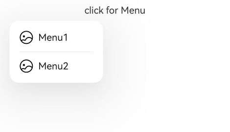
Text('click for Menu')
.bindMenu([
{
value: 'Menu1',
action: () => {
console.info('handle Menu1 select');
}
},
{
value: 'Menu2',
action: () => {
console.info('handle Menu2 select');
}
},
])
}
.width('100%')
.margin({ top: 5 })
}
}
Example 2: Displaying a Custom Menu
@Entry
@Component
struct MenuExample {
  @State listData: number[] = [0, 0, 0];

  @Builder MenuBuilder() {
    Flex({ direction: FlexDirection.Column, justifyContent: FlexAlign.Center, alignItems: ItemAlign.Center }) {
      ForEach(this.listData, (item:number, index) => {
        Column() {
          Row() {
            Image($r("app.media.icon")).width(20).height(20).margin({ right: 5 })
            Text(`Menu${index as number + 1}`).fontSize(20)
          }
          .width('100%')
          .height(30)
          .justifyContent(FlexAlign.Center)
          .align(Alignment.Center)
          .onClick(() => {
            console.info(`Menu${index as number + 1} Clicked!`);
          })

          if (index != this.listData.length - 1) {
            Divider().height(10).width('80%').color('#ccc')
          }
        }.padding(5).height(40)
      })
    }.width(100)
  }

  build() {
    Column() {
      Text('click for menu')
        .fontSize(20)
        .margin({ top: 20 })
        .bindMenu(this.MenuBuilder)
    }
    .height('100%')
    .width('100%')
    .backgroundColor('#f0f0f0')
  }
}
Example 3: Displaying a Menu on Long Press
// xxx.ets
@Entry
@Component
struct ContextMenuExample {
  @Builder MenuBuilder() {
    Flex({ direction: FlexDirection.Column, justifyContent: FlexAlign.Center, alignItems: ItemAlign.Center }) {
      Text('Test menu item 1')
        .fontSize(20)
        .width(100)
        .height(50)
        .textAlign(TextAlign.Center)
      Divider().height(10)
      Text('Test menu item 2')
        .fontSize(20)
        .width(100)
        .height(50)
        .textAlign(TextAlign.Center)
    }.width(100)
  }

  build() {
    Column() {
      Text('LongPress for menu')
    }
    .width('100%')
    .margin({ top: 5 })
    .bindContextMenu(this.MenuBuilder, ResponseType.LongPress)
  }
}
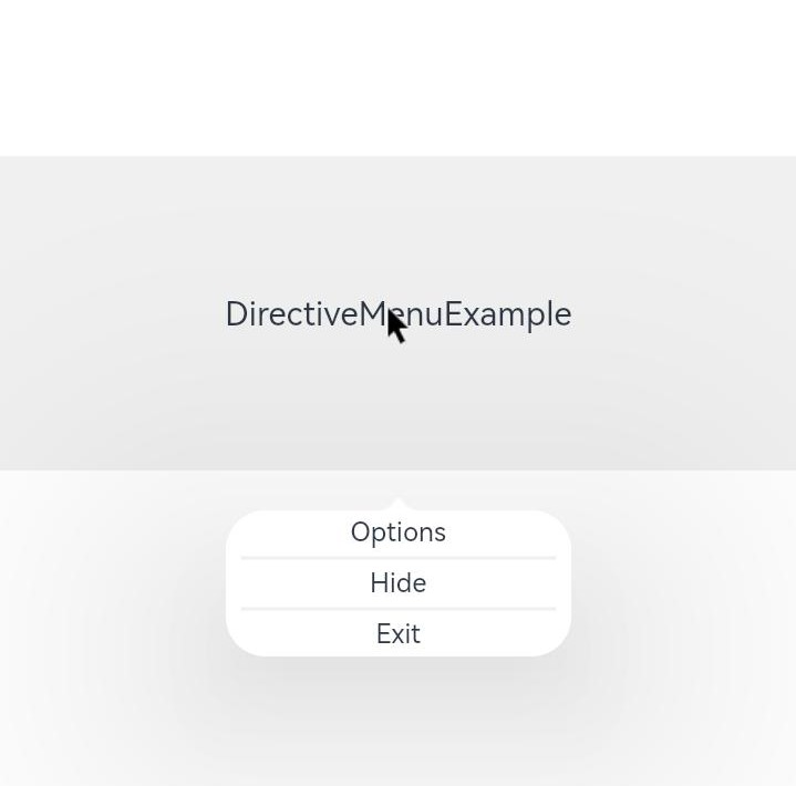
Example 4: Displaying a Menu with an Arrow on Right-Clicking
// xxx.ets
@Entry
@Component
struct DirectiveMenuExample {
  @Builder MenuBuilder() {
    Flex({ direction: FlexDirection.Column, alignItems: ItemAlign.Center, justifyContent: FlexAlign.Center }) {
      Text('Options')
      Divider().strokeWidth(2).margin(5).color('#F0F0F0')
      Text('Hide')
      Divider().strokeWidth(2).margin(5).color('#F0F0F0')
      Text('Exit')
    }
    .width(200)
  }

  build() {
    Flex({ direction: FlexDirection.Column, alignItems: ItemAlign.Center, justifyContent: FlexAlign.Center }) {
      Column() {
        Text("DirectiveMenuExample")
          .fontSize(20)
          .width('100%')
          .height("25%")
          .backgroundColor('#F0F0F0')
          .textAlign(TextAlign.Center)
          .bindContextMenu(this.MenuBuilder, ResponseType.RightClick, {
            enableArrow: true,
            placement: Placement.Bottom
          })
      }
    }
    .width('100%')
    .height('100%')
  }
}
Example 5: Displaying a Menu with a Screenshot Preview on Long Press
// xxx.ets
@Entry
@Component
struct Index {
private iconStr: ResourceStr = $r("app.media.icon");
@Builder
MyMenu() {
Menu() {
MenuItem({ startIcon: this.iconStr, content: "Menu option" })
MenuItem({ startIcon: this.iconStr, content: "Menu option" })
MenuItem({ startIcon: this.iconStr, content: "Menu option" })
}
}
build() {
Column({ space: 50 }) {
Column() {
Column() {
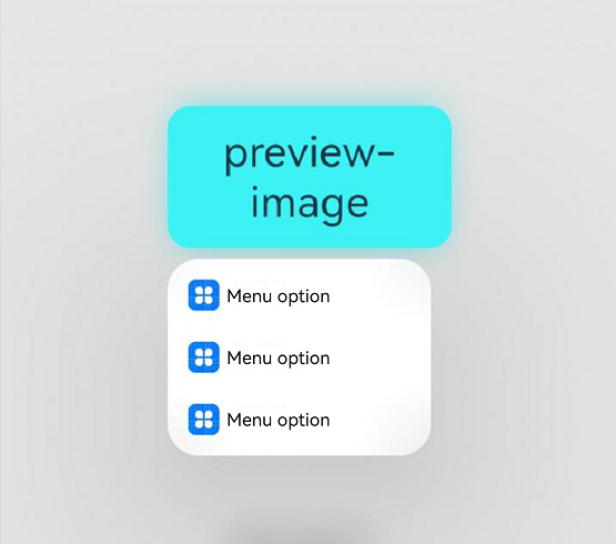
Text('preview-image')
.width(200)
.height(100)
.textAlign(TextAlign.Center)
.margin(100)
.fontSize(30)
.bindContextMenu(this.MyMenu, ResponseType.LongPress,
{ preview: MenuPreviewMode.IMAGE,
previewAnimationOptions: {scale: [0.8, 1.0]},
})
.backgroundColor("#ff3df2f5")
}
}.width('100%')
}
}
}
Example 6: Displaying a Menu with a Custom Preview on Long Press
// xxx.ets
@Entry
@Component
struct Index {
private iconStr: ResourceStr = $r("app.media.icon");
@Builder
MyMenu() {
Menu() {
MenuItem({ startIcon: this.iconStr, content: "Menu option" })
MenuItem({ startIcon: this.iconStr, content: "Menu option" })
MenuItem({ startIcon: this.iconStr, content: "Menu option" })
}
}
@Builder
MyPreview() {
Column() {
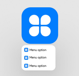
Image($r('app.media.icon'))
.width(200)
.height(200)
}
}
build() {
Column({ space: 50 }) {
Column() {
Column() {
Text('preview-builder')
.width(200)
.height(100)
.textAlign(TextAlign.Center)
.margin(100)
.fontSize(30)
.bindContextMenu(this.MyMenu, ResponseType.LongPress,
{
preview: this.MyPreview
})
}
}.width('100%')
}
}
}
Example 7: Using a State Variable for Menu Visibility
// xxx.ets
@Entry
@Component
struct Index {
  private iconStr: ResourceStr = $r("app.media.icon");
  @State isShown: boolean = false;

  @Builder
  MyMenu() {
    Menu() {
      MenuItem({ startIcon: this.iconStr, content: "Menu option" })
      MenuItem({ startIcon: this.iconStr, content: "Menu option" })
      MenuItem({ startIcon: this.iconStr, content: "Menu option" })
    }
  }

  @Builder
  MyPreview() {
    Column() {
      Image($r('app.media.icon'))
        .width(200)
        .height(200)
    }
  }

  build() {
    Column({ space: 50 }) {
      Column() {
        Column() {
          Text('preview-builder')
            .width(200)
            .height(100)
            .textAlign(TextAlign.Center)
            .margin(100)
            .fontSize(30)
            .bindContextMenu(this.isShown, this.MyMenu,
              {
                preview: this.MyPreview,
                aboutToDisappear: ()=>{
                  this.isShown = false;
                }
              })
          Button('click')
            .onClick(()=>{
              this.isShown = true;
            })
        }
      }.width('100%')
    }
  }
}
Example 8: Using Custom Menu and Preview Animations
// xxx.ets
@Entry
@Component
struct MenuExample {
@Builder MenuBuilder() {
Flex({ direction: FlexDirection.Column, justifyContent: FlexAlign.Center, alignItems: ItemAlign.Center }) {
Text('Test menu item 1')
.fontSize(12)
.width(200)
.height(30)
.textAlign(TextAlign.Center)
Divider().height(10)
Text('Test menu item 2')
.fontSize(12)
.width(100)
.height(30)
.textAlign(TextAlign.Center)
}.width(100)
}
@Builder
MyPreview() {
Column() {
Image($r('app.media.icon'))
.width(50)
.height(50)
}
}
@State isShow:boolean = false;
private iconStr: ResourceStr = $r("app.media.icon");
@Builder
MyMenu() {
Menu() {
MenuItem({ startIcon: this.iconStr, content: "Menu option" })
MenuItem({ startIcon: this.iconStr, content: "Menu option" })
MenuItem({ startIcon: this.iconStr, content: "Menu option" })
}
}
build() {
Column() {
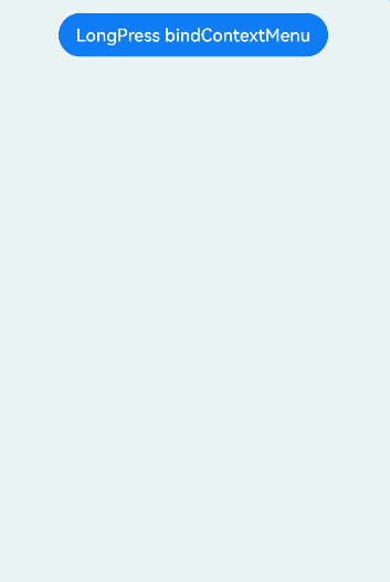
Button('LongPress bindContextMenu')
.margin({ top: 15 })
.bindContextMenu(
this.MenuBuilder,
ResponseType.LongPress,{
transition: TransitionEffect.OPACITY.animation({ duration: 4000, curve: Curve.Ease }).combine(
TransitionEffect.rotate({ z: 1, angle: 180 })),
preview: this.MyPreview,
previewAnimationOptions: {
scale: [0.8, 1.0],
transition: TransitionEffect.OPACITY.animation({ duration: 4000, curve: Curve.Ease }).combine(
TransitionEffect.rotate({ z: 1, angle: 180 }))
}
})
}
.width('100%')
.margin({ top: 5 })
}
}
Example 9: Setting the Symbol Icon
// xxx.ets
import { SymbolGlyphModifier } from '@kit.ArkUI';
@Entry
@Component
struct MenuExample {
  @State symbolIconModifier1: SymbolGlyphModifier = new SymbolGlyphModifier($r('sys.symbol.ohos_photo')).fontSize('24vp');
  @State symbolIconModifier2: SymbolGlyphModifier = new SymbolGlyphModifier($r('sys.symbol.ohos_photo')).fontSize('24vp');
  build() {
    Column() {
      Text('click for Menu')
    }
    .width('100%')
    .margin({ top: 5 })
    .bindMenu([
      {
        value: 'Menu1',
        symbolIcon:this.symbolIconModifier1,
        action: () => {
          console.info('handle Menu1 select');
        }
      },
      {
        value: 'Menu2',
        symbolIcon:this.symbolIconModifier2,
        action: () => {
          console.info('handle Menu2 select');
        }
      },
    ])
  }
}
Example 10: Using Shared Element Transition
// xxx.ets
@Entry
@Component
struct Index {
  private iconStr: ResourceStr = $r("app.media.app_icon");

  @Builder
  MyMenu() {
    Menu() {
      MenuItem({ startIcon: this.iconStr, content: "Menu option" })
      MenuItem({ startIcon: this.iconStr, content: "Menu option" })
      MenuItem({ startIcon: this.iconStr, content: "Menu option" })
    }
  }

  @Builder
  MyPreview() {
    Column() {
      Image($r('app.media.example'))
        .width(200)
        .height(200)
    }
  }

  build() {
    Column({ space: 50 }) {
      Column() {
        Column() {
          Image($r('app.media.example'))
            .width(100)
            .height(100)
            .margin(100)
            .bindContextMenu(this.MyMenu, ResponseType.LongPress,
              {
                preview: this.MyPreview,
                previewAnimationOptions: {
                  hoverScale: [1.0, 0.95]
                }
              })
        }
      }.width('100%')
    }
  }
}

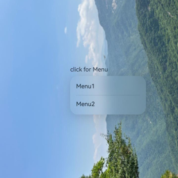
Example 11: Customizing the Background Blur Effect
// xxx.ets
@Entry
@Component
struct MenuExample {
  build() {
    Stack() {
      Image($r('app.media.bg'))
      Column() {
        Text('click for Menu')
          .bindMenu([
            {
              value: 'Menu1',
              action: () => {
                console.info('handle Menu1 select')
              }
            },
            {
              value: 'Menu2',
              action: () => {
                console.info('handle Menu2 select')
              }
            },
          ],
            {
              backgroundBlurStyle: BlurStyle.BACKGROUND_THIN,
              backgroundBlurStyleOptions: {
                colorMode:ThemeColorMode.LIGHT,
                blurOptions:{grayscale:[20,20]},
                policy: BlurStyleActivePolicy.ALWAYS_ACTIVE,
                adaptiveColor: AdaptiveColor.AVERAGE,
                scale: 1
              },
            }
          )
      }
      .width('100%')
      .margin({ top: 5 })
    }
  }
}
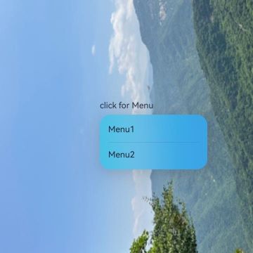
Example 12: Customizing the Background Effect
// xxx.ets
@Entry
@Component
struct MenuExample {
  build() {
    Stack() {
      Image($r('app.media.bg'))
      Column() {
        Text('click for Menu')
          .bindMenu([
            {
              value: 'Menu1',
              action: () => {
                console.info('handle Menu1 select');
              }
            },
            {
              value: 'Menu2',
              action: () => {
                console.info('handle Menu2 select');
              }
            },
          ],
            {
              backgroundBlurStyle: BlurStyle.BACKGROUND_THIN,
              backgroundEffect: {
                radius: 60,
                saturation: 10,
                brightness: 1,
                color: '#661A1A1A',
                adaptiveColor: AdaptiveColor.AVERAGE,
                blurOptions:{grayscale:[20,20]}
              }
            }
          )
      }
      .width('100%')
      .margin({ top: 5 })
    }
  }
}
你可能感兴趣的鸿蒙文章
- 所属分类: 后端技术
- 本文标签:
热门推荐
-
2、 优质文章
-
3、 gt
-
7、 openharmony
-
9、 golang
-
10、 Vue中input框自动聚焦