harmony 鸿蒙Location
Location
The location attributes set the alignment mode, layout direction, and position of a component.
NOTE
The APIs of this module are supported since API version 7. Updates will be marked with a superscript to indicate their earliest API version.
align
align(value: Alignment)
Sets the alignment mode of the component content in the drawing area.
Widget capability: This API can be used in ArkTS widgets since API version 9.
Atomic service API: This API can be used in atomic services since API version 11.
System capability: SystemCapability.ArkUI.ArkUI.Full
Parameters
| Name | Type | Mandatory | Description |
|---|---|---|---|
| value | Alignment | Yes | Sets the alignment mode of the component content in the drawing area. This attribute is available only in the following components: Stack, Button, StepperItem,FolderStack, Marquee, Text, TextArea, and TextInput. For details about the alignment results of text-related components (the last four aforementioned components), see textAlign. If the component does not support the textAlign attribute, horizontal alignment cannot be set for text. Default value: Alignment.Center NOTE This parameter does not support the mirroring functionality. In the Stack component, this attribute has the same effect as alignContent, which means that it sets the alignment mode of child components in the container. |
direction
direction(value: Direction)
Sets how elements are laid out along the main axis of the container.
Widget capability: This API can be used in ArkTS widgets since API version 9.
Atomic service API: This API can be used in atomic services since API version 11.
System capability: SystemCapability.ArkUI.ArkUI.Full
Parameters
| Name | Type | Mandatory | Description |
|---|---|---|---|
| value | Direction | Yes | How elements are laid out along the main axis of the container. If this parameter is set to auto, the layout is subject to the system language. The attribute does not take effect in the Column component. Default value: Direction.Auto |
position
position(value: Position|Edges|LocalizedEdges)
Sets the absolute position of the component relative to the position of the parent component.
Widget capability: This API can be used in ArkTS widgets since API version 9.
Atomic service API: This API can be used in atomic services since API version 11.
System capability: SystemCapability.ArkUI.ArkUI.Full
Parameters
| Name | Type | Mandatory | Description |
|---|---|---|---|
| value | Position |Edges12+ |LocalizedEdges12+ | Yes | Absolute position of the component relative to the position of the parent component. If the parent container is Row, Column, or Flex, the child component for which position is set does not take up space in the container. If of the Position type, this parameter sets the position based on the upper left corner of the parent component. If of the Edges type, this parameter sets the position based on the offset relative to the four edges of the parent component. If of the LocalizedEdges type, this parameter sets the position based on the offset relative to the four edges of the parent component, with support for the mirror mode. The position attribute is applicable to scenarios where the component’s position in the parent container is fixed, for example, where it is pinned to top or floating on the UI. The attribute is not available for a layout container whose width and height are zero. The attribute does not take effect when the component is in a RelativeContainer component and with the alignRules attribute set. |
markAnchor
markAnchor(value: Position|LocalizedPosition)
Sets the anchor for locating the component.
Widget capability: This API can be used in ArkTS widgets since API version 9.
Atomic service API: This API can be used in atomic services since API version 11.
System capability: SystemCapability.ArkUI.ArkUI.Full
Parameters
| Name | Type | Mandatory | Description |
|---|---|---|---|
| value | Position |LocalizedPosition12+ | Yes | Anchor for locating the component, which is used to move the component further away from the position specified by position or offset. .position({x: value1, y: value2}).markAnchor({x: value3, y: value4}) has the same effect as .position({x: value1 - value3, y: value2 - value4}). The same applies to offset. When markAnchor is used alone, markAnchor ({x: value1, y: value2}) has the same effect as .offset ({x: -value1, y: -value2}). The default value varies by API version. API version 9 and earlier: { x: 0, y: 0 } API version 10: none |
offset
offset(value: Position|Edges|LocalizedEdges)
Sets the offset of the component relative to its original position.
Widget capability: This API can be used in ArkTS widgets since API version 9.
Atomic service API: This API can be used in atomic services since API version 11.
System capability: SystemCapability.ArkUI.ArkUI.Full
Parameters
| Name | Type | Mandatory | Description |
|---|---|---|---|
| value | Position |Edges12+ |LocalizedEdges12+ | Yes | Offset of the component relative to its original position. The offset attribute does not affect the layout of the parent container. It adjusts the component position only during drawing. If of the Position type, this parameter sets the offset relative to the upper left corner of the component. If of the Edges type, this parameter sets the offset relative to the four edges of the component. {x: x, y: y} has the same effect as {left: x, top: y} and {right: -x, bottom: -y}. The LocalizedEdges type supports the mirror mode: start is equivalent to x with left-to-right scripts and -x with right-to-left scripts. The default value varies by API version. API version 9 and earlier: { x: 0, y: 0 } Default unit: vp API version 10: none |
alignRules9+
alignRules(value: AlignRuleOption)
Sets the alignment rules in the relative container. This API is valid only when the container is RelativeContainer.
Widget capability: This API can be used in ArkTS widgets since API version 9.
Atomic service API: This API can be used in atomic services since API version 11.
System capability: SystemCapability.ArkUI.ArkUI.Full
Parameters
| Name | Type | Mandatory | Description |
|---|---|---|---|
| value | AlignRuleOption | Yes | Alignment rules in the relative container. |
alignRules12+
alignRules(alignRule: LocalizedAlignRuleOptions)
Sets the alignment rules in the relative container. This API is valid only when the container is RelativeContainer. This API takes the right-to-left scripts into account, using start and end instead of left and right for alignment in the horizontal direction. Prioritize this API in aligning child components in the relative container.
Widget capability: This API can be used in ArkTS widgets since API version 12.
Atomic service API: This API can be used in atomic services since API version 12.
System capability: SystemCapability.ArkUI.ArkUI.Full
Parameters
| Name | Type | Mandatory | Description |
|---|---|---|---|
| alignRule | LocalizedAlignRuleOptions | Yes | Alignment rules in the relative container. |
AlignRuleOption
Widget capability: This API can be used in ArkTS widgets since API version 9.
| Name | Type | Description |
|---|---|---|
| left | { anchor: string, align: HorizontalAlign } | Left alignment. - anchor: ID of the component that functions as the anchor point. - align: alignment mode relative to the anchor component. Atomic service API: This API can be used in atomic services since API version 11. |
| right | { anchor: string, align: HorizontalAlign } | Right alignment. - anchor: ID of the component that functions as the anchor point. - align: alignment mode relative to the anchor component. Atomic service API: This API can be used in atomic services since API version 11. |
| middle | { anchor: string, align: HorizontalAlign } | Horizontal center alignment. - anchor: ID of the component that functions as the anchor point. - align: alignment mode relative to the anchor component. Atomic service API: This API can be used in atomic services since API version 11. |
| top | { anchor: string, align: VerticalAlign } | Top alignment. - anchor: ID of the component that functions as the anchor point. - align: alignment mode relative to the anchor component. Atomic service API: This API can be used in atomic services since API version 11. |
| bottom | { anchor: string, align: VerticalAlign } | Bottom alignment. - anchor: ID of the component that functions as the anchor point. - align: alignment mode relative to the anchor component. Atomic service API: This API can be used in atomic services since API version 11. |
| center | { anchor: string, align: VerticalAlign } | Vertical center alignment. Atomic service API: This API can be used in atomic services since API version 11. |
| bias11+ | Bias | Offset of the component under the anchor constraints. The value is the ratio of the distance to the left/upper anchor to the total distance between anchors. Widget capability: This API can be used in ArkTS widgets since API version 11. Atomic service API: This API can be used in atomic services since API version 12. |
LocalizedAlignRuleOptions12+
Atomic service API: This API can be used in atomic services since API version 12.
| Name | Type | Description |
|---|---|---|
| start | LocalizedHorizontalAlignParam | Left alignment with left-to-right scripts and right alignment with right-to-left scripts in the horizontal direction. |
| end | LocalizedHorizontalAlignParam | Right alignment with left-to-right scripts and left alignment with right-to-left scripts in the horizontal direction. |
| middle | LocalizedHorizontalAlignParam | Center alignment in the horizontal direction. |
| top | LocalizedVerticalAlignParam | Top alignment in the vertical direction. |
| bottom | LocalizedVerticalAlignParam | Bottom alignment in the vertical direction. |
| center | LocalizedVerticalAlignParam | Center alignment in the vertical direction. |
| bias | Bias | Offset of the component under the anchor constraints. The value is the ratio of the distance to the left/upper anchor to the total distance between anchors. |
LocalizedHorizontalAlignParam12+
Atomic service API: This API can be used in atomic services since API version 12.
| Name | Type | Description |
|---|---|---|
| anchor | string | ID of the component that serves as the anchor. |
| align | HorizontalAlign | Horizontal alignment mode relative to the anchor component. |
LocalizedVerticalAlignParam12+
Atomic service API: This API can be used in atomic services since API version 12.
| Name | Type | Description |
|---|---|---|
| anchor | string | ID of the component that serves as the anchor. |
| align | VerticalAlign | Vertical alignment mode relative to the anchor component. |
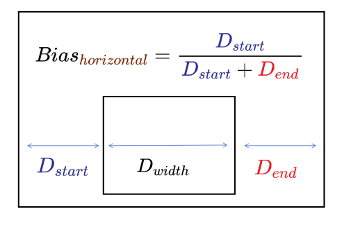
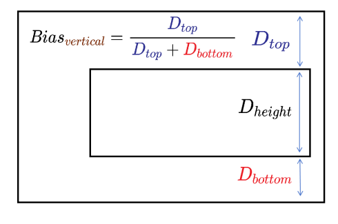
Bias
Defines the offset of the component under the anchor constraints.
In the horizontal direction, the value of Bias is the ratio of the distance from the component to the left anchor Dstart to the total distance between the component and the horizontal anchors Dstart + Dend. In a mirrored language layout, Dstart is the distance from the component to the right anchor. The width of the component is represented by Dwidth.
Similarly, in the vertical direction, the value of Bias is the ratio of the distance from the component to the top anchor Dtop to the total distance between the component and the vertical anchors Dtop + Dbottom. The height of the component is represented by Dheight.
Atomic service API: This API can be used in atomic services since API version 12.
| Name | Type | Mandatory | Description |
|---|---|---|---|
| horizontal | number | No | Bias value in the horizontal direction. This parameter takes effect when the child component has a correct width and two horizontal anchors. Default value: 0.5 |
| vertical | number | No | Bias value in the vertical direction. This parameter takes effect when the child component has a correct height and two vertical anchors. Default value: 0.5 |
chainMode12+
chainMode(direction: Axis, style: ChainStyle)
Sets the parameters of the chain in which the component is the head. This parameter has effect only when the parent container is RelativeContainer. The chain head is the first component in the chain that satisfies the chain formation rules. In a horizontal layout, it starts from the left (or from the right in a mirrored language layout). In a vertical layout, it starts from the top. For details, see RelativeContainer Example 7.
System capability: SystemCapability.ArkUI.ArkUI.Full
Parameters
| Name | Type | Mandatory | Description |
|---|---|---|---|
| direction | Axis | Yes | Direction of the chain. |
| style | ChainStyle | Yes | Style of the chain. |
ChainStyle12+
Enumerates the chain styles.
Atomic service API: This API can be used in atomic services since API version 12.
System capability: SystemCapability.ArkUI.ArkUI.Full
| Name | Description |
|---|---|
| SPREAD | Child components are evenly distributed among constraint anchors. For details, see RelativeContainer Example 7. |
| SPREAD_INSIDE | All child components except the first and last ones are evenly distributed among constraint anchors. For details, see RelativeContainer Example 7. |
| PACKED | There is no gap between child components in the chain. For details, see RelativeContainer Example 7. |
chainWeight14+
chainWeight(chainWeight: ChainWeightOptions)
Sets the weight of the component in a chain, which is used to re-lay out components that form the chain. This API has effect only when the parent container is RelativeContainer.
System capability: SystemCapability.ArkUI.ArkUI.Full
Atomic service API: This API can be used in atomic services since API version 14.
Parameters
| Name | Type | Mandatory | Description |
|---|---|---|---|
| chainWeight | ChainWeightOptions | Yes | Layout weight of the component in the horizontal or vertical direction. The component with chainWeight set will have its size in the horizontal or vertical direction allocated according to the set weights. The allocation ignores the component’s intrinsic size and enables the component to adaptively fill the remaining space. |
Example
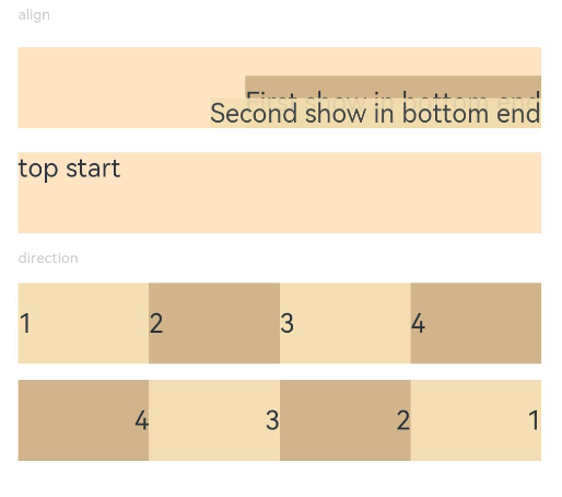
Example 1: Setting the Alignment Mode and Main Axis Layout
This example demonstrates setting the alignment mode of content within a component and the layout of child components along the main axis of the parent container.
// xxx.ets
@Entry
@Component
struct PositionExample1 {
  build() {
    Column() {
      Column({ space: 10 }) {
        // When the component content is within the area specified by the component width and height, set the alignment mode of the content in the component.
        Text('align').fontSize(9).fontColor(0xCCCCCC).width('90%')
        Stack() {
          Text('First show in bottom end').height('65%').backgroundColor(0xD2B48C)
          Text('Second show in bottom end').backgroundColor(0xF5DEB3).opacity(0.9)
        }.width('90%').height(50).margin({ top: 5 }).backgroundColor(0xFFE4C4)
        .align(Alignment.BottomEnd)
        Stack() {
          Text('top start')
        }.width('90%').height(50).margin({ top: 5 }).backgroundColor(0xFFE4C4)
        .align(Alignment.TopStart)

        // To arrange the child components from left to right, set direction of the parent container to Direction.Ltr.
        Text('direction').fontSize(9).fontColor(0xCCCCCC).width('90%')
        Row() {
          Text('1').height(50).width('25%').fontSize(16).backgroundColor(0xF5DEB3)
          Text('2').height(50).width('25%').fontSize(16).backgroundColor(0xD2B48C)
          Text('3').height(50).width('25%').fontSize(16).backgroundColor(0xF5DEB3)
          Text('4').height(50).width('25%').fontSize(16).backgroundColor(0xD2B48C)
        }
        .width('90%')
        .direction(Direction.Ltr)
        // To arrange the child components from right to left, set direction of the parent container to Direction.Rtl.
        Row() {
          Text('1').height(50).width('25%').fontSize(16).backgroundColor(0xF5DEB3).textAlign(TextAlign.End)
          Text('2').height(50).width('25%').fontSize(16).backgroundColor(0xD2B48C).textAlign(TextAlign.End)
          Text('3').height(50).width('25%').fontSize(16).backgroundColor(0xF5DEB3).textAlign(TextAlign.End)
          Text('4').height(50).width('25%').fontSize(16).backgroundColor(0xD2B48C).textAlign(TextAlign.End)
        }
        .width('90%')
        .direction(Direction.Rtl)
      }
    }
    .width('100%').margin({ top: 5 })
  }
}
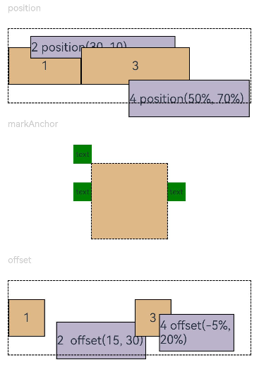
Example 2: Setting the Position Offset
This example demonstrates position offsets based on the parent component, relative positioning, and anchors.
// xxx.ets
@Entry
@Component
struct PositionExample2 {
  build() {
    Column({ space: 20 }) {
      // Set the offset of the component's upper left corner relative to the parent component's upper left corner.
      Text('position').fontSize(12).fontColor(0xCCCCCC).width('90%')
      Row() {
        Text('1').size({ width: '30%', height: '50' }).backgroundColor(0xdeb887).border({ width: 1 }).fontSize(16)
          .textAlign(TextAlign.Center)
        Text('2 position(30, 10)')
          .size({ width: '60%', height: '30' })
          .backgroundColor(0xbbb2cb)
          .border({ width: 1 })
          .fontSize(16)
          .align(Alignment.Start)
          .position({ x: 30, y: 10 })
        Text('3').size({ width: '45%', height: '50' }).backgroundColor(0xdeb887).border({ width: 1 }).fontSize(16)
          .textAlign(TextAlign.Center)
        Text('4 position(50%, 70%)')
          .size({ width: '50%', height: '50' })
          .backgroundColor(0xbbb2cb)
          .border({ width: 1 })
          .fontSize(16)
          .position({ x: '50%', y: '70%' })
      }.width('90%').height(100).border({ width: 1, style: BorderStyle.Dashed })

      // Offset relative to the start point. x indicates the horizontal distance between the end point and the start point. If the value of x is greater than 0, the component is offset to the left. Otherwise, the component is offset to the right.
      // y indicates the vertical distance between the end point and the start point. If the value of y is greater than 0, the component is offset to the top. Otherwise, the component is offset to the bottom.
      Text('markAnchor').fontSize(12).fontColor(0xCCCCCC).width('90%')
      Stack({ alignContent: Alignment.TopStart }) {
        Row()
          .size({ width: '100', height: '100' })
          .backgroundColor(0xdeb887)
        Text('text')
          .fontSize('30px')
          .textAlign(TextAlign.Center)
          .size({ width: 25, height: 25 })
          .backgroundColor(Color.Green)
          .markAnchor({ x: 25, y: 25 })
        Text('text')
          .fontSize('30px')
          .textAlign(TextAlign.Center)
          .size({ width: 25, height: 25 })
          .backgroundColor(Color.Green)
          .markAnchor({ x: -100, y: -25 })
        Text('text')
          .fontSize('30px')
          .textAlign(TextAlign.Center)
          .size({ width: 25, height: 25 })
          .backgroundColor(Color.Green)
          .markAnchor({ x: 25, y: -25 })
      }.margin({ top: 25 }).border({ width: 1, style: BorderStyle.Dashed })

      // Offset of the component relative to itself. If the value of x is greater than 0, the component is offset to the right. Otherwise, the component is offset to the left. If the value of y is greater than 0, the component is offset to the bottom. Otherwise, the component is offset to the top.
      Text('offset').fontSize(12).fontColor(0xCCCCCC).width('90%')
      Row() {
        Text('1').size({ width: '15%', height: '50' }).backgroundColor(0xdeb887).border({ width: 1 }).fontSize(16)
          .textAlign(TextAlign.Center)
        Text('2  offset(15, 30)')
          .size({ width: 120, height: '50' })
          .backgroundColor(0xbbb2cb)
          .border({ width: 1 })
          .fontSize(16)
          .align(Alignment.Start)
          .offset({ x: 15, y: 30 })
        Text('3').size({ width: '15%', height: '50' }).backgroundColor(0xdeb887).border({ width: 1 }).fontSize(16)
          .textAlign(TextAlign.Center)
        Text('4 offset(-5%, 20%)')
          .size({ width: 100, height: '50' })
          .backgroundColor(0xbbb2cb)
          .border({ width: 1 })
          .fontSize(16)
          .offset({ x: '-5%', y: '20%' })
      }.width('90%').height(100).border({ width: 1, style: BorderStyle.Dashed })
    }
    .width('100%').margin({ top: 25 })
  }
}
Example 3: Setting the Absolute Positioning and Relative Offset
This example demonstrates how to use position to set absolute positioning, which determines the position of child components relative to the parent component. It also shows how to use offset to set relative offsets for moving components from their original layout positions.
// xxx.ets
@Entry
@Component
struct Example3 {
  build() {
    Column({ space: 20 }){
      Text('position use Edges').fontSize(12).fontColor(0xCCCCCC).width('90%')
      Row() {
        Text('bottom:0, right:0').size({ width: '30%', height: '50' }).backgroundColor(0xdeb887).border({ width: 1 }).fontSize(16)
          .textAlign(TextAlign.Center).position({bottom: 0, right: 0})
        Text('top:0, left:0').size({ width: '30%', height: '50' }).backgroundColor(0xdeb887).border({ width: 1 }).fontSize(16)
          .textAlign(TextAlign.Center).position({top: 0, left: 0})
        Text('top:10%, left:50%').size({ width: '50%', height: '30' }).backgroundColor(0xbbb2cb).border({ width: 1 }).fontSize(16)
          .textAlign(TextAlign.Center).position({ top: '10%', left: '50%' })
        Text('bottom:0, left:30').size({ width: '50%', height: '30' }).backgroundColor(0xbbb2cb).border({ width: 1 }).fontSize(16)
          .textAlign(TextAlign.Center).position({ bottom: 0, left: 30 })
      }.width('90%').height(100).border({ width: 1, style: BorderStyle.Dashed })


      Text('offset use Edges').fontSize(12).fontColor(0xCCCCCC).width('90%')
      Row() {
        Text('1').size({ width: '25%', height: 50 }).backgroundColor(0xdeb887).border({ width: 1 }).fontSize(16)
          .textAlign(TextAlign.Center)
        Text('2 top:30, left:0').size({ width: '25%', height: 50 }).backgroundColor(0xbbb2cb).border({ width: 1 }).fontSize(16)
          .textAlign(TextAlign.Center).offset({top: 30, left: 0})
        Text('3').size({ width: '25%', height: 50 }).backgroundColor(0xdeb887).border({ width: 1 }).fontSize(16)
          .textAlign(TextAlign.Center)
        Text('4 bottom:10, right:30').size({ width: '25%', height: 50 }).backgroundColor(0xbbb2cb).border({ width: 1 }).fontSize(12)
          .textAlign(TextAlign.Center).offset({bottom: 10, right: 30})
      }.width('90%').height(150).border({ width: 1, style: BorderStyle.Dashed })
    }.width('100%').margin({ top: 25 })
  }
}

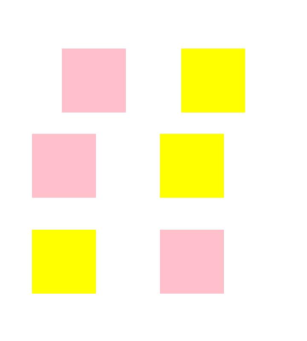
Example 4: Implementing a Mirror Effect
This example demonstrates how to implement a mirroring effect using position, offset, and markAnchor sequentially. The yellow blocks indicate the original effect, and the pink blocks indicate the mirroring effect.
// xxx.ets
import { LengthMetrics } from '@kit.ArkUI';
@Entry
@Component
struct Example4 {
  private scroller: Scroller = new Scroller()

  build() {
    Column() {
      Stack({ alignContent: Alignment.End }) {
        Scroll(this.scroller) {
          Flex({ direction: FlexDirection.Column }) {
            RelativeContainer() {
              Row() {
              }
              .position({ start: LengthMetrics.px(200), top: LengthMetrics.px(100) })
              .width("30%")
              .height("20%")
              .backgroundColor(Color.Pink)
              .padding(50)
              .margin(50)
              Row() {
              }
              .position({ left:'200px', top: '100px' })
              .width("30%")
              .height("20%")
              .backgroundColor(Color.Yellow)
              .padding(50)
              .margin(50)
              Row() {
              }
              .offset({ start: LengthMetrics.vp(100), top: LengthMetrics.vp(200)  })
              .width("30%")
              .height("20%")
              .backgroundColor(Color.Pink)
              .padding(50)
              .margin(50)
              Row() {
              }
              .offset({ left: 100, top: 200  })
              .width("30%")
              .height("20%")
              .backgroundColor(Color.Yellow)
              .padding(50)
              .margin(50)
              Row() {
              }
              .markAnchor({ start: LengthMetrics.fp(100), top: LengthMetrics.fp(-350) })
              .width("30%")
              .height("20%")
              .backgroundColor(Color.Pink)
              .padding(50)
              .margin(50)
              Row() {
              }
              .markAnchor({ x: '100fp', y: '-350fp' })
              .width("30%")
              .height("20%")
              .backgroundColor(Color.Yellow)
              .padding(50)
              .margin(50)
            }
            .backgroundColor(Color.White)
            .padding(50)
            .margin(50)
          }
        }
        .width('100%')
        .scrollBar(BarState.Off)
        .scrollable(ScrollDirection.Vertical)

        ScrollBar({ scroller: this.scroller, direction: ScrollBarDirection.Vertical, state: BarState.Auto }) {
          Text()
            .width(20)
            .height(100)
            .borderRadius(10)
            .backgroundColor('#C0C0C0')
        }.width(20).backgroundColor('#ededed')
      }
    }.height('90%')
  }
}
你可能感兴趣的鸿蒙文章
- 所属分类: 后端技术
- 本文标签:
热门推荐
-
2、 优质文章
-
3、 gt
-
7、 openharmony
-
9、 golang
-
10、 Vue中input框自动聚焦