harmony 鸿蒙Layout Constraints
Layout Constraints
Layout constraints refer to constraints on the aspect ratio and display priority of components.
NOTE
The APIs of this module are supported since API version 7. Updates will be marked with a superscript to indicate their earliest API version.
aspectRatio
aspectRatio(value: number)
Sets the aspect ratio of the component, which can be obtained using the following formula: width/height. - If only width and aspectRatio are set, the height is calculated using the following formula: width/aspectRatio. - If only height and aspectRatio are set, the width is calculated using the following formula: height x aspectRatio. - If width, height, and aspectRatio are all set, the explicitly set height is ignored, and the effective height is calculated using the following formula: width/aspectRatio.
After aspectRatio is set, the width and height of the component are constrained by the size of the parent component’s content area.
Widget capability: This API can be used in ArkTS widgets since API version 9.
Atomic service API: This API can be used in atomic services since API version 11.
System capability: SystemCapability.ArkUI.ArkUI.Full
Parameters
| Name | Type | Mandatory | Description |
|---|---|---|---|
| value | number | Yes | Aspect ratio of the component. The default value varies by API version. API version 9 and earlier: 1.0 API version 10: none NOTE This parameter takes effect only when a valid value greater than 0 is specified. For example, if a Row component has only its width set and does not have any child component, then when aspectRatio is not set or is set to a negative value, the height of the Row component is 0. |
displayPriority
displayPriority(value: number)
Sets the display priority for the component in the layout container.
Widget capability: This API can be used in ArkTS widgets since API version 9.
Atomic service API: This API can be used in atomic services since API version 11.
System capability: SystemCapability.ArkUI.ArkUI.Full
Parameters
| Name | Type | Mandatory | Description |
|---|---|---|---|
| value | number | Yes | Display priority of the component in the layout container. Default value: 1 NOTE This parameter is only effective in Row, Column, and Flex (single-line) container components. The digits after the decimal point are not counted in determining the display priority. That is, numbers in the [x, x + 1) range are considered to represent the same priority. For example, 1.0 and 1.9 represent the same priority. If the displayPriority value of all child components is not greater than 1, there is no difference in priority. When the displayPriority value of a child component is greater than 1, a larger value indicates higher priority. If the parent container does not have enough space, child components with lower priority are hidden. If child components of a certain priority are hidden, those with an even lower priority are also hidden. |
Example
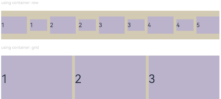
Example 1: Setting the Component Aspect Ratio
This example illustrates how to use the aspectRatio attribute to set different aspect ratios for a component.
// xxx.ets
@Entry
@Component
struct AspectRatioExample {
  private children: string[] = ['1', '2', '3', '4', '5', '6']

  build() {
    Column({ space: 20 }) {
      Text('using container: row').fontSize(14).fontColor(0xCCCCCC).width('100%')
      Row({ space: 10 }) {
        ForEach(this.children, (item:string) => {
          // Component width = Component height x 1.5 = 90
          Text(item)
            .backgroundColor(0xbbb2cb)
            .fontSize(20)
            .aspectRatio(1.5)
            .height(60)
          // Component height = Component width/1.5 = 60/1.5 = 40
          Text(item)
            .backgroundColor(0xbbb2cb)
            .fontSize(20)
            .aspectRatio(1.5)
            .width(60)
        }, (item:string) => item)
      }
      .size({ width: "100%", height: 100 })
      .backgroundColor(0xd2cab3)
      .clip(true)

      // Grid child component width/height = 3/2
      Text('using container: grid').fontSize(14).fontColor(0xCCCCCC).width('100%')
      Grid() {
        ForEach(this.children, (item:string) => {
          GridItem() {
            Text(item)
              .backgroundColor(0xbbb2cb)
              .fontSize(40)
              .width('100%')
              .aspectRatio(1.5)
          }
        }, (item:string) => item)
      }
      .columnsTemplate('1fr 1fr 1fr')
      .columnsGap(10)
      .rowsGap(10)
      .size({ width: "100%", height: 165 })
      .backgroundColor(0xd2cab3)
    }.padding(10)
  }
}
Figure 1 Portrait display
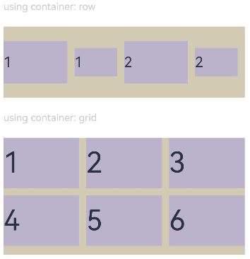
Figure 2 Landscape display
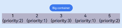
Example 2: Setting the Component Display Priority
This example shows how to use displayPriority to assign display priorities to child components.
class ContainerInfo {
  label: string = '';
  size: string = '';
}

class ChildInfo {
  text: string = '';
  priority: number = 0;
}

@Entry
@Component
struct DisplayPriorityExample {
  // Display the container size.
  private container: ContainerInfo[] = [
    { label: 'Big container', size: '90%' },
    { label: 'Middle container', size: '50%' },
    { label: 'Small container', size: '30%' }
  ]
  private children: ChildInfo[] = [
    { text: '1\n(priority:2)', priority: 2 },
    { text: '2\n(priority:1)', priority: 1 },
    { text: '3\n(priority:3)', priority: 3 },
    { text: '4\n(priority:1)', priority: 1 },
    { text: '5\n(priority:2)', priority: 2 }
  ]
  @State currentIndex: number = 0;

  build() {
    Column({ space: 10 }) {
      // Switch the size of the parent container.
      Button(this.container[this.currentIndex].label).backgroundColor(0x317aff)
        .onClick(() => {
          this.currentIndex = (this.currentIndex + 1) % this.container.length;
        })
      // Set the width for the parent flex container through variables.
      Flex({ justifyContent: FlexAlign.SpaceBetween }) {
        ForEach(this.children, (item:ChildInfo) => {
          // Bind the display priority to the child component through displayPriority.
          Text(item.text)
            .width(120)
            .height(60)
            .fontSize(24)
            .textAlign(TextAlign.Center)
            .backgroundColor(0xbbb2cb)
            .displayPriority(item.priority)
        }, (item:ChildInfo) => item.text)
      }
      .width(this.container[this.currentIndex].size)
      .backgroundColor(0xd2cab3)
    }.width("100%").margin({ top: 50 })
  }
}
Landscape display in containers of different sizes
你可能感兴趣的鸿蒙文章
- 所属分类: 后端技术
- 本文标签:
热门推荐
-
2、 优质文章
-
3、 gt
-
7、 openharmony
-
9、 golang
-
10、 Vue中input框自动聚焦