harmony 鸿蒙Row
Row
The Row component lays out child components horizontally.
NOTE
This component is supported since API version 7. Updates will be marked with a superscript to indicate their earliest API version.
Child Components
Supported
APIs
Row
Row(options?: RowOptions)
Creates a horizontal linear layout container. You can set the spacing between child components, which can be of type number or string.
Widget capability: This API can be used in ArkTS widgets since API version 9.
Atomic service API: This API can be used in atomic services since API version 11.
System capability: SystemCapability.ArkUI.ArkUI.Full
Parameters
| Name | Type | Mandatory | Description |
|---|---|---|---|
| options | RowOptions | No | Spacing between child components. |
Row16+
Row(options?: RowOptions|RowOptionsV2)
Creates a horizontal linear layout container. You can set the spacing between child components, which can be of type number, string, or Resource.
Widget capability: This API can be used in ArkTS widgets since API version 16.
Atomic service API: This API can be used in atomic services since API version 16.
System capability: SystemCapability.ArkUI.ArkUI.Full
Parameters
| Name | Type | Mandatory | Description |
|---|---|---|---|
| options | RowOptions |RowOptionsV2 | No | Spacing between child components. |
RowOptions14+
Defines the spacing properties for child components used for constructing a Row component.
Widget capability: This API can be used in ArkTS widgets since API version 14.
Atomic service API: This API can be used in atomic services since API version 14.
System capability: SystemCapability.ArkUI.ArkUI.Full
| Name | Type | Mandatory | Description |
|---|---|---|---|
| space | number |string | No | Spacing between child components. Since API version 9, this parameter does not take effect when it is set to a negative number or when justifyContent is set to FlexAlign.SpaceBetween, FlexAlign.SpaceAround or FlexAlign.SpaceEvenly. Default value: 0, in vp NOTE The value of space can be a number greater than or equal to 0 or a string that can be converted to a number. |
RowOptionsV216+
Defines the spacing properties for child components used for constructing a Row component.
Widget capability: This API can be used in ArkTS widgets since API version 16.
Atomic service API: This API can be used in atomic services since API version 16.
System capability: SystemCapability.ArkUI.ArkUI.Full
| Name | Type | Mandatory | Description |
|---|---|---|---|
| space | SpaceType | No | Horizontal spacing between two adjacent child components. This parameter does not take effect if the value specified is a negative number, or if justifyContent is set to FlexAlign.SpaceBetween, FlexAlign.SpaceAround, or FlexAlign.SpaceEvenly. Default value: 0, in vp NOTE The value of space can be a number greater than or equal to 0, a string that can be converted to a number, or a Resource type that can be converted to a number. |
Attributes
In addition to the universal attributes, the following attributes are supported.
alignItems
alignItems(value: VerticalAlign)
Sets the alignment mode of child components in the vertical direction.
Widget capability: This API can be used in ArkTS widgets since API version 9.
Atomic service API: This API can be used in atomic services since API version 11.
System capability: SystemCapability.ArkUI.ArkUI.Full
Parameters
| Name | Type | Mandatory | Description |
|---|---|---|---|
| value | VerticalAlign | Yes | Alignment mode of child components in the vertical direction. Default value: VerticalAlign.Center |
justifyContent8+
justifyContent(value: FlexAlign)
Sets the alignment mode of the child components in the horizontal direction.
Widget capability: This API can be used in ArkTS widgets since API version 9.
Atomic service API: This API can be used in atomic services since API version 11.
System capability: SystemCapability.ArkUI.ArkUI.Full
Parameters
| Name | Type | Mandatory | Description |
|---|---|---|---|
| value | FlexAlign | Yes | Alignment mode of child components in the horizontal direction. Default value: FlexAlign.Start |
NOTE
During row layout, child components do not shrink if flexShrink is not set for them. In this case, the total size of the child components on the main axis can exceed the size of the container on the main axis.
reverse12+
reverse(isReversed: Optional<boolean>)
Sets whether to reverse the arrangement of child components on the main axis (horizontal direction).
Widget capability: This API can be used in ArkTS widgets since API version 12.
Atomic service API: This API can be used in atomic services since API version 12.
System capability: SystemCapability.ArkUI.ArkUI.Full
Parameters
| Name | Type | Mandatory | Description |
|---|---|---|---|
| isReversed | Optional<boolean> | Yes | Whether whether to reverse the arrangement of child components on the main axis (horizontal direction). Default value: true |
NOTE
If the reverse attribute is not set, the arrangement on the main axis remains in the normal order. If the attribute is set to undefined, it defaults to true, which reverses the arrangement on the main axis.
Keep in mind that the main axis arrangement direction is also affected by the direction attribute. If reverse is set to true, it effectively reverses the arrangement that results from the direction attribute settings.
Events
The universal events are supported.
Example
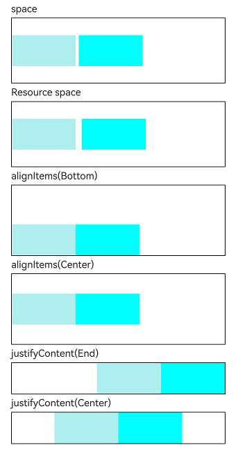
This example demonstrates how to set horizontal layout properties, such as spacing and alignment, using the Row component.
// resources/base/element/string.json
{
  "string": [
    {
      "name": "stringSpace",
      "value": "5"
    }
  ]
}
// xxx.ets
@Entry
@Component
struct RowExample {
  build() {
    Column({ space: 5 }) {
      // Set the horizontal spacing between two adjacent child components to 5.
      Text('space').width('90%')
      Row({ space: 5 }) {
        Row().width('30%').height(50).backgroundColor(0xAFEEEE)
        Row().width('30%').height(50).backgroundColor(0x00FFFF)
      }.width('90%').height(107).border({ width: 1 })

      // Set the spacing between child components using the Resource type.
      Text('Resource space').width('90%')
      Row({ space: $r("app.string.stringSpace") }) {
        Row().width('30%').height(50).backgroundColor(0xAFEEEE)
        Row().width('30%').height(50).backgroundColor(0x00FFFF)
      }.width('90%').height(107).border({ width: 1 })

      // Set the alignment mode of the child components in the vertical direction.
      Text('alignItems(Bottom)').width('90%')
      Row() {
        Row().width('30%').height(50).backgroundColor(0xAFEEEE)
        Row().width('30%').height(50).backgroundColor(0x00FFFF)
      }.width('90%').alignItems(VerticalAlign.Bottom).height('15%').border({ width: 1 })

      Text('alignItems(Center)').width('90%')
      Row() {
        Row().width('30%').height(50).backgroundColor(0xAFEEEE)
        Row().width('30%').height(50).backgroundColor(0x00FFFF)
      }.width('90%').alignItems(VerticalAlign.Center).height('15%').border({ width: 1 })

      // Set the alignment mode of the child components in the horizontal direction.
      Text('justifyContent(End)').width('90%')
      Row() {
        Row().width('30%').height(50).backgroundColor(0xAFEEEE)
        Row().width('30%').height(50).backgroundColor(0x00FFFF)
      }.width('90%').border({ width: 1 }).justifyContent(FlexAlign.End)

      Text('justifyContent(Center)').width('90%')
      Row() {
        Row().width('30%').height(50).backgroundColor(0xAFEEEE)
        Row().width('30%').height(50).backgroundColor(0x00FFFF)
      }.width('90%').border({ width: 1 }).justifyContent(FlexAlign.Center)
    }.width('100%')
  }
}
你可能感兴趣的鸿蒙文章
- 所属分类: 后端技术
- 本文标签:
热门推荐
-
2、 优质文章
-
3、 gt
-
7、 openharmony
-
9、 golang
-
10、 Vue中input框自动聚焦