harmony 鸿蒙Flex Layout
Flex Layout
NOTE - The APIs of this module are supported since API version 7. Updates will be marked with a superscript to indicate their earliest API version.
flexBasis
flexBasis(value: number|string)
Sets the base size of the component.
Widget capability: This API can be used in ArkTS widgets since API version 9.
Atomic service API: This API can be used in atomic services since API version 11.
System capability: SystemCapability.ArkUI.ArkUI.Full
Parameters
| Name | Type | Mandatory | Description |
|---|---|---|---|
| value | number |string | Yes | Base size of the component in the main axis of the parent container. Default value: ‘auto’ (indicating that the base size of the component in the main axis is the original size of the component) For the string type, the value must be a string that can be converted into a number (for example, ‘10’), a string that includes a length unit (for example, ‘10px’), or the literal string ‘auto’; percentage-based strings are not supported. For the number type, the value range is (0, +∞), and the unit is vp. Invalid values are treated as the default value ‘auto’. |
flexGrow
flexGrow(value: number)
Sets the percentage of the parent container’s remaining space that is allocated to the component.
Widget capability: This API can be used in ArkTS widgets since API version 9.
Atomic service API: This API can be used in atomic services since API version 11.
System capability: SystemCapability.ArkUI.ArkUI.Full
Parameters
| Name | Type | Mandatory | Description |
|---|---|---|---|
| value | number | Yes | Percentage of the parent container’s remaining space that is allocated to the component. Value range: (0,+∞). Default value: 0 |
flexShrink
flexShrink(value: number)
Sets the percentage of the parent container’s shrink size that is allocated to the component. When the parent container is Column or Row, you must set the size along the main axis.
Widget capability: This API can be used in ArkTS widgets since API version 9.
Atomic service API: This API can be used in atomic services since API version 11.
System capability: SystemCapability.ArkUI.ArkUI.Full
Parameters
| Name | Type | Mandatory | Description |
|---|---|---|---|
| value | number | Yes | Percentage of the parent container’s shrink size that is allocated to the component. If the parent container is Column or Row, the value range is (0, +∞), and the default value is 0. If the parent container is Flex, the default value is 1. When constraintSize is applied to the Column and Row components without the main axis size specified (through width, height, or size), these components use their default layout behavior, adapting to the size of their child component along the main axis. In this case, flexShrink does not take effect. |
alignSelf
alignSelf(value: ItemAlign)
Sets the alignment mode of the child components along the cross axis of the parent container.
Widget capability: This API can be used in ArkTS widgets since API version 9.
Atomic service API: This API can be used in atomic services since API version 11.
System capability: SystemCapability.ArkUI.ArkUI.Full
Parameters
| Name | Type | Mandatory | Description |
|---|---|---|---|
| value | ItemAlign | Yes | Alignment mode of the child components along the cross axis of the parent container. The setting overwrites the alignItems setting of the parent container (Flex, Column, Row, or GridRow). GridCol can have the alignsSelf attribute bound to change its own layout along the cross axis. Default value: ItemAlign.Auto |
Example
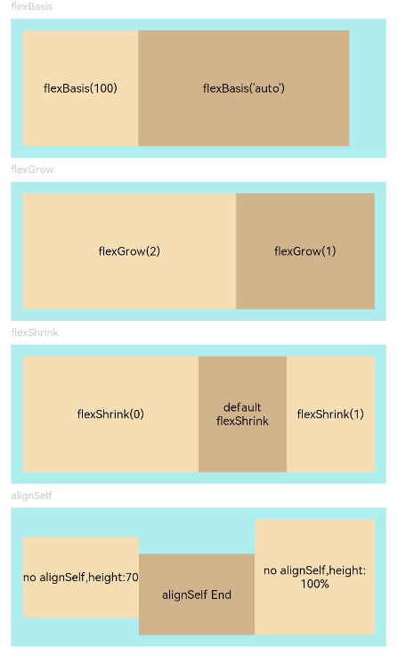
This example shows how to set up a flex layout through the flexBasis, flexGrow, flexShrink, and alignSelf attributes.
// xxx.ets
@Entry
@Component
struct FlexExample {
  build() {
    Column({ space: 5 }) {
      Text('flexBasis').fontSize(9).fontColor(0xCCCCCC).width('90%')
      // Base size in the main axis
      // The value of flexBasis() can be 'auto' or a number, which is equivalent to .width()/.height().
      Flex() {
        Text('flexBasis(100)')
          .flexBasis(100) // The width is 100 vp.
          .height(100)
          .backgroundColor(0xF5DEB3)
          .textAlign(TextAlign.Center)
        Text(`flexBasis('auto')`)
          .flexBasis('auto') // The width is 60% of the original width.
          .width('60%')
          .height(100)
          .backgroundColor(0xD2B48C)
          .textAlign(TextAlign.Center)
      }.width('90%').height(120).padding(10).backgroundColor(0xAFEEEE)

      Text('flexGrow').fontSize(9).fontColor(0xCCCCCC).width('90%')
      // flexGrow() indicates the percentage of the remaining space allocated to the component.
      Flex() {
        Text('flexGrow(2)')
          .flexGrow(2) // The width allocated to the Text component is 2/3 of the remaining width of the parent container.
          .height(100)
          .backgroundColor(0xF5DEB3)
          .textAlign(TextAlign.Center)
        Text('flexGrow(1)')
          .flexGrow(1) // The width allocated to the Text component is 1/3 of the remaining width of the parent container.
          .height(100)
          .backgroundColor(0xD2B48C)
          .textAlign(TextAlign.Center)
      }.width('90%').height(120).padding(10).backgroundColor(0xAFEEEE)

      Text('flexShrink').fontSize(9).fontColor(0xCCCCCC).width('90%')
      // flexShrink() indicates the percentage of the shrink size allocated to the component.
      // The value is 0 for the first Text component and 1 for the other two Text components. This means that, if the components cannot be completely displayed in the parent container, the latter two are shrunk proportionally, while the former is not shrunk.
      Flex({ direction: FlexDirection.Row }) {
        Text('flexShrink(0)')
          .flexShrink(0)
          .width('50%')
          .height(100)
          .backgroundColor(0xF5DEB3)
          .textAlign(TextAlign.Center)
        Text('default flexShrink') // The default value is 1.
          .width('40%')
          .height(100)
          .backgroundColor(0xD2B48C)
          .textAlign(TextAlign.Center)
        Text('flexShrink(1)')
          .flexShrink(1)
          .width('40%')
          .height(100)
          .backgroundColor(0xF5DEB3)
          .textAlign(TextAlign.Center)
      }.width('90%').height(120).padding(10).backgroundColor(0xAFEEEE)

      Text('alignSelf').fontSize(9).fontColor(0xCCCCCC).width('90%')
      // The alignSelf setting overrides the alignItems setting of the parent container.
      Flex({ direction: FlexDirection.Row, alignItems: ItemAlign.Center }) {
        Text('no alignSelf,height:70')
          .width('33%')
          .height(70)
          .backgroundColor(0xF5DEB3)
          .textAlign(TextAlign.Center)
        Text('alignSelf End')
          .alignSelf(ItemAlign.End)
          .width('33%')
          .height(70)
          .backgroundColor(0xD2B48C)
          .textAlign(TextAlign.Center)
        Text('no alignSelf,height:100%')
          .width('34%')
          .height('100%')
          .backgroundColor(0xF5DEB3)
          .textAlign(TextAlign.Center)
      }.width('90%').height(120).padding(10).backgroundColor(0xAFEEEE)
    }.width('100%').margin({ top: 5 })
  }
}
你可能感兴趣的鸿蒙文章
- 所属分类: 后端技术
- 本文标签:
热门推荐
-
2、 优质文章
-
3、 gt
-
7、 openharmony
-
9、 golang
-
10、 Vue中input框自动聚焦