harmony 鸿蒙Focus Control
Focus Control
Focus control attributes set whether a component is focusable and how it participates in focus navigation.
NOTE
The APIs of this module are supported since API version 8. Updates will be marked with a superscript to indicate their earliest API version.
Custom components are inherently unfocusable, and setting focusable and enabled attributes to false or setting the visibility attribute to Hidden or None does not impact their child components’ capability to gain focus.
Components can actively acquire focus independently of the window’s focus state.
For details about focus development, see Focus Event.
focusable
focusable(value: boolean)
Sets whether the component is focusable.
Atomic service API: This API can be used in atomic services since API version 11.
System capability: SystemCapability.ArkUI.ArkUI.Full
Parameters
| Name | Type | Mandatory | Description |
|---|---|---|---|
| value | boolean | Yes | Whether the component is focusable. true: The component is focusable. false: The component is not focusable. NOTE Components that have default interaction logic, such as Button and TextInput, are focusable by default. Other components, such as Text and Image, are not focusable by default. Only focusable components can trigger a focus event. |
tabIndex9+
tabIndex(index: number)
Sets the Tab order of the component in sequential focus navigation with the Tab key.
Atomic service API: This API can be used in atomic services since API version 11.
System capability: SystemCapability.ArkUI.ArkUI.Full
Parameters
| Name | Type | Mandatory | Description |
|---|---|---|---|
| index | number | Yes | Tab order of the component in sequential focus navigation with the Tab key. When components with positive tabIndex values are present, only these components are reachable through sequential focus navigation, and they are navigated cyclically in ascending order based on the tabIndex value. When components with positive tabIndex values are not present, those components with a tabIndex value of 0 are navigated based on the preset focus navigation rule. tabIndex is not yet compatible with UiExtension component. As such, using tabIndex on a page that contains UiExtension may lead to disordered focus navigation. - tabIndex >= 0: The component is focusable and can be reached through sequential keyboard navigation. - tabIndex < 0 (usually tabIndex = -1): The component is focusable, but cannot be reached through sequential keyboard navigation. Default value: 0 NOTE tabIndex and focusScopeId cannot be used together. |
defaultFocus9+
defaultFocus(value: boolean)
Specifies whether to set the component as the default focus of the page.
Atomic service API: This API can be used in atomic services since API version 11.
System capability: SystemCapability.ArkUI.ArkUI.Full
Parameters
| Name | Type | Mandatory | Description |
|---|---|---|---|
| value | boolean | Yes | Whether to set the component as the default focus of the page. This parameter takes effect only when the page is new and accessed for the first time. Default value: false NOTE The value true means to set the component as the default focus, and the value false has no effect. If no component on the page has defaultFocus(true) set: For API version 11 and earlier, the default focus is on the first focusable non-container component on the page. For API version versions later than 11, the default focus is on the page’s root container. If defaultFocus(true) is set for multiple components on the page, the first component found in the component tree in-depth traversal is used as the default focus. |
groupDefaultFocus9+
groupDefaultFocus(value: boolean)
Specifies whether to set the component as the default focus of the container.
Atomic service API: This API can be used in atomic services since API version 11.
System capability: SystemCapability.ArkUI.ArkUI.Full
Parameters
| Name | Type | Mandatory | Description |
|---|---|---|---|
| value | boolean | Yes | Whether to set the component as the default focus of the parent container. This parameter takes effect only when the container is new and obtains focus for the first time. true: The component is the default focus of the parent container. false: The component is not the default focus of the parent container. Default value: false NOTE This parameter must be used together with tabIndex. When tabIndex is set for a container and groupDefaultFocus(true) is set for a child in the container or for the container itself, then when the container obtains focus for the first time through sequential Tab navigation, the focus automatically moves to the specified component. If groupDefaultFocus(true) is set for multiple components in the container (including the container itself), the first component found in the component tree in-depth traversal receives the focus. |
focusOnTouch9+
focusOnTouch(value: boolean)
Sets whether the component is focusable on touch.
Atomic service API: This API can be used in atomic services since API version 11.
System capability: SystemCapability.ArkUI.ArkUI.Full
Parameters
| Name | Type | Mandatory | Description |
|---|---|---|---|
| value | boolean | Yes | Whether the component is focusable on touch. true: The component is focusable on touch. false: The component is not focusable on touch. Default value: false NOTE The component is focusable only when it is touchable. |
focusBox12+
focusBox(style: FocusBoxStyle): T
Sets the system focus box style for the component.
Atomic service API: This API can be used in atomic services since API version 12.
System capability: SystemCapability.ArkUI.ArkUI.Full
Parameters
| Name | Type | Mandatory | Description |
|---|---|---|---|
| style | FocusBoxStyle | Yes | System focus box style for the component. NOTE This style affects only the components that display the system focus box during focus traversal. |
focusControl9+
Implements focus control.
Atomic service API: This API can be used in atomic services since API version 11.
requestFocus9+
requestFocus(value: string): boolean
Requests the focus to move to the specified component. It is a global API. This API does not take effect in the current frame; the focus change will occur in the next frame. Use the requestFocus API in FocusController for immediate effect.
Atomic service API: This API can be used in atomic services since API version 11.
Parameters
| Name | Type | Mandatory | Description |
|---|---|---|---|
| value | string | Yes | String bound to the target component using key(value: string) or id(value: string). |
Return value
| Type | Description |
|---|---|
| boolean | Returns whether the focus is successfully moved to the target component. Returns true if the specified component exists and the focus is successfully moved to the target component; returns false otherwise. |
NOTE
The following components support focus control: TextInput, TextArea, Search, Button, Text, Image, List, Grid. Currently, the running effect of the focus event can be displayed only on a real device.
FocusBoxStyle12+
Atomic service API: This API can be used in atomic services since API version 12.
| Name | Type | Mandatory | Description |
|---|---|---|---|
| margin | LengthMetrics | No | Distance of the focus box from the component’s edge. A positive number indicates the outside, and a negative number indicates the inside. The value cannot be in percentage. |
| strokeColor | ColorMetrics | No | Stroke color of the focus box. |
| strokeWidth | LengthMetrics | No | Stroke width of the focus box. Negative numbers and percentages are not supported. |
focusScopePriority12+
focusScopePriority(scopeId: string, priority?: FocusPriority): T
Sets the focus priority of this component in a specified container. It must be used together with focusScopeId.
Atomic service API: This API can be used in atomic services since API version 12.
System capability: SystemCapability.ArkUI.ArkUI.Full
Parameters
| Name | Type | Mandatory | Description |
|---|---|---|---|
| scopeId | string | Yes | ID of the container component where the current component’s focus priority takes effect. NOTE 1. The current component must be within the container identified by scopeId, or the container to which the current component belongs must be within the container identified by scopeId. 2. A component cannot set multiple priorities. 3. A container component with focusScopeId set cannot have its priority set. |
| priority | FocusPriority | No | Focus priority. NOTE If priority is not set, the component uses the default AUTO priority. Impact of the priority on focus traversal and component focus: 1. When the container gains focus as a whole (page level switching/focus switching to a focus group/container component requesting focus with requestFocus), if there is a component with a priority of PREVIOUS within the container, that component gains focus; otherwise, the last focused component does. 2. When a container does not gain focus as a whole (using Tab or arrow keys in non-focus group scenarios), the highest priority component gets focus on first focus; subsequent focus follows position order regardless of priority. |
FocusPriority12+
Atomic service API: This API can be used in atomic services since API version 12.
System capability: SystemCapability.ArkUI.ArkUI.Full
| Name | Description |
|---|---|
| AUTO | Default priority, that is, the focus priority assigned by default. |
| PRIOR | Priority that indicates the component is prioritized in the container. This level is higher than AUTO. |
| PREVIOUS | Priority of a previously focused node in the container. This level is higher than PRIOR. |
KeyProcessingMode15+
Enumerates the modes for processing key events.
Atomic service API: This API can be used in atomic services since API version 15.
System capability: SystemCapability.ArkUI.ArkUI.Full
| Name | Value | Description |
|---|---|---|
| FOCUS_NAVIGATION | 0 | Default value. When the current component does not consume the key event, focus navigation using the Tab and arrow keys preferentially stays within the current container. |
| ANCESTOR_EVENT | 1 | When the current component does not consume the key event, focus navigation using the Tab and arrow keys is bubbled up to the parent component. |
focusScopeId12+
focusScopeId(id: string, isGroup?: boolean)
Assigns an ID to this container component and specifies whether the container is a focus group.
Atomic service API: This API can be used in atomic services since API version 12.
System capability: SystemCapability.ArkUI.ArkUI.Full
Parameters
| Name | Type | Mandatory | Description |
|---|---|---|---|
| id | string | Yes | ID of the current container component. NOTE The ID must be unique within a single level page. |
| isGroup | boolean | No | Whether the current container component is a focus group. true: The current container component is a focus group. false: The current container component is not a focus group. NOTE Focus groups cannot be nested and should not be configured repeatedly. The focus group and tabIndex cannot be used together. The focus group enables the container and its elements to navigate focus according to the focus group rules as follows: 1. Only arrow keys are allowed for focus traversal within the focus group; the Tab key will move the focus out of the focus group. 2. When arrow keys are used to move the focus from outside the focus group to inside, if there is a component with a priority of PREVIOUS within the focus group, that component gains focus; otherwise, the last focused component does. |
focusScopeId14+
focusScopeId(id: string, isGroup?: boolean, arrowStepOut?: boolean)
Assigns an ID to this container component and specifies whether the container is a focus group.
System capability: SystemCapability.ArkUI.ArkUI.Full
Parameters
| Name | Type | Mandatory | Description |
|---|---|---|---|
| id | string | Yes | ID of the current container component. NOTE The ID must be unique within a single level page. Atomic service API: This API can be used in atomic services since API version 12. |
| isGroup | boolean | No | Whether the current container component is a focus group. true: The current container component is a focus group. false: The current container component is not a focus group. NOTE Focus groups cannot be nested and should not be configured repeatedly. The focus group and tabIndex cannot be used together. The focus group enables the container and its elements to navigate focus according to the focus group rules as follows: 1. Only arrow keys are allowed for focus traversal within the focus group; the Tab key will move the focus out of the focus group. 2. When arrow keys are used to move the focus from outside the focus group to inside, if there is a component with a priority of PREVIOUS within the focus group, that component gains focus; otherwise, the last focused component does. Atomic service API: This API can be used in atomic services since API version 12. |
| arrowStepOut14+ | boolean | No | Whether the focus can be moved out of the current focus group using arrow keys. true: The focus can be moved out of the current focus group using arrow keys. false: The focus cannot be moved out of the current focus group using arrow keys. Atomic service API: This API can be used in atomic services since API version 14. |
tabStop14+
tabStop(isTabStop: boolean) :T
Sets whether this container component is a focus stop. During focus traversal, the focus stops at the container component serving as a focus stop.
Atomic service API: This API can be used in atomic services since API version 14.
System capability: SystemCapability.ArkUI.ArkUI.Full
Parameters
| Name | Type | Mandatory | Description |
|---|---|---|---|
| isTabStop | boolean | Yes | Whether the current container component is a focus stop. true: The current container component is a focus stop. false: The current container component is not a focus stop. NOTE 1. To configure tabStop, make sure the component is a container and has focusable child components. By default, container components cannot directly gain focus. 2. When requestFocus is used for requesting focus, if the component is a container and tabStop is configured, the focus can stop at the container. If tabStop is not configured, the component can still gain focus, even if there are other components in the focus chain with tabStop configured. 3. Containers with tabStop configured should not be nested more than two levels deep. Focus traversal rules with tabStop: 1. During focus traversal using the Tab key or arrow keys, the focus stops at components with tabStop configured. If the focus is inside a container with tabStop configured, it can move to the next focusable component within the container. If the focus is outside such a container, it can move to the next focusable component outside the container. 2. When the focus is on a container with tabStop configured, pressing Enter moves the focus to the first focusable component inside the container. Pressing ESC moves the focus back to the previous component with tabStop configured, without exceeding the current level of the page root container. Pressing the spacebar triggers the onClick event of the container. 3. Whenever possible, avoid configuring tabStop on the root container. If tabStop is configured on the root container, the following behaviors will occur: - Using clearFocus to clear the focus to the root container and then pressing Enter will move the focus to the previously focused component inside the root container. - Using ESC to clear the focus to the root container and then pressing Enter will move the focus to the first focusable component inside the root container. |
Example for describing the keys and focusable components during focus traversal

If the current focus is on button2, pressing the Tab key will move the focus to Column3. Pressing the Tab key again will move the focus back to button1.
nextFocus18+
nextFocus(nextStep: Optional<FocusMovement>): T
Sets the custom focus movement logic for the component.
Atomic service API: This API can be used in atomic services since API version 18.
System capability: SystemCapability.ArkUI.ArkUI.Full
Parameters
| Name | Type | Mandatory | Description |
|---|---|---|---|
| nextStep | FocusMovement | No | Custom focus movement logic of the component. NOTE The default value resets nextStep to empty. If custom focus movement is not set or the specified component does not exist, the default focus movement logic applies. |
FocusMovement18+
Sets the target component for focus movement based on key presses. If it is not specified, the default focus movement logic applies.
Atomic service API: This API can be used in atomic services since API version 18.
System capability: SystemCapability.ArkUI.ArkUI.Full
| Name | Type | Read-Only/Optional | Description |
|---|---|---|---|
| forward | string | Optional | ID of the component to focus on when the Tab key is pressed. The default value resets forward to empty. |
| backward | string | Optional | ID of the component to focus on when Shift+Tab is pressed. The default value resets backward to empty. |
| up | string | Optional | ID of the component to focus on when the up arrow key is pressed. The default value resets up to empty. |
| down | string | Optional | ID of the component to focus on when the down arrow key is pressed. The default value resets down to empty. |
| left | string | Optional | ID of the component to focus on when the left arrow key is pressed. The default value resets left to empty. |
| right | string | Optional | ID of the component to focus on when the right arrow key is pressed. The default value resets right to empty. |
Example
Example 1: Setting Focus and Focus Traversal Effects for Components
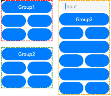
This example shows how to use defaultFocus, groupDefaultFocus, and focusOnTouch. defaultFocus sets the bound component as the initial focus after the page is created. groupDefaultFocus sets the bound component as the initial focus after the container with the specified tabIndex is created. focusOnTouch sets the bound component to obtain focus upon being clicked.
// focusTest.ets
@Entry
@Component
struct FocusableExample {
  @State inputValue: string = ''

  build() {
    Scroll() {
      Row({ space: 20 }) {
        Column({ space: 20 }) {
          Column({ space: 5 }) {
            Button('Group1')
              .width(165)
              .height(40)
              .fontColor(Color.White)
              .focusOnTouch(true)           // The button is focusable on touch.
            Row({ space: 5 }) {
              Button()
                .width(80)
                .height(40)
                .fontColor(Color.White)
              Button()
                .width(80)
                .height(40)
                .fontColor(Color.White)
                .focusOnTouch(true)           // The button is focusable on touch.
            }
            Row({ space: 5 }) {
              Button()
                .width(80)
                .height(40)
                .fontColor(Color.White)
              Button()
                .width(80)
                .height(40)
                .fontColor(Color.White)
            }
          }.borderWidth(2).borderColor(Color.Red).borderStyle(BorderStyle.Dashed)
          .tabIndex(1)                      // The column is the initial component to have focus in sequential keyboard navigation.
          Column({ space: 5 }) {
            Button('Group2')
              .width(165)
              .height(40)
              .fontColor(Color.White)
            Row({ space: 5 }) {
              Button()
                .width(80)
                .height(40)
                .fontColor(Color.White)
              Button()
                .width(80)
                .height(40)
                .fontColor(Color.White)
                .groupDefaultFocus(true)      // The button obtains focus when its upper-level column is in focus.
            }
            Row({ space: 5 }) {
              Button()
                .width(80)
                .height(40)
                .fontColor(Color.White)
              Button()
                .width(80)
                .height(40)
                .fontColor(Color.White)
            }
          }.borderWidth(2).borderColor(Color.Green).borderStyle(BorderStyle.Dashed)
          .tabIndex(2)                      // The column is the second component to have focus in sequential keyboard navigation.
        }
        Column({ space: 5 }) {
          TextInput({placeholder: 'input', text: this.inputValue})
            .onChange((value: string) => {
              this.inputValue = value
            })
            .width(156)
            .defaultFocus(true)             // The <TextInput> component is the initial default focus of the page.
          Button('Group3')
            .width(165)
            .height(40)
            .fontColor(Color.White)
          Row({ space: 5 }) {
            Button()
              .width(80)
              .height(40)
              .fontColor(Color.White)
            Button()
              .width(80)
              .height(40)
              .fontColor(Color.White)
          }
          Button()
            .width(165)
            .height(40)
            .fontColor(Color.White)
          Row({ space: 5 }) {
            Button()
              .width(80)
              .height(40)
              .fontColor(Color.White)
            Button()
              .width(80)
              .height(40)
              .fontColor(Color.White)
          }
        }.borderWidth(2).borderColor(Color.Orange).borderStyle(BorderStyle.Dashed)
        .tabIndex(3)                      // The column is the third component to have focus in sequential keyboard navigation.
      }.alignItems(VerticalAlign.Top)
    }
  }
}
Diagrams:
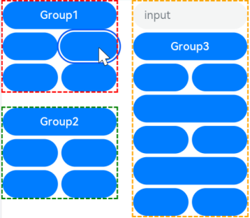
On first-time access, the focus is on the TextInput component bound to defaultFocus.
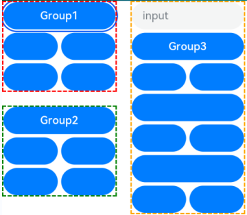
When you press the Tab key for the first time, the focus switches to the container that matches tabIndex(1) and automatically moves to the component bound to groupDefaultFocus.
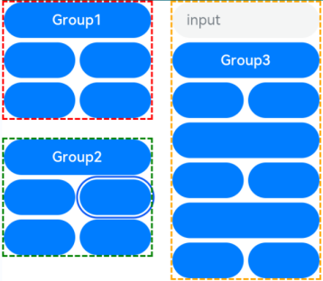
When you press the Tab key for the second time, the focus switches to the container that matches tabIndex(2) and automatically moves to the component bound to groupDefaultFocus.
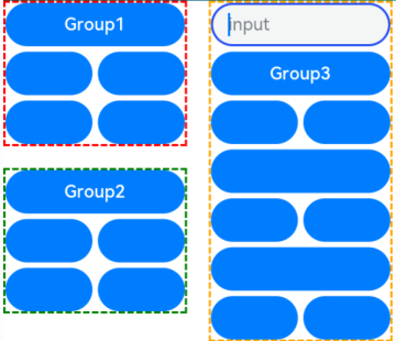
When you press the Tab key for the third time, the focus switches to the container that matches tabIndex(3) and automatically moves to the component bound to groupDefaultFocus.
Clicking the component bound to focusOnTouch sets the focus on the component and removes the focus indicator. Pressing the Tab key again displays the focus indicator.
Example 2: Setting Focus on a Specific Component
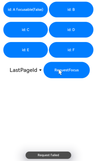
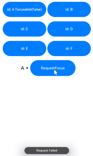
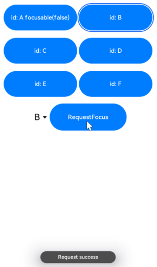
This example demonstrates how to set focus on a specific component using focusControl.requestFocus.
NOTE
To avoid confusion with focusControl instances, it is recommended that you obtain a UIContext instance using the getUIContext API, and then obtain the focusControl instance bound to the context through the getFocusController API.
// requestFocus.ets
@Entry
@Component
struct RequestFocusExample {
  @State idList: string[] = ['A', 'B', 'C', 'D', 'E', 'F', 'LastPageId']
  @State selectId: string = 'LastPageId'

  build() {
    Column({ space:20 }){
      Row({space: 5}) {
        Button("id: " + this.idList[0] + " focusable(false)")
          .width(200).height(70).fontColor(Color.White)
          .id(this.idList[0])
          .focusable(false)
        Button("id: " + this.idList[1])
          .width(200).height(70).fontColor(Color.White)
          .id(this.idList[1])
      }
      Row({space: 5}) {
        Button("id: " + this.idList[2])
          .width(200).height(70).fontColor(Color.White)
          .id(this.idList[2])
        Button("id: " + this.idList[3])
          .width(200).height(70).fontColor(Color.White)
          .id(this.idList[3])
      }
      Row({space: 5}) {
        Button("id: " + this.idList[4])
          .width(200).height(70).fontColor(Color.White)
          .id(this.idList[4])
        Button("id: " + this.idList[5])
          .width(200).height(70).fontColor(Color.White)
          .id(this.idList[5])
      }
      Row({space: 5}) {
        Select([{value: this.idList[0]},
                {value: this.idList[1]},
                {value: this.idList[2]},
                {value: this.idList[3]},
                {value: this.idList[4]},
                {value: this.idList[5]},
                {value: this.idList[6]}])
          .value(this.selectId)
          .onSelect((index: number) => {
            this.selectId = this.idList[index]
          })
        Button("RequestFocus")
          .width(200).height(70).fontColor(Color.White)
          .onClick(() => {
            // You are advised to use this.getUIContext().getFocusController().requestFocus().
            let res = focusControl.requestFocus(this.selectId)      // Move the focus to the component specified by this.selectId.
            if (res) {
              this.getUIContext().getPromptAction().showToast({message: 'Request success'})
            } else {
              this.getUIContext().getPromptAction().showToast({message: 'Request failed'})
            }
          })
      }
    }.width('100%').margin({ top:20 })
  }
}
Diagrams:
Press the Tab key to activate the focus state. Below shows how the UI behaves when you request focus for a component that does not exist.
Below shows how the UI behaves when you request focus for a component that is not focusable.
Below shows how the UI behaves when you request focus for a focusable component.
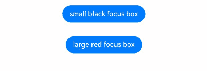
Example 3: Customizing the Focus Box Style
This example shows how to change the focus box style of a component by configuring focusBox.
import { ColorMetrics, LengthMetrics } from '@kit.ArkUI'

@Entry
@Component
struct RequestFocusExample {
  build() {
    Column({ space: 30 }) {
      Button("small black focus box")
        .focusBox({
          margin: new LengthMetrics(0),
          strokeColor: ColorMetrics.rgba(0, 0, 0),
        })
      Button("large red focus box")
        .focusBox({
          margin: LengthMetrics.px(20),
          strokeColor: ColorMetrics.rgba(255, 0, 0),
          strokeWidth: LengthMetrics.px(10)
        })
    }
    .alignItems(HorizontalAlign.Center)
    .width('100%')
  }
}
Example 4: Setting Focus Group Traversal
This example demonstrates how to set a component as the initial focus when its container gains focus by configuring focusScopePriority. Configuring focusScopeId allows the bound container component to become a focus group.
// focusTest.ets
@Entry
@Component
struct FocusableExample {
  @State inputValue: string = ''

  build() {
    Scroll() {
      Row({ space: 20 }) {
        Column({ space: 20 }) {  // Labeled as Column1.
          Column({ space: 5 }) {
            Button('Group1')
              .width(165)
              .height(40)
              .fontColor(Color.White)
            Row({ space: 5 }) {
              Button()
                .width(80)
                .height(40)
                .fontColor(Color.White)
              Button()
                .width(80)
                .height(40)
                .fontColor(Color.White)
            }
            Row({ space: 5 }) {
              Button()
                .width(80)
                .height(40)
                .fontColor(Color.White)
              Button()
                .width(80)
                .height(40)
                .fontColor(Color.White)
            }
          }.borderWidth(2).borderColor(Color.Red).borderStyle(BorderStyle.Dashed)
          Column({ space: 5 }) {
            Button('Group2')
              .width(165)
              .height(40)
              .fontColor(Color.White)
            Row({ space: 5 }) {
              Button()
                .width(80)
                .height(40)
                .fontColor(Color.White)
              Button()
                .width(80)
                .height(40)
                .fontColor(Color.White)
                .focusScopePriority('ColumnScope1', FocusPriority.PRIOR) // Focus when Column1 first gains focus.
            }
            Row({ space: 5 }) {
              Button()
                .width(80)
                .height(40)
                .fontColor(Color.White)
              Button()
                .width(80)
                .height(40)
                .fontColor(Color.White)
            }
          }.borderWidth(2).borderColor(Color.Green).borderStyle(BorderStyle.Dashed)
        }
        .focusScopeId('ColumnScope1')
        Column({ space: 5 }) {  // Labeled as Column2.
          TextInput({placeholder: 'input', text: this.inputValue})
            .onChange((value: string) => {
              this.inputValue = value
            })
            .width(156)
          Button('Group3')
            .width(165)
            .height(40)
            .fontColor(Color.White)
          Row({ space: 5 }) {
            Button()
              .width(80)
              .height(40)
              .fontColor(Color.White)
            Button()
              .width(80)
              .height(40)
              .fontColor(Color.White)
          }
          Button()
            .width(165)
            .height(40)
            .fontColor(Color.White)
            .focusScopePriority('ColumnScope2', FocusPriority.PREVIOUS)  // Focuses when Column2 first gains focus.
          Row({ space: 5 }) {
            Button()
              .width(80)
              .height(40)
              .fontColor(Color.White)
            Button()
              .width(80)
              .height(40)
              .fontColor(Color.White)
          }
          Button()
            .width(165)
            .height(40)
            .fontColor(Color.White)
          Row({ space: 5 }) {
            Button()
              .width(80)
              .height(40)
              .fontColor(Color.White)
            Button()
              .width(80)
              .height(40)
              .fontColor(Color.White)
          }
        }.borderWidth(2).borderColor(Color.Orange).borderStyle(BorderStyle.Dashed)
        .focusScopeId('ColumnScope2', true) // Column2 is a focus group.
      }.alignItems(VerticalAlign.Top)
    }
  }
}
Example 5: Setting Focus Stop
This example illustrates how to use tabStop to make the focus stop on a component during focus traversal with the Tab key.
import { ColorMetrics, LengthMetrics } from '@kit.ArkUI'

@Entry
@Component
struct TabStop {
  build() {
    Column({ space: 20 }) {
      Column({ space: 20 }) {
        Column({ space: 20 }) {
          Row({ space: 5 }) {
            Button("button 1")
              .width(200).height(70).fontColor(Color.White)
              .focusBox({
                margin: LengthMetrics.px(20),
                strokeColor: ColorMetrics.rgba(23, 169, 141),
                strokeWidth: LengthMetrics.px(10)
              })
          }
          Row({ space: 5 }) {
            Button("button 2")
              .width(200).height(70).fontColor(Color.White)
              .focusBox({
                margin: LengthMetrics.px(20),
                strokeColor: ColorMetrics.rgba(23, 169, 141),
                strokeWidth: LengthMetrics.px(10)
              })
          }
        }.width('80%').margin({ top: 30 }).borderColor(Color.Black)
      }.width('95%').margin({ top: 60 }).borderColor(Color.Black)
      Column({ space: 20 }) {
        Column({ space: 20 }) {
          Row({ space: 5 }) {
            Button("button 3")
              .width(200)
              .height('70%')
              .fontColor(Color.White)
              .focusBox({
                margin: LengthMetrics.px(20),
                strokeColor: ColorMetrics.rgba(23, 169, 141),
                strokeWidth: LengthMetrics.px(10)
              })
              .margin({ top: 15 })
          }
        }
        .width('80%')
        .height('120')
        .borderColor(Color.Black)
        .margin({ top: 10 })
        .tabStop(true)
        .focusBox({
          margin: LengthMetrics.px(20),
          strokeColor: ColorMetrics.rgba(23, 169, 141),
          strokeWidth: LengthMetrics.px(10)
        })
        .borderWidth(1)
      }.width('95%').margin({ top: 50 }).borderColor(Color.Black)
    }
  }
}
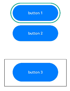
Diagrams:
Pressing Tab twice moves the focus to button2.
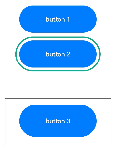
Pressing Tab again moves the focus to the component configured with tabStop.
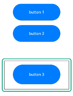
Pressing Enter moves the focus to button3.
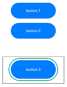
Pressing ESC again moves the focus to the component configured with tabStop.
Pressing Tab moves the focus back to button1.
Example 6: Setting Custom Focus Movement
This example demonstrates how to implement custom focus movement logic using the nextFocus API. Without nextFocus configured, the default focus navigation order using the Tab key is as follows: M -> A -> B -> C. After nextFocus is configured, the order changes to the following: M -> D -> F -> B.
class MyButtonModifier implements AttributeModifier<ButtonAttribute> {
  applyNormalAttribute(instance: ButtonAttribute): void {
    instance.id('M')
    instance.nextFocus({forward: 'D', up: 'C', down: 'D'})
  }
}

@Entry
@Component
struct Index {
  @State modifier: MyButtonModifier = new MyButtonModifier()
  @State idList: string[] = ['A', 'B', 'C', 'D', 'E', 'F']

  build() {
    Column({space: 10}) {
      Row({space: 10}) {
        Button("id: M")
          .attributeModifier(this.modifier)
        Button("id: " + this.idList[0])
          .id(this.idList[0])
          .nextFocus({forward: 'C', backward: 'M', up: 'E', right: 'F', down: 'B', left: 'D'});
        Button("id: " + this.idList[1])
          .id(this.idList[1])
      }
      Column({space: 10}) {
        Button("id: " + this.idList[2])
          .id(this.idList[2]);
        Button("id: " + this.idList[3])
          .id(this.idList[3])
          .nextFocus({forward: 'F'});
      }
      Row({space: 10}) {
        Button("id: " + this.idList[4])
          .id(this.idList[4]);
        Button("id: " + this.idList[5])
          .id(this.idList[5])
          .nextFocus({forward: 'B'});
      }
    }
  }
}

你可能感兴趣的鸿蒙文章
- 所属分类: 后端技术
- 本文标签:
热门推荐
-
2、 优质文章
-
3、 gt
-
7、 openharmony
-
9、 golang
-
10、 Vue中input框自动聚焦