harmony 鸿蒙TextArea
TextArea
The TextArea component provides multi-line text input and automatically wraps text to ensure that no line extends beyond the component’s width.
If the component does not have its height set, it adapts its height to the content. If the component does not have its width set, it stretches to fill the maximum available width.
NOTE
This component is supported since API version 7. Updates will be marked with a superscript to indicate their earliest API version.
Child Components
Not supported
APIs
TextArea(value?: TextAreaOptions)
Atomic service API: This API can be used in atomic services since API version 11.
System capability: SystemCapability.ArkUI.ArkUI.Full
Parameters
| Name | Type | Mandatory | Description |
|---|---|---|---|
| value | TextAreaOptions | No | Parameters of the TextArea component. |
TextAreaOptions
Atomic service API: This API can be used in atomic services since API version 11.
System capability: SystemCapability.ArkUI.ArkUI.Full
| Name | Type | Mandatory | Description |
|---|---|---|---|
| placeholder | ResourceStr | No | Text displayed when there is no input. When only the placeholder attribute is set, the text selection handle is still available; the caret stays at the beginning of the placeholder text when the handle is released. |
| text | ResourceStr | No | Current text input. You are advised to bind the state variable to the text in real time through the onChange event, so as to prevent display errors when the component is updated. Since API version 10, this parameter supports two-way binding through $$. Since API version 18, this parameter supports two-way binding through !!. |
| controller8+ | TextAreaController | No | Text area controller. |
Attributes
In addition to the universal attributes, the following attributes are supported.
NOTE
The default value of the universal attribute padding is as follows:
{
top: ‘8vp’,
right: ‘16vp’,
bottom: ‘8vp’,
left: ‘16vp’
}Since API version 11, .width(‘auto’) can be set for the TextArea component. Under this setting, the component auto-adapts its width to the text width, while respecting the constraintSize configuration and the maximum and minimum width restrictions received by the parent container. For details, see Size.
placeholderColor
placeholderColor(value: ResourceColor)
Sets the placeholder text color.
Atomic service API: This API can be used in atomic services since API version 11.
System capability: SystemCapability.ArkUI.ArkUI.Full
Parameters
| Name | Type | Mandatory | Description |
|---|---|---|---|
| value | ResourceColor | Yes | Placeholder text color. The default value follows the theme. |
placeholderFont
placeholderFont(value: Font)
Sets the placeholder text style, including the font size, font width, font family, and font style. The ‘HarmonyOS Sans’ font and registered custom fonts are supported.
Atomic service API: This API can be used in atomic services since API version 11.
System capability: SystemCapability.ArkUI.ArkUI.Full
Parameters
| Name | Type | Mandatory | Description |
|---|---|---|---|
| value | Font | Yes | Placeholder text style. |
textAlign
textAlign(value: TextAlign)
Sets the horizontal alignment of the text.
Available options are TextAlign.Start, TextAlign.Center, and TextAlign.End.
To set vertical alignment for the text, use the align attribute. The align attribute alone does not control the horizontal position of the text. In other words, Alignment.TopStart, Alignment.Top, and Alignment.TopEnd produce the same effect, top-aligning the text; Alignment.Start, Alignment.Center, and Alignment.End produce the same effect, centered-aligning the text vertically; Alignment.BottomStart, Alignment.Bottom, and Alignment.BottomEnd produce the same effect, bottom-aligning the text.
When textAlign is set to TextAlign.JUSTIFY, the text in the last line is horizontally aligned with the start edge.
Since API version 11, textAlign can be set to TextAlign.JUSTIFY.
Atomic service API: This API can be used in atomic services since API version 11.
System capability: SystemCapability.ArkUI.ArkUI.Full
Parameters
| Name | Type | Mandatory | Description |
|---|---|---|---|
| value | TextAlign | Yes | Horizontal alignment of the text. Default value: TextAlign.Start |
caretColor
caretColor(value: ResourceColor)
Sets the color of the caret in the text box.
Atomic service API: This API can be used in atomic services since API version 11.
System capability: SystemCapability.ArkUI.ArkUI.Full
Parameters
| Name | Type | Mandatory | Description |
|---|---|---|---|
| value | ResourceColor | Yes | Color of the caret in the text box. Default value: ’#007DFF’ |
NOTE
Since API version 12, this API can be used to set the text handle color, which is the same as the caret color.
fontColor
fontColor(value: ResourceColor)
Sets the font color.
Atomic service API: This API can be used in atomic services since API version 11.
System capability: SystemCapability.ArkUI.ArkUI.Full
Parameters
| Name | Type | Mandatory | Description |
|---|---|---|---|
| value | ResourceColor | Yes | Font color. |
fontSize
fontSize(value: Length)
Sets the text size.
Atomic service API: This API can be used in atomic services since API version 11.
System capability: SystemCapability.ArkUI.ArkUI.Full
Parameters
| Name | Type | Mandatory | Description |
|---|---|---|---|
| value | Length | Yes | Font size. If fontSize is of the number type, the unit fp is used. The default font size is 16 fp on non-wearable devices and 18 fp on wearable devices. This parameter cannot be set in percentage. |
fontStyle
fontStyle(value: FontStyle)
Sets the font style.
Atomic service API: This API can be used in atomic services since API version 11.
System capability: SystemCapability.ArkUI.ArkUI.Full
Parameters
| Name | Type | Mandatory | Description |
|---|---|---|---|
| value | FontStyle | Yes | Font style. Default value: FontStyle.Normal |
fontWeight
fontWeight(value: number|FontWeight|string)
Sets the font weight. If the value is too large, the text may be clipped depending on the font.
Atomic service API: This API can be used in atomic services since API version 11.
System capability: SystemCapability.ArkUI.ArkUI.Full
Parameters
| Name | Type | Mandatory | Description |
|---|---|---|---|
| value | number |FontWeight |string | Yes | Font weight. For the number type, the value range is [100, 900], at an interval of 100. The default value is 400. A larger value indicates a heavier font weight. For the string type, only strings that represent a number, for example, “400”, and the following enumerated values of FontWeight are supported: “bold”, “bolder”, “lighter”, “regular”, and “medium”. Default value: FontWeight.Normal |
fontFamily
fontFamily(value: ResourceStr)
Sets the font family.
Atomic service API: This API can be used in atomic services since API version 11.
System capability: SystemCapability.ArkUI.ArkUI.Full
Parameters
| Name | Type | Mandatory | Description |
|---|---|---|---|
| value | ResourceStr | Yes | Font family. Default font: ‘HarmonyOS Sans’ The ‘HarmonyOS Sans’ font and registered custom fonts are supported for applications. Only the ‘HarmonyOS Sans’ font is supported for widgets. |
inputFilter8+
inputFilter(value: ResourceStr, error?: (value: string) => void)
Sets the regular expression for input filtering. Only inputs that comply with the regular expression can be displayed. Other inputs are filtered out. The specified regular expression can match single characters, but not strings.
Atomic service API: This API can be used in atomic services since API version 11.
System capability: SystemCapability.ArkUI.ArkUI.Full
Parameters
| Name | Type | Mandatory | Description |
|---|---|---|---|
| value | ResourceStr | Yes | Regular expression. |
| error | (value: string) => void | No | Filtered-out content to return when regular expression matching fails. |
copyOption9+
copyOption(value: CopyOptions)
Sets whether copy and paste is allowed. If this attribute is set to CopyOptions.None, the text can only be pasted; all other actions, such as copying, cutting, and sharing, are disabled.
Dragging is not allowed when CopyOptions.None is set.
Atomic service API: This API can be used in atomic services since API version 11.
System capability: SystemCapability.ArkUI.ArkUI.Full
Parameters
| Name | Type | Mandatory | Description |
|---|---|---|---|
| value | CopyOptions | Yes | Whether copy and paste is allowed. Default value: CopyOptions.LocalDevice |
maxLength10+
maxLength(value: number)
Sets the maximum number of characters for text input. By default, there is no maximum number of characters. When the maximum number of characters is reached, no more characters can be entered, and the border turns red.
Atomic service API: This API can be used in atomic services since API version 11.
System capability: SystemCapability.ArkUI.ArkUI.Full
Parameters
| Name | Type | Mandatory | Description |
|---|---|---|---|
| value | number | Yes | Maximum number of characters for text input. |
showCounter10+
showCounter(value: boolean, options?: InputCounterOptions)
Sets the character counter displayed when the number of characters entered exceeds the threshold.
options can be set only when value is set to true, in which case a character counter is displayed below the text box. This attribute must be used together with maxlength. The character counter is displayed in this format: Number of characters entered/Character limit.
It is visible when the number of characters entered is greater than the character limit multiplied by the threshold percentage value. If options is not set, the text box border and character counter subscript turn red when the number of characters entered reaches the limit. If value is set to true and options is set, the text box border and character counter subscript turn red and the text box shakes when the number of characters entered reaches the limit, provided that the value of thresholdPercentage is valid. If highlightBorder is set to false, the text box border does not turn red. By default, highlightBorder is set to true. The character counter is not displayed for text boxes in inline input style.
Atomic service API: This API can be used in atomic services since API version 11.
System capability: SystemCapability.ArkUI.ArkUI.Full
Parameters
| Name | Type | Mandatory | Description |
|---|---|---|---|
| value | boolean | Yes | Whether to display the character counter. |
| options11+ | InputCounterOptions | No | Threshold percentage of the character counter. |
style10+
style(value: TextContentStyle)
Sets the polymorphic style of the text box. The inline input style is only available for the TextAreaType.Normal type.
Atomic service API: This API can be used in atomic services since API version 11.
System capability: SystemCapability.ArkUI.ArkUI.Full
Parameters
| Name | Type | Mandatory | Description |
|---|---|---|---|
| value | TextContentStyle | Yes | Polymorphic style of the text box. Default value: TextContentStyle.DEFAULT |
enableKeyboardOnFocus10+
enableKeyboardOnFocus(value: boolean)
Sets whether to bring up the keyboard when the TextArea component obtains focus in a way other than clicking.
Since API version 10, the TextArea component brings up the keyboard by default when it obtains focus.
Atomic service API: This API can be used in atomic services since API version 11.
System capability: SystemCapability.ArkUI.ArkUI.Full
Parameters
| Name | Type | Mandatory | Description |
|---|---|---|---|
| value | boolean | Yes | Whether to bring up the keyboard when the TextArea component obtains focus in a way other than clicking. Default value: true |
selectionMenuHidden10+
selectionMenuHidden(value: boolean)
Sets whether to hide the system text selection menu.
Atomic service API: This API can be used in atomic services since API version 11.
System capability: SystemCapability.ArkUI.ArkUI.Full
Parameters
| Name | Type | Mandatory | Description |
|---|---|---|---|
| value | boolean | Yes | Whether to hide the system text selection menu. true: The system text selection menu does not appear under the following circumstances: clicking the text box cursor, long-pressing the text box, double-tapping the text box, triple-tapping the text box, or right-clicking the text box. false: The system text selection menu appears under the following circumstances: clicking the text box cursor, long-pressing the text box, double-tapping the text box, triple-tapping the text box, or right-clicking the text box. Default value: false |
barState10+
barState(value: BarState)
Sets the scrollbar display mode when the text box is editable.
Atomic service API: This API can be used in atomic services since API version 11.
System capability: SystemCapability.ArkUI.ArkUI.Full
Parameters
| Name | Type | Mandatory | Description |
|---|---|---|---|
| value | BarState | Yes | Scrollbar display mode when the text box is editable. Default value: BarState.Auto |
maxLines10+
maxLines(value: number)
Sets the maximum number of lines that can be displayed. When textOverflow is set, text is truncated if the content exceeds this limit. When textOverflow is not set, in inline style, the text is scrollable if the content exceeds the limit while the text box is focused; maxLines does not apply when the text box is not focused. In non-inline style, the text is truncated according to the number of lines.
Atomic service API: This API can be used in atomic services since API version 11.
System capability: SystemCapability.ArkUI.ArkUI.Full
Parameters
| Name | Type | Mandatory | Description |
|---|---|---|---|
| value | number | Yes | Maximum number of lines that can be displayed with the inline style in the editing state or with the non-inline style. Default value: 3 with the inline style; +∞ with the non-inline style, indicating that there is no maximum number of lines Value range: (0, +∞) |
customKeyboard10+
customKeyboard(value: CustomBuilder, options?: KeyboardOptions)
Custom keyboard.
When a custom keyboard is set, activating the text box opens the specified custom component, instead of the system input method.
The custom keyboard’s height can be set through the height attribute of the custom component’s root node, and its width is fixed at the default value.
The custom keyboard is presented by overlaying the original screen, which is not compressed or lifted if avoid mode is not enabled or avoidance is not needed for the text box.
The custom keyboard cannot obtain the focus, but it blocks gesture events.
By default, the custom keyboard is closed when the input component loses the focus. You can also use the TextAreaController.stopEditing API to close the keyboard.
When a custom keyboard is set, the text box does not support camera input, even when the device supports.
When setting a custom keyboard, you can bind the onKeyPrelme event to prevent input from the physical keyboard.
Atomic service API: This API can be used in atomic services since API version 11.
System capability: SystemCapability.ArkUI.ArkUI.Full
Parameters
| Name | Type | Mandatory | Description |
|---|---|---|---|
| value | CustomBuilder | Yes | Custom keyboard. Atomic service API: This API can be used in atomic services since API version 11. |
| options12+ | KeyboardOptions | No | Whether to support keyboard avoidance. |
type11+
type(value: TextAreaType)
Sets the text box type.
Atomic service API: This API can be used in atomic services since API version 12.
System capability: SystemCapability.ArkUI.ArkUI.Full
Parameters
| Name | Type | Mandatory | Description |
|---|---|---|---|
| value | TextAreaType | Yes | Text box type. Default value: TextAreaType.Normal |
enterKeyType11+
enterKeyType(value: EnterKeyType)
Sets the type of the Enter key.
Atomic service API: This API can be used in atomic services since API version 12.
System capability: SystemCapability.ArkUI.ArkUI.Full
Parameters
| Name | Type | Mandatory | Description |
|---|---|---|---|
| value | EnterKeyType | Yes | Type of the Enter key. Default value: EnterKeyType.NEW_LINE |
enableAutoFill12+
enableAutoFill(value: boolean)
Sets whether to enable autofill.
Atomic service API: This API can be used in atomic services since API version 12.
System capability: SystemCapability.ArkUI.ArkUI.Full
Parameters
| Name | Type | Mandatory | Description |
|---|---|---|---|
| value | boolean | Yes | Whether to enable autofill. true: enable false: disable Default value: true |
contentType12+
contentType(contentType: ContentType)
Sets the content type for autofill.
Atomic service API: This API can be used in atomic services since API version 12.
System capability: SystemCapability.ArkUI.ArkUI.Full
Parameters
| Name | Type | Mandatory | Description |
|---|---|---|---|
| contentType | ContentType | Yes | Content type for autofill. |
lineHeight12+
lineHeight(value: number|string|Resource)
Sets the text line height. If the value is less than or equal to 0, the line height is not limited and the font size is adaptive. If the value is of the number type, the unit fp is used.
Atomic service API: This API can be used in atomic services since API version 12.
System capability: SystemCapability.ArkUI.ArkUI.Full
Parameters
| Name | Type | Mandatory | Description |
|---|---|---|---|
| value | number |string |Resource | Yes | Text line height. |
decoration12+
decoration(value: TextDecorationOptions)
Sets the color, type, and style of the text decorative line.
Atomic service API: This API can be used in atomic services since API version 12.
System capability: SystemCapability.ArkUI.ArkUI.Full
Parameters
| Name | Type | Mandatory | Description |
|---|---|---|---|
| value | TextDecorationOptions | Yes | Text decorative line options. Default value: { type: TextDecorationType.None, color: Color.Black, style: TextDecorationStyle.SOLID } |
letterSpacing12+
letterSpacing(value: number|string|Resource)
Sets the letter spacing for a text style. If the value specified is a percentage or 0, the default value is used. For the string type, numeric string values with optional units, for example, “10” or “10fp”, are supported.
If the value specified is a negative value, the text is compressed. A negative value too small may result in the text being compressed to 0 and no content being displayed.
Atomic service API: This API can be used in atomic services since API version 12.
System capability: SystemCapability.ArkUI.ArkUI.Full
Parameters
| Name | Type | Mandatory | Description |
|---|---|---|---|
| value | number |string |Resource | Yes | Letter spacing. Unit: fp |
fontFeature12+
fontFeature(value: string)
Sets the font feature, for example, monospaced digits.
Format: normal |<feature-tag-value>
Format of <feature-tag-value>: <string> [ <integer> |on |off ]
There can be multiple <feature-tag-value> values, which are separated by commas (,).
For example, the input format for monospaced clock fonts is “ss01” on.
Atomic service API: This API can be used in atomic services since API version 12.
System capability: SystemCapability.ArkUI.ArkUI.Full
Parameters
| Name | Type | Mandatory | Description |
|---|---|---|---|
| value | string | Yes | Font feature. |
For details about the supported font features, see Font Feature List. Font features are advanced typographic features, such as ligatures and monospace, for OpenType fonts. They are typically used in custom fonts and require the support of the font itself. For more information about the font features, see Low-level font feature settings control: the font-feature-settings property and The Complete CSS Demo for OpenType Features.
wordBreak12+
wordBreak(value: WordBreak)
Sets the word break rule. This attribute does not take effect for the placeholder text.
Atomic service API: This API can be used in atomic services since API version 12.
System capability: SystemCapability.ArkUI.ArkUI.Full
Parameters
| Name | Type | Mandatory | Description |
|---|---|---|---|
| value | WordBreak | Yes | Word break rule. Default value: WordBreak.BREAK_WORD |
NOTE
The component does not support the clip attribute. Therefore, setting this attribute does not affect text clipping.
selectedBackgroundColor12+
selectedBackgroundColor(value: ResourceColor)
Sets the background color of the selected text. If the opacity is not set, a 20% opacity will be used.
Atomic service API: This API can be used in atomic services since API version 12.
System capability: SystemCapability.ArkUI.ArkUI.Full
Parameters
| Name | Type | Mandatory | Description |
|---|---|---|---|
| value | ResourceColor | Yes | Background color of the selected text. By default, a 20% opacity is applied. |
caretStyle12+
caretStyle(value: CaretStyle)
Sets the caret style.
Atomic service API: This API can be used in atomic services since API version 12.
System capability: SystemCapability.ArkUI.ArkUI.Full
Parameters
| Name | Type | Mandatory | Description |
|---|---|---|---|
| value | CaretStyle | Yes | Caret style. |
textIndent12+
textIndent(value: Dimension)
Sets the indent of the first line text.
Atomic service API: This API can be used in atomic services since API version 12.
System capability: SystemCapability.ArkUI.ArkUI.Full
Parameters
| Name | Type | Mandatory | Description |
|---|---|---|---|
| value | Dimension | Yes | Indent of the first line text. Default value: 0 |
textOverflow12+
textOverflow(value: TextOverflow)
Sets the display mode when the text is too long.
In inline style, the effect of truncating text according to maxLines only applies when textOverflow is set.
Text is clipped at the transition between words. To clip text in the middle of a word, set wordBreak to WordBreak.BREAK_ALL.
If overflow is set to TextOverflow.None, TextOverflow.Clip, or TextOverflow.Ellipsis, this attribute must be used with maxLines for the settings to take effect. TextOverflow.None produces the same effect as TextOverflow.Clip.
Widget capability: This API can be used in ArkTS widgets.
Atomic service API: This API can be used in atomic services since API version 12.
System capability: SystemCapability.ArkUI.ArkUI.Full
Parameters
| Name | Type | Mandatory | Description |
|---|---|---|---|
| value | TextOverflow | Yes | Display mode when the text is too long. Default value: TextOverflow.Clip |
NOTE
The TextArea component does not support the TextOverflow.MARQUEE mode. If this attribute is set to TextOverflow.MARQUEE, TextOverflow.Clip is used instead.
minFontSize12+
minFontSize(value: number|string|Resource)
Sets the minimum font size. For the string type, numeric string values with optional units, for example, “10” or “10fp”, are supported.
For the setting to take effect, this attribute must be used together with maxFontSize and maxLines, or layout constraint settings.
When the adaptive font size is used, the fontSize settings do not take effect.
Atomic service API: This API can be used in atomic services since API version 12.
System capability: SystemCapability.ArkUI.ArkUI.Full
Parameters
| Name | Type | Mandatory | Description |
|---|---|---|---|
| value | number |string |Resource | Yes | Minimum font size. Unit: fp |
maxFontSize12+
maxFontSize(value: number|string|Resource)
Sets the maximum font size. For the string type, numeric string values with optional units, for example, “10” or “10fp”, are supported.
For the setting to take effect, this attribute must be used together with minFontSize and maxLines, or layout constraint settings.
When the adaptive font size is used, the fontSize settings do not take effect.
Atomic service API: This API can be used in atomic services since API version 12.
System capability: SystemCapability.ArkUI.ArkUI.Full
Parameters
| Name | Type | Mandatory | Description |
|---|---|---|---|
| value | number |string |Resource | Yes | Maximum font size. Unit: fp |
heightAdaptivePolicy12+
heightAdaptivePolicy(value: TextHeightAdaptivePolicy)
Sets how the adaptive height is determined for the text.
When this attribute is set to TextHeightAdaptivePolicy.MAX_LINES_FIRST, the maxLines attribute takes precedence for adjusting the text height. If the maxLines setting results in a layout beyond the layout constraints, the text will shrink to a font size between minFontSize and maxFontSize to allow for more content to be shown. If the text box is in inline input style, the font size in the editing state is different from that in the non-editing state.
If this attribute is set to TextHeightAdaptivePolicy.MIN_FONT_SIZE_FIRST, the minFontSize attribute takes precedence for adjusting the text height. If the text can fit in one line with the minFontSize setting, the text will enlarge to the largest possible font size between minFontSize and maxFontSize.
If this attribute is set to TextHeightAdaptivePolicy.LAYOUT_CONSTRAINT_FIRST, the layout constraints take precedence for adjusting the text height. If the resultant layout is beyond the layout constraints, the text will shrink to a font size between minFontSize and maxFontSize to respect the layout constraints.
Atomic service API: This API can be used in atomic services since API version 12.
System capability: SystemCapability.ArkUI.ArkUI.Full
Parameters
| Name | Type | Mandatory | Description |
|---|---|---|---|
| value | TextHeightAdaptivePolicy | Yes | How the adaptive height is determined for the text. Default value: TextHeightAdaptivePolicy.MAX_LINES_FIRST |
lineSpacing12+
lineSpacing(value: LengthMetrics)
Sets the line spacing of the text. If the value specified is less than or equal to 0, the default value 0 is used.
Atomic service API: This API can be used in atomic services since API version 12.
System capability: SystemCapability.ArkUI.ArkUI.Full
Parameters
| Name | Type | Mandatory | Description |
|---|---|---|---|
| value | LengthMetrics | Yes | Line spacing. Default value: 0 |
lineBreakStrategy12+
lineBreakStrategy(strategy: LineBreakStrategy)
Sets the line break rule. This attribute takes effect when wordBreak is not set to breakAll. Hyphens are not supported.
Atomic service API: This API can be used in atomic services since API version 12.
System capability: SystemCapability.ArkUI.ArkUI.Full
Parameters
| Name | Type | Mandatory | Description |
|---|---|---|---|
| strategy | LineBreakStrategy | Yes | Line break rule. Default value: LineBreakStrategy.GREEDY |
editMenuOptions12+
editMenuOptions(editMenu: EditMenuOptions)
Sets the extended options of the custom context menu on selection, including the text content, icon, and callback.
Atomic service API: This API can be used in atomic services since API version 12.
System capability: SystemCapability.ArkUI.ArkUI.Full
Parameters
| Name | Type | Mandatory | Description |
|---|---|---|---|
| editMenu | EditMenuOptions | Yes | Extended options of the custom context menu on selection. |
enablePreviewText12+
enablePreviewText(enable: boolean)
Sets whether to enable preview text.
Preview text is in a temporary state and does not support text interception. As such, it does not trigger onWillInsert, onDidInsert, onWillDelete, or onDidDelete callbacks.
Atomic service API: This API can be used in atomic services since API version 12.
System capability: SystemCapability.ArkUI.ArkUI.Full
Parameters
| Name | Type | Mandatory | Description |
|---|---|---|---|
| enable | boolean | Yes | Whether to enable preview text. Default value: true |
enableHapticFeedback13+
enableHapticFeedback(isEnabled: boolean)
Specifies whether to enable haptic feedback.
Atomic service API: This API can be used in atomic services since API version 13.
System capability: SystemCapability.ArkUI.ArkUI.Full
Parameters
| Name | Type | Mandatory | Description |
|---|---|---|---|
| isEnabled | boolean | Yes | Whether to enable haptic feedback. Default value: true |
NOTE
To enable haptic feedback, you must declare the ohos.permission.VIBRATE permission under requestPermissions in the module.json5 file of the project.
> "requestPermissions": [ > { > "name": "ohos.permission.VIBRATE", > } > ] > ``` ### keyboardAppearance<sup>15+</sup> keyboardAppearance(appearance: Optional\<KeyboardAppearance>) Sets the appearance of the keyboard when the text box is focused. **Atomic service API**: This API can be used in atomic services since API version 15. **System capability**: SystemCapability.ArkUI.ArkUI.Full **Parameters** |Name|Type|Mandatory|Description| |------|-----------------------------------------|----|------------------------------------------------------| |appearance|[Optional](ts-universal-attributes-custom-property.md#optional12)\<[KeyboardAppearance](ts-text-common.md#keyboardappearance15)>|Yes|Appearance of the keyboard.<br>Default value: **KeyboardAppearance.NONE_IMMERSIVE**| ### stopBackPress<sup>15+</sup> stopBackPress(isStopped: Optional\<boolean>) Sets whether to prevent the back button press from being propagated to other components or applications. **Atomic service API**: This API can be used in atomic services since API version 15. **System capability**: SystemCapability.ArkUI.ArkUI.Full **Parameters** |Name|Type |Mandatory|Description | |------|---------------------------------------------------|----|-----------------------------------------| |isStopped|[Optional](ts-universal-attributes-custom-property.md#optional12)\<boolean>|Yes|Whether to consume the back button press.<br>Default value: **true**| ### halfLeading<sup>18+</sup> halfLeading(halfLeading: Optional\<boolean>) Sets whether half leading is enabled. **Atomic service API**: This API can be used in atomic services since API version 18. **System capability**: SystemCapability.ArkUI.ArkUI.Full **Parameters** |Name|Type |Mandatory|Description | |------|---------------------------------------------|----|---------------------------------------------| |halfLeading|[Optional](ts-universal-attributes-custom-property.md#optional12)\<boolean>|Yes|Whether half leading is enabled.<br>Half leading is the leading split in half and applied equally to the top and bottom edges. The value **true** means that half leading is enabled, and **false** means the opposite.<br>Default value: **false**| ### minFontScale<sup>18+</sup> minFontScale(scale: Optional\<number|Resource>) Sets the minimum font scale factor for text. **Atomic service API**: This API can be used in atomic services since API version 18. **System capability**: SystemCapability.ArkUI.ArkUI.Full **Parameters** |Name|Type |Mandatory|Description | |------|---------------------------------------------|----|---------------------------------------------| |scale|[Optional](ts-universal-attributes-custom-property.md#optional12)\<number \|[Resource](https://m.seaxiang.com/blog/QdcP30)>|Yes|Minimum font scale factor for text. The **undefined** type is supported.<br>Value range: [0, 1]<br>**NOTE**<br>A value less than 0 is handled as 0. A value greater than 1 is handled as 1. Abnormal values are ineffective by default.| ### maxFontScale<sup>18+</sup> maxFontScale(scale: Optional\<number|Resource>) Sets the maximum font scale factor for text. **Atomic service API**: This API can be used in atomic services since API version 18. **System capability**: SystemCapability.ArkUI.ArkUI.Full **Parameters** |Name|Type |Mandatory|Description | |------|---------------------------------------------|----|---------------------------------------------| |scale|[Optional](ts-universal-attributes-custom-property.md#optional12)\<number \|[Resource](https://m.seaxiang.com/blog/QdcP30)>|Yes|Maximum font scale factor for text. The **undefined** type is supported.<br>Value range: [1, +∞)<br>**NOTE**<br>A value less than 1 is handled as 1. Abnormal values are ineffective by default.| ### ellipsisMode<sup>18+</sup> ellipsisMode(mode: Optional\<EllipsisMode>) Sets the ellipsis position. For the settings to work, **overflow** must be set to **TextOverflow.Ellipsis** and **maxLines** must be specified. Setting **ellipsisMode** alone does not take effect. **EllipsisMode.START** and **EllipsisMode.CENTER** take effect only when **maxLines** is set to **1**. **Atomic service API**: This API can be used in atomic services since API version 18. **System capability**: SystemCapability.ArkUI.ArkUI.Full **Parameters** |Name|Type |Mandatory|Description | |------|---------------------------------------------------|----|-----------------------------------------| |mode|[Optional](ts-universal-attributes-custom-property.md#optional12)\<[EllipsisMode](ts-appendix-enums.md#ellipsismode11)>|Yes|Ellipsis position.<br>Default value: **EllipsisMode.END**| ## Events In addition to the [universal events](ts-component-general-events.md), the following events are supported. ### onChange onChange(callback: EditableTextOnChangeCallback) Called when the input in the text box changes. In this callback, if cursor operations are performed, you need to adjust the cursor logic based on the **previewText** parameter to make sure it works seamlessly under the preview display scenario. **Atomic service API**: This API can be used in atomic services since API version 11. **System capability**: SystemCapability.ArkUI.ArkUI.Full **Parameters** |Name|Type|Mandatory|Description | |------|------|----|--------------------| |callback|[EditableTextOnChangeCallback](ts-text-common.md#editabletextonchangecallback12)|Yes|Callback invoked when the input in the text box changes.| ### onEditChange<sup>10+</sup> onEditChange(callback: (isEditing: boolean) => void) Triggered when the input status changes. The text box is in the editing state when it has the caret placed in it, and is in the non-editing state otherwise. If the value of **isEditing** is **true**, the text box is in the editing state. **Atomic service API**: This API can be used in atomic services since API version 11. **System capability**: SystemCapability.ArkUI.ArkUI.Full **Parameters** |Name |Type |Mandatory|Description | |---------|-------|----|--------------------| |isEditing|boolean|Yes|Whether the text box is in the editing state. The value **true** indicates that the text box is in the editing state.| ### onCopy<sup>8+</sup> onCopy(callback: (value: string) => void) Triggered when a copy operation is performed. **Atomic service API**: This API can be used in atomic services since API version 11. **System capability**: SystemCapability.ArkUI.ArkUI.Full **Parameters** |Name|Type|Mandatory|Description | |------|------|----|----------------| |value|string|Yes|Text that is copied.| ### onCut<sup>8+</sup> onCut(callback: (value: string) => void) Triggered when a cut operation is performed. **Atomic service API**: This API can be used in atomic services since API version 11. **System capability**: SystemCapability.ArkUI.ArkUI.Full **Parameters** |Name|Type|Mandatory|Description | |------|------|----|----------------| |value|string|Yes|Text that is cut.| ### onPaste onPaste(callback: (value: string, event: PasteEvent) => void) Triggered when a paste operation is performed. **Atomic service API**: This API can be used in atomic services since API version 11. **System capability**: SystemCapability.ArkUI.ArkUI.Full **Parameters** |Name |Type |Mandatory|Description | |-------------------|------------------------------------------------------------|----|----------------------| |value |string |Yes|Text to be pasted. | |event<sup>11+</sup>|[PasteEvent](ts-basic-components-richeditor.md#pasteevent11)|Yes|Custom paste event.| ### onTextSelectionChange<sup>10+</sup> onTextSelectionChange(callback: (selectionStart: number, selectionEnd: number) => void) Triggered when the position of the text selection changes or when the cursor position changes during the editing state. **Atomic service API**: This API can be used in atomic services since API version 11. **System capability**: SystemCapability.ArkUI.ArkUI.Full **Parameters** |Name |Type|Mandatory|Description | |--------------|------|----|---------------------------------------| |selectionStart|number|Yes|Start position of the selected text. The start position of text is **0**.| |selectionEnd |number|Yes|End position of the selected text. | ### onContentScroll<sup>10+</sup> onContentScroll(callback: (totalOffsetX: number, totalOffsetY: number) => void) Triggered when the text content is scrolled. **Atomic service API**: This API can be used in atomic services since API version 11. **System capability**: SystemCapability.ArkUI.ArkUI.Full **Parameters** |Name |Type|Mandatory|Description | |------------|------|----|----------------------------------| |totalOffsetX|number|Yes|Offset in the X coordinate of the text in the content area, in px.| |totalOffsetY|number|Yes|Offset in the Y coordinate of the text in the content area, in px.| ### onSubmit<sup>11+</sup> onSubmit(callback: (enterKey: EnterKeyType) => void) Triggered when the Enter key on the soft keyboard is pressed. **Atomic service API**: This API can be used in atomic services since API version 12. **System capability**: SystemCapability.ArkUI.ArkUI.Full **Parameters** |Name|Type |Mandatory|Description | |--------|------------------------------------------------|----|------------------------------------------------------------| |enterKey|[EnterKeyType](https://m.seaxiang.com/blog/KFt0Ne)|Yes|Type of the Enter key. If it is **EnterKeyType.NEW_LINE** and the text box is in inline input style, **onSubmit** is not triggered.| ### onSubmit<sup>14+</sup> onSubmit(callback: TextAreaSubmitCallback) Triggered when the Enter key on the soft keyboard is pressed, providing methods to maintain the editing state of the **TextArea** component upon submission. **Atomic service API**: This API can be used in atomic services since API version 14. **System capability**: SystemCapability.ArkUI.ArkUI.Full **Parameters** |Name|Type |Mandatory|Description | |------|-------|----|-----------------------------| |callback|[TextAreaSubmitCallback](#textareasubmitcallback14)|Yes|Callback triggered when the Enter key on the soft keyboard is pressed.| ### onWillInsert<sup>12+</sup> onWillInsert(callback: Callback\<InsertValue, boolean>) Triggered when text is about to be inserted. **Atomic service API**: This API can be used in atomic services since API version 12. **System capability**: SystemCapability.ArkUI.ArkUI.Full **Parameters** |Name|Type |Mandatory|Description | |------|------------------------------------------------------------|----|------------------| |callback|Callback\<[InsertValue](ts-text-common.md#insertvalue12), boolean>|Yes|Callback triggered when text is about to be inserted.<br>It returns **true** if the text is inserted; returns **false** otherwise.<br>This callback is not triggered for pre-edit or candidate word operations.<br>It is available only for system input methods.| ### onDidInsert<sup>12+</sup> onDidInsert(callback: Callback\<InsertValue>) Called when text is inserted. **Atomic service API**: This API can be used in atomic services since API version 12. **System capability**: SystemCapability.ArkUI.ArkUI.Full **Parameters** |Name|Type |Mandatory|Description | |------|------------------------------------------------------------|----|------------------| |callback|Callback\<[InsertValue](ts-text-common.md#insertvalue12)>|Yes|Callback triggered when text is inserted.<br>It is available only for system input methods.| ### onWillDelete<sup>12+</sup> onWillDelete(callback: Callback\<DeleteValue, boolean>) Triggered when text is about to be deleted. **Atomic service API**: This API can be used in atomic services since API version 12. **System capability**: SystemCapability.ArkUI.ArkUI.Full **Parameters** |Name|Type |Mandatory|Description | |------|------------------------------------------------------------|----|------------------| |callback|Callback\<[DeleteValue](ts-text-common.md#deletevalue12), boolean>|Yes|Callback triggered when text is about to be deleted.<br>It returns **true** if the text is deleted; returns **false** otherwise.<br>This callback is not called for text preview.<br>It is available only for system input methods.| ### onDidDelete<sup>12+</sup> onDidDelete(callback: Callback\<DeleteValue>) Triggered when text is deleted. **Atomic service API**: This API can be used in atomic services since API version 12. **System capability**: SystemCapability.ArkUI.ArkUI.Full **Parameters** |Name|Type |Mandatory|Description | |------|------------------------------------------------------------|----|------------------| |callback|Callback\<[DeleteValue](ts-text-common.md#deletevalue12)>|Yes|Callback triggered when text is deleted.<br>It is available only for system input methods.| ### onWillChange<sup>15+</sup> onWillChange(callback: Callback\<EditableTextChangeValue, boolean>) Called when the text content is about to change. This callback is triggered after **onWillInsert** and **onWillDelete**, but before **onDidInsert** and **onDidDelete**. **Atomic service API**: This API can be used in atomic services since API version 15. **System capability**: SystemCapability.ArkUI.ArkUI.Full **Parameters** |Name|Type |Mandatory|Description | |------|------------------------------------------------------------|----|------------------| |callback|Callback\<[EditableTextChangeValue](ts-text-common.md#editabletextchangevalue15), boolean>|Yes|Callback triggered when the text content is about to change.<br>Returning **true** allows the change to proceed, while returning **false** cancels the change.| ## TextAreaController<sup>8+</sup> Inherits from [TextContentControllerBase](ts-types.md#textcontentcontrollerbase10). **Atomic service API**: This API can be used in atomic services since API version 11. **System capability**: SystemCapability.ArkUI.ArkUI.Full ### Objects to Importcontroller: TextAreaController = new TextAreaController()
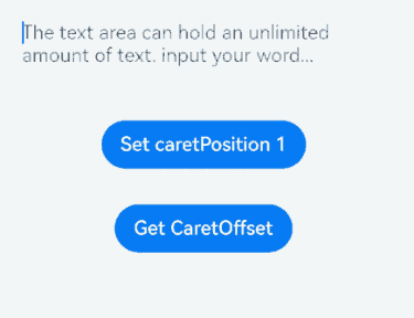
### constructor<sup>8+</sup>

constructor()

A constructor used to create a **TextAreaController** object.

**Atomic service API**: This API can be used in atomic services since API version 11.

**System capability**: SystemCapability.ArkUI.ArkUI.Full

### caretPosition<sup>8+</sup>

caretPosition(value: number): void

Sets the position of the caret.

**Atomic service API**: This API can be used in atomic services since API version 11.

**System capability**: SystemCapability.ArkUI.ArkUI.Full

**Parameters**

|Name|Type|Mandatory|Description|
|------|----|----|----|
|value|number |Yes|Length from the start of the string to the position where the caret is located.|

### setTextSelection<sup>10+</sup>

setTextSelection(selectionStart: number, selectionEnd: number, options?: SelectionOptions): void

Sets the text selection range and highlights the selected text when the component is focused. This API works only when the value of **selectionStart** is less than that of **selectionEnd**.

**Atomic service API**: This API can be used in atomic services since API version 11.

**System capability**: SystemCapability.ArkUI.ArkUI.Full

**Parameters**

|Name|Type|Mandatory|Description|
|------|----|----|----|
|selectionStart|number |Yes|Start position of the text selection range. The start position of text in the text box is 0.<br>A value less than 0 is handled as **0**. A value greater than the maximum text length is handled as the maximum text length.<br>**Atomic service API**: This API can be used in atomic services since API version 11.|
|selectionEnd |number |Yes|End position of the text selection range.<br>A value less than 0 is handled as the value **0**. A value greater than the maximum text length is handled as the maximum text length.<br>**Atomic service API**: This API can be used in atomic services since API version 11.|
|options<sup>12+</sup> |[SelectionOptions](ts-types.md#selectionoptions12)|No |Configuration options for text selection.<br>Default value: **MenuPolicy.DEFAULT**<br>**Atomic service API**: This API can be used in atomic services since API version 12.|

>  **NOTE**
>
>  If **selectionMenuHidden** is set to **true** or a 2-in-1 device is used, calling **setTextSelection** does not display the context menu even when **options** is set to **MenuPolicy.SHOW**.
>
>  If the selected text contains an emoji, the emoji is selected when its start position is within the text selection range.

### stopEditing<sup>10+</sup>

stopEditing(): void

Exits the editing state.

**Atomic service API**: This API can be used in atomic services since API version 11.

**System capability**: SystemCapability.ArkUI.ArkUI.Full

## TextAreaType<sup>11+</sup>

**Atomic service API**: This API can be used in atomic services since API version 12.

**System capability**: SystemCapability.ArkUI.ArkUI.Full

|Name|Value|Description|
|------|-----|------|
|NORMAL |0|Normal input mode.<br>The value can contain digits, letters, underscores (_), spaces, and special characters.|
|NUMBER |2|Digit input mode.   |
|PHONE_NUMBER|3|Phone number input mode.<br>In this mode, the following are allowed: digits, spaces, plus signs (+), hyphens (-), asterisks (*), and number signs (#); the length is not limited.|
|EMAIL  |5|Email address input mode.<br>This mode accepts only digits, letters, underscores (_), dots (.), and the following special characters: ! # $ % & ' * + - / = ? ^ ` \{ \|\} ~ @ (which can only appear once)|
|NUMBER_DECIMAL<sup>12+</sup>|12|Number input mode with a decimal point.<br>The value can contain digits and one decimal point.|
|URL<sup>12+</sup>|13|URL input mode.|

## TextAreaSubmitCallback<sup>14+</sup>

type TextAreaSubmitCallback = (enterKeyType: EnterKeyType, event?: SubmitEvent) => void

Represents the callback invoked when the Enter key on the soft keyboard is pressed.

**Atomic service API**: This API can be used in atomic services since API version 14.

**System capability**: SystemCapability.ArkUI.ArkUI.Full

**Parameters**

|Name|Type                                                      |Mandatory|Description                                                  |
|--------|------------------------------------------------------------|----|--------------------------------------------------------|
|enterKeyType|[EnterKeyType](https://m.seaxiang.com/blog/KFt0Ne)           |Yes|Type of the Enter key.<br>If the type is **EnterKeyType.NEW_LINE**, **onSubmit** is not triggered.|
|event  |[SubmitEvent](ts-basic-components-textinput.md#submitevent11)|No|Submit event.      |

## Example

### Example 1: Setting and Obtaining the Cursor Position

This example demonstrates how to use the controller to set and obtain the cursor position within a text box.

```ts
// xxx.ets
@Entry
@Component
struct TextAreaExample {
  @State text: string = ''
  @State positionInfo: CaretOffset = { index: 0, x: 0, y: 0 }
  controller: TextAreaController = new TextAreaController()

  build() {
    Column() {
      TextArea({
        text: this.text,
        placeholder: 'The text area can hold an unlimited amount of text. input your word...',
        controller: this.controller
      })
        .placeholderFont({ size: 16, weight: 400 })
        .width(336)
        .height(56)
        .margin(20)
        .fontSize(16)
        .fontColor('#182431')
        .backgroundColor('#FFFFFF')
        .onChange((value: string) => {
          this.text = value
        })
      Text(this.text)
      Button('Set caretPosition 1')
        .backgroundColor('#007DFF')
        .margin(15)
        .onClick(() => {
          // Move the caret to after the first entered character.
          this.controller.caretPosition(1)
        })
      Button('Get CaretOffset')
        .backgroundColor('#007DFF')
        .margin(15)
        .onClick(() => {
          this.positionInfo = this.controller.getCaretOffset()
        })
    }.width('100%').height('100%').backgroundColor('#F1F3F5')
  }
}
Example 2: Implementing a Counter
This example showcases the implementation of a counter feature using the maxLength and showCounter attributes.
// xxx.ets
@Entry
@Component
struct TextAreaExample {
  @State text: string = ''
  controller: TextAreaController = new TextAreaController()

  build() {
    Column() {
      TextArea({
        text: this.text,
        placeholder: 'The text area can hold an unlimited amount of text. input your word...',
        controller: this.controller
      })
        .placeholderFont({ size: 16, weight: 400 })
        .width(336)
        .height(56)
        .margin(20)
        .fontSize(16)
        .fontColor('#182431')
        .backgroundColor('#FFFFFF')
        .maxLength(4)
        .showCounter(true, { thresholdPercentage: 50, highlightBorder: true })
          // The character counter is in this format: Number of characters that have been entered/Maximum number of characters allowed, which is specified by maxLength().
          // The character counter is displayed when the number of characters that have been entered is greater than the maximum number of characters multiplied by 50% (threshold percentage).
          // When highlightBorder is set to false, the text box border turns red when the number of entered characters reaches the maximum. The default value is true.
        .onChange((value: string) => {
          this.text = value
        })
    }.width('100%').height('100%').backgroundColor('#F1F3F5')
  }
}

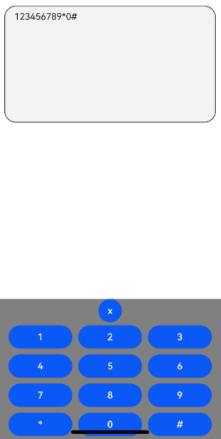
Example 3: Implementing a Custom Keyboard
This example demonstrates how to implement a custom keyboard using the customKeyboard attribute.
// xxx.ets
@Entry
@Component
struct TextAreaExample {
  controller: TextAreaController = new TextAreaController()
  @State inputValue: string = ""

  // Create a custom keyboard component.
  @Builder CustomKeyboardBuilder() {
    Column() {
      Button('x').onClick(() => {
        // Disable the custom keyboard.
        this.controller.stopEditing()
      })
      Grid() {
        ForEach([1, 2, 3, 4, 5, 6, 7, 8, 9, '*', 0, '#'], (item: number|string) => {
          GridItem() {
            Button(item + "")
              .width(110).onClick(() => {
              this.inputValue += item
            })
          }
        })
      }.maxCount(3).columnsGap(10).rowsGap(10).padding(5)
    }.backgroundColor(Color.Gray)
  }

  build() {
    Column() {
      TextArea({ controller: this.controller, text: this.inputValue})
        // Bind the custom keyboard.
        .customKeyboard(this.CustomKeyboardBuilder()).margin(10).border({ width: 1 })
        .height(200)
    }
  }
}
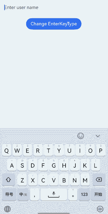
Example 4: Setting the Enter Key Type
This example shows how to use the enterKeyType attribute to dynamically change the effect of the Enter key on the soft keyboard.
// xxx.ets
@Entry
@Component
struct TextAreaExample {
  @State text: string = ''
  @State enterTypes: Array<EnterKeyType> =
    [EnterKeyType.Go, EnterKeyType.Search, EnterKeyType.Send, EnterKeyType.Done, EnterKeyType.Next,
      EnterKeyType.PREVIOUS, EnterKeyType.NEW_LINE]
  @State index: number = 0

  build() {
    Column({ space: 20 }) {
      TextArea({ placeholder: 'Enter user name', text: this.text })
        .width(380)
        .enterKeyType(this.enterTypes[this.index])
        .onChange((value: string) => {
          this.text = value
        })
        .onSubmit((enterKey: EnterKeyType) => {
          console.log("trigger area onsubmit" + enterKey);
        })
      Button('Change EnterKeyType').onClick(() => {
        this.index = (this.index + 1) % this.enterTypes.length;
      })

    }.width('100%')
  }
}
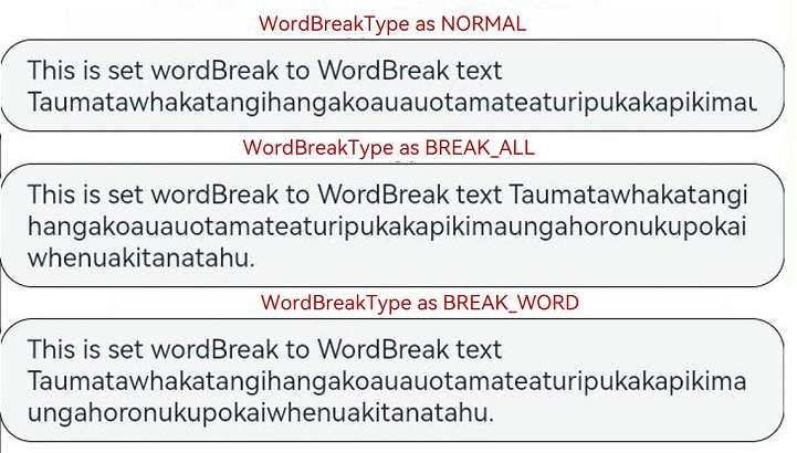
Example 5: Setting Text Wrapping Rules
This example demonstrates the effects of different text wrapping rules using the wordBreak attribute.
// xxx.ets
@Entry
@Component
struct TextAreaExample {
  build() {
    Column() {
      Text("WordBreakType as NORMAL: ").fontSize(16).fontColor(0xFF0000)
      TextArea({
        text: 'This is set wordBreak to WordBreak text Taumatawhakatangihangakoauauotamateaturipukakapikimaungahoronukupokaiwhenuakitanatahu.'
      })
        .fontSize(16)
        .border({ width: 1 })
        .wordBreak(WordBreak.NORMAL)
      Text("WordBreakType as BREAK_ALL: ").fontSize(16).fontColor(0xFF0000)
      TextArea({
        text: 'This is set wordBreak to WordBreak text Taumatawhakatangihangakoauauotamateaturipukakapikimaungahoronukupokaiwhenuakitanatahu.'
      })
        .fontSize(16)
        .border({ width: 1 })
        .wordBreak(WordBreak.BREAK_ALL)
      Text("WordBreakType as BREAK_ALL: ").fontSize(16).fontColor(0xFF0000)
      TextArea({
        text: 'The TextArea component automatically wraps text so that each line does not have more than the width of the component.\nIf the component does not have its height set, it adapts its height to the content. If the component does not have its width set, it takes the maximum available width.'
      })
        .fontSize(16)
        .border({ width: 1 })
        .wordBreak(WordBreak.BREAK_ALL)
      Text("WordBreakType as BREAK_WORD: ").fontSize(16).fontColor(0xFF0000)
      TextArea({
        text: 'This is set wordBreak to WordBreak text Taumatawhakatangihangakoauauotamateaturipukakapikimaungahoronukupokaiwhenuakitanatahu.'
      })
        .fontSize(16)
        .border({ width: 1 })
        .wordBreak(WordBreak.BREAK_WORD)
    }
  }
}
Example 6: Setting the Text Style
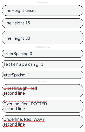
This example showcases various text styles by using the lineHeight, letterSpacing, and decoration attributes.
// xxx.ets
@Entry
@Component
struct TextAreaExample {
  build() {
    Row() {
      Column() {
        Text('lineHeight').fontSize(9).fontColor(0xCCCCCC)
        TextArea({ text: 'lineHeight unset' })
          .border({ width: 1 }).padding(10).margin(5)
        TextArea({ text: 'lineHeight 15' })
          .border({ width: 1 }).padding(10).margin(5).lineHeight(15)
        TextArea({ text: 'lineHeight 30' })
          .border({ width: 1 }).padding(10).margin(5).lineHeight(30)

        Text('letterSpacing').fontSize(9).fontColor(0xCCCCCC)
        TextArea({ text: 'letterSpacing 0' })
          .border({ width: 1 }).padding(5).margin(5).letterSpacing(0)
        TextArea({ text: 'letterSpacing 3' })
          .border({ width: 1 }).padding(5).margin(5).letterSpacing(3)
        TextArea({ text: 'letterSpacing -1' })
          .border({ width: 1 }).padding(5).margin(5).letterSpacing(-1)

        Text('decoration').fontSize(9).fontColor(0xCCCCCC)
        TextArea({ text: 'LineThrough, Red\nsecond line' })
          .border({ width: 1 }).padding(5).margin(5)
          .decoration({ type: TextDecorationType.LineThrough, color: Color.Red })
        TextArea({ text: 'Overline, Red, DOTTED\nsecond line' })
          .border({ width: 1 }).padding(5).margin(5)
          .decoration({ type: TextDecorationType.Overline, color: Color.Red, style: TextDecorationStyle.DOTTED })
        TextArea({ text: 'Underline, Red, WAVY\nsecond line' })
          .border({ width: 1 }).padding(5).margin(5)
          .decoration({ type: TextDecorationType.Underline, color: Color.Red, style: TextDecorationStyle.WAVY })
      }.height('90%')
    }
    .width('90%')
    .margin(10)
  }
}
Example 7: Setting Text Feature Effects
This example demonstrates how to use the fontFeature attribute to display text with various typographic features.
// xxx.ets
@Entry
@Component
struct TextAreaExample {
  @State text1: string = 'This is ss01 on : 0123456789'
  @State text2: string = 'This is ss01 off: 0123456789'

  build() {
    Column() {
      TextArea({ text: this.text1 })
        .fontSize(20)
        .margin({ top: 200 })
        .fontFeature("\"ss01\" on")
      TextArea({ text: this.text2 })
        .margin({ top: 10 })
        .fontSize(20)
        .fontFeature("\"ss01\" off")
    }
    .width("90%")
    .margin("5%")
  }
}

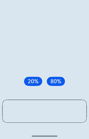
Example 8: Setting Custom Keyboard Avoidance
This example illustrates the implementation of a custom keyboard that automatically adjusts its position to avoid covering the text box.
// xxx.ets
@Entry
@Component
struct TextAreaExample {
  controller: TextAreaController = new TextAreaController()
  @State inputValue: string = ""
  @State height1: string|number = '80%'
  @State height2: number = 100
  @State supportAvoidance: boolean = true;

  // Create a custom keyboard component.
  @Builder
  CustomKeyboardBuilder() {
    Column() {
      Row() {
        Button('x').onClick(() => {
          // Disable the custom keyboard.
          this.controller.stopEditing()
        }).margin(10)
      }

      Grid() {
        ForEach([1, 2, 3, 4, 5, 6, 7, 8, 9, '*', 0, '#'], (item: number|string) => {
          GridItem() {
            Button(item + "")
              .width(110).onClick(() => {
              this.inputValue += item
            })
          }
        })
      }.maxCount(3).columnsGap(10).rowsGap(10).padding(5)
    }.backgroundColor(Color.Gray)
  }

  build() {
    Column() {
      Row() {
        Button("20%")
          .fontSize(24)
          .onClick(() => {
            this.height1 = "20%"
          })
        Button("80%")
          .fontSize(24)
          .margin({ left: 20 })
          .onClick(() => {
            this.height1 = "80%"
          })
      }
      .justifyContent(FlexAlign.Center)
      .alignItems(VerticalAlign.Bottom)
      .height(this.height1)
      .width("100%")
      .padding({ bottom: 50 })

      TextArea({ controller: this.controller, text: this.inputValue })
        .height(100)
        .customKeyboard(this.CustomKeyboardBuilder(), { supportAvoidance: this.supportAvoidance })// Bind a custom keyboard.
        .margin(10)
        .border({ width: 1 })
    }
  }
}
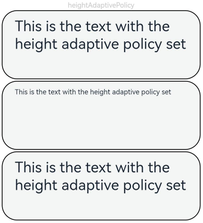
Example 9: Setting Text Auto-Adaptation
This example showcases the implementation of text auto-adaptation features using the minFontSize, maxFontSize, and heightAdaptivePolicy attributes.
// xxx.ets
@Entry
@Component
struct TextAreaExample {
  build() {
    Row() {
      Column() {
        Text('heightAdaptivePolicy').fontSize(9).fontColor(0xCCCCCC)
        TextArea({text: 'This is the text with the height adaptive policy set'})
          .width('80%').height(90).borderWidth(1).margin(1)
          .minFontSize(4)
          .maxFontSize(40)
          .maxLines(3)
          .heightAdaptivePolicy(TextHeightAdaptivePolicy.MAX_LINES_FIRST)
        TextArea({text: 'This is the text with the height adaptive policy set'})
          .width('80%').height(90).borderWidth(1).margin(1)
          .minFontSize(4)
          .maxFontSize(40)
          .maxLines(3)
          .heightAdaptivePolicy(TextHeightAdaptivePolicy.MIN_FONT_SIZE_FIRST)
        TextArea({text: 'This is the text with the height adaptive policy set'})
          .width('80%').height(90).borderWidth(1).margin(1)
          .minFontSize(4)
          .maxFontSize(40)
          .maxLines(3)
          .heightAdaptivePolicy(TextHeightAdaptivePolicy.LAYOUT_CONSTRAINT_FIRST)
      }.height('90%')
    }
    .width('90%')
    .margin(10)
  }
}
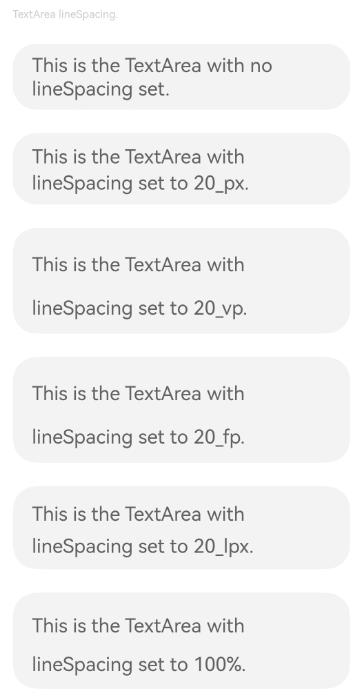
Example 10: Setting the Text Line Spacing
This example demonstrates how to use the lineSpacing attribute to set different line spacing values for text presentation.
// xxx.ets
import { LengthMetrics } from '@kit.ArkUI'

@Entry
@Component
struct TextAreaExample {
  build() {
    Flex({ direction: FlexDirection.Column, alignItems: ItemAlign.Start, justifyContent: FlexAlign.SpaceBetween }) {
      Text('TextArea lineSpacing.').fontSize(9).fontColor(0xCCCCCC)
      TextArea({ text: 'This is the TextArea with no lineSpacing set.' })
        .fontSize(12)
      TextArea({ text: 'This is the TextArea with lineSpacing set to 20_px.' })
        .fontSize(12)
        .lineSpacing(LengthMetrics.px(20))
      TextArea({ text: 'This is the TextArea with lineSpacing set to 20_vp.' })
        .fontSize(12)
        .lineSpacing(LengthMetrics.vp(20))
      TextArea({ text: 'This is the TextArea with lineSpacing set to 20_fp.' })
        .fontSize(12)
        .lineSpacing(LengthMetrics.fp(20))
      TextArea({ text: 'This is the TextArea with lineSpacing set to 20_lpx.' })
        .fontSize(12)
        .lineSpacing(LengthMetrics.lpx(20))
      TextArea({ text: 'This is the TextArea with lineSpacing set to 100%.' })
        .fontSize(12)
        .lineSpacing(LengthMetrics.percent(1))
    }.height(600).width(350).padding({ left: 35, right: 35, top: 35 })
  }
}
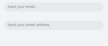
Example 11: Setting Autofill
This example illustrates how to implement the autofill feature for text input using the contentType and enableAutoFill attributes.
// xxx.ets
@Entry
@Component
struct TextAreaExample {
  @State text: string = ''

  build() {
    Column() {
      // Email address autofill.
      TextArea({ placeholder: 'input your email...' })
        .width('95%')
        .height(40)
        .margin(20)
        .contentType(ContentType.EMAIL_ADDRESS)
        .enableAutoFill(true)
        .maxLength(20)
      // Full street address autofill.
      TextArea({ placeholder: 'input your street address...' })
        .width('95%')
        .height(40)
        .margin(20)
        .contentType(ContentType.FULL_STREET_ADDRESS)
        .enableAutoFill(true)
        .maxLength(20)
    }.width('100%').height('100%').backgroundColor('#F1F3F5')
  }
}
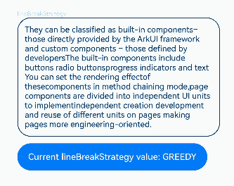
Example 12: Setting Line Break Rules
This example demonstrates the effects of different line break rules using the wordBreak attribute.
// xxx.ets
@Entry
@Component
struct TextAreaExample {
  @State message1: string =
    "They can be classified as built-in components–those directly provided by the ArkUI framework and custom components – those defined by developers" +
      "The built-in components include buttons radio buttonsprogress indicators and text You can set the rendering effectof thesecomponents in method chaining mode," +
      "page components are divided into independent UI units to implementindependent creation development and reuse of different units on pages making pages more engineering-oriented."
  @State lineBreakStrategyIndex: number = 0
  @State lineBreakStrategy: LineBreakStrategy[] =
    [LineBreakStrategy.GREEDY, LineBreakStrategy.HIGH_QUALITY, LineBreakStrategy.BALANCED]
  @State lineBreakStrategyStr: string[] = ['GREEDY', 'HIGH_QUALITY', 'BALANCED']

  build() {
    Flex({ direction: FlexDirection.Column, alignItems: ItemAlign.Start }) {
      Text('lineBreakStrategy').fontSize(9).fontColor(0xCCCCCC)
      TextArea({ text: this.message1 })
        .fontSize(12)
        .border({ width: 1 })
        .padding(10)
        .width('100%')
        .lineBreakStrategy(this.lineBreakStrategy[this.lineBreakStrategyIndex])
      Row() {
        Button('Current lineBreakStrategy value: ' + this.lineBreakStrategyStr[this.lineBreakStrategyIndex]).onClick(() => {
          this.lineBreakStrategyIndex++
          if (this.lineBreakStrategyIndex > (this.lineBreakStrategyStr.length - 1)) {
            this.lineBreakStrategyIndex = 0
          }
        })
      }.padding({ top: 10 })
    }.height(700).width(370).padding({ left: 35, right: 35, top: 35 })
  }
}
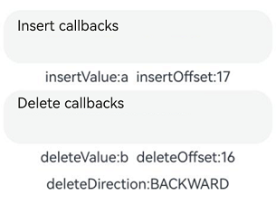
Example 13: Setting Insert and Delete Callbacks
This example showcases the implementation of insert and delete operations using the onWillInsert, onDidInsert, onWillDelete, and onDidDelete APIs.
// xxx.ets
@Entry
@Component
struct TextAreaExample {
  @State insertValue: string = ""
  @State deleteValue: string = ""
  @State insertOffset: number = 0
  @State deleteOffset: number = 0
  @State deleteDirection: number = 0

  build() {
    Row() {
      Column() {
        TextArea({ text: "Insert callbacks" })
          .width(300)
          .height(60)
          .onWillInsert((info: InsertValue) => {
            this.insertValue = info.insertValue
            return true;
          })
          .onDidInsert((info: InsertValue) => {
            this.insertOffset = info.insertOffset
          })

        Text("insertValue:" + this.insertValue + "  insertOffset:" + this.insertOffset).height(30)

        TextArea({ text: "Delete callbacks" })
          .width(300)
          .height(60)
          .onWillDelete((info: DeleteValue) => {
            this.deleteValue = info.deleteValue
            info.direction
            return true;
          })
          .onDidDelete((info: DeleteValue) => {
            this.deleteOffset = info.deleteOffset
            this.deleteDirection = info.direction
          })

        Text("deleteValue:" + this.deleteValue + "  deleteOffset:" + this.deleteOffset).height(30)
        Text("deleteDirection:" + (this.deleteDirection == 0 ? "BACKWARD" : "FORWARD")).height(30)

      }.width('100%')
    }
    .height('100%')
  }
}
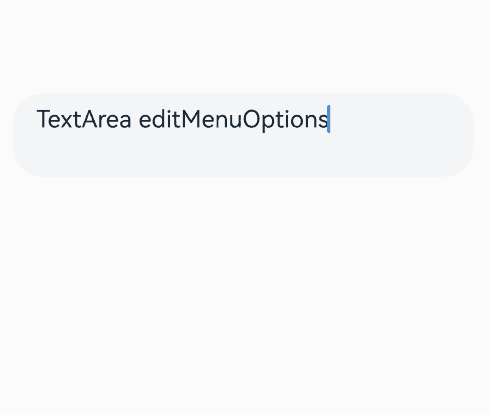
Example 14: Setting Custom Menu Extensions
This example demonstrates how to use the editMenuOptions API to create custom menu extensions for text settings. It includes customizing text content, icons, and callbacks for these extensions.
// xxx.ets
@Entry
@Component
struct TextAreaExample {
  @State text: string = 'TextArea editMenuOptions'
  onCreateMenu = (menuItems: Array<TextMenuItem>) => {
    let item1: TextMenuItem = {
      content: 'Custom 1',
      icon: $r('app.media.startIcon'),
      id: TextMenuItemId.of('Custom 1'),
    }
    let item2: TextMenuItem = {
      content: 'Custom 2',
      id: TextMenuItemId.of('Custom 2'),
      icon: $r('app.media.startIcon'),
    }
    menuItems.push(item1)
    menuItems.unshift(item2)
    return menuItems
  }
  onMenuItemClick = (menuItem: TextMenuItem, textRange: TextRange) => {
    if (menuItem.id.equals(TextMenuItemId.of("custom2"))) {
      console.log("Intercept id: custom2 start:" + textRange.start + "; end:" + textRange.end)
      return true
    }
    if (menuItem.id.equals(TextMenuItemId.COPY)) {
      console.log("Intercept COPY start:" + textRange.start + "; end:" + textRange.end)
      return true
    }
    if (menuItem.id.equals(TextMenuItemId.SELECT_ALL)) {
      console.log("Do not intercept SELECT_ALL start:" + textRange.start + "; end:" + textRange.end)
      return false
    }
    return false
  }
  @State editMenuOptions: EditMenuOptions = {
    onCreateMenu: this.onCreateMenu, onMenuItemClick: this.onMenuItemClick
  }

  build() {
    Column() {
      TextArea({ text: this.text })
        .width('95%')
        .height(56)
        .editMenuOptions(this.editMenuOptions)
        .margin({ top: 100 })
    }
    .width("90%")
    .margin("5%")
  }
}
Example 15: Setting Text Overflow
This example demonstrates how to use textOverflow, ellipsisMode, and maxlines to display excess content with an ellipsis (…) when the text is too long.
// xxx.ets
@Entry
@Component
struct EllipsisModeExample {
  @State textIndex: number = 0
  @State text: string = "As the sun begins to set, casting a warm golden hue across the sky," +
    "the world seems to slow down and breathe a sigh of relief. The sky is painted with hues of orange, " +
    " pink, and lavender, creating a breath taking tapestry that stretches as far as the eye can see." +
    "The air is filled with the sweet scent of blooming flowers, mingling with the earthy aroma of freshly turned soil."
  @State ellipsisModeIndex: number = 0
  @State ellipsisMode: (EllipsisMode|undefined|null)[] =
    [EllipsisMode.START, EllipsisMode.END, EllipsisMode.CENTER, undefined, null]
  @State ellipsisModeStr: string[] = ['START ', 'END', 'CENTER', 'undefined', 'null']
  @State textOverflowIndex: number = 0
  @State textOverflow: TextOverflow[] = [TextOverflow.Ellipsis, TextOverflow.Clip]
  @State textOverflowStr: string[] = ['Ellipsis', 'Clip']
  @State maxLinesIndex: number = 0
  @State maxLines: number[] = [1, 2, 3]
  @State maxLinesStr: string[] = ['1', '2', '3']
  @State styleAreaIndex: number = 0
  @State styleArea: TextContentStyle[] = [TextContentStyle.INLINE, TextContentStyle.DEFAULT]
  @State styleAreaStr: string[] = ['Inline', 'Default']

  build() {
    Column() {
      TextArea({ text: this.text })
        .textOverflow(this.textOverflow[this.textOverflowIndex])
        .ellipsisMode(this.ellipsisMode[this.ellipsisModeIndex])
        .maxLines(this.maxLines[this.maxLinesIndex])
        .style(this.styleArea[this.styleAreaIndex])
        .fontSize(30)
        .margin(30)

      Button('ellipsisMode Value: ' + this.ellipsisModeStr[this.ellipsisModeIndex]).onClick(() => {
        this.ellipsisModeIndex++
        if (this.ellipsisModeIndex > (this.ellipsisModeStr.length - 1)) {
          this.ellipsisModeIndex = 0
        }
      }).fontSize(20)
      Button('textOverflow Value: ' + this.textOverflowStr[this.textOverflowIndex]).onClick(() => {
        this.textOverflowIndex++
        if (this.textOverflowIndex > (this.textOverflowStr.length - 1)) {
          this.textOverflowIndex = 0
        }
      }).fontSize(20)
      Button('maxLines Value: ' + this.maxLinesStr[this.maxLinesIndex]).onClick(() => {
        this.maxLinesIndex++
        if (this.maxLinesIndex > (this.maxLinesStr.length - 1)) {
          this.maxLinesIndex = 0
        }
      }).fontSize(20)
      Button('Style Value: ' + this.styleAreaStr[this.styleAreaIndex]).onClick(() => {

        this.styleAreaIndex++
        if (this.styleAreaIndex > (this.styleAreaStr.length - 1)) {
          this.styleAreaIndex = 0
        }
      }).fontSize(20)
    }.height(600).width('100%').padding({ left: 35, right: 35, top: 35 })
  }
}

Example 16: Implementing Custom Copy, Cut, and Paste Behavior
This example demonstrates how to listen for the copy, cut, and paste buttons in the text selection menu, how to disable the system paste functionality, and how to implement custom paste behavior.
// xxx.ets
@Entry
@Component
struct TextAreaExample {
  @State text: string = ''
  controller: TextAreaController = new TextAreaController()

  build() {
    Column() {
      TextArea({
        text: this.text,
        placeholder: 'placeholder',
        controller: this.controller
      })
        .placeholderColor(Color.Red)
        .textAlign(TextAlign.Center)
        .caretColor(Color.Green)
        .caretStyle({ width: '2vp' })
        .fontStyle(FontStyle.Italic)
        .fontWeight(FontWeight.Bold)
        .fontFamily('HarmonyOS Sans')
        .inputFilter('[a-zA-Z]+', (value) => { // Only alphabetic input is allowed.
          console.error(`unsupport char ${value}`)
        })
        .copyOption(CopyOptions.LocalDevice)
        .enableKeyboardOnFocus(false)
        .selectionMenuHidden(false)
        .barState(BarState.On)
        .type(TextAreaType.NORMAL)
        .selectedBackgroundColor(Color.Orange)
        .textIndent(2)
        .halfLeading(true)
        .minFontScale(1)
        .maxFontScale(2)
        .enablePreviewText(true)
        .enableHapticFeedback(true)
        .stopBackPress(false)// Delegate back press to other components.
        .width(336)
        .height(56)
        .margin(20)
        .fontSize(16)
        .onEditChange((isEditing: boolean) => {
          console.log(`isEditing ${isEditing}`)
        })
        .onCopy((value) => {
          console.log(`copy ${value}`)
        })
        .onCut((value) => {
          console.log(`cut ${value}`)
        })
        .onPaste((value, event) => {
          // Prevent the default system paste behavior and implement custom logic.
          if (event.preventDefault) {
            event.preventDefault()
          }
          console.log(`paste:${value}`)
          this.text = value
        })
        .onTextSelectionChange((start: number, end: number) => {
          console.log(`onTextSelectionChange start ${start}, end ${end}`)
        })
        .onContentScroll((totalOffsetX: number, totalOffsetY: number) => {
          console.log(`onContentScroll offsetX ${totalOffsetX}, offsetY ${totalOffsetY}`)
        })
    }.width('100%').height('100%').backgroundColor('#F1F3F5')
  }
}

Example 17: Setting the Minimum and Maximum Font Scale Factor
This example demonstrates how to set the minimum and maximum font scale factor using minFontScale and maxFontScale.
import { abilityManager, Configuration } from '@kit.AbilityKit';
import { BusinessError } from '@kit.BasicServicesKit';

// xxx.ets
@Entry
@Component
export struct TextAreaExample11 {
  @State minFontScale: number = 0.85;
  @State maxFontScale: number = 2;
  @State changeValue: string = 'abcde';

  build() {
    Column() {
      Column({ space: 30 }) {
        Text("System font size changes: small and large, small and large")
        TextArea({
          placeholder: 'The text area can hold an unlimited amount of text. input your word...',
        })
        // Set the minimum font scale factor; if the value is undefined, the text follows the default font scale factor.
          .minFontScale(0.85)
          // Set the maximum font scale factor; if the value is undefined, the text follows the default font scale factor.
          .maxFontScale(2)
      }.width('100%')
    }
  }
}
Create a new directory named profile in the following path: AppScope/resources/base.
Inside the newly created profile directory, create a file named configuration.json.
Add the following JSON code to the configuration.json file:
{
  "configuration":{
    "fontSizeScale": "followSystem",
    "fontSizeMaxScale": "3.2"
}
}
Modify the app.json5 file in AppScope as follows:
{
  "app": {
    "bundleName": "com.example.myapplication",
    "vendor": "example",
    "versionCode": 1000000,
    "versionName": "1.0.0",
    "icon": "$media:app_icon",
    "label": "$string:app_name",
    "configuration": "$profile:configuration"
  }
}
你可能感兴趣的鸿蒙文章
- 所属分类: 后端技术
- 本文标签:
热门推荐
-
2、 优质文章
-
3、 gt
-
7、 openharmony
-
9、 golang
-
10、 Vue中input框自动聚焦