harmony 鸿蒙TextClock
TextClock
The TextClock component displays the current system time in text format for different time zones. The time is accurate to seconds.
The time updates stop when the component is invisible. The component’s visibility is determined by the value of ratios in the onVisibleAreaChange event callback: If the value is greater than 0, the component is visible.
NOTE
This component is supported since API version 8. Updates will be marked with a superscript to indicate their earliest API version.
Child Components
Not supported
APIs
TextClock(options?: TextClockOptions)
Widget capability: Since API version 11, this feature is supported in ArkTS widgets.
Atomic service API: This API can be used in atomic services since API version 11.
System capability: SystemCapability.ArkUI.ArkUI.Full
Parameters
| Name | Type | Mandatory | Description |
|---|---|---|---|
| options | TextClockOptions | No | Options of the text clock. |
TextClockOptions14+
Widget capability: This API can be used in ArkTS widgets since API version 14.
Atomic service API: This API can be used in atomic services since API version 14.
System capability: SystemCapability.ArkUI.ArkUI.Full
| Name | Type | Mandatory | Description |
|---|---|---|---|
| timeZoneOffset | number | No | Time zone offset. The value range is [-14, 12], indicating UTC+12 to UTC-12. A negative value indicates Eastern Standard Time, and a positive value indicates Western Standard Time. For example, -8 indicates UTC+8. If the value is a floating point number within the value range, it is rounded off, with the decimal portion discarded. For countries or regions crossing the International Date Line, use -13 (UTC+13) and -14 (UTC+14) to ensure time consistency across the country or region. If the set value is not within the valid range, the time zone offset of the current system will be used. Default value: time zone offset of the current system The value is not rounded when it is a floating point number in the { 9.5, 3.5, -3.5, -4.5, -5.5, -5.75, -6.5, -9.5, -10.5, -12.75 } set. |
| controller | TextClockController | No | Controller to control the status of the |
Attributes
In addition to the universal attributes, the following attributes are supported.
format
format(value: string)
Sets the time format, for example, yyyy/MM/dd or yyyy-MM-dd.
y: year (yyyy indicates the complete year, and yy indicates the last two digits of the year.)
M: month (To display 01 for January, use MM instead.)
d: day (To display 01 for the first day, use dd instead.)
E: day of week (To display the full name, use EEEE; to display the abbreviation, use E, EE, or EEE.)H: hour (24-hour format)h: hour (12-hour format)
m: minute
s: second
SS: centisecond (If the number of the uppercase letter S is less than 3, the part is processed as centiseconds.)
SSS: millisecond (If the number of the uppercase letter S is greater than or equal to 3, the part is processed as milliseconds.)
a: morning/afternoon (This parameter does not take effect when the hour part is set to H.)
Separators: slashes (/), hyphens (-), dots (.), or any custom characters (which cannot be letters) used to separate the parts of the date
The parts of the date can be used alone or combined with each other as needed. The time can be updated as frequent as once per second. As such, whenever possible, avoid setting the centisecond and millisecond parts separately.
When an invalid letter is set, the letter is ignored. If all letters in format are invalid, the display format follows the system’s language and hour format settings.
If format is left empty or set to undefined, the default value will be used.
Default value outside of widgets: 12-hour format: aa hh:mm:ss; 24-hour format: HH:mm:ss.
Default value in widgets: 12-hour format: hh:mm, 24-hour format: HH:mm.
When used in widgets, the minimum time unit is minute. In this case, if the format contains seconds or centiseconds, the default value will be used.
Widget capability: Since API version 11, this feature is supported in ArkTS widgets.
Atomic service API: This API can be used in atomic services since API version 11.
System capability: SystemCapability.ArkUI.ArkUI.Full
Parameters
| Name | Type | Mandatory | Description |
|---|---|---|---|
| value | string | Yes | Time format to set. |
The following table shows how different settings of format work out.
| Input Format | Display Effect |
|---|---|
| EEEE, M, d, yyyy | Saturday, February 4, 2023 |
| MMM d, yyyy | February 4, 2023 |
| EEEE, M, d | Saturday, February 4 |
| MMM dd | February 4 |
| MM/dd/yyyy | 02/04/2023 |
| EEEE MM dd | Saturday February 04 |
| yyyy | 2023 |
| yy | 23 |
| MM | February |
| M | February |
| dd (complete date) | 04 |
| d | 4 |
| EEEE (full name) | Saturday |
| E, EE, EEE (abbreviation) | Sat |
| MMM d, yyyy | February 4, 2023 |
| yyyy/M/d | 2023/2/4 |
| yyyy-M-d | 2023-2-4 |
| yyyy.M.d | 2023.2.4 |
| HH:mm:ss | 17:00:04 |
| aa hh:mm:ss | 5:00:04 AM |
| hh:mm:ss | 5:00:04 |
| HH:mm | 17:00 |
| aa hh:mm | 5:00 AM |
| hh:mm | 5:00 |
| mm:ss | 00:04 |
| mm:ss.SS | 00:04.91 |
| mm:ss.SSS | 00:04.536 |
| hh:mm:ss aa | 5:00:04 AM |
| HH | 17 |
fontColor
fontColor(value: ResourceColor)
Sets the font color.
Widget capability: Since API version 11, this feature is supported in ArkTS widgets.
Atomic service API: This API can be used in atomic services since API version 11.
System capability: SystemCapability.ArkUI.ArkUI.Full
Parameters
| Name | Type | Mandatory | Description |
|---|---|---|---|
| value | ResourceColor | Yes | Font color. |
fontSize
fontSize(value: Length)
Sets the font size.
Widget capability: Since API version 11, this feature is supported in ArkTS widgets.
Atomic service API: This API can be used in atomic services since API version 11.
System capability: SystemCapability.ArkUI.ArkUI.Full
Parameters
| Name | Type | Mandatory | Description |
|---|---|---|---|
| value | Length | Yes | Font size. If fontSize is of the number type, the unit fp is used. The default font size is 16 fp. This parameter cannot be set in percentage. |
fontStyle
fontStyle(value: FontStyle)
Sets the font style.
Widget capability: Since API version 11, this feature is supported in ArkTS widgets.
Atomic service API: This API can be used in atomic services since API version 11.
System capability: SystemCapability.ArkUI.ArkUI.Full
Parameters
| Name | Type | Mandatory | Description |
|---|---|---|---|
| value | FontStyle | Yes | Font style. Default value: FontStyle.Normal |
fontWeight
fontWeight(value: number|FontWeight|string)
Sets the font weight. If the value is too large, the text may be clipped depending on the font.
Widget capability: Since API version 11, this feature is supported in ArkTS widgets.
Atomic service API: This API can be used in atomic services since API version 11.
System capability: SystemCapability.ArkUI.ArkUI.Full
Parameters
| Name | Type | Mandatory | Description |
|---|---|---|---|
| value | number |FontWeight |string | Yes | Font weight. For the number type, the value range is [100, 900], at an interval of 100. The default value is 400. A larger value indicates a heavier font weight. For the string type, only strings that represent a number, for example, “400”, and the following enumerated values of FontWeight are supported: “bold”, “bolder”, “lighter”, “regular”, and “medium”. Default value: FontWeight.Normal |
fontFamily
fontFamily(value: ResourceStr)
Sets the font family.
Widget capability: Since API version 11, this feature is supported in ArkTS widgets.
Atomic service API: This API can be used in atomic services since API version 11.
System capability: SystemCapability.ArkUI.ArkUI.Full
Parameters
| Name | Type | Mandatory | Description |
|---|---|---|---|
| value | ResourceStr | Yes | Font family. Default font: ‘HarmonyOS Sans’ The ‘HarmonyOS Sans’ font and registered custom fonts are supported for applications. Only the ‘HarmonyOS Sans’ font is supported for widgets. |
textShadow11+
textShadow(value: ShadowOptions|Array<ShadowOptions>)
Sets the text shadow. It supports input parameters in an array to implement multiple text shadows. This API does not work with the fill attribute or coloring strategy.
Widget capability: Since API version 11, this feature is supported in ArkTS widgets.
Atomic service API: This API can be used in atomic services since API version 12.
System capability: SystemCapability.ArkUI.ArkUI.Full
Parameters
| Name | Type | Mandatory | Description |
|---|---|---|---|
| value | ShadowOptions |Array<ShadowOptions> | Yes | Text shadow. |
fontFeature11+
fontFeature(value: string)
Sets the font feature, for example, monospaced digits.
Format: normal |<feature-tag-value>
Format of <feature-tag-value>: <string> [ <integer> |on |off ]
There can be multiple <feature-tag-value> values, which are separated by commas (,).
For example, the input format for monospaced clock fonts is “ss01” on.
Widget capability: Since API version 11, this feature is supported in ArkTS widgets.
Atomic service API: This API can be used in atomic services since API version 12.
System capability: SystemCapability.ArkUI.ArkUI.Full
Parameters
| Name | Type | Mandatory | Description |
|---|---|---|---|
| value | string | Yes | Font feature. |
contentModifier12+
contentModifier(modifier: ContentModifier<TextClockConfiguration>)
Creates a content modifier.
Atomic service API: This API can be used in atomic services since API version 12.
System capability: SystemCapability.ArkUI.ArkUI.Full
Parameters
| Name | Type | Mandatory | Description |
|---|---|---|---|
| modifier | ContentModifier<TextClockConfiguration> | Yes | Content modifier to apply to the text clock. modifier: content modifier. You need a custom class to implement the ContentModifier API. |
dateTimeOptions12+
dateTimeOptions(dateTimeOptions: Optional<DateTimeOptions>)
Sets whether to display a leading zero for the hour.
Widget capability: This API can be used in ArkTS widgets since API version 12.
Atomic service API: This API can be used in atomic services since API version 12.
System capability: SystemCapability.ArkUI.ArkUI.Full
Parameters
| Name | Type | Mandatory | Description |
|---|---|---|---|
| dateTimeOptions | Optional<DateTimeOptions> | Yes | Whether to display leading zeros in the hour. It only supports setting the hour parameter. When the parameter value is {hour: “2-digit”}, a leading zero is displayed. When the parameter value is {hour: “numeric”}, no leading zero is displayed. Default value: undefined, indicating that the component decides whether to display a leading zero based on the format settings configured in the application. |
Events
In addition to the universal events, the following events are supported.
onDateChange
onDateChange(event: (value: number) => void)
Triggered when the time changes.
This event does not take effect when the component is invisible.
If the event is not used in a widget, it is triggered when the change occurs in seconds.
If the event is used in a widget, it is triggered when the change occurs in minutes.
Widget capability: Since API version 11, this feature is supported in ArkTS widgets.
Atomic service API: This API can be used in atomic services since API version 11.
System capability: SystemCapability.ArkUI.ArkUI.Full
Parameters
| Name | Type | Mandatory | Description |
|---|---|---|---|
| value | number | Yes | Unix time stamp, which is the number of seconds that have elapsed since the Unix epoch. |
TextClockController
Implements the controller of the TextClock component. You can bind the controller to the component to control its start and stop. A TextClock component can be bound to only one controller.
Widget capability: Since API version 11, this feature is supported in ArkTS widgets.
Atomic service API: This API can be used in atomic services since API version 11.
System capability: SystemCapability.ArkUI.ArkUI.Full
Objects to Import
controller: TextClockController = new TextClockController();
constructor
constructor()
A constructor used to create a TextClockController instance.
Widget capability: Since API version 11, this feature is supported in ArkTS widgets.
Atomic service API: This API can be used in atomic services since API version 11.
System capability: SystemCapability.ArkUI.ArkUI.Full
start
start()
Starts the
Widget capability: Since API version 11, this feature is supported in ArkTS widgets.
Atomic service API: This API can be used in atomic services since API version 11.
System capability: SystemCapability.ArkUI.ArkUI.Full
stop
stop()
Stops the
Widget capability: Since API version 11, this feature is supported in ArkTS widgets.
Atomic service API: This API can be used in atomic services since API version 11.
System capability: SystemCapability.ArkUI.ArkUI.Full
TextClockConfiguration12+
You need a custom class to implement the ContentModifier API.
Atomic service API: This API can be used in atomic services since API version 12.
System capability: SystemCapability.ArkUI.ArkUI.Full
| Name | Type | Mandatory | Description |
|---|---|---|---|
| timeZoneOffset | number | Yes | Time zone offset of the text clock. |
| started | boolean | Yes | Whether the text clock is started. Default value: true |
| timeValue | number | Yes | Time zone offset of the text clock in seconds from UTC. |
Example
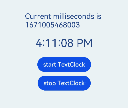
Example 1
@Entry
@Component
struct Second {
  @State accumulateTime: number = 0
  // Objects to import
  controller: TextClockController = new TextClockController()
  build() {
    Flex({ direction: FlexDirection.Column, alignItems: ItemAlign.Center, justifyContent: FlexAlign.Center }) {
      Text('Current milliseconds is ' + this.accumulateTime)
        .fontSize(20)
      // Display the system time in 12-hour format for the UTC+8 time zone, accurate to seconds.
      TextClock({ timeZoneOffset: -8, controller: this.controller })
        .format('aa hh:mm:ss')
        .onDateChange((value: number) => {
          this.accumulateTime = value
        })
        .margin(20)
        .fontSize(30)
      Button("start TextClock")
        .margin({ bottom: 10 })
        .onClick(() => {
          // Start the text clock.
          this.controller.start()
        })
      Button("stop TextClock")
        .onClick(() => {
          // Stop the text clock.
          this.controller.stop()
        })
    }
    .width('100%')
    .height('100%')
  }
}
Example 2
@Entry
@Component
struct TextClockExample {
  @State textShadows : ShadowOptions|Array<ShadowOptions> = [{ radius: 10, color: Color.Red, offsetX: 10, offsetY: 0 },{ radius: 10, color: Color.Black, offsetX: 20, offsetY: 0 },
      { radius: 10, color: Color.Brown, offsetX: 30, offsetY: 0 },{ radius: 10, color: Color.Green, offsetX: 40, offsetY: 0 },
      { radius: 10, color: Color.Yellow, offsetX: 100, offsetY: 0 }]
  build() {
    Column({ space: 8 }) {
      TextClock().fontSize(50).textShadow(this.textShadows)
    }
  }
}

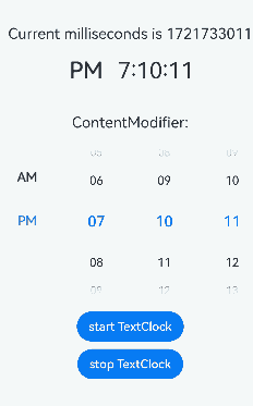
Example 3
This example implements the functionality of customizing the style of a text clock, creating a time picker component with a custom style: The time picker dynamically adjusts its selected value based on the text clock’s timezone offset and the time zone offset in seconds from UTC, creating a clock effect; depending on whether the text clock is started, the time picker toggles between a 12-hour and a 24-hour format display.
class MyTextClockStyle implements ContentModifier<TextClockConfiguration> {
  currentTimeZoneOffset: number = new Date().getTimezoneOffset() / 60
  title: string = ''

  constructor(title: string) {
    this.title = title
  }

  applyContent(): WrappedBuilder<[TextClockConfiguration]> {
    return wrapBuilder(buildTextClock)
  }
}

@Builder
function buildTextClock(config: TextClockConfiguration) {
  Row() {
    Column() {
      Text((config.contentModifier as MyTextClockStyle).title)
        .fontSize(20)
        .margin(20)
      TimePicker({
        selected: (new Date(config.timeValue * 1000 + ((config.contentModifier as MyTextClockStyle).currentTimeZoneOffset - config.timeZoneOffset) * 60 * 60 * 1000)),
        format: TimePickerFormat.HOUR_MINUTE_SECOND
      })
        .useMilitaryTime(!config.started)
    }
  }
}

@Entry
@Component
struct TextClockExample {
  @State accumulateTime1: number = 0
  @State timeZoneOffset: number = -8
  controller1: TextClockController = new TextClockController()
  controller2: TextClockController = new TextClockController()

  build() {
    Flex({ direction: FlexDirection.Column, alignItems: ItemAlign.Center, justifyContent: FlexAlign.Center }) {
      Text('Current milliseconds is ' + this.accumulateTime1)
        .fontSize(20)
        .margin({ top: 20 })
      TextClock({ timeZoneOffset: this.timeZoneOffset, controller: this.controller1 })
        .format('aa hh:mm:ss')
        .onDateChange((value: number) => {
          this.accumulateTime1 = value
        })
        .margin(20)
        .fontSize(30)
      TextClock({ timeZoneOffset: this.timeZoneOffset, controller: this.controller2 })
        .format('aa hh:mm:ss')
        .fontSize(30)
        .contentModifier(new MyTextClockStyle('ContentModifier:'))
      Button("start TextClock")
        .margin({ top: 20, bottom: 10 })
        .onClick(() => {
          // Start the text clock.
          this.controller1.start()
          this.controller2.start()
        })
      Button("stop TextClock")
        .margin({ bottom: 30 })
        .onClick(() => {
          // Stop the text clock.
          this.controller1.stop()
          this.controller2.stop()
        })

    }
    .width('100%')
    .height('100%')
  }
}
Example 4
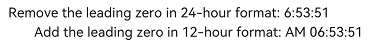
This example demonstrates how to use the dateTimeOptions attribute to add or remove the leading zero for the hour field. By default, the hour field in the 24-hour format includes a leading zero. In the 12-hour format, the hour field typically does not include a leading zero.
@Entry
@Component
struct TextClockExample {
  build() {
    Column({ space: 8 }) {
      Row() {
        Text("Remove the leading zero in 24-hour format: ")
          .fontSize(20)
        TextClock()
          .fontSize(20)
          .format("HH:mm:ss")
          .dateTimeOptions({hour: "numeric"})
      }
      Row() {
        Text("Add the leading zero in 12-hour format: ")
          .fontSize(20)
        TextClock()
          .fontSize(20)
          .format("aa hh:mm:ss")
          .dateTimeOptions({hour: "2-digit"})
      }
    }
    .alignItems(HorizontalAlign.Start)
  }
}
你可能感兴趣的鸿蒙文章
- 所属分类: 后端技术
- 本文标签:
热门推荐
-
2、 优质文章
-
3、 gt
-
7、 openharmony
-
9、 golang
-
10、 Vue中input框自动聚焦