harmony 鸿蒙TextInput
TextInput
The TextInput component provides single-line text input.
NOTE
This component is supported since API version 7. Updates will be marked with a superscript to indicate their earliest API version.
Child Components
Not supported
APIs
TextInput(value?: TextInputOptions)
Atomic service API: This API can be used in atomic services since API version 11.
System capability: SystemCapability.ArkUI.ArkUI.Full
Parameters
| Name | Type | Mandatory | Description |
|---|---|---|---|
| value | TextInputOptions | No | Parameters of the TextInput component. |
TextInputOptions
Atomic service API: This API can be used in atomic services since API version 11.
System capability: SystemCapability.ArkUI.ArkUI.Full
| Name | Type | Mandatory | Description |
|---|---|---|---|
| placeholder | ResourceStr | No | Text displayed when there is no input. |
| text | ResourceStr | No | Current text input. You are advised to bind the state variable to the text in real time through the onChange event, so as to prevent display errors when the component is updated. Since API version 10, this parameter supports two-way binding through $$. Since API version 18, this parameter supports two-way binding through !!. |
| controller8+ | TextInputController | No | Text input controller. |
Attributes
In addition to the universal attributes, the following attributes are supported.
NOTE
When no underline is set, the default value of the universal attribute padding is as follows:
{
top: ‘8vp’,
right: ‘16vp’,
bottom: ‘8vp’,
left: ‘16vp’
}When an underline is set, the default value of padding is as follows:
{
top: ‘12vp’,
right: ‘0vp’,
bottom: ‘12vp’,
left: ‘0vp’
}When padding is set to 0, set borderRadius to 0 to avoid truncation of the cursor.
Since API version 10, .width(‘auto’) can be set for the TextInput component. Under this setting, the component auto-adapts its width to the text width, while respecting the constraintSize configuration and the maximum and minimum width restrictions imposed by the parent container. For details, see Size.
type
type(value: InputType)
Sets the text box type.
Atomic service API: This API can be used in atomic services since API version 11.
System capability: SystemCapability.ArkUI.ArkUI.Full
Parameters
| Name | Type | Mandatory | Description |
|---|---|---|---|
| value | InputType | Yes | Text box type. Default value: InputType.Normal |
placeholderColor
placeholderColor(value: ResourceColor)
Sets the placeholder text color.
The default value on wearable devices is ’#99ffffff’.
Atomic service API: This API can be used in atomic services since API version 11.
System capability: SystemCapability.ArkUI.ArkUI.Full
Parameters
| Name | Type | Mandatory | Description |
|---|---|---|---|
| value | ResourceColor | Yes | Placeholder text color. The default value follows the theme. |
placeholderFont
placeholderFont(value?: Font)
Sets the placeholder text style, including the font size, font width, font family, and font style. The ‘HarmonyOS Sans’ font and registered custom fonts are supported.
The default value on wearable devices is 18fp.
Atomic service API: This API can be used in atomic services since API version 11.
System capability: SystemCapability.ArkUI.ArkUI.Full
Parameters
| Name | Type | Mandatory | Description |
|---|---|---|---|
| value | Font | No | Placeholder text style. |
enterKeyType
enterKeyType(value: EnterKeyType)
Sets the type of the Enter key.
Atomic service API: This API can be used in atomic services since API version 11.
System capability: SystemCapability.ArkUI.ArkUI.Full
Parameters
| Name | Type | Mandatory | Description |
|---|---|---|---|
| value | EnterKeyType | Yes | Type of the Enter key. Default value: EnterKeyType.Done |
caretColor
caretColor(value: ResourceColor)
Sets the color of the caret in the text box.
Atomic service API: This API can be used in atomic services since API version 11.
System capability: SystemCapability.ArkUI.ArkUI.Full
Parameters
| Name | Type | Mandatory | Description |
|---|---|---|---|
| value | ResourceColor | Yes | Color of the caret in the text box. Default value: ’#007DFF’ |
NOTE
Since API version 12, this API can be used to set the text handle color, which is the same as the caret color.
maxLength
maxLength(value: number)
Sets the maximum number of characters for text input.
Atomic service API: This API can be used in atomic services since API version 11.
System capability: SystemCapability.ArkUI.ArkUI.Full
Parameters
| Name | Type | Mandatory | Description |
|---|---|---|---|
| value | number | Yes | Maximum number of characters for text input. Default value: Infinity, indicating that there is no upper limit on the number of characters that can be entered NOTE If this attribute is not set or is set to an invalid value, the default value is used. If a decimal number is specified, the integer part is used. |
fontColor
fontColor(value: ResourceColor)
Sets the font color.
The default value on wearable devices is ’#dbffffff’.
Atomic service API: This API can be used in atomic services since API version 11.
System capability: SystemCapability.ArkUI.ArkUI.Full
Parameters
| Name | Type | Mandatory | Description |
|---|---|---|---|
| value | ResourceColor | Yes | Font color. |
fontSize
fontSize(value: Length)
Sets the font size.
The default value on wearable devices is 18fp.
Atomic service API: This API can be used in atomic services since API version 11.
System capability: SystemCapability.ArkUI.ArkUI.Full
Parameters
| Name | Type | Mandatory | Description |
|---|---|---|---|
| value | Length | Yes | Font size. If fontSize is of the number type, the unit fp is used. The default font size is 16 fp. The value cannot be a percentage. |
fontStyle
fontStyle(value: FontStyle)
Sets the font style.
Atomic service API: This API can be used in atomic services since API version 11.
System capability: SystemCapability.ArkUI.ArkUI.Full
Parameters
| Name | Type | Mandatory | Description |
|---|---|---|---|
| value | FontStyle | Yes | Font style. Default value: FontStyle.Normal |
fontWeight
fontWeight(value: number|FontWeight|string)
Sets the font weight. If the value is too large, the text may be clipped depending on the font.
Atomic service API: This API can be used in atomic services since API version 11.
System capability: SystemCapability.ArkUI.ArkUI.Full
Parameters
| Name | Type | Mandatory | Description |
|---|---|---|---|
| value | number |FontWeight |string | Yes | Font weight. For the number type, the value range is [100, 900], at an interval of 100. The default value is 400. A larger value indicates a heavier font weight. For the string type, only strings that represent a number, for example, “400”, and the following enumerated values of FontWeight are supported: “bold”, “bolder”, “lighter”, “regular”, and “medium”. Default value: FontWeight.Normal |
fontFamily
fontFamily(value: ResourceStr)
Sets the font family.
Atomic service API: This API can be used in atomic services since API version 11.
System capability: SystemCapability.ArkUI.ArkUI.Full
Parameters
| Name | Type | Mandatory | Description |
|---|---|---|---|
| value | ResourceStr | Yes | Font family. Default font: ‘HarmonyOS Sans’ The ‘HarmonyOS Sans’ font and registered custom fonts are supported for applications. Only the ‘HarmonyOS Sans’ font is supported for widgets. |
inputFilter8+
inputFilter(value: ResourceStr, error?: Callback<string>)
Sets the regular expression for input filtering. Only inputs that comply with the regular expression can be displayed. Other inputs are filtered out. The specified regular expression can match single characters, but not strings.
Since API version 11, if inputFilter is set and the entered characters are not null, the filtering effect attached to the text box type (specified through the type attribute) does not take effect.
Atomic service API: This API can be used in atomic services since API version 11.
System capability: SystemCapability.ArkUI.ArkUI.Full
Parameters
| Name | Type | Mandatory | Description |
|---|---|---|---|
| value | ResourceStr | Yes | Regular expression. |
| error | Callback<string> | No | Filtered-out content to return when regular expression matching fails. |
copyOption9+
copyOption(value: CopyOptions)
Sets whether copy and paste is allowed. If this attribute is set to CopyOptions.None, the text can only be pasted; all other actions, such as copying, cutting, and sharing, are disabled.
Dragging is not allowed when CopyOptions.None is set.
Atomic service API: This API can be used in atomic services since API version 11.
System capability: SystemCapability.ArkUI.ArkUI.Full
Parameters
| Name | Type | Mandatory | Description |
|---|---|---|---|
| value | CopyOptions | Yes | Whether copy and paste is allowed. Default value: CopyOptions.LocalDevice |
showPasswordIcon9+
showPasswordIcon(value: boolean)
Sets whether to display the password icon at the end of the password text box.
Atomic service API: This API can be used in atomic services since API version 11.
System capability: SystemCapability.ArkUI.ArkUI.Full
Parameters
| Name | Type | Mandatory | Description |
|---|---|---|---|
| value | boolean | Yes | Whether to display the password icon at the end of the password text box. Default value: true |
style9+
style(value: TextInputStyle|TextContentStyle)
Sets the text input style. The inline input style only supports InputType.Normal.
Atomic service API: This API can be used in atomic services since API version 11.
System capability: SystemCapability.ArkUI.ArkUI.Full
Parameters
| Name | Type | Mandatory | Description |
|---|---|---|---|
| value | TextInputStyle |TextContentStyle | Yes | Text input style. Default value: TextInputStyle.Default |
textAlign9+
textAlign(value: TextAlign)
Sets the horizontal alignment of the text.
Available options are TextAlign.Start, TextAlign.Center, and TextAlign.End.
To set vertical alignment for the text, use the align attribute. The align attribute alone does not control the horizontal position of the text. In other words, Alignment.TopStart, Alignment.Top, and Alignment.TopEnd produce the same effect, top-aligning the text; Alignment.Start, Alignment.Center, and Alignment.End produce the same effect, centered-aligning the text vertically; Alignment.BottomStart, Alignment.Bottom, and Alignment.BottomEnd produce the same effect, bottom-aligning the text.
Atomic service API: This API can be used in atomic services since API version 11.
System capability: SystemCapability.ArkUI.ArkUI.Full
Parameters
| Name | Type | Mandatory | Description |
|---|---|---|---|
| value | TextAlign | Yes | Horizontal alignment of the text. Default value: TextAlign.Start |
selectedBackgroundColor10+
selectedBackgroundColor(value: ResourceColor)
Sets the background color of the selected text. If the opacity is not set, a 20% opacity will be used.
Atomic service API: This API can be used in atomic services since API version 11.
System capability: SystemCapability.ArkUI.ArkUI.Full
Parameters
| Name | Type | Mandatory | Description |
|---|---|---|---|
| value | ResourceColor | Yes | Background color of the selected text. By default, a 20% opacity is applied. |
caretStyle10+
caretStyle(value: CaretStyle)
Sets the caret style.
Atomic service API: This API can be used in atomic services since API version 11.
System capability: SystemCapability.ArkUI.ArkUI.Full
Parameters
| Name | Type | Mandatory | Description |
|---|---|---|---|
| value | CaretStyle | Yes | Caret style. |
caretPosition10+
caretPosition(value: number)
Sets the caret position.
Atomic service API: This API can be used in atomic services since API version 11.
System capability: SystemCapability.ArkUI.ArkUI.Full
Parameters
| Name | Type | Mandatory | Description |
|---|---|---|---|
| value | number | Yes | Caret position. |
showUnit10+
showUnit(value: CustomBuilder)
Sets the unit displayed with the text box. This attribute effective only when showUnderline is set to true.
Atomic service API: This API can be used in atomic services since API version 11.
System capability: SystemCapability.ArkUI.ArkUI.Full
Parameters
| Name | Type | Mandatory | Description |
|---|---|---|---|
| value | CustomBuilder | Yes | Unit displayed with the text box. |
showError10+
showError(value?: ResourceStr|undefined)
Sets the error message displayed when an error occurs.
On wearable devices, the error message is displayed at a font size of 13 fp and center-aligned.
If the data type is ResourceStr and the input content does not comply with specifications, the error message is displayed. If the error message does not fit in one line, an ellipsis (…) is displayed to represent clipped text. If the data type is undefined, no error message is displayed. For details, see Example 2.
Atomic service API: This API can be used in atomic services since API version 11.
System capability: SystemCapability.ArkUI.ArkUI.Full
Parameters
| Name | Type | Mandatory | Description |
|---|---|---|---|
| value | ResourceStr |undefined | No | Error message displayed when an error occurs. By default, no error message is displayed. NOTE The Resource type is supported since API version 12. |
showUnderline10+
showUnderline(value: boolean)
Sets whether to show an underline. By default, the underline comes in the color of ’#33182431’, thickness of 1 px, and text box size of 48 vp. The underline is only available for the InputType.Normal type.
Atomic service API: This API can be used in atomic services since API version 11.
System capability: SystemCapability.ArkUI.ArkUI.Full
Parameters
| Name | Type | Mandatory | Description |
|---|---|---|---|
| value | boolean | Yes | Whether to show an underline. Default value: false |
passwordIcon10+
passwordIcon(value: PasswordIcon)
Sets the password icon to display at the end of the password text box.
Images in JPG, PNG, BMP, HEIC, and WEBP formats are supported.
The icon size is fixed at 24 vp (or 28 vp on wearable devices), regardless of the source image size.
Atomic service API: This API can be used in atomic services since API version 11.
System capability: SystemCapability.ArkUI.ArkUI.Full
Parameters
| Name | Type | Mandatory | Description |
|---|---|---|---|
| value | PasswordIcon | Yes | Password icon to display at the end of the password text box. By default, the system-provided icon is used. |
enableKeyboardOnFocus10+
enableKeyboardOnFocus(value: boolean)
Sets whether to enable the input method when the TextInput component obtains focus in a way other than clicking.
Since API version 10, the TextInput component brings up the keyboard by default when it obtains focus.
Atomic service API: This API can be used in atomic services since API version 11.
System capability: SystemCapability.ArkUI.ArkUI.Full
Parameters
| Name | Type | Mandatory | Description |
|---|---|---|---|
| value | boolean | Yes | Whether to enable the input method when the TextInput component obtains focus in a way other than clicking. Default value: true |
selectionMenuHidden10+
selectionMenuHidden(value: boolean)
Sets whether to hide the system text selection menu.
Atomic service API: This API can be used in atomic services since API version 11.
System capability: SystemCapability.ArkUI.ArkUI.Full
Parameters
| Name | Type | Mandatory | Description |
|---|---|---|---|
| value | boolean | Yes | Whether to hide the system text selection menu. true: The system text selection menu does not appear under the following circumstances: clicking the text box cursor, long-pressing the text box, double-tapping the text box, triple-tapping the text box, or right-clicking the text box. false: The system text selection menu appears under the following circumstances: clicking the text box cursor, long-pressing the text box, double-tapping the text box, triple-tapping the text box, or right-clicking the text box. Default value: false |
barState10+
barState(value: BarState)
Sets the scrollbar state when the inline input style is used.
Atomic service API: This API can be used in atomic services since API version 11.
System capability: SystemCapability.ArkUI.ArkUI.Full
Parameters
| Name | Type | Mandatory | Description |
|---|---|---|---|
| value | BarState | Yes | Scrollbar state when the inline input style is used. Default value: BarState.Auto |
maxLines10+
maxLines(value: number)
Sets the maximum number of lines that can be displayed when the inline input style is used.
Atomic service API: This API can be used in atomic services since API version 11.
System capability: SystemCapability.ArkUI.ArkUI.Full
Parameters
| Name | Type | Mandatory | Description |
|---|---|---|---|
| value | number | Yes | Maximum number of lines that can be displayed with the inline style in the editing state or with the non-inline style. Default value: 3 Value range: (0, +∞) |
customKeyboard10+
customKeyboard(value: CustomBuilder, options?: KeyboardOptions)
Sets a custom keyboard.
When a custom keyboard is set, activating the text box opens the specified custom component, instead of the system input method.
The custom keyboard’s height can be set through the height attribute of the custom component’s root node, and its width is fixed at the default value.
The custom keyboard is presented by overlaying the original screen, which is not compressed or lifted if avoid mode is not enabled or avoidance is not needed for the text box.
The custom keyboard cannot obtain the focus, but it blocks gesture events.
By default, the custom keyboard is closed when the input component loses the focus. You can also use the TextInputController.stopEditing API to close the keyboard.
When a custom keyboard is set, the text box does not support camera input, even when the device supports.
When setting a custom keyboard, you can bind the onKeyPrelme event to prevent input from the physical keyboard.
Atomic service API: This API can be used in atomic services since API version 11.
System capability: SystemCapability.ArkUI.ArkUI.Full
Parameters
| Name | Type | Mandatory | Description |
|---|---|---|---|
| value | CustomBuilder | Yes | Custom keyboard. Atomic service API: This API can be used in atomic services since API version 11. |
| options12+ | KeyboardOptions | No | Whether to support keyboard avoidance. |
enableAutoFill11+
enableAutoFill(value: boolean)
Sets whether to enable autofill.
Atomic service API: This API can be used in atomic services since API version 12.
System capability: SystemCapability.ArkUI.ArkUI.Full
Parameters
| Name | Type | Mandatory | Description |
|---|---|---|---|
| value | boolean | Yes | Whether to enable autofill. true: enable false: disable Default value: true |
passwordRules11+
passwordRules(value: string)
Rules for generating passwords. When autofill is used, these rules are transparently transmitted to Password Vault for generating a new password.
Atomic service API: This API can be used in atomic services since API version 12.
System capability: SystemCapability.ArkUI.ArkUI.Full
Parameters
| Name | Type | Mandatory | Description |
|---|---|---|---|
| value | string | Yes | Rules for generating passwords. |
cancelButton11+
cancelButton(options: CancelButtonOptions)
Sets the style of the cancel button on the right. This attribute is not available for the inline input style.
The default value is 28fp on wearable devices.
Atomic service API: This API can be used in atomic services since API version 12.
System capability: SystemCapability.ArkUI.ArkUI.Full
Parameters
| Name | Type | Mandatory | Description |
|---|---|---|---|
| options | CancelButtonOptions | Yes | Options of the cancel button on the right. Default value: { style: CancelButtonStyle.INPUT } |
selectAll11+
selectAll(value: boolean)
Sets whether to select all text in the initial state. This attribute is not available for the inline input style.
Atomic service API: This API can be used in atomic services since API version 12.
System capability: SystemCapability.ArkUI.ArkUI.Full
Parameters
| Name | Type | Mandatory | Description |
|---|---|---|---|
| value | boolean | Yes | Whether to select all text in the initial state. Default value: false |
showCounter11+
showCounter(value: boolean, options?: InputCounterOptions)
Sets the character counter displayed when the number of characters entered exceeds the threshold.
options can be set only when value is set to true, in which case a character counter is displayed below the text box. This attribute must be used together with maxLength. The character counter is displayed in this format: Number of characters entered/Character limit.
It is visible when the number of characters entered is greater than the character limit multiplied by the threshold percentage value. If options is not set, the text box border and character counter subscript turn red when the number of characters entered exceeds the limit. If value is set to true and options is set, the text box border and character counter subscript turn red and the text box shakes when the number of characters entered reaches the limit, provided that the value of thresholdPercentage is valid. If highlightBorder is set to false, the text box border does not turn red. By default, highlightBorder is set to true.
The character counter is not displayed for text boxes in inline or password input style.
Atomic service API: This API can be used in atomic services since API version 11.
System capability: SystemCapability.ArkUI.ArkUI.Full
Parameters
| Name | Type | Mandatory | Description |
|---|---|---|---|
| value | boolean | Yes | Whether to display the character counter. |
| options11+ | InputCounterOptions | No | Threshold percentage of the character counter. |
contentType12+
contentType(value: ContentType)
Sets the content type for autofill.
Atomic service API: This API can be used in atomic services since API version 12.
System capability: SystemCapability.ArkUI.ArkUI.Full
Parameters
| Name | Type | Mandatory | Description |
|---|---|---|---|
| value | ContentType | Yes | Content type for autofill. |
underlineColor12+
underlineColor(value: ResourceColor|UnderlineColor|undefined)
Sets the color of the underline when it is shown.
Atomic service API: This API can be used in atomic services since API version 12.
System capability: SystemCapability.ArkUI.ArkUI.Full
| Name | Type | Mandatory | Description |
|---|---|---|---|
| value | ResourceColor |UnderlineColor |undefined | Yes | Color of the underline. The underline color changes with the underline mode. If the underline color is only set for the normal state, you can directly enter a value of the ResourceColor type. If the value specified is undefined, null, or invalid, all underlines are restored to the default value. Default value: underline color configured for the theme, which is #33182431 by default |
lineHeight12+
lineHeight(value: number|string|Resource)
Sets the text line height. If the value is less than or equal to 0, the line height is not limited and the font size is adaptive. If the value is of the number type, the unit fp is used. For the string type, numeric string values with optional units, for example, “10” or “10fp”, are supported.
Atomic service API: This API can be used in atomic services since API version 12.
System capability: SystemCapability.ArkUI.ArkUI.Full
Parameters
| Name | Type | Mandatory | Description |
|---|---|---|---|
| value | number |string |Resource | Yes | Text line height. |
decoration12+
decoration(value: TextDecorationOptions)
Sets the color, type, and style of the text decorative line. This attribute does not take effect for the password input mode.
Atomic service API: This API can be used in atomic services since API version 12.
System capability: SystemCapability.ArkUI.ArkUI.Full
Parameters
| Name | Type | Mandatory | Description |
|---|---|---|---|
| value | TextDecorationOptions | Yes | Text decorative line options. Default value: { type: TextDecorationType.None, color: Color.Black, style: TextDecorationStyle.SOLID } |
letterSpacing12+
letterSpacing(value: number|string|Resource)
Sets the letter spacing for a text style. If the value specified is a percentage or 0, the default value is used. For the string type, numeric string values with optional units, for example, “10” or “10fp”, are supported.
If the value specified is a negative value, the text is compressed. A negative value too small may result in the text being compressed to 0 and no content being displayed.
Atomic service API: This API can be used in atomic services since API version 12.
System capability: SystemCapability.ArkUI.ArkUI.Full
Parameters
| Name | Type | Mandatory | Description |
|---|---|---|---|
| value | number |string |Resource | Yes | Letter spacing. Unit: fp |
fontFeature12+
fontFeature(value: string)
Sets the font feature, for example, monospaced digits.
Format: normal |<feature-tag-value>
Format of <feature-tag-value>: <string> [ <integer> |on |off ]
There can be multiple <feature-tag-value> values, which are separated by commas (,).
For example, the input format for monospaced clock fonts is “ss01” on.
Atomic service API: This API can be used in atomic services since API version 12.
System capability: SystemCapability.ArkUI.ArkUI.Full
Parameters
| Name | Type | Mandatory | Description |
|---|---|---|---|
| value | string | Yes | Font feature. |
For details about the supported font features, see Font Feature List. Font features are advanced typographic features, such as ligatures and monospace, for OpenType fonts. They are typically used in custom fonts and require the support of the font itself. For more information about the font features, see Low-level font feature settings control: the font-feature-settings property and The Complete CSS Demo for OpenType Features.
NOTE
This attribute is not available when type is set to an enum value that indicates the password input mode, such as Password, NEW_PASSWORD, or NUMBER_PASSWORD.
wordBreak12+
wordBreak(value: WordBreak)
Sets the word break rule. This attribute is effective for the inline input style, but does not apply to the placeholder text.
Atomic service API: This API can be used in atomic services since API version 12.
System capability: SystemCapability.ArkUI.ArkUI.Full
Parameters
| Name | Type | Mandatory | Description |
|---|---|---|---|
| value | WordBreak | Yes | Word break rule in the inline input style. Default value: WordBreak.BREAK_WORD |
NOTE
The component does not support the clip attribute. Therefore, setting this attribute does not affect text clipping.
textOverflow12+
textOverflow(value: TextOverflow)
Sets the display mode when the text is too long. This attribute is only available for the inline input style.
Text is clipped at the transition between words. To clip text in the middle of a word, set wordBreak to WordBreak.BREAK_ALL.
TextOverflow.None produces the same effect as TextOverflow.Clip.
Atomic service API: This API can be used in atomic services since API version 12.
System capability: SystemCapability.ArkUI.ArkUI.Full
Parameters
| Name | Type | Mandatory | Description |
|---|---|---|---|
| value | TextOverflow | Yes | Display mode when the text is too long. Default value in non-editing state in the inline input style: TextOverflow.Ellipsis Default value in editing state in the inline input style: TextOverflow.Clip |
NOTE
The TextInput component does not support the TextOverflow.MARQUEE mode. If TextOverflow.MARQUEE is set, the component automatically switches to TextOverflow.Ellipsis for the non-editing state in the inline input style and TextOverflow.Clip for the non-inline input style and the editing state in the inline input style.
textIndent12+
textIndent(value: Dimension)
Sets the indent of the first line text.
Atomic service API: This API can be used in atomic services since API version 12.
System capability: SystemCapability.ArkUI.ArkUI.Full
Parameters
| Name | Type | Mandatory | Description |
|---|---|---|---|
| value | Dimension | Yes | Indent of the first line text. Default value: 0 |
minFontSize12+
minFontSize(value: number|string|Resource)
Sets the minimum font size. For the string type, numeric string values with optional units, for example, “10” or “10fp”, are supported.
For the setting to take effect, this attribute must be used together with maxFontSize and maxLines (when the component is in editing state in the inline input style), or layout constraint settings.
When the adaptive font size is used, the fontSize settings do not take effect.
Atomic service API: This API can be used in atomic services since API version 12.
System capability: SystemCapability.ArkUI.ArkUI.Full
Parameters
| Name | Type | Mandatory | Description |
|---|---|---|---|
| value | number |string |Resource | Yes | Minimum font size. Unit: fp |
maxFontSize12+
maxFontSize(value: number|string|Resource)
Sets the maximum font size. For the string type, numeric string values with optional units, for example, “10” or “10fp”, are supported.
For the setting to take effect, this attribute must be used together with minFontSize and maxLines (when the component is in editing state in the inline input style), or layout constraint settings.
When the adaptive font size is used, the fontSize settings do not take effect.
Atomic service API: This API can be used in atomic services since API version 12.
System capability: SystemCapability.ArkUI.ArkUI.Full
Parameters
| Name | Type | Mandatory | Description |
|---|---|---|---|
| value | number |string |Resource | Yes | Maximum font size. Unit: fp |
heightAdaptivePolicy12+
heightAdaptivePolicy(value: TextHeightAdaptivePolicy)
Sets how the adaptive height is determined for the text in the inline input style.
When this attribute is set to TextHeightAdaptivePolicy.MAX_LINES_FIRST, the maxLines attribute takes precedence for adjusting the text height. If the maxLines setting results in a layout beyond the layout constraints, the text will shrink to a font size between minFontSize and maxFontSize to allow for more content to be shown.
If this attribute is set to TextHeightAdaptivePolicy.MIN_FONT_SIZE_FIRST, the minFontSize attribute takes precedence for adjusting the text height. If the text can fit in one line with the minFontSize setting, the text will enlarge to the largest possible font size between minFontSize and maxFontSize.
TextHeightAdaptivePolicy.LAYOUT_CONSTRAINT_FIRST produces the same effect as TextHeightAdaptivePolicy.MIN_FONT_SIZE_FIRST.
When the component is in the non-inline input style, the three values of TextHeightAdaptivePolicy have the same effect, that is, the text will shrink to a font size between minFontSize and maxFontSize to allow for more content to be shown.
NOTE
If the text box is in inline input style, the font size in the editing state is different from that in the non-editing state.
Atomic service API: This API can be used in atomic services since API version 12.
System capability: SystemCapability.ArkUI.ArkUI.Full
Parameters
| Name | Type | Mandatory | Description |
|---|---|---|---|
| value | TextHeightAdaptivePolicy | Yes | How the adaptive height is determined for the text. Default value: TextHeightAdaptivePolicy.MAX_LINES_FIRST |
showPassword12+
showPassword(visible: boolean)
Sets whether to show the password.
This API has effect only when the input type is set to Password, NEWPASSWORD, or NUMBERPASSWORD mode. It does not work in other modes.
When in password mode, there may be inconsistency between the backend state of the text box and the frontend application’s state management variables. This can cause issues with the icon at the end of the password text box. To avoid such issues, use the onSecurityStateChange callback to sync the states. For details, see Example 1.
Atomic service API: This API can be used in atomic services since API version 12.
System capability: SystemCapability.ArkUI.ArkUI.Full
Parameters
| Name | Type | Mandatory | Description |
|---|---|---|---|
| visible | boolean | Yes | Whether to show the password. Default value: false |
lineBreakStrategy12+
lineBreakStrategy(strategy: LineBreakStrategy)
Sets the line break rule. This attribute takes effect when wordBreak is not set to breakAll. Hyphens are not supported.
Atomic service API: This API can be used in atomic services since API version 12.
System capability: SystemCapability.ArkUI.ArkUI.Full
Parameters
| Name | Type | Mandatory | Description |
|---|---|---|---|
| strategy | LineBreakStrategy | Yes | Line break rule. Default value: LineBreakStrategy.GREEDY NOTE This attribute does not take effect for the non-inline input style. |
editMenuOptions12+
editMenuOptions(editMenu: EditMenuOptions)
Sets the extended options of the custom context menu on selection, including the text content, icon, and callback.
Atomic service API: This API can be used in atomic services since API version 12.
System capability: SystemCapability.ArkUI.ArkUI.Full
Parameters
| Name | Type | Mandatory | Description |
|---|---|---|---|
| editMenu | EditMenuOptions | Yes | Extended options of the custom context menu on selection. |
enablePreviewText12+
enablePreviewText(enable: boolean)
Sets whether to enable preview text.
Preview text is in a temporary state and does not support text interception. As such, it does not trigger onWillInsert, onDidInsert, onWillDelete, or onDidDelete callbacks.
Atomic service API: This API can be used in atomic services since API version 12.
System capability: SystemCapability.ArkUI.ArkUI.Full
Parameters
| Name | Type | Mandatory | Description |
|---|---|---|---|
| enable | boolean | Yes | Whether to enable preview text. Default value: true |
enableHapticFeedback13+
enableHapticFeedback(isEnabled: boolean)
Specifies whether to enable haptic feedback.
Atomic service API: This API can be used in atomic services since API version 13.
System capability: SystemCapability.ArkUI.ArkUI.Full
Parameters
| Name | Type | Mandatory | Description |
|---|---|---|---|
| isEnabled | boolean | Yes | Whether to enable haptic feedback. Default value: true |
NOTE
To enable haptic feedback, you must declare the ohos.permission.VIBRATE permission under requestPermissions in the module.json5 file of the project.
> "requestPermissions": [ > { > "name": "ohos.permission.VIBRATE", > } > ] > ``` ### keyboardAppearance<sup>15+</sup> keyboardAppearance(appearance: Optional\<KeyboardAppearance>) Sets the appearance of the keyboard when the text box is focused. **Atomic service API**: This API can be used in atomic services since API version 15. **System capability**: SystemCapability.ArkUI.ArkUI.Full **Parameters** |Name|Type|Mandatory|Description| |------|-----------------------------------------|----|------------------------------------------------------| |appearance|[Optional](ts-universal-attributes-custom-property.md#optional12)\<[KeyboardAppearance](ts-text-common.md#keyboardappearance15)>|Yes|Appearance of the keyboard.<br>Default value: **KeyboardAppearance.NONE_IMMERSIVE**| ### stopBackPress<sup>15+<sup> stopBackPress(isStopped: Optional\<boolean>) Sets whether to prevent the back button press from being propagated to other components or applications. **Atomic service API**: This API can be used in atomic services since API version 15. **System capability**: SystemCapability.ArkUI.ArkUI.Full **Parameters** |Name|Type |Mandatory|Description | |------|---------------------------------------------------|----|-----------------------------------------| |isStopped|[Optional](ts-universal-attributes-custom-property.md#optional12)\<boolean>|Yes|Whether to consume the back button press.<br>Default value: **true**| ### halfLeading<sup>18+</sup> halfLeading(halfLeading: Optional\<boolean>) Sets whether half leading is enabled. **Atomic service API**: This API can be used in atomic services since API version 18. **System capability**: SystemCapability.ArkUI.ArkUI.Full **Parameters** |Name|Type |Mandatory|Description | |------|---------------------------------------------|----|---------------------------------------------| |halfLeading|[Optional](ts-universal-attributes-custom-property.md#optional12)\<boolean>|Yes|Whether half leading is enabled.<br>Half leading is the leading split in half and applied equally to the top and bottom edges. The value **true** means that half leading is enabled, and **false** means the opposite.<br>Default value: **false**| ### minFontScale<sup>18+</sup> minFontScale(scale: Optional\<number|Resource>) Sets the minimum font scale factor for text. **Atomic service API**: This API can be used in atomic services since API version 18. **System capability**: SystemCapability.ArkUI.ArkUI.Full **Parameters** |Name|Type |Mandatory|Description | |------|---------------------------------------------|----|---------------------------------------------| |scale|[Optional](ts-universal-attributes-custom-property.md#optional12)\<number \|[Resource](https://m.seaxiang.com/blog/QdcP30)>|Yes|Minimum font scale factor for text. The **undefined** type is supported.<br>Value range: [0, 1]<br>**NOTE**<br>A value less than 0 is handled as 0. A value greater than 1 is handled as 1. Abnormal values are ineffective by default.| ### maxFontScale<sup>18+</sup> maxFontScale(scale: Optional\<number|Resource>) Sets the maximum font scale factor for text. **Atomic service API**: This API can be used in atomic services since API version 18. **System capability**: SystemCapability.ArkUI.ArkUI.Full **Parameters** |Name|Type |Mandatory|Description | |------|---------------------------------------------|----|---------------------------------------------| |scale|[Optional](ts-universal-attributes-custom-property.md#optional12)\<number \|[Resource](https://m.seaxiang.com/blog/QdcP30)>|Yes|Maximum font scale factor for text. The **undefined** type is supported.<br>Value range: [1, +∞)<br>**NOTE**<br>A value less than 1 is handled as 1. Abnormal values are ineffective by default.| ### cancelButton<sup>18+</sup> cancelButton(symbolOptions: CancelButtonSymbolOptions) Sets the style of the cancel button on the right. This attribute is not available for the inline input style. **Atomic service API**: This API can be used in atomic services since API version 18. **System capability**: SystemCapability.ArkUI.ArkUI.Full **Parameters** |Name|Type |Mandatory|Description | |------|------------------------------------------------------------|----|------------------------------------------------------------| |symbolOptions|[CancelButtonSymbolOptions](ts-basic-components-search.md#cancelbuttonsymboloptions12)|Yes|Style of the cancel button on the right.<br>Default value:<br>{<br>style: CancelButtonStyle.INPUT<br>}| ### ellipsisMode<sup>18+</sup> ellipsisMode(mode: Optional\<EllipsisMode>) Sets the ellipsis position. For the settings to work, **overflow** must be set to **TextOverflow.Ellipsis**. Setting **ellipsisMode** alone does not take effect. **EllipsisMode.START** and **EllipsisMode.CENTER** take effect only when **maxLines** is set to **1** in inline style. **Atomic service API**: This API can be used in atomic services since API version 18. **System capability**: SystemCapability.ArkUI.ArkUI.Full **Parameters** |Name|Type |Mandatory|Description | |------|---------------------------------------------------|----|-----------------------------------------| |mode|[Optional](ts-universal-attributes-custom-property.md#optional12)\<[EllipsisMode](ts-appendix-enums.md#ellipsismode11)>|Yes|Ellipsis position.<br>Default value: **EllipsisMode.END**| ## InputType **System capability**: SystemCapability.ArkUI.ArkUI.Full |Name |Description | |-----------------------------|------------------------------------------------------------| |Normal |Normal input mode. In this mode, there is no special restriction on the input characters.<br>**Atomic service API**: This API can be used in atomic services since API version 11.| |Password |Password input mode.<br>An eye icon is used to show or hide the password. By default, the entered characters are temporarily shown before being obscured by dots; they are directly obscured by dots since API version 12 on certain devices. The password input mode does not support underlines. If Password Vault is enabled, autofill is available for the username and password.<br>**Atomic service API**: This API can be used in atomic services since API version 11.| |Email |Email address input mode.<br>This mode accepts only digits, letters, underscores (_), dots (.), and the following special characters: ! # $ % & ' " * + - / = ? ^ ` \{ \|\} ~ @ (which can only appear once)<br>**Atomic service API**: This API can be used in atomic services since API version 11.| |Number |Digit input mode.<br>**Atomic service API**: This API can be used in atomic services since API version 11.| |PhoneNumber<sup>9+</sup> |Phone number input mode.<br>In this mode, the following are allowed: digits, spaces, plus signs (+), hyphens (-), asterisks (*), and number signs (#); the length is not limited.<br>**Atomic service API**: This API can be used in atomic services since API version 11.| |USER_NAME<sup>11+</sup> |Username input mode.<br>If Password Vault is enabled, autofill is available for the username and password.<br>**Atomic service API**: This API can be used in atomic services since API version 12.| |NEW_PASSWORD<sup>11+</sup> |New password input mode.<br>An eye icon is used to show or hide the password. By default, the entered characters are temporarily shown before being obscured by dots; they are directly obscured by dots since API version 12 on certain devices. If Password Vault is enabled, a new password can be automatically generated.<br>**Atomic service API**: This API can be used in atomic services since API version 12.| |NUMBER_PASSWORD<sup>11+</sup>|Numeric password input mode.<br>An eye icon is used to show or hide the password. By default, the entered characters are temporarily shown before being obscured by dots; they are directly obscured by dots since API version 12 on certain devices. The password input mode does not support underlines.<br>**Atomic service API**: This API can be used in atomic services since API version 12.| |NUMBER_DECIMAL<sup>11+</sup>|Number input mode with a decimal point.<br>The value can contain digits and one decimal point.<br>**Atomic service API**: This API can be used in atomic services since API version 11.| |URL<sup>12+</sup>|URL input mode.<br>**Atomic service API**: This API can be used in atomic services since API version 12.| ## ContentType<sup>12+</sup> Enumerates the content types for autofill. **System capability**: SystemCapability.ArkUI.ArkUI.Full |Name |Value|Description | |--------------------------|----|------------------------------------------------------------| |USER_NAME |0 |Username. Password Vault, when enabled, can automatically save and fill in usernames.<br>**Atomic service API**: This API can be used in atomic services since API version 12.| |PASSWORD |1 |Password. Password Vault, when enabled, can automatically save and fill in passwords.<br>**Atomic service API**: This API can be used in atomic services since API version 12.| |NEW_PASSWORD |2 |New password. Password Vault, when enabled, can automatically generate a new password.<br>**Atomic service API**: This API can be used in atomic services since API version 12.| |FULL_STREET_ADDRESS |3 |Full street address. The scenario-based autofill feature, when enabled, can automatically save and fill in full street addresses.<br>**Atomic service API**: This API can be used in atomic services since API version 12.| |HOUSE_NUMBER |4 |House number. The scenario-based autofill feature, when enabled, can automatically save and fill in house numbers.<br>**Atomic service API**: This API can be used in atomic services since API version 12.| |DISTRICT_ADDRESS |5 |District and county. The scenario-based autofill feature, when enabled, can automatically save and fill in districts and counties.<br>**Atomic service API**: This API can be used in atomic services since API version 12.| |CITY_ADDRESS |6 |City. The scenario-based autofill feature, when enabled, can automatically save and fill in cities.<br>**Atomic service API**: This API can be used in atomic services since API version 12.| |PROVINCE_ADDRESS |7 |Province. The scenario-based autofill feature, when enabled, can automatically save and fill in provinces.<br>**Atomic service API**: This API can be used in atomic services since API version 12.| |COUNTRY_ADDRESS |8 |Country. The scenario-based autofill feature, when enabled, can automatically save and fill in countries.<br>**Atomic service API**: This API can be used in atomic services since API version 12.| |PERSON_FULL_NAME |9 |Full name. The scenario-based autofill feature, when enabled, can automatically save and fill in full names.<br>**Atomic service API**: This API can be used in atomic services since API version 12.| |PERSON_LAST_NAME |10 |Last name. The scenario-based autofill feature, when enabled, can automatically save and fill in last names.<br>**Atomic service API**: This API can be used in atomic services since API version 12.| |PERSON_FIRST_NAME |11 |First name. The scenario-based autofill feature, when enabled, can automatically save and fill in first names.<br>**Atomic service API**: This API can be used in atomic services since API version 12.| |PHONE_NUMBER |12 |Phone number. The scenario-based autofill feature, when enabled, can automatically save and fill in phone numbers.<br>**Atomic service API**: This API can be used in atomic services since API version 12.| |PHONE_COUNTRY_CODE |13 |Country code. The scenario-based autofill feature, when enabled, can automatically save and fill in country codes.<br>**Atomic service API**: This API can be used in atomic services since API version 12.| |FULL_PHONE_NUMBER |14 |Phone number with country code. The scenario-based autofill feature, when enabled, can automatically save and fill in phone numbers with country codes.<br>**Atomic service API**: This API can be used in atomic services since API version 12.| |EMAIL_ADDRESS |15 |Email address. The scenario-based autofill feature, when enabled, can automatically save and fill in email addresses.<br>**Atomic service API**: This API can be used in atomic services since API version 12.| |BANK_CARD_NUMBER |16 |Bank card number. The scenario-based autofill feature, when enabled, can automatically save and fill in bank card numbers.<br>**Atomic service API**: This API can be used in atomic services since API version 12.| |ID_CARD_NUMBER |17 |ID card number. The scenario-based autofill feature, when enabled, can automatically save and fill in ID card numbers.<br>**Atomic service API**: This API can be used in atomic services since API version 12.| |NICKNAME |23 |Nickname. The scenario-based autofill feature, when enabled, can automatically save and fill in nicknames.<br>**Atomic service API**: This API can be used in atomic services since API version 12.| |DETAIL_INFO_WITHOUT_STREET|24 |Address information without street address. The scenario-based autofill feature, when enabled, can automatically save and fill in address information without street addresses.<br>**Atomic service API**: This API can be used in atomic services since API version 12.| |FORMAT_ADDRESS |25 |Standard address. The scenario-based autofill feature, when enabled, can automatically save and fill in standard addresses.<br>**Atomic service API**: This API can be used in atomic services since API version 12.| |PASSPORT_NUMBER<sup>18+</sup> |26 |Passport number. The scenario-based autofill feature, when enabled, can automatically save and fill in passport numbers.<br>**Atomic service API**: This API can be used in atomic services since API version 18.| |VALIDITY<sup>18+</sup> |27 |Passport validity period. The scenario-based autofill feature, when enabled, can automatically save and fill in passport validity periods.<br>**Atomic service API**: This API can be used in atomic services since API version 18.| |ISSUE_AT<sup>18+</sup> |28 |Passport place of issue. The scenario-based autofill feature, when enabled, can automatically save and fill in the place of issue for passports.<br>**Atomic service API**: This API can be used in atomic services since API version 18.| |ORGANIZATION<sup>18+</sup> |29 |Invoice title. The scenario-based autofill feature, when enabled, can automatically save and fill in invoice titles.<br>**Atomic service API**: This API can be used in atomic services since API version 18.| |TAX_ID<sup>18+</sup> |30 |Tax ID. The scenario-based autofill feature, when enabled, can automatically save and fill in tax IDs.<br>**Atomic service API**: This API can be used in atomic services since API version 18.| |ADDRESS_CITY_AND_STATE<sup>18+</sup> |31 |Location. The scenario-based autofill feature, when enabled, can automatically save and fill in locations.<br>**Atomic service API**: This API can be used in atomic services since API version 18.| |FLIGHT_NUMBER<sup>18+</sup> |32 |Flight number. Currently not supported for automatic saving and auto-filling.<br>**Atomic service API**: This API can be used in atomic services since API version 18.| |LICENSE_NUMBER<sup>18+</sup> |33 |Driver's license number. Currently not supported for automatic saving and auto-filling.<br>**Atomic service API**: This API can be used in atomic services since API version 18.| |LICENSE_FILE_NUMBER<sup>18+</sup> |34 |Driver's license file number. Currently not supported for automatic saving and auto-filling.<br>**Atomic service API**: This API can be used in atomic services since API version 18.| |LICENSE_PLATE<sup>18+</sup> |35 |License plate number. The scenario-based autofill feature, when enabled, can automatically save and fill in license plate numbers.<br>**Atomic service API**: This API can be used in atomic services since API version 18.| |ENGINE_NUMBER<sup>18+</sup> |36 |Vehicle registration engine number. Currently not supported for automatic saving and auto-filling.<br>**Atomic service API**: This API can be used in atomic services since API version 18.| |LICENSE_CHASSIS_NUMBER<sup>18+</sup> |37 |Chassis number. Currently not supported for automatic saving and auto-filling.<br>**Atomic service API**: This API can be used in atomic services since API version 18.| ## TextInputStyle<sup>9+</sup> **Atomic service API**: This API can be used in atomic services since API version 11. **System capability**: SystemCapability.ArkUI.ArkUI.Full |Name |Description | |-------|------------------------------------------------------------| |Default|Default style. The caret width is fixed at 1.5 vp, and the caret height is subject to the background height and font size of the selected text.| |Inline|Inline input style. The background height of the selected text is the same as the height of the text box.<br>This style is used in scenarios where editing and non-editing states are obvious, for example, renaming in the file list view.<br>The **showError** attribute is not supported for this style.<br>This style does not allow for text dragging and dropping.| ## PasswordIcon<sup>10+</sup> **Atomic service API**: This API can be used in atomic services since API version 11. **System capability**: SystemCapability.ArkUI.ArkUI.Full |Name|Type|Mandatory|Description| |----|-----|----|----| |onIconSrc|string \|[Resource](https://m.seaxiang.com/blog/QdcP30)|No |Icon that can be used to hide the password in password input mode.<br>The string type can be used to load network images and local images.| |offIconSrc|string \|[Resource](https://m.seaxiang.com/blog/QdcP30)|No |Icon that can be used to show the password in password input mode.<br>The string type can be used to load network images and local images.| ## EnterKeyType Enumerates the Enter key types. **System capability**: SystemCapability.ArkUI.ArkUI.Full |Name |Value|Description | |----------------------|---|------------------| |Go |2|The Enter key is labeled "Go."<br>**Atomic service API**: This API can be used in atomic services since API version 11.| |Search |3|The Enter key is labeled "Search."<br>**Atomic service API**: This API can be used in atomic services since API version 11.| |Send |4|The Enter key is labeled "Send."<br>**Atomic service API**: This API can be used in atomic services since API version 11.| |Next |5|The Enter key is labeled "Next."<br>**Atomic service API**: This API can be used in atomic services since API version 11.| |Done |6|The Enter key is labeled "Done."<br>**Atomic service API**: This API can be used in atomic services since API version 11.| |PREVIOUS<sup>11+</sup>|7|The Enter key is labeled "Previous."<br>**Atomic service API**: This API can be used in atomic services since API version 12.| |NEW_LINE<sup>11+</sup>|8|The Enter key is labeled "New Line."<br>**Atomic service API**: This API can be used in atomic services since API version 12.| ## Events In addition to the [universal events](ts-component-general-events.md), the following events are supported. ### onChange onChange(callback: EditableTextOnChangeCallback) Triggered when the input in the text box changes. In this callback, if cursor operations are performed, you need to adjust the cursor logic based on the **previewText** parameter to ensure it works seamlessly within the preview display scenario. **Atomic service API**: This API can be used in atomic services since API version 11. **System capability**: SystemCapability.ArkUI.ArkUI.Full **Parameters** |Name|Type|Mandatory|Description | |------|------|----|--------------------| |callback|[EditableTextOnChangeCallback](ts-text-common.md#editabletextonchangecallback12)|Yes|Callback invoked when the input in the text box changes.| ### onSubmit onSubmit(callback: OnSubmitCallback) Triggered when the Enter key on the keyboard is pressed for submission. **Atomic service API**: This API can be used in atomic services since API version 11. **System capability**: SystemCapability.ArkUI.ArkUI.Full **Parameters** |Name |Type |Mandatory|Description | |-------------------|------------------------------------------------|----|------------------------------------------------------------| |callback |[OnSubmitCallback](#onsubmitcallback18)|Yes|Callback for submission.| ### onEditChanged<sup>(deprecated)</sup> onEditChanged(callback: (isEditing: boolean) => void) Triggered when the input status changes. This API is deprecated since API version 8. You are advised to use **onEditChange** instead. **System capability**: SystemCapability.ArkUI.ArkUI.Full **Parameters** |Name |Type |Mandatory|Description | |---------|-------|----|--------------------| |isEditing|boolean|Yes|Whether the text box is in the editing state. The value **true** indicates that the text box is in the editing state.| ### onEditChange<sup>8+</sup> onEditChange(callback: Callback\<boolean>) Triggered when the input status changes. The text box is in the editing state when it has the caret placed in it, and is in the non-editing state otherwise. **Atomic service API**: This API can be used in atomic services since API version 11. **System capability**: SystemCapability.ArkUI.ArkUI.Full **Parameters** |Name |Type |Mandatory|Description | |---------|-------|----|--------------------| |callback|Callback\<boolean>|Yes|Callback for input status changes. It returns **true** if the input operation is currently in progress.| ### onCopy<sup>8+</sup> onCopy(callback: Callback\<string>) Triggered when a copy operation is performed. **Atomic service API**: This API can be used in atomic services since API version 11. **System capability**: SystemCapability.ArkUI.ArkUI.Full **Parameters** |Name |Type |Mandatory|Description | |---------|-------|----|----------------| |callback|Callback\<string>|Yes|Callback used to return the copied text content.| ### onCut<sup>8+</sup> onCut(callback: Callback\<string>) Triggered when a cut operation is performed. **Atomic service API**: This API can be used in atomic services since API version 11. **System capability**: SystemCapability.ArkUI.ArkUI.Full **Parameters** |Name |Type |Mandatory|Description | |---------|-------|----|----------------| |callback|Callback\<string>|Yes|Callback used to return the cut text content.| ### onPaste<sup>8+</sup> onPaste(callback: OnPasteCallback) Triggered when a paste operation is performed. **Atomic service API**: This API can be used in atomic services since API version 11. **System capability**: SystemCapability.ArkUI.ArkUI.Full **Parameters** |Name |Type |Mandatory|Description | |-------------------|------------------------------------------------------------|----|----------------------| |callback|[OnPasteCallback](#onpastecallback18) |Yes|Callback used to return the pasted text content.| ### onTextSelectionChange<sup>10+</sup> onTextSelectionChange(callback: OnTextSelectionChangeCallback) Triggered when the position of the text selection changes or when the cursor position changes during the editing state. **Atomic service API**: This API can be used in atomic services since API version 11. **System capability**: SystemCapability.ArkUI.ArkUI.Full **Parameters** |Name |Type|Mandatory|Description | |--------------|------|----|---------------------------------------| |callback|[OnTextSelectionChangeCallback](#ontextselectionchangecallback18)|Yes|Callback for text selection changes or cursor position changes.| ### onContentScroll<sup>10+</sup> onContentScroll(callback: OnContentScrollCallback) Triggered when the text content is scrolled. **Atomic service API**: This API can be used in atomic services since API version 11. **System capability**: SystemCapability.ArkUI.ArkUI.Full **Parameters** |Name |Type|Mandatory|Description | |------------|------|----|----------------------------------| |callback|[OnContentScrollCallback](#oncontentscrollcallback18)|Yes|Callback for text content scrolling.| ### onSecurityStateChange<sup>12+</sup> onSecurityStateChange(callback: Callback\<boolean>) Triggered when the password visibility changes. **Atomic service API**: This API can be used in atomic services since API version 12. **System capability**: SystemCapability.ArkUI.ArkUI.Full **Parameters** |Name |Type|Mandatory|Description | |------------|------|----|----------------------------------| |callback|Callback\<boolean>|Yes|Callback used to return the result.| ### onWillInsert<sup>12+</sup> onWillInsert(callback: Callback\<InsertValue, boolean>) Triggered when text is about to be inserted. **Atomic service API**: This API can be used in atomic services since API version 12. **System capability**: SystemCapability.ArkUI.ArkUI.Full **Parameters** |Name|Type |Mandatory|Description | |------|------------------------------------------------------------|----|------------------| |callback|Callback\<[InsertValue](ts-text-common.md#insertvalue12), boolean>|Yes|Callback triggered when text is about to be inserted.<br>It returns **true** if the text is inserted; returns **false** otherwise.<br>This callback is not triggered for pre-edit or candidate word operations.<br>It is available only for system input methods.| ### onDidInsert<sup>12+</sup> onDidInsert(callback: Callback\<InsertValue>) Triggered when text is inserted. **Atomic service API**: This API can be used in atomic services since API version 12. **System capability**: SystemCapability.ArkUI.ArkUI.Full **Parameters** |Name|Type |Mandatory|Description | |------|------------------------------------------------------------|----|------------------| |callback|Callback\<[InsertValue](ts-text-common.md#insertvalue12)>|Yes|Callback triggered when text is inserted.<br>It is available only for system input methods.| ### onWillDelete<sup>12+</sup> onWillDelete(callback: Callback\<DeleteValue, boolean>) Triggered when text is about to be deleted. **Atomic service API**: This API can be used in atomic services since API version 12. **System capability**: SystemCapability.ArkUI.ArkUI.Full **Parameters** |Name|Type |Mandatory|Description | |------|------------------------------------------------------------|----|------------------| |callback|Callback\<[DeleteValue](ts-text-common.md#deletevalue12), boolean>|Yes|Callback triggered when text is about to be deleted.<br>It returns **true** if the text is deleted; returns **false** otherwise.<br>This callback is not called for text preview.<br>It is available only for system input methods.| ### onDidDelete<sup>12+</sup> onDidDelete(callback: Callback\<DeleteValue>) Triggered when text is deleted. **Atomic service API**: This API can be used in atomic services since API version 12. **System capability**: SystemCapability.ArkUI.ArkUI.Full **Parameters** |Name|Type |Mandatory|Description | |------|------------------------------------------------------------|----|------------------| |callback|Callback\<[DeleteValue](ts-text-common.md#deletevalue12)>|Yes|Callback triggered when text is deleted.<br>It is available only for system input methods.| ### onWillChange<sup>15+</sup> onWillChange(callback: Callback\<EditableTextChangeValue, boolean>) Called when the text content is about to change. This callback is triggered after **onWillInsert** and **onWillDelete**, but before **onDidInsert** and **onDidDelete**. **Atomic service API**: This API can be used in atomic services since API version 15. **System capability**: SystemCapability.ArkUI.ArkUI.Full **Parameters** |Name|Type |Mandatory|Description | |------|------------------------------------------------------------|----|------------------| |callback|Callback\<[EditableTextChangeValue](ts-text-common.md#editabletextchangevalue15), boolean>|Yes|Callback triggered when the text content is about to change.<br>Returning **true** allows the change to proceed, while returning **false** cancels the change.| ## TextInputController<sup>8+</sup> Inherits from [TextContentControllerBase](ts-types.md#textcontentcontrollerbase10). **Atomic service API**: This API can be used in atomic services since API version 11. **System capability**: SystemCapability.ArkUI.ArkUI.Full ### Objects to Importcontroller: TextInputController = new TextInputController()
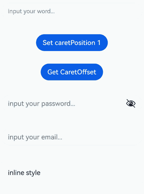
### constructor<sup>8+</sup>

constructor()

A constructor used to create a **TextInputController** object.

**Atomic service API**: This API can be used in atomic services since API version 11.

**System capability**: SystemCapability.ArkUI.ArkUI.Full

### caretPosition<sup>8+</sup>

caretPosition(value: number): void

Sets the position of the caret. If the value is less than 0, the value **0** is used. If the value exceeds the text length, the caret is placed at the end of the text.

**Atomic service API**: This API can be used in atomic services since API version 11.

**System capability**: SystemCapability.ArkUI.ArkUI.Full

**Parameters**

|Name|Type|Mandatory|Description|
|-----|------|----|------|
|value|number|Yes |Length from the start of the string to the position where the caret is located.|
### setTextSelection<sup>10+</sup>

setTextSelection(selectionStart: number, selectionEnd: number, options?: SelectionOptions): void

Sets the text selection area, which will be highlighted.

**Atomic service API**: This API can be used in atomic services since API version 11.

**System capability**: SystemCapability.ArkUI.ArkUI.Full

**Parameters**

|Name|Type|Mandatory|Description|
|-------|------|----|-----|
|selectionStart|number|Yes |Start position of the text selection range. The start position of text in the text box is 0.|
|selectionEnd |number|Yes |End position of the text selection range.|
|options<sup>12+</sup> |[SelectionOptions](ts-types.md#selectionoptions12)|No |Configuration options for text selection.<br>Default value: **MenuPolicy.DEFAULT**<br>This API can be used in atomic services since API version 12.|

>  **NOTE**
>
>  If **selectionStart** or **selectionEnd** is set to **undefined**, the value **0** will be used.
>
>  If **selectionMenuHidden** is set to **true** or a 2-in-1 device is used, calling **setTextSelection** does not display the context menu even when **options** is set to **MenuPolicy.SHOW**.
>
>  If the selected text contains an emoji, the emoji is selected when its start position is within the text selection range.

### stopEditing<sup>10+</sup>

stopEditing(): void

Exits the editing state.

**Atomic service API**: This API can be used in atomic services since API version 11.

**System capability**: SystemCapability.ArkUI.ArkUI.Full

## UnderlineColor<sup>12+</sup>

**Atomic service API**: This API can be used in atomic services since API version 12.

**System capability**: SystemCapability.ArkUI.ArkUI.Full

|Name|Type|Mandatory|Description|
|----|-----|----|----|
|typing|[ResourceColor](https://m.seaxiang.com/blog/QdcP30) \|undefined|No|Underline color in the typing state. If no value is specified or if the value specified is **undefined**, **null**, or invalid, the default value is used.|
|normal|[ResourceColor](https://m.seaxiang.com/blog/QdcP30) \|undefined|No|Underline color in the normal state. If no value is specified or if the value specified is **undefined**, **null**, or invalid, the default value is used.|
|error |[ResourceColor](https://m.seaxiang.com/blog/QdcP30) \|undefined|No|Underline color when an error occurs. If no value is specified or if the value specified is **undefined**, **null**, or invalid, the default value is used. This option changes the color used in the **showCounter** attribute when the maximum number of characters is reached.|
|disable|[ResourceColor](https://m.seaxiang.com/blog/QdcP30) \|undefined|No|Underline color in the disabled state. If no value is specified or if the value specified is **undefined**, **null**, or invalid, the default value is used.|

## SubmitEvent<sup>11+</sup>

Defines the user submission event.

**Atomic service API**: This API can be used in atomic services since API version 11.

**System capability**: SystemCapability.ArkUI.ArkUI.Full

### Properties

**Atomic service API**: This API can be used in atomic services since API version 11.

**System capability**: SystemCapability.ArkUI.ArkUI.Full

|Name|Type|Mandatory|Description|
|----|-----|----|----|
|text            |string   |Yes|Text in the text box.                                |

### keepEditableState

keepEditableState(): void

Maintains the editable state of the text box when called.

**Atomic service API**: This API can be used in atomic services since API version 11.

**System capability**: SystemCapability.ArkUI.ArkUI.Full

## OnPasteCallback<sup>18+</sup>

type OnPasteCallback = (content: string, event: PasteEvent) => void

Defines the callback used to return the pasted text content.

**Atomic service API**: This API can be used in atomic services since API version 18.

**System capability**: SystemCapability.ArkUI.ArkUI.Full

**Parameters**

|Name           |Type                                                      |Mandatory|Description                |
|-------------------|------------------------------------------------------------|----|----------------------|
|content             |string                                                     |Yes|Text to be pasted.    |
|event|[PasteEvent](ts-basic-components-richeditor.md#pasteevent11)|Yes|Custom paste event.|

## OnSubmitCallback<sup>18+</sup>

type OnSubmitCallback = (enterKey: EnterKeyType, event: SubmitEvent) => void

Defines the callback for submission.

**Atomic service API**: This API can be used in atomic services since API version 18.

**System capability**: SystemCapability.ArkUI.ArkUI.Full

**Parameters**

|Name           |Type                                          |Mandatory|Description                                                      |
|-------------------|------------------------------------------------|----|------------------------------------------------------------|
|enterKey          |[EnterKeyType](#enterkeytype)|Yes|Type of the Enter key.|
|event|[SubmitEvent](#submitevent11)       |Yes|Submit event.                                                |

## OnTextSelectionChangeCallback<sup>18+</sup>

type OnTextSelectionChangeCallback = (selectionStart: number, selectionEnd: number) => void

Defines the callback for text selection changes or cursor position changes.

**Atomic service API**: This API can be used in atomic services since API version 18.

**System capability**: SystemCapability.ArkUI.ArkUI.Full

**Parameters**

|Name      |Type|Mandatory|Description                                 |
|--------------|------|----|---------------------------------------|
|selectionStart|number|Yes|Start position of the selected text. The start position of text is **0**.|
|selectionEnd |number|Yes|End position of the selected text.                 |

## OnContentScrollCallback<sup>18+</sup>

type OnContentScrollCallback = (totalOffsetX: number, totalOffsetY: number) => void

Defines the callback for text content scrolling.

**Atomic service API**: This API can be used in atomic services since API version 18.

**System capability**: SystemCapability.ArkUI.ArkUI.Full

**Parameters**

|Name    |Type|Mandatory|Description                            |
|------------|------|----|----------------------------------|
|totalOffsetX|number|Yes|Offset in the X coordinate of the text in the content area, in px.|
|totalOffsetY|number|Yes|Offset in the Y coordinate of the text in the content area, in px.|

## Example

### Example 1: Setting and Obtaining the Cursor Position

This example demonstrates how to use the controller to set and obtain the cursor position within a text box.

```ts
// xxx.ets
@Entry
@Component
struct TextInputExample {
  @State text: string = ''
  @State positionInfo: CaretOffset = { index: 0, x: 0, y: 0 }
  @State passwordState: boolean = false
  controller: TextInputController = new TextInputController()

  build() {
    Column() {
      // Use !! to implement two-way binding of the text parameter.
      TextInput({ text: this.text!!, placeholder: 'input your word...', controller: this.controller })
        .placeholderColor(Color.Grey)
        .placeholderFont({ size: 14, weight: 400 })
        .caretColor(Color.Blue)
        .width('95%')
        .height(40)
        .margin(20)
        .fontSize(14)
        .fontColor(Color.Black)
        .inputFilter('[a-z]', (e) => {
          console.log(JSON.stringify(e))
        })
      Text(this.text)
      Button('Set caretPosition 1')
        .margin(15)
        .onClick(() => {
          // Move the caret to after the first entered character.
          this.controller.caretPosition(1)
        })
      Button('Get CaretOffset')
        .margin(15)
        .onClick(() => {
          this.positionInfo = this.controller.getCaretOffset()
        })
      // Password text box.
      TextInput({ placeholder: 'input your password...' })
        .width('95%')
        .height(40)
        .margin(20)
        .type(InputType.Password)
        .maxLength(9)
        .showPasswordIcon(true)
        .showPassword(this.passwordState)
        .onSecurityStateChange(((isShowPassword: boolean) => {
          // Update the password visibility.
          console.info('isShowPassword', isShowPassword)
          this.passwordState = isShowPassword
        }))
      // Email address autofill.
      TextInput({ placeholder: 'input your email...' })
        .width('95%')
        .height(40)
        .margin(20)
        .contentType(ContentType.EMAIL_ADDRESS)
        .maxLength(9)
      // Inline-style text box.
      TextInput({ text: 'inline style' })
        .width('95%')
        .height(50)
        .margin(20)
        .borderRadius(0)
        .style(TextInputStyle.Inline)
    }.width('100%')
  }
}
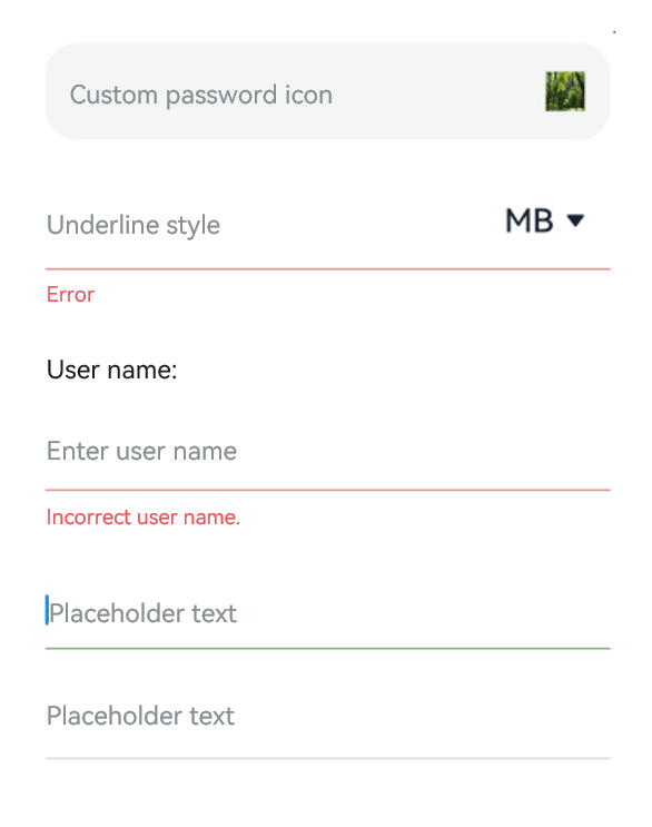
Example 2: Setting Underlines
This example showcases the effects of underlines in different scenarios using the showUnderline, showError, showUnit, and passwordIcon attributes.
// xxx.ets
@Entry
@Component
struct TextInputExample {
  @State passWordSrc1: Resource = $r('app.media.ImageOne');
  @State passWordSrc2: Resource = $r('app.media.ImageTwo');
  @State textError: string = '';
  @State text: string = '';
  @State nameText: string = 'test';

  @Builder
  itemEnd() {
    Select([{ value: 'KB' },
      { value: 'MB' },
      { value: 'GB' },
      { value: 'TB', }])
      .height("48vp")
      .borderRadius(0)
      .selected(2)
      .align(Alignment.Center)
      .value('MB')
      .font({ size: 20, weight: 500 })
      .fontColor('#182431')
      .selectedOptionFont({ size: 20, weight: 400 })
      .optionFont({ size: 20, weight: 400 })
      .backgroundColor(Color.Transparent)
      .responseRegion({
        height: "40vp",
        width: "80%",
        x: '10%',
        y: '6vp'
      })
      .onSelect((index: number) => {
        console.info('Select:' + index);
      })
  }

  build() {
    Column({ space: 20 }) {
      // Customize the password icon.
      TextInput({ placeholder: 'Custom password icon' })
        .type(InputType.Password)
        .width(350)
        .height(60)
        .passwordIcon({ onIconSrc: this.passWordSrc1, offIconSrc: this.passWordSrc2 })
      // Show an underline.
      TextInput({ placeholder: 'Underline style' })
        .showUnderline(true)
        .width(350)
        .height(60)
        .showError('Error')
        .showUnit(this.itemEnd)

      Text(`User name: ${this.text}`)
        .width(350)
      TextInput({ placeholder: 'Enter user name', text: this.text })
        .showUnderline(true)
        .width(350)
        .showError(this.textError)
        .onChange((value: string) => {
          this.text = value
        })
        .onSubmit((enterKey: EnterKeyType, event: SubmitEvent) => {
          // If the entered user name is incorrect, clear the text box and display an error message.
          if (this.text == this.nameText) {
            this.textError = '';
          } else {
            this.textError = 'Incorrect user name.';
            this.text = '';
            // Call keepEditableState to maintain the editable state of the text box.
            event.keepEditableState();
          }
        })
      // Set the color of the underline.
      TextInput({ placeholder: 'Placeholder text' })
        .width(350)
        .showUnderline(true)
        .underlineColor({
          normal: Color.Orange,
          typing: Color.Green,
          error: Color.Red,
          disable: Color.Gray
        });
      TextInput({ placeholder: 'Placeholder text' })
        .width(350)
        .showUnderline(true)
        .underlineColor(Color.Gray);

    }.width('100%').margin({ top: 10 })
  }
}
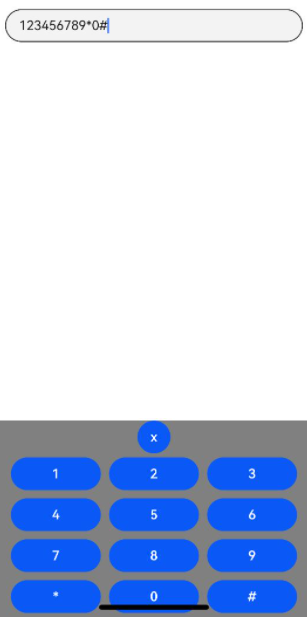
Example 3: Implementing a Custom Keyboard
This example demonstrates how to implement a custom keyboard using the customKeyboard attribute.
// xxx.ets
@Entry
@Component
struct TextInputExample {
  controller: TextInputController = new TextInputController();
  @State inputValue: string = "";

  // Create a custom keyboard component.
  @Builder
  CustomKeyboardBuilder() {
    Column() {
      Button('x').onClick(() => {
        // Disable the custom keyboard.
        this.controller.stopEditing();
      })
      Grid() {
        ForEach([1, 2, 3, 4, 5, 6, 7, 8, 9, '*', 0, '#'], (item: number|string) => {
          GridItem() {
            Button(item + "")
              .width(110).onClick(() => {
              this.inputValue += item;
            })
          }
        })
      }.maxCount(3).columnsGap(10).rowsGap(10).padding(5)
    }.backgroundColor(Color.Gray)
  }

  build() {
    Column() {
      TextInput({ controller: this.controller, text: this.inputValue })// Bind a custom keyboard.
        .customKeyboard(this.CustomKeyboardBuilder()).margin(10).border({ width: 1 }).height('48vp')
    }
  }
}
Example 4: Customizing the Cancel Button Style on the Right
This example demonstrates how to use the cancelButton attribute to customize the style of the cancel button on the right side of the text box.
// xxx.ets
@Entry
@Component
struct TextInputExample {
  @State text: string = '';
  controller: TextInputController = new TextInputController();

  build() {
    Column() {
      TextInput({ placeholder: 'input ...', controller: this.controller })
        .width(380)
        .height(60)
        .cancelButton({
          style: CancelButtonStyle.CONSTANT,
          icon: {
            size: 45,
            src: $r('app.media.app_icon'),
            color: Color.Blue
          }
        })
        .onChange((value: string) => {
          this.text = value;
        })
    }
  }
}

Example 5: Implementing a Counter
This example showcases the implementation of a counter feature using the maxLength, showCounter, and showUnderline attributes.
// xxx.ets
@Entry
@Component
struct TextInputExample {
  @State text: string = '';
  controller: TextInputController = new TextInputController();

  build() {
    Column() {
      TextInput({ text: this.text, controller: this.controller })
        .placeholderFont({ size: 16, weight: 400 })
        .width(336)
        .height(56)
        .maxLength(6)
        .showUnderline(true)
        .showCounter(true,
          { thresholdPercentage: 50, highlightBorder: true })// The character counter is in this format: Number of characters that have been entered/Maximum number of characters allowed, which is specified by maxLength().
          // The character counter is displayed when the number of characters that have been entered is greater than the maximum number of characters multiplied by 50% (threshold percentage).
          // When highlightBorder is set to false, the text box border turns red when the number of entered characters reaches the maximum. The default value is true.
        .onChange((value: string) => {
          this.text = value;
        })
    }.width('100%').height('100%').backgroundColor('#F1F3F5')
  }
}

Example 6: Formatting Phone Numbers
This example illustrates how to format phone numbers using the onChange callback API.
// xxx.ets
@Entry
@Component
struct TextInputExample {
  @State submitValue: string = '';
  @State text: string = '';
  public readonly NUM_TEXT_MAXSIZE_LENGTH = 13;
  @State teleNumberNoSpace: string = "";
  @State nextCaret: number = -1; // Used to record the position for the next caret setting.
  @State actualCh: number = -1; // Used to record the insertion or deletion position relative to the i-th digit of the caret.
  @State lastCaretPosition: number = 0;
  @State lastCaretPositionEnd: number = 0;
  controller: TextInputController = new TextInputController();

  isEmpty(str?: string): boolean {
    return str == 'undefined'||!str||!new RegExp("[^\\s]").test(str);
  }

  checkNeedNumberSpace(numText: string) {
    let isSpace: RegExp = new RegExp('[\\+;,#\\*]', 'g');
    let isRule: RegExp = new RegExp('^\\+.*');

    if (isSpace.test(numText)) {
      // If the phone number contains special characters, no space is added.
      if (isRule.test(numText)) {
        return true;
      } else {
        return false;
      }
    }
    return true;
  }

  removeSpace(str: string): string {
    if (this.isEmpty(str)) {
      return '';
    }
    return str.replace(new RegExp("[\\s]", "g"), '');
  }

  setCaret() {
    if (this.nextCaret != -1) {
      console.log("to keep caret position right, change caret to", this.nextCaret);
      this.controller.caretPosition(this.nextCaret);
      this.nextCaret = -1;
    }
  }

  calcCaretPosition(nextText: string) {
    let befNumberNoSpace: string = this.removeSpace(this.text);
    this.actualCh = 0;
    if (befNumberNoSpace.length < this.teleNumberNoSpace.length) { // Insertion scenario
      for (let i = 0; i < this.lastCaretPosition; i++) {
        if (this.text[i] != ' ') {
          this.actualCh += 1;
        }
      }
      this.actualCh += this.teleNumberNoSpace.length - befNumberNoSpace.length;
      console.log("actualCh: " + this.actualCh);
      for (let i = 0; i < nextText.length; i++) {
        if (nextText[i] != ' ') {
          this.actualCh -= 1;
          if (this.actualCh <= 0) {
            this.nextCaret = i + 1;
            break;
          }
        }
      }
    } else if (befNumberNoSpace.length > this.teleNumberNoSpace.length) { // Deletion scenario
      if (this.lastCaretPosition === this.text.length) {
        console.log("Caret at last, no need to change");
      } else if (this.lastCaretPosition === this.lastCaretPositionEnd) {
        // Scenario where the backspace key on the keyboard is used to delete characters one by one
        for (let i = this.lastCaretPosition; i < this.text.length; i++) {
          if (this.text[i] != ' ') {
            this.actualCh += 1;
          }
        }
        for (let i = nextText.length - 1; i >= 0; i--) {
          if (nextText[i] != ' ') {
            this.actualCh -= 1;
            if (this.actualCh <= 0) {
              this.nextCaret = i;
              break;
            }
          }
        }
      } else {
        // When cutting or selecting text with a handle to delete multiple characters at once
        this.nextCaret = this.lastCaretPosition; // Maintain the caret position.
      }
    }
  }

  build() {
    Column() {
      Row() {
        TextInput({ text: `${this.text}`, controller: this.controller }).type(InputType.PhoneNumber).height('48vp')
          .onChange((number: string) => {
            this.teleNumberNoSpace = this.removeSpace(number);
            let nextText: string = "";
            if (this.teleNumberNoSpace.length > this.NUM_TEXT_MAXSIZE_LENGTH - 2) {
              nextText = this.teleNumberNoSpace;
            } else if (this.checkNeedNumberSpace(number)) {
              if (this.teleNumberNoSpace.length <= 3) {
                nextText = this.teleNumberNoSpace;
              } else {
                let split1: string = this.teleNumberNoSpace.substring(0, 3);
                let split2: string = this.teleNumberNoSpace.substring(3);
                nextText = split1 + ' ' + split2;
                if (this.teleNumberNoSpace.length > 7) {
                  split2 = this.teleNumberNoSpace.substring(3, 7);
                  let split3: string = this.teleNumberNoSpace.substring(7);
                  nextText = split1 + ' ' + split2 + ' ' + split3;
                }
              }
            } else {
              nextText = number;
            }
            console.log("onChange Triggered:" + this.text + "|" + nextText + "|" + number);
            if (this.text === nextText && nextText === number) {
              // The number has been formatted. Changing the caret position at this time will not reset the number.
              this.setCaret();
            } else {
              this.calcCaretPosition(nextText);
            }
            this.text = nextText;
          })
          .onTextSelectionChange((selectionStart, selectionEnd) => {
            // Record the caret position.
            console.log("selection change: ", selectionStart, selectionEnd);
            this.lastCaretPosition = selectionStart;
            this.lastCaretPositionEnd = selectionEnd;
          })
      }
    }
    .width('100%')
    .height("100%")
  }
}

Example 7: Setting Text Wrapping Rules
This example demonstrates the effects of different text wrapping rules using the wordBreak attribute.
// xxx.ets
@Entry
@Component
struct TextInputExample {
  @State textStrEn: string =
    'This is set wordBreak to WordBreak text Taumatawhakatangihangakoauauotamateaturipukakapikimaungahoronukupokaiwhenuakitanatahu.';
  @State textStrZn: string =
    'The TextArea component provides multi-line text input and automatically wraps text to ensure that no line extends beyond the component's width.\nWhen the height is not set, the component has no default height and adapts to the content height. When the width is not set, it defaults to the maximum width.';';

  build() {
    Row() {
      Column() {
        Text("WordBreakType as NORMAL in the inline input style:").fontSize(16).fontColor(0xCCCCCC)
        TextInput({
          text: this.textStrEn
        })
          .margin(10)
          .fontSize(16)
          .style(TextInputStyle.Inline)// Inline input style
          .wordBreak(WordBreak.NORMAL) // This attribute does not take effect for the non-inline input style.

        Text("WordBreakType as BREAK_ALL in the inline input style:").fontSize(16).fontColor(0xCCCCCC)
        TextInput({
          text: this.textStrEn
        })
          .margin(10)
          .fontSize(16)
          .style(TextInputStyle.Inline)
          .wordBreak(WordBreak.BREAK_ALL)

        Text("WordBreakType as BREAK_WORD in the inline input style:").fontSize(16).fontColor(0xCCCCCC)
        TextInput({
          text: this.textStrEn
        })
          .margin(10)
          .fontSize(16)
          .style(TextInputStyle.Inline)
          .wordBreak(WordBreak.BREAK_WORD)
      }.width('100%')
    }.height('100%').margin(10)
  }
}
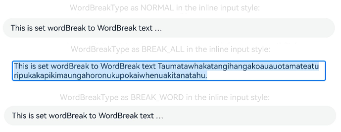
Example 8: Setting the Text Style
This example showcases various text styles by using the lineHeight, letterSpacing, and decoration attributes.
// xxx.ets
@Entry
@Component
struct TextInputExample {
  build() {
    Row() {
      Column() {
        Text('lineHeight').fontSize(9).fontColor(0xCCCCCC)
        TextInput({ text: 'lineHeight unset' })
          .border({ width: 1 }).padding(10).margin(5)
        TextInput({ text: 'lineHeight 15' })
          .border({ width: 1 }).padding(10).margin(5).lineHeight(15)
        TextInput({ text: 'lineHeight 30' })
          .border({ width: 1 }).padding(10).margin(5).lineHeight(30)

        Text('letterSpacing').fontSize(9).fontColor(0xCCCCCC)
        TextInput({ text: 'letterSpacing 0' })
          .border({ width: 1 }).padding(5).margin(5).letterSpacing(0)
        TextInput({ text: 'letterSpacing 3' })
          .border({ width: 1 }).padding(5).margin(5).letterSpacing(3)
        TextInput({ text: 'letterSpacing -1' })
          .border({ width: 1 }).padding(5).margin(5).letterSpacing(-1)

        Text('decoration').fontSize(9).fontColor(0xCCCCCC)
        TextInput({ text: 'LineThrough, Red' })
          .border({ width: 1 }).padding(5).margin(5)
          .decoration({ type: TextDecorationType.LineThrough, color: Color.Red })
        TextInput({ text: 'Overline, Red, DASHED' })
          .border({ width: 1 }).padding(5).margin(5)
          .decoration({ type: TextDecorationType.Overline, color: Color.Red, style: TextDecorationStyle.DASHED })
        TextInput({ text: 'Underline, Red, WAVY' })
          .border({ width: 1 }).padding(5).margin(5)
          .decoration({ type: TextDecorationType.Underline, color: Color.Red, style: TextDecorationStyle.WAVY })
      }.height('90%')
    }
    .width('90%')
    .margin(10)
  }
}
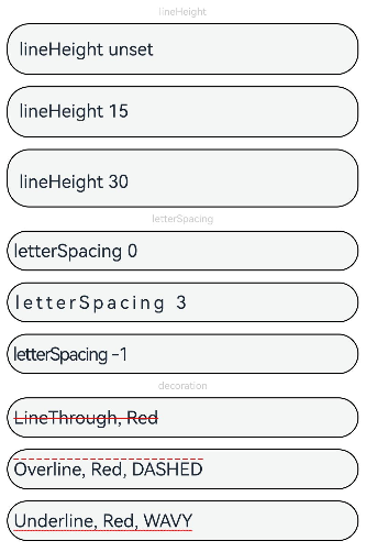
Example 9: Setting Text Feature Effects
This example demonstrates how to use the fontFeature attribute to display text with various typographic features.
// xxx.ets
@Entry
@Component
struct TextInputExample {
  @State text1: string = 'This is ss01 on : 0123456789';
  @State text2: string = 'This is ss01 off: 0123456789';

  build() {
    Column() {
      TextInput({ text: this.text1 })
        .fontSize(20)
        .margin({ top: 200 })
        .fontFeature("\"ss01\" on")
      TextInput({ text: this.text2 })
        .margin({ top: 10 })
        .fontSize(20)
        .fontFeature("\"ss01\" off")
    }
    .width("90%")
    .margin("5%")
  }
}
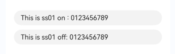
Example 10: Setting Custom Keyboard Avoidance
This example illustrates the implementation of a custom keyboard that automatically adjusts its position to avoid covering the text box.
// xxx.ets
@Entry
@Component
struct TextInputExample {
  controller: TextInputController = new TextInputController();
  @State inputValue: string = "";
  @State height1: string|number = '80%';
  @State supportAvoidance: boolean = true;

  // Create a custom keyboard component.
  @Builder
  CustomKeyboardBuilder() {
    Column() {
      Row() {
        Button('x').onClick(() => {
          // Disable the custom keyboard.
          this.controller.stopEditing();
        }).margin(10)
      }

      Grid() {
        ForEach([1, 2, 3, 4, 5, 6, 7, 8, 9, '*', 0, '#'], (item: number|string) => {
          GridItem() {
            Button(item + "")
              .width(110).onClick(() => {
              this.inputValue += item;
            })
          }
        })
      }.maxCount(3).columnsGap(10).rowsGap(10).padding(5)
    }.backgroundColor(Color.Gray)
  }

  build() {
    Column() {
      Row() {
        Button("20%")
          .fontSize(24)
          .onClick(() => {
            this.height1 = "20%";
          })
        Button("80%")
          .fontSize(24)
          .margin({ left: 20 })
          .onClick(() => {
            this.height1 = "80%";
          })
      }
      .justifyContent(FlexAlign.Center)
      .alignItems(VerticalAlign.Bottom)
      .height(this.height1)
      .width("100%")
      .padding({ bottom: 50 })

      TextInput({ controller: this.controller, text: this.inputValue })// Bind a custom keyboard.
        .customKeyboard(this.CustomKeyboardBuilder(), { supportAvoidance: this.supportAvoidance })
        .margin(10)
        .border({ width: 1 })

    }
  }
}
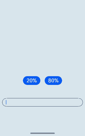
Example 11: Setting Text Auto-Adaptation
This example showcases the implementation of text auto-adaptation features using the minFontSize, maxFontSize, and heightAdaptivePolicy attributes.
// xxx.ets
@Entry
@Component
struct TextInputExample {
  build() {
    Row() {
      Column() {
        Text('heightAdaptivePolicy').fontSize(9).fontColor(0xCCCCCC)
        TextInput({ text: 'This is the text without the height adaptive policy set' })
          .width('80%').height(50).borderWidth(1).margin(1)
        TextInput({ text: 'This is the text with the height adaptive policy set' })
          .width('80%')
          .height(50)
          .borderWidth(1)
          .margin(1)
          .minFontSize(4)
          .maxFontSize(40)
          .maxLines(3)
          .heightAdaptivePolicy(TextHeightAdaptivePolicy.MAX_LINES_FIRST)
        TextInput({ text: 'This is the text with the height adaptive policy set' })
          .width('80%')
          .height(50)
          .borderWidth(1)
          .margin(1)
          .minFontSize(4)
          .maxFontSize(40)
          .maxLines(3)
          .heightAdaptivePolicy(TextHeightAdaptivePolicy.MIN_FONT_SIZE_FIRST)
        TextInput({ text: 'This is the text with the height adaptive policy set' })
          .width('80%')
          .height(50)
          .borderWidth(1)
          .margin(1)
          .minFontSize(4)
          .maxFontSize(40)
          .maxLines(3)
          .heightAdaptivePolicy(TextHeightAdaptivePolicy.LAYOUT_CONSTRAINT_FIRST)
      }.height('90%')
    }
    .width('90%')
    .margin(10)
  }
}
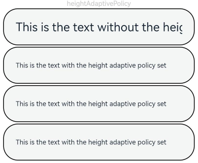
Example 12: Setting Line Break Rules
This example demonstrates the effects of different line break rules using the wordBreak attribute.
// xxx.ets
@Entry
@Component
struct TextInputExample {
  @State message1: string =
    "They can be classified as built-in components–those directly provided by the ArkUI framework and custom components – those defined by developers" +
      "The built-in components include buttons radio buttonsprogress indicators and text You can set the rendering effectof thesecomponents in method chaining mode," +
      "page components are divided into independent UI units to implement independent creation development and reuse of different units on pages making pages more engineering-oriented.";
  @State lineBreakStrategyIndex: number = 0;
  @State lineBreakStrategy: LineBreakStrategy[] =
    [LineBreakStrategy.GREEDY, LineBreakStrategy.HIGH_QUALITY, LineBreakStrategy.BALANCED];
  @State lineBreakStrategyStr: string[] = ['GREEDY', 'HIGH_QUALITY', 'BALANCED'];

  build() {
    Flex({ direction: FlexDirection.Column, alignItems: ItemAlign.Start }) {
      Text('lineBreakStrategy').fontSize(9).fontColor(0xCCCCCC)
      TextInput({ text: this.message1 })
        .fontSize(12)
        .border({ width: 1 })
        .padding(10)
        .width('100%')
        .maxLines(12)
        .style(TextInputStyle.Inline)
        .lineBreakStrategy(this.lineBreakStrategy[this.lineBreakStrategyIndex])
      Row() {
        Button('Current lineBreakStrategy value: ' + this.lineBreakStrategyStr[this.lineBreakStrategyIndex]).onClick(() => {
          this.lineBreakStrategyIndex++;
          if (this.lineBreakStrategyIndex > (this.lineBreakStrategyStr.length - 1)) {
            this.lineBreakStrategyIndex = 0;
          }
        })
      }
    }.height(700).width(370).padding({ left: 35, right: 35, top: 35 })
  }
}
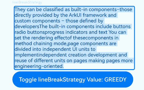
Example 13: Setting Insert and Delete Callbacks
This example showcases the implementation of insert and delete operations using the onWillInsert, onDidInsert, onWillDelete, and onDidDelete APIs.
// xxx.ets
@Entry
@Component
struct TextInputExample {
  @State insertValue: string = "";
  @State deleteValue: string = "";
  @State insertOffset: number = 0;
  @State deleteOffset: number = 0;
  @State deleteDirection: number = 0;

  build() {
    Row() {
      Column() {
        TextInput({ text: "Insert callbacks" })
          .height(60)
          .onWillInsert((info: InsertValue) => {
            this.insertValue = info.insertValue;
            return true;
          })
          .onDidInsert((info: InsertValue) => {
            this.insertOffset = info.insertOffset;
          })

        Text("insertValue:" + this.insertValue + "  insertOffset:" + this.insertOffset).height(30)

        TextInput({ text: "Delete callbacks" })
          .height(60)
          .onWillDelete((info: DeleteValue) => {
            this.deleteValue = info.deleteValue;
            info.direction;
            return true;
          })
          .onDidDelete((info: DeleteValue) => {
            this.deleteOffset = info.deleteOffset;
            this.deleteDirection = info.direction;
          })

        Text("deleteValue:" + this.deleteValue + "  deleteOffset:" + this.deleteOffset).height(30)
        Text("deleteDirection:" + (this.deleteDirection == 0 ? "BACKWARD" : "FORWARD")).height(30)

      }.width('100%')
    }
    .height('100%')
  }
}
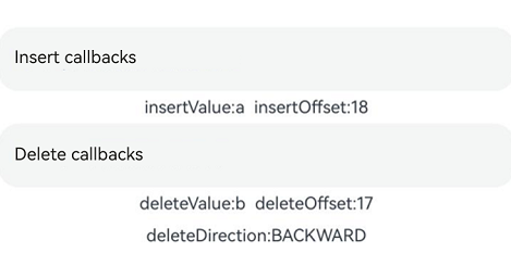
Example 14: Setting Custom Menu Extensions
This example demonstrates how to use the editMenuOptions API to create custom menu extensions for text settings. It includes customizing text content, icons, and callbacks for these extensions.
// xxx.ets
@Entry
@Component
struct TextInputExample {
  @State text: string = 'TextInput editMenuOptions'
  onCreateMenu = (menuItems: Array<TextMenuItem>) => {
    let item1: TextMenuItem = {
      content: 'custom1',
      icon: $r('app.media.startIcon'),
      id: TextMenuItemId.of('custom1'),
    };
    let item2: TextMenuItem = {
      content: 'custom2',
      id: TextMenuItemId.of('custom2'),
      icon: $r('app.media.startIcon'),
    };
    menuItems.push(item1);
    menuItems.unshift(item2);
    return menuItems;
  }
  onMenuItemClick = (menuItem: TextMenuItem, textRange: TextRange) => {
    if (menuItem.id.equals(TextMenuItemId.of("custom2"))) {
      console.log("Intercept id: custom2 start:" + textRange.start + "; end:" + textRange.end);
      return true;
    }
    if (menuItem.id.equals(TextMenuItemId.COPY)) {
      console.log("Intercept COPY start:" + textRange.start + "; end:" + textRange.end);
      return true;
    }
    if (menuItem.id.equals(TextMenuItemId.SELECT_ALL)) {
      console.log("Do not intercept SELECT_ALL start:" + textRange.start + "; end:" + textRange.end);
      return false;
    }
    return false;
  }
  @State editMenuOptions: EditMenuOptions = {
    onCreateMenu: this.onCreateMenu, onMenuItemClick: this.onMenuItemClick
  }

  build() {
    Column() {
      TextInput({ text: this.text })
        .width('95%')
        .height(50)
        .editMenuOptions(this.editMenuOptions)
        .margin({ top: 100 })
    }
    .width("90%")
    .margin("5%")
  }
}
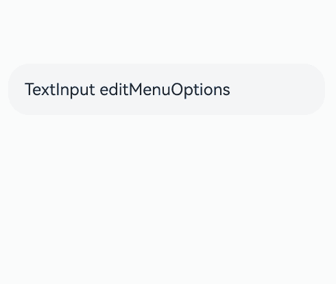
Example 15: Setting a Symbol-Type Cancel Button
This example demonstrates how to use the cancelButton attribute to customize the style of the symbol-type cancel button on the right side of the text box.
import { SymbolGlyphModifier } from '@kit.ArkUI';

// xxx.ets
@Entry
@Component
struct TextInputExample {
  @State text: string = '';
  symbolModifier: SymbolGlyphModifier =
    new SymbolGlyphModifier($r('sys.symbol.trash')).fontColor([Color.Red]).fontSize(16).fontWeight(FontWeight.Regular);

  build() {
    Column() {
      TextInput({ text: this.text, placeholder: 'input your word...' })
        .cancelButton({
          style: CancelButtonStyle.CONSTANT,
          icon: this.symbolModifier
        })
    }
  }
}

Example 16: Setting Text Overflow
This example demonstrates how to use textOverflow, ellipsisMode, and style to display excess content with an ellipsis (…) when the text is too long.
// xxx.ets
@Entry
@Component
struct EllipsisModeExample {
  @State text: string = "As the sun begins to set, casting a warm golden hue across the sky," +
    "the world seems to slow down and breathe a sigh of relief. The sky is painted with hues of orange, " +
    " pink, and lavender, creating a breath taking tapestry that stretches as far as the eye can see." +
    "The air is filled with the sweet scent of blooming flowers, mingling with the earthy aroma of freshly turned soil."
  @State ellipsisModeIndex: number = 0
  @State ellipsisMode: (EllipsisMode|undefined|null)[] = [EllipsisMode.END, EllipsisMode.START, EllipsisMode.CENTER]
  @State ellipsisModeStr: string[] = ['END ', 'START', 'CENTER']
  @State textOverflowIndex: number = 0
  @State textOverflow: TextOverflow[] = [TextOverflow.Ellipsis, TextOverflow.Clip]
  @State textOverflowStr: string[] = ['Ellipsis', 'Clip']
  @State styleInputIndex: number = 0
  @State styleInput: TextInputStyle[] = [TextInputStyle.Inline, TextInputStyle.Default]
  @State styleInputStr: string[] = ['Inline', 'Default']
  build() {
    Row() {
      Column({ space: 20 }) {
        Text('Test TextInput').fontSize(30)
        TextInput({ text: this.text})
          .textOverflow( this.textOverflow[this.textOverflowIndex])
          .ellipsisMode( this.ellipsisMode[this.ellipsisModeIndex])
          .style(this.styleInput[this.styleInputIndex])
          .fontSize(30)
          .margin(30)
        Button('ellipsisMode Value: ' + this.ellipsisModeStr[this.ellipsisModeIndex]).onClick(() => {
          this.ellipsisModeIndex++
          if (this.ellipsisModeIndex > (this.ellipsisModeStr.length - 1)) {
            this.ellipsisModeIndex = 0
          }
        }).fontSize(20)
        Button('textOverflow Value: ' + this.textOverflowStr[this.textOverflowIndex]).onClick(() => {
          this.textOverflowIndex++
          if (this.textOverflowIndex > (this.textOverflowStr.length - 1)) {
            this.textOverflowIndex = 0
          }
        }).fontSize(20)
        Button('Style Value: ' + this.styleInputStr[this.styleInputIndex]).onClick(() => {
          this.styleInputIndex++
          if (this.styleInputIndex > (this.styleInputStr.length - 1)) {
            this.styleInputIndex = 0
          }
        }).fontSize(20)
      }
    }
  }
}

Example 17: Implementing Callbacks for Input Status Changes, Copy, Cut, Paste, and Content Scrolling
This example demonstrates how to monitor input status changes, copy, cut, paste, and text content scrolling events using the onEditChange, onCopy, onCut, onPaste, and onContentScroll APIs.
// xxx.ets
@Entry
@Component
struct TextInputExample {
  @State editStatus: boolean = false;
  @State copyValue: string = "";
  @State cutValue: string = "";
  @State pasteValue: string = "";
  @State totalOffsetX: number = 0;
  @State totalOffsetY: number = 0;

  build() {
    Row() {
      Column() {
        TextInput({ text: "TextInput supports the callback on input status changes" })
          .height(60)
          .fontStyle(FontStyle.Italic)
          .fontWeight(FontWeight.Bold)
          .fontFamily("HarmonyOS Sans")
          .copyOption(CopyOptions.LocalDevice)
          .textAlign(TextAlign.Center)
          .selectedBackgroundColor(Color.Blue)
          .caretStyle({ width: '4vp' })
          .caretPosition(10)// Set the caret position in the TextInput component.
          .selectionMenuHidden(true)// Hide the system text selection menu.
          .onEditChange((status: boolean) => {
            this.editStatus = status;
          })
          .defaultFocus (true)// Set the TextInput component as the default focus.
          .enableKeyboardOnFocus (false)// Prevent the keyboard from appearing when the TextArea component obtains focus in a way other than clicking.
          .selectAll(false)

        Text("editStatus:" + this.editStatus).height(30)

        TextInput({ text: "TextInput supports the callback on copy operations" })
          .height(60)
          .fontStyle(FontStyle.Italic)
          .fontWeight(FontWeight.Bold)
          .fontFamily("HarmonyOS Sans")
          .copyOption(CopyOptions.LocalDevice)
          .textAlign(TextAlign.Center)
          .selectedBackgroundColor(Color.Blue)
          .caretStyle({ width: '4vp' })
          .onCopy((copyValue: string) => {
            this.copyValue = copyValue;
          })

        Text("copyValue:" + this.copyValue).height(30)

        TextInput({ text: "TextInput supports the callback on cut operations" })
          .height(60)
          .fontStyle(FontStyle.Italic)
          .fontWeight(FontWeight.Bold)
          .fontFamily("HarmonyOS Sans")
          .copyOption(CopyOptions.LocalDevice)
          .textAlign(TextAlign.Center)
          .selectedBackgroundColor(Color.Blue)
          .caretStyle({ width: '4vp' })
          .onCut((cutValue: string) => {
            this.cutValue = cutValue;
          })

        Text("cutValue:" + this.cutValue).height(30)

        TextInput({ text: "TextInput supports the callback on paste operations" })
          .height(60)
          .fontStyle(FontStyle.Italic)
          .fontWeight(FontWeight.Bold)
          .fontFamily("HarmonyOS Sans")
          .copyOption(CopyOptions.LocalDevice)
          .textAlign(TextAlign.Center)
          .selectedBackgroundColor(Color.Blue)
          .caretStyle({ width: '4vp' })
          .onPaste((pasteValue: string) => {
            this.pasteValue = pasteValue;
          })

        Text("pasteValue:" + this.pasteValue).height(30)

        TextInput({ text: "TextInput supports the callback on content scrolling: Scroll the text to see offset changes when the text width exceeds the text box width" })
          .height(60)
          .fontStyle(FontStyle.Italic)
          .fontWeight(FontWeight.Bold)
          .fontFamily("HarmonyOS Sans")
          .copyOption(CopyOptions.LocalDevice)
          .textAlign(TextAlign.Center)
          .selectedBackgroundColor(Color.Blue)
          .caretStyle({ width: '4vp' })
          .onContentScroll((totalOffsetX: number, totalOffsetY: number) => {
            this.totalOffsetX = totalOffsetX;
            this.totalOffsetY = totalOffsetY;
          })

        Text("totalOffsetX:" + this.totalOffsetX + "  totalOffsetY:" + this.totalOffsetY).height(30)

      }.width('100%')
    }
    .height('100%')
  }
}
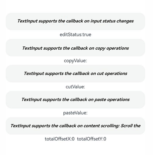
Example 18: Setting the Minimum and Maximum Font Scale Factor
This example demonstrates how to set the minimum and maximum font scale factor using minFontScale and maxFontScale.
import { abilityManager, Configuration } from '@kit.AbilityKit';
import { BusinessError } from '@kit.BasicServicesKit';

// xxx.ets
@Entry
@Component
export struct TextAreaExample11 {
  @State minFontScale: number = 0.85;
  @State maxFontScale: number = 2;
  @State changeValue: string = 'abcde';

  build() {
    Column() {
      Column({ space: 30 }) {
        Text("System font size changes: small and large, small and large")
        TextArea({
          placeholder: 'The text area can hold an unlimited amount of text. input your word...',
        })
        // Set the minimum font scale factor; if the value is undefined, the text follows the default font scale factor.
          .minFontScale(0.85)
          // Set the maximum font scale factor; if the value is undefined, the text follows the default font scale factor.
          .maxFontScale(2)
      }.width('100%')
    }
  }
}
Create a new directory named profile in the following path: AppScope/resources/base.
Inside the newly created profile directory, create a file named configuration.json.
Add the following JSON code to the **configuration.json** file:
{
  "configuration":{
    "fontSizeScale": "followSystem",
    "fontSizeMaxScale": "3.2"
}
}
Modify the app.json5 file in AppScope as follows:
{
  "app": {
    "bundleName": "com.example.myapplication",
    "vendor": "example",
    "versionCode": 1000000,
    "versionName": "1.0.0",
    "icon": "$media:app_icon",
    "label": "$string:app_name",
    "configuration": "$profile:configuration"
  }
}
你可能感兴趣的鸿蒙文章
- 所属分类: 后端技术
- 本文标签:
热门推荐
-
2、 优质文章
-
3、 gt
-
7、 openharmony
-
9、 golang
-
10、 Vue中input框自动聚焦