harmony 鸿蒙Search
Search
The Search component provides an area for users to enter search queries.
NOTE
This component is supported since API version 8. Updates will be marked with a superscript to indicate their earliest API version.
Child Components
Not supported
APIs
Search(options?: SearchOptions)
Atomic service API: This API can be used in atomic services since API version 11.
System capability: SystemCapability.ArkUI.ArkUI.Full
Parameters
| Name | Type | Mandatory | Description |
|---|---|---|---|
| options | SearchOptions | No | Initialization options of the Search component. |
SearchOptions18+
Describes the initialization options of the Search component.
Atomic service API: This API can be used in atomic services since API version 18.
System capability: SystemCapability.ArkUI.ArkUI.Full
| Name | Type | Mandatory | Description |
|---|---|---|---|
| value8+ | string | No | Text input in the search text box. Since API version 10, this parameter supports two-way binding through $$. Since API version 18, this parameter supports two-way binding through !!. Atomic service API: This API can be used in atomic services since API version 11. |
| placeholder8+ | ResourceStr | No | Text displayed when there is no input. Atomic service API: This API can be used in atomic services since API version 11. |
| icon8+ | string | No | Path to the search icon. By default, the system search icon is used. NOTE The icon data source can be a local or online image. - The supported formats include PNG, JPG, BMP, SVG, GIF, pixelmap, and HEIF. - The Base64 string is supported in the following format: data:image/[png|jpeg|bmp|webp|heif];base64,[base64 data], where [base64 data] is a Base64 string. If this attribute and the searchIcon attribute are both set, the searchIcon attribute takes precedence. Atomic service API: This API can be used in atomic services since API version 11. |
| controller8+ | SearchController | No | Controller of the Search component. Atomic service API: This API can be used in atomic services since API version 11. |
Attributes
In addition to the universal attributes, the following attributes are supported.
searchButton
searchButton(value: string, option?: SearchButtonOptions)
Sets the text on the search button located next to the search text box.
Clicking the search button triggers both onSubmit and onClick callbacks.
The default font size on wearable devices is 18 fp.
Atomic service API: This API can be used in atomic services since API version 11.
System capability: SystemCapability.ArkUI.ArkUI.Full
Parameters
| Name | Type | Mandatory | Description |
|---|---|---|---|
| value | string | Yes | Text on the search button located next to the search text box. |
| option | SearchButtonOptions | No | Font of the search text box. Default value: { fontSize: ‘16fp’, fontColor: ‘#ff3f97e9’ } |
placeholderColor
placeholderColor(value: ResourceColor)
Sets the placeholder text color. The default value on wearable devices is #99ffffff.
Atomic service API: This API can be used in atomic services since API version 11.
System capability: SystemCapability.ArkUI.ArkUI.Full
Parameters
| Name | Type | Mandatory | Description |
|---|---|---|---|
| value | ResourceColor | Yes | Placeholder text color. Default value: ’#99182431’ |
placeholderFont
placeholderFont(value?: Font)
Sets the placeholder text style, including the font size, font width, font family, and font style. The ‘HarmonyOS Sans’ font and registered custom fonts are supported.
The default font size on wearable devices is 18 px.
Atomic service API: This API can be used in atomic services since API version 11.
System capability: SystemCapability.ArkUI.ArkUI.Full
Parameters
| Name | Type | Mandatory | Description |
|---|---|---|---|
| value | Font | No | Placeholder text style. |
textFont
textFont(value?: Font)
Sets the style of the text entered in the search box, including the font size, font width, font family, and font style. Currently, only the default font family is supported.
The default font size on wearable devices is 18 fp.
Atomic service API: This API can be used in atomic services since API version 11.
System capability: SystemCapability.ArkUI.ArkUI.Full
Parameters
| Name | Type | Mandatory | Description |
|---|---|---|---|
| value | Font | No | Text font of the search text box. |
textAlign9+
textAlign(value: TextAlign)
Sets the text alignment mode in the search text box. Currently, the following alignment modes are supported: Start, Center, and End.
Atomic service API: This API can be used in atomic services since API version 11.
System capability: SystemCapability.ArkUI.ArkUI.Full
Parameters
| Name | Type | Mandatory | Description |
|---|---|---|---|
| value | TextAlign | Yes | Text alignment mode in the search text box. Default value: TextAlign.Start |
copyOption9+
copyOption(value: CopyOptions)
Sets whether copy and paste is allowed. If this attribute is set to CopyOptions.None, the text can only be pasted; all other actions, such as copying, cutting, and sharing, are disabled.
Dragging is not allowed when CopyOptions.None is set.
Atomic service API: This API can be used in atomic services since API version 11.
System capability: SystemCapability.ArkUI.ArkUI.Full
Parameters
| Name | Type | Mandatory | Description |
|---|---|---|---|
| value | CopyOptions | Yes | Whether copy and paste is allowed. Default value: CopyOptions.LocalDevice |
searchIcon10+
searchIcon(value: IconOptions|SymbolGlyphModifier)
Sets the style of the search icon on the left.
The default icon size on wearable devices is 16 vp.
Atomic service API: This API can be used in atomic services since API version 11.
System capability: SystemCapability.ArkUI.ArkUI.Full
Parameters
| Name | Type | Mandatory | Description |
|---|---|---|---|
| value | IconOptions |SymbolGlyphModifier | Yes | Style of the search icon on the left. Default value in light mode: { size: ‘16vp’, color: ‘#99182431’, src: ‘ ‘ } Default value in dark mode: { size: ‘16vp’, color: ‘#99ffffff’, src: ‘ ‘ } |
cancelButton10+
cancelButton(value: CancelButtonOptions|CancelButtonSymbolOptions)
Sets the style of the Cancel button on the right.
The default icon size on wearable devices is 18 vp.
Atomic service API: This API can be used in atomic services since API version 11.
System capability: SystemCapability.ArkUI.ArkUI.Full
Parameters
| Name | Type | Mandatory | Description |
|---|---|---|---|
| value | CancelButtonOptions |CancelButtonSymbolOptions | Yes | Style of the Cancel button on the right. Default value: { style: CancelButtonStyle.INPUT, icon: { size: ‘16vp’, color: ‘#99ffffff’, src: ‘ ‘ } } When style is set to CancelButtonStyle.CONSTANT, the Cancel button is always displayed. |
fontColor10+
fontColor(value: ResourceColor)
Sets the font color of the input text. Universal text attributes fontSize, fontStyle, fontWeight, and fontFamily are set in the textFont attribute.
The default value on wearable devices is ’#dbffffff’.
Atomic service API: This API can be used in atomic services since API version 11.
System capability: SystemCapability.ArkUI.ArkUI.Full
Parameters
| Name | Type | Mandatory | Description |
|---|---|---|---|
| value | ResourceColor | Yes | Font color of the input text. Default value: ’#FF182431’ |
caretStyle10+
caretStyle(value: CaretStyle)
Sets the caret style.
Atomic service API: This API can be used in atomic services since API version 11.
System capability: SystemCapability.ArkUI.ArkUI.Full
Parameters
| Name | Type | Mandatory | Description |
|---|---|---|---|
| value | CaretStyle | Yes | Caret style. Default value: { width: ‘1.5vp’, color: ‘#007DFF’ } |
NOTE
Since API version 12, this API can be used to set the text handle color, which is the same as the caret color.
enableKeyboardOnFocus10+
enableKeyboardOnFocus(value: boolean)
Sets whether to enable the input method when the Search component obtains focus in a way other than clicking.
Since API version 10, the Search component brings up the keyboard by default when it obtains focus.
Atomic service API: This API can be used in atomic services since API version 11.
System capability: SystemCapability.ArkUI.ArkUI.Full
Parameters
| Name | Type | Mandatory | Description |
|---|---|---|---|
| value | boolean | Yes | Whether to enable the input method when the component obtains focus in a way other than clicking. Default value: true |
selectionMenuHidden10+
selectionMenuHidden(value: boolean)
Sets whether to hide the system text selection menu.
Atomic service API: This API can be used in atomic services since API version 11.
System capability: SystemCapability.ArkUI.ArkUI.Full
Parameters
| Name | Type | Mandatory | Description |
|---|---|---|---|
| value | boolean | Yes | Whether to hide the system text selection menu. true: Tapping, long-pressing, double-tapping, triple-tapping, or right-clicking the text box will not trigger the system text selection menu. false: Tapping, long-pressing, double-tapping, triple-tapping, or right-clicking the text box will trigger the system text selection menu. Default value: false |
customKeyboard10+
customKeyboard(value: CustomBuilder, options?: KeyboardOptions)
Sets the custom keyboard.
When a custom keyboard is set, activating the text box opens the specified custom component, instead of the system input method.
The custom keyboard’s height can be set through the height attribute of the custom component’s root node, and its width is fixed at the default value.
The custom keyboard is presented by overlaying the original screen. It is not compressed or lifted if avoid mode is not enabled or avoidance is not needed for the text box.
The custom keyboard cannot obtain the focus, but it blocks gesture events.
By default, the custom keyboard is closed when the input component loses the focus. You can also use the stopEditing API to close the keyboard.
When a custom keyboard is set, the text box does not support camera input, even when the device supports.
When setting a custom keyboard, you can bind the onKeyPrelme event to prevent input from the physical keyboard.
Atomic service API: This API can be used in atomic services since API version 11.
System capability: SystemCapability.ArkUI.ArkUI.Full
Parameters
| Name | Type | Mandatory | Description |
|---|---|---|---|
| value | CustomBuilder | Yes | Custom keyboard. |
| options12+ | KeyboardOptions | No | Whether to support keyboard avoidance. |
type11+
type(value: SearchType)
Sets the text box type.
Atomic service API: This API can be used in atomic services since API version 12.
System capability: SystemCapability.ArkUI.ArkUI.Full
Parameters
| Name | Type | Mandatory | Description |
|---|---|---|---|
| value | SearchType | Yes | Text box type. Default value: SearchType.Normal |
maxLength11+
maxLength(value: number)
Sets the maximum number of characters for text input. By default, there is no maximum number of characters. When the maximum number is reached, no more characters can be entered.
Atomic service API: This API can be used in atomic services since API version 12.
System capability: SystemCapability.ArkUI.ArkUI.Full
Parameters
| Name | Type | Mandatory | Description |
|---|---|---|---|
| value | number | Yes | Maximum number of characters for text input. |
enterKeyType12+
enterKeyType(value: EnterKeyType)
Sets the type of the Enter key.
Atomic service API: This API can be used in atomic services since API version 12.
System capability: SystemCapability.ArkUI.ArkUI.Full
Parameters
| Name | Type | Mandatory | Description |
|---|---|---|---|
| value | EnterKeyType | Yes | Type of the Enter key. Default value: EnterKeyType.Search |
lineHeight12+
lineHeight(value: number|string|Resource)
Sets the text line height. If the value is less than or equal to 0, the line height is not limited and the font size is adaptive. If the value is of the number type, the unit fp is used.
Atomic service API: This API can be used in atomic services since API version 12.
System capability: SystemCapability.ArkUI.ArkUI.Full
Parameters
| Name | Type | Mandatory | Description |
|---|---|---|---|
| value | number |string |Resource | Yes | Text line height. |
decoration12+
decoration(value: TextDecorationOptions)
Sets the color, type, and style of the text decorative line.
Atomic service API: This API can be used in atomic services since API version 12.
System capability: SystemCapability.ArkUI.ArkUI.Full
Parameters
| Name | Type | Mandatory | Description |
|---|---|---|---|
| value | TextDecorationOptions | Yes | Text decorative line options. Default value: { type: TextDecorationType.None, color: Color.Black, style: TextDecorationStyle.SOLID } |
letterSpacing12+
letterSpacing(value: number|string|Resource)
Sets the letter spacing for a text style. If the value specified is a percentage or 0, the default value is used. For the string type, numeric string values with optional units, for example, “10” or “10fp”, are supported.
If the value specified is a negative value, the text is compressed. A negative value too small may result in the text being compressed to 0 and no content being displayed.
Atomic service API: This API can be used in atomic services since API version 12.
System capability: SystemCapability.ArkUI.ArkUI.Full
Parameters
| Name | Type | Mandatory | Description |
|---|---|---|---|
| value | number |string |Resource | Yes | Letter spacing. Unit: fp |
fontFeature12+
fontFeature(value: string)
Sets the font feature, for example, monospaced digits.
Format: normal |<feature-tag-value>
Format of <feature-tag-value>: <string> [ <integer> |on |off ]
There can be multiple <feature-tag-value> values, which are separated by commas (,).
For example, the input format for monospaced clock fonts is “ss01” on.
Atomic service API: This API can be used in atomic services since API version 12.
System capability: SystemCapability.ArkUI.ArkUI.Full
Parameters
| Name | Type | Mandatory | Description |
|---|---|---|---|
| value | string | Yes | Font feature. |
For details about the supported font features, see Font Feature List. Font features are advanced typographic features, such as ligatures and monospace, for OpenType fonts. They are typically used in custom fonts and require the support of the font itself. For more information about the font features, see Low-level font feature settings control: the font-feature-settings property and The Complete CSS Demo for OpenType Features.
selectedBackgroundColor12+
selectedBackgroundColor(value: ResourceColor)
Sets the background color of the selected text. If the opacity is not set, a 20% opacity will be used.
Atomic service API: This API can be used in atomic services since API version 12.
System capability: SystemCapability.ArkUI.ArkUI.Full
Parameters
| Name | Type | Mandatory | Description |
|---|---|---|---|
| value | ResourceColor | Yes | Background color of the selected text. By default, a 20% opacity is applied. |
inputFilter12+
inputFilter(value: ResourceStr, error?: Callback< string >)
Sets the regular expression for input filtering. Only inputs that comply with the regular expression can be displayed. Other inputs are filtered out. The specified regular expression can match single characters, but not strings.
If inputFilter is set and the entered characters are not null, the filtering effect attached to the text box type (specified through the type attribute) does not take effect.
Atomic service API: This API can be used in atomic services since API version 12.
System capability: SystemCapability.ArkUI.ArkUI.Full
Parameters
| Name | Type | Mandatory | Description |
|---|---|---|---|
| value | ResourceStr | Yes | Regular expression. |
| error | Callback< string > | No | Filtered-out content to return when regular expression matching fails. |
textIndent12+
textIndent(value: Dimension)
Sets the indent of the first line text.
Atomic service API: This API can be used in atomic services since API version 12.
System capability: SystemCapability.ArkUI.ArkUI.Full
Parameters
| Name | Type | Mandatory | Description |
|---|---|---|---|
| value | Dimension | Yes | Indent of the first line text. Default value: 0 |
minFontSize12+
minFontSize(value: number|string|Resource)
Sets the minimum font size. For the string type, numeric string values with optional units, for example, “10” or “10fp”, are supported.
For the setting to take effect, this attribute must be used together with maxFontSize or layout constraint settings.
When the adaptive font size is used, the fontSize settings do not take effect.
Atomic service API: This API can be used in atomic services since API version 12.
System capability: SystemCapability.ArkUI.ArkUI.Full
Parameters
| Name | Type | Mandatory | Description |
|---|---|---|---|
| value | number |string |Resource | Yes | Minimum font size. Unit: fp |
maxFontSize12+
maxFontSize(value: number|string|Resource)
Sets the maximum font size. For the string type, numeric string values with optional units, for example, “10” or “10fp”, are supported.
For the setting to take effect, this attribute must be used together with minFontSize or layout constraint settings.
When the adaptive font size is used, the fontSize settings do not take effect.
Atomic service API: This API can be used in atomic services since API version 12.
System capability: SystemCapability.ArkUI.ArkUI.Full
Parameters
| Name | Type | Mandatory | Description |
|---|---|---|---|
| value | number |string |Resource | Yes | Maximum font size. Unit: fp |
halfLeading18+
halfLeading(halfLeading: Optional<boolean>)
Sets whether half leading is enabled.
Atomic service API: This API can be used in atomic services since API version 18.
System capability: SystemCapability.ArkUI.ArkUI.Full
Parameters
| Name | Type | Mandatory | Description |
|---|---|---|---|
| halfLeading | Optional<boolean> | Yes | Whether half leading is enabled. Half leading is the leading split in half and applied equally to the top and bottom edges. The value true means that half leading is enabled, and false means the opposite. Default value: false |
minFontScale18+
minFontScale(scale: Optional<number|Resource>)
Sets the minimum font scale factor for text.
Atomic service API: This API can be used in atomic services since API version 18.
System capability: SystemCapability.ArkUI.ArkUI.Full
Parameters
| Name | Type | Mandatory | Description |
|---|---|---|---|
| scale | Optional<number |Resource> | Yes | Minimum font scale factor for text. The undefined type is supported. Value range: [0, 1] NOTE A value less than 0 is handled as 0. A value greater than 1 is handled as 1. Abnormal values are ineffective by default. |
maxFontScale18+
maxFontScale(scale: Optional<number|Resource>)
Sets the maximum font scale factor for text.
Atomic service API: This API can be used in atomic services since API version 18.
System capability: SystemCapability.ArkUI.ArkUI.Full
Parameters
| Name | Type | Mandatory | Description |
|---|---|---|---|
| scale | Optional<number |Resource> | Yes | Maximum font scale factor for text. The undefined type is supported. Value range: [1, +∞) NOTE A value less than 1 is handled as 1. Abnormal values are ineffective by default. |
editMenuOptions12+
editMenuOptions(editMenu: EditMenuOptions)
Sets the extended options of the custom context menu on selection, including the text content, icon, and callback.
Atomic service API: This API can be used in atomic services since API version 12.
System capability: SystemCapability.ArkUI.ArkUI.Full
Parameters
| Name | Type | Mandatory | Description |
|---|---|---|---|
| editMenu | EditMenuOptions | Yes | Extended options of the custom context menu on selection. |
enablePreviewText12+
enablePreviewText(enable: boolean)
Sets whether to enable preview text.
Preview text is in a temporary state and does not support text interception. As such, it does not trigger onWillInsert, onDidInsert, onWillDelete, or onDidDelete callbacks.
Atomic service API: This API can be used in atomic services since API version 12.
System capability: SystemCapability.ArkUI.ArkUI.Full
Parameters
| Name | Type | Mandatory | Description |
|---|---|---|---|
| enable | boolean | Yes | Whether to enable preview text. Default value: true |
enableHapticFeedback13+
enableHapticFeedback(isEnabled: boolean)
Specifies whether to enable haptic feedback.
Atomic service API: This API can be used in atomic services since API version 13.
System capability: SystemCapability.ArkUI.ArkUI.Full
Parameters
| Name | Type | Mandatory | Description |
|---|---|---|---|
| isEnabled | boolean | Yes | Whether to enable haptic feedback. Default value: true |
NOTE
To enable haptic feedback, you must declare the ohos.permission.VIBRATE permission under requestPermissions in the module.json5 file of the project.
> "requestPermissions": [
>  {
>     "name": "ohos.permission.VIBRATE",
>  }
> ]
> ```

### keyboardAppearance<sup>15+</sup>

keyboardAppearance(appearance: Optional\<KeyboardAppearance>)

Sets the appearance of the keyboard when the text box is focused.

**Atomic service API**: This API can be used in atomic services since API version 15.

**System capability**: SystemCapability.ArkUI.ArkUI.Full

**Parameters**

|Name|Type|Mandatory|Description|
|------|-----------------------------------------|----|------------------------------------------------------|
|appearance|[Optional](https://m.seaxiang.com/blog/aIyD72)\<[KeyboardAppearance](ts-text-common.md#keyboardappearance15)>|Yes|Appearance of the keyboard.<br>Default value: **KeyboardAppearance.NONE_IMMERSIVE**|

### stopBackPress<sup>15+</sup>

stopBackPress(isStopped: Optional\<boolean>)

Sets whether to prevent the back button press from being propagated to other components or applications.

**Atomic service API**: This API can be used in atomic services since API version 15.

**System capability**: SystemCapability.ArkUI.ArkUI.Full

**Parameters**

|Name|Type |Mandatory|Description                            |
|------|-------|----|----------------------------------|
|isStopped|[Optional](https://m.seaxiang.com/blog/aIyD72)\<boolean>|Yes|Whether to consume the back button press.<br>Default value: **true**|

## IconOptions<sup>10+</sup>

**Atomic service API**: This API can be used in atomic services since API version 11.

**System capability**: SystemCapability.ArkUI.ArkUI.Full

|Name|Type                                |Mandatory|Description |
|------|------------------------------------------|----|-----------|
|size |[Length](ts-types.md#length)             |No|Icon size. It cannot be set in percentage. |
|color|[ResourceColor](https://m.seaxiang.com/blog/QdcP30)|No|Icon color. |
|src  |[ResourceStr](https://m.seaxiang.com/blog/QdcP30)   |No|Image source of the icon.|

## SearchButtonOptions<sup>10+</sup>

**System capability**: SystemCapability.ArkUI.ArkUI.Full

|Name |Type                                |Mandatory|Description      |
|---------|------------------------------------------|----|----------------|
|fontSize|[Length](ts-types.md#length)             |No|Font size of the button. It cannot be set in percentage. **Atomic service API**: This API can be used in atomic services since API version 11.|
|fontColor|[ResourceColor](https://m.seaxiang.com/blog/QdcP30)|No|Font color of the button. **Atomic service API**: This API can be used in atomic services since API version 11.|
|autoDisable<sup>18+</sup>|Boolean                 |No|Whether to disable the search button when there is no text input.<br>Default value: **false**<br>**true**: The search button is disabled when there is no text input.<br>**false**: The search button remains enabled regardless of the text input.<br>**Atomic service API**: This API can be used in atomic services since API version 18.|

## CancelButtonStyle<sup>10+</sup>

**Atomic service API**: This API can be used in atomic services since API version 11.

**System capability**: SystemCapability.ArkUI.ArkUI.Full

|Name                 |Description     |
|-----------------------|----------------|
|CONSTANT|The Cancel button is always displayed.|
|INVISIBLE|The Cancel button is always hidden.|
|INPUT   |The Cancel button is displayed when there is text input.|

## SearchType<sup>11+</sup>

**Atomic service API**: This API can be used in atomic services since API version 12.

**System capability**: SystemCapability.ArkUI.ArkUI.Full

|Name              |Value         |Description       |
|------------------|------|-------------|
|NORMAL |0|Normal input mode.<br>The value can contain digits, letters, underscores (_), spaces, and special characters.<br>**Atomic service API**: This API can be used in atomic services since API version 12.|
|NUMBER |2|Digit input mode.<br>**Atomic service API**: This API can be used in atomic services since API version 12.   |
|PHONE_NUMBER|3|Phone number input mode.<br>In this mode, the following are allowed: digits, spaces, plus signs (+), hyphens (-), asterisks (*), and number signs (#); the length is not limited.<br>**Atomic service API**: This API can be used in atomic services since API version 12.|
|EMAIL  |5|Email address input mode.<br>This mode accepts only digits, letters, underscores (_), dots (.), and the following special characters: ! # $ % & ' * + - / = ? ^ ` \{ \|\} ~ @ (which can only appear once)<br>**Atomic service API**: This API can be used in atomic services since API version 12.|
|NUMBER_DECIMAL<sup>12+</sup>|12|Number input mode with a decimal point.<br>The value can contain digits and one decimal point.<br>**Atomic service API**: This API can be used in atomic services since API version 12.|
|URL<sup>12+</sup>|13|URL input mode.<br>**Atomic service API**: This API can be used in atomic services since API version 12.|

## CancelButtonOptions<sup>12+</sup>

**Atomic service API**: This API can be used in atomic services since API version 12.

**System capability**: SystemCapability.ArkUI.ArkUI.Full

|Name |Type                                |Mandatory|Description      |
|---------|------------------------------------------|----|----------------|
|style|[CancelButtonStyle](#cancelbuttonstyle10)             |No|Display state of the Cancel button on the right.|
|icon|[IconOptions](#iconoptions10)|No|Icon of the Cancel button on the right.|

## CancelButtonSymbolOptions<sup>12+</sup>

**Atomic service API**: This API can be used in atomic services since API version 12.

**System capability**: SystemCapability.ArkUI.ArkUI.Full

|Name |Type                                |Mandatory|Description      |
|---------|------------------------------------------|----|----------------|
|style|[CancelButtonStyle](#cancelbuttonstyle10)             |No|Display state of the Cancel button on the right.|
|icon|[SymbolGlyphModifier](https://m.seaxiang.com/blog/jhwRZU)|No|Symbol icon of the Cancel button on the right.|

## Events

In addition to the [universal events](ts-component-general-events.md), the following events are supported.

### onSubmit

onSubmit(callback: Callback\<string>)

Invoked when users click the search icon or the search button, or touch the search button on a soft keyboard.

**Atomic service API**: This API can be used in atomic services since API version 11.

**System capability**: SystemCapability.ArkUI.ArkUI.Full

**Parameters**

|Name|Type|Mandatory|Description                      |
|------|------|----|----------------------------|
|callback|Callback\<string>|Yes|Search submission callback, which returns the text content currently in the search box.|

### onSubmit<sup>14+</sup>

onSubmit(callback: SearchSubmitCallback)

Invoked when the search icon, search button, or soft keyboard search button is clicked. The submission event provides a method to maintain the edit state of the **Search** component.

**Atomic service API**: This API can be used in atomic services since API version 14.

**System capability**: SystemCapability.ArkUI.ArkUI.Full

**Parameters**

|Name|Type |Mandatory|Description                       |
|------|-------|----|-----------------------------|
|callback|[SearchSubmitCallback](#searchsubmitcallback14)|Yes|Callback triggered when the search icon, search button, or soft keyboard search button is clicked.|

### onChange

onChange(callback: EditableTextOnChangeCallback)

Invoked when the input in the text box changes.

In this callback, if cursor operations are performed,  you must adjust the cursor logic based on the **previewText** parameter to ensure it works seamlessly within the preview display scenario.

**Atomic service API**: This API can be used in atomic services since API version 11.

**System capability**: SystemCapability.ArkUI.ArkUI.Full

**Parameters**

|Name|Type|Mandatory|Description                      |
|------|------|----|----------------------------|
|callback|[EditableTextOnChangeCallback](ts-text-common.md#editabletextonchangecallback12)|Yes|Callback invoked when the input in the text box changes.|

### onCopy

onCopy(callback:Callback\<string>)

Invoked when a copy operation is performed.

**Atomic service API**: This API can be used in atomic services since API version 11.

**System capability**: SystemCapability.ArkUI.ArkUI.Full

**Parameters**

|Name |Type |Mandatory|Description          |
|---------|-------|----|----------------|
|callback|Callback\<string>|Yes|Callback used to return the copied text content.|

### onCut

onCut(callback:Callback\<string>)

Invoked when a cut operation is performed.

**Atomic service API**: This API can be used in atomic services since API version 11.

**System capability**: SystemCapability.ArkUI.ArkUI.Full

**Parameters**

|Name |Type |Mandatory|Description          |
|---------|-------|----|----------------|
|callback|Callback\<string>|Yes|Callback used to return the cut text content.|

### onPaste

onPaste(callback:OnPasteCallback )

Invoked when a paste operation is performed.

**Atomic service API**: This API can be used in atomic services since API version 11.

**System capability**: SystemCapability.ArkUI.ArkUI.Full

**Parameters**
|Name           |Type                                                      |Mandatory|Description                |
|-------------------|------------------------------------------------------------|----|----------------------|
|callback|[OnPasteCallback](ts-basic-components-textinput.md#onpastecallback18)     |Yes|Callback used to return the pasted text content.|

### onTextSelectionChange<sup>10+</sup>

onTextSelectionChange(callback: OnTextSelectionChangeCallback)

Invoked when the position of the text selection changes or when the cursor position changes during the editing state.

**Atomic service API**: This API can be used in atomic services since API version 11.

**System capability**: SystemCapability.ArkUI.ArkUI.Full

**Parameters**

|Name      |Type|Mandatory|Description                                           |
|--------------|------|----|-------------------------------------------------|
|callback|[OnTextSelectionChangeCallback](ts-basic-components-textinput.md#ontextselectionchangecallback18)|Yes|Callback for text selection changes or cursor position changes.|

### onContentScroll<sup>10+</sup>

onContentScroll(callback: OnContentScrollCallback)

Invoked when the text content is scrolled.

**Atomic service API**: This API can be used in atomic services since API version 11.

**System capability**: SystemCapability.ArkUI.ArkUI.Full

**Parameters**

|Name    |Type|Mandatory|Description                            |
|------------|------|----|----------------------------------|
|callback|[OnContentScrollCallback](ts-basic-components-textinput.md#oncontentscrollcallback18)|Yes|Callback for text content scrolling.|

### onEditChange<sup>12+</sup>

onEditChange(callback: Callback< boolean >)

Invoked when the input status changes. The text box is in the editing state when it has the caret placed in it, and is in the non-editing state otherwise. The callback returns **true** when the component is in an editing state.

**Atomic service API**: This API can be used in atomic services since API version 12.

**System capability**: SystemCapability.ArkUI.ArkUI.Full

**Parameters**

|Name |Type                             |Mandatory|Description              |
|---------|----------------------------------|----|--------------------|
|callback| Callback< boolean >|Yes|Callback triggered when the editing state changes. Returns **true** if the component is in an editing state.|

### onWillInsert<sup>12+</sup>

onWillInsert(callback: Callback\<InsertValue, boolean>)

Invoked when text is about to be inserted.

**Atomic service API**: This API can be used in atomic services since API version 12.

**System capability**: SystemCapability.ArkUI.ArkUI.Full

**Parameters**

|Name|Type                                                      |Mandatory|Description            |
|------|------------------------------------------------------------|----|------------------|
|callback|Callback\<[InsertValue](ts-text-common.md#insertvalue12), boolean>|Yes|Callback invoked when text is about to be inserted.<br>It returns **true** if the text is inserted; returns **false** otherwise.<br>This callback is not triggered for pre-edit or candidate word operations.<br>It is available only for system input methods.|

### onDidInsert<sup>12+</sup>

onDidInsert(callback: Callback\<InsertValue>)

Invoked when text is inserted.

**Atomic service API**: This API can be used in atomic services since API version 12.

**System capability**: SystemCapability.ArkUI.ArkUI.Full

**Parameters**

|Name|Type                                                      |Mandatory|Description            |
|------|------------------------------------------------------------|----|------------------|
|callback|Callback\<[InsertValue](ts-text-common.md#insertvalue12)>|Yes|Callback invoked when text is inserted.<br>It is available only for system input methods.|

### onWillDelete<sup>12+</sup>

onWillDelete(callback: Callback\<DeleteValue, boolean>)

Invoked when text is about to be deleted.

**Atomic service API**: This API can be used in atomic services since API version 12.

**System capability**: SystemCapability.ArkUI.ArkUI.Full

**Parameters**

|Name|Type                                                      |Mandatory|Description            |
|------|------------------------------------------------------------|----|------------------|
|callback|Callback\<[DeleteValue](ts-text-common.md#deletevalue12), boolean>|Yes|Callback invoked when text is about to be deleted.<br>It returns **true** if the text is deleted; returns **false** otherwise.<br>This callback is not invoked for text preview.<br>It is available only for system input methods.|

### onDidDelete<sup>12+</sup>

onDidDelete(callback: Callback\<DeleteValue>)

Called when text is deleted.

**Atomic service API**: This API can be used in atomic services since API version 12.

**System capability**: SystemCapability.ArkUI.ArkUI.Full

**Parameters**

|Name|Type                                                      |Mandatory|Description            |
|------|------------------------------------------------------------|----|------------------|
|callback|Callback\<[DeleteValue](ts-text-common.md#deletevalue12)>|Yes|Callback invoked when text is deleted.<br>It is available only for system input methods.|

### onWillChange<sup>15+</sup>

onWillChange(callback: Callback\<EditableTextChangeValue, boolean>)

Called when the text content is about to change.

This callback is triggered after **onWillInsert** and **onWillDelete**, but before **onDidInsert** and **onDidDelete**.

**Atomic service API**: This API can be used in atomic services since API version 15.

**System capability**: SystemCapability.ArkUI.ArkUI.Full

**Parameters**

|Name|Type                                                      |Mandatory|Description            |
|------|------------------------------------------------------------|----|------------------|
|callback|Callback\<[EditableTextChangeValue](ts-text-common.md#editabletextchangevalue15), boolean>|Yes|Callback triggered when the text content is about to change.<br>Returning **true** allows the change to proceed, while returning **false** cancels the change.|

## SearchController

Inherits from [TextContentControllerBase](ts-types.md#textcontentcontrollerbase10).

### Objects to Import
controller: SearchController = new SearchController()
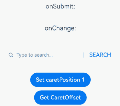
### constructor<sup>8+</sup>

constructor()

A constructor used to create a **SearchController** object.

**Atomic service API**: This API can be used in atomic services since API version 11.

**System capability**: SystemCapability.ArkUI.ArkUI.Full

### caretPosition<sup>8+</sup>

caretPosition(value: number): void

Sets the position of the caret.

**Atomic service API**: This API can be used in atomic services since API version 11.

**System capability**: SystemCapability.ArkUI.ArkUI.Full

**Parameters**

|Name|Type|Mandatory|Description                        |
|------|--------|----|----------------------------------|
|value|number |Yes|Length from the start of the character string to the position where the caret is located.|

### stopEditing<sup>10+</sup>

stopEditing(): void

Exits the editing state.

**Atomic service API**: This API can be used in atomic services since API version 11.

**System capability**: SystemCapability.ArkUI.ArkUI.Full

### setTextSelection<sup>12+</sup>

setTextSelection(selectionStart: number, selectionEnd: number, options?: SelectionOptions): void;

Sets the text selection range and highlights the selected text when the component is focused. This API works only when the value of **selectionStart** is less than that of **selectionEnd**.

**Atomic service API**: This API can be used in atomic services since API version 12.

**System capability**: SystemCapability.ArkUI.ArkUI.Full

**Parameters**

|Name      |Type|Mandatory|Description|
|--------------|--------|----|--------|
|selectionStart|number |Yes|Start position of the text selection range. The start position of text in the text box is 0.<br>A value less than 0 is handled as **0**. A value greater than the maximum text length is handled as the maximum text length.<br>|
|selectionEnd |number |Yes|End position of the text selection range.<br>A value less than 0 is handled as the value **0**. A value greater than the maximum text length is handled as the maximum text length.<br>|
|options|[SelectionOptions](ts-types.md#selectionoptions12)|No |Configuration options for text selection.<br>Default value: **MenuPolicy.DEFAULT**|

>  **NOTE**
>
>  If **selectionStart** or **selectionEnd** is set to **undefined**, the value **0** will be used.
>
>  If **selectionMenuHidden** is set to **true** or a 2-in-1 device is used, calling **setTextSelection** does not display the context menu even when **options** is set to **MenuPolicy.SHOW**.
>
>  If the selected text contains an emoji, the emoji is selected when its start position is within the text selection range.

## SearchSubmitCallback<sup>14+</sup>

type SearchSubmitCallback = (searchContent: string, event?: SubmitEvent) => void

Represents the callback triggered when the search icon, search button, or soft keyboard search button is clicked.

**Atomic service API**: This API can be used in atomic services since API version 14.

**System capability**: SystemCapability.ArkUI.ArkUI.Full

**Parameters**

|Name|Type                                                      |Mandatory|Description                                                  |
|--------|------------------------------------------------------------|----|--------------------------------------------------------|
|searchContent|string           |Yes|Current text input.|
|event  |[SubmitEvent](ts-basic-components-textinput.md#submitevent11)|No|Submit event. |

##  Example

### Example 1: Setting and Obtaining the Cursor Position

This example demonstrates how to use the controller to set and obtain the cursor position within a text box.

```ts
// xxx.ets
@Entry
@Component
struct SearchExample {
  @State changeValue: string = ''
  @State submitValue: string = ''
  @State positionInfo: CaretOffset = { index: 0, x: 0, y: 0 }
  controller: SearchController = new SearchController()

  build() {
    Column({space: 10}) {
      Text('onSubmit:' + this.submitValue).fontSize(18).margin(15)
      Text('onChange:' + this.changeValue).fontSize(18).margin(15)
      Search({ value: this.changeValue, placeholder: 'Type to search...', controller: this.controller })
        .searchButton('SEARCH')
        .width('95%')
        .height(40)
        .backgroundColor('#F5F5F5')
        .placeholderColor(Color.Grey)
        .placeholderFont({ size: 14, weight: 400 })
        .textFont({ size: 14, weight: 400 })
        .onSubmit((value: string) => {
          this.submitValue = value
        })
        .onChange((value: string) => {
          this.changeValue = value
        })
        .margin(20)
      Button('Set caretPosition 1')
        .onClick(() => {
          // Move the caret to after the first entered character.
          this.controller.caretPosition(1)
        })
      Button('Get CaretOffset')
        .onClick(() => {
          this.positionInfo = this.controller.getCaretOffset()
        })
    }.width('100%')
  }
}
Example 2: Setting Search and Delete Icons
This example demonstrates how to set search and delete icons using the searchButton, searchIcon, and cancelButton attributes.
// xxx.ets
@Entry
@Component
struct SearchExample {
  @State changeValue: string = ''
  @State submitValue: string = ''

  build() {
    Column() {
      Text('onSubmit:' + this.submitValue).fontSize(18).margin(15)
      Search({ value: this.changeValue, placeholder: 'Type to search...' })
        .searchButton('SEARCH')
        .searchIcon({
          src: $r('sys.media.ohos_ic_public_search_filled')
        })
        .cancelButton({
          style: CancelButtonStyle.CONSTANT,
          icon: {
            src: $r('sys.media.ohos_ic_public_cancel_filled')
          }
        })
        .width('90%')
        .height(40)
        .maxLength(20)
        .backgroundColor('#F5F5F5')
        .placeholderColor(Color.Grey)
        .placeholderFont({ size: 14, weight: 400 })
        .textFont({ size: 14, weight: 400 })
        .onSubmit((value: string) => {
          this.submitValue = value
        })
        .onChange((value: string) => {
          this.changeValue = value
        })
        .margin(20)
    }.width('100%')
  }
}

Example 3: Implementing a Custom Keyboard
This example demonstrates how to implement a custom keyboard using the customKeyboard attribute.
// xxx.ets
@Entry
@Component
struct SearchExample {
  controller: SearchController = new SearchController()
  @State inputValue: string = ""

  // Create a custom keyboard component.
  @Builder CustomKeyboardBuilder() {
    Column() {
      Button('x').onClick(() => {
        // Disable the custom keyboard.
        this.controller.stopEditing()
      })
      Grid() {
        ForEach([1, 2, 3, 4, 5, 6, 7, 8, 9, '*', 0, '#'], (item: number|string) => {
          GridItem() {
            Button(item + "")
              .width(110).onClick(() => {
              this.inputValue += item
            })
          }
        })
      }.maxCount(3).columnsGap(10).rowsGap(10).padding(5)
    }.backgroundColor(Color.Gray)
  }

  build() {
    Column() {
      Search({ controller: this.controller, value: this.inputValue})
        // Bind the custom keyboard.
        .customKeyboard(this.CustomKeyboardBuilder()).margin(10).border({ width: 1 })
    }
  }
}
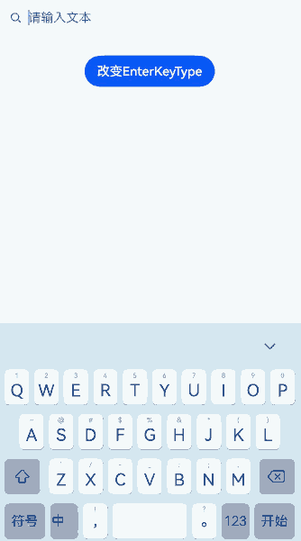
Example 4: Setting the Enter Key Type
This example shows how to use the enterKeyType attribute to dynamically change the effect of the Enter key on the soft keyboard.
// xxx.ets
@Entry
@Component
struct SearchExample {
  @State text: string = ''
  @State enterTypes: Array<EnterKeyType> = [EnterKeyType.Go, EnterKeyType.Search, EnterKeyType.Send, EnterKeyType.Done, EnterKeyType.Next, EnterKeyType.PREVIOUS, EnterKeyType.NEW_LINE]
  @State index: number = 0
  build() {
    Column({ space: 20 }) {
      Search({ placeholder: 'Enter text', value: this.text })
        .width(380)
        .enterKeyType(this.enterTypes[this.index])
        .onChange((value: string) => {
          this.text = value
        })
        .onSubmit((value: String) => {
          console.log("trigger search onsubmit" + value);
        })

      Button('Change EnterKeyType').onClick(() => {
        this.index = (this.index + 1) % this.enterTypes.length;
      })
    }.width('100%')
  }
}
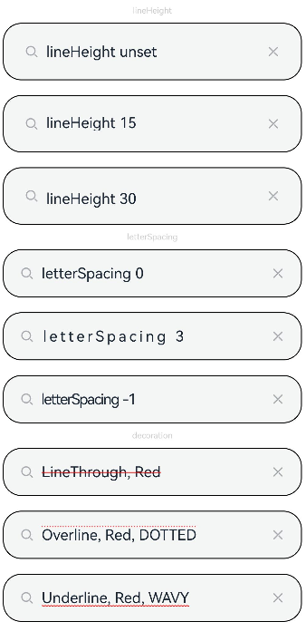
Example 5: Setting the Text Style
This example showcases various text styles by using the lineHeight, letterSpacing, and decoration attributes.
// xxx.ets
@Entry
@Component
struct SearchExample {
  build() {
    Row() {
      Column() {
        Text('lineHeight').fontSize(9).fontColor(0xCCCCCC)
        Search({value: 'lineHeight unset'})
          .border({ width: 1 }).padding(10)
        Search({value: 'lineHeight 15'})
          .border({ width: 1 }).padding(10).lineHeight(15)
        Search({value: 'lineHeight 30'})
          .border({ width: 1 }).padding(10).lineHeight(30)

        Text('letterSpacing').fontSize(9).fontColor(0xCCCCCC)
        Search({value: 'letterSpacing 0'})
          .border({ width: 1 }).padding(5).letterSpacing(0)
        Search({value: 'letterSpacing 3'})
          .border({ width: 1 }).padding(5).letterSpacing(3)
        Search({value: 'letterSpacing -1'})
          .border({ width: 1 }).padding(5).letterSpacing(-1)

        Text('decoration').fontSize(9).fontColor(0xCCCCCC)
        Search({value: 'LineThrough, Red'})
          .border({ width: 1 }).padding(5)
          .decoration({type: TextDecorationType.LineThrough, color: Color.Red})
        Search({value: 'Overline, Red, DOTTED'})
          .border({ width: 1 }).padding(5)
          .decoration({type: TextDecorationType.Overline, color: Color.Red, style: TextDecorationStyle.DOTTED})
        Search({value: 'Underline, Red, WAVY'})
          .border({ width: 1 }).padding(5)
          .decoration({type: TextDecorationType.Underline, color: Color.Red, style: TextDecorationStyle.WAVY})
      }.height('90%')
    }
    .width('90%')
    .margin(10)
  }
}
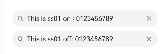
Example 6: Setting Text Feature Effects
This example demonstrates how to use the fontFeature attribute to display text with various typographic features.
// xxx.ets
@Entry
@Component
struct SearchExample {
  @State text1: string = 'This is ss01 on : 0123456789'
  @State text2: string = 'This is ss01 off: 0123456789'

  build() {
    Column(){
      Search({value: this.text1})
        .margin({top:200})
        .fontFeature("\"ss01\" on")
      Search({value: this.text2})
        .margin({top:10})
        .fontFeature("\"ss01\" off")
    }
    .width("90%")
    .margin("5%")
  }
}
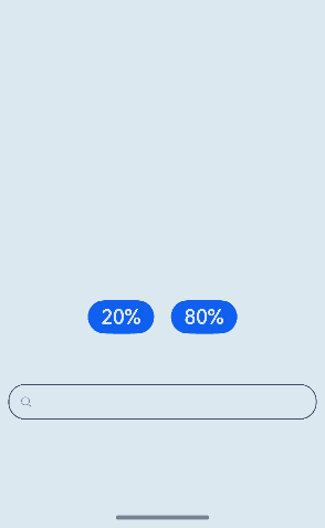
Example 7: Setting Custom Keyboard Avoidance
This example illustrates the implementation of a custom keyboard that automatically adjusts its position to avoid covering the text box.
// xxx.ets
@Entry
@Component
struct SearchExample {
  controller: SearchController = new SearchController()
  @State inputValue: string = ""
  @State height1: string|number = '80%'
  @State supportAvoidance: boolean = true

  // Create a custom keyboard component.
  @Builder
  CustomKeyboardBuilder() {
    Column() {
      Row() {
        Button('x').onClick(() => {
          // Disable the custom keyboard.
          this.controller.stopEditing()
        }).margin(10)
      }

      Grid() {
        ForEach([1, 2, 3, 4, 5, 6, 7, 8, 9, '*', 0, '#'], (item: number|string) => {
          GridItem() {
            Button(item + "")
              .width(110).onClick(() => {
              this.inputValue += item
            })
          }
        })
      }.maxCount(3).columnsGap(10).rowsGap(10).padding(5)
    }
    .backgroundColor(Color.Gray)
  }

  build() {
    Column() {
      Row() {
        Button("20%")
          .fontSize(24)
          .onClick(() => {
            this.height1 = "20%"
          })
        Button("80%")
          .fontSize(24)
          .margin({ left: 20 })
          .onClick(() => {
            this.height1 = "80%"
          })
      }
      .justifyContent(FlexAlign.Center)
      .alignItems(VerticalAlign.Bottom)
      .height(this.height1)
      .width("100%")
      .padding({ bottom: 50 })

      Search({ controller: this.controller, value: this.inputValue })// Bind a custom keyboard.
        .customKeyboard(this.CustomKeyboardBuilder(), { supportAvoidance: this.supportAvoidance })
        .margin(10)
        .border({ width: 1 })
        .onChange((value: string) => {
          this.inputValue = value
        })
    }
  }
}
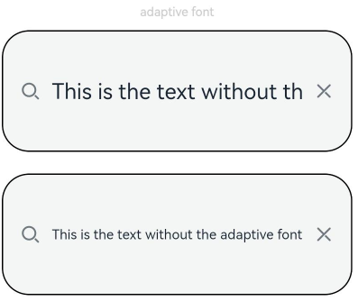
Example 8: Setting Text Auto-Adaptation
This example showcases the implementation of text auto-adaptation features using the minFontSize and maxFontSize attributes.
// xxx.ets
@Entry
@Component
struct SearchExample {
  build() {
    Row() {
      Column() {
        Text('adaptive font').fontSize(9).fontColor(0xCCCCCC)

        Search({value: 'This is the text without the adaptive font'})
          .width('80%').height(90).borderWidth(1)
        Search({value: 'This is the text without the adaptive font'})
          .width('80%').height(90).borderWidth(1)
          .minFontSize(4)
          .maxFontSize(40)
      }.height('90%')
    }
    .width('90%')
    .margin(10)
  }
}
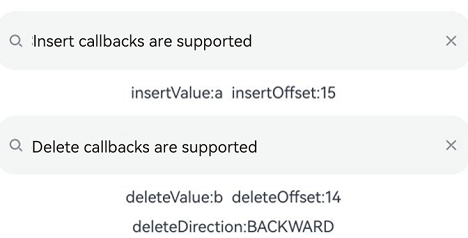
Example 9: Setting Insert and Delete Callbacks
This example showcases the implementation of insert and delete operations using the onWillInsert, onDidInsert, onWillDelete, and onDidDelete APIs.
// xxx.ets
@Entry
@Component
struct SearchExample {
  @State insertValue: string = ""
  @State deleteValue: string = ""
  @State insertOffset: number = 0
  @State deleteOffset: number = 0
  @State deleteDirection: number = 0

  build() {
    Row() {
      Column() {
        Search({ value: "Insert callbacks are supported" })
          .height(60)
          .onWillInsert((info: InsertValue) => {
            this.insertValue = info.insertValue
            return true;
          })
          .onDidInsert((info: InsertValue) => {
            this.insertOffset = info.insertOffset
          })

        Text("insertValue:" + this.insertValue + "  insertOffset:" + this.insertOffset).height(30)

        Search({ value: "Delete callbacks are supported" })
          .height(60)
          .onWillDelete((info: DeleteValue) => {
            this.deleteValue = info.deleteValue
            info.direction
            return true;
          })
          .onDidDelete((info: DeleteValue) => {
            this.deleteOffset = info.deleteOffset
            this.deleteDirection = info.direction
          })

        Text("deleteValue:" + this.deleteValue + "  deleteOffset:" + this.deleteOffset).height(30)
        Text("deleteDirection:" + (this.deleteDirection == 0 ? "BACKWARD" : "FORWARD")).height(30)

      }.width('100%')
    }
    .height('100%')
  }
}
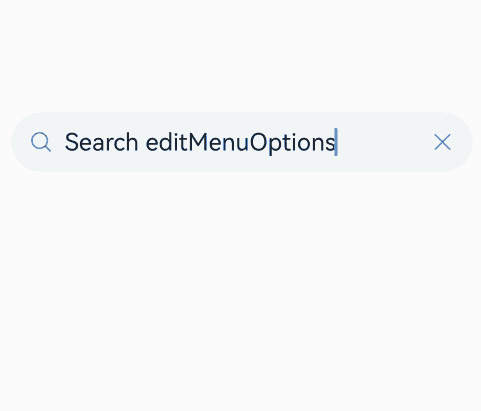
Example 10: Setting Custom Menu Extensions
This example demonstrates how to use the editMenuOptions API to create custom menu extensions for text settings. It includes customizing text content, icons, and callbacks for these extensions.
// xxx.ets
@Entry
@Component
struct SearchExample {
  @State text: string = 'Search editMenuOptions'
  onCreateMenu = (menuItems: Array<TextMenuItem>) => {
    let item1: TextMenuItem = {
      content: 'Custom 1',
      icon: $r('app.media.startIcon'),
      id: TextMenuItemId.of('custom1'),
    }
    let item2: TextMenuItem = {
      content: 'Custom 2',
      id: TextMenuItemId.of('custom2'),
      icon: $r('app.media.startIcon'),
    }
    menuItems.push(item1)
    menuItems.unshift(item2)
    return menuItems
  }
  onMenuItemClick = (menuItem: TextMenuItem, textRange: TextRange) => {
    if (menuItem.id.equals(TextMenuItemId.of("custom2"))) {
      console.log("Intercept id: custom2 start:" + textRange.start + "; end:" + textRange.end)
      return true
    }
    if (menuItem.id.equals(TextMenuItemId.COPY)) {
      console.log("Intercept COPY start:" + textRange.start + "; end:" + textRange.end)
      return true
    }
    if (menuItem.id.equals(TextMenuItemId.SELECT_ALL)) {
      console.log("Do not intercept SELECT_ALL start:" + textRange.start + "; end:" + textRange.end)
      return false
    }
    return false
  }
  @State editMenuOptions: EditMenuOptions = {
    onCreateMenu: this.onCreateMenu, onMenuItemClick: this.onMenuItemClick
  }

  build() {
    Column() {
      Search({ value: this.text })
        .width('95%')
        .editMenuOptions(this.editMenuOptions)
        .margin({ top: 100 })
    }
    .width("90%")
    .margin("5%")
  }
}
Example 11: Setting a Custom Symbol-Type Cancel Button
This example demonstrates how to use the searchIcon and cancelButton attributes to customize the style of the symbol-type cancel button on the right side of the text box.
// xxx.ets
import { SymbolGlyphModifier } from '@kit.ArkUI'

@Entry
@Component
struct SearchExample {
  controller: SearchController = new SearchController()
  @State changeValue: string = ''
  @State submitValue: string = ''

  build() {
    Column() {
      Search({ value: this.changeValue, placeholder: 'Type to search...', controller: this.controller })
        .searchIcon(new SymbolGlyphModifier($r('sys.symbol.magnifyingglass')).fontColor([Color.Red]))
        .cancelButton({
          style: CancelButtonStyle.CONSTANT,
          icon: new SymbolGlyphModifier($r('sys.symbol.xmark')).fontColor([Color.Green])
        })
        .searchButton('SEARCH')
        .width('95%')
        .height(40)
        .backgroundColor('#F5F5F5')
        .placeholderColor(Color.Grey)
        .placeholderFont({ size: 14, weight: 400 })
        .textFont({ size: 14, weight: 400 })
        .margin(10)
    }
    .width('100%')
    .height('100%')
  }
}

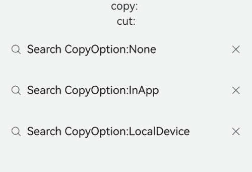
Example 12: Setting Whether Text is Copyable
This example demonstrates how to set whether text is copyable using copyOption.
// xxx.ets

@Entry
@Component
struct SearchExample {
  controller: SearchController = new SearchController()
  @State copyValue: string = ''
  @State cutValue: string = ''

  build() {
    Column({ space: 3 }) {
      Text("copy: " + this.copyValue)
      Text("cut:" + this.cutValue)
      Search({ value: 'Search CopyOption:None', controller: this.controller })
        .width('95%')
        .height(40)
        .copyOption(CopyOptions.None)
        .onCopy((value: string) => {
          this.copyValue = value;
        })
        .onCut((value: string) => {
          this.cutValue = value;
        })
      Search({ value: 'Search CopyOption:InApp', controller: this.controller })
        .width('95%')
        .height(40)
        .copyOption(CopyOptions.InApp)
        .onCopy((value: string) => {
          this.copyValue = value;
        })
        .onCut((value: string) => {
          this.cutValue = value;
        })
      Search({ value: 'Search CopyOption:LocalDevice', controller: this.controller })
        .width('95%')
        .height(40)
        .copyOption(CopyOptions.LocalDevice)
        .onCopy((value: string) => {
          this.copyValue = value;
        })
        .onCut((value: string) => {
          this.cutValue = value;
        })
    }
    .width('100%')
    .height('100%')
  }
}
Example 13: Setting the Horizontal Alignment, Caret Style, and Background Color of the Selected Text
This example shows how to set the horizontal alignment, caret style, and background color of the selected text using textAlign, caretStyle, and selectedBackgroundColor.
// xxx.ets

@Entry
@Component
struct SearchExample {
  controller: SearchController = new SearchController()

  build() {
    Column({ space: 3 }) {
      Search({ value: 'Search textAlign sample', controller: this.controller })
        .width('95%')
        .height(40)
        .stopBackPress(true)
        .textAlign(TextAlign.Center)
        .caretStyle({ width: 3, color: Color.Green })
        .selectedBackgroundColor(Color.Gray)
    }
    .width('100%')
    .height('100%')
  }
}

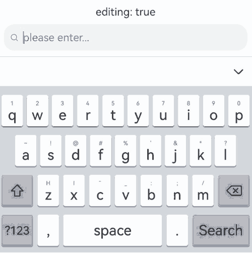
Example 14: Configuring the Text Box to Receive Default Focus and Bring Up the Soft Keyboard
This example illustrates how to configure the text box to receive default focus and bring up the soft keyboard using defaultFocus and enableKeyboardOnFocus.
// xxx.ets

@Entry
@Component
struct SearchExample {
  controller: SearchController = new SearchController()
  @State value: string = 'false'

  build() {
    Column({ space: 3 }) {
      Text('editing: ' + this.value)
      Search({ placeholder: 'please enter...', controller: this.controller })
        .width('95%')
        .height(40)
        .defaultFocus(true)
        .enableKeyboardOnFocus(true)
        .enablePreviewText(true)
        .enableHapticFeedback(true)
        .onEditChange((data: boolean) => {
          this.value = data ? 'true' : 'false'
        })
    }
    .width('100%')
    .height('100%')
  }
}
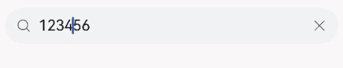
Example 15: Disabling the System Context Menu on Selection
This example shows how to disable the system context menu on selection using defaultFocus and enableKeyboardOnFocus.
// xxx.ets
@Entry
@Component
struct SearchExample {
controller: SearchController = new SearchController()
build() {
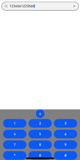
Column({ space: 3 }) {
Search({ value: '123456', controller: this.controller })
.width('95%')
.height(40)
.type(SearchType.NUMBER)
.selectionMenuHidden(true)
}
.width('100%')
.height('100%')
}
}
Example 16: Setting Input Filtering
This example shows how to set input filtering using inputFilter.
// xxx.ets

@Entry
@Component
struct SearchExample {
  controller: SearchController = new SearchController()
  @State filterValue: string = ''

  build() {
    Column({ space: 3 }) {
      Text('Filter:' + this.filterValue)
      Search({ placeholder: 'please enter...', controller: this.controller })
        .width('95%')
        .height(40)
        .textIndent(5)
        .halfLeading(true)
        .inputFilter('[a-z]', (filterValue: string) => {
          this.filterValue = filterValue
        })
    }
    .width('100%')
    .height('100%')
  }
}

Example 17: Selecting a Specific Text Range
This example illustrates how to select a specific range of text content using setTextSelection.
// xxx.ets
@Entry
@Component
struct SearchExample {
controller: SearchController = new SearchController()
@State startIndex: number = 0
@State endIndex: number = 0
build() {
Column({ space: 3 }) {
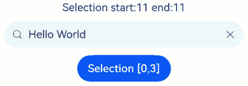
Text('Selection start:' + this.startIndex + ' end:' + this.endIndex)
Search({ value: 'Hello World', controller: this.controller })
.width('95%')
.height(40)
.minFontScale(1)
.maxFontScale(1.5)
.defaultFocus(true)
.onTextSelectionChange((selectionStart: number, selectionEnd: number) => {
this.startIndex = selectionStart
this.endIndex = selectionEnd
})
Button('Selection [0,3]')
.onClick(() => {
this.controller.setTextSelection(0, 3)
})
}
.width('100%')
.height('100%')
}
}
Example 18: Handling Text Scrolling Events
This example demonstrates how to set a callback for text scrolling events using onContentScroll.
// xxx.ets
@Entry
@Component
struct SearchExample {
controller: SearchController = new SearchController()
@State offsetX: number = 0
@State offsetY: number = 0
build() {
Column({ space: 3 }) {
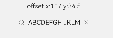
Text('offset x:' + this.offsetX + ' y:' + this.offsetY)
Search({ value: 'ABCDEFGHIJKLMNOPQRSTUVWXYZ', controller: this.controller })
.width(200)
.height(40)
.onContentScroll((totalOffsetX: number, totalOffsetY: number) => {
this.offsetX = totalOffsetX
this.offsetY = totalOffsetY
})
}
.width('100%')
.height('100%')
}
}
Example 19: Setting the Minimum and Maximum Font Scale Factor
This example demonstrates how to set the minimum and maximum font scale factor using minFontScale and maxFontScale.
import { abilityManager, Configuration } from '@kit.AbilityKit';
import { BusinessError } from '@kit.BasicServicesKit';

// xxx.ets
@Entry
@Component
export struct TextAreaExample11 {
  @State minFontScale: number = 0.85;
  @State maxFontScale: number = 2;
  @State changeValue: string = 'abcde';

  build() {
    Column() {
      Column({ space: 30 }) {
        Text("System font size changes: small and large, small and large")
        TextArea({
          placeholder: 'The text area can hold an unlimited amount of text. input your word...',
        })
        // Set the minimum font scale factor; if the value is undefined, the text follows the default font scale factor.
          .minFontScale(0.85)
          // Set the maximum font scale factor; if the value is undefined, the text follows the default font scale factor.
          .maxFontScale(2)
      }.width('100%')
    }
  }
}
Create a new directory named profile in the following path: AppScope/resources/base.
Inside the newly created profile directory, create a file named configuration.json.
Add the following JSON code to the configuration.json file:
{
  "configuration":{
    "fontSizeScale": "followSystem",
    "fontSizeMaxScale": "3.2"
}
}
Modify the app.json5 file in AppScope as follows:
{
  "app": {
    "bundleName": "com.example.myapplication",
    "vendor": "example",
    "versionCode": 1000000,
    "versionName": "1.0.0",
    "icon": "$media:app_icon",
    "label": "$string:app_name",
    "configuration": "$profile:configuration"
  }
}
你可能感兴趣的鸿蒙文章
- 所属分类: 后端技术
- 本文标签:
热门推荐
-
2、 优质文章
-
3、 gt
-
7、 openharmony
-
9、 golang
-
10、 Vue中input框自动聚焦