harmony 鸿蒙Select
Select
The Select component provides a drop-down list box that allows users to select among multiple options.
NOTE
This component is supported since API version 8. Updates will be marked with a superscript to indicate their earliest API version.
Child Components
Not supported
APIs
Select(options: Array<SelectOption>)
Atomic service API: This API can be used in atomic services since API version 11.
System capability: SystemCapability.ArkUI.ArkUI.Full
Parameters
| Name | Type | Mandatory | Description |
|---|---|---|---|
| options | Array<SelectOption> | Yes | Options in the drop-down list box. |
SelectOption
System capability: SystemCapability.ArkUI.ArkUI.Full
| Name | Type | Mandatory | Description |
|---|---|---|---|
| value | ResourceStr | Yes | Value of an option in the drop-down list box. Atomic service API: This API can be used in atomic services since API version 11. |
| icon | ResourceStr | No | Icon of an option in the drop-down list box. Atomic service API: This API can be used in atomic services since API version 11. |
| symbolIcon12+ | SymbolGlyphModifier | No | Symbol icon of an option in the drop-down menu. symbolIcon is at a higher priority than icon. Atomic service API: This API can be used in atomic services since API version 12. |
Attributes
In addition to the universal attributes, the following attributes are supported.
selected
selected(value: number|Resource)
Sets the index of the initial selected option in the drop-down list box. The index of the first option is 0. If this attribute is set to an invalid value or is not set, the default value -1 will be used, which means that no option will be selected. If this attribute is set to undefined or null, the first option will be selected.
Since API version 10, this attribute supports two-way binding through $$. Since API version 18, this attribute supports two-way binding through !!.
Atomic service API: This API can be used in atomic services since API version 11.
System capability: SystemCapability.ArkUI.ArkUI.Full
Parameters
| Name | Type | Mandatory | Description |
|---|---|---|---|
| value | number |Resource11+ | Yes | Index of the default option in the drop-down list box. The index is zero-based. |
selected18+
selected(numCount: Optional
Sets the index of the initial selected option in the drop-down list box. The index of the first option is 0. If this attribute is set to an invalid value or is not set, the default value -1 will be used, which means that no option will be selected. If this attribute is set to undefined or null, the first option will be selected.
This attribute supports two-way binding through $$. This attribute supports two-way binding through !!.
Atomic service API: This API can be used in atomic services since API version 18.
System capability: SystemCapability.ArkUI.ArkUI.Full
Parameters
| Name | Type | Mandatory | Description |
|---|---|---|---|
| numCount | Optional<number |Resource> | Yes | Index of the initial selected option in the drop-down list box. If numCount is set to undefined, the first item is selected by default. |
value
value(value: ResourceStr)
Sets the text of the drop-down button. By default, it will be replaced by the content of the selected option, if any.
Since API version 10, this attribute supports two-way binding through $$. Since API version 18, this attribute supports two-way binding through !!.
Atomic service API: This API can be used in atomic services since API version 11.
System capability: SystemCapability.ArkUI.ArkUI.Full
Parameters
| Name | Type | Mandatory | Description |
|---|---|---|---|
| value | ResourceStr11+ | Yes | Text of the drop-down button. NOTE If the text is longer than the column width, it will be truncated. |
value18+
value(resStr: Optional<ResourceStr>)
Sets the text of the drop-down button. By default, it will be replaced by the content of the selected option, if any. Compared to value, this API supports the undefined type for the resStr parameter.
This attribute supports two-way binding through $$ or !!.
Atomic service API: This API can be used in atomic services since API version 18.
System capability: SystemCapability.ArkUI.ArkUI.Full
Parameters
| Name | Type | Mandatory | Description |
|---|---|---|---|
| resStr | Optional<ResourceStr> | Yes | Text of the drop-down button. If resStr is set to undefined, the previous value is retained. |
controlSize12+
controlSize(value: ControlSize)
Sets the size of the Select component.
Atomic service API: This API can be used in atomic services since API version 12.
System capability: SystemCapability.ArkUI.ArkUI.Full
Parameters
| Name | Type | Mandatory | Description |
|---|---|---|---|
| value | ControlSize11+ | Yes | Size of the Select component. Default value: ControlSize.NORMAL |
The priorities of controlSize, width, and height are as follows:
If only width and height are set and the text is too large to fit in the component the text exceeds the component size and is displayed as an ellipsis (…).
If only controlSize is set but width and height are not set, the width and height of the component adapt to the text. The text cannot exceed the component, and minWidth and minHeight are set.
3) If controlSize, width, and height are set, the values of width and height take effect. If the values of width and height are less than the values of minWidth and minHeight set by controlSize, the values of width and height do not take effect, the width and height are the same as the minimum width minWidth and minimum height minHeight configured by controlSize.
controlSize18+
controlSize(size: Optional<ControlSize>)
Sets the size of the Select component. Compared to controlSize12+, this API supports the undefined type for the size parameter.
Atomic service API: This API can be used in atomic services since API version 18.
System capability: SystemCapability.ArkUI.ArkUI.Full
Parameters
| Name | Type | Mandatory | Description |
|---|---|---|---|
| size | Optional<ControlSize> | Yes | Size of the Select component. If size is set to undefined, the default value ControlSize.NORMAL is used. |
The priorities of controlSize, width, and height are as follows:
If only width and height are set and the text is too large to fit in the component the text exceeds the component size and is displayed as an ellipsis (…).
If only controlSize is set but width and height are not set, the width and height of the component adapt to the text. The text cannot exceed the component, and minWidth and minHeight are set.
3) If controlSize, width, and height are set, the values of width and height take effect. If the values of width and height are less than the values of minWidth and minHeight set by controlSize, the values of width and height do not take effect, the width and height are the same as the minimum width minWidth and minimum height minHeight configured by controlSize.
menuItemContentModifier12+
menuItemContentModifier(modifier: ContentModifier<MenuItemConfiguration>)
Creates a content modifier for the drop-down list box.
Atomic service API: This API can be used in atomic services since API version 12.
System capability: SystemCapability.ArkUI.ArkUI.Full
Parameters
| Name | Type | Mandatory | Description |
|---|---|---|---|
| modifier | ContentModifier<MenuItemConfiguration> | Yes | Content modifier to apply to the drop-down list box. modifier: content modifier. You need a custom class to implement the ContentModifier API. |
menuItemContentModifier18+
menuItemContentModifier(modifier: Optional<ContentModifier<MenuItemConfiguration>>)
Creates a content modifier for the drop-down list box. Compared to menuItemContentModifier12+, this API supports the undefined type for the modifier parameter.
Atomic service API: This API can be used in atomic services since API version 18.
System capability: SystemCapability.ArkUI.ArkUI.Full
Parameters
| Name | Type | Mandatory | Description |
|---|---|---|---|
| modifier | Optional<ContentModifier<MenuItemConfiguration>> | Yes | Content modifier to apply to the drop-down list box. modifier: content modifier. You need a custom class to implement the ContentModifier API. If modifier is set to undefined, no content modifier is used. |
divider12+
divider(options: Optional<DividerOptions>|null)
Sets the divider style. If this attribute is not set, the divider is displayed based on the default value.
Atomic service API: This API can be used in atomic services since API version 12.
System capability: SystemCapability.ArkUI.ArkUI.Full
Parameters
|Name|Type |Mandatory|Description |
|——|——-|—-|———————————————————————|
|options|Optional<DividerOptions> |null|Yes|Divider options.
1. If DividerOptions is set, the divider is displayed in the configured style.
Default value:
{
strokeWidth: ‘1px’ ,
color: ‘#33182431’
}
2. If this parameter is set to null, the divider is not displayed.
3. If the value of strokeWidth is too larger, the divider may overlap the text. The divider extends both upwards and downwards from the bottom of each item.
4. The default values for startMargin and endMargin are consistent with the style of the divider when the divider attribute is not set. If the sum of startMargin and endMargin is equal to the value of optionWidth, the divider is not displayed. If the sum of startMargin and endMargin exceeds the value of optionWidth, the divider line is displayed in the default style.|
dividerStyle18+
Sets the divider style. If this attribute is not set, the divider is displayed based on the default value. This attribute cannot be used together with the divider attribute. The last one called will take effect.
Atomic service API: This API can be used in atomic services since API version 18.
System capability: SystemCapability.ArkUI.ArkUI.Full
Parameters
| Name | Type | Mandatory | Description |
|---|---|---|---|
| options | Optional<DividerStyleOptions> |null | Yes | Divider options. 1. If DividerOptions is set, the divider is displayed in the configured style. Default value: { strokeWidth: ‘1px’ , color: ‘#33182431’ } 2. If this parameter is set to null or undefined, the default divider is displayed. 3. When mode is set to FLOAT_ABOVE_MENU, be careful with the strokeWidth settings to avoid covering text. The divider extends both upwards and downwards from the bottom of each item. When mode is EMBEDDED_IN_MENU, the divider expands to fill its own space within the menu. 4. The default values for startMargin and endMargin are consistent with the style of the divider when the divider attribute is not set. If the sum of startMargin and endMargin is equal to the value of optionWidth, the divider is not displayed. If the sum of startMargin and endMargin exceeds the value of optionWidth, the divider line is displayed in the default style. |
font
font(value: Font)
Sets the text font of the drop-down button. If size is set to 0, the text is not displayed. If size is set to a negative value, the text is displayed at its default size.
Atomic service API: This API can be used in atomic services since API version 11.
System capability: SystemCapability.ArkUI.ArkUI.Full
Parameters
| Name | Type | Mandatory | Description |
|---|---|---|---|
| value | Font | Yes | Text font of the drop-down button. Default value: API version 11 and earlier versions: { size: $r('sys.float.ohos_id_text_size_button1'),weight: FontWeight.Medium } Since API version 12: The default value of size is $r(‘sys.float.ohos_id_text_size_button2’) in the case of controlSize.SMALL and $r(‘sys.float.ohos_id_text_size_button1’) in other cases. |
font18+
font(selectFont: Optional<Font>)
Sets the font style of the drop-down button. If size is set to 0, the text is not displayed. If size is set to a negative value, the text is displayed at its default size. Compared to font, this API supports the undefined type for the selectFont parameter.
Atomic service API: This API can be used in atomic services since API version 18.
System capability: SystemCapability.ArkUI.ArkUI.Full
Parameters
| Name | Type | Mandatory | Description |
|---|---|---|---|
| selectFont | Optional<Font> | Yes | Font style of the drop-down button. If controlSize is set to controlSize.SMALL, the default value of size is $r(‘sys.float.ohos_id_text_size_button2’). Otherwise, the default value is $r(‘sys.float.ohos_id_text_size_button1’). If selectFont is set to undefined, the default font style is used. |
fontColor
fontColor(value: ResourceColor)
Sets the font color of the drop-down button.
Atomic service API: This API can be used in atomic services since API version 11.
System capability: SystemCapability.ArkUI.ArkUI.Full
Parameters
| Name | Type | Mandatory | Description |
|---|---|---|---|
| value | ResourceColor | Yes | Font color of the drop-down button. Default value: $r(‘sys.color.ohos_id_color_text_primary’) with the opacity of $r(‘sys.color.ohos_id_alpha_content_primary’) |
fontColor18+
fontColor(resColor: Optional<ResourceColor>)
Sets the font color of the drop-down button. Compared to fontColor, this API supports the undefined type for the resColor parameter.
Atomic service API: This API can be used in atomic services since API version 18.
System capability: SystemCapability.ArkUI.ArkUI.Full
Parameters
| Name | Type | Mandatory | Description |
|---|---|---|---|
| resColor | Optional<ResourceColor> | Yes | Font color of the drop-down button. When resColor is set to undefined, the default value is a blend of $r(‘sys.color.ohos_id_color_text_primary’) with the opacity of $r(‘sys.color.ohos_id_alpha_content_primary’). If value is set to undefined, the previous value is retained. |
selectedOptionBgColor
selectedOptionBgColor(value: ResourceColor)
Sets the background color of the selected option in the drop-down list box.
Atomic service API: This API can be used in atomic services since API version 11.
System capability: SystemCapability.ArkUI.ArkUI.Full
Parameters
| Name | Type | Mandatory | Description |
|---|---|---|---|
| value | ResourceColor | Yes | Background color of the selected option in the drop-down list box. Default value: $r(‘sys.color.ohos_id_color_component_activated’) with the opacity of $r(‘sys.color.ohos_id_alpha_highlight_bg’) |
selectedOptionBgColor18+
selectedOptionBgColor(resColor: Optional<ResourceColor>)
Sets the background color of the selected option in the drop-down list box. Compared to selectedOptionBgColor, this API supports the undefined type for the resColor parameter.
Atomic service API: This API can be used in atomic services since API version 18.
System capability: SystemCapability.ArkUI.ArkUI.Full
Parameters
| Name | Type | Mandatory | Description |
|---|---|---|---|
| resColor | Optional<ResourceColor> | Yes | Background color of the selected option in the drop-down list box. When resColor is set to undefined, the default value is a blend of $r(‘sys.color.ohos_id_color_component_activated’) with the opacity of $r(‘sys.color.ohos_id_alpha_highlight_bg’). |
selectedOptionFont
selectedOptionFont(value: Font)
Sets the text font of the selected option in the drop-down list box. When size is set to 0, the text is not displayed. When size is set to a negative value, the text is displayed at its default size.
Atomic service API: This API can be used in atomic services since API version 11.
System capability: SystemCapability.ArkUI.ArkUI.Full
Parameters
| Name | Type | Mandatory | Description |
|---|---|---|---|
| value | Font | Yes | Text font of the selected option in the drop-down list box. Default value: { size: $r(‘sys.color.ohos_id_text_size_body1’), weight: FontWeight.Regular } |
selectedOptionFont18+
selectedOptionFont(selectFont: Optional<Font>)
Sets the text font of the selected option in the drop-down list box. When size is set to 0, the text is not displayed. When size is set to a negative value, the text is displayed at its default size. Compared to selectedOptionFont, this API supports the undefined type for the selectFont parameter.
Atomic service API: This API can be used in atomic services since API version 18.
System capability: SystemCapability.ArkUI.ArkUI.Full
Parameters
| Name | Type | Mandatory | Description |
|---|---|---|---|
| selectFont | Optional<Font> | Yes | Text font of the selected option in the drop-down list box. If selectFont is set to undefined, the default value is used: { size: $r(‘sys.color.ohos_id_text_size_body1’), weight: FontWeight.Regular } |
selectedOptionFontColor
selectedOptionFontColor(value: ResourceColor)
Sets the font color of the selected option in the drop-down list box.
Atomic service API: This API can be used in atomic services since API version 11.
System capability: SystemCapability.ArkUI.ArkUI.Full
Parameters
| Name | Type | Mandatory | Description |
|---|---|---|---|
| value | ResourceColor | Yes | Font color of the selected option in the drop-down list box. Default value: $r(‘sys.color.ohos_id_color_text_primary_activated’) |
selectedOptionFontColor18+
selectedOptionFontColor(resColor: Optional<ResourceColor>)
Sets the font color of the selected option in the drop-down list box. Compared to selectedOptionFontColor, this API supports the undefined type for the resColor parameter.
Atomic service API: This API can be used in atomic services since API version 18.
System capability: SystemCapability.ArkUI.ArkUI.Full
Parameters
| Name | Type | Mandatory | Description |
|---|---|---|---|
| resColor | Optional<ResourceColor> | Yes | Font color of the selected option in the drop-down list box. If resColor is set to undefined, the default value $r(‘sys.color.ohos_id_color_text_primary_activated’) is used. |
optionBgColor
optionBgColor(value: ResourceColor)
Sets the background color of options in the drop-down list box.
Atomic service API: This API can be used in atomic services since API version 11.
System capability: SystemCapability.ArkUI.ArkUI.Full
Parameters
| Name | Type | Mandatory | Description |
|---|---|---|---|
| value | ResourceColor | Yes | Background color of an option in the drop-down list box. Default value: Versions earlier than API version 11: Color.White Since API version 11: Color.Transparent |
optionBgColor18+
optionBgColor(resColor: Optional<ResourceColor>)
Sets the background color of options in the drop-down list box. Compared to optionBgColor, this API supports the undefined type for the resColor parameter.
Atomic service API: This API can be used in atomic services since API version 18.
System capability: SystemCapability.ArkUI.ArkUI.Full
Parameters
| Name | Type | Mandatory | Description |
|---|---|---|---|
| resColor | Optional<ResourceColor> | Yes | Background color of an option in the drop-down list box. If resColor is set to undefined, the default value Color.Transparent is used. |
optionFont
optionFont(value: Font)
Sets the text font of options in the drop-down list box. When size is set to 0, the text is not displayed. When size is set to a negative value, the text is displayed at its default size.
Atomic service API: This API can be used in atomic services since API version 11.
System capability: SystemCapability.ArkUI.ArkUI.Full
Parameters
| Name | Type | Mandatory | Description |
|---|---|---|---|
| value | Font | Yes | Text font of options in the drop-down list box. Default value: { size: $r(‘sys.float.ohos_id_text_size_body1’), weight: FontWeight.Regular } |
optionFont18+
optionFont(selectFont: Optional<Font>)
Sets the text font of options in the drop-down list box. When size is set to 0, the text is not displayed. When size is set to a negative value, the text is displayed at its default size.
Compared to optionFont, this API supports the undefined type for the selectFont parameter.
Atomic service API: This API can be used in atomic services since API version 18.
System capability: SystemCapability.ArkUI.ArkUI.Full
Parameters
| Name | Type | Mandatory | Description |
|---|---|---|---|
| selectFont | Optional<Font> | Yes | Text font of options in the drop-down list box. If selectFont is set to undefined, the default value is used: { size: $r(‘sys.float.ohos_id_text_size_body1’), weight: FontWeight.Regular } |
optionFontColor
optionFontColor(value: ResourceColor)
Sets the font color of options in the drop-down list box.
Atomic service API: This API can be used in atomic services since API version 11.
System capability: SystemCapability.ArkUI.ArkUI.Full
Parameters
| Name | Type | Mandatory | Description |
|---|---|---|---|
| value | ResourceColor | Yes | Font color of options in the drop-down list box. Default value: $r(‘sys.color.ohos_id_color_text_primary’) |
optionFontColor18+
optionFontColor(resColor: Optional<ResourceColor>)
Sets the font color of options in the drop-down list box. Compared to optionFontColor, this API supports the undefined type for the resColor parameter.
Atomic service API: This API can be used in atomic services since API version 18.
System capability: SystemCapability.ArkUI.ArkUI.Full
Parameters
| Name | Type | Mandatory | Description |
|---|---|---|---|
| resColor | Optional<ResourceColor> | Yes | Font color of options in the drop-down list box. If resColor is set to undefined, the default value $r(‘sys.color.ohos_id_color_text_primary’) is used. |
space10+
space(value: Length)
Sets the spacing between the text and arrow of an option. This attribute cannot be set in percentage. If the value specified is null, undefined, or a value less than or equal to 8, the default value is used.
Atomic service API: This API can be used in atomic services since API version 11.
System capability: SystemCapability.ArkUI.ArkUI.Full
Parameters
| Name | Type | Mandatory | Description |
|---|---|---|---|
| value | Length | Yes | Spacing between the text and arrow of an option. Default value: 8 NOTE For the string type, percentage values are not supported. |
space18+
space(spaceLength: Optional<Length>)
Sets the spacing between the text and arrow of an option. This attribute cannot be set in percentage. If the value specified is null, undefined, or a value less than or equal to 8, the default value is used.
Atomic service API: This API can be used in atomic services since API version 18.
System capability: SystemCapability.ArkUI.ArkUI.Full
Parameters
| Name | Type | Mandatory | Description |
|---|---|---|---|
| spaceLength | Optional<Length> | Yes | Spacing between the text and arrow of an option. If spaceLength is set to undefined, the default value 8 is used. |
arrowPosition10+
arrowPosition(value: ArrowPosition)
Sets the alignment between the text and arrow of an option.
Atomic service API: This API can be used in atomic services since API version 11.
System capability: SystemCapability.ArkUI.ArkUI.Full
Parameters
| Name | Type | Mandatory | Description |
|---|---|---|---|
| value | ArrowPosition | Yes | Alignment between the text and arrow of an option. Default value: ArrowPosition.END |
arrowPosition18+
arrowPosition(position: Optional<ArrowPosition>)
Sets the alignment between the text and arrow of an option. Compared to arrowPosition, this API supports the undefined type for the position parameter.
Atomic service API: This API can be used in atomic services since API version 18.
System capability: SystemCapability.ArkUI.ArkUI.Full
Parameters
| Name | Type | Mandatory | Description |
|---|---|---|---|
| position | Optional<ArrowPosition> | Yes | Alignment between the text and arrow of an option. If position is set to undefined, the default value ArrowPosition.END is used. |
menuAlign10+
menuAlign(alignType: MenuAlignType, offset?: Offset)
Sets the alignment between the drop-down button and the drop-down menu.
Atomic service API: This API can be used in atomic services since API version 11.
System capability: SystemCapability.ArkUI.ArkUI.Full
Parameters
| Name | Type | Mandatory | Description |
|---|---|---|---|
| alignType | MenuAlignType | Yes | Alignment type. Default value: MenuAlignType.START |
| offset | Offset | No | Offset of the drop-down menu relative to the drop-down button after alignment based on the alignment type. Default value: {dx: 0, dy: 0} |
menuAlign18+
menuAlign(alignType: Optional<MenuAlignType>, offset?: Offset)
Sets the alignment between the drop-down button and the drop-down menu. Compared to menuAlign10+, this API supports the undefined type for the alignType parameter.
Atomic service API: This API can be used in atomic services since API version 18.
System capability: SystemCapability.ArkUI.ArkUI.Full
Parameters
| Name | Type | Mandatory | Description |
|---|---|---|---|
| alignType | Optional<MenuAlignType> | Yes | Alignment type. If alignType is set to undefined, the default value MenuAlignType.START is used. |
| offset | Offset | No | Offset of the drop-down menu relative to the drop-down button after alignment based on the alignment type. Default value: {dx: 0, dy: 0} |
optionWidth11+
optionWidth(value: Dimension|OptionWidthMode )
Sets the width for the option in the drop-down list box. This attribute cannot be set in percentage. OptionWidthMode specifies whether to inherit the width of the drop-down list button.
If an invalid value or a value less than the minimum width of 56 vp is set, the attribute does not take effect, and the option width uses the default value, which is two columns.
Atomic service API: This API can be used in atomic services since API version 12.
System capability: SystemCapability.ArkUI.ArkUI.Full
Parameters
| Name | Type | Mandatory | Description |
|---|---|---|---|
| value | Dimension |OptionWidthMode | Yes | Width of the option in the drop-down list box. |
optionWidth18+
optionWidth(width: Optional<Dimension|OptionWidthMode> )
Sets the width for the option in the drop-down list box. This attribute cannot be set in percentage. OptionWidthMode specifies whether to inherit the width of the drop-down list button. Compared to optionWidth11+, this API supports the undefined type for the width parameter.
If an invalid value or a value less than the minimum width of 56 vp is set, the attribute does not take effect, and the option width uses the default value, which is two columns.
Atomic service API: This API can be used in atomic services since API version 18.
System capability: SystemCapability.ArkUI.ArkUI.Full
Parameters
| Name | Type | Mandatory | Description |
|---|---|---|---|
| width | Optional<Dimension |OptionWidthMode> | Yes | Width of the option in the drop-down list box. If set to undefined, this attribute does not take effect. In this case, the default width of two columns is used. |
optionHeight11+
optionHeight(value: Dimension)
Sets the maximum height for the option in the drop-down list box. This attribute cannot be set in percentage. The default and maximum value is 80% of the available height of the screen.
If set to an invalid value, 0, or undefined, this attribute does not take effect. In this case, the default value is used.
If the actual height of all options in the drop-down list box is less than the preset height, the options are displayed at their actual height.
Atomic service API: This API can be used in atomic services since API version 12.
System capability: SystemCapability.ArkUI.ArkUI.Full
Parameters
| Name | Type | Mandatory | Description |
|---|---|---|---|
| value | Dimension | Yes | Maximum height of the option in the drop-down list box. |
optionHeight18+
optionHeight(height: Optional<Dimension>)
Sets the maximum height for the option in the drop-down list box. This attribute cannot be set in percentage. The default and maximum value is 80% of the available height of the screen. Compared to optionHeight11+, this API supports the undefined type for the height parameter.
If set to an invalid value or 0, this attribute does not take effect. In this case, the default value is used.
If the actual height of all options in the drop-down list box is less than the preset height, the options are displayed at their actual height.
Atomic service API: This API can be used in atomic services since API version 18.
System capability: SystemCapability.ArkUI.ArkUI.Full
Parameters
| Name | Type | Mandatory | Description |
|---|---|---|---|
| height | Optional<Dimension> | Yes | Maximum height of the option in the drop-down list box. |
menuBackgroundColor11+
menuBackgroundColor(value: ResourceColor)
Sets the background color of the drop-down list box.
Atomic service API: This API can be used in atomic services since API version 12.
System capability: SystemCapability.ArkUI.ArkUI.Full
Parameters
| Name | Type | Mandatory | Description |
|---|---|---|---|
| value | ResourceColor | Yes | Background color of the drop-down list box. Default value: Versions earlier than API version 11: $r(‘sys.color.ohos_id_color_card_bg’) Since API version 11: Color.Transparent |
menuBackgroundColor18+
menuBackgroundColor(resColor: Optional<ResourceColor>)
Sets the background color of the drop-down list box. Compared to menuBackgroundColor11+, this API supports the undefined type for the resColor parameter.
Atomic service API: This API can be used in atomic services since API version 18.
System capability: SystemCapability.ArkUI.ArkUI.Full
Parameters
| Name | Type | Mandatory | Description |
|---|---|---|---|
| resColor | Optional<ResourceColor> | Yes | Background color of the drop-down list box. If resColor is set to undefined, the default value Color.Transparent is used. |
menuBackgroundBlurStyle11+
menuBackgroundBlurStyle(value: BlurStyle)
Sets the background blur style of the drop-down list box.
Atomic service API: This API can be used in atomic services since API version 12.
System capability: SystemCapability.ArkUI.ArkUI.Full
Parameters
| Name | Type | Mandatory | Description |
|---|---|---|---|
| value | BlurStyle | Yes | Background blur style of the drop-down list box. Default value: BlurStyle.COMPONENT_ULTRA_THICK |
menuBackgroundBlurStyle18+
menuBackgroundBlurStyle(style: Optional<BlurStyle>)
Sets the background blur style of the drop-down list box. Compared to menuBackgroundBlurStyle11+, this API supports the undefined type for the style parameter.
Atomic service API: This API can be used in atomic services since API version 18.
System capability: SystemCapability.ArkUI.ArkUI.Full
Parameters
| Name | Type | Mandatory | Description |
|---|---|---|---|
| style | Optional<BlurStyle> | Yes | Background blur style of the drop-down list box. If style is set to undefined, the default value BlurStyle.COMPONENT_ULTRA_THICK is used. |
avoidance18+
avoidance(mode: AvoidanceMode)
Sets the avoidance mode for the drop-down list box.
Widget capability: This API can be used in ArkTS widgets since API version 18.
Atomic service API: This API can be used in atomic services since API version 18.
System capability: SystemCapability.ArkUI.ArkUI.Full
Parameters
| Name | Type | Mandatory | Description |
|---|---|---|---|
| mode | AvoidanceMode | Yes | Avoidance mode of the drop-down list box. Default value: AvoidanceMode.COVER_TARGET |
menuOutline18+
menuOutline(value: MenuOutlineOptions)
Sets the outline style for the drop-down list box.
Atomic service API: This API can be used in atomic services since API version 18.
System capability: SystemCapability.ArkUI.ArkUI.Full
Parameters
| Name | Type | Mandatory | Description |
|---|---|---|---|
| value | MenuOutlineOptions | Yes | Outline style of the drop-down list box. |
ArrowPosition10+
Atomic service API: This API can be used in atomic services since API version 11.
System capability: SystemCapability.ArkUI.ArkUI.Full
| Name | Value | Description |
|---|---|---|
| END | 0 | The text is in front of the arrow. |
| START | 1 | The arrow is in front of the text. |
MenuAlignType10+
Atomic service API: This API can be used in atomic services since API version 11.
System capability: SystemCapability.ArkUI.ArkUI.Full
| Name | Value | Description |
|---|---|---|
| START | 0 | Aligned with the start edge in the same direction as the language in use. |
| CENTER | 1 | Aligned with the center. |
| END | 2 | Aligned with the end edge in the same direction as the language in use. |
AvoidanceMode18+
Enumerates the avoidance modes of the drop-down list box.
Widget capability: This API can be used in ArkTS widgets since API version 18.
Atomic service API: This API can be used in atomic services since API version 18.
System capability: SystemCapability.ArkUI.ArkUI.Full
| Name | Description |
|---|---|
| COVER_TARGET | If there is not enough space below the target component, cover the target component. |
| AVOID_AROUND_TARGET | If there is not enough space around the target component, compress and display in the largest available space (scrollable). |
MenuItemConfiguration12+
Atomic service API: This API can be used in atomic services since API version 12.
System capability: SystemCapability.ArkUI.ArkUI.Full
| Name | Type | Mandatory | Description |
|---|---|---|---|
| value | ResourceStr | Yes | Text content of the option in the drop-down list box. NOTE If the text is longer than the width of the menu text area, it is truncated. |
| icon | ResourceStr | No | Icon of the option in the drop-down list box. NOTE The string type can be used to load network images and local images. |
| symbolIcon12+ | SymbolGlyphModifier | No | Symbol icon of the option in the drop-down list box. |
| selected | boolean | Yes | Whether the option in the drop-down list box is selected. Default value: false |
| index | number | Yes | Index of the option in the drop-down list box. The index is zero-based. |
| triggerSelect | (index: number, value: string) :void | Yes | Invoked when an option in the drop-down list box is selected. index: index of the selected option. value: text of the selected option. NOTE The value of index will be assigned to the index parameter in the onSelect callback; the value of value will be returned to the Select component for display and will also be assigned to the value parameter in the onSelect callback. |
MenuOutlineOptions18+
Defines the outline options for the drop-down list box.
Atomic service API: This API can be used in atomic services since API version 18.
System capability: SystemCapability.ArkUI.ArkUI.Full
| Name | Type | Mandatory | Description |
|---|---|---|---|
| width | Dimension |EdgeOutlineWidths | No | Width of the outline. Percentage values are not supported. Default value: 0 |
| color | ResourceColor |EdgeColors | No | Color of the outline. Default value: #19ffffff |
Events
onSelect
onSelect(callback: (index: number, value: string) => void)
Invoked when an option in the drop-down list box is selected.
Atomic service API: This API can be used in atomic services since API version 11.
System capability: SystemCapability.ArkUI.ArkUI.Full
Parameters
| Name | Type | Mandatory | Description |
|---|---|---|---|
| index | number | Yes | Index of the selected option. The index is zero-based. |
| value | string | Yes | Value of the selected option. |
onSelect18+
onSelect(callback: Optional<OnSelectCallback> )
Invoked when an option in the drop-down list box is selected. Compared to onSelect, this API supports the undefined type for the callback parameter.
Atomic service API: This API can be used in atomic services since API version 18.
System capability: SystemCapability.ArkUI.ArkUI.Full
Parameters
| Name | Type | Mandatory | Description |
|---|---|---|---|
| callback | Optional<OnSelectCallback> | Yes | Invoked when an option in the drop-down list box is selected. If callback is set to undefined, the callback function is not used. |
OnSelectCallback18+
type OnSelectCallback = (index: number, selectStr: string) => void
Invoked when an option in the drop-down list box is selected.
Atomic service API: This API can be used in atomic services since API version 18.
System capability: SystemCapability.ArkUI.ArkUI.Full
Parameters
| Name | Type | Mandatory | Description |
|---|---|---|---|
| index | number | Yes | Index of the selected option. The index is zero-based. |
| selectStr | string | Yes | Value of the selected option. |
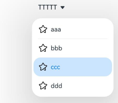
Example 1: Creating a Drop-down List Box
This example demonstrates how to create a drop-down list box by configuring SelectOptions.
// xxx.ets
@Entry
@Component
struct SelectExample {
  @State text: string = "TTTTT"
  @State index: number = 2
  @State space: number = 8
  @State arrowPosition: ArrowPosition = ArrowPosition.END

  build() {
    Column() {
      Select([{ value: 'aaa', icon: $r("app.media.selection") },
        { value: 'bbb', icon: $r("app.media.selection") },
        { value: 'ccc', icon: $r("app.media.selection") },
        { value: 'ddd', icon: $r("app.media.selection") }])
        .selected(this.index)
        .value(this.text)
        .font({ size: 16, weight: 500 })
        .fontColor('#182431')
        .selectedOptionFont({ size: 16, weight: 400 })
        .optionFont({ size: 16, weight: 400 })
        .space(this.space)
        .arrowPosition(this.arrowPosition)
        .menuAlign(MenuAlignType.START, { dx: 0, dy: 0 })
        .optionWidth(200)
        .optionHeight(300)
        .onSelect((index: number, text?: string|undefined) => {
          console.info('Select:' + index)
          this.index = index;
          if (text) {
            this.text = text;
          }
        })
        .avoidance(AvoidanceMode.COVER_TARGET);
    }.width('100%')
  }
}
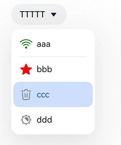
Example 2: Setting the Symbol Icon
This example implements a drop-down list box, each option of which uses a symbol as its image.
// xxx.ets
import { SymbolGlyphModifier } from '@kit.ArkUI'

@Entry
@Component
struct SelectExample {
  @State text: string = "TTTTT"
  @State index: number = 2
  @State space: number = 8
  @State arrowPosition: ArrowPosition = ArrowPosition.END
  @State symbolModifier1: SymbolGlyphModifier =
    new SymbolGlyphModifier($r('sys.symbol.ohos_wifi')).fontColor([Color.Green]);
  @State symbolModifier2: SymbolGlyphModifier =
    new SymbolGlyphModifier($r('sys.symbol.ohos_star')).fontColor([Color.Red]);
  @State symbolModifier3: SymbolGlyphModifier =
    new SymbolGlyphModifier($r('sys.symbol.ohos_trash')).fontColor([Color.Gray]);
  @State symbolModifier4: SymbolGlyphModifier =
    new SymbolGlyphModifier($r('sys.symbol.exposure')).fontColor([Color.Gray]);

  build() {
    Column() {
      Select([{ value: 'aaa', symbolIcon: this.symbolModifier1 },
        { value: 'bbb', symbolIcon: this.symbolModifier2 },
        { value: 'ccc', symbolIcon: this.symbolModifier3 },
        { value: 'ddd', symbolIcon: this.symbolModifier4 }])
        .selected(this.index)
        .value(this.text)
        .font({ size: 16, weight: 500 })
        .fontColor('#182431')
        .selectedOptionFont({ size: 16, weight: 400 })
        .optionFont({ size: 16, weight: 400 })
        .space(this.space)
        .arrowPosition(this.arrowPosition)
        .menuAlign(MenuAlignType.START, { dx: 0, dy: 0 })
        .onSelect((index: number, text?: string|undefined) => {
          console.info('Select:' + index)
          this.index = index;
          if (text) {
            this.text = text;
          }
        })
        .avoidance(AvoidanceMode.COVER_TARGET);
    }.width('100%')
  }
}
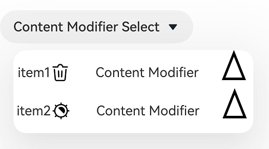
Example 3: Implementing a Custom Drop-down List Box
This example implements a custom drop-down list box, each option of which consists of text + symbol + blank area + text + drawn triangle. After a menu option is clicked, the text content of the menu option is displayed.
import { SymbolGlyphModifier } from '@kit.ArkUI'

class MyMenuItemContentModifier implements ContentModifier<MenuItemConfiguration> {
  modifierText: string = ""

  constructor(text: string) {
    this.modifierText = text;
  }

  applyContent(): WrappedBuilder<[MenuItemConfiguration]> {
    return wrapBuilder(MenuItemBuilder)
  }
}

@Builder
function MenuItemBuilder(configuration: MenuItemConfiguration) {
  Row() {
    Text(configuration.value)
    Blank()
    if (configuration.symbolIcon) {
      SymbolGlyph().attributeModifier(configuration.symbolIcon).fontSize(24)
    } else if (configuration.icon) {
      Image(configuration.icon).size({ width: 24, height: 24 })
    }
    Blank(30)
    Text((configuration.contentModifier as MyMenuItemContentModifier).modifierText)
    Blank(30)
    Path()
      .width('100px')
      .height('150px')
      .commands('M40 0 L80 100 L0 100 Z')
      .fillOpacity(0)
      .stroke(Color.Black)
      .strokeWidth(3)
  }
  .onClick(() => {
    configuration.triggerSelect(configuration.index, configuration.value.valueOf().toString())
  })
}

@Entry
@Component
struct SelectExample {
  @State text: string = "Content Modifier Select"
  @State symbolModifier1: SymbolGlyphModifier =
    new SymbolGlyphModifier($r('sys.symbol.ohos_trash')).fontColor([Color.Gray]);
  @State symbolModifier2: SymbolGlyphModifier =
    new SymbolGlyphModifier($r('sys.symbol.exposure')).fontColor([Color.Gray]);

  build() {
    Column() {
      Row() {
        Select([{ value: 'item1', icon: $r('app.media.icon'), symbolIcon: this.symbolModifier1 },
          { value: 'item1', icon: $r('app.media.icon'), symbolIcon: this.symbolModifier2 }])
          .value(this.text)
          .onSelect((index: number, text?: string) => {
            console.info('Select index:' + index)
            console.info('Select text:' + text)
          })
          .menuItemContentModifier(new MyMenuItemContentModifier("Content Modifier"))

      }.alignItems(VerticalAlign.Center).height('50%')
    }
  }
}
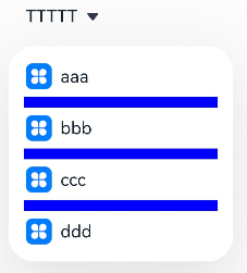
Example 4: Using the Divider Style
This example demonstrates how to configure a drop-down list box with a custom divider style by setting divider with DividerOptions.
// xxx.ets
@Entry
@Component
struct SelectExample {
  @State text: string = "TTTTT"
  @State index: number = -1
  @State arrowPosition: ArrowPosition = ArrowPosition.END

  build() {
    Column() {
      Select([{ value: 'aaa', icon: $r("app.media.icon") },
        { value: 'bbb', icon: $r("app.media.icon") },
        { value: 'ccc', icon: $r("app.media.icon") },
        { value: 'ddd', icon: $r("app.media.icon") }])
        .selected(this.index)
        .value(this.text)
        .font({ size: 16, weight: 500 })
        .fontColor('#182431')
        .selectedOptionFont({ size: 16, weight: 400 })
        .optionFont({ size: 16, weight: 400 })
        .arrowPosition(this.arrowPosition)
        .menuAlign(MenuAlignType.START, { dx: 0, dy: 0 })
        .optionWidth(200)
        .optionHeight(300)
        .divider({
          strokeWidth: 5,
          color: Color.Blue,
          startMargin: 10,
          endMargin: 10
        })
        .onSelect((index: number, text?: string|undefined) => {
          console.info('Select:' + index)
          this.index = index;
          if (text) {
            this.text = text;
          }
        })
        .avoidance(AvoidanceMode.COVER_TARGET);
    }.width('100%')
  }
}
Example 5: Using the No-Divider Style
This example demonstrates how to create a drop-down list box with no divider by setting divider to null.
// xxx.ets
@Entry
@Component
struct SelectExample {
  @State text: string = "TTTTT"
  @State index: number = -1
  @State arrowPosition: ArrowPosition = ArrowPosition.END

  build() {
    Column() {
      Select([{ value: 'aaa', icon: $r("app.media.icon") },
        { value: 'bbb', icon: $r("app.media.icon") },
        { value: 'ccc', icon: $r("app.media.icon") },
        { value: 'ddd', icon: $r("app.media.icon") }])
        .selected(this.index)
        .value(this.text)
        .font({ size: 16, weight: 500 })
        .fontColor('#182431')
        .selectedOptionFont({ size: 16, weight: 400 })
        .optionFont({ size: 16, weight: 400 })
        .arrowPosition(this.arrowPosition)
        .menuAlign(MenuAlignType.START, { dx: 0, dy: 0 })
        .optionWidth(200)
        .optionHeight(300)
        .divider(null)
        .onSelect((index: number, text?: string|undefined) => {
          console.info('Select:' + index)
          this.index = index;
          if (text) {
            this.text = text;
          }
        })
        .avoidance(AvoidanceMode.COVER_TARGET);
    }.width('100%')
  }
}

你可能感兴趣的鸿蒙文章
- 所属分类: 后端技术
- 本文标签:
热门推荐
-
2、 优质文章
-
3、 gt
-
7、 openharmony
-
9、 golang
-
10、 Vue中input框自动聚焦