harmony 鸿蒙Slider
Slider
The Slider component is used to quickly adjust settings, such as the volume and brightness.
NOTE
This component is supported since API version 7. Updates will be marked with a superscript to indicate their earliest API version.
Child Components
Not supported
APIs
Slider(options?: SliderOptions)
Widget capability: This API can be used in ArkTS widgets since API version 9.
Atomic service API: This API can be used in atomic services since API version 11.
System capability: SystemCapability.ArkUI.ArkUI.Full
Parameters
| Name | Type | Mandatory | Description |
|---|---|---|---|
| options | SliderOptions | No | Parameters of the slider. |
SliderOptions
Widget capability: This API can be used in ArkTS widgets since API version 9.
Atomic service API: This API can be used in atomic services since API version 11.
System capability: SystemCapability.ArkUI.ArkUI.Full
| Name | Type | Mandatory | Description |
|---|---|---|---|
| value | number | No | Current progress. Default value: same as the value of min Since API version 10, this parameter supports two-way binding through $$. This parameter supports two-way binding through !!. Value range: [min, max] Values less than the value of min are adjusted to the value of min, and values greater than the value of max are capped at the value of max. |
| min | number | No | Minimum value. Default value: 0 |
| max | number | No | Maximum value. Default value: 100 NOTE If the value of min is greater than or equal to the value of max, the min value defaults to 0, and the max value defaults to 100. If the value is not within the [min, max] range, the value of min or max is used, whichever is closer. |
| step | number | No | Step of the slider. Default value: 1 Value range: [0.01, max - min] NOTE If this parameter is set to a value less than 0 or greater than the value of max, the default value is used. |
| style | SliderStyle | No | Style of the slider thumb and track. Default value: SliderStyle.OutSet |
| direction8+ | Axis | No | Whether the slider moves horizontally or vertically. Default value: Axis.Horizontal |
| reverse8+ | boolean | No | Whether the slider values are reversed. Default value: false true: Horizontal sliders slide from right to left, while vertical sliders slide from bottom to top. false: Horizontal sliders slide from left to right, while vertical sliders slide from top to bottom. |
SliderStyle
System capability: SystemCapability.ArkUI.ArkUI.Full
| Name | Description |
|---|---|
| OutSet | The thumb is on the track. Widget capability: This API can be used in ArkTS widgets since API version 9. Atomic service API: This API can be used in atomic services since API version 11. |
| InSet | The thumb is in the track. Widget capability: This API can be used in ArkTS widgets since API version 9. Atomic service API: This API can be used in atomic services since API version 11. |
| NONE12+ | There is no thumb. Widget capability: This API can be used in ArkTS widgets since API version 12. Atomic service API: This API can be used in atomic services since API version 12. |
Attributes
All the universal attributes except responseRegion are supported.
blockColor
blockColor(value: ResourceColor)
Sets the color of the thumb.
When SliderBlockType.DEFAULT is used, blockColor sets the color of the round thumb.
When SliderBlockType.IMAGE is used, blockColor does not work as the thumb has no fill color.
When SliderBlockType.SHAPE is used, blockColor sets the color of the thumb in a custom shape.
Widget capability: This API can be used in ArkTS widgets since API version 9.
Atomic service API: This API can be used in atomic services since API version 11.
System capability: SystemCapability.ArkUI.ArkUI.Full
Parameters
| Name | Type | Mandatory | Description |
|---|---|---|---|
| value | ResourceColor | Yes | Color of the thumb. Default value: $r(‘sys.color.ohos_id_color_foreground_contrary’) |
trackColor
trackColor(value: ResourceColor|LinearGradient)
Sets the background color of the track.
Since API version 12, LinearGradient can be used to create a gradient effect for the track.
Widget capability: This API can be used in ArkTS widgets since API version 9.
Atomic service API: This API can be used in atomic services since API version 11.
System capability: SystemCapability.ArkUI.ArkUI.Full
Parameters
| Name | Type | Mandatory | Description |
|---|---|---|---|
| value | ResourceColor |LinearGradient12+ | Yes | Background color of the track. NOTE With gradient color settings, if the color stop values are invalid or if the color stops are empty, the gradient effect will not be applied. Default value: $r(‘sys.color.ohos_id_color_component_normal’) The LinearGradient type cannot be used in atomic services. |
selectedColor
selectedColor(value: ResourceColor)
Sets the color of the portion of the track between the minimum value and the thumb, representing the selected portion.
Widget capability: This API can be used in ArkTS widgets since API version 9.
Atomic service API: This API can be used in atomic services since API version 11.
System capability: SystemCapability.ArkUI.ArkUI.Full
Parameters
| Name | Type | Mandatory | Description |
|---|---|---|---|
| value | ResourceColor | Yes | Color of the portion of the track between the minimum value and the thumb. NOTE With gradient color settings, if the color stop values are invalid or if the color stops are empty, the gradient effect will not be applied. Default value: $r(‘sys.color.ohos_id_color_emphasize’) |
selectedColor18+
selectedColor(selectedColor: ResourceColor|LinearGradient)
Sets the color of the portion of the track between the minimum value and the thumb, representing the selected portion. Compared to selectedColor, this API supports the LinearGradient type.
Since API version 16, LinearGradient can be used to create a gradient effect for the selected portion.
Widget capability: This API can be used in ArkTS widgets since API version 18.
Atomic service API: This API can be used in atomic services since API version 18.
System capability: SystemCapability.ArkUI.ArkUI.Full
Parameters
| Name | Type | Mandatory | Description |
|---|---|---|---|
| selectedColor | ResourceColor |LinearGradient18+ | Yes | Color of the portion of the track between the minimum value and the thumb. NOTE With gradient color settings, if the color stop values are invalid or if the color stops are empty, the gradient effect will not be applied. Default value: $r(‘sys.color.ohos_id_color_emphasize’) |
showSteps
showSteps(value: boolean)
Sets whether to display the current step.
Widget capability: This API can be used in ArkTS widgets since API version 9.
Atomic service API: This API can be used in atomic services since API version 11.
System capability: SystemCapability.ArkUI.ArkUI.Full
Parameters
| Name | Type | Mandatory | Description |
|---|---|---|---|
| value | boolean | Yes | Whether to display the current step. true: Display the current step. false: Do not display the current step. Default value: false |
showTips
showTips(value: boolean, content?: ResourceStr)
Sets whether to display a tooltip when the user drags the slider.
When direction is set to Axis.Horizontal, the tooltip is displayed right above the slider; if there is insufficient space above, it will be displayed below. When direction is set to Axis.Vertical, the tooltip is displayed on the left of the slider; if there is insufficient space on the left, it will be displayed on the right. If the margins are not set or are set to small values, the tooltip may be clipped.
The drawing area of the tooltip is the overlay of the slider.
Widget capability: This API can be used in ArkTS widgets since API version 9.
Atomic service API: This API can be used in atomic services since API version 11.
System capability: SystemCapability.ArkUI.ArkUI.Full
Parameters
| Name | Type | Mandatory | Description |
|---|---|---|---|
| value | boolean | Yes | Whether to display a tooltip when the user drags the slider. Default value: false |
| content10+ | ResourceStr | No | Content of the tooltip. By default, the tooltip shows the current percentage value. |
trackThickness8+
trackThickness(value: Length)
Sets the thickness of the track. If the value is less than or equal to 0, the default value is used.
To ensure SliderStyle works as expected for the thumb and track, blockSize should increase or decrease proportionally with trackThickness.
Specially, when style is SliderStyle.OutSet, trackThickness: blockSize = 1:4; when style is SliderStyle.InSet, trackThickness: blockSize = 5:3.
In changing the value of trackThickness, if it or the value of blockSize exceeds the width or height of the slider, the default value is used. (When style is SliderStyle.OutSet, it is possible that only the value of blockSize exceeds the height of the slider.)
Widget capability: This API can be used in ArkTS widgets since API version 9.
Atomic service API: This API can be used in atomic services since API version 11.
System capability: SystemCapability.ArkUI.ArkUI.Full
Parameters
| Name | Type | Mandatory | Description |
|---|---|---|---|
| value | Length | Yes | Thickness of the track. Default value: 4.0vp when style is set to SliderStyle.OutSet; 20.0vp when style is set to SliderStyle.InSet |
blockBorderColor10+
blockBorderColor(value: ResourceColor)
Sets the border color of the slider in the block direction.
When SliderBlockType.DEFAULT is used, blockBorderColor sets the border color of the round slider.
When SliderBlockType.IMAGE is used, blockBorderColor does not work as the slider has no border.
When SliderBlockType.SHAPE is used, blockBorderColor sets the border color of the slider in a custom shape.
Atomic service API: This API can be used in atomic services since API version 11.
System capability: SystemCapability.ArkUI.ArkUI.Full
Parameters
| Name | Type | Mandatory | Description |
|---|---|---|---|
| value | ResourceColor | Yes | Border color of the slider in the block direction. Default value: ’#00000000’ |
blockBorderWidth10+
blockBorderWidth(value: Length)
Sets the border width of the slider in the block direction.
When SliderBlockType.DEFAULT is used, blockBorderWidth sets the border width of the round slider.
When SliderBlockType.IMAGE is used, blockBorderWidth does not work as the slider has no border.
When SliderBlockType.SHAPE is used, blockBorderWidth sets the border width of the slider in a custom shape.
Atomic service API: This API can be used in atomic services since API version 11.
System capability: SystemCapability.ArkUI.ArkUI.Full
Parameters
| Name | Type | Mandatory | Description |
|---|---|---|---|
| value | Length | Yes | Border width of the slider in the block direction. NOTE For the string type, percentage values are not supported. |
stepColor10+
stepColor(value: ResourceColor)
Sets the step color.
Atomic service API: This API can be used in atomic services since API version 11.
System capability: SystemCapability.ArkUI.ArkUI.Full
Parameters
| Name | Type | Mandatory | Description |
|---|---|---|---|
| value | ResourceColor | Yes | Step color. Default value: $r(‘sys.color.ohos_id_color_foreground’) mixed with $r(‘sys.color.ohos_id_alpha_normal_bg’) transparency |
trackBorderRadius10+
trackBorderRadius(value: Length)
Sets the radius of the rounded corner of the track.
Atomic service API: This API can be used in atomic services since API version 11.
System capability: SystemCapability.ArkUI.ArkUI.Full
Parameters
| Name | Type | Mandatory | Description |
|---|---|---|---|
| value | Length | Yes | Radius of the rounded corner of the track. Default value: ‘2vp’ when style is SliderStyle.OutSet ‘10vp’ when style is SliderStyle.InSet NOTE For the string type, percentage values are not supported. If the value is less than 0, the default value is used. |
selectedBorderRadius12+
selectedBorderRadius(value: Dimension)
Set the corner radius of the selected (highlighted) part of the slider.
Atomic service API: This API can be used in atomic services since API version 12.
System capability: SystemCapability.ArkUI.ArkUI.Full
Parameters
| Name | Type | Mandatory | Description |
|---|---|---|---|
| value | Dimension | Yes | Corner radius of the selected part of the slider. Default value: - For SliderStyle.InSet or SliderStyle.OutSet: same as the corner radius of the background - SliderStyle.NONE: 0 NOTE Percentage values are not supported. If the value is less than 0, the default value is used. |
blockSize10+
blockSize(value: SizeOptions)
Sets the size of the slider in the block direction.
When the slider type is set to SliderBlockType.DEFAULT, the smaller of the width and height values is used as the radius of the circle.
When the slider type is set to SliderBlockType.IMAGE, this API sets the size of the image, which is scaled using the ObjectFit.Cover strategy.
When the slider type is set to SliderBlockType.SHAPE, this API sets the size of the custom shape, which is also scaled using the ObjectFit.Cover strategy.
Atomic service API: This API can be used in atomic services since API version 11.
System capability: SystemCapability.ArkUI.ArkUI.Full
Parameters
| Name | Type | Mandatory | Description |
|---|---|---|---|
| value | SizeOptions | Yes | Size of the slider in the block direction. Default value: For SliderStyle.OutSet: {width: 18, height: 18} - For SliderStyle.InSet: {width: 12, height: 12} - For SliderStyle.NONE: This parameter is not effective. If the set blockSize has different width and height values, the smaller value is taken. If one or both of the width and height values are less than or equal to 0, the default value is used instead. |
blockStyle10+
blockStyle(value: SliderBlockStyle)
Sets the style of the slider in the block direction.
Atomic service API: This API can be used in atomic services since API version 11.
System capability: SystemCapability.ArkUI.ArkUI.Full
Parameters
| Name | Type | Mandatory | Description |
|---|---|---|---|
| value | SliderBlockStyle | Yes | Style of the slider in the block direction. Default value: SliderBlockType.DEFAULT, indicating the round slider. |
stepSize10+
stepSize(value: Length)
Sets the step size (diameter). If the value is 0, the step size is not displayed. If the value is less than 0, the default value is used.
Atomic service API: This API can be used in atomic services since API version 11.
System capability: SystemCapability.ArkUI.ArkUI.Full
Parameters
| Name | Type | Mandatory | Description |
|---|---|---|---|
| value | Length | Yes | Step size (diameter). Default value: ‘4vp’ Value range: [0, trackThickness) |
minLabel(deprecated)
minLabel(value: string)
Sets the minimum value.
This API is deprecated since API version 9. You are advised to use min instead.
System capability: SystemCapability.ArkUI.ArkUI.Full
Parameters
| Name | Type | Mandatory | Description |
|---|---|---|---|
| value | string | Yes | Minimum value. |
maxLabel(deprecated)
maxLabel(value: string)
Sets the maximum value.
This API is deprecated since API version 9. You are advised to use max instead.
System capability: SystemCapability.ArkUI.ArkUI.Full
Parameters
| Name | Type | Mandatory | Description |
|---|---|---|---|
| value | string | Yes | Maximum value. |
NOTE
- By default, the slider has no padding.
- A horizontal slider is displayed in the center with the following default settings: 40 vp height, width equal with that of the parent container, 10 vp left and right margins not covered by any padding (if set).
- A vertical slider is displayed in the center with the following default settings: 40 vp width, height equal with that of the parent container, 6 vp top and bottom margins not covered by any padding (if set).
sliderInteractionMode12+
sliderInteractionMode(value: SliderInteraction)
Sets the interaction mode between the user and the slider.
Atomic service API: This API can be used in atomic services since API version 12.
System capability: SystemCapability.ArkUI.ArkUI.Full
Parameters
| Name | Type | Mandatory | Description |
|---|---|---|---|
| value | SliderInteraction | Yes | Interaction mode between the user and the slider. Default value: SliderInteraction.SLIDE_AND_CLICK |
minResponsiveDistance12+
minResponsiveDistance(value: number)
Sets the minimum distance required for the slider to respond.
Atomic service API: This API can be used in atomic services since API version 12.
System capability: SystemCapability.ArkUI.ArkUI.Full
Parameters
| Name | Type | Mandatory | Description |
|---|---|---|---|
| value | number | Yes | Minimum distance required for the slider to respond. The slider will only respond and move when the sliding distance exceeds this threshold. NOTE The unit is the same as that of min and max. If the value is less than 0, greater than the result of (max - min), or invalid, the default value is used. Default value: 0 |
contentModifier12+
contentModifier(modifier: ContentModifier<SliderConfiguration>)
Creates a content modifier.
Atomic service API: This API can be used in atomic services since API version 12.
System capability: SystemCapability.ArkUI.ArkUI.Full
Parameters
| Name | Type | Mandatory | Description |
|---|---|---|---|
| modifier | ContentModifier<SliderConfiguration> | Yes | Content modifier to apply to the slider. modifier: content modifier. You need a custom class to implement the ContentModifier API. |
NOTE
- If contentModifier is set, then clicks and swipes within the custom area will not trigger the onChange event of the original slider.
- The onChange event of the original slider can only be triggered when the triggerChange function is called with the correct parameter value.
slideRange12+
slideRange(value: SlideRange)
Sets the slide range.
Atomic service API: This API can be used in atomic services since API version 12.
System capability: SystemCapability.ArkUI.ArkUI.Full
Parameters
| Name | Type | Mandatory | Description |
|---|---|---|---|
| value | SlideRange | Yes | Slide range. |
enableHapticFeedback18+
enableHapticFeedback(enabled: boolean)
Specifies whether to enable haptic feedback.
To enable haptic feedback, you must declare the ohos.permission.VIBRATE permission under requestPermissions in the module.json5 file of the project.
"requestPermissions": [
  {
    "name": "ohos.permission.VIBRATE",
  }
 ]
Atomic service API: This API can be used in atomic services since API version 18.
System capability: SystemCapability.ArkUI.ArkUI.Full
| Name | Type | Mandatory | Description |
|---|---|---|---|
| enabled | boolean | Yes | Whether to enable haptic feedback. true (default): Haptic feedback is enabled. false: Haptic feedback is disabled. |
digitalCrownSensitivity18+
digitalCrownSensitivity(sensitivity: Optional<CrownSensitivity>)
Sets the sensitivity to the digital crown rotation.
Atomic service API: This API can be used in atomic services since API version 18.
System capability: SystemCapability.ArkUI.ArkUI.Full
Parameters
| Name | Type | Mandatory | Description |
|---|---|---|---|
| sensitivity | Optional<CrownSensitivity> | Yes | Sensitivity to the digital crown rotation. Default value: CrownSensitivity.MEDIUM |
SliderBlockStyle10+
Describes the style of the slider in the block direction.
Atomic service API: This API can be used in atomic services since API version 11.
System capability: SystemCapability.ArkUI.ArkUI.Full
| Name | Type | Mandatory | Description |
|---|---|---|---|
| type | SliderBlockType | Yes | Type of the slider in the block direction. Default value: SliderBlockType.DEFAULT, indicating the round slider. |
| image | ResourceStr | No | Image resource of the slider. The area size for displaying the image is subject to the blockSize attribute. Be mindful of the image size when selecting an image. |
| shape | Circle |Ellipse |Path |Rect | No | Custom shape of the slider. |
SliderBlockType10+
Enumerates the types of the slider in the block direction.
Atomic service API: This API can be used in atomic services since API version 11.
System capability: SystemCapability.ArkUI.ArkUI.Full
|Name |Value|Description | |——-|–|———————-| |DEFAULT|0|Round slider.| |IMAGE |1|Slider with an image background.| |SHAPE |2|Slider in a custom shape.|
SliderInteraction12+
Enumerates the interaction modes between the user and the slider.
Atomic service API: This API can be used in atomic services since API version 12.
System capability: SystemCapability.ArkUI.ArkUI.Full
|Name |Value|Description | |——|–|—————————–| |SLIDE_AND_CLICK|0|Users can drag the slider or touch the track to move the slider. The slider moves as soon as the mouse or finger is pressed.| |SLIDE_ONLY|1|Users are not allowed to move the slider by touching the slider.| |SLIDE_AND_CLICK_UP|2|Users can drag the slider or touch the track to move the slider. The slider moves when the mouse is released or finger is lifted, if the release/lift position coincides with the screen press position.|
SlideRange12+
Defines the callback type used in SlideRange.
Atomic service API: This API can be used in atomic services since API version 12.
System capability: SystemCapability.ArkUI.ArkUI.Full
| Name | Type | Mandatory | Description |
|---|---|---|---|
| from | number | No | Start of the slide range. |
| to | number | No | End of the slide range. |
NOTE
- Currently, this API takes effect only when MIN ≤ from ≤ to ≤ MAX (the values of MIN and MAX do not depend on the values set, but on the actual values that take effect).
- You can set either from or to, or you can set both from and to.
- When the API is effective, if the set from value is between the adjacent multiples of step, then from takes the value of the left interval multiple of step or MIN as the corrected value.
- When the API is effective, if the set to value is between the adjacent multiples of step, then to takes the value of the right interval multiple of step or MAX as the corrected value.
- After from and to have taken their corrected values, when value is undefined or null, it takes the same value as from; when value is a number type, and if value ≤ from, then it takes from; if value > to, then it takes to.
Events
In addition to the universal events, the following events are supported.
onChange
onChange(callback: (value: number, mode: SliderChangeMode) => void)
Triggered when the slider is dragged or clicked.
The Begin and End states are triggered when the slider is clicked with a gesture. The Moving and Click states are triggered when the value of value changes.
If the coherent action is a drag action, the Click state will not be triggered.
Widget capability: This API can be used in ArkTS widgets since API version 9.
Atomic service API: This API can be used in atomic services since API version 11.
System capability: SystemCapability.ArkUI.ArkUI.Full
Parameters
| Name | Type | Mandatory | Description |
|---|---|---|---|
| value | number | Yes | Current sliding progress. Its range of changes corresponds to the array of step sizes. If the return value contains decimals, you can use the number.toFixed() API to process the data to the expected precision. |
| mode | SliderChangeMode | Yes | State triggered by the event. |
SliderChangeMode
Widget capability: This API can be used in ArkTS widgets since API version 9.
Atomic service API: This API can be used in atomic services since API version 11.
System capability: SystemCapability.ArkUI.ArkUI.Full
| Name | Value | Description |
|---|---|---|
| Begin | 0 | The user touches or clicks the thumb. |
| Moving | 1 | The user is dragging the slider. |
| End | 2 | The user stops dragging the slider by lifting their finger or releasing the mouse device. NOTE The trigger occurs when an invalid value is restored to the default value, that is, when the value is set to less than min or greater than max. |
| Click8+ | 3 | The user moves the thumb by touching or clicking the track. |
SliderConfiguration12+
You need a custom class to implement the ContentModifier API.
Atomic service API: This API can be used in atomic services since API version 12.
System capability: SystemCapability.ArkUI.ArkUI.Full
| Name | Type | Read Only | Optional | Description |
|---|---|---|---|---|
| value | number | No | No | Current progress. |
| min | number | No | No | Minimum value. |
| max | number | No | No | Maximum value. |
| step | number | No | No | Step of the slider. |
| triggerChange | SliderTriggerChangeCallback | No | No | Triggers slider changes. |
SliderTriggerChangeCallback12+
type SliderTriggerChangeCallback = (value: number, mode: SliderChangeMode) => void
Defines the callback type used in SliderConfiguration.
Atomic service API: This API can be used in atomic services since API version 12.
System capability: SystemCapability.ArkUI.ArkUI.Full
Parameters
| Name | Type | Mandatory | Description |
|---|---|---|---|
| value | number | Yes | Current progress. Value range: [min, max] |
| mode | SliderChangeMode | Yes | State triggered by the event. |
Example
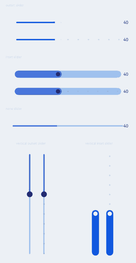
Example 1: Using Basic Slider Styles
This example demonstrates how to control the display of the tooltip, current step, and slider thumb and track by configuring style, showTips, and showSteps.
// xxx.ets
@Entry
@Component
struct SliderExample {
  @State outSetValueOne: number = 40
  @State inSetValueOne: number = 40
  @State noneValueOne: number = 40
  @State outSetValueTwo: number = 40
  @State inSetValueTwo: number = 40
  @State vOutSetValueOne: number = 40
  @State vInSetValueOne: number = 40
  @State vOutSetValueTwo: number = 40
  @State vInSetValueTwo: number = 40

  build() {
    Column({ space: 8 }) {
      Text('outset slider').fontSize(9).fontColor(0xCCCCCC).width('90%').margin(15)
      Row() {
        Slider({
          value: this.outSetValueOne,
          min: 0,
          max: 100,
          style: SliderStyle.OutSet
        })
          .showTips(true)
          .onChange((value: number, mode: SliderChangeMode) => {
            this.outSetValueOne = value
            console.info('value:' + value + 'mode:' + mode.toString())
          })
        // toFixed(0) converts the return value of the slider to an integer.
        Text(this.outSetValueOne.toFixed(0)).fontSize(12)
      }
      .width('80%')
      Row() {
        Slider({
          value: this.outSetValueTwo,
          step: 10,
          style: SliderStyle.OutSet
        })
          .showSteps(true)
          .onChange((value: number, mode: SliderChangeMode) => {
            this.outSetValueTwo = value
            console.info('value:' + value + 'mode:' + mode.toString())
          })
        Text(this.outSetValueTwo.toFixed(0)).fontSize(12)
      }
      .width('80%')

      Text('inset slider').fontSize(9).fontColor(0xCCCCCC).width('90%').margin(15)
      Row() {
        Slider({
          value: this.inSetValueOne,
          min: 0,
          max: 100,
          style: SliderStyle.InSet
        })
          .blockColor('#191970')
          .trackColor('#ADD8E6')
          .selectedColor('#4169E1')
          .showTips(true)
          .onChange((value: number, mode: SliderChangeMode) => {
            this.inSetValueOne = value
            console.info('value:' + value + 'mode:' + mode.toString())
          })
        Text(this.inSetValueOne.toFixed(0)).fontSize(12)
      }
      .width('80%')
      Row() {
        Slider({
          value: this.inSetValueTwo,
          step: 10,
          style: SliderStyle.InSet
        })
          .blockColor('#191970')
          .trackColor('#ADD8E6')
          .selectedColor('#4169E1')
          .showSteps(true)
          .onChange((value: number, mode: SliderChangeMode) => {
            this.inSetValueTwo = value
            console.info('value:' + value + 'mode:' + mode.toString())
          })
        Text(this.inSetValueTwo.toFixed(0)).fontSize(12)
      }
      .width('80%')

      Text('none slider').fontSize(9).fontColor(0xCCCCCC).width('90%').margin(15)
      Row() {
        Slider({
          value: this.noneValueOne,
          min: 0,
          max: 100,
          style: SliderStyle.NONE
        })
          .blockColor('#191970')
          .trackColor('#ADD8E6')
          .selectedColor('#4169E1')
          .showTips(true)
          .onChange((value: number, mode: SliderChangeMode) => {
            this.noneValueOne = value
            console.info('value:' + value + 'mode:' + mode.toString())
          })
        Text(this.noneValueOne.toFixed(0)).fontSize(12)
      }
      .width('80%')

      Row() {
        Column() {
          Text('vertical outset slider').fontSize(9).fontColor(0xCCCCCC).width('50%').margin(15)
          Row() {
            Text().width('10%')
            Slider({
              value: this.vOutSetValueOne,
              style: SliderStyle.OutSet,
              direction: Axis.Vertical
            })
              .blockColor('#191970')
              .trackColor('#ADD8E6')
              .selectedColor('#4169E1')
              .showTips(true)
              .onChange((value: number, mode: SliderChangeMode) => {
                this.vOutSetValueOne = value
                console.info('value:' + value + 'mode:' + mode.toString())
              })
            Slider({
              value: this.vOutSetValueTwo,
              step: 10,
              style: SliderStyle.OutSet,
              direction: Axis.Vertical
            })
              .blockColor('#191970')
              .trackColor('#ADD8E6')
              .selectedColor('#4169E1')
              .showSteps(true)
              .onChange((value: number, mode: SliderChangeMode) => {
                this.vOutSetValueTwo = value
                console.info('value:' + value + 'mode:' + mode.toString())
              })
          }
        }.width('50%').height(300)

        Column() {
          Text('vertical inset slider').fontSize(9).fontColor(0xCCCCCC).width('50%').margin(15)
          Row() {
            Slider({
              value: this.vInSetValueOne,
              style: SliderStyle.InSet,
              direction: Axis.Vertical,
              reverse: true // By default, at the top of the vertical slider is the min value and at the bottom is the max value. Therefore, if you want to slide from bottom to top, set reverse to true.
            })
              .showTips(true)
              .onChange((value: number, mode: SliderChangeMode) => {
                this.vInSetValueOne = value
                console.info('value:' + value + 'mode:' + mode.toString())
              })
            Slider({
              value: this.vInSetValueTwo,
              step: 10,
              style: SliderStyle.InSet,
              direction: Axis.Vertical,
              reverse: true
            })
              .showSteps(true)
              .onChange((value: number, mode: SliderChangeMode) => {
                this.vInSetValueTwo = value
                console.info('value:' + value + 'mode:' + mode.toString())
              })
          }
        }.width('50%').height(300)
      }
    }.width('100%')
  }
}
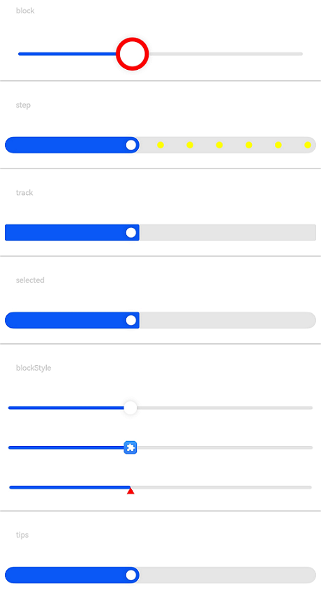
Example 2: Using Custom Slider Styles
This example demonstrates how to customize the slider styles by setting blockBorderColor, blockSize, blockBorderWidth, and blockStyle for the slider block, stepSize and stepColor for the step, trackBorderRadius for the track’s corner radius, and selectedBorderRadius for the selected part’s corner radius.
@Entry
@Component
struct SliderExample {
  @State tipsValue: number = 40

  build() {
    Column({ space: 8 }) {
      Text('block').fontSize(9).fontColor(0xCCCCCC).margin(15).width('90%')
      Slider({ style: SliderStyle.OutSet, value: 40 })
        .blockSize({ width: 40, height: 40 })
        .blockBorderColor(Color.Red)
        .blockBorderWidth(5)
      Divider()
      Text('step').fontSize(9).fontColor(0xCCCCCC).margin(15).width('90%')
      Slider({ style: SliderStyle.InSet, value: 40, step: 10 })
        .showSteps(true)
        .stepSize(8)
        .stepColor(Color.Yellow)
      Divider()
      Text('track').fontSize(9).fontColor(0xCCCCCC).margin(15).width('90%')
      Slider({ style: SliderStyle.InSet, value: 40 })
        .trackBorderRadius(2)
      Divider()
      Text('selected').fontSize(9).fontColor(0xCCCCCC).margin(15).width('90%')
      Slider({ style: SliderStyle.InSet, value: 40 })
        .selectedBorderRadius(2)
      Divider()
      Text('blockStyle').fontSize(9).fontColor(0xCCCCCC).margin(15).width('90%')
      Slider({ style: SliderStyle.OutSet, value: 40 })
        .blockStyle({ type: SliderBlockType.DEFAULT })
      Slider({ style: SliderStyle.OutSet, value: 40 })
        .blockStyle({ type: SliderBlockType.IMAGE, image: $r('sys.media.ohos_app_icon') })
      Slider({ style: SliderStyle.OutSet, value: 40 })
        .blockSize({ width: '60px', height: '60px' })
        .blockColor(Color.Red)
        .blockStyle({ type: SliderBlockType.SHAPE, shape: new Path({ commands: 'M60 60 M30 30 L15 56 L45 56 Z' }) })
      Divider()
      Text('tips').fontSize(9).fontColor(0xCCCCCC).margin(15).width('90%')
      Slider({ style: SliderStyle.InSet, value: this.tipsValue })
        .showTips(true, this.tipsValue.toFixed())
        .onChange(value => {
          this.tipsValue = value
        })
    }
  }
}
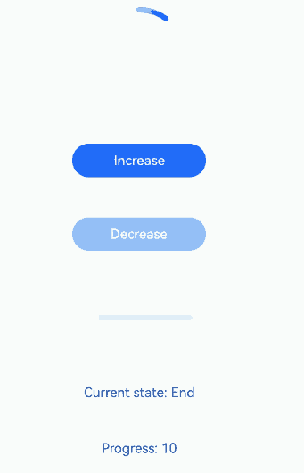
Example 3: Customizing the Slider
This example demonstrates how to customize the Slider component using a style builder to define the content area. Clicking the increase button will increment the progress bar by the step size set in the original Slider component, and clicking the decrease button will decrement the progress bar, triggering the onChange event of the original component.
// xxx.ets

@Builder function buildSlider(config: SliderConfiguration) {
  Row() {
    Column({space: 30}) {
      Progress({value: config.value, total: config.max, type:ProgressType.Ring})
        .margin({ top:20 })

      Button('Increase').onClick(() => {
        config.value = config.value + config.step
        config.triggerChange(config.value, SliderChangeMode.Click)
      })
        .width(100)
        .height(25)
        .fontSize(10)
        .enabled(config.value<config.max)

      Button('Decrease').onClick(() => {
        config.value=config.value-config.step
        config.triggerChange(config.value, SliderChangeMode.Click)
      })
        .width(100)
        .height(25)
        .fontSize(10)
        .enabled(config.value>config.min)

      Slider({
        value: config.value,
        min: config.min,
        max: config.max,
        step:config.step,
      })
        .width(config.max)
        .visibility((config.contentModifier as MySliderStyle).showSlider?Visibility.Visible:Visibility.Hidden)
        .showSteps(true)
        .onChange((value: number, mode: SliderChangeMode) => {
          config.triggerChange(value, mode)
        })
      Text('Current state: '+ ((config.contentModifier as MySliderStyle).sliderChangeMode==0?"Begin"
        :((config.contentModifier as MySliderStyle).sliderChangeMode==1?"Moving"
          :((config.contentModifier as MySliderStyle).sliderChangeMode==2?"End"
            :((config.contentModifier as MySliderStyle).sliderChangeMode==3?"Click":"None")))))
        .fontSize(10)
      Text('Progress: '+ config.value)
        .fontSize(10)
      Text('Min: ' + config.min)
        .fontSize(10)
      Text('Max: ' + config.max)
        .fontSize(10)
      Text('Step: ' + config.step)
        .fontSize(10)
    }
    .width('80%')

  }
  .width('100%')
}

class MySliderStyle implements ContentModifier<SliderConfiguration> {
  showSlider:boolean=true
  sliderChangeMode:number=0
  constructor(showSlider: boolean,sliderChangeMode:number) {
    this.showSlider = showSlider
    this.sliderChangeMode = sliderChangeMode
  }
  applyContent() : WrappedBuilder<[SliderConfiguration]> {
    return wrapBuilder(buildSlider)
  }
}


@Entry
@Component
struct SliderExample {
  @State showSlider:boolean=true
  @State sliderValue: number = 0
  @State sliderMin: number = 10
  @State sliderMax: number = 100
  @State sliderStep: number = 20
  @State sliderChangeMode: number = 0

  build() {
    Column({ space: 8 }) {

      Row() {
        Slider({
          value: this.sliderValue,
          min: this.sliderMin,
          max: this.sliderMax,
          step:this.sliderStep,
        })
          .showSteps(true)
          .onChange((value: number, mode: SliderChangeMode) => {
            this.sliderValue = value
            this.sliderChangeMode=mode
            console.info(' [SliderLog] value:' + value + 'mode:' + mode.toString())
          })
          .contentModifier(new MySliderStyle(this.showSlider,this.sliderChangeMode))

      }
      .width('100%')

    }.width('100%')
  }
}
你可能感兴趣的鸿蒙文章
- 所属分类: 后端技术
- 本文标签:
热门推荐
-
2、 优质文章
-
3、 gt
-
7、 openharmony
-
9、 golang
-
10、 Vue中input框自动聚焦