harmony 鸿蒙Circle
Circle
The Circle component is used to draw a circle.
NOTE
This component is supported since API version 7. Updates will be marked with a superscript to indicate their earliest API version.
Child Components
Not supported
APIs
Circle(value?: CircleOptions)
Widget capability: This API can be used in ArkTS widgets since API version 9.
Atomic service API: This API can be used in atomic services since API version 11.
System capability: SystemCapability.ArkUI.ArkUI.Full
Parameters
| Name | Type | Mandatory | Description |
|---|---|---|---|
| value | CircleOptions | No | Options of the circle. |
CircleOptions
Widget capability: This API can be used in ArkTS widgets since API version 9.
Atomic service API: This API can be used in atomic services since API version 11.
System capability: SystemCapability.ArkUI.ArkUI.Full
| Name | Type | Mandatory | Description |
|---|---|---|---|
| width | string |number | No | Width of the circle. The value must be greater than or equal to 0. Default value: 0 Default unit: vp An invalid value is handled as the default value. |
| height | string |number | No | Height of the circle. The value must be greater than or equal to 0. Default value: 0 Default unit: vp An invalid value is handled as the default value. |
Attributes
In addition to the universal attributes, the following attributes are supported.
fill
fill(value: ResourceColor)
Sets the color of the fill area. An invalid value is handled as the default value. If this attribute and the universal attribute foregroundColor are both set, whichever is set later takes effect.
Widget capability: This API can be used in ArkTS widgets since API version 9.
System capability: SystemCapability.ArkUI.ArkUI.Full
Parameters
| Name | Type | Mandatory | Description |
|---|---|---|---|
| value | ResourceColor | Yes | Color of the fill area. Default value: Color.Black |
fillOpacity
fillOpacity(value: number|string|Resource)
Sets the opacity of the fill area. The value range is [0.0, 1.0]. A value less than 0.0 evaluates to the value 0.0. A value greater than 1.0 evaluates to the value 1.0. Any other value evaluates to the value 1.0.
Widget capability: This API can be used in ArkTS widgets since API version 9.
System capability: SystemCapability.ArkUI.ArkUI.Full
Parameters
| Name | Type | Mandatory | Description |
|---|---|---|---|
| value | number |string |Resource | Yes | Opacity of the fill area. Default value: 1 |
stroke
stroke(value: ResourceColor)
Sets the stroke color. If this attribute is not set, the component does not have any stroke. If the value is invalid, no stroke will be drawn.
Widget capability: This API can be used in ArkTS widgets since API version 9.
System capability: SystemCapability.ArkUI.ArkUI.Full
Parameters
| Name | Type | Mandatory | Description |
|---|---|---|---|
| value | ResourceColor | Yes | Stroke color. |
strokeDashArray
strokeDashArray(value: Array<any>)
Sets stroke dashes. The value must be greater than or equal to 0. Invalid values are treated as the default value.
Widget capability: This API can be used in ArkTS widgets since API version 9.
System capability: SystemCapability.ArkUI.ArkUI.Full
Parameters
| Name | Type | Mandatory | Description |
|---|---|---|---|
| value | Array<any> | Yes | Stroke dashes. Default value: [] Default unit: vp |
strokeDashOffset
strokeDashOffset(value: number|string)
Sets the offset of the start point for drawing the stroke. An invalid value is handled as the default value.
Widget capability: This API can be used in ArkTS widgets since API version 9.
System capability: SystemCapability.ArkUI.ArkUI.Full
Parameters
| Name | Type | Mandatory | Description |
|---|---|---|---|
| value | number |string | Yes | Offset of the start point for drawing the stroke. Default value: 0 Default unit: vp |
strokeLineCap
strokeLineCap(value: LineCapStyle)
Sets the cap style of the stroke.
Widget capability: This API can be used in ArkTS widgets since API version 9.
System capability: SystemCapability.ArkUI.ArkUI.Full
Parameters
| Name | Type | Mandatory | Description |
|---|---|---|---|
| value | LineCapStyle | Yes | Cap style of the stroke. Default value: LineCapStyle.Butt |
strokeLineJoin
strokeLineJoin(value: LineJoinStyle)
Sets the join style of the stroke. This attribute does not work for the Circle component, which does not have corners.
Widget capability: This API can be used in ArkTS widgets since API version 9.
System capability: SystemCapability.ArkUI.ArkUI.Full
Parameters
| Name | Type | Mandatory | Description |
|---|---|---|---|
| value | LineJoinStyle | Yes | Join style of the stroke. Default value: LineJoinStyle.Miter |
strokeMiterLimit
strokeMiterLimit(value: number|string)
Sets the limit on the ratio of the miter length to the value of strokeWidth used to draw a miter join. This attribute does not take effect for the Circle component, which does not have a miter join.
Widget capability: This API can be used in ArkTS widgets since API version 9.
System capability: SystemCapability.ArkUI.ArkUI.Full
Parameters
| Name | Type | Mandatory | Description |
|---|---|---|---|
| value | number |string | Yes | Limit on the ratio of the miter length to the value of strokeWidth used to draw a miter join. Default value: 4 |
strokeOpacity
strokeOpacity(value: number|string|Resource)
Sets the stroke opacity. The value range is [0.0, 1.0]. A value less than 0.0 evaluates to the value 0.0. A value greater than 1.0 evaluates to the value 1.0. Any other value evaluates to the value 1.0.
Widget capability: This API can be used in ArkTS widgets since API version 9.
System capability: SystemCapability.ArkUI.ArkUI.Full
Parameters
| Name | Type | Mandatory | Description |
|---|---|---|---|
| value | number |string |Resource | Yes | Stroke opacity. Default value: 1 |
strokeWidth
strokeWidth(value: Length)
Sets the stroke width. If this attribute is of the string type, percentage values are not supported and will be treated as 1 px.
Widget capability: This API can be used in ArkTS widgets since API version 9.
System capability: SystemCapability.ArkUI.ArkUI.Full
Parameters
| Name | Type | Mandatory | Description |
|---|---|---|---|
| value | Length | Yes | Stroke width. The value must be greater than or equal to 0. Default value: 1 Default unit: vp An invalid value is handled as the default value. |
antiAlias
antiAlias(value: boolean)
Specifies whether anti-aliasing is enabled.
Widget capability: This API can be used in ArkTS widgets since API version 9.
System capability: SystemCapability.ArkUI.ArkUI.Full
Parameters
| Name | Type | Mandatory | Description |
|---|---|---|---|
| value | boolean | Yes | Whether anti-aliasing is enabled. true: Anti-aliasing is enabled. false: Anti-aliasing is disabled. Default value: true |
Example
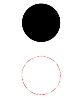
This example demonstrates how to use fillOpacity, stroke, and strokeDashArray to set the opacity, stroke color, and stroke dashes of a circle.
// xxx.ets
@Entry
@Component
struct CircleExample {
  build() {
    Column({ space: 10 }) {
      // Draw a circle whose diameter is 150.
      Circle({ width: 150, height: 150 })
      // Draw a circle whose diameter is 150 and stroke color is red. (If the width and height values are different, the smaller value will be used as the diameter.)
      Circle()
        .width(150)
        .height(200)
        .fillOpacity(0)
        .strokeWidth(3)
        .stroke(Color.Red)
        .strokeDashArray([1, 2])
    }.width('100%')
  }
}
你可能感兴趣的鸿蒙文章
- 所属分类: 后端技术
- 本文标签:
热门推荐
-
2、 优质文章
-
3、 gt
-
7、 openharmony
-
9、 golang
-
10、 Vue中input框自动聚焦