harmony 鸿蒙Custom Component Lifecycle
Custom Component Lifecycle
The lifecycle callbacks of a custom component are used to notify users of the lifecycle of the component. These callbacks are private and are invoked by the development framework at a specified time at runtime. They cannot be manually invoked from applications. Do not reuse the same custom component node across multiple windows, as otherwise its lifecycle may become disrupted.
NOTE
- The initial APIs of this module are supported since API version 7. Newly added APIs will be marked with a superscript to indicate their earliest API version.
- Promise and asynchronous callback functions can be used in lifecycle functions, for example, network resource getters and timer setters.
aboutToAppear
aboutToAppear?(): void
Invoked after a new instance of the custom component is created and before its build() function is executed. You can change state variables in aboutToAppear. The change will take effect when you execute the build() function next time. The aboutToAppear lifecycle callback of a custom component with a custom layout is invoked during the layout process.
Widget capability: This API can be used in ArkTS widgets since API version 9.
Atomic service API: This API can be used in atomic services since API version 11.
System capability: SystemCapability.ArkUI.ArkUI.Full
onDidBuild12+
onDidBuild?(): void
Invoked after the build() function of the custom component is executed. You can use this callback for actions that do not directly affect the UI, such as tracking data reporting. Do not change state variables or use functions (such as animateTo) in onDidBuild. Otherwise, unstable UI performance may result.
Atomic service API: This API can be used in atomic services since API version 12.
System capability: SystemCapability.ArkUI.ArkUI.Full
aboutToDisappear
aboutToDisappear?(): void
Invoked when this component is about to disappear. Do not change state variables in the aboutToDisappear function as doing this can cause unexpected errors. For example, the modification of the @Link decorated variable may cause unstable application running.
Widget capability: This API can be used in ArkTS widgets since API version 9.
Atomic service API: This API can be used in atomic services since API version 11.
System capability: SystemCapability.ArkUI.ArkUI.Full
onPageShow
onPageShow?(): void
Invoked each time the page is displayed, for example, during page redirection or when the application is switched to the foreground. It works only for the custom components decorated by @Entry.
Atomic service API: This API can be used in atomic services since API version 11.
System capability: SystemCapability.ArkUI.ArkUI.Full
onPageHide
onPageHide?(): void
Invoked each time the page is hidden, for example, during page redirection or when the application is switched to the background. It works only for the custom components decorated by @Entry.
Atomic service API: This API can be used in atomic services since API version 11.
System capability: SystemCapability.ArkUI.ArkUI.Full
onBackPress
onBackPress?(): void|boolean
Invoked when the user clicks the Back button. It works only for the custom components decorated by @Entry. The value true means that the page executes its own return logic, and false (default) means that the default return logic is used.
Atomic service API: This API can be used in atomic services since API version 11.
System capability: SystemCapability.ArkUI.ArkUI.Full
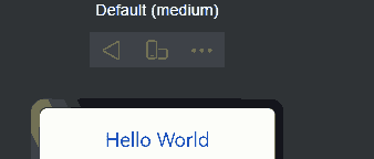
// xxx.ets
@Entry
@Component
struct IndexComponent {
  @State textColor: Color = Color.Black;

  onPageShow() {
    this.textColor = Color.Blue;
    console.info('IndexComponent onPageShow');
  }

  onPageHide() {
    this.textColor = Color.Transparent;
    console.info('IndexComponent onPageHide');
  }

  onBackPress() {
    this.textColor = Color.Red;
    console.info('IndexComponent onBackPress');
  }

  build() {
    Column() {
      Text('Hello World')
        .fontColor(this.textColor)
        .fontSize(30)
        .margin(30)
    }.width('100%')
  }
}
onNewParam18+
onNewParam?(param: ESObject): void
Invoked when a page that previously existed in the router stack is moved to the top of the stack through the singleton mode. This callback is effective only for custom components decorated with @Entry and used as router pages.
Atomic service API: This API can be used in atomic services since API version 18.
System capability: SystemCapability.ArkUI.ArkUI.Full
Parameters
| Name | Type | Description |
|---|---|---|
| param | ESObject | Data passed to the target page during redirection. |
// pages/Index.ets
import { router } from '@kit.ArkUI';

export class routerParam {
  msg: string = '__NA__';

  constructor(msg: string) {
    this.msg = msg;
  }
}

@Entry
@Component
struct Index {
  aboutToAppear(): void {
    console.log('onNewParam', 'Index aboutToAppear');
  }

  onNewParam(param: ESObject) {
    console.log('onNewParam', 'Index onNewParam, param: ' + JSON.stringify(param));
  }

  build() {
    Column() {
      Button('push pageOne Standard')
        .margin(10)
        .onClick(() => {
          this.getUIContext().getRouter().pushUrl({
            url: 'pages/PageOne',
            params: new routerParam('push pageOne Standard')
          }, router.RouterMode.Standard);
        })
      Button('push pageOne Single')
        .margin(10)
        .onClick(() => {
          this.getUIContext().getRouter().pushUrl({
            url: 'pages/PageOne',
            params: new routerParam('push pageOne Single')
          }, router.RouterMode.Single)
        })
    }
    .width('100%')
    .height('100%')
  }
}
// pages/PageOne.ets
import { router } from '@kit.ArkUI';
import { routerParam } from './Index';

@Entry
@Component
struct PageOne {
  aboutToAppear(): void {
    console.log('onNewParam', 'PageOne aboutToAppear');
  }

  onNewParam(param: ESObject) {
    console.log('onNewParam', 'PageOne onNewParam, param: ' + JSON.stringify(param));
  }

  build() {
    Column() {
      Button('push Index Standard')
        .margin(10)
        .onClick(() => {
          this.getUIContext().getRouter().pushUrl({
            url: 'pages/Index',
            params: new routerParam('push Index Standard')
          }, router.RouterMode.Standard);
        })
      Button('push Index Single')
        .margin(10)
        .onClick(() => {
          this.getUIContext().getRouter().pushUrl({
            url: 'pages/Index',
            params: new routerParam('push Index Single')
          }, router.RouterMode.Single)
        })
    }
    .width('100%')
    .height('100%')
  }
}
aboutToReuse10+
aboutToReuse?(params: { [key: string]: unknown }): void
Invoked when a reusable custom component is re-added to the node tree from the reuse cache to receive construction parameters of the component.
Atomic service API: This API can be used in atomic services since API version 11.
System capability: SystemCapability.ArkUI.ArkUI.Full
Parameters
| Name | Type | Description |
|---|---|---|
| params | { [key: string]: unknown } | Construction parameters of the custom component. |
// xxx.ets
export class Message {
  value: string|undefined;

  constructor(value: string) {
    this.value = value
  }
}

@Entry
@Component
struct Index {
  @State switch: boolean = true

  build() {
    Column() {
      Button('Hello World')
        .fontSize(50)
        .fontWeight(FontWeight.Bold)
        .onClick(() => {
          this.switch = !this.switch
        })
      if (this.switch) {
        Child({ message: new Message('Child') })
      }
    }
    .height("100%")
    .width('100%')
  }
}

@Reusable
@Component
struct Child {
  @State message: Message = new Message('AboutToReuse');

  aboutToReuse(params: Record<string, ESObject>) {
    console.info("Recycle Child")
    this.message = params.message as Message
  }

  build() {
    Column() {
      Text(this.message.value)
        .fontSize(20)
    }
    .borderWidth(2)
    .height(100)
  }
}
aboutToReuse18+
aboutToReuse?(): void
Invoked when a reusable custom component managed by state management V2 is taken from the reuse pool and reinserted into the node tree.
For details, see \@ReusableV2.
Atomic service API: This API can be used in atomic services since API version 18.
System capability: SystemCapability.ArkUI.ArkUI.Full
@Entry
@ComponentV2
struct Index {
  @Local condition: boolean = true;
  build() {
    Column() {
      Button('Recycle/Reuse').onClick(()=>{this.condition=!this.condition;}) // Click to switch the recycle/reuse state.
      if (this.condition) {
        ReusableV2Component()
      }
    }
  }
}
@ReusableV2
@ComponentV2
struct ReusableV2Component {
  @Local message: string = 'Hello World';
  aboutToReuse() {
    console.log('ReusableV2Component aboutToReuse'); // Called when a component is reused.
  }
  build() {
    Column() {
      Text(this.message)
    }
  }
}
aboutToRecycle10+
aboutToRecycle?(): void
Invoked when this reusable component is about to be added from the component tree to the reuse cache.
Atomic service API: This API can be used in atomic services since API version 11.
System capability: SystemCapability.ArkUI.ArkUI.Full
// xxx.ets
export class Message {
  value: string|undefined;

  constructor(value: string) {
    this.value = value;
  }
}

@Entry
@Component
struct Index {
  @State switch: boolean = true;

  build() {
    Column() {
      Button('Hello World')
        .fontSize(50)
        .fontWeight(FontWeight.Bold)
        .onClick(() => {
          this.switch = !this.switch;
        })
      if (this.switch) {
        Child({ message: new Message('Child') })
      }
    }
    .height("100%")
    .width('100%')
  }
}

@Reusable
@Component
struct Child {
  @State message: Message = new Message('AboutToReuse');

  aboutToReuse(params: Record<string, ESObject>) {
    console.info("Reuse Child");
    this.message = params.message as Message;
  }

  aboutToRecycle() {
    // This is where you can release memory-intensive content or other non-essential resource references to avoid continuous memory usage that could lead to memory leaks.
    console.info("The child enters the recycle pool.");
  }

  build() {
    Column() {
      Text(this.message.value)
        .fontSize(20)
    }
    .borderWidth(2)
    .height(100)
  }
}
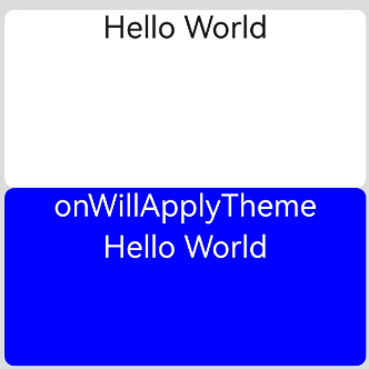
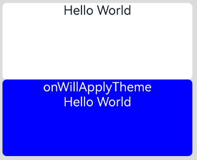
onWillApplyTheme12+
onWillApplyTheme?(theme: Theme): void
Invoked before the build() function of a new instance of the custom component is executed, to obtain the Theme object of the component context. You can change state variables in onWillApplyTheme. The change will take effect when you execute the build() function next time.
NOTE
Since API version 18, this API is supported in the components of V2.
Atomic service API: This API can be used in atomic services since API version 12.
System capability: SystemCapability.ArkUI.ArkUI.Full
Parameters
| Name | Type | Description |
|---|---|---|
| theme | Theme | Current theme object of the custom component. |
V1:
// xxx.ets
import { CustomTheme, CustomColors, Theme, ThemeControl } from '@kit.ArkUI';

class BlueColors implements CustomColors {
  fontPrimary = Color.White;
  backgroundPrimary = Color.Blue;
  brand = Color.Blue; // Brand color
}

class PageCustomTheme implements CustomTheme {
  colors?: CustomColors;

  constructor(colors: CustomColors) {
    this.colors = colors;
  }
}
const BlueColorsTheme = new PageCustomTheme(new BlueColors());
// setDefaultTheme should be called on the application entry page or in an ability.
ThemeControl.setDefaultTheme(BlueColorsTheme);

@Entry
@Component
struct IndexComponent {
  @State textColor: ResourceColor = $r('sys.color.font_primary');
  @State columBgColor: ResourceColor = $r('sys.color.background_primary');

  // Obtain the Theme object of the current component context. Set textColor and columBgColor in onWillApplyTheme to the color (BlueColorsTheme) of the Theme object in use.
  onWillApplyTheme(theme: Theme) {
    this.textColor = theme.colors.fontPrimary;
    this.columBgColor = theme.colors.backgroundPrimary;
    console.info('IndexComponent onWillApplyTheme');
  }

  build() {
    Column() {
      // Initial color style of the component
      Column() {
        Text('Hello World')
          .fontColor($r('sys.color.font_primary'))
          .fontSize(30)
      }
      .width('100%')
      .height('25%')
      .borderRadius('10vp')
      .backgroundColor($r('sys.color.background_primary'))

      // The color style configured in onWillApplyTheme is applied.
      Column() {
        Text('onWillApplyTheme')
          .fontColor(this.textColor)
          .fontSize(30)
        Text('Hello World')
          .fontColor(this.textColor)
          .fontSize(30)
      }
      .width('100%')
      .height('25%')
      .borderRadius('10vp')
      .backgroundColor(this.columBgColor)
    }
    .padding('16vp')
    .backgroundColor('#dcdcdc')
    .width('100%')
    .height('100%')
  }
}
V2:
import { CustomTheme, CustomColors, Theme, ThemeControl } from '@kit.ArkUI';

class BlueColors implements CustomColors {
  fontPrimary = Color.White;
  backgroundPrimary = Color.Blue;
  brand = Color.Blue; // Brand color
}

class PageCustomTheme implements CustomTheme {
  colors?: CustomColors;

  constructor(colors: CustomColors) {
    this.colors = colors;
  }
}

const BlueColorsTheme = new PageCustomTheme(new BlueColors());
// setDefaultTheme should be called on the application entry page or in an ability.
ThemeControl.setDefaultTheme(BlueColorsTheme);

@Entry
@ComponentV2
struct IndexComponent {
  @Local textColor: ResourceColor = $r('sys.color.font_primary');
  @Local columBgColor: ResourceColor = $r('sys.color.background_primary');

  // Obtain the Theme object of the current component context. Set textColor and columBgColor in onWillApplyTheme to the color (BlueColorsTheme) of the Theme object in use.
  onWillApplyTheme(theme: Theme) {
    this.textColor = theme.colors.fontPrimary;
    this.columBgColor = theme.colors.backgroundPrimary;
    console.info('IndexComponent onWillApplyTheme');
  }

  build() {
    Column() {
      // Initial color style of the component
      Column() {
        Text('Hello World')
          .fontColor($r('sys.color.font_primary'))
          .fontSize(30)
      }
      .width('100%')
      .height('25%')
      .borderRadius('10vp')
      .backgroundColor($r('sys.color.background_primary'))

      // The color style configured in onWillApplyTheme is applied.
      Column() {
        Text('onWillApplyTheme')
          .fontColor(this.textColor)
          .fontSize(30)
        Text('Hello World')
          .fontColor(this.textColor)
          .fontSize(30)
      }
      .width('100%')
      .height('25%')
      .borderRadius('10vp')
      .backgroundColor(this.columBgColor)
    }
    .padding('16vp')
    .backgroundColor('#dcdcdc')
    .width('100%')
    .height('100%')
  }
}
你可能感兴趣的鸿蒙文章
- 所属分类: 后端技术
- 本文标签:
热门推荐
-
2、 优质文章
-
3、 gt
-
7、 openharmony
-
9、 golang
-
10、 Vue中input框自动聚焦