harmony 鸿蒙Custom Component Layout
Custom Component Layout
The custom layout of a custom component is used to lay out its child components through data calculation.
NOTE
The initial APIs of this module are supported since API version 9. Newly added APIs will be marked with a superscript to indicate their earliest API version.
onPlaceChildren10+
onPlaceChildren?(selfLayoutInfo: GeometryInfo, children: Array<Layoutable>, constraint: ConstraintSizeOptions):void
Invoked when the custom component lays out its child components. Through this callback the component receives its child component size constraints from the ArkUI framework. State variables should not be changed in this callback.
Atomic service API: This API can be used in atomic services since API version 11.
System capability: SystemCapability.ArkUI.ArkUI.Full
Parameters
| Name | Type | Mandatory | Description |
|---|---|---|---|
| selfLayoutInfo | GeometryInfo | Yes | Layout information of the custom component itself after measurement. |
| children | Array<Layoutable> | Yes | Layout information of the child components after measurement. |
| constraint | ConstraintSizeOptions | Yes | Size constraint of the parent component. |
Example
See the example for customizing a layout.
onMeasureSize10+
onMeasureSize?(selfLayoutInfo: GeometryInfo, children: Array<Measurable>, constraint: ConstraintSizeOptions): SizeResult
Invoked when the custom component needs to determine its size. Through this callback the component receives its child component layout information and size constraint from the ArkUI framework. State variables should not be changed in this callback.
Atomic service API: This API can be used in atomic services since API version 11.
System capability: SystemCapability.ArkUI.ArkUI.Full
Parameters
| Name | Type | Mandatory | Description |
|---|---|---|---|
| selfLayoutInfo | GeometryInfo | Yes | Layout information of the custom component itself after measurement. NOTE During the first layout, the component will use its own set attributes as the basis for layout. |
| children | Array<Measurable> | Yes | Layout information of the child components after measurement. NOTE When a child component does not have its layout information set, it retains the previous layout settings or, if no previous layout settings are available, stays at the default size of 0. |
| constraint | ConstraintSizeOptions | Yes | Size constraint of the parent component. |
Return value
| Type | Description |
|---|---|
| SizeResult | Component size information. |
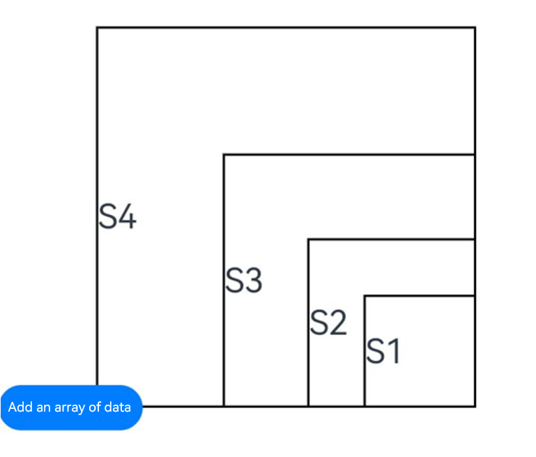
Example 1 This example demonstrates how to customize a layout.
// xxx.ets
@Entry
@Component
struct Index {
  build() {
    Column() {
      CustomLayout({ builder: ColumnChildren })
    }
  }
}

@Builder
function ColumnChildren() {
  ForEach([1, 2, 3], (index: number) => {// LazyForEach is not supported.
    Text('S' + index)
      .fontSize(30)
      .width(100)
      .height(100)
      .borderWidth(2)
      .offset({ x: 10, y: 20 })
  })
}

@Component
struct CustomLayout {
  @Builder
  doNothingBuilder() {
  };

  @BuilderParam builder: () => void = this.doNothingBuilder;
  @State startSize: number = 100;
  result: SizeResult = {
    width: 0,
    height: 0
  };

  onPlaceChildren(selfLayoutInfo: GeometryInfo, children: Array<Layoutable>, constraint: ConstraintSizeOptions) {
    let startPos = 300;
    children.forEach((child) => {
      let pos = startPos - child.measureResult.height;
      child.layout({ x: pos, y: pos })
    })
  }

  onMeasureSize(selfLayoutInfo: GeometryInfo, children: Array<Measurable>, constraint: ConstraintSizeOptions) {
    let size = 100;
    children.forEach((child) => {
      let result: MeasureResult = child.measure({ minHeight: size, minWidth: size, maxWidth: size, maxHeight: size })
      size += result.width / 2
      ;
    })
    this.result.width = 100;
    this.result.height = 400;
    return this.result;
  }

  build() {
    this.builder()
  }
}
Example 2 This example shows how to determine whether a component participates in layout calculation based on its position.
// xxx.ets
@Entry
@Component
struct Index {
  build() {
    Column() {
      CustomLayout({ builder: ColumnChildren })
    }
    .justifyContent(FlexAlign.Center)
    .width("100%")
    .height("100%")
  }
}

@Builder
function ColumnChildren() {
  ForEach([1, 2, 3], (item: number, index: number) => { // LazyForEach is not supported.
    Text('S' + item)
      .fontSize(20)
      .width(60 + 10 * index)
      .height(100)
      .borderWidth(2)
      .margin({ left:10 })
      .padding(10)
  })
}

@Component
struct CustomLayout {
  // Lay out only one row, and hide child components that are too large for the available space.
  @Builder
  doNothingBuilder() {
  };

  @BuilderParam builder: () => void = this.doNothingBuilder;
  result: SizeResult = {
    width: 0,
    height: 0
  };
  overFlowIndex: number = -1;

  onPlaceChildren(selfLayoutInfo: GeometryInfo, children: Array<Layoutable>, constraint: ConstraintSizeOptions) {
    let currentX = 0;
    let infinity = 100000;
    if (this.overFlowIndex == -1) {
      this.overFlowIndex = children.length;
    }
    for (let index = 0; index < children.length; ++index) {
      let child = children[index];
      if (index >= this.overFlowIndex) {
        // Hide any child component that extends beyond the area of its parent component by placing it in a distant position.
        child.layout({x: infinity, y: 0});
        continue;
      }
      child.layout({ x: currentX, y: 0 })
      let margin = child.getMargin();
      currentX += child.measureResult.width + margin.start + margin.end;
    }
  }

  onMeasureSize(selfLayoutInfo: GeometryInfo, children: Array<Measurable>, constraint: ConstraintSizeOptions) {
    let width = 0;
    let height = 0;
    this.overFlowIndex = -1;
    // Assume that the component width cannot exceed 200 vp or the maximum constraint.
    let maxWidth = Math.min(200, constraint.maxWidth as number);
    for (let index = 0; index < children.length; ++index) {
      let child = children[index];
      let childResult: MeasureResult = child.measure({
          minHeight: constraint.minHeight,
          minWidth: constraint.minWidth,
          maxWidth: constraint.maxWidth,
          maxHeight: constraint.maxHeight
      })
      let margin = child.getMargin();
      let newWidth = width + childResult.width + margin.start + margin.end;
      if (newWidth > maxWidth) {
        // Record the index of the component that should not be laid out.
        this.overFlowIndex = index;
        break;
      }
      // Accumulate the width and height of the parent component.
      width = newWidth;
      height = Math.max(height, childResult.height + margin.top + margin.bottom);
    }
    this.result.width = width;
    this.result.height = height;
    return this.result;
  }

  build() {
    this.builder()
  }
}

Example 3 This example shows how to obtain the FrameNode of a child component using uniqueId and change its size and background color using the FrameNode API.
import { FrameNode, NodeController } from '@kit.ArkUI';
@Entry
@Component
struct Index {
  build() {
    Column() {
      CustomLayout()
    }
  }
}

class MyNodeController extends NodeController {
  private rootNode: FrameNode|null = null;
  makeNode(uiContext: UIContext): FrameNode|null {
    this.rootNode = new FrameNode(uiContext)
    return this.rootNode
  }
}

@Component
struct CustomLayout {
  @Builder
  childrenBuilder() {
    ForEach([1, 2, 3], (index: number) => {// LazyForEach is not supported.
      NodeContainer(new MyNodeController())
    })
  };

  @BuilderParam builder: () => void = this.childrenBuilder;
  result: SizeResult = {
    width: 0,
    height: 0
  };

  onPlaceChildren(selfLayoutInfo: GeometryInfo, children: Array<Layoutable>, constraint: ConstraintSizeOptions) {
    let prev = 0;
    children.forEach((child) => {
      let pos = prev + 10;
      prev = pos + child.measureResult.width
      child.layout({ x: pos, y: 0 })
    })
  }

  onMeasureSize(selfLayoutInfo: GeometryInfo, children: Array<Measurable>, constraint: ConstraintSizeOptions) {
    let size = 100;
    children.forEach((child) => {
      console.log("child uniqueId: ", child.uniqueId)
      const uiContext = this.getUIContext()
      if (uiContext) {
        let node: FrameNode|null = uiContext.getFrameNodeByUniqueId(child.uniqueId) // Obtain the FrameNode of the NodeContainer component.
        if (node) {
          node.getChild(0)!.commonAttribute.width(100)
          node.getChild(0)!.commonAttribute.height(100)
          node.getChild(0)!.commonAttribute.backgroundColor(Color.Pink) // Change the size and background color of the FrameNode.
        }
      }
      child.measure({ minHeight: size, minWidth: size, maxWidth: size, maxHeight: size })
    })
    this.result.width = 320;
    this.result.height = 100;
    return this.result;
  }

  build() {
    this.builder()
  }
}
GeometryInfo10+
Provides the parent component layout information. Inherits from SizeResult.
Atomic service API: This API can be used in atomic services since API version 11.
System capability: SystemCapability.ArkUI.ArkUI.Full
| Name | Type | Read-Only | Optional | Description |
|---|---|---|---|---|
| borderWidth | EdgeWidth | No | No | Border width of the parent component. Unit: vp |
| margin | Margin | No | No | Margin of the parent component. Unit: vp |
| padding | Padding | No | No | Padding of the parent component. Unit: vp |
Layoutable10+
Provides the child component layout information.
Atomic service API: This API can be used in atomic services since API version 11.
System capability: SystemCapability.ArkUI.ArkUI.Full
Properties
| Name | Type | Read-Only | Optional | Description |
|---|---|---|---|---|
| measureResult | MeasureResult | No | No | Measurement result of the child component. Atomic service API: This API can be used in atomic services since API version 11. Unit: vp |
layout
layout(position: Position)
Applies the specified position information to the child component.
Atomic service API: This API can be used in atomic services since API version 11.
System capability: SystemCapability.ArkUI.ArkUI.Full
Parameters
| Name | Type | Mandatory | Description |
|---|---|---|---|
| position | Position | Yes | Absolute position. |
getMargin12+
getMargin() : DirectionalEdgesT<number>
Obtains the margin of the child component.
Atomic service API: This API can be used in atomic services since API version 12.
System capability: SystemCapability.ArkUI.ArkUI.Full
Return value
| Type | Description |
|---|---|
| DirectionalEdgesT<number> | Margin of the child component. |
### getPadding12+
getPadding() : DirectionalEdgesT<number>
Obtains the padding of the child component.
Atomic service API: This API can be used in atomic services since API version 12.
System capability: SystemCapability.ArkUI.ArkUI.Full
Return value
| Type | Description |
|---|---|
| DirectionalEdgesT<number> | Padding of the child component. |
getBorderWidth12+
getBorderWidth() : DirectionalEdgesT<number>
Obtains the border width of the child component.
Atomic service API: This API can be used in atomic services since API version 12.
System capability: SystemCapability.ArkUI.ArkUI.Full
Return value
| Type | Description |
|---|---|
| DirectionalEdgesT<number> | Border width of the child component. |
Measurable10+
Provides the child component position information.
Atomic service API: This API can be used in atomic services since API version 11.
System capability: SystemCapability.ArkUI.ArkUI.Full
Name
Atomic service API: This API can be used in atomic services since API version 18.
System capability: SystemCapability.ArkUI.ArkUI.Full
| Name | Type | Mandatory | Description |
|---|---|---|---|
| uniqueId18+ | number | No | Unique ID that the system assigns to the child component. |
measure
measure(constraint: ConstraintSizeOptions) : MeasureResult
Applies the size constraint to the child component.
Atomic service API: This API can be used in atomic services since API version 11.
System capability: SystemCapability.ArkUI.ArkUI.Full
Parameters
| Name | Type | Mandatory | Description |
|---|---|---|---|
| constraint | ConstraintSizeOptions | Yes | Size constraint. |
Return value
| Type | Description |
|---|---|
| MeasureResult | Provides the measurement result of the component. |
### getMargin12+
getMargin() : DirectionalEdgesT<number>
Obtains the margin of the child component.
Atomic service API: This API can be used in atomic services since API version 12.
System capability: SystemCapability.ArkUI.ArkUI.Full
Return value
| Type | Description |
|---|---|
| DirectionalEdgesT<number> | Margin of the child component. |
getPadding12+
getPadding() : DirectionalEdgesT<number>
Obtains the padding of the child component.
Atomic service API: This API can be used in atomic services since API version 12.
System capability: SystemCapability.ArkUI.ArkUI.Full
Return value
| Type | Description |
|---|---|
| DirectionalEdgesT<number> | Padding of the child component. |
### getBorderWidth12+
getBorderWidth() : DirectionalEdgesT<number>
Obtains the border width of the child component.
Atomic service API: This API can be used in atomic services since API version 12.
System capability: SystemCapability.ArkUI.ArkUI.Full
Return value
| Type | Description |
|---|---|
| DirectionalEdgesT<number> | Border width of the child component. |
MeasureResult10+
Provides the measurement result of the component. This API inherites from SizeResult.
Atomic service API: This API can be used in atomic services since API version 11.
System capability: SystemCapability.ArkUI.ArkUI.Full
SizeResult10+
Provides the component size information.
Atomic service API: This API can be used in atomic services since API version 11.
System capability: SystemCapability.ArkUI.ArkUI.Full
| Name | Type | Read-Only | Optional | Description |
|---|---|---|---|---|
| width | number | No | No | Width obtained from the measurement result. Unit: vp |
| height | number | No | No | Height obtained from the measurement result. Unit: vp |
DirectionalEdgesT<T>12+
Defines the directional edges.
Widget capability: This API can be used in ArkTS widgets since API version 12.
Atomic service API: This API can be used in atomic services since API version 12.
System capability: SystemCapability.ArkUI.ArkUI.Full
| Name | Type | Read-Only | Optional | Description |
|---|---|---|---|---|
| start | T | No | No | Start edge. It is the left edge if the direction is left-to-right and the right edge if the direction is right-to-left. |
| end | T | No | No | End edge. It is the right edge if the direction is left-to-right and the left edge if the direction is right-to-left. |
| top | T | No | No | Top edge. |
| bottom | T | No | No | Top edge. |
NOTE
- The custom layout does not support the LazyForEach syntax.
- When a custom layout is created in builder mode, only this.builder() is allowed in the build() method of a custom component, as shown in the recommended usage in the example below.
- The size parameters of the parent component (custom component), except aspectRatio, are at a lower priority than those specified by onMeasureSize.
- The position parameters of the child component, except offset, position, and markAnchor, are at a lower priority than those specified by onPlaceChildren, and do not take effect.
- When using the custom layout method, you must call onMeasureSize and onPlaceChildren at the same time for the layout to display properly.
onLayout(deprecated)
onLayout?(children: Array<LayoutChild>, constraint: ConstraintSizeOptions): void
Invoked when the custom component lays out its child components. Through this callback the component receives its child component layout information and size constraint from the ArkUI framework. State variables should not be changed in this callback.
This API is supported since API version 9 and deprecated since API version 10. You are advised to use onPlaceChildren instead.
Widget capability: This API can be used in ArkTS widgets since API version 9.
System capability: SystemCapability.ArkUI.ArkUI.Full
Parameters
| Name | Type | Mandatory | Description |
|---|---|---|---|
| children | Array<LayoutChild> | Yes | Child component layout information. |
| constraint | ConstraintSizeOptions | Yes | Size constraint of the parent component. |
onMeasure(deprecated)
onMeasure?(children: Array<LayoutChild>, constraint: ConstraintSizeOptions): void
Invoked when the custom component needs to determine its size. Through this callback the component receives its child component layout information and size constraint from the ArkUI framework. State variables should not be changed in this callback.
This API is supported since API version 9 and deprecated since API version 10. You are advised to use onMeasureSize instead.
Widget capability: This API can be used in ArkTS widgets since API version 9.
System capability: SystemCapability.ArkUI.ArkUI.Full
Parameters
| Name | Type | Mandatory | Description |
|---|---|---|---|
| children | Array<LayoutChild> | Yes | Child component layout information. |
| constraint | ConstraintSizeOptions | Yes | Size constraint of the parent component. |
LayoutChild(deprecated)
Child component layout information.
This API is supported since API version 9 and deprecated since API version 10. It is supported in ArkTS widgets.
Widget capability: This API can be used in ArkTS widgets since API version 9.
System capability: SystemCapability.ArkUI.ArkUI.Full
| Name | Type | Read-Only | Optional | Description |
|---|---|---|---|---|
| name | string | No | No | Name of the child component. |
| id | string | No | No | ID of the child component. |
| constraint | ConstraintSizeOptions | No | No | Constraint size of the child component. |
| borderInfo | LayoutBorderInfo | No | No | Provides the border information of the child component. |
| position | Position | No | No | Position coordinates of the child component. |
| measure | (childConstraint: ConstraintSizeOptions) => void | No | No | Method called to apply the size constraint to the child component. |
| layout | (LayoutInfo: LayoutInfo) => void | No | No | Method called to apply the specified position information to the child component. |
LayoutBorderInfo(deprecated)
Provides the border information of the child component.
This API is supported since API version 9 and deprecated since API version 10. It is supported in ArkTS widgets.
Widget capability: This API can be used in ArkTS widgets since API version 9.
System capability: SystemCapability.ArkUI.ArkUI.Full
| Name | Type | Read-Only | Optional | Description |
|---|---|---|---|---|
| borderWidth | EdgeWidths | No | No | Edge widths in different directions of the component. |
| margin | Margin | No | No | Margins in different directions of the component. |
| padding | Padding | No | No | Paddings in different directions of the component. |
LayoutInfo(deprecated)
Provides the layout information of the child component.
This API is supported since API version 9 and deprecated since API version 10. It is supported in ArkTS widgets.
Widget capability: This API can be used in ArkTS widgets since API version 9.
System capability: SystemCapability.ArkUI.ArkUI.Full
| Name | Type | Read-Only | Optional | Description |
|---|---|---|---|---|
| position | Position | No | No | Position coordinates of the child component. |
| constraint | ConstraintSizeOptions | No | No | Constraint size of the child component. |
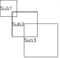
The layout can be modified through layout.
// xxx.ets
@Entry
@Component
struct Index {
  build() {
    Column() {
      CustomLayout() {
        ForEach([1, 2, 3], (index: number) => {
          Text('Sub' + index)
            .fontSize(30)
            .borderWidth(2)
        })
      }
    }
  }
}


@Component
struct CustomLayout {
  @Builder
  doNothingBuilder() {
  };

  @BuilderParam builder: () => void = this.doNothingBuilder;

  onLayout(children: Array<LayoutChild>, constraint: ConstraintSizeOptions) {
    let pos = 0;
    children.forEach((child) => {
      child.layout({ position: { x: pos, y: pos }, constraint: constraint })
      pos += 70;
    })
  }

  onMeasure(children: Array<LayoutChild>, constraint: ConstraintSizeOptions) {
    let size = 100;
    children.forEach((child) => {
      child.measure({ minHeight: size, minWidth: size, maxWidth: size, maxHeight: size })
      size += 50;
    })
  }

  build() {
    this.builder()
  }
}
你可能感兴趣的鸿蒙文章
- 所属分类: 后端技术
- 本文标签:
热门推荐
-
2、 优质文章
-
3、 gt
-
7、 openharmony
-
9、 golang
-
10、 Vue中input框自动聚焦