harmony 鸿蒙Span
Span
As a child of the Text and ContainerSpan components, the Span component is used to display inline text.
NOTE
This component is supported since API version 7. Updates will be marked with a superscript to indicate their earliest API version.
Since API version 10, this component can inherit the attributes of the Text parent component. That is, if no attribute is set for this component, it inherits the attributes (if set) of its parent component. Only the following attributes can be inherited: fontColor, fontSize, fontStyle, fontWeight, decoration, letterSpacing, textCase, fontfamily, and textShadow.
Child Components
Not supported
APIs
Span(value: string|Resource)
Widget capability: This API can be used in ArkTS widgets since API version 9.
Atomic service API: This API can be used in atomic services since API version 11.
System capability: SystemCapability.ArkUI.ArkUI.Full
Parameters
| Name | Type | Mandatory | Description |
|---|---|---|---|
| value | string |Resource | Yes | Plain text. |
Attributes
Inherited from BaseSpan.
decoration
decoration(value: DecorationStyleInterface)
Style and color of the text decorative line.
Widget capability: This API can be used in ArkTS widgets since API version 9.
Atomic service API: This API can be used in atomic services since API version 11.
System capability: SystemCapability.ArkUI.ArkUI.Full
Parameters
| Name | Type | Mandatory | Description |
|---|---|---|---|
| value | DecorationStyleInterface12+ | Yes | Style of the text decorative line. Default value: { type: TextDecorationType.None, color: Color.Black, style: TextDecorationStyle.SOLID } NOTE The style parameter cannot be used in widgets. |
letterSpacing
letterSpacing(value: number|string)
Letter spacing. A negative value tightens the spacing; a positive value loosens the spacing, and the letters are spread farther apart with the value. For the string type, numeric string values with optional units, for example, “10” or “10fp”, are supported.
Widget capability: This API can be used in ArkTS widgets since API version 9.
Atomic service API: This API can be used in atomic services since API version 11.
System capability: SystemCapability.ArkUI.ArkUI.Full
Parameters
| Name | Type | Mandatory | Description |
|---|---|---|---|
| value | number |string | Yes | Letter spacing. Unit: fp |
textCase
textCase(value: TextCase)
Text case.
Widget capability: This API can be used in ArkTS widgets since API version 9.
Atomic service API: This API can be used in atomic services since API version 11.
System capability: SystemCapability.ArkUI.ArkUI.Full
Parameters
| Name | Type | Mandatory | Description |
|---|---|---|---|
| value | TextCase | Yes | Text case. Default value: TextCase.Normal |
fontColor
fontColor(value: ResourceColor)
Sets the font color.
Widget capability: This API can be used in ArkTS widgets since API version 9.
Atomic service API: This API can be used in atomic services since API version 11.
System capability: SystemCapability.ArkUI.ArkUI.Full
Parameters
| Name | Type | Mandatory | Description |
|---|---|---|---|
| value | ResourceColor | Yes | Font color. |
fontSize
fontSize(value: number|string|Resource)
Sets the font size.
Widget capability: This API can be used in ArkTS widgets since API version 9.
Atomic service API: This API can be used in atomic services since API version 11.
System capability: SystemCapability.ArkUI.ArkUI.Full
Parameters
| Name | Type | Mandatory | Description |
|---|---|---|---|
| value | number |string |Resource | Yes | Font size. If fontSize is of the number type, the unit fp is used. The default font size is 16 fp. For the string type, numeric string values with optional units, for example, “10” or “10fp”, are supported. Percentage values are not supported. |
fontStyle
fontStyle(value: FontStyle)
Sets the font style.
Widget capability: This API can be used in ArkTS widgets since API version 9.
Atomic service API: This API can be used in atomic services since API version 11.
System capability: SystemCapability.ArkUI.ArkUI.Full
Parameters
| Name | Type | Mandatory | Description |
|---|---|---|---|
| value | FontStyle | Yes | Font style. Default value: FontStyle.Normal |
fontWeight
fontWeight(value: number|FontWeight|string)
Sets the font weight. If the value is too large, the text may be clipped depending on the font.
Widget capability: This API can be used in ArkTS widgets since API version 9.
Atomic service API: This API can be used in atomic services since API version 11.
System capability: SystemCapability.ArkUI.ArkUI.Full
Parameters
| Name | Type | Mandatory | Description |
|---|---|---|---|
| value | number |FontWeight |string | Yes | Font weight. For the number type, the value range is [100, 900], at an interval of 100. The default value is 400. A larger value indicates a heavier font weight. For the string type, only strings of the number type are supported, for example, 400, “bold”, “bolder”, “lighter”, “regular”, and “medium”, which correspond to the enumerated values in FontWeight. Default value: FontWeight.Normal |
fontFamily
fontFamily(value: string|Resource)
Sets the font family.
Widget capability: This API can be used in ArkTS widgets since API version 9.
Atomic service API: This API can be used in atomic services since API version 11.
System capability: SystemCapability.ArkUI.ArkUI.Full
Parameters
| Name | Type | Mandatory | Description |
|---|---|---|---|
| value | string |Resource | Yes | Font family. Default font: ‘HarmonyOS Sans’ The ‘HarmonyOS Sans’ font and registered custom fonts are supported for applications. Only the ‘HarmonyOS Sans’ font is supported for widgets. |
lineHeight10+
lineHeight(value: Length)
Sets the line height for the text. When using the string type, numeric string values with optional units, for example, “10” or “10fp”, are supported.
Atomic service API: This API can be used in atomic services since API version 11.
System capability: SystemCapability.ArkUI.ArkUI.Full
Parameters
| Name | Type | Mandatory | Description |
|---|---|---|---|
| value | Length | Yes | Line height of the text. |
font10+
font(value: Font)
Sets the text style, covering the font size, font width, Font family, and font style.
Atomic service API: This API can be used in atomic services since API version 11.
System capability: SystemCapability.ArkUI.ArkUI.Full
Parameters
| Name | Type | Mandatory | Description |
|---|---|---|---|
| value | Font | Yes | Text style. |
textShadow11+
textShadow(value: ShadowOptions|Array<ShadowOptions>)
Text shadow. It supports input parameters in an array to implement multiple text shadows. This API does not work with the fill attribute or coloring strategy.
Atomic service API: This API can be used in atomic services since API version 12.
System capability: SystemCapability.ArkUI.ArkUI.Full
Parameters
| Name | Type | Mandatory | Description |
|---|---|---|---|
| value | ShadowOptions | Array<ShadowOptions> | Yes | Text shadow. |
Events
Among all the universal events, only the click event is supported.
NOTE
As the Span component does not include size information, the target attribute of the ClickEvent object returned by the click event is invalid.
BaseSpan
Defines the BaseSpan base class, including the common attributes of the span.
System capability: SystemCapability.ArkUI.ArkUI.Full
Atomic service API: This API can be used in atomic services since API version 12.
textBackgroundStyle11+
textBackgroundStyle(style: TextBackgroundStyle): T
Background style. This attribute prioritizes the value separately set for the component. If it is not set, the component can inherit the settings from its parent ContainerSpan.
Atomic service API: This API can be used in atomic services since API version 12.
System capability: SystemCapability.ArkUI.ArkUI.Full
Parameters
| Name | Type | Mandatory | Description |
|---|---|---|---|
| style | TextBackgroundStyle | Yes | Background style. Default value: { color: Color.Transparent, radius: 0 } |
Return value
| Type | Description |
|---|---|
| T | Attributes of the span. |
baselineOffset12+
baselineOffset(value: LengthMetrics): T
Sets the offset of the baseline. This attribute coexists with the baselineOffset attribute of the parent component.
Atomic service API: This API can be used in atomic services since API version 12.
System capability: SystemCapability.ArkUI.ArkUI.Full
Parameters
| Name | Type | Mandatory | Description |
|---|---|---|---|
| value | LengthMetrics | Yes | Offset of the baseline. If the value specified is a percentage, the default value is used. A positive number is offset upwards, and a negative number is offset downwards. Default value: 0 In an image span, setting this parameter to a non-zero value will cause verticalAlign to become ineffective. |
Return value
| Type | Description |
|---|---|
| T | Attributes of the span. |
TextBackgroundStyle11+
Atomic service API: This API can be used in atomic services since API version 12.
System capability: SystemCapability.ArkUI.ArkUI.Full
| Name | Type | Mandatory | Description |
|---|---|---|---|
| color | ResourceColor | No | Text background color. |
| radius | Dimension |BorderRadiuses | No | Rounded corner radius of the text background. |
Example
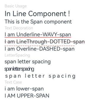
Example 1: Setting the Text Style
This example demonstrates how to apply different text styles and configure click events for the Span component.
// xxx.ets
@Entry
@Component
struct SpanExample {
  build() {
    Flex({ direction: FlexDirection.Column, alignItems: ItemAlign.Start }) {
      Text('Basic Usage').fontSize(9).fontColor(0xCCCCCC)
      Text() {
        Span('In Line')
        Span(' Component')
        Span(' !')
      }

      Text() {
        Span('This is the Span component').fontSize(12).textCase(TextCase.Normal)
          .decoration({ type: TextDecorationType.None, color: Color.Red })
          .fontFamily('HarmonyOS Sans')
      }.margin({ top: 12 })

      // Add a line under the text.
      Text('Text Decoration').fontSize(9).fontColor(0xCCCCCC).margin({ top: 12 })
      Text() {
        Span('I am Underline-WAVY-span')
          .decoration({ type: TextDecorationType.Underline, color: Color.Red, style: TextDecorationStyle.WAVY })
          .fontSize(12)
      }

      Text() {
        Span('I am LineThrough-DOTTED-span')
          .decoration({ type: TextDecorationType.LineThrough, color: Color.Red, style: TextDecorationStyle.DOTTED })
          .fontSize(12)
      }

      Text() {
        Span('I am Overline-DASHED-span')
          .decoration({ type: TextDecorationType.Overline, color: Color.Red, style: TextDecorationStyle.DASHED })
          .fontSize(12)
      }

      // Set the letter spacing.
      Text('LetterSpacing').fontSize(9).fontColor(0xCCCCCC).margin({ top: 12 })
      Text() {
        Span('span letter spacing')
          .letterSpacing(0)
          .fontSize(12)
      }

      Text() {
        Span('span letter spacing')
          .letterSpacing(-2)
          .fontSize(12)
      }

      Text() {
        Span('span letter spacing')
          .letterSpacing(3)
          .fontSize(12)
      }

      // Set the text case.
      Text('Text Case').fontSize(9).fontColor(0xCCCCCC).margin({ top: 12 })
      Text() {
        Span('I am Lower-span').fontSize(12)
          .textCase(TextCase.LowerCase)
          .decoration({ type: TextDecorationType.None })
      }

      Text() {
        Span('I am Upper-span').fontSize(12)
          .textCase(TextCase.UpperCase)
          .decoration({ type: TextDecorationType.None })
      }

      // Set the text font style.
      Text('FontStyle').fontSize(9).fontColor(0xCCCCCC).margin({ top: 12 })
      Text() {
        Span('I am FontStyle-Normal').fontSize(12)
          .fontStyle(FontStyle.Normal)
      }

      Text() {
        Span('I am FontStyle-Italic').fontSize(12)
          .fontStyle(FontStyle.Italic)
      }

      // Set the text font weight.
      Text('FontWeight').fontSize(9).fontColor(0xCCCCCC).margin({ top: 12 })
      Text() {
        Span('I am FontWeight-Lighter').fontSize(12)
          .fontWeight(FontWeight.Lighter)
      }

      Text() {
        Span('I am FontWeight-Bold').fontSize(12)
          .fontWeight(FontWeight.Bold)
      }

      // Set the text line height.
      Text('LineHeight').fontSize(9).fontColor(0xCCCCCC).margin({ top: 12 })
      Text() {
        Span('I am lineHeight default\n').fontSize(12)
          .fontWeight(FontWeight.Lighter)
        Span('I am lineHeight 30').fontSize(12)
          .lineHeight(30)
      }
      .backgroundColor(Color.Gray)

      // Set the text style.
      Text('Font').fontSize(9).fontColor(0xCCCCCC).margin({ top: 12 })
      Text() {
        Span('span font 12 Bolder Italic')
          .font({
            size: 12,
            weight: FontWeight.Bolder,
            style: FontStyle.Italic,
            family: "HarmonyOS Sans"
          })
      }

      // Set the click event.
      Text('span click event').fontSize(9).fontColor(0xCCCCCC).margin({ top: 12 })
      Text() {
        Span('Span default ').fontSize(12)
        Span('Span click')
          .onClick((event) => {
            console.log("span onClick")
          })
      }
    }.width('100%').padding({ left: 35, right: 35, top: 35 })
  }
}
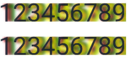
Example 2: Setting the Text Shadow
This example demonstrates the effect of setting a shadow for text using the textShadow attributes.
// xxx.ets
@Entry
@Component
struct SpanExample {
  @State textShadows: ShadowOptions|Array<ShadowOptions> = [{
    radius: 10,
    color: Color.Red,
    offsetX: 10,
    offsetY: 0
  }, {
    radius: 10,
    color: Color.Orange,
    offsetX: 20,
    offsetY: 0
  },
    {
      radius: 10,
      color: Color.Yellow,
      offsetX: 30,
      offsetY: 0
    }, {
      radius: 10,
      color: Color.Green,
      offsetX: 40,
      offsetY: 0
    },
    {
      radius: 10,
      color: Color.Blue,
      offsetX: 100,
      offsetY: 0
    }]

  build() {
    Column({ space: 8 }) {
      Text() {
        Span('123456789').fontSize(50).textShadow(this.textShadows).fontColor(Color.Pink)
      }

      Text() {
        Span('123456789') // span can inherit text shadow & font size from outer text
      }.fontSize(50).textShadow(this.textShadows).fontColor(Color.Pink)
    }
  }
}
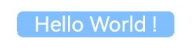
Example 3: Setting the Background Style
This example demonstrates the effect of setting a background style for text using the textBackgroundStyle attribute.
// xxx.ets
@Component
@Entry
struct SpanExample {
  build() {
    Column() {
      Text() {
        Span('   Hello World !   ')
          .fontSize('20fp')
          .textBackgroundStyle({ color: "#7F007DFF", radius: "5vp" })
          .fontColor(Color.White)
      }
    }.width('100%').margin({ bottom: '5vp' }).alignItems(HorizontalAlign.Center)
  }
}
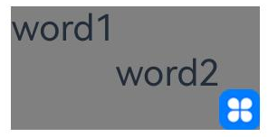
Example 4: Setting the Text Baseline Offset
This example demonstrates the effect of setting different baseline offsets for text using the baselineOffset attribute.
// xxx.ets
import { LengthUnit, LengthMetrics } from '@kit.ArkUI';

@Entry
@Component
struct SpanExample {
  build() {
    Row() {
      Column() {
        Text() {
          Span('SpanOne')
            .fontSize(10)
            .baselineOffset(new LengthMetrics(20, LengthUnit.VP))
          Span('SpanTwo')
            .fontSize(10)
            .baselineOffset(new LengthMetrics(0, LengthUnit.VP))
          ImageSpan($r("app.media.sky"))// You are advised to use a custom local image.
            .width('80px')
            .baselineOffset(new LengthMetrics(-20, LengthUnit.VP))
        }
        .backgroundColor('#7F007DFF')
      }
      .width('100%')
    }
    .height('100%')
  }
}
你可能感兴趣的鸿蒙文章
- 所属分类: 后端技术
- 本文标签:
热门推荐
-
2、 优质文章
-
3、 gt
-
7、 openharmony
-
9、 golang
-
10、 Vue中input框自动聚焦