harmony 鸿蒙Border
Border
The border attributes are used to set border styles for components.
NOTE
The APIs of this module are supported since API version 7. Updates will be marked with a superscript to indicate their earliest API version.
border
border(value: BorderOptions)
Sets the border.
Widget capability: This API can be used in ArkTS widgets since API version 9.
Atomic service API: This API can be used in atomic services since API version 11.
System capability: SystemCapability.ArkUI.ArkUI.Full
Parameters
| Name | Type | Mandatory | Description |
|---|---|---|---|
| value | BorderOptions | Yes | Unified border style. NOTE The default value is 0, indicating that the border is not displayed. The border of a component is displayed above the content of its child components since API version 9. |
borderStyle
borderStyle(value: BorderStyle|EdgeStyles)
Sets the border style.
Widget capability: This API can be used in ArkTS widgets since API version 9.
Atomic service API: This API can be used in atomic services since API version 11.
System capability: SystemCapability.ArkUI.ArkUI.Full
Parameters
| Name | Type | Mandatory | Description |
|---|---|---|---|
| value | BorderStyle |EdgeStyles9+ | Yes | Border style. Default value: BorderStyle.Solid |
borderWidth
borderWidth(value: Length|EdgeWidths|LocalizedEdgeWidths)
Sets the border width.
Widget capability: This API can be used in ArkTS widgets since API version 9.
Atomic service API: This API can be used in atomic services since API version 11.
System capability: SystemCapability.ArkUI.ArkUI.Full
Parameters
| Name | Type | Mandatory | Description |
|---|---|---|---|
| value | Length |EdgeWidths9+ |LocalizedEdgeWidths12+ | Yes | Border width. Percentage values are not supported. |
borderColor
borderColor(value: ResourceColor|EdgeColors|LocalizedEdgeColors)
Sets the border color.
Widget capability: This API can be used in ArkTS widgets since API version 9.
Atomic service API: This API can be used in atomic services since API version 11.
System capability: SystemCapability.ArkUI.ArkUI.Full
Parameters
| Name | Type | Mandatory | Description |
|---|---|---|---|
| value | ResourceColor |EdgeColors9+ |LocalizedEdgeColors12+ | Yes | Border color. Default value: Color.Black |
borderRadius
borderRadius(value: Length|BorderRadiuses|LocalizedBorderRadiuses)
Sets the radius of the border rounded corners. The radius is restricted by the component size. The maximum value is half of the component width or height.
Widget capability: This API can be used in ArkTS widgets since API version 9.
Atomic service API: This API can be used in atomic services since API version 11.
System capability: SystemCapability.ArkUI.ArkUI.Full
Parameters
| Name | Type | Mandatory | Description |
|---|---|---|---|
| value | Length |BorderRadiuses9+ |LocalizedBorderRadiuses12+ | Yes | Radius of the border rounded corners. The value can be expressed as a percentage of the component’s width. |
BorderOptions
Widget capability: This API can be used in ArkTS widgets since API version 9.
Atomic service API: This API can be used in atomic services since API version 11.
| Name | Type | Mandatory | Description |
|---|---|---|---|
| width | Length |EdgeWidths9+ |LocalizedEdgeWidths12+ | No | Border width. |
| color | ResourceColor |EdgeColors9+ |LocalizedEdgeColors12+ | No | Border color. |
| radius | Length |BorderRadiuses9+ |LocalizedBorderRadiuses12+ | No | Radius of the border rounded corners. |
| style | BorderStyle |EdgeStyles9+ | No | Sets the border. |
| dashGap12+ | LengthMetrics |EdgeWidths |LocalizedEdgeWidths | No | Gap between dashed line segments. It takes effect when the border style is set to dashed. Percentage values are not supported. |
| dashWidth12+ | LengthMetrics |EdgeWidths |LocalizedEdgeWidths | No | Width of dashed line segments. It takes effect when the border style is set to dashed. Percentage values are not supported. |
EdgeWidths9+
To reference this object, at least one parameter must be passed.
Widget capability: This API can be used in ArkTS widgets since API version 9.
Atomic service API: This API can be used in atomic services since API version 11.
| Name | Type | Mandatory | Description |
|---|---|---|---|
| left | Length | No | Width of the left border. |
| right | Length | No | Width of the right border. |
| top | Length | No | Width of the top border. |
| bottom | Length | No | Width of the bottom border. |
LocalizedEdgeWidths12+
Represents the edge widths in different directions of a component.
To reference this object, at least one parameter must be passed.
Widget capability: This API can be used in ArkTS widgets since API version 12.
| Name | Type | Mandatory | Description |
|---|---|---|---|
| start | LengthMetrics | No | Width of the left border. Width of the right border for right-to-left scripts. |
| end | LengthMetrics | No | Width of the right border. Width of the left border for right-to-left scripts. |
| top | LengthMetrics | No | Width of the top border. |
| bottom | LengthMetrics | No | Width of the bottom border. |
EdgeColors9+
To reference this object, at least one parameter must be passed.
Widget capability: This API can be used in ArkTS widgets since API version 9.
Atomic service API: This API can be used in atomic services since API version 11.
| Name | Type | Mandatory | Description |
|---|---|---|---|
| left | ResourceColor | No | Color of the left border. |
| right | ResourceColor | No | Color of the right border. |
| top | ResourceColor | No | Color of the top border. |
| bottom | ResourceColor | No | Color of the bottom border. |
LocalizedEdgeColors12+
Describes the edge colors of a component.
To reference this object, at least one parameter must be passed.
Widget capability: This API can be used in ArkTS widgets since API version 12.
Atomic service API: This API can be used in atomic services since API version 12.
| Name | Type | Mandatory | Description |
|---|---|---|---|
| start | ResourceColor | No | Color of the left border. Color of the right border for right-to-left scripts. |
| end | ResourceColor | No | Color of the right border. Color of the left border for right-to-left scripts. |
| top | ResourceColor | No | Color of the top border. |
| bottom | ResourceColor | No | Color of the bottom border. |
BorderRadiuses9+
To reference this object, at least one parameter must be passed.
Widget capability: This API can be used in ArkTS widgets since API version 9.
Atomic service API: This API can be used in atomic services since API version 11.
| Name | Type | Mandatory | Description |
|---|---|---|---|
| topLeft | Length | No | Radius of the upper left rounded corner. |
| topRight | Length | No | Radius of the upper right rounded corner. |
| bottomLeft | Length | No | Radius of the lower left rounded corner. |
| bottomRight | Length | No | Radius of the lower right rounded corner. |
LocalizedBorderRadiuses12+
Describes the corner radius of a component’s border.
To reference this object, at least one parameter must be passed.
Widget capability: This API can be used in ArkTS widgets since API version 12.
Atomic service API: This API can be used in atomic services since API version 12.
| Name | Type | Mandatory | Description |
|---|---|---|---|
| topStart | LengthMetrics12+ | No | Radius of the upper left rounded corner. Radius of the upper right rounded corner for right-to-left scripts. |
| topEnd | LengthMetrics12+ | No | Radius of the upper right rounded corner. Radius of the upper left rounded corner for right-to-left scripts. |
| bottomStart | LengthMetrics12+ | No | Radius of the lower left rounded corner. Radius of the lower right rounded corner for right-to-left scripts. |
| bottomEnd | LengthMetrics12+ | No | Radius of the lower right rounded corner. Radius of the lower left rounded corner for right-to-left scripts. |
EdgeStyles9+
To reference this object, at least one parameter must be passed.
Widget capability: This API can be used in ArkTS widgets since API version 9.
Atomic service API: This API can be used in atomic services since API version 11.
| Name | Type | Mandatory | Description |
|---|---|---|---|
| left | BorderStyle | No | Style of the left border. |
| right | BorderStyle | No | Style of the right border. |
| top | BorderStyle | No | Style of the top border. |
| bottom | BorderStyle | No | Style of the bottom border. |
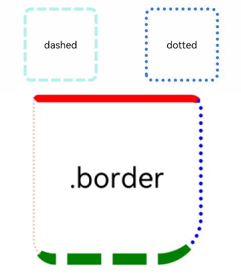
Example
Example 1
// xxx.ets
@Entry
@Component
struct BorderExample {
  build() {
    Column() {
      Flex({ justifyContent: FlexAlign.SpaceAround, alignItems: ItemAlign.Center }) {
        // Dashed border
        Text('dashed')
          .borderStyle(BorderStyle.Dashed).borderWidth(5).borderColor(0xAFEEEE).borderRadius(10)
          .width(120).height(120).textAlign(TextAlign.Center).fontSize(16)
        // Dotted border
        Text('dotted')
          .border({ width: 5, color: 0x317AF7, radius: 10, style: BorderStyle.Dotted })
          .width(120).height(120).textAlign(TextAlign.Center).fontSize(16)
      }.width('100%').height(150)

      Text('.border')
        .fontSize(50)
        .width(300)
        .height(300)
        .border({
          width: { left: 3, right: 6, top: 10, bottom: 15 },
          color: { left: '#e3bbbb', right: Color.Blue, top: Color.Red, bottom: Color.Green },
          radius: { topLeft: 10, topRight: 20, bottomLeft: 40, bottomRight: 80 },
          style: {
            left: BorderStyle.Dotted,
            right: BorderStyle.Dotted,
            top: BorderStyle.Solid,
            bottom: BorderStyle.Dashed
          }
        }).textAlign(TextAlign.Center)
    }
  }
}
Example 2
// xxx.ets
// The width, radius, and color attributes of border use the LocalizedEdgeWidths and LocalizedEdgeColors types.

import { LengthMetrics } from '@kit.ArkUI';
@Entry
@Component
struct BorderExample {
  build() {
    Column() {
      Flex({ justifyContent: FlexAlign.SpaceAround, alignItems: ItemAlign.Center }) {
        // Dashed border
        Text('dashed')
          .borderStyle(BorderStyle.Dashed)
          .borderWidth(5)
          .borderColor(0xAFEEEE)
          .borderRadius(10)
          .width(120)
          .height(120)
          .textAlign(TextAlign.Center)
          .fontSize(16)
        // Dotted border
        Text('dotted')
          .border({ width: 5, color: 0x317AF7, radius: 10, style: BorderStyle.Dotted })
          .width(120)
          .height(120)
          .textAlign(TextAlign.Center)
          .fontSize(16)
      }.width('100%').height(150)

      Text('.border')
        .fontSize(50)
        .width(300)
        .height(300)
        .border({
          width: {
            start: LengthMetrics.vp(3),
            end: LengthMetrics.vp(6),
            top: LengthMetrics.vp(10),
            bottom: LengthMetrics.vp(15)
          },
          color: { start: '#e3bbbb', end: Color.Blue, top: Color.Red, bottom: Color.Green },
          radius: {
            topStart: LengthMetrics.vp(10),
            topEnd: LengthMetrics.vp(20),
            bottomStart: LengthMetrics.vp(40),
            bottomEnd: LengthMetrics.vp(80)
          },
          style: {
            left: BorderStyle.Dotted,
            right: BorderStyle.Dotted,
            top: BorderStyle.Solid,
            bottom: BorderStyle.Dashed
          }
        })
        .textAlign(TextAlign.Center)
    }
  }
}
The following shows how the example is represented with left-to-right scripts.
The following shows how the example is represented with right-to-left scripts.
你可能感兴趣的鸿蒙文章
- 所属分类: 后端技术
- 本文标签:
热门推荐
-
2、 优质文章
-
3、 gt
-
7、 openharmony
-
9、 golang
-
10、 Vue中input框自动聚焦